
Search results for "Stay hidden" in Home Design Ideas
 Griffin Designs LLC
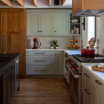
This modern farmhouse kitchen is in a former 1820s stable converted into a home. Natural cherry and soft green painted cabinet finishes paired with Zellige tile accents and beamed ceilings reflect the vintage character of the old barn and compliment the open plan of the space. The Sub-Zero refrigerator is hidden in plain sight while the 48” Wolf range and steam oven are positioned perfectly, allowing this family to stay together while cooking, socializing and eating.
By moving the cramped kitchen to the opposite side of the home, this Morris County New Jersey kitchen and bath remodeler was able to take advantage of a much larger and underutilized space while also improving the overall flow in the remainder of the home.
 KraftMaster Renovations
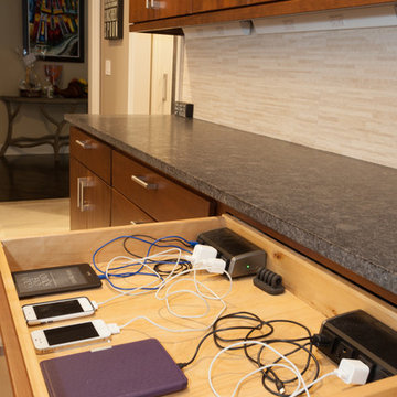
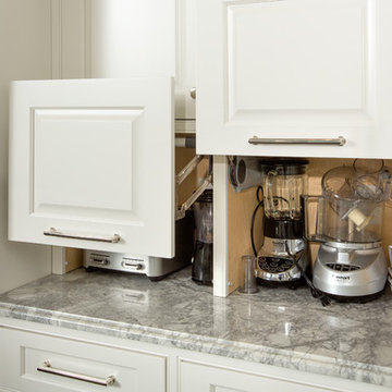
Clear the clutter with this clever charging drawer provides a convient place to store and power all of the portable electronics. iPods, iPhone's, cell phones, virtually any thing that needs a usb plug has a home.
Blackstock Photography
 Timothy M. Giguere, AIA - TMS Architects
Architectrure by TMS Architects
Rob Karosis Photography
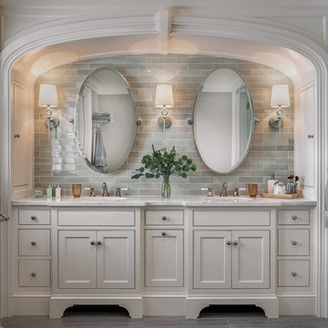
Beach style master gray tile and subway tile gray floor bathroom photo in Boston with beaded inset cabinets, white cabinets, gray walls, marble countertops and white countertops
Beach style master gray tile and subway tile gray floor bathroom photo in Boston with beaded inset cabinets, white cabinets, gray walls, marble countertops and white countertops
Find the right local pro for your project
 Advance Design Studio, Ltd.
Jackie and Sean loved the Algonquin neighborhood they lived in with the peaceful neighborhood and the close proximity to work and school. What they didn’t love was how outdated their home had become. With a cramped kitchen and an unused dining room, they decided a remodel was the perfect solution to their problem. They would be able to continue to live in the area they loved, while at the same time they could have the dream home they envisioned.
After a thorough search, Jackie came across Advance Design Studio. She was impressed by all of the positive reviews she saw on the internet and saw herself identifying with all of the project stories she saw on the website. Once they met with designer Scott Christensen and owner Todd Jurs, they knew Advance Design was the right company to make their dreams a reality.
The project consisted of four main areas: the kitchen/dining/powder room, the laundry room, the master bathroom, and the kid’s bathroom. They wanted to expand the kitchen into the seldom used dining room and add a large island for hosting parties and family gatherings. They also wanted new hardwood flooring throughout the first level. The laundry room needed to be more functional, and all three bathrooms were in dire need of updating.
The closed off kitchen was opened up to create a sweeping space between the new eating area and the much larger kitchen. A handsome dry bar complete with a beverage refrigerator and lighted glass door cabinetry makes an elegant transition across from a peninsula area filled with storage. An additional decorative cabinet lighting up elegant dishware through the mullioned glass sits directly across from the drybar.
An expansive island was critical to the kitchen plans. Jackie, Sean and Scott worked closely together to create just the right details for their design. They wanted the island to be functional in addition to being the centerpiece of the room. Added storage for the kid’s school supplies was hidden behind cabinet doors so the children could do their schoolwork right at the island, and a microwave drawer glides open with the touch of a finger hidden inconspicuously within the island space. The easy to care for Cambria Britannica Quartz island top with its sweeping grey and white marble look perched atop hand-carved Craftsman corbels was absolutely what they were hoping for, blending both beauty and function perfectly.
Adding a nice contrast to the brightness of the quartz and the white cabinetry, Kodiak - Leather granite countertops were used to balance the light and dark tones of the space. Dura Supreme Classic White painted cabinets grace the perimeter, while Maple Poppy Seed stained cabinets with a beautiful soft grey woodgrain were used in the beverage center and island. The two tones compliment the large space balancing it out nicely creating interest and elegance with the simple Craftsman style full overlay doors.
A deep warm Barnwood White Oak flooring was added throughout the lower level. The new floor brings additional contrast to the bright kitchen and provides unity with the now open floorplan as it rolls in to the foyer and family room. Final details like the show-stopping lunar like duo light fixtures complete the space and intermix expertly with crisscross details of the glass door mullions, the island bar seating and even accessories in the space.
The small cluttered laundry room needed more space and more storage. With a busy family it seemed to overflow daily and did not have anywhere to hide the families “in and out stuff.” Scott designed the new space with a stackable washer and dryer and much more efficiently organized cabinetry. Doing laundry is now (almost!) a pleasure and keeping everyone’s “stuff” hidden, but readily accessible is now a snap.
The master bath was not a place where the couple enjoyed spending time getting ready for their day. The tub almost never was used, so removing it made it possible to build an extra-large shower, replacing the small cramped cube of the previous shower they hated. Clean, horizontal lines softly draw your eye around the space with porcelain tile called Driftwood Sea spray. Full overlay cabinetry in a soft white vanity with double sinks makes getting ready for the day much more convenient for the busy couple.
Long floor planks made of porcelain tile mimic real hardwood floors in a soft grey to compliment the shower, but with the ease and care of a tile surface. Cambrian Black Granite counters with a matte finish and under mount porcelain sinks with handsome brushed chrome hardware complete the handsome space. A real bonus in any master bath; a custom built in storage nook was tucked in the corner of the space for linens and heavenly storage.
The kid’s bath was in sad shape because it was original to the house. To keep the budget in control, the tub which was in great condition was retained, but focus was on the new large brick style porcelain charcoal tile on the floor, crisp white new Craftsman style cabinetry with pretty furniture details on the corner base, a striking granite top with white under mount porcelain sinks and fresh hardware and faucets. Some beautiful soft grey wood mirrors to match mom and dads were custom sized and placed under new lighting, and 4 hooks were smartly arranged down the wall for kids’ towels.
This couple was determined not to move, and made their house their dream home. Not only does their home function greatly now, but Jackie says, “When the neighbors come to visit, they’re asking if they can “steal” the design”! The added functionality, elegance, and open floor plan were exactly what this family needed in order to stay.
Advance Design Studio, Joe Nowak
 Studio Dearborn
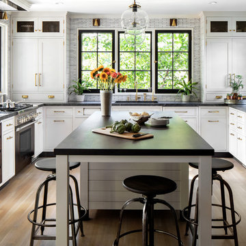
INTERNATIONAL AWARD WINNER. 2018 NKBA Design Competition Best Overall Kitchen. 2018 TIDA International USA Kitchen of the Year. 2018 Best Traditional Kitchen - Westchester Home Magazine design awards.
The designer's own kitchen was gutted and renovated in 2017, with a focus on classic materials and thoughtful storage. The 1920s craftsman home has been in the family since 1940, and every effort was made to keep finishes and details true to the original construction. For sources, please see the website at www.studiodearborn.com. Photography, Adam Kane Macchia and Timothy Lenz

 IS Architecture
The kitchen, breakfast room and family room are all open to one another. The kitchen has a large twelve foot island topped with Calacatta marble and features a roll-out kneading table, and room to seat the whole family. The sunlight breakfast room opens onto the patio which has a built-in barbeque, and both bar top seating and a built in bench for outdoor dining. The large family room features a cozy fireplace, TV media, and a large built-in bookcase. The adjoining craft room is separated by a set of pocket french doors; where the kids can be visible from the family room as they do their homework.
 Pineapple House Interior Design
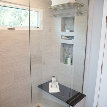
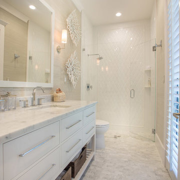
The shower is universally designed and has no curb or step at its entry. The drawer pulls are also designed for easy use.
A Bonisolli Photography
Mid-sized transitional white tile walk-in shower photo in Miami with an undermount sink, flat-panel cabinets, white cabinets and marble countertops
Mid-sized transitional white tile walk-in shower photo in Miami with an undermount sink, flat-panel cabinets, white cabinets and marble countertops

Sponsored
Columbus, OH

Hope Restoration & General Contracting
Columbus Design-Build, Kitchen & Bath Remodeling, Historic Renovations

 transFORM Home
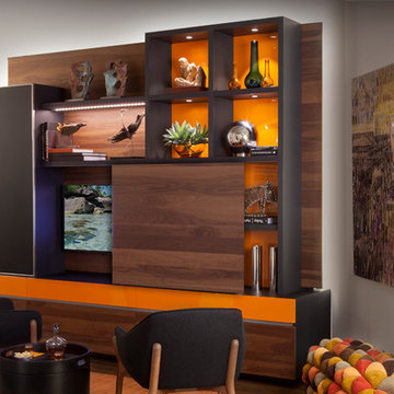
This custom living room unit and media center was designed to provide all that a Manhattan family needs for entertaining lots of guests or to just kick back, relax and watch some TV. The wall unit also shows off some of our favorite new material finishes with a combination of wood veneer, matte glass, and high gloss.
Color played a big role in the design of this entertainment center. It contrasts a radiant high gloss orange with a warm Smoked Walnut wood grain for a balanced and modern look. The orange high gloss adds an artistic accent to the unit, while keeping the design free from chaotic lines and color schemes. Our no-handle design is made possible by a brushed aluminum J-channel that provides a clean look and makes the drawers easy to access. Flat style doors and drawer fronts also contribute to the smooth and modern European look of the media center.
Our space saving entertainment system also delivers an abundant amount of floor to ceiling storage, both open and in drawers. There is ample room to store and display books, sculptures and home decor. Bottom cabinets are a suitable place to conceal and store media equipment. 1.5 inch thick floating shelves above the television and the box shelves alongside, featured in Midnight Ash, provide definition to the design and balance the high intensity orange elements. Top shelves provide space to arrange fragile keepsakes while bottom shelves can be used to display your favorite reads.
Opposite the open shelving is a matte black glass fronted cabinet to house your favorite drinks and glassware for quick entertaining. The black satin glass is defined by an aluminum door frame. Clear glass shelves are found within the glass door cabinet and provide a useful place for storing dry bar essentials like rocks glasses and your preferred liquor selection. The cabinet includes vertical profile LED strip lights on both side panels that illuminate when the door is opened. The lighting shines through the shelves and sparkles off the glassware, silver ice bucket and colorful drinks you might keep there.
The unit contains a sliding door that alternately hides a flat screen television and reveals a shelf. This feature paired with our wire management system helps keep your wall unit and your living area looking neat and tidy.
The hidden hardware adds a unique function to this design without drawing the eye. Short arm flap stays and drop-down flap hinges allow for the soft, almost automatic opening of the long panel faces that conceal the drawers behind. The drawers are easy to access and provide the storage of multiple drawers without cluttering the look of the media center.
This design is completed with integrated LED lighting. Behind the floating backing panel, adjustable LED lighting enhances the spacious look of the unit and provide mood lights for the living room. The shelves are equipped with recessed LED lights that make the orange high gloss color pop and showcase your displayed possessions. The floating shelves are equipped with horizontal profile LED strip lights to give the whole unit a warm glow. Our lighting systems offer features such as touch switches and dimmers, which add light, comfort and convenience to your living space.
Tell us what you want in your living room media center.
 Kathleen Jennison
An Arts & Crafts Bungalow is one of my favorite styles of homes. We have quite a few of them in our Stockton Mid-Town area. And when C&L called us to help them remodel their 1923 American Bungalow, I was beyond thrilled.
As per usual, when we get a new inquiry, we quickly Google the project location while we are talking to you on the phone. My excitement escalated when I saw the Google Earth Image of the sweet Sage Green bungalow in Mid-Town Stockton. "Yes, we would be interested in working with you," I said trying to keep my cool.
But what made it even better was meeting C&L and touring their home, because they are the nicest young couple, eager to make their home period perfect. Unfortunately, it had been slightly molested by some bad house-flippers, and we needed to bring the bathroom back to it "roots."
We knew we had to banish the hideous brown tile and cheap vanity quickly. But C&L complained about the condensation problems and the constant fight with mold. This immediately told me that improper remodeling had occurred and we needed to remedy that right away.
The Before: Frustrations with a Botched Remodel
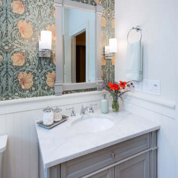
The bathroom needed to be brought back to period appropriate design with all the functionality of a modern bathroom. We thought of things like marble countertop, white mosaic floor tiles, white subway tile, board and batten molding, and of course a fabulous wallpaper.
This small (and only) bathroom on a tight budget required a little bit of design sleuthing to figure out how we could get the proper look and feel. Our goal was to determine where to splurge and where to economize and how to complete the remodel as quickly as possible because C&L would have to move out while construction was going on.
The Process: Hard Work to Remedy Design and Function
During our initial design study, (which included 2 hours in the owners’ home), we noticed framed images of William Morris Arts and Crafts textile patterns and knew this would be our design inspiration. We presented C&L with three options and they quickly selected the Pimpernel Design Concept.
We had originally selected the Black and Olive colors with a black vanity, mirror, and black and white floor tile. C&L liked it but weren’t quite sure about the black, We went back to the drawing board and decided the William & Co Pimpernel Wallpaper in Bayleaf and Manilla color with a softer gray painted vanity and mirror and white floor tile was more to their liking.
After the Design Concept was approved, we went to work securing the building permit, procuring all the elements, and scheduling our trusted tradesmen to perform the work.
We did uncover some shoddy work by the flippers such as live electrical wires hidden behind the wall, plumbing venting cut-off and buried in the walls (hence the constant dampness), the tub barely balancing on two fence boards across the floor joist, and no insulation on the exterior wall.
All of the previous blunders were fixed and the bathroom put back to its previous glory. We could feel the house thanking us for making it pretty again.
The After Reveal: Cohesive Design Decisions
We selected a simple white subway tile for the tub/shower. This is always classic and in keeping with the style of the house.
We selected a pre-fab vanity and mirror, but they look rich with the quartz countertop. There is much more storage in this small vanity than you would think.
The Transformation: A Period Perfect Refresh
We began the remodel just as the pandemic reared and stay-in-place orders went into effect. As C&L were already moved out and living with relatives, we got the go-ahead from city officials to get the work done (after all, how can you shelter in place without a bathroom?).
All our tradesmen were scheduled to work so that only one crew was on the job site at a time. We stayed on the original schedule with only a one week delay.
The end result is the sweetest little bathroom I've ever seen (and I can't wait to start work on C&L's kitchen next).
Thank you for joining me in this project transformation. I hope this inspired you to think about being creative with your design projects, determining what works best in keeping with the architecture of your space, and carefully assessing how you can have the best life in your home.
 Barbra Bright Design
Andrew McKinney Photography
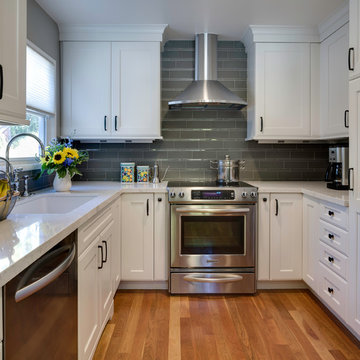
Not every kitchen on houzz is enormous! Here's a 10' x 10' kitchen.
It seems that painted white kitchens never go out of favor. While the cabinets, faucets and hardware lean toward a more traditional look, that look is tempered by the modern lines of grey glass tile and the chimney hood.
And instead of carrara marble counter tops, the client opted for quartz for a similar look (Cambria's "Torquay").
 transFORM Home
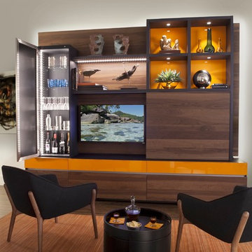
This custom living room unit and media center was designed to provide all that a Manhattan family needs for entertaining lots of guests or to just kick back, relax and watch some TV. The wall unit also shows off some of our favorite new material finishes with a combination of wood veneer, matte glass, and high gloss.
Color played a big role in the design of this entertainment center. It contrasts a radiant high gloss orange with a warm Smoked Walnut wood grain for a balanced and modern look. The orange high gloss adds an artistic accent to the unit, while keeping the design free from chaotic lines and color schemes. Our no-handle design is made possible by a brushed aluminum J-channel that provides a clean look and makes the drawers easy to access. Flat style doors and drawer fronts also contribute to the smooth and modern European look of the media center.
Our space saving entertainment system also delivers an abundant amount of floor to ceiling storage, both open and in drawers. There is ample room to store and display books, sculptures and home decor. Bottom cabinets are a suitable place to conceal and store media equipment. 1.5 inch thick floating shelves above the television and the box shelves alongside, featured in Midnight Ash, provide definition to the design and balance the high intensity orange elements. Top shelves provide space to arrange fragile keepsakes while bottom shelves can be used to display your favorite reads.
Opposite the open shelving is a matte black glass fronted cabinet to house your favorite drinks and glassware for quick entertaining. The black satin glass is defined by an aluminum door frame. Clear glass shelves are found within the glass door cabinet and provide a useful place for storing dry bar essentials like rocks glasses and your preferred liquor selection. The cabinet includes vertical profile LED strip lights on both side panels that illuminate when the door is opened. The lighting shines through the shelves and sparkles off the glassware, silver ice bucket and colorful drinks you might keep there.
The unit contains a sliding door that alternately hides a flat screen television and reveals a shelf. This feature paired with our wire management system helps keep your wall unit and your living area looking neat and tidy.
The hidden hardware adds a unique function to this design without drawing the eye. Short arm flap stays and drop-down flap hinges allow for the soft, almost automatic opening of the long panel faces that conceal the drawers behind. The drawers are easy to access and provide the storage of multiple drawers without cluttering the look of the media center.
This design is completed with integrated LED lighting. Behind the floating backing panel, adjustable LED lighting enhances the spacious look of the unit and provide mood lights for the living room. The shelves are equipped with recessed LED lights that make the orange high gloss color pop and showcase your displayed possessions. The floating shelves are equipped with horizontal profile LED strip lights to give the whole unit a warm glow. Our lighting systems offer features such as touch switches and dimmers, which add light, comfort and convenience to your living space.
Tell us what you want in your living room media center.


Sponsored
Delaware, OH

Buckeye Basements, Inc.
Central Ohio's Basement Finishing ExpertsBest Of Houzz '13-'21

 Mehl Home Designs
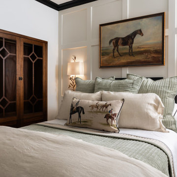
A custom armoire style closet with glass doors mimics an antique to create a unique feel in this cozy guest suite. Earth tones in the bedding pull in a warm touch to the neutral walls and trim.
 Kathleen Jennison
An Arts & Crafts Bungalow is one of my favorite styles of homes. We have quite a few of them in our Stockton Mid-Town area. And when C&L called us to help them remodel their 1923 American Bungalow, I was beyond thrilled.
As per usual, when we get a new inquiry, we quickly Google the project location while we are talking to you on the phone. My excitement escalated when I saw the Google Earth Image of the sweet Sage Green bungalow in Mid-Town Stockton. "Yes, we would be interested in working with you," I said trying to keep my cool.
But what made it even better was meeting C&L and touring their home, because they are the nicest young couple, eager to make their home period perfect. Unfortunately, it had been slightly molested by some bad house-flippers, and we needed to bring the bathroom back to it "roots."
We knew we had to banish the hideous brown tile and cheap vanity quickly. But C&L complained about the condensation problems and the constant fight with mold. This immediately told me that improper remodeling had occurred and we needed to remedy that right away.
The Before: Frustrations with a Botched Remodel
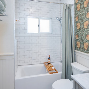
The bathroom needed to be brought back to period appropriate design with all the functionality of a modern bathroom. We thought of things like marble countertop, white mosaic floor tiles, white subway tile, board and batten molding, and of course a fabulous wallpaper.
This small (and only) bathroom on a tight budget required a little bit of design sleuthing to figure out how we could get the proper look and feel. Our goal was to determine where to splurge and where to economize and how to complete the remodel as quickly as possible because C&L would have to move out while construction was going on.
The Process: Hard Work to Remedy Design and Function
During our initial design study, (which included 2 hours in the owners’ home), we noticed framed images of William Morris Arts and Crafts textile patterns and knew this would be our design inspiration. We presented C&L with three options and they quickly selected the Pimpernel Design Concept.
We had originally selected the Black and Olive colors with a black vanity, mirror, and black and white floor tile. C&L liked it but weren’t quite sure about the black, We went back to the drawing board and decided the William & Co Pimpernel Wallpaper in Bayleaf and Manilla color with a softer gray painted vanity and mirror and white floor tile was more to their liking.
After the Design Concept was approved, we went to work securing the building permit, procuring all the elements, and scheduling our trusted tradesmen to perform the work.
We did uncover some shoddy work by the flippers such as live electrical wires hidden behind the wall, plumbing venting cut-off and buried in the walls (hence the constant dampness), the tub barely balancing on two fence boards across the floor joist, and no insulation on the exterior wall.
All of the previous blunders were fixed and the bathroom put back to its previous glory. We could feel the house thanking us for making it pretty again.
The After Reveal: Cohesive Design Decisions
We selected a simple white subway tile for the tub/shower. This is always classic and in keeping with the style of the house.
We selected a pre-fab vanity and mirror, but they look rich with the quartz countertop. There is much more storage in this small vanity than you would think.
The Transformation: A Period Perfect Refresh
We began the remodel just as the pandemic reared and stay-in-place orders went into effect. As C&L were already moved out and living with relatives, we got the go-ahead from city officials to get the work done (after all, how can you shelter in place without a bathroom?).
All our tradesmen were scheduled to work so that only one crew was on the job site at a time. We stayed on the original schedule with only a one week delay.
The end result is the sweetest little bathroom I've ever seen (and I can't wait to start work on C&L's kitchen next).
Thank you for joining me in this project transformation. I hope this inspired you to think about being creative with your design projects, determining what works best in keeping with the architecture of your space, and carefully assessing how you can have the best life in your home.
 Steve Gray Renovations Inc.
Steve Gray Renovations
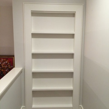
Example of a mid-sized classic vinyl floor and brown floor hallway design in Indianapolis with white walls
Example of a mid-sized classic vinyl floor and brown floor hallway design in Indianapolis with white walls
Sponsored
Columbus, OH
Hope Restoration & General Contracting
Columbus Design-Build, Kitchen & Bath Remodeling, Historic Renovations

 Lundin Architects LLC
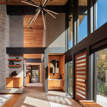
Perched on a ridge at the edge of a wooded expanse, this mid-century modern home was designed to embrace both the intimate connection to the forest and the expansive valley views beyond. The site—carefully chosen from the family’s 52-acre homestead in western Wisconsin—balances privacy and openness, placing the home at the meeting point of dense trees and rolling fields.
The approach winds through the forest, offering only glimpses of the structure. Upon arrival, the parking area is subtly positioned below the main level, reinforcing the sense of discovery. As one ascends the entry walk, the house unfolds, revealing a dramatic view through the two-story living space, anchored by a brick fireplace that extends from floor to ceiling. The asymmetrical roofline lifts upward, accentuating the openness and maximizing natural light.
Inside, warm materials define the interiors. Wood ceilings and floors, complemented by concrete-look tile, establish a natural, grounded aesthetic. Black wood-clad beams provide scale and structure, subtly delineating spaces within the open-plan layout. A wood lattice screen partially conceals the dining area from the foyer, offering both openness and privacy. The kitchen—designed for gathering—features a large island, a dedicated baking station, and a breakfast counter that catches morning light while serving as a pass-through to the adjacent patio. Two textured glass sliding panels allow the kitchen to be closed off when needed. Just beyond, a hidden gem: the home’s personal Tiki room, complete with a vintage mug collection and a full bar.
To the east, the central fireplace marks the transition to more intimate spaces. A wide stair, integrated with the hearth, leads to the lower level, while a library with a corner window creates a quiet retreat, perfect for reading and taking in the valley beyond. The primary suite extends off this wing, featuring a spa-like bath with a textured tile walk-in shower, a soaking tub positioned for dramatic views, and a private balcony overlooking the landscape.
The lower level is designed for family gatherings and extended stays. A secondary fireplace, echoing the materials of the main level, anchors a cozy living area with an adjacent kitchenette. Additional bedrooms and baths provide ample accommodations, while a hidden playhouse under the stair and a dedicated bunk room add playful touches for visiting grandchildren.
The home is a balance of openness and enclosure, modernity and warmth—designed not only as a retreat but as a multigenerational gathering place, deeply connected to the land.
 Lundin Architects LLC
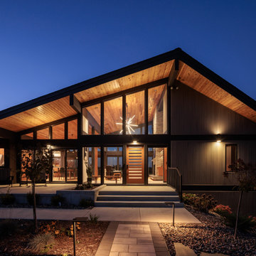
Perched on a ridge at the edge of a wooded expanse, this mid-century modern home was designed to embrace both the intimate connection to the forest and the expansive valley views beyond. The site—carefully chosen from the family’s 52-acre homestead in western Wisconsin—balances privacy and openness, placing the home at the meeting point of dense trees and rolling fields.
The approach winds through the forest, offering only glimpses of the structure. Upon arrival, the parking area is subtly positioned below the main level, reinforcing the sense of discovery. As one ascends the entry walk, the house unfolds, revealing a dramatic view through the two-story living space, anchored by a brick fireplace that extends from floor to ceiling. The asymmetrical roofline lifts upward, accentuating the openness and maximizing natural light.
Inside, warm materials define the interiors. Wood ceilings and floors, complemented by concrete-look tile, establish a natural, grounded aesthetic. Black wood-clad beams provide scale and structure, subtly delineating spaces within the open-plan layout. A wood lattice screen partially conceals the dining area from the foyer, offering both openness and privacy. The kitchen—designed for gathering—features a large island, a dedicated baking station, and a breakfast counter that catches morning light while serving as a pass-through to the adjacent patio. Two textured glass sliding panels allow the kitchen to be closed off when needed. Just beyond, a hidden gem: the home’s personal Tiki room, complete with a vintage mug collection and a full bar.
To the east, the central fireplace marks the transition to more intimate spaces. A wide stair, integrated with the hearth, leads to the lower level, while a library with a corner window creates a quiet retreat, perfect for reading and taking in the valley beyond. The primary suite extends off this wing, featuring a spa-like bath with a textured tile walk-in shower, a soaking tub positioned for dramatic views, and a private balcony overlooking the landscape.
The lower level is designed for family gatherings and extended stays. A secondary fireplace, echoing the materials of the main level, anchors a cozy living area with an adjacent kitchenette. Additional bedrooms and baths provide ample accommodations, while a hidden playhouse under the stair and a dedicated bunk room add playful touches for visiting grandchildren.
The home is a balance of openness and enclosure, modernity and warmth—designed not only as a retreat but as a multigenerational gathering place, deeply connected to the land.
3