
Search results for "Straightened" in Home Design Ideas
 marmarjohnson
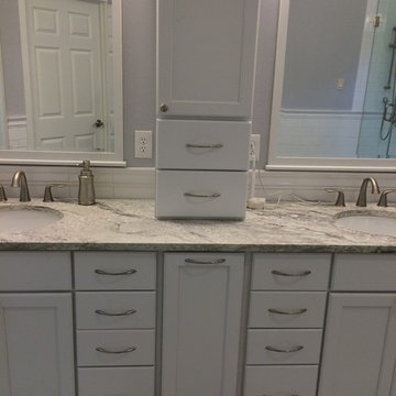
Cabinet on counter divides the two vanities. Cabinet directly below it is wired for electrical and has metal buckets currently being used for hair dryer and straightening iron.
 Mabry Design
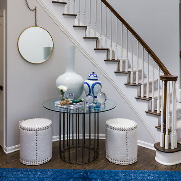
Example of a mid-sized transitional carpeted curved wood railing staircase design in Cleveland with carpeted risers
 H & R Cabinets Inc
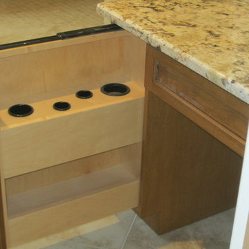
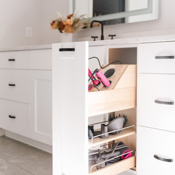
Pull out drawer for blow dryer / curling iron / cords
Elegant bathroom photo in Miami
Elegant bathroom photo in Miami
Find the right local pro for your project
 Dalia Tole
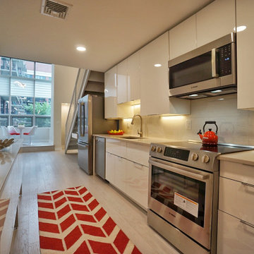
Just straightening the narrow entrance and raising the ceiling created a drop dead gorgeous entrance to a stylish and modern loft. High gloss acrylic cabinet doors, minimalist hardware, white hardwood and concrete color quartz give a sleek modern look. Backsplash: Porcelanosa, appliances: Bosch, Cabinets: Ikea, Countertop: Caesarstone Haze
 Tracy Berman Interiors
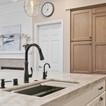
This kitchen was your typical builder basic design. Lot's of cabinets with no thought for function. An odd shaped island that took up space, but didn't provide much storage. We straightened out the island to create more storage and loads of function. It now has the sink, dishwasher, trash center, bookcase, mixer cabinet and microwave drawer plus more! We removed the wall double ovens and added a 48" range instead. This allowed us to flank either side of the fridge with roll out pantry cabinets. An appliance garage was added to the corner. The range has a custom hood over it that blends seamlessly with the cabinets. The client needed a space to sit and check the mail so we created an office space at the end of the wall. Behind the blinds is a new 10' slider for access to the patio. Luxury vinyl plank flooring went in throughout the house. Custom pendant lights were hung in clusters of three above the island. The kitchen was painted Accessible Beige by SW.
 Cedarstone Group Inc.
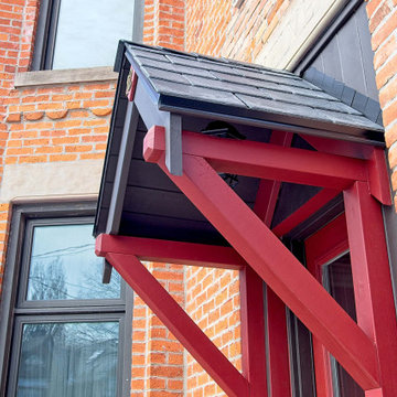
This 100+ year old house in East York needed a new face lift on the front porch. We rebuilt the whole porch to the front entrance, straightening everything back up. The stunning red really pops in the contrast with the black/deep blue.
 CKF Co.
Master Bathroom renovation by CKF in Omaha using Cambria countertops with cabinets for a Modern Farmhouse look
Minimalist bathroom photo in Omaha
Minimalist bathroom photo in Omaha
 Studio TOOP
design: Studio TOOP, 2009
location: Amersfoort, NL
status: built in 2009, Tuinvreugd
photo: Jolanthe Lalkens, 2010
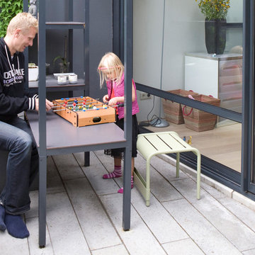
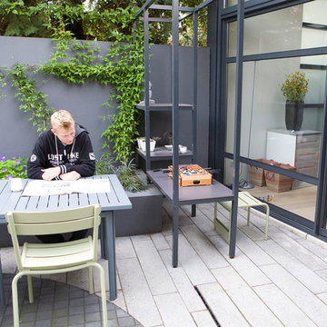
A family friendly garden that, doesn't look like, well, a family garden. That was the assignment. Clean lines, a modern feel, not too much work, enough space for the kids to play and, oh yeah, a cage for the rabbit all in a space less than 50 m2.
The new extension on the back of the house, catty cornered slightly with the original facade and the garden boundaries brought it's own challenges. This diagonal was used to make extra space for different functions but "straightened" in the experience of the inner square. Inside the aluminum pergola (coated in the same gray - ral 7016 - as the woodwork on the extension) house various functions: the rabbit cage, a water and sand table, the swing (steel rod in the aluminum for extra support) and a table where the kids can draw or play table football.
 DIGSdesign
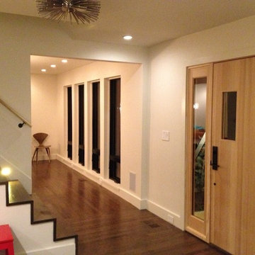
new interior entry with raised floor and new straightened stair. new entry door and sidelight. view of dining windows repositioned from the traditional initial layout
 Brittanys Design
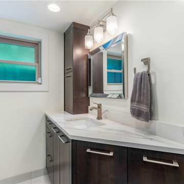
This compact bathroom received a complete remodel including the removing the wall between the shower and toilet along with straightening the wall behind the vanity. These changes made a huge impact on the visual size of this compact space. The custom double apron tub created the open concept along with the custom vanity with an angle to again give more space while also providing valuable storage. The beautifully elegant wall of tile coupled with the durable and gorgeous quartz countertop create a lux feel in this little bathroom.
 Studio TOOP
design: Studio TOOP, 2009
location: Amersfoort, NL
status: built in 2009, Tuinvreugd
photo: Jolanthe Lalkens, 2010
A family friendly garden that, doesn't look like, well, a family garden. That was the assignment. Clean lines, a modern feel, not too much work, enough space for the kids to play and, oh yeah, a cage for the rabbit all in a space less than 50 m2.
The new extension on the back of the house, catty cornered slightly with the original facade and the garden boundaries brought it's own challenges. This diagonal was used to make extra space for different functions but "straightened" in the experience of the inner square. Inside the aluminum pergola (coated in the same gray - ral 7016 - as the woodwork on the extension) house various functions: the rabbit cage, a water and sand table, the swing (steel rod in the aluminum for extra support) and a table where the kids can draw or play table football.
 Degnan Design-Build-Remodel
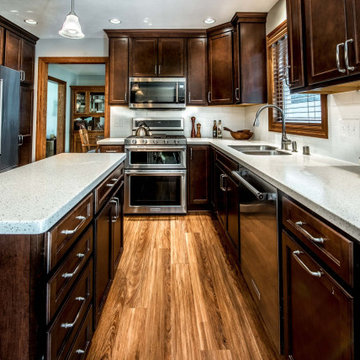
Straightening the wall of cabinets and eliminating the peninsula, allowed for an additional upper cabinet and an extra set of drawers. The refrigerator was placed within arms reach of the island and is surrounded by a set of pantry cabinets to give it a built-in look. These changes doubled the usable storage space of this kitchen.
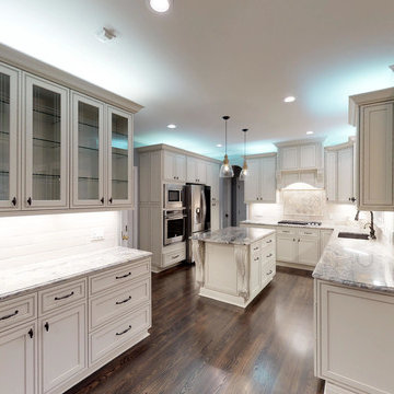
 Cabinets by RenewaBuild
This kitchen took its style cue from the owners fireplace design. Corbel details were used to echo the feel already set in motion. The peninsula was straightened out to make the work area flow and function better. Double wall oven, refrigerator and an additional pantry cabinet were put together on the same wall, where previously countertop space was chopped up and unusable. Cabinetry with glass doors was added to replace a china cabinet, bridging the space between kitchen and entertaining areas. Hardwood floors were refinished with a custom blended stain.

 Two if by Sea Gallery
Dented brass top on one lantern was straightened as much as possible and stress cracks sealed with solder to stabilize.
Home design - traditional home design idea in Boston
Home design - traditional home design idea in Boston
 Reico Kitchen & Bath
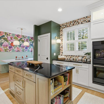
Kayla Carter of Reico Kitchen & Bath in Wilmington, NC, designed a contemporary kitchen and primary bath. Both spaces feature Masterpiece Cabinetry in the Martel door style.
In the kitchen, the perimeter cabinets are in a Frost finish, and the island is in Maple in a Wicker finish, complimented by Silestone Et Marquina countertops.
In the primary bath, the vanity cabinets are also in Maple in a Wicker finish with Emerald Green quartzite for the vanity top and shower benches.
Kayla shared, “The biggest challenge was reworking the existing space to create more room. We removed a knee wall and straightened the layout to make space for a larger island, which opened up the kitchen. My favorite part of this design is the Emerald Green countertops on the master vanity and shower benches. They pair perfectly with the green shower tile. I also enjoyed that the client was willing to step outside the box and choose combinations you don’t see every day.”
Photos courtesy of Shoot to Sell Media.
 Tracy Berman Interiors
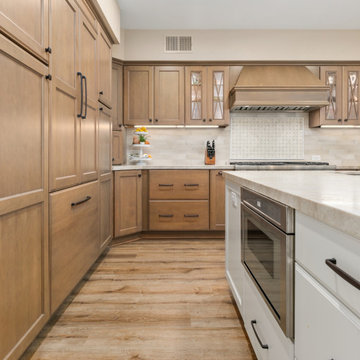
This kitchen was your typical builder basic design. Lot's of cabinets with no thought for function. An odd shaped island that took up space, but didn't provide much storage. We straightened out the island to create more storage and loads of function. It now has the sink, dishwasher, trash center, bookcase, mixer cabinet and microwave drawer plus more! We removed the wall double ovens and added a 48" range instead. This allowed us to flank either side of the fridge with roll out pantry cabinets. An appliance garage was added to the corner. The range has a custom hood over it that blends seamlessly with the cabinets. The client needed a space to sit and check the mail so we created an office space at the end of the wall. Behind the blinds is a new 10' slider for access to the patio. Luxury vinyl plank flooring went in throughout the house. Custom pendant lights were hung in clusters of three above the island. The kitchen was painted Accessible Beige by SW.
 Harmony Design Northwest
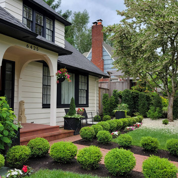
To achieve a formal style, traditional materials and linear designs were used. The cracked concrete driveway was replaced with matching brick, and the curved walkway was straightened. The front entry was resurfaced with red clay brick veneer to create a cohesive look.
Boxwoods border the front walkway, entry, patios, and driveway, forming a low hedge. The red clay brick pavers in a herringbone pattern add a timeless appeal to the house.
Small garden beds feature white-blooming favorites like Hydrangea arborescens Annabelle’, Gardenia jasminoides ‘Kleim’s Hardy,’ and Liriope muscari ‘Monroe’s White.’ For privacy, Buxus sempervirens ‘Skywalker’ was chosen for hedging.
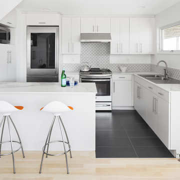
 Cape Associates, Inc.
This 1,200 square-foot Provincetown condominium lives large, both functionally and aesthetically, thanks to its recent renovation. The waterfront home, overlooking Cape Cod Bay, is part of an historic grouping of three individual buildings on Commercial Street that have been combined into condominiums.
Begun in November 2014 and completed just in time for summer in May 2016, b Architecture Studios and Cape Associates Builders worked with a budget of $366,000 to transform this prosaic dwelling into a stunning light-flooded space—designed to maximize both the living space and the mesmerizing views of the bay.
“The space was totally reconfigured,” said project manager Jon Ziperman. “It was a total gut job requiring leveling of floors, straightening of walls, removing a chimney and fireplace that ran up to the above neighbors’ unit.” The renovation also required a complete rewiring and plumbing system that involved wires and pipes that were integrated into the surrounding units. From wall to wall and floor to ceiling, there was nothing that could be salvaged from the original space.
One of the most prominent changes was moving the stairway from its original placement, where it originally broke up the living and dining space and blocked views to the bay beyond. The stairway now sits on the opposite side of the condominium. With the stairs tucked to the left side of the living area, the sightline now extends from the entry straight through the living and dining areas to the water. The new design allowed for storage space beneath the stairs, which lead to an airy sleeping loft, and room for a desk niche. A light well, where the former sleeping area was, and new windows bring abundant natural light to the central living area.
Innovative features in the entry room include a Murphy bed and sliding glass door separating it from the living area, so that the space can double as a guest room.
“The Murphy bed fit in nicely, allowing for a flush wall at the entry/guest room and a desk niche in the adjacent room,” Brown said. “Convincing the client to create the wrap-around chair rail, lined up with the divided lights of the sliding glass door, makes a purposeful connection in a small space.”
Neolith countertops in the open kitchen and details like the flush minimal baseboard contribute to the sleek, modern aesthetic, now complemented by the owner’s contemporary furnishings. This complete renovation has rendered this compact home worthy of its beautiful setting.
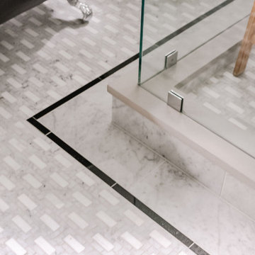
 Tangerine Designs Kitchens and Baths
Removing the tired, old angled shower in the middle of the room allowed us to open up the space. We added a toilet room, Double Vanity sinks and straightened the free standing tub.
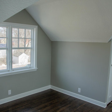
 Jacobson Construction
We Minnesotans understand that winters can be long, cold, and dark. Sunshine is a precious commodity in the middle of February. We designed the second-floor addition to let the sunshine in and make this the brightest room in the home.
Two skylights were added to the stair well, with three more in the new addition.
The second-floor landing was extended into the new space. Following the home’s existing architecture, this new 300 sq. ft. room features dormers with high-efficiency windows. Additional storage was created with several built-in closets in both the hallway and the addition.
These photos were taken in March. With all the skylights facing the South, you can imagine how bright this room will be year-round.
The remodeled staircase leads to the second floor and the new addition. The stair's risers, handrail, and banister are white, a master design detail that flows from the first floor to the second.
The stair treads and new room flooring are constructed with 1 ½ inch solid Red Oak, an excellent choice that soaks up sunshine and offers a complement to the light gray walls and white trim and accents.
I hate dusting. Doesn't everyone? The arrow above points to a place where dust can collect on mission-style railings, right at the crevice of the bottom of the stair railing. That severe crack makes it difficult to clean. On my projects (like the one above), the bottom rail straightens out and then connects to the banister at a right angle, eliminating the dust trap which is always hard to reach!
20