
Search results for "Straightened" in Home Design Ideas

 Studio41 Home Design Showroom
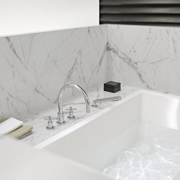
YOU DON'T CHANGE A CLASSIC. YOU REFINE IT. | Tara is the contemporary interpretation of a design icon. Evolution in design, in architecture, new finishes and colors. These are small changes, fine details. But it is precisely these details that determine the class of Tara. Tara looks even more elegant. The extended body formally straightens up the fitting. The rosettes and handles are more streamlined, and the overall contours are sharper. All this is done to put even greater emphasis on the perfect, geometric, symmetric and clear use of form and to concentrate and refocus. TARA has set the standard for more than a decade. Tara will set the standard for the future. | Available at www.shopstudio41.com
 The Organized Couple - Professional Organizers
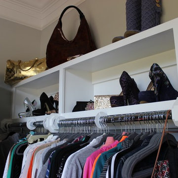
The tops in this space are sporty tops that have been organized by type, material and color. Above that are several pairs of shoes organized in a way that maximizes space and shoes both the front and back of the shoe to encourage easy decision making while building an outfit.
There are also several hand bags, purses and one pair of boots, all with filler and straighteners to maintain their shape.
In the very front is a triangular scarf rack.
Find the right local pro for your project
 CCASA Architects
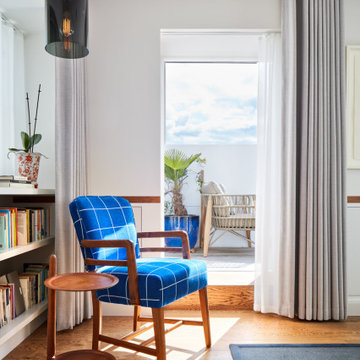
The existing roof was converted into the master suite, with a generous bedroom, a spacious en-suite bathroom and a small terrace. The mansard roof design allowed for inclined walls that were straighten up to allow for additional storage.
 Kon-strux Developments
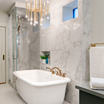
The freestanding tub is a throwback to bathtub gin-era images of the roaring 20s. In this glam-but-comfortable master bathroom, you can picture it with the lights down low, kids in bubbles, a foot up during dressing to straighten a stocking...
(Calgary Photos)
 Cape Associates, Inc.
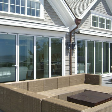
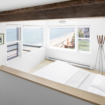
This 1,200 square-foot Provincetown condominium lives large, both functionally and aesthetically, thanks to its recent renovation. The waterfront home, overlooking Cape Cod Bay, is part of an historic grouping of three individual buildings on Commercial Street that have been combined into condominiums.
Begun in November 2014 and completed just in time for summer in May 2016, b Architecture Studios and Cape Associates Builders worked with a budget of $366,000 to transform this prosaic dwelling into a stunning light-flooded space—designed to maximize both the living space and the mesmerizing views of the bay.
“The space was totally reconfigured,” said project manager Jon Ziperman. “It was a total gut job requiring leveling of floors, straightening of walls, removing a chimney and fireplace that ran up to the above neighbors’ unit.” The renovation also required a complete rewiring and plumbing system that involved wires and pipes that were integrated into the surrounding units. From wall to wall and floor to ceiling, there was nothing that could be salvaged from the original space.
One of the most prominent changes was moving the stairway from its original placement, where it originally broke up the living and dining space and blocked views to the bay beyond. The stairway now sits on the opposite side of the condominium. With the stairs tucked to the left side of the living area, the sightline now extends from the entry straight through the living and dining areas to the water. The new design allowed for storage space beneath the stairs, which lead to an airy sleeping loft, and room for a desk niche. A light well, where the former sleeping area was, and new windows bring abundant natural light to the central living area.
Innovative features in the entry room include a Murphy bed and sliding glass door separating it from the living area, so that the space can double as a guest room.
“The Murphy bed fit in nicely, allowing for a flush wall at the entry/guest room and a desk niche in the adjacent room,” Brown said. “Convincing the client to create the wrap-around chair rail, lined up with the divided lights of the sliding glass door, makes a purposeful connection in a small space.”
Neolith countertops in the open kitchen and details like the flush minimal baseboard contribute to the sleek, modern aesthetic, now complemented by the owner’s contemporary furnishings. This complete renovation has rendered this compact home worthy of its beautiful setting.
 Nextday Cleaning - Washington
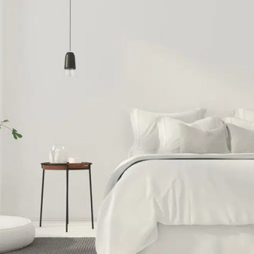
Enjoy a cleaner and more relaxing bedroom with vacuumed or mopped floors, dusted furniture and surfaces, cleaned mirrors and windowsills, neatly made beds, general straightening, and emptied trash.
 Eric S. Perry Design & Build, Inc.
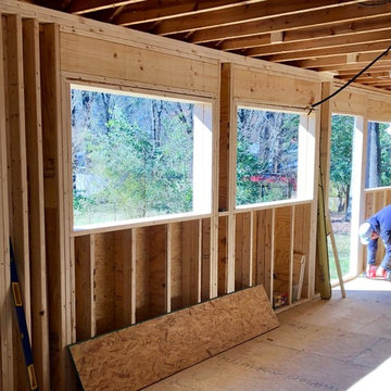
We had to build temporary support walls then reframe the exterior walls and straighten the crookedest floor ever!
Example of a huge eclectic galley light wood floor enclosed kitchen design in Raleigh with a single-bowl sink, flat-panel cabinets, green cabinets, quartzite countertops, green backsplash, cement tile backsplash, black appliances and white countertops
Example of a huge eclectic galley light wood floor enclosed kitchen design in Raleigh with a single-bowl sink, flat-panel cabinets, green cabinets, quartzite countertops, green backsplash, cement tile backsplash, black appliances and white countertops
 Nextday Cleaning - Fairfax
Enjoy a cleaner and more relaxing bedroom with vacuumed or mopped floors, dusted furniture and surfaces, cleaned mirrors and windowsills, neatly made beds, general straightening, and emptied trash.
 Deck and Patio Company "Outdoor Living Experts"
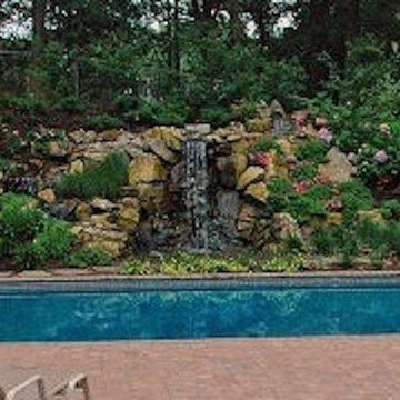
Once the stream and waterfall was complete, the next step was pressing the boulders into the surrounding slope to continue the natural presence of large boulders. Then the landscape crew installed natural woodland planting to tie in with the tall oaks adding color and evergreen shrubs to ensure year-round color.
Once the slope was stabilized, it was time for the pool renovation. After draining the pool and removing the liner, a poorly built concrete block wall was uncovered where we straighten the wall and filled the block in with concrete and steal rebar for strength. New vinyl covered stairs were added, plus new pipes, returns, skimmers, pump, filter and a new liner.
Cambridge Sahara Chestnut pavers were used to create a dramatic pool/patio area.
www.deckandpatio.com
 Gary J. Basten Construction, Inc.
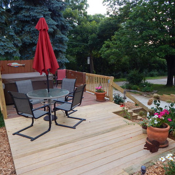
A beautiful Allouez home with many foundation issues.
Inspiration for a large contemporary yellow two-story vinyl house exterior remodel in Other
Inspiration for a large contemporary yellow two-story vinyl house exterior remodel in Other
 Field Architecture
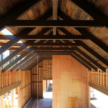
Sentinel stretches across the brow of a winding grade break high above the Napa Valley. This seasonal residence was conceived as an agrarian compound which draws inspiration from its agricultural roots and takes a leap forward in innovative construction and a modern expression of timber and steel craft.
A gently curving gravel drive circuits the lower end of the vineyard, announcing the arrival on the property. The drive slowly straightens to align with the vineyard rows to the North and the long axis of the residential structures to the South. Three gable-end barn forms follow the ordered lines of the vineyard to one side, and on the other, hug the rock-lined edge of the forest. Flanked by main residence and guest residence on either side, the taller, middle barn structure steps back from the forest to form a broad terrace. An elegant trellised colonnade threads through the three buildings, providing shade and dappled light to the terrace – a private place for food and wine to be enjoyed overlooking the magnificent valley below.
 Revival House
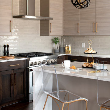
To further enhance the design of the kitchen, designer Danee straightened out the center island and designed it with clean lines that give it the appearance of a beautiful furniture piece. We love the look of the waterfall edge!
 Sunday Morning Kitchen and Bath
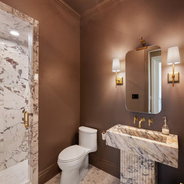
This "After" shot highlights the dramatic change in layout and texture. By eliminating the awkward angled closet and straightening the vanity wall, the space feels more intentional and expansive.
 Jill Helgeson Interiors
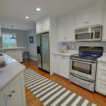
This kitchen was small and cramped. The refrigerator was pushed up against the wall and could hardly be opened. There was a door beside it to a laundry closet and then the garage.
By eliminating the door, we opened up the kitchen and made room for a pantry where the laundry was. We shifted the refrigerator to the opposite end of the room and straightened out the cabinet where the sink is.
This room is now a beautiful and functional kitchen. The Master Bathroom has been reconfigured to include a full size stacking washer and dryer. The quartz countertops and white cabinets and gorgeous metallic backsplash tiles really brightened this space and now it is a fun place to be!
Stuart Wade was the photographer.
 Studio TOOP
design: Studio TOOP, 2009
location: Amersfoort, NL
status: built in 2009, Tuinvreugd
photo: Jolanthe Lalkens, 2010
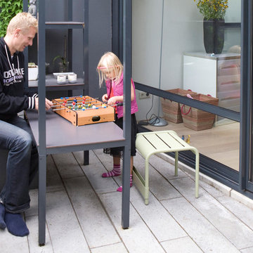
A family friendly garden that, doesn't look like, well, a family garden. That was the assignment. Clean lines, a modern feel, not too much work, enough space for the kids to play and, oh yeah, a cage for the rabbit all in a space less than 50 m2.
The new extension on the back of the house, catty cornered slightly with the original facade and the garden boundaries brought it's own challenges. This diagonal was used to make extra space for different functions but "straightened" in the experience of the inner square. Inside the aluminum pergola (coated in the same gray - ral 7016 - as the woodwork on the extension) house various functions: the rabbit cage, a water and sand table, the swing (steel rod in the aluminum for extra support) and a table where the kids can draw or play table football.
 DIGSdesign
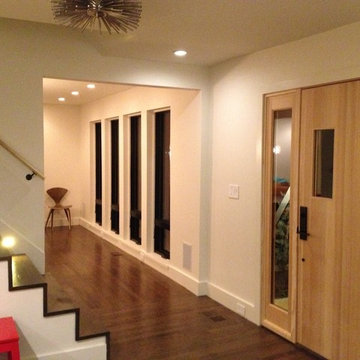
new interior entry with raised floor and new straightened stair. new entry door and sidelight. view of dining windows repositioned from the traditional initial layout
 Cedarstone Group Inc.
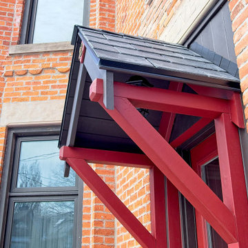
This 100+ year old house in East York needed a new face lift on the front porch. We rebuilt the whole porch to the front entrance, straightening everything back up. The stunning red really pops in the contrast with the black/deep blue.
 Dalia Tole
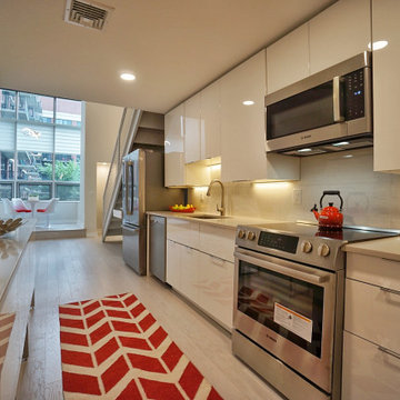
Just straightening the narrow entrance and raising the ceiling created a drop dead gorgeous entrance to a stylish and modern loft. High gloss acrylic cabinet doors, minimalist hardware, white hardwood and concrete color quartz give a sleek modern look. Backsplash: Porcelanosa, appliances: Bosch, Cabinets: Ikea, Countertop: Caesarstone Haze
 Tracy Berman Interiors
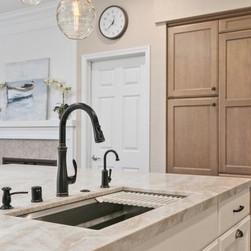
This kitchen was your typical builder basic design. Lot's of cabinets with no thought for function. An odd shaped island that took up space, but didn't provide much storage. We straightened out the island to create more storage and loads of function. It now has the sink, dishwasher, trash center, bookcase, mixer cabinet and microwave drawer plus more! We removed the wall double ovens and added a 48" range instead. This allowed us to flank either side of the fridge with roll out pantry cabinets. An appliance garage was added to the corner. The range has a custom hood over it that blends seamlessly with the cabinets. The client needed a space to sit and check the mail so we created an office space at the end of the wall. Behind the blinds is a new 10' slider for access to the patio. Luxury vinyl plank flooring went in throughout the house. Custom pendant lights were hung in clusters of three above the island. The kitchen was painted Accessible Beige by SW.
16