
Search results for "Subtract" in Home Design Ideas
 Level One Construction
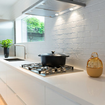
Seamless Elegance is a story bringing together both old and new. A cramped kitchen and a seldom-used den in a 100 year-old house were opened up to create a sprawling 300-sqft paradise. Obsessing over the little details was important to achieving our goal of seamless elegance.
The archway and molding detail between the dining and living room was perfectly mirrored between the dining room and kitchen, right down to the hidden closets. A faux brick wall painted white was added to the back wall of the kitchen to give the illusion that the previous expansion was always there.
The existing 1.5” wide beautiful oak hardwood floor was matched to the rest of the house and continued into the kitchen. The flooring throughout the house was re-done at the same time to solidify the marriage between old and new; the result was a seamless transition into functionality. The character brought into the space by the oak hardwood floor and brick wall off sets the contemporary high gloss white cabinets.
No upper cabinets were used in this design because we wanted to showcase the brick accent wall. The storage lost from zero upper kitchen cabinets was more than made up in floor-to-ceiling pantry. This corner pantry accommodates the bulk of storage for food and dishes in the kitchen. The subtraction of the upper cabinets allows the Tom Dixon pendant lights to be boldly featured over the eating peninsula.
Visual lines were a key aspect in this design helping the eye move throughout the space. The cabinet break lines are at the same height as the counter tops creating one continuous line. The paneled dishwasher blends perfectly with the rest of the kitchen cabinetry. The white quartz countertop flows down into a waterfall edge at the end of the eating peninsula, being the final grounding piece to visual lines.
Although the kitchen is all white, it is offset and given visual interest through texture and the use of different materials. The white allows the beautiful expensive appliances to be showcased along with the newly refinished flooring. The clean crisp kitchen will be the perfect backdrop to show case boldly colored art and accessories.
 Level One Construction
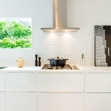
Seamless Elegance is a story bringing together both old and new. A cramped kitchen and a seldom-used den in a 100 year-old house were opened up to create a sprawling 300-sqft paradise. Obsessing over the little details was important to achieving our goal of seamless elegance.
The archway and molding detail between the dining and living room was perfectly mirrored between the dining room and kitchen, right down to the hidden closets. A faux brick wall painted white was added to the back wall of the kitchen to give the illusion that the previous expansion was always there.
The existing 1.5” wide beautiful oak hardwood floor was matched to the rest of the house and continued into the kitchen. The flooring throughout the house was re-done at the same time to solidify the marriage between old and new; the result was a seamless transition into functionality. The character brought into the space by the oak hardwood floor and brick wall off sets the contemporary high gloss white cabinets.
No upper cabinets were used in this design because we wanted to showcase the brick accent wall. The storage lost from zero upper kitchen cabinets was more than made up in floor-to-ceiling pantry. This corner pantry accommodates the bulk of storage for food and dishes in the kitchen. The subtraction of the upper cabinets allows the Tom Dixon pendant lights to be boldly featured over the eating peninsula.
Visual lines were a key aspect in this design helping the eye move throughout the space. The cabinet break lines are at the same height as the counter tops creating one continuous line. The paneled dishwasher blends perfectly with the rest of the kitchen cabinetry. The white quartz countertop flows down into a waterfall edge at the end of the eating peninsula, being the final grounding piece to visual lines.
Although the kitchen is all white, it is offset and given visual interest through texture and the use of different materials. The white allows the beautiful expensive appliances to be showcased along with the newly refinished flooring. The clean crisp kitchen will be the perfect backdrop to show case boldly colored art and accessories.
 Level One Construction
Seamless Elegance is a story bringing together both old and new. A cramped kitchen and a seldom-used den in a 100 year-old house were opened up to create a sprawling 300-sqft paradise. Obsessing over the little details was important to achieving our goal of seamless elegance.
The archway and molding detail between the dining and living room was perfectly mirrored between the dining room and kitchen, right down to the hidden closets. A faux brick wall painted white was added to the back wall of the kitchen to give the illusion that the previous expansion was always there.
The existing 1.5” wide beautiful oak hardwood floor was matched to the rest of the house and continued into the kitchen. The flooring throughout the house was re-done at the same time to solidify the marriage between old and new; the result was a seamless transition into functionality. The character brought into the space by the oak hardwood floor and brick wall off sets the contemporary high gloss white cabinets.
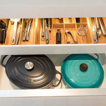
No upper cabinets were used in this design because we wanted to showcase the brick accent wall. The storage lost from zero upper kitchen cabinets was more than made up in floor-to-ceiling pantry. This corner pantry accommodates the bulk of storage for food and dishes in the kitchen. The subtraction of the upper cabinets allows the Tom Dixon pendant lights to be boldly featured over the eating peninsula.
Visual lines were a key aspect in this design helping the eye move throughout the space. The cabinet break lines are at the same height as the counter tops creating one continuous line. The paneled dishwasher blends perfectly with the rest of the kitchen cabinetry. The white quartz countertop flows down into a waterfall edge at the end of the eating peninsula, being the final grounding piece to visual lines.
Although the kitchen is all white, it is offset and given visual interest through texture and the use of different materials. The white allows the beautiful expensive appliances to be showcased along with the newly refinished flooring. The clean crisp kitchen will be the perfect backdrop to show case boldly colored art and accessories.
Find the right local pro for your project
 Level One Construction
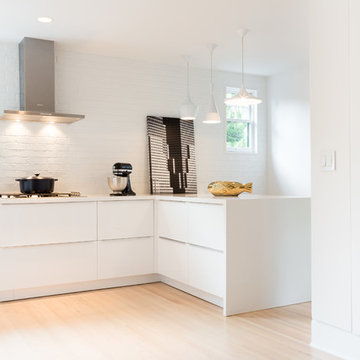
Seamless Elegance is a story bringing together both old and new. A cramped kitchen and a seldom-used den in a 100 year-old house were opened up to create a sprawling 300-sqft paradise. Obsessing over the little details was important to achieving our goal of seamless elegance.
The archway and molding detail between the dining and living room was perfectly mirrored between the dining room and kitchen, right down to the hidden closets. A faux brick wall painted white was added to the back wall of the kitchen to give the illusion that the previous expansion was always there.
The existing 1.5” wide beautiful oak hardwood floor was matched to the rest of the house and continued into the kitchen. The flooring throughout the house was re-done at the same time to solidify the marriage between old and new; the result was a seamless transition into functionality. The character brought into the space by the oak hardwood floor and brick wall off sets the contemporary high gloss white cabinets.
No upper cabinets were used in this design because we wanted to showcase the brick accent wall. The storage lost from zero upper kitchen cabinets was more than made up in floor-to-ceiling pantry. This corner pantry accommodates the bulk of storage for food and dishes in the kitchen. The subtraction of the upper cabinets allows the Tom Dixon pendant lights to be boldly featured over the eating peninsula.
Visual lines were a key aspect in this design helping the eye move throughout the space. The cabinet break lines are at the same height as the counter tops creating one continuous line. The paneled dishwasher blends perfectly with the rest of the kitchen cabinetry. The white quartz countertop flows down into a waterfall edge at the end of the eating peninsula, being the final grounding piece to visual lines.
Although the kitchen is all white, it is offset and given visual interest through texture and the use of different materials. The white allows the beautiful expensive appliances to be showcased along with the newly refinished flooring. The clean crisp kitchen will be the perfect backdrop to show case boldly colored art and accessories.
 Level One Construction
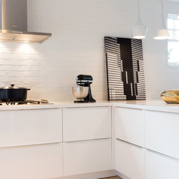
Seamless Elegance is a story bringing together both old and new. A cramped kitchen and a seldom-used den in a 100 year-old house were opened up to create a sprawling 300-sqft paradise. Obsessing over the little details was important to achieving our goal of seamless elegance.
The archway and molding detail between the dining and living room was perfectly mirrored between the dining room and kitchen, right down to the hidden closets. A faux brick wall painted white was added to the back wall of the kitchen to give the illusion that the previous expansion was always there.
The existing 1.5” wide beautiful oak hardwood floor was matched to the rest of the house and continued into the kitchen. The flooring throughout the house was re-done at the same time to solidify the marriage between old and new; the result was a seamless transition into functionality. The character brought into the space by the oak hardwood floor and brick wall off sets the contemporary high gloss white cabinets.
No upper cabinets were used in this design because we wanted to showcase the brick accent wall. The storage lost from zero upper kitchen cabinets was more than made up in floor-to-ceiling pantry. This corner pantry accommodates the bulk of storage for food and dishes in the kitchen. The subtraction of the upper cabinets allows the Tom Dixon pendant lights to be boldly featured over the eating peninsula.
Visual lines were a key aspect in this design helping the eye move throughout the space. The cabinet break lines are at the same height as the counter tops creating one continuous line. The paneled dishwasher blends perfectly with the rest of the kitchen cabinetry. The white quartz countertop flows down into a waterfall edge at the end of the eating peninsula, being the final grounding piece to visual lines.
Although the kitchen is all white, it is offset and given visual interest through texture and the use of different materials. The white allows the beautiful expensive appliances to be showcased along with the newly refinished flooring. The clean crisp kitchen will be the perfect backdrop to show case boldly colored art and accessories.
 Brizo Faucet
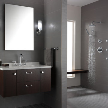
Minimalist? Maximalist? Yes. The Odin Bath Collection by Brizo® pairs a clean, Scandinavian design with a wealth of leading-edge technologies.
Odin is summed up with one phrase “addition by subtraction.” Studying Scandinavian furniture created an appreciation for the value of reducing something to its essential lines—and getting rid of everything else.
 The Design Gallery
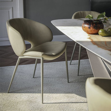
The Miranda chair with perforated backrest is distinctive for its originality and personality within the Cattelan Italia chair collection.
The body is rich in sartorial details, realized with the utmost care and precision. The seat and backrest, modeled like two complementary shells, have a polygonal shape, enriched by rounded edges and gentle curves. If this design chair is a shell, it cannot help but reveal a magnificent pearl inside, created, or rather subtracted, by the designer with the expedient of the elliptical cavity in the backrest.
This chair with a hole in the backrest is also enriched by soft ripples, like waves on the shore, which accentuate the feeling of comfort. The seat portion has an obvious and welcoming curvature, which is further emphasized by the raised stitching that matches the leather or fabric: a touch of elegance that highlights the craftsmanship with which it is made.
The model is available in the Miranda Wood version, with a frame and legs made from fine wood, and in the Miranda ML version, with steel legs that provide a more slender and manageable seat.
#cattelanitalia #cattelanchairs #italianluxuryliving #mirandachairs #cattelannewcollection #thedesigngallery #thedesigngalleryea #madeinkenya
 Level One Construction
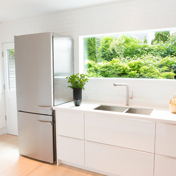
Seamless Elegance is a story bringing together both old and new. A cramped kitchen and a seldom-used den in a 100 year-old house were opened up to create a sprawling 300-sqft paradise. Obsessing over the little details was important to achieving our goal of seamless elegance.
The archway and molding detail between the dining and living room was perfectly mirrored between the dining room and kitchen, right down to the hidden closets. A faux brick wall painted white was added to the back wall of the kitchen to give the illusion that the previous expansion was always there.
The existing 1.5” wide beautiful oak hardwood floor was matched to the rest of the house and continued into the kitchen. The flooring throughout the house was re-done at the same time to solidify the marriage between old and new; the result was a seamless transition into functionality. The character brought into the space by the oak hardwood floor and brick wall off sets the contemporary high gloss white cabinets.
No upper cabinets were used in this design because we wanted to showcase the brick accent wall. The storage lost from zero upper kitchen cabinets was more than made up in floor-to-ceiling pantry. This corner pantry accommodates the bulk of storage for food and dishes in the kitchen. The subtraction of the upper cabinets allows the Tom Dixon pendant lights to be boldly featured over the eating peninsula.
Visual lines were a key aspect in this design helping the eye move throughout the space. The cabinet break lines are at the same height as the counter tops creating one continuous line. The paneled dishwasher blends perfectly with the rest of the kitchen cabinetry. The white quartz countertop flows down into a waterfall edge at the end of the eating peninsula, being the final grounding piece to visual lines.
Although the kitchen is all white, it is offset and given visual interest through texture and the use of different materials. The white allows the beautiful expensive appliances to be showcased along with the newly refinished flooring. The clean crisp kitchen will be the perfect backdrop to show case boldly colored art and accessories.
 Level One Construction
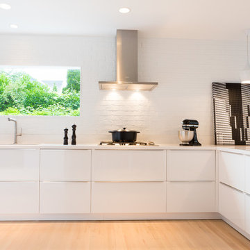
Seamless Elegance is a story bringing together both old and new. A cramped kitchen and a seldom-used den in a 100 year-old house were opened up to create a sprawling 300-sqft paradise. Obsessing over the little details was important to achieving our goal of seamless elegance.
The archway and molding detail between the dining and living room was perfectly mirrored between the dining room and kitchen, right down to the hidden closets. A faux brick wall painted white was added to the back wall of the kitchen to give the illusion that the previous expansion was always there.
The existing 1.5” wide beautiful oak hardwood floor was matched to the rest of the house and continued into the kitchen. The flooring throughout the house was re-done at the same time to solidify the marriage between old and new; the result was a seamless transition into functionality. The character brought into the space by the oak hardwood floor and brick wall off sets the contemporary high gloss white cabinets.
No upper cabinets were used in this design because we wanted to showcase the brick accent wall. The storage lost from zero upper kitchen cabinets was more than made up in floor-to-ceiling pantry. This corner pantry accommodates the bulk of storage for food and dishes in the kitchen. The subtraction of the upper cabinets allows the Tom Dixon pendant lights to be boldly featured over the eating peninsula.
Visual lines were a key aspect in this design helping the eye move throughout the space. The cabinet break lines are at the same height as the counter tops creating one continuous line. The paneled dishwasher blends perfectly with the rest of the kitchen cabinetry. The white quartz countertop flows down into a waterfall edge at the end of the eating peninsula, being the final grounding piece to visual lines.
Although the kitchen is all white, it is offset and given visual interest through texture and the use of different materials. The white allows the beautiful expensive appliances to be showcased along with the newly refinished flooring. The clean crisp kitchen will be the perfect backdrop to show case boldly colored art and accessories.
 Level One Construction
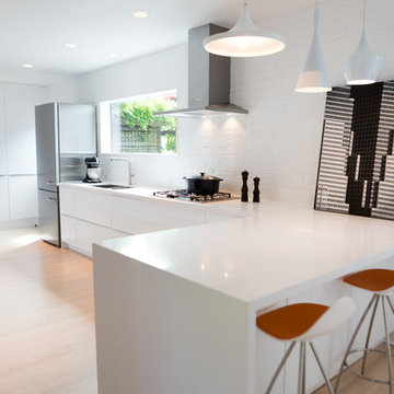
Seamless Elegance is a story bringing together both old and new. A cramped kitchen and a seldom-used den in a 100 year-old house were opened up to create a sprawling 300-sqft paradise. Obsessing over the little details was important to achieving our goal of seamless elegance.
The archway and molding detail between the dining and living room was perfectly mirrored between the dining room and kitchen, right down to the hidden closets. A faux brick wall painted white was added to the back wall of the kitchen to give the illusion that the previous expansion was always there.
The existing 1.5” wide beautiful oak hardwood floor was matched to the rest of the house and continued into the kitchen. The flooring throughout the house was re-done at the same time to solidify the marriage between old and new; the result was a seamless transition into functionality. The character brought into the space by the oak hardwood floor and brick wall off sets the contemporary high gloss white cabinets.
No upper cabinets were used in this design because we wanted to showcase the brick accent wall. The storage lost from zero upper kitchen cabinets was more than made up in floor-to-ceiling pantry. This corner pantry accommodates the bulk of storage for food and dishes in the kitchen. The subtraction of the upper cabinets allows the Tom Dixon pendant lights to be boldly featured over the eating peninsula.
Visual lines were a key aspect in this design helping the eye move throughout the space. The cabinet break lines are at the same height as the counter tops creating one continuous line. The paneled dishwasher blends perfectly with the rest of the kitchen cabinetry. The white quartz countertop flows down into a waterfall edge at the end of the eating peninsula, being the final grounding piece to visual lines.
Although the kitchen is all white, it is offset and given visual interest through texture and the use of different materials. The white allows the beautiful expensive appliances to be showcased along with the newly refinished flooring. The clean crisp kitchen will be the perfect backdrop to show case boldly colored art and accessories.
 Level One Construction
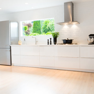
Seamless Elegance is a story bringing together both old and new. A cramped kitchen and a seldom-used den in a 100 year-old house were opened up to create a sprawling 300-sqft paradise. Obsessing over the little details was important to achieving our goal of seamless elegance.
The archway and molding detail between the dining and living room was perfectly mirrored between the dining room and kitchen, right down to the hidden closets. A faux brick wall painted white was added to the back wall of the kitchen to give the illusion that the previous expansion was always there.
The existing 1.5” wide beautiful oak hardwood floor was matched to the rest of the house and continued into the kitchen. The flooring throughout the house was re-done at the same time to solidify the marriage between old and new; the result was a seamless transition into functionality. The character brought into the space by the oak hardwood floor and brick wall off sets the contemporary high gloss white cabinets.
No upper cabinets were used in this design because we wanted to showcase the brick accent wall. The storage lost from zero upper kitchen cabinets was more than made up in floor-to-ceiling pantry. This corner pantry accommodates the bulk of storage for food and dishes in the kitchen. The subtraction of the upper cabinets allows the Tom Dixon pendant lights to be boldly featured over the eating peninsula.
Visual lines were a key aspect in this design helping the eye move throughout the space. The cabinet break lines are at the same height as the counter tops creating one continuous line. The paneled dishwasher blends perfectly with the rest of the kitchen cabinetry. The white quartz countertop flows down into a waterfall edge at the end of the eating peninsula, being the final grounding piece to visual lines.
Although the kitchen is all white, it is offset and given visual interest through texture and the use of different materials. The white allows the beautiful expensive appliances to be showcased along with the newly refinished flooring. The clean crisp kitchen will be the perfect backdrop to show case boldly colored art and accessories.
 Level One Construction
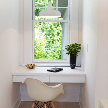
Seamless Elegance is a story bringing together both old and new. A cramped kitchen and a seldom-used den in a 100 year-old house were opened up to create a sprawling 300-sqft paradise. Obsessing over the little details was important to achieving our goal of seamless elegance.
The archway and molding detail between the dining and living room was perfectly mirrored between the dining room and kitchen, right down to the hidden closets. A faux brick wall painted white was added to the back wall of the kitchen to give the illusion that the previous expansion was always there.
The existing 1.5” wide beautiful oak hardwood floor was matched to the rest of the house and continued into the kitchen. The flooring throughout the house was re-done at the same time to solidify the marriage between old and new; the result was a seamless transition into functionality. The character brought into the space by the oak hardwood floor and brick wall off sets the contemporary high gloss white cabinets.
No upper cabinets were used in this design because we wanted to showcase the brick accent wall. The storage lost from zero upper kitchen cabinets was more than made up in floor-to-ceiling pantry. This corner pantry accommodates the bulk of storage for food and dishes in the kitchen. The subtraction of the upper cabinets allows the Tom Dixon pendant lights to be boldly featured over the eating peninsula.
Visual lines were a key aspect in this design helping the eye move throughout the space. The cabinet break lines are at the same height as the counter tops creating one continuous line. The paneled dishwasher blends perfectly with the rest of the kitchen cabinetry. The white quartz countertop flows down into a waterfall edge at the end of the eating peninsula, being the final grounding piece to visual lines.
Although the kitchen is all white, it is offset and given visual interest through texture and the use of different materials. The white allows the beautiful expensive appliances to be showcased along with the newly refinished flooring. The clean crisp kitchen will be the perfect backdrop to show case boldly colored art and accessories.
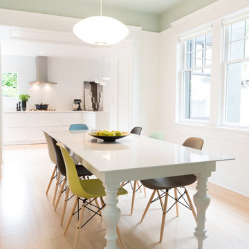 Level One Construction
Seamless Elegance is a story bringing together both old and new. A cramped kitchen and a seldom-used den in a 100 year-old house were opened up to create a sprawling 300-sqft paradise. Obsessing over the little details was important to achieving our goal of seamless elegance.
The archway and molding detail between the dining and living room was perfectly mirrored between the dining room and kitchen, right down to the hidden closets. A faux brick wall painted white was added to the back wall of the kitchen to give the illusion that the previous expansion was always there.
The existing 1.5” wide beautiful oak hardwood floor was matched to the rest of the house and continued into the kitchen. The flooring throughout the house was re-done at the same time to solidify the marriage between old and new; the result was a seamless transition into functionality. The character brought into the space by the oak hardwood floor and brick wall off sets the contemporary high gloss white cabinets.
No upper cabinets were used in this design because we wanted to showcase the brick accent wall. The storage lost from zero upper kitchen cabinets was more than made up in floor-to-ceiling pantry. This corner pantry accommodates the bulk of storage for food and dishes in the kitchen. The subtraction of the upper cabinets allows the Tom Dixon pendant lights to be boldly featured over the eating peninsula.
Visual lines were a key aspect in this design helping the eye move throughout the space. The cabinet break lines are at the same height as the counter tops creating one continuous line. The paneled dishwasher blends perfectly with the rest of the kitchen cabinetry. The white quartz countertop flows down into a waterfall edge at the end of the eating peninsula, being the final grounding piece to visual lines.
Although the kitchen is all white, it is offset and given visual interest through texture and the use of different materials. The white allows the beautiful expensive appliances to be showcased along with the newly refinished flooring. The clean crisp kitchen will be the perfect backdrop to show case boldly colored art and accessories.
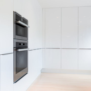 Level One Construction
Seamless Elegance is a story bringing together both old and new. A cramped kitchen and a seldom-used den in a 100 year-old house were opened up to create a sprawling 300-sqft paradise. Obsessing over the little details was important to achieving our goal of seamless elegance.
The archway and molding detail between the dining and living room was perfectly mirrored between the dining room and kitchen, right down to the hidden closets. A faux brick wall painted white was added to the back wall of the kitchen to give the illusion that the previous expansion was always there.
The existing 1.5” wide beautiful oak hardwood floor was matched to the rest of the house and continued into the kitchen. The flooring throughout the house was re-done at the same time to solidify the marriage between old and new; the result was a seamless transition into functionality. The character brought into the space by the oak hardwood floor and brick wall off sets the contemporary high gloss white cabinets.
No upper cabinets were used in this design because we wanted to showcase the brick accent wall. The storage lost from zero upper kitchen cabinets was more than made up in floor-to-ceiling pantry. This corner pantry accommodates the bulk of storage for food and dishes in the kitchen. The subtraction of the upper cabinets allows the Tom Dixon pendant lights to be boldly featured over the eating peninsula.
Visual lines were a key aspect in this design helping the eye move throughout the space. The cabinet break lines are at the same height as the counter tops creating one continuous line. The paneled dishwasher blends perfectly with the rest of the kitchen cabinetry. The white quartz countertop flows down into a waterfall edge at the end of the eating peninsula, being the final grounding piece to visual lines.
Although the kitchen is all white, it is offset and given visual interest through texture and the use of different materials. The white allows the beautiful expensive appliances to be showcased along with the newly refinished flooring. The clean crisp kitchen will be the perfect backdrop to show case boldly colored art and accessories.
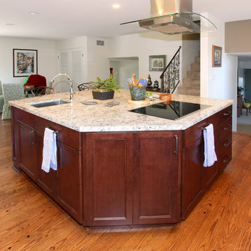
 Lewis Design-Build-Remodel
Eat-in kitchen - large traditional dark wood floor eat-in kitchen idea in Other with an undermount sink, shaker cabinets, dark wood cabinets, quartz countertops, green backsplash, porcelain backsplash, stainless steel appliances and an island
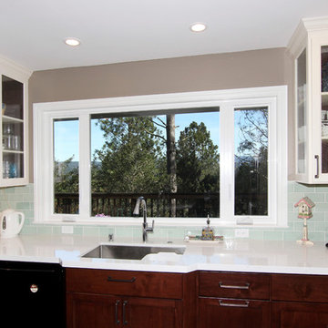 Lewis Design-Build-Remodel
Inspiration for a large timeless dark wood floor eat-in kitchen remodel in Other with an undermount sink, shaker cabinets, dark wood cabinets, quartz countertops, green backsplash, porcelain backsplash, stainless steel appliances and an island
 Architectural Resource LLC
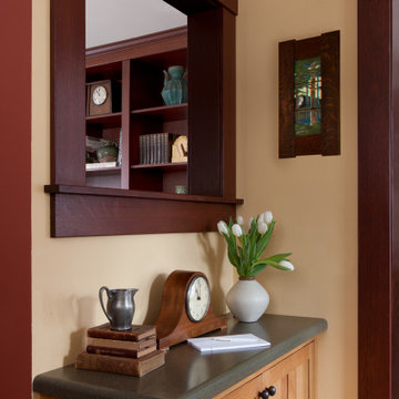
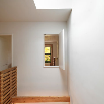
The Brooke Residence ‘Addi- tion by Subtraction’ remodeling project was recognized with numerous regional and national awards and was selected for Fine Homebuilding’s Annual Issue on Houses.
This 1920’s Craftsman Bungalow had been poorly modified in the 70’s in an attempt to address poor energy performance with a scabbed on solarium. The design solution removed the solarium and completely reimagined the floor plan: The kitchen was relocated to the rear; the stairway was relocated to enhance function, and a better connection to the family room was created.

 Croma Design Inc.
Donna Griffith Photography
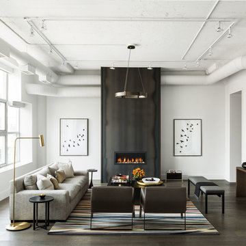
Living room - large transitional enclosed and formal dark wood floor and brown floor living room idea in Toronto with white walls, a ribbon fireplace, a metal fireplace and no tv
Living room - large transitional enclosed and formal dark wood floor and brown floor living room idea in Toronto with white walls, a ribbon fireplace, a metal fireplace and no tv
 Croma Design Inc.
Donna Griffith Photography
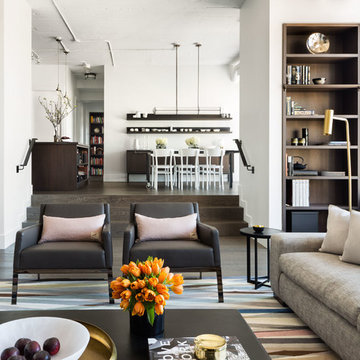
Example of a large transitional formal and enclosed dark wood floor and brown floor living room design in Toronto with white walls, a ribbon fireplace, a metal fireplace and no tv
Example of a large transitional formal and enclosed dark wood floor and brown floor living room design in Toronto with white walls, a ribbon fireplace, a metal fireplace and no tv
8