Search results for "Supplements" in Home Design Ideas
The rooms in this charming 1920’s Burns Park home were completely compartmentalized (typical for homes built in this period). The homeowners wanted a more open space with sightlines into the dining and living spaces, and a kitchen that could accommodate more than one cook!
We removed a wall and replaced it with a beautiful Butternut beam and countertop seating, a more casual eating area to supplement their dining room. Bringing this home into 2018 while paying respect to its historic neighborhood was an important part of this project. The personality, cabinetry and contemporary finishes in this kitchen better mirror this cheerful and vibrant family.

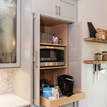
The vision for my kitchen was to design a space that's chic, practical, and an extension of my personal style. I opted for an updated, contemporary neutral palette, using a soft green cabinetry for a touch of warmth. My favorite of these is the walnut pantry interior, which stores a ton of food, spices, and vitamins, and even has supplemental wine storage.

This loft is situated in the former International Tailoring Company Building in New York’s East Village. The clients bought a top-floor loft and an abandoned mechanical room directly above it. Our task was to combine the rooftop space with the loft to create a cohesive triplex apartment. We achieved this by carefully opening up the roof’s 100-year-old structural members to install a staircase connecting the existing loft to the additional upper two levels. On the main floor, the first run of the staircase is located in the apartment's entry and is made of a sculptural form of dark oak. The second run of the staircase is more open, allowing light from the top level's many windows to filter into the spaces below. The existing main loft was gut-renovated to create a more open space. The open kitchen/living space was strategically positioned to be surrounded by the building’s huge industrial steel windows, taking advantage of the apartment's high vantage over Union Square. Opposite the windows, custom woodwork serves to unify the kitchen with the living room. The built-in spans the full width of the apartment with dark textured oak panels concealing the appliances, the TV, and creating ample storage. The blackened steel paneled backsplash and chunky black granite countertops complete the dark color palette used in the kitchen. Throughout the apartment, a play of dark and light elements creates a distinctive atmosphere. In the open living areas, the light pouring in from the large windows contrasts with the dark colors selected for the built environment. The more private spaces, such as the bedroom, have a darker feel, with walls and ceilings painted in a deep purple that borders on black alongside more dark oak custom built-ins. The dining room functions as a bridge between the public and private spaces, with walls and ceiling painted in the same moody purple and a vintage mirrored tile accent wall reflecting natural light from the adjacent room’s windows. The middle floor, which has fewer windows, is painted bright white to enhance light in the home office located there.. On the penthouse level, panoramic views were achieved by installing new floor-to-ceiling sliding glass panels, supplementing the existing industrial steel windows, and opening onto an adjacent roof terrace. The top floor functions as a lounge overlooking the city and includes unique custom features, such as a steel multi-drop lighting fixture above the stairs, hanging glass and steel shelving, and a built-in wet bar. Here again, dark-colored finishes and materials are used as a counterpoint to the abundant light entering the space. A future plan for the apartment is to create a private roof garden on top of the penthouse with an outdoor stair connecting it to the roof terrace below.
Find the right local pro for your project

The Setup:
After purchasing this home, the homeowners faced a unique opportunity to reimagine their kitchen and nearby spaces. Water damage from a burst pipe had left much of the home’s interior in need of repair, and while the existing kitchen was functional and in relatively good shape, it didn’t align with the family’s vision for their new home. The layout included a peninsula that wasn’t ideal, and there were some druthers with the nearby pantry.
Since the space needed to be rebuilt anyway, the homeowners saw this as a chance to create a kitchen that was both highly functional for their four young children and timeless in its design. The project also included a refresh of the adjacent message center and dining room — spaces that play key roles in the family’s daily life. The goal was to create a cohesive flow between these areas, balancing modern functionality with the craftsman-inspired character of the rest of the home.
Design Objectives:
- Replace the outdated peninsula with a large island to maximize counter space and create new seating options.
- Open up the space visually by removing soffits and rethinking the cabinetry layout.
Incorporate concealed refrigeration and freezer units to provide significant storage for the family while maintaining a streamlined aesthetic.
- Integrate black cabinetry into the design without making the space feel harsh or heavy.
- Ensure the lighting plan balances functional task lighting with ambient accent lighting.
- Avoid visual clutter in the cabinetry design while still giving a nod to the craftsman aesthetic.
- Incorporate a slab backsplash as a key design feature.
Design Challenges:
- The outdated peninsula left dead space in the kitchen and lacked sufficient seating for the family.
- The cooktop wall was cramped, with small cabinets flanking the hood, limited storage, and soffits that made the space feel closed-in.
- The family needed significant refrigeration space (two refrigerators and a freezer) but wanted to avoid a cluttered look with visible stainless steel appliances.
- Adding black cabinetry risked making the space feel too dark or heavy.
- The original lighting plan was insufficient, particularly over the dining table where a decorative fixture proved too dim.
- The family wanted shaker-style drawer fronts to match the home’s arts-and-crafts design but worried that too much shaker cabinetry might look overly busy.
- Prioritizing a slab backsplash in the wish list priority planning.
The Renewed Space
Design Solutions:
- A functional island: The peninsula was replaced with a large island that provides continuous countertop space for prepping and serving. The island also features seating for four people, creating a central hub for informal meals and activities.
- Streamlined cooktop wall: The soffits were removed, and the upper cabinets on the cooktop wall were eliminated to create a more open, streamlined design. A custom oversized hood became the focal point of the wall, with the blower unit offset inside it to align with the cooktop while maintaining exterior visual symmetry.
- Concealed refrigeration: Two column refrigerators and one freezer were integrated into the cabinetry, concealing them behind wood paneling that blends seamlessly with the overall design.
- Warm black cabinetry: The black cabinetry was crafted from hickory with a visible grain, softening its appearance and adding warmth. The grain detail gives the cabinetry a rich, textured look that avoids feeling stark or overpowering.
- Additional lighting: In the dining area, recessed can lights were added during an additional installation phase to supplement the gorgeous decorative fixture’s dim output. The new lighting plan creates a layered effect, combining functional task lighting with softer ambient lighting.
- Simplified cabinetry details: Slab drawer fronts were used on the upper drawers, while five-piece shaker fronts (with slightly less prominent rail and stile pieces) were reserved for the middle and lower drawers. This approach simplified the overall look while maintaining the craftsman-inspired aesthetic.
- Slab backsplash priority: The slab backsplash was prioritized by making thoughtful adjustments elsewhere, like opting not to extend cabinetry to the ceiling, which also helped visually prioritize the gorgeous slab backsplash. This decision also enhanced the kitchen’s furniture-like feel, aligning with the home’s craftsman character.
- This kitchen perfectly balances practicality with timeless style. By addressing the family’s functional needs — ample seating, smart storage, and effective lighting — while incorporating thoughtful design elements like warm black cabinetry and a striking slab backsplash, Alicia created a space that works beautifully for a busy household. The result is a cohesive, inviting kitchen that honors the home’s craftsman roots and will serve the family well for years to come.

Michael K. Wilkinson
To open up the kitchen to the dining room, we removed a load bearing masonry wall and installed an engineered steel beam. The kids can now do homework at the dining table or island when the parents are cooking for a family-friendly setting. The island has a waterfall countertop. This protects the sides of the cabinets due to traffic circulation and kids.
There are no side windows, as the new full light door and three casement windows bring in a lot of natural light. We also needed the wall space on the sides for storage/cabinets.
The clients selected a subtle gray for the trim around the door and casement windows.
We toothed in new white oak flooring and refinished all the floors so they match. To supplement the existing radiators in the dining room, we added electric radiant floor heat.

Colorful stylish teen girls' rooms done in sophisticated palettes that will grow with the girls. Bright poppy colors and fun prints create the perfect space to hang out with friends, and are parent-approved.

The Kitchen Garden - Raised Beds with for organic vegetables, herbs and greens to supplement the families diet. Farm to table never got closer than growing your own food right in your own home.

Supplementing existing plant material to create a cohesive look and flow of the arrival sequence to the main house.
This is an example of a transitional landscaping in Austin.

The Setup:
After purchasing this home, the homeowners faced a unique opportunity to reimagine their kitchen and nearby spaces. Water damage from a burst pipe had left much of the home’s interior in need of repair, and while the existing kitchen was functional and in relatively good shape, it didn’t align with the family’s vision for their new home. The layout included a peninsula that wasn’t ideal, and there were some druthers with the nearby pantry.
Since the space needed to be rebuilt anyway, the homeowners saw this as a chance to create a kitchen that was both highly functional for their four young children and timeless in its design. The project also included a refresh of the adjacent message center and dining room — spaces that play key roles in the family’s daily life. The goal was to create a cohesive flow between these areas, balancing modern functionality with the craftsman-inspired character of the rest of the home.
Design Objectives:
- Replace the outdated peninsula with a large island to maximize counter space and create new seating options.
- Open up the space visually by removing soffits and rethinking the cabinetry layout.
Incorporate concealed refrigeration and freezer units to provide significant storage for the family while maintaining a streamlined aesthetic.
- Integrate black cabinetry into the design without making the space feel harsh or heavy.
- Ensure the lighting plan balances functional task lighting with ambient accent lighting.
- Avoid visual clutter in the cabinetry design while still giving a nod to the craftsman aesthetic.
- Incorporate a slab backsplash as a key design feature.
Design Challenges:
- The outdated peninsula left dead space in the kitchen and lacked sufficient seating for the family.
- The cooktop wall was cramped, with small cabinets flanking the hood, limited storage, and soffits that made the space feel closed-in.
- The family needed significant refrigeration space (two refrigerators and a freezer) but wanted to avoid a cluttered look with visible stainless steel appliances.
- Adding black cabinetry risked making the space feel too dark or heavy.
- The original lighting plan was insufficient, particularly over the dining table where a decorative fixture proved too dim.
- The family wanted shaker-style drawer fronts to match the home’s arts-and-crafts design but worried that too much shaker cabinetry might look overly busy.
- Prioritizing a slab backsplash in the wish list priority planning.
The Renewed Space
Design Solutions:
- A functional island: The peninsula was replaced with a large island that provides continuous countertop space for prepping and serving. The island also features seating for four people, creating a central hub for informal meals and activities.
- Streamlined cooktop wall: The soffits were removed, and the upper cabinets on the cooktop wall were eliminated to create a more open, streamlined design. A custom oversized hood became the focal point of the wall, with the blower unit offset inside it to align with the cooktop while maintaining exterior visual symmetry.
- Concealed refrigeration: Two column refrigerators and one freezer were integrated into the cabinetry, concealing them behind wood paneling that blends seamlessly with the overall design.
- Warm black cabinetry: The black cabinetry was crafted from hickory with a visible grain, softening its appearance and adding warmth. The grain detail gives the cabinetry a rich, textured look that avoids feeling stark or overpowering.
- Additional lighting: In the dining area, recessed can lights were added during an additional installation phase to supplement the gorgeous decorative fixture’s dim output. The new lighting plan creates a layered effect, combining functional task lighting with softer ambient lighting.
- Simplified cabinetry details: Slab drawer fronts were used on the upper drawers, while five-piece shaker fronts (with slightly less prominent rail and stile pieces) were reserved for the middle and lower drawers. This approach simplified the overall look while maintaining the craftsman-inspired aesthetic.
- Slab backsplash priority: The slab backsplash was prioritized by making thoughtful adjustments elsewhere, like opting not to extend cabinetry to the ceiling, which also helped visually prioritize the gorgeous slab backsplash. This decision also enhanced the kitchen’s furniture-like feel, aligning with the home’s craftsman character.
- This kitchen perfectly balances practicality with timeless style. By addressing the family’s functional needs — ample seating, smart storage, and effective lighting — while incorporating thoughtful design elements like warm black cabinetry and a striking slab backsplash, Alicia created a space that works beautifully for a busy household. The result is a cohesive, inviting kitchen that honors the home’s craftsman roots and will serve the family well for years to come.

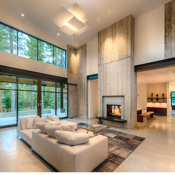
This 4 bedroom (2 en suite), 4.5 bath home features vertical board–formed concrete expressed both outside and inside, complemented by exposed structural steel, Western Red Cedar siding, gray stucco, and hot rolled steel soffits. An outdoor patio features a covered dining area and fire pit. Hydronically heated with a supplemental forced air system; a see-through fireplace between dining and great room; Henrybuilt cabinetry throughout; and, a beautiful staircase by MILK Design (Chicago). The owner contributed to many interior design details, including tile selection and layout.

Subtle texture wrapping in wave pattern tile. The white shaker vanity pairs a quartz top with a brushed nickel faucet, supplemented by a matching over toilet storage cabinet.

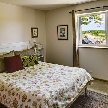
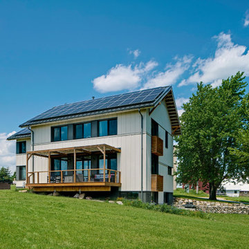
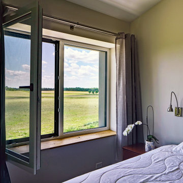
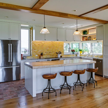
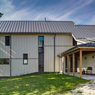
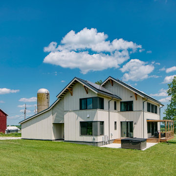
Starry Nights Farm, an organic cattle farm in southern Wisconsin, requested a home in line with their sustainability goals: net zero energy, health-promoting, and a functional farmhouse. Durability and resilience were also priorities, so we chose Insulated Concrete Forms as the wall system, and in addition to heat-pump space conditioning, added a pellet stove for supplemental and backup heating.
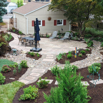
Kitchen design by Interior Trends, Wichita, KS. Photo by Fred Lassmann, Wichita, KS
Lighting supplied by Accent Lighting Inc, Wichita, KS
Elegant kitchen photo in Wichita

Our team of Austin architects decided to keep the kitchen in its original location but add almost 300 square feet to accommodate a large island with seating, a scullery, and a pantry. Additionally, we removed the existing walls to open the kitchen to the main living area. Unique design features include a wall of emerald green cabinets, a custom plaster range hood, brick backsplash accents, and wire mesh front upper cabinets. The large scullery provides further storage and a practical workspace, featuring a supplemental sink and dishwasher.

Brighten your stairway with LED lights. The Wireless Power Outage LED Lighting Kit is perfect for providing bright backup lighting anywhere in your home or office during a power outage. Also great as supplemental emergency lighting in public buildings. ReadyBright Lights only work in conjunction with our MB220 Power Outage Detector. They will receive a wireless signal when installed within 70 feet of your outlet holding the MB220 for instant light the moment you lose power.

NatureKast has a reputation for long lasting and beautiful outdoor products. As a result of years of experience and sensational craftsmanship, we’ve come up with a product that is stunningly beautiful, but also ruggedly functional. These cabinets are constructed out of 3/4” thick White or Black PVC and feature 100% Stainless Steel hardware. On top of that, we’ve pioneered a closed-cell weatherproof Resin that we’ve moulded to create exterior beauty that you will love at first sight. Available in 3 captivating door styles, and 15 finishes, these cabinets are designed to beautifully supplement your outdoor living space by providing comfort, style and longevity.

photos by Pedro Marti
The owner’s of this apartment had been living in this large working artist’s loft in Tribeca since the 70’s when they occupied the vacated space that had previously been a factory warehouse. Since then the space had been adapted for the husband and wife, both artists, to house their studios as well as living quarters for their growing family. The private areas were previously separated from the studio with a series of custom partition walls. Now that their children had grown and left home they were interested in making some changes. The major change was to take over spaces that were the children’s bedrooms and incorporate them in a new larger open living/kitchen space. The previously enclosed kitchen was enlarged creating a long eat-in counter at the now opened wall that had divided off the living room. The kitchen cabinetry capitalizes on the full height of the space with extra storage at the tops for seldom used items. The overall industrial feel of the loft emphasized by the exposed electrical and plumbing that run below the concrete ceilings was supplemented by a grid of new ceiling fans and industrial spotlights. Antique bubble glass, vintage refrigerator hinges and latches were chosen to accent simple shaker panels on the new kitchen cabinetry, including on the integrated appliances. A unique red industrial wheel faucet was selected to go with the integral black granite farm sink. The white subway tile that pre-existed in the kitchen was continued throughout the enlarged area, previously terminating 5 feet off the ground, it was expanded in a contrasting herringbone pattern to the full 12 foot height of the ceilings. This same tile motif was also used within the updated bathroom on top of a concrete-like porcelain floor tile. The bathroom also features a large white porcelain laundry sink with industrial fittings and a vintage stainless steel medicine display cabinet. Similar vintage stainless steel cabinets are also used in the studio spaces for storage. And finally black iron plumbing pipe and fittings were used in the newly outfitted closets to create hanging storage and shelving to complement the overall industrial feel.
Pedro Marti

In this project, we added 1,100 sf to this home for a convenient In-law suite. The bedroom and other living areas feature white walls with white trim, grey hardwood flooring, and bay windows with white trim for lots of natural lighting supplemented by recessed lighting in strategic locations long the tray ceiling.
23