
Search results for "Swapped" in Home Design Ideas
 TVL Creative Ltd.
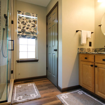
This remodel took a dated and cramped bathroom and transformed it into a classy oasis for our Lowry clients. The clients had a limited budget and wanted to leave the space as in-place as possible. However, the large drop in tub ate valuable floor space and a half wall between the shower and tub had become a holding place for random items without a home. The thick frame on the shower glass made the shower feel extremely small, and the dated lighting and fixtures further depressed the space. We proposed a traditional and elegant design that consider the client's budgetary and spatial constraints. We removed the existing drop-in tub and replaced it with a lovely free-standing soaker. The length of this tub is short, but the depth is exaggerated, making it an ideal replacement in this tiny footprint. The shower glass was swapped for framless glass that boldly expands space. We tore out the existing carpet and installed gorgeous wood-look tile that adds depth and warmth to the room. The clients opted to keep their existing vanity to save cost, so a new top was added to bring the aesthetic up to the level of the new additions. The wall paint was taken from a buttery yellow to a soft gray-green, accented by a darker version of this same color on the siding barn door and toilet room door. New vanity lights, faucets, and storage shelves were installed to help our clients organize and keep things off the counter tops. Finally, new custom up-down window shades were curated for the bathroom to add to the final touch. This space is a simple scope with a dramatic transformation that introduces a timeless look for years to come.
 SEN Creative
Photo: Lauren Andersen © 2019 Houzz
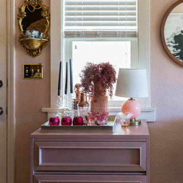
Living room - transitional living room idea in San Francisco
Living room - transitional living room idea in San Francisco
 TVL Creative Ltd.
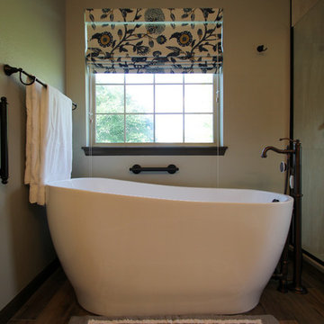
This remodel took a dated and cramped bathroom and transformed it into a classy oasis for our Lowry clients. The clients had a limited budget and wanted to leave the space as in-place as possible. However, the large drop in tub ate valuable floor space and a half wall between the shower and tub had become a holding place for random items without a home. The thick frame on the shower glass made the shower feel extremely small, and the dated lighting and fixtures further depressed the space. We proposed a traditional and elegant design that consider the client's budgetary and spatial constraints. We removed the existing drop-in tub and replaced it with a lovely free-standing soaker. The length of this tub is short, but the depth is exaggerated, making it an ideal replacement in this tiny footprint. The shower glass was swapped for framless glass that boldly expands space. We tore out the existing carpet and installed gorgeous wood-look tile that adds depth and warmth to the room. The clients opted to keep their existing vanity to save cost, so a new top was added to bring the aesthetic up to the level of the new additions. The wall paint was taken from a buttery yellow to a soft gray-green, accented by a darker version of this same color on the siding barn door and toilet room door. New vanity lights, faucets, and storage shelves were installed to help our clients organize and keep things off the counter tops. Finally, new custom up-down window shades were curated for the bathroom to add to the final touch. This space is a simple scope with a dramatic transformation that introduces a timeless look for years to come.
Find the right local pro for your project

 ASR DESIGN STUDIO
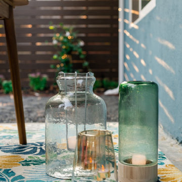
When a pandemic threatens to keep you locked down inside, there’s only one thing for you to do: Create a stylish sanctuary in your own backyard!
This reasoning spurred the inspiration for the backyard restyle at Project GC, which saw Ariel and Robert furnishing and styling their outdoor space on a budget so they could take advantage of the weather and spend more time outside while WFH during Covid.
Our goal was to design with the great outdoors in mind by selecting furnishings that could withstand the weather and could remain outside throughout the seasons.
The traditional work desk was swapped for an outdoor table that could easily multitask, and we used an outdoor rug that was both comfy and weather practical.
We intentionally chose furniture that was light and easy to carry so we could shuffle the style to suit our lifestyle.
The blue ottomans allowed us to convert the space from WFH mode to entertainer mode and we added in some comfort and color with seat and back cushions.
Finally, we created mood lighting with strung lights and lanterns of different scales that could remain outside. Voila – an outdoor space we could work, play and stay in!
 Venetian Stairs
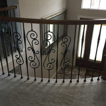
At the Dalcour home we did a full baluster swap. Removing the plain wooden pickets and installing our powder coated wrought iron balusters completely changed the profile of the stairs. The final result speaks for itself.
 Amy Pearson Design
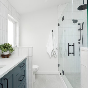
This project took APD to the Oregon Coast for the remodel of two beach house bathrooms! The primary suite was gutted - removing an unused jetted tub in favor of an expansive corner vanity. The shower was opened up by removing an awkwardly located tall cabinet and by swapping a full height wall in favor for a pony wall with glass above. The bathroom is bathed in natural light via the skylight and frosted casement window. A luxurious shower experience was created with ceiling mount rain shower head, wall mount fixed shower head, hand shower on slider bar, and a modern waterfall slab shower bench with integrated niche. A subtle coastal vibe was created with the blue, white, and sandy gray color palette while artistic light fixtures fixtures, clean lined matte black plumbing, and straight stacked tile infuse modernity. In the hall bathroom, a cohesive design was created with added playfulness from the patterned floor tile!
 Little Crown Interiors
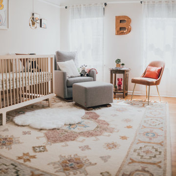
An eclectic, modern, and a little edgy take on a gender neutral nursery. We used a mostly neutral palette with whites and grays to set tone for the space. Then we warmed up the space with a gorgeous dark sage green dresser, copper accents, and burnt orange tones while still maintaining the light and airy feel. The client was an avid art appreciator, so we included some standout pieces by contemporary artists like Murakami and Kaws. Design by Little Crown Interiors, Photo by Full Spectrum Photography.
 Venetian Stairs
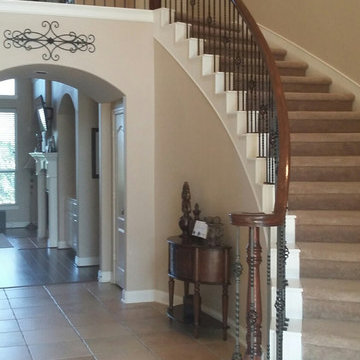
For the Blackhorse Houston home, we removed the wooden balusters and installed our PC4/1, PC4/4, and PC6/1 powder coated wrought iron balusters with our Midnight Bronze finish. To finish out this 1 for 1 baluster swap, we installed our large 60/7 shoes, giving the staircase a mediterranean look that will be the focal point of the entryway.
 Venetian Stairs
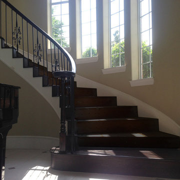
At the Ryan home we did a full baluster swap – removing the wooden balusters and installing our PC44/1 and PC28/3 wrought iron balusters in our Classic Black finish. To complete the remodel, we sanded and refinished the handrails, newels, and caps, custom stained and finished the stairs, and installed a new starter step with riser.
 Board & Vellum
Photo by Cindy Apple
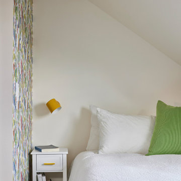
Example of a mid-sized ornate guest bedroom design in Seattle with white walls
Example of a mid-sized ornate guest bedroom design in Seattle with white walls
 Evalia Design, LLC.
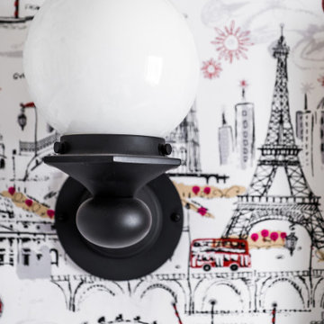
The Paris inspired bathroom is a showstopper for guests! A standard vanity was used and we swapped out the hardware with these mother-of-pearl brass knobs. This powder room includes black beadboard, black and white floor tile, marble vanity top, wallpaper, wall sconces, and a decorative mirror.
 Stebnitz Builders, Inc.
In every project we complete, design, form, function and safety are all important aspects to a successful space plan.
For these homeowners, it was an absolute must. The family had some unique needs that needed to be addressed. As physical abilities continued to change, the accessibility and safety in their master bathroom was a significant concern.
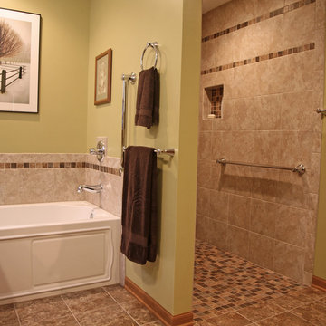
The layout of the bathroom was the first to change. We swapped places with the tub and vanity to give better access to both. A beautiful chrome grab bar was added along with matching towel bar and towel ring.
The vanity was changed out and now featured an angled cut-out for easy access for a wheelchair to pull completely up to the sink while protecting knees and legs from exposed plumbing and looking gorgeous doing it.
The toilet came out of the corner and we eliminated the privacy wall, giving it far easier access with a wheelchair. The original toilet was in great shape and we were able to reuse it. But now, it is equipped with much-needed chrome grab bars for added safety and convenience.
The shower was moved and reconstructed to allow for a larger walk-in tile shower with stylish chrome grab bars, an adjustable handheld showerhead and a comfortable fold-down shower bench – proving a bathroom can (and should) be functionally safe AND aesthetically beautiful at the same time.
 Star D Services, LLC
Star D Services, LLC
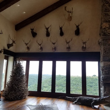
I, Cooper (Owner of Star D Services, LLC) hung each and every one of those mounts and pictures etc. Every few Months or so I go back to take down the smallest ones (or whichever the customer wants) and swap them out for his son's newer bigger mounts. Always adding to the collection. The mounts are not a millimeter off from one mount to the next or from one wall to the next.
I don't have pictures anymore from 2015 but we also helped a Master Carpenter and planed and installed the wood floor as well as much more carpentry work to complete the building.

 TKS Design Group
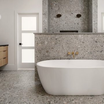
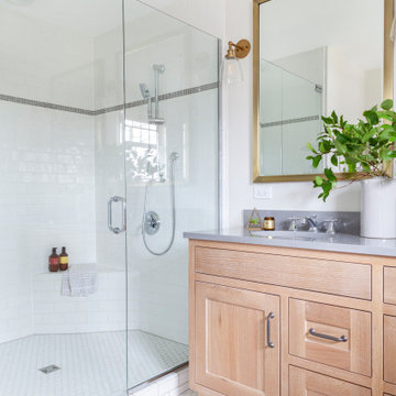
This project is a good example of what can be done with a little refresh. Sometimes parts of your space work well and parts don’t, so a full gut and replace might not make sense. That was the case here.
After living with it for a decade or so realized they would really prefer two sinks in the vanity. Since there were two windows in the bathroom, we decided to eliminate the window to the left of the current vanity and replace with it with a longer run of cabinets.
The other window is to the right of the vanity let’s in beautiful morning light. The window we removed was a northern exposure and its location under an eave didn’t allow for much light, so it was the perfect solution!
In addition to the new vanity, we also changed out the countertop, added new mirrors and lighting, and changed out the tile floor to a larger hex with fewer grout lines. This adds a brighter more modern look while still maintaining the vintage feel of the room.
The shower was in great shape, so we left that as is except for swapping out the shower floor tile to match the main floor and adding a more updated decorative mosaic tile. We added a new toilet and for a bit of luxury a heated towel bar.
Designed by: Susan Klimala, CKD, CBD
Photography by: LOMA Studios
For more information on kitchen and bath design ideas go to: www.kitchenstudio-ge.com
Project Year: 2020
 Amy Pearson Design
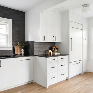
This classic Portland bungalow in the highly desirable Irvington neighborhood was in desperate need of a kitchen update. Aside from tired finishes and cabinets that have seen a full life, the original layout left the family living in a small portion of the kitchen and not taking advantage of the full square footage.
The family desired a design that married both the original architectural details of their bungalow with their preference for clean and modern European design. To accomplish this request, APD brought in sleek flat panel custom frameless cabinets filled with smart and strategic accessories to make the most out of every cabinet box, including full height pantry pull-out, spice and utensil pull-outs flanking the cooking zone, a blind corner pull-0ut to avoid loosing items in the hard-to-reach space, trash & recycling pull-0ut disguised to blend with the adjacent three drawers, and a wall cabinet pull-out sized to fit under the support beam spanning the width of the room. For the traditional - we kept the classic moldings around the windows and doors, continued the homes hardwood floors into the new space, incorporated classic school house light fixtures, and swapped out the slider to the back patio in favor for one with divided lights adding to the architectural detail. Matte black granite countertops with handmade black ceramic tile backsplash bridge the gap between the modern and the traditional thanks to their clean lines, high contrast color palette, and textural and artistic details.
Opting for a few adjustments to the layout created a space plan that took advantage of the full square footage of the room! In the original layout, the refrigerator was squeezed onto the same wall as the cooking, leaving very little counterspace around the hard working cooking zone along with a significant portion of the room (a previous addition) under-utilized. Relocating the refrigerator increased counterspace and storage while creating a “flow” through the entire room.
Luxury Miele and Subzero appliances make this kitchen a chef’s dream! To add to the clean modern look, we opted for an induction cooktop with wall oven directly below … a great alternative to the often used range! Paneling the built-in refrigerator and dishwasher help to calm the overall visual noise of the space, hiding the two hardworking appliances away!
This new family kitchen is at once hardworking, sleek, and timeless!
 Klopf Architecture
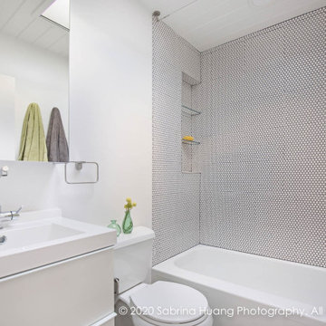
Joseph Eichler developed his moderately priced houses for the mass-market starting in 1949. His homes were designed using affordable materials and simple construction techniques. Nearly 70 years later these homes are in need of updating and remodeling an Eichler home today can become an imposing and costly project if you’re not careful. For this project the clients, who had undergone several previous house renovations, were determined to stick with an established budget from the beginning. Klopf Architecture helped them modernize their Eichler with a premium appearance on a reasonable budget.
The clients challenged the Klopf team to create a design that had a high-end feel and nicely done while adhering to their budget. That meant not all of the initial project scope could be built. Like many other Eichler homes, the original floor plan did not meet the family’s needs leaving them feeling disconnected from one room to another. While an early goal was to expand the house into a carport and create a larger garage, it did not survive the contractor pricing phase of the project.
The goals that did survive through to the end of the project included blurring some of the boundaries and opening up some of the spaces, making them more functional and creating a smoother flow in the house. The Klopf team joined the former separate kitchen and formal living room into one large space and shift the dining room where it is now connected to the kitchen. Klopf swapped the family room to the front alongside the living room, so the spaces feel more cohesive and are now better suited for family activities. The functional layout of the master bathroom was changed to include a large, curbless shower.
Installing a complete IKEA kitchen including cabinets, countertops, appliances, light fixtures, and furnishings was key to staying within budget. Bath fixtures in this house are also exclusively IKEA. Klopf Architecture has designed many homes using IKEA products, which are quite compatible offering an affordable, contemporary take on Eichler homes. The clients saved additional money from the simplicity and availability of IKEA products and by orchestrating the orders and purchases themselves. Following each construction meeting, the clients would make a run to IKEA and purchase items, pick up needed spare parts, and bring them back right away to stay ahead of the contractor’s schedule and minimize the chance of delays and bottlenecks.
Klopf balanced material selections by retaining some of the original woodwork and simply refinishing the mahogany paneling. They were able to retain the original windows and sliding doors which were still in good shape, avoiding some of the most costly replacement expenses. Additionally interior doors were simply refinished and the exterior siding cleaned up and repainted. Formerly dark interiors are now illuminated with new slimmer semi-recessed lighting eliminating the need for costly roof work.
Attention to design details allowed the Klopf team to ensure the house ended up with a high quality feel. Key visual elements were strictly aligned and Klopf worked with the clients to select a unified materials palette throughout the spaces so the house flows seamlessly together. Aligning the tile layout with the trusses and keeping it level with the concrete slab outside allowed them to achieve a level of quality that may otherwise be missed.
The clients were able to keep their budget on track by determining clear goals and making critical decisions upfront, choosing materials and furnishings wisely, working with the right design and construction teams in place and to a large part, their willingness to participate throughout the process. In the end the clients were much happier with their reconfigured Eichler home and Klopf Architecture managed to keep their remodeling costs to about $325/sf – a good amount below the average Bay Area Eichler remodel.
Project Team: John Klopf, Angela Todorova, Sherry Tan
Contractor: Keycon Construction
Structural Engineer: Sezen & Moon
Photography: Sabrina Huang
Year Completed: 2020
 Dalrymple | Sallis Architecture
Move Media, Pensacola
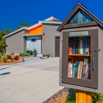
Example of a mid-sized trendy gray one-story concrete fiberboard house exterior design in New Orleans with a shed roof and a metal roof
Example of a mid-sized trendy gray one-story concrete fiberboard house exterior design in New Orleans with a shed roof and a metal roof

86