
Search results for "Swapped" in Home Design Ideas

 Kristine Grace Interiors
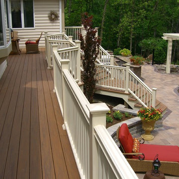
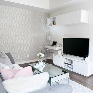
The client wanted a shabby-chic style with pops of colour. She wanted to create a space where she could work from home without it looking too overcrowded. She wanted her space to feel brighter and with more character. We added a wall paper to add dimension and character to her space, while also introducing lots of texture. We swapped out her dark cabinets for bright white furniture pieces to lighten up the space.
 Touchstone Kitchen and Bath
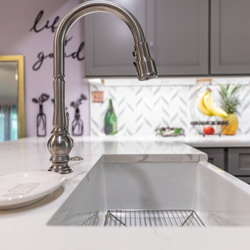
This gorgeous new kitchen used to be just about half the size before we stepped in for renovations. Not only did we open up the space, but we completely changed nearly every design aspect!
The kitchen went from a U-shape to an L-shape, we added an island with seating, swapped laminate counters for quartz and upgraded the backsplash tile. We replaced the old wood-tone cabinets with sleek, painted cabinets - and installed under cabinet lighting and plugs to keep the counters looking bright and clutter-free.
Find the right local pro for your project
 Denise Maloney Interior Design
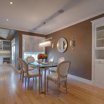
Removing a wall and swapping the kitchen and dining spaces really opened up this space. The warm walls lend a cozy feel to the otherwise cool materials.
Photography by Brian Ashby
 Brynn Charles Designs, LLC
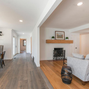
Replaced wood paneling, opened doorway between spaces, swapped old door for new painted black, refinished beautiful original hardwood floors, updated mantle to farmhouse style
 Home Run Remodeling & Construction, Inc.
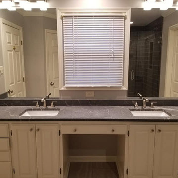
Bathroom makeover in St Charles this past winter. Swapped the placement of bath and shower- in lieu of a tub we did a water closet for privacy. Painted existing cabinets, subway tile shower with Schluter System prepping, floating counter top bench and floating wood shelves.
 Aardvark Architecture
This proposal is for a new two-story home on the vacant heavily wooded lot with an existing 150-foot-long driveway lined by several beautiful oak trees culminating in a behemoth 43-inch oak tree where the driveway meets the main lot. The far end of the driveway terminates in a grove of three 43/40/43-inch redwoods and at the very center of the vacant lot stands a gargantuan V-twin 59-inch redwood tree paired with a “small” 29-inch redwood tree. The owners want to build a beautiful contemporary-styled home for their family that fully enjoys and embraces the mature trees on their cozy 65-foot by 100-foot lot.
As with all small, constrained lots, this project’s site design started first with meeting the relatively large parking and car maneuvering requirements. Menlo Park’s Department of Transportation typically requires side-facing garages to have 24-feet of backup space. So that they could give the largest feature redwood tree on site an added four feet (50%) of clearance outside of its critical root zone, the owners agreed to install a vehicle turntable at the end of their driveway to eliminate the extra four feet of space needed to back up and turnaround. This allowed them to pull their garage forward an additional four feet towards the front property line on the panhandle side, drastically reducing the rest of the home’s impact on the gargantuan V-Twin paired redwood tree at the center of the lot.
One of the owners has mobility issues, and accordingly, they first sought to design a one-story floor plan that incorporated all their family’s needs including plenty of covered patio and deck space to enjoy our fantastic California weather. But that single-story footprint spread too far into the critical root zones of several of the redwood trees on site, even despite the use of the vehicle turntable. During my interview process with the owners, they made it clear to me that one of their primary concerns is ensuring that the largest trees on site would thrive and become features of their new home after construction is complete. The single-story designs that removed the grove of three huge redwood trees were non-starters, as was the skimpy 5x10 master bath I designed when trying to squeeze the whole house program into an overly compromised single-story design. It was therefore deemed necessary to go with a two-story design despite the owner’s mobility issues. This two-story design has a much more compact ground floor footprint and has no bedrooms downstairs, other than the detached ADU. The owners must give up the floor area and incur the costs to install a residential elevator to access their upstairs master suite.
Our ground floor footprint is smaller due to the two-story design decision, and our foundation is pulled away from the trees thanks to the vehicle turntable. Yet, a tiny portion of the home’s ground floor footprint still encroaches into the critical root zones of the largest 59” redwood tree. Therefore, as outlined in the Arborist Report prepared by Aesculus Arboricultural Consulting, the structural engineers are incorporating an array of drilled piers and shallow-grade beams for the main home’s foundation and deck area nearest the redwood’s critical root zone. This drilled piers and grade beam foundation is a type of “bridging” foundation as outlined in Aesculus’ report to preserve the health of these trees that the property was designed around. The rest of the foundation will be constructed as an insulated slab-on-grade foundation to minimize the number of steps and ramps needed for the owners to enjoy their home and patio areas.
Despite the owner’s desire to keep as many trees as possible on site, and despite the smaller ground floor footprint and the advantage of the vehicle turntable, the need for a 20x20-foot garage and 20x20/25-foot guest parking space on our panhandle lot requires the removal of two heritage trees in the required driveway, a 16” coast redwood, and a 17” coast redwood. An alternate design, such as swapping the garage and guest parking locations north-to-south, still requires the removal of these two trees for vehicle maneuvering but has the added disadvantage of cutting off the home’s sightlines to the behemoth 43” oak tree just outside the currently proposed front patio space and living room. Jim Redman of Elements Landscape is proposing 13 new trees be planted on site to replace the lost value of these two heritage coast redwood trees.
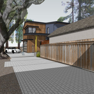
This contemporary architectural design features clean lines, and an abundance of full-height windows and large skylights to best take in the immense trees on site. To blend in with the forest-like setting, the home boasts a mix of rich textures and features a color palette of natural wood tones contrasted with dark blue and black. Once through the new steel gate at the street and down the 150-foot tree-lined driveway, a large covered front patio becomes visible past the neighbor’s detached accessory structure. The covered patio is just across the driveway from the beautiful 43” behemoth coast live oak. The single plane of the covered patio roof is delicately supported by a pair of steel posts in a “V-twin” configuration much like the largest redwood trees that tower over the center of the lot and will still be visible above the new two-story home, even from the front yard. The patio is covered in a dark-colored standing seam roof, with steel C-channel fascias, and tongue-and-groove wood ceiling planks on the underside. Generously sized skylights on the patio roof and inside the living area allow for impressive views of the amazing oak canopy as well as precious natural light.
Supporting the sloped covered patio on the other side is the two-car garage with a secondary bedroom suite stacked above the garage. This two-story volume is to be clad in vertical clear-coated redwood siding, to tie in with the grove of three 43-inch redwood trees just beyond. The garage door, and the bank of windows for Bedroom#2 above feature a steel fascia eyebrow header feature to provide shade and overhang protection, as we are not proposing a large overhang at this “redwood trunk”. The garage and bedroom volume are pulled 16 feet away from the side property line, instead of the minimum required setback of 6’-6”, thus leaving plenty of room for the redwood grove and existing mature pear tree to continue to thrive. This existing mature green screen in this 16-foot-wide side yard is a feature worth soaking in, which is why tall windows with low sill heights are proposed for both the stairs and the upstairs hallway. Though it may be infrequent to approve side-facing 2nd floor windows with sill heights as low as what we’re proposing, we are confident that the mature green screen and the over 16-foot-wide side yard are sufficient to provide for the continued privacy of our neighbor’s rear yard space, especially considering theses windows are in walkway zones.
The covered patio at the front entry is also bound by the 10-foot-tall living room. The great room is clad in a dark blue brick veneer, which wraps around all three sides of the living room. Upon entering the home from the covered patio, you are immediately greeted with one of the most impressive features of the home’s design: a 10-foot-tall by 24-foot-wide set of sliding glass doors. From the entry, this huge opening gives merely an initial glimpse of the massive trunks of the gargantuan V-twin redwoods sitting at the center of the lot. All three sliding glass panels open directly out into the smaller partially covered deck in the rear. This roof overhang element matches the design of the front patio with a steel C-channel fascia and a large skylight. But the rear deck’s roof element is set flat at a ten-foot ceiling height so that the living room’s ceiling seems to float above and out beyond the expanse of full-height sliding doors, thus creating an indoor-outdoor living space that will feel much larger than the home’s actual footprint. This rear covered deck is smaller than the patio in the front and also has a mix of solid and open-slatted roofing to allow for more solar access for the relatively small amount of open sky available.
The downstairs living room is open to the dining and kitchen areas, as well as the stair-and-elevator tower beyond. The stair tower is very open and glassy, and the stairs wind up and around the redwood-clad elevator tower. From certain perspectives in the 16-foot-wide side yard, it will almost seem as if the grove of three redwoods has a fourth tree that the house and the stairs were carefully built around. Other than the 3-foot-wide windows, the exterior walls of the stair tower, downstairs utility spaces, and Bedroom#3 above are finished in cement plaster, painted dark blue and black. The sloped roof over the stair-and-elevator tower continues cleanly over the area of upstairs Bedroom#3. This roof level is set by the side daylight plane and only yields an inside wall height of just under 6 feet in height. The owners are satisfied that the rest of this upstairs room has a nice vaulted ceiling to make up for the one short wall under the daylight plane.
The rest of the ground floor adjacent to the stair tower consists of a small utility wing containing a half-bath, laundry, storage area, and an exterior alcove for the electric heat pump HVAC unit. This short wing also gives more accessible access to the rear yard deck, as well as a backdrop for an outdoor kitchen. The bright white stone backsplash for the outdoor kitchen provides contrast to the otherwise consistent use of cement plaster painted dark blue and black for the two-story wing closest to the detached ADU. Though Bedroom#3 is stacked directly above this small wing, it is relatively short to comply with the side daylight plane of this narrow lot. Still, to further help break up the scale of this wall, another steel fascia eyebrow element is set about 8 feet above the rear deck.
The master suite sits centered above the ten-foot-tall great room. The master bedroom and its balcony, as well as the master bathtub area, have a commanding view of the central redwood trees and their impressive canopy, though the balcony is mostly recessed and should pose no privacy concerns to the neighbor’s rear yards. The master balcony parapet is clad in the same brick veneer continuing up from the living room below. A dark-painted metal rail makes up the rest of the open guardrail height. The entire length of the master balcony is comprised of 9-foot-tall sliding glass doors, but the area above the doors, as well as the area below the master bathroom windows, is accented with more redwood siding. The remainder of the master suite bathroom and walk-in closet is finished in cement plaster painted dark blue. The master bathroom has one side yard-facing window but will be frosted glass for both the owner’s and the neighbor’s privacy.
The 2nd floor is capped under a simple gable roof design with one roof ridge and varying eave and rake overhangs depending on the 2nd-floor layout and solar orientation. Since these roof planes are quite difficult to see in the middle of the heavily wooded panhandle lot, we are proposing a white TPO roofing for these two upper roof planes as a more sustainable choice compared to more dark-colored roofing like the covered patios and detached ADU.
The owners also wish to build a detached 292-square-foot Accessory Dwelling Unit (ADU) as an office and guest suite. For the ADU foundation to be situated outside the central redwood tree’s critical root zone, this relatively tiny structure takes advantage of the narrower 4-foot side and rear setbacks allowed for ADUs smaller than 800 square feet. The small L-shaped detached ADU frames a wonderful quasi-courtyard around the gargantuan V-twin redwoods at the center of the lot. The ADU shares a matching material palette consisting of cement plaster painted blue and black, vertical redwood siding and soffits, and thin brick veneer. The ADU also features large full-height windows. The only difference between the main home and the ADU material palette is that the roofing will be a dark composition shingle roofing since it will be quite visible from the master balcony.
 Benson Homes LLC
This remodeling story is a wonderful example of how removing and shifting walls can have an amazing impact on the functionality and visual appeal of an entire level of a home. When our clients reached out to us, they were looking to create an open concept Kitchen that would allow for easy entertaining. The couple had recently purchased this townhome so his mother could be closer to the family.
The existing floorplan offered first floor living, but the Kitchen was tucked in the back and was separated from the rest of the living space by a full wall with a small pass through into the Dining Room. Our design involved removing the dividing wall between the Dining Room and Kitchen as well as the fake columns and beam that separated the Dining Room and Living Room. The entire space was opened up to allow for easy flow and view throughout the first floor living space. The wall shared by the Kitchen and large Master Bedroom was shifted back just enough to provide a full wall of additional cabinetry including a much-needed large double Pantry cabinet. Now that we had opened up the Kitchen area we could focus on the cabinetry layout and selections.
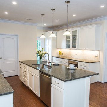
The existing wood toned cabinets were replaced with white cabinets and crown molding to match the rest of the home. The larger, open space allowed for more cabinetry and the addition of an island with new undermount sink, dishwasher and convenient trash pullout along with seating for the grandchildren. A new range hood was installed and vented to the exterior of the house to replace the old recirculating hood. We were able to repurpose the some of the existing cabinets for use above the washer and dryer in the adjoining Laundry Room and swapped out the existing swinging door for a pocket door to free up traffic flow when doing Laundry and working in the Kitchen. The slate-look ceramic tile was replaced with a pre-engineered hardwood floor that creates a sense of warmth while easy to clean. The new Cambria countertop compliments the slate-look tile found in the Dining Room and Living Room and a natural field tile backsplash offsets the cabinets beautifully.
The single fluorescent ceiling light was outdated and did not provide adequate lighting for the new Kitchen. The new lighting plan was carefully thought out to provide general illumination through well placed recessed lighting; task lighting through pendant lighting over the island and under cabinet lighting; and aesthetic fluidity with an eye-catching chandelier for the Dining Room table. Special details include a touch faucet, under counter microwave and glass front cabinetry for displaying dishes.
By removing and shifting walls, we improved the entire flow of the first floor visually as well as functionally and created a beautiful, light-filled space for cooking and entertaining. Grandma can easily prepare meals in her new Kitchen and still chat with her guests and grandchildren who love to sit at the island as well as in the adjoining Dining Room and Living Room.
The Benson Homes team really enjoyed creating this space for this family and we hope they will enjoy spending time with friends and family for years to come.
 Venetian Stairs
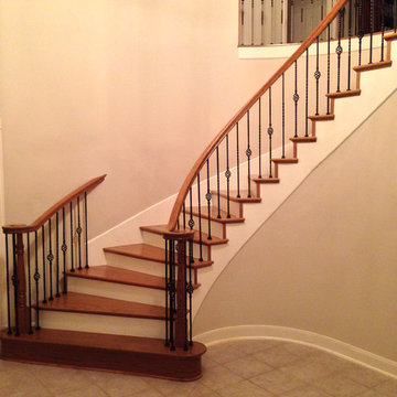
For this Houston area baluster swap, we removed the carpet and the treads. New full oak treads were installed, as well as painted risers, and a wall was built ad the end of the curved balcony. We replaced the oak caps and installed our PC6/1 and PC4/1 wrought iron balusters along with the refinished handrail. As you can see, the over all effect enriches the entire space.
 White Birch Design
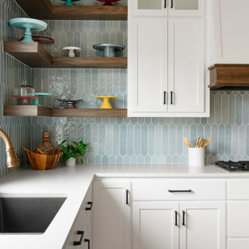
Apple Valley, MN kitchen remodel by White Birch Design, serving the Minneapolis and St. Paul area. To learn more about us and see more examples of our work, visit our website at www.whitebirchdesignllc.com
 abarnai
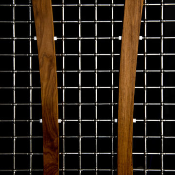
These Custom Trellises were created as the focal point for our client’s revamped outdoor living space, the Courtyard Oasis. They were designed to make a statement all their own during the dormant winter months, and to sustain and emphasize the expanding growth of vines during the summer months. The wood frame is oil rubbed teak and the wire mesh is a combination of stainless steel and aluminum. The stone inserts are removable and can be changed and swapped seasonally or along with furniture upgrades or changes in personal taste. All of the materials were selected for their look and feel, as well as their durability in outdoor climates to ensure beauty and enjoyment for years to come.
 Jarrett Design
These clients win the award for ‘Most Jarrett Design Projects in One Home’! We consider ourselves extremely fortunate to have been able to work with these kind folks so consistently over the years.
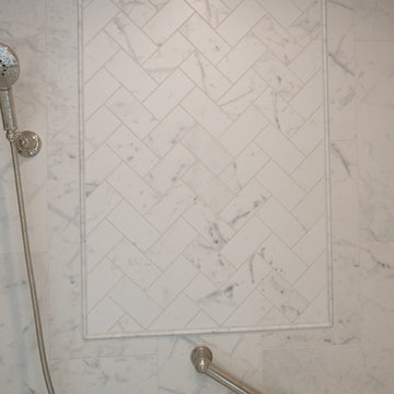
The most recent project features their master bath, a room they have been wanting to tackle for many years. We think it was well worth the wait! It started off as an outdated space with an enormous platform tub open to the bedroom featuring a large round column. The open concept was inspired by island homes long ago, but it was time for some privacy. The water closet, shower and linen closet served the clients well, but the tub and vanities had to be updated with storage improvements desired. The clients also wanted to add organized spaces for clothing, shoes and handbags. Swapping the large tub for a dainty freestanding tub centered on the new window, cleared space for gorgeous his and hers vanities and armoires flanking the tub. The area where the old double vanity existed was transformed into personalized storage closets boasting beautiful custom mirrored doors. The bathroom floors and shower surround were replaced with classic white and grey materials. Handmade vessel sinks and faucets add a rich touch. Soft brass wire doors are the highlight of a freestanding custom armoire created to house handbags adding more convenient storage and beauty to the bedroom. Star sconces, bell jar fixture, wallpaper and window treatments selected by the homeowner with the help of the talented Lisa Abdalla Interiors provide the finishing traditional touches for this sanctuary.
Jacqueline Powell Photography
 Unpatterned
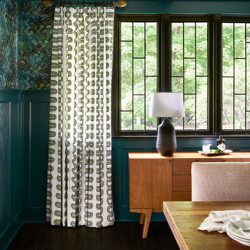
Sometimes we start with a few foundational items and a blank slate. We’ve worked with these Clients on their previous home, and they were ready to make their bedroom suite all their own. Keeping the built-ins was a requirement as was wallpaper, some new window treatments, a closet overhaul, and all the decor and details. We kept the bed and drapes and swapped the rest to create a luxe sleeping retreat.
Phase 2 of this project was to tackle the dining room and adjacent powder room. The dining room had a small sun room attached to it that was not being utilized. We turned it into a luxe home bar with custom cabinetry and a stunning quartz countertop / backsplash. Gold wallpaper on the ceiling completed the room and highlighted all of the fun metal details throughout the space. We ran the color from the bar through the dining room and accented it with bold wallpaper. We added some contrasting colors with the rug selection and brought in wood tones with the furniture to ground the space.
FUN FACT : The art over the fireplace is a vintage photo from District’s Vintage Chicago Project, featuring photos found in vintage furniture over the lifetime of the store.
Bedroom Photography: Dustin Halleck / Dining Room & Bar Photography: Ryan McDonald
 Lauren Levant
Design by Lauren Levant, Photography by Dave Bryce
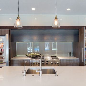
Example of a mid-sized transitional l-shaped dark wood floor and brown floor eat-in kitchen design in Other with an undermount sink, flat-panel cabinets, brown cabinets, laminate countertops, gray backsplash, glass sheet backsplash, paneled appliances and an island
Example of a mid-sized transitional l-shaped dark wood floor and brown floor eat-in kitchen design in Other with an undermount sink, flat-panel cabinets, brown cabinets, laminate countertops, gray backsplash, glass sheet backsplash, paneled appliances and an island
 TVL Creative Ltd.
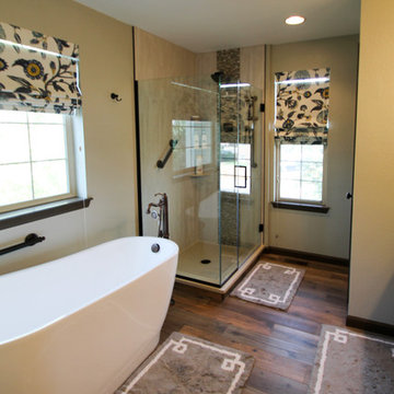
This remodel took a dated and cramped bathroom and transformed it into a classy oasis for our Lowry clients. The clients had a limited budget and wanted to leave the space as in-place as possible. However, the large drop in tub ate valuable floor space and a half wall between the shower and tub had become a holding place for random items without a home. The thick frame on the shower glass made the shower feel extremely small, and the dated lighting and fixtures further depressed the space. We proposed a traditional and elegant design that consider the client's budgetary and spatial constraints. We removed the existing drop-in tub and replaced it with a lovely free-standing soaker. The length of this tub is short, but the depth is exaggerated, making it an ideal replacement in this tiny footprint. The shower glass was swapped for framless glass that boldly expands space. We tore out the existing carpet and installed gorgeous wood-look tile that adds depth and warmth to the room. The clients opted to keep their existing vanity to save cost, so a new top was added to bring the aesthetic up to the level of the new additions. The wall paint was taken from a buttery yellow to a soft gray-green, accented by a darker version of this same color on the siding barn door and toilet room door. New vanity lights, faucets, and storage shelves were installed to help our clients organize and keep things off the counter tops. Finally, new custom up-down window shades were curated for the bathroom to add to the final touch. This space is a simple scope with a dramatic transformation that introduces a timeless look for years to come.
 Snake River Interiors
A respectful renovation balances historical preservation and contemporary design.
A historic log cabin, reimagined for a preservation-minded couple. Working with the architect, we thoughtfully swapped extraneous wood for panoramic windows and steel I-beams. The resulting interior feels simultaneously seamless and sophisticated, open and intimate. Layers of texture lend intrigue throughout: rustic timber walls complement the client’s contemporary art collection; plush upholstery softens such as a copious cobalt sectional soften minimalist lines of metal; cozy nooks, like one bridging the living room and master suite, invite relaxation. The master transforms the historic core of the cabin into a refuge defined by logs darkened to near black. Catering to keen chefs, we designed a gourmet kitchen as functional as it is flawless; opting out of a dining room in favor of a larger family area, the expansive kitchen island seats six. Every careful detail reflects the synergy we felt with this client and their respect for both history and design.
 High Touch Remodeling
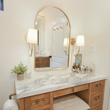
Complete Bathroom Relocation.
In this space we completely relocated the bathroom to allow maximum flow. We swapped the vanity and toilet location and installed a custom white oak cabinet and a marble countertop.
 Refresh Renovations Auckland West
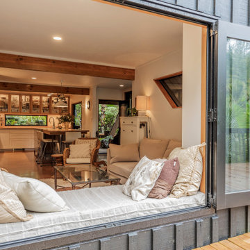
It takes a special kind of client to embrace the eclectic design style. Eclecticism is an approach to design that combines elements from various periods, styles, and sources. It involves the deliberate mixing and matching of different aesthetics to create a unique and visually interesting space. Eclectic design celebrates the diversity of influences and allows for the expression of personal taste and creativity.
The client a window dresser in her former life her own bold ideas right from the start, like the wallpaper for the kitchen splashback.
The kitchen used to be in what is now the sitting area and was moved into the former dining space. Creating a large Kitchen with a large bench style table coming off it combines the spaces and allowed for steel tube elements in combination with stainless and timber benchtops. Combining materials adds depth and visual interest. The playful and unexpected elements like the elephant wallpaper in the kitchen create a lively and engaging environment.
The swapping of the spaces created an open layout with seamless integration to the adjacent living area. The prominent focal point of this kitchen is the island.
All the spaces allowed the client the freedom to experiment and showcase her personal style.
 Southern Pro-Vision Landscape Construction
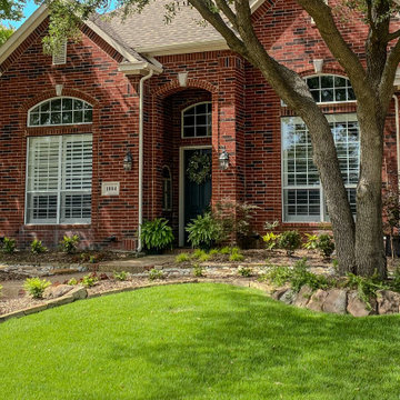
Title: North Dallas Front Yard Curb Appeal Reimagined
This project focused on transforming a dated, sparse front entry into a textured and inviting landscape that complements the home’s classic red brick exterior.
The Challenge:
The original landscape (seen in the "Before" photos) lacked definition, featuring aging shrubs and a worn flagstone path that didn't quite manage the slight slope of the yard. The goal was to create a more intentional, high-end look that felt both organic and structured.
The Solution:
Stone Artistry: We replaced the old borders with hand-stacked Oklahoma chop stone retaining walls. This added much-needed height and structure, creating clean lines that frame the new turf and planting beds.
The Dry Creek Bed: A focal point of the design is the custom Colorado river rock dry creek bed interspersed with large flagstone steppers. This not only serves as a beautiful visual "river" flowing through the landscape but also provides a functional solution for water runoff.
Lush Layers: We swapped out the old, thin grass for a vibrant, healthy lawn and introduced a variety of drought-tolerant plantings and ornamental grasses. The use of dark mulch provides a sharp contrast, making the greens of the plants and the earthy tones of the stone truly pop.
The result is a low-maintenance, high-impact landscape that provides a warm, sophisticated welcome to the home.
 Venetian Stairs
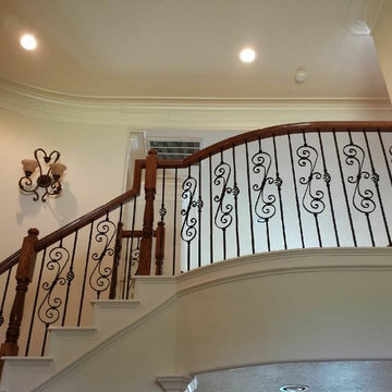
A baluster replacement here in Houston, for the Ossman residence we removed all the wooden balusters and replaced them with out powder coated ones, with an old world copper finish. The new balusters, our PC 22/5 double S scroll balusters, PC 4/4 double twist balusters and PC6/4/OWC double basket balusters, were arranged in an alternating pattern.
This job was completed in one day.
91