
Search results for "Tall most" in Home Design Ideas

 Susan Yeley Homes
This gem of a house was built in the 1950s, when its neighborhood undoubtedly felt remote. The university footprint has expanded in the 70 years since, however, and today this home sits on prime real estate—easy biking and reasonable walking distance to campus.
When it went up for sale in 2017, it was largely unaltered. Our clients purchased it to renovate and resell, and while we all knew we'd need to add square footage to make it profitable, we also wanted to respect the neighborhood and the house’s own history. Swedes have a word that means “just the right amount”: lagom. It is a guiding philosophy for us at SYH, and especially applied in this renovation. Part of the soul of this house was about living in just the right amount of space. Super sizing wasn’t a thing in 1950s America. So, the solution emerged: keep the original rectangle, but add an L off the back.
With no owner to design with and for, SYH created a layout to appeal to the masses. All public spaces are the back of the home--the new addition that extends into the property’s expansive backyard. A den and four smallish bedrooms are atypically located in the front of the house, in the original 1500 square feet. Lagom is behind that choice: conserve space in the rooms where you spend most of your time with your eyes shut. Put money and square footage toward the spaces in which you mostly have your eyes open.
In the studio, we started calling this project the Mullet Ranch—business up front, party in the back. The front has a sleek but quiet effect, mimicking its original low-profile architecture street-side. It’s very Hoosier of us to keep appearances modest, we think. But get around to the back, and surprise! lofted ceilings and walls of windows. Gorgeous.
 Custom Kitchens by John Wilkins, Inc.
Mike Kaskel
Example of a transitional home design design in San Francisco
Example of a transitional home design design in San Francisco
 Thyme & Place Design LLC
The existing kitchen was in a word, "stuck" between the family room, mudroom and the rest of the house. The client has renovated most of the home but did not know what to do with the kitchen. The space was visually cut off from the family room, had underwhelming storage capabilities, and could not accommodate family gatherings at the table. Access to the recently redesigned backyard was down a step and through the mud room.
We began by relocating the access to the yard into the kitchen with a French door. The remaining space was converted into a walk-in pantry accessible from the kitchen. Next, we opened a window to the family room, so the children were visible from the kitchen side. The old peninsula plan was replaced with a beautiful blue painted island with seating for 4. The outdated appliances received a major upgrade with Sub Zero Wolf cooking and food preservation products.
The visual beauty of the vaulted ceiling is enhanced by long pendants and oversized crown molding. A hard-working wood tile floor grounds the blue and white colorway. The colors are repeated in a lovely blue and white screened marble tile. White porcelain subway tiles frame the feature. The biggest and possibly the most appreciated change to the space was when we opened the wall from the kitchen into the dining room to connect the disjointed spaces. Now the family has experienced a new appreciation for their home. Rooms which were previously storage areas and now integrated into the family lifestyle. The open space is so conducive to entertaining visitors frequently just "drop in”.
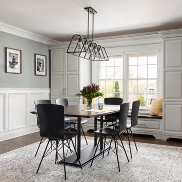
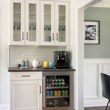
In the dining area, we designed custom cabinets complete with a window seat, the perfect spot for additional diners or a perch for the family cat. The tall cabinets store all the china and crystal once stored in a back closet. Now it is always ready to be used. The last repurposed space is now home to a refreshment center. Cocktails and coffee are easily stored and served convenient to the kitchen but out of the main cooking area.
How do they feel about their new space? It has changed the way they live and use their home. The remodel has created a new environment to live, work and play at home. They could not be happier.
Find the right local pro for your project

 Bilotta Kitchen & Home
This kitchen is a result of updating a Tudor-style home with a more modern aesthetic. The 12’ island, with a Super White Pental Quartz countertop, is larger than the kitchen was prior to the renovation. A combination of finishes were used – dark horizontal grain cabinetry mixed with a horizontal, grainier pattern for the island and range wall (horizontal patterns were used to emphasize the length of the room). The wall cabinets are steel and glass to lighten up the back wall with Calcutta Gold Marble backsplash from Artistic Tile. The range wall is the most used area, with a Kyoto Steel tile backsplash. The 48” professional series range is flanked by spice drawers, a large pantry (left), and the 30” refrigerator (right). A secondary sink was placed behind the chef with a knife block and knife drawer for easy food prep. The opposite end of the island is for entertaining – with the bar, tall freezer column, and wine cooler.
Bilotta Designer: Senior Designer, Paula Greer, CKD.
Architect: Mario Canteros, Canteros & Zorilla Architecture.
GC: Stephen Moliterno, M.J.S. Contracting Corp.
Photo Credit: Peter Krupenye

 Mariano & Co., LLC
Master Bathroom Remodel in Gold Canyon! We removed a tub shower combo to create a large walk-in shower. Replaced the vanity with new cabinets, plumbing, sinks, and granite counter tops! In the Kitchen, we lowered the Island to all one level and added new counter tops!
 Drury Design
The 100-year old home’s kitchen was old and just didn’t function well. A peninsula in the middle of the main part of the kitchen blocked the path from the back door. This forced the homeowners to mostly use an odd, U-shaped corner of the kitchen.
Design objectives:
-Add an island
-Wow-factor design
-Incorporate arts and crafts with a touch of Mid-century modern style
-Allow for a better work triangle when cooking
-Create a seamless path coming into the home from the backdoor
-Make all the countertops in the space 36” high (the old kitchen had different base cabinet heights)
Design challenges to be solved:
-Island design
-Where to place the sink and dishwasher
-The family’s main entrance into the home is a back door located within the kitchen space. Samantha needed to find a way to make an unobstructed path through the kitchen to the outside
-A large eating area connected to the kitchen felt slightly misplaced – Samantha wanted to bring the kitchen and materials more into this area
-The client does not like appliance garages/cabinets to the counter. The more countertop space, the better!
Design solutions:
-Adding the right island made all the difference! Now the family has a couple of seats within the kitchen space. -Multiple walkways facilitate traffic flow.
-Multiple pantry cabinets (both shallow and deep) are placed throughout the space. A couple of pantry cabinets were even added to the back door wall and wrap around into the breakfast nook to give the kitchen a feel of extending into the adjoining eating area.
-Upper wall cabinets with clear glass offer extra lighting and the opportunity for the client to display her beautiful vases and plates. They add and an airy feel to the space.
-The kitchen had two large existing windows that were ideal for a sink placement. The window closest to the back door made the most sense due to the fact that the other window was in the corner. Now that the sink had a place, we needed to worry about the dishwasher. Samantha didn’t want the dishwasher to be in the way of people coming in the back door – it’s now in the island right across from the sink.
-The homeowners love Motawi Tile. Some fantastic pieces are placed within the backsplash throughout the kitchen. -Larger tiles with borders make for nice accent pieces over the rangetop and by the bar/beverage area.
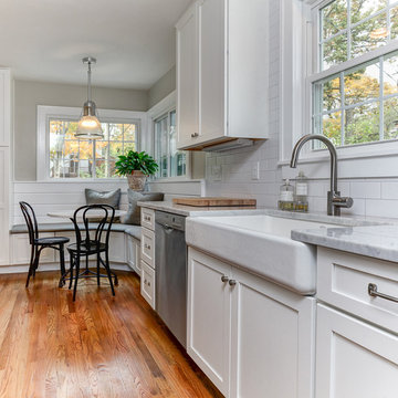
-The adjacent area for eating is a gorgeous nook with massive windows. We added a built-in furniture-style banquette with additional lower storage cabinets in the same finish. It’s a great way to connect and blend the two areas into what now feels like one big space!

 Jarrett Design
Entertaining friends and family doesn't work well when rooms are small and closed off. So when our clients decided to remodel, they knew they wanted to open up the space to accommodate large gatherings. Also important were ample storage and quality appliances that would hold up to the demands of cooking creative meals several nights a week.
As is sometimes the case with remodeling, solving one problem can create another. Opening up the space involved removing a wall, which sacrificed critical square footage for cabinetry and appliances. We knew the wall needed to come down so we were challenged with making sure every available cabinet space in the kitchen was being utilized as thoughtfully and creatively as possible. A tall pantry was added next to the refrigerator to allow for storage of pots and pans, as well as food, while another pantry in the adjacent dining room housed all dishes and silverware. A small bar area was created in an unused section in the back of the home to store coffee and tea accessories and drinkware. Finally, a small island in the center of the kitchen offered the ideal location for the microwave and most-used pots and pans.
With the expanded space, smart use of storage options and top-notch appliances, our clients are enjoying working in their new kitchen and have already hosted a ravioli-making class!
Matt Villano Photography

 Thyme & Place Design LLC
The existing kitchen was in a word, "stuck" between the family room, mudroom and the rest of the house. The client has renovated most of the home but did not know what to do with the kitchen. The space was visually cut off from the family room, had underwhelming storage capabilities, and could not accommodate family gatherings at the table. Access to the recently redesigned backyard was down a step and through the mud room.
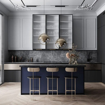
We began by relocating the access to the yard into the kitchen with a French door. The remaining space was converted into a walk-in pantry accessible from the kitchen. Next, we opened a window to the family room, so the children were visible from the kitchen side. The old peninsula plan was replaced with a beautiful blue painted island with seating for 4. The outdated appliances received a major upgrade with Sub Zero Wolf cooking and food preservation products.
The visual beauty of the vaulted ceiling is enhanced by long pendants and oversized crown molding. A hard-working wood tile floor grounds the blue and white colorway. The colors are repeated in a lovely blue and white screened marble tile. White porcelain subway tiles frame the feature. The biggest and possibly the most appreciated change to the space was when we opened the wall from the kitchen into the dining room to connect the disjointed spaces. Now the family has experienced a new appreciation for their home. Rooms which were previously storage areas and now integrated into the family lifestyle. The open space is so conducive to entertaining visitors frequently just "drop in”.
In the dining area, we designed custom cabinets complete with a window seat, the perfect spot for additional diners or a perch for the family cat. The tall cabinets store all the china and crystal once stored in a back closet. Now it is always ready to be used. The last repurposed space is now home to a refreshment center. Cocktails and coffee are easily stored and served convenient to the kitchen but out of the main cooking area.
How do they feel about their new space? It has changed the way they live and use their home. The remodel has created a new environment to live, work and play at home. They could not be happier.



 Hearthstone Inc
Richard Herman is in the hospitality business and owns several upscale hotels in Florida and in other states as well as cattle ranches in both Florida and Missouri. Their farm in Ocala is by farm their most unique. The property serves as a 4-H demonstration project for the purpose of children’s education. They have been working with the Academy Prep of St. Pete which is dedicated to inner-city youths that are selected on the basis of need and achievement. Wife Diane spends her time on the farm raising Gypsy Vanners, a diminutive draft horse named after the job they did in Eastern Europe, pulling the wagons (vans) for gypsies that wandered across the continent. On the Ocala farm, there are several mules with a unique profession.
Richard had visited the Hearthstone display at a Log & Timber Home Shows at the Orlando Convention Center many years ago. He was impressed that Hearthstone had stayed in touch with him over the years by mailings, invitations to shows, and periodic phone calls. When the time came to start serious consideration of the design of barn, Hearthstone responded promptly and professionally to Richard and Diane’s requests for information and a review of their ideas for their barn, which would serve as the centerpiece for their new farm.
They wanted a multipurpose facility that could accommodate an educational environment and a large hall suitable for the fundraising events for his charities. Richard wanted a barn that reflected the look and feel of barns built at the dawn of the 20th century. Besides the rustic chicken houses and vegetable gardens, they have completely renovated a 1020’s era farmhouse to be as historically correct as possible and serves as the entry to the farm.
“They very careful to feel us out, get comfortable with our capabilities, and be convinced that we could perform as promised,” said Project Manager John Ricketson of Hearthstone.
Design Process
There were some initial drawings that gave us a start on the basic shape and size of the barn. From there, it was a process of narrowing down the uses of each area and the spans that could be achieved. The barn was going to have the traditional “board & batten” exterior siding and a metal roof. There is a cantilevered ‘hay hood” on the north gable end above the large sliding barn doors that open into the foyer and horse stalls. The wings house a combination of areas, beginning with the large restrooms to accommodate crowds for events. Other parts of the wings have garage areas for the farm vehicles, feed room, tack room, wash rack, storage, offices, and smaller restrooms.
Keeping with the look and feel of the turn of the century, Hearthstone developed a process for giving the timbers a surface texture that mimicked the circular cuts of timbers that had just come out of an old sawmill. This was easier said than done. Randy Giles guided his millwright (Wolfgang) in designing a machine that would do this effectively.
The barn was delivered in October of 2014 and was erected over the course of two weeks, thanks to a hardworking crew (Eric Foster) and near-perfect weather. After the Hearthstone crew completed the erection and roof dry-in, it was time for the local carpenters to step up and install some light conventional framing on the gable ends before applying the roof fascia and exterior board & batten siding. Next came the big sliding barn doors, plumbing, electrical, heating, and cooling. Large rustic fixtures were hung from the great hall roof timbers.
Exterior
The board & batten siding was cypress and allowed to turn color naturally as rain hit it and the sun started working on it with UV rays. This method causes a much grayer look closer to the ground and less so where the roof overhang provides protection. The North end has some large limestone boulders and planters arranged around the pad with tall pampas grass. The planters provide casual seating before events and during outside receptions. The entire area was sodded with lush St. Augustine grass and split rail fences were added to enclose the barn area. The corrugated metal roof was a special order material that immediately rusted after being exposed to moisture. The layer of rust protects the metal from the elements.
Interior
The board & batten theme was carried throughout most of the interior with the timbers left natural to show off the circular saw texture. All of the tongue & groove decking was shipped in advance to allow the local painter to pre-stain it with a dark brown transparent stain that is a beautiful background to the light color Eastern White Pine timbers.
“Everything was unique in this project” said Project Manager John Ricketson. “The setting on a small demonstration farm close to Ocala, the multipurpose design, the circular saw texture on the timbers.”
The Hermans are very proud of their farm’s outcome. Richard sent a note to Randy Giles, owner of Hearthstone: “The Barn is fantastic, not a single problem, period. Next month, we have Jo Dee Messina coming in to help with a fundraiser for a local center for abused kids. Folks love the farm, ...... but that barn gets all of the attention. I would encourage you to use me as a reference for your sales team, feel free to extend my cell phone to any prospective purchasers.”
 Drury Design
The 100-year old home’s kitchen was old and just didn’t function well. A peninsula in the middle of the main part of the kitchen blocked the path from the back door. This forced the homeowners to mostly use an odd, U-shaped corner of the kitchen.
Design objectives:
-Add an island
-Wow-factor design
-Incorporate arts and crafts with a touch of Mid-century modern style
-Allow for a better work triangle when cooking
-Create a seamless path coming into the home from the backdoor
-Make all the countertops in the space 36” high (the old kitchen had different base cabinet heights)
Design challenges to be solved:
-Island design
-Where to place the sink and dishwasher
-The family’s main entrance into the home is a back door located within the kitchen space. Samantha needed to find a way to make an unobstructed path through the kitchen to the outside
-A large eating area connected to the kitchen felt slightly misplaced – Samantha wanted to bring the kitchen and materials more into this area
-The client does not like appliance garages/cabinets to the counter. The more countertop space, the better!
Design solutions:
-Adding the right island made all the difference! Now the family has a couple of seats within the kitchen space. -Multiple walkways facilitate traffic flow.
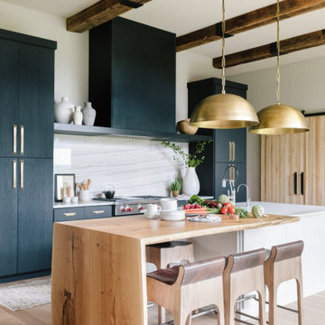
-Multiple pantry cabinets (both shallow and deep) are placed throughout the space. A couple of pantry cabinets were even added to the back door wall and wrap around into the breakfast nook to give the kitchen a feel of extending into the adjoining eating area.
-Upper wall cabinets with clear glass offer extra lighting and the opportunity for the client to display her beautiful vases and plates. They add and an airy feel to the space.
-The kitchen had two large existing windows that were ideal for a sink placement. The window closest to the back door made the most sense due to the fact that the other window was in the corner. Now that the sink had a place, we needed to worry about the dishwasher. Samantha didn’t want the dishwasher to be in the way of people coming in the back door – it’s now in the island right across from the sink.
-The homeowners love Motawi Tile. Some fantastic pieces are placed within the backsplash throughout the kitchen. -Larger tiles with borders make for nice accent pieces over the rangetop and by the bar/beverage area.
-The adjacent area for eating is a gorgeous nook with massive windows. We added a built-in furniture-style banquette with additional lower storage cabinets in the same finish. It’s a great way to connect and blend the two areas into what now feels like one big space!





 Custom Storage Solutions
 in Holland, Ohio was hired to design and build Berry a new bar to go with his awesome Man Cave. We made the bar a little over 6 feet long and 22 inches deep, 42 inches tall, just the right size for this space. It has a custom epoxy top, and some L.E.D. lighting that includes a remote to change colors anytime. We also used this same lighting behind the Pegasus sign behind the bar. We also installed our pvc flooring tiles by RaceDeck in a checkerboard pattern. Berry's man cave includes most of the essentials for a space like this, Bar number one, juke box, pool table, plenty of seating and lots of neon signs!

 Visbeen Architects
Builder: J. Peterson Homes
Interior Designer: Francesca Owens
Photographers: Ashley Avila Photography, Bill Hebert, & FulView
Capped by a picturesque double chimney and distinguished by its distinctive roof lines and patterned brick, stone and siding, Rookwood draws inspiration from Tudor and Shingle styles, two of the world’s most enduring architectural forms. Popular from about 1890 through 1940, Tudor is characterized by steeply pitched roofs, massive chimneys, tall narrow casement windows and decorative half-timbering. Shingle’s hallmarks include shingled walls, an asymmetrical façade, intersecting cross gables and extensive porches. A masterpiece of wood and stone, there is nothing ordinary about Rookwood, which combines the best of both worlds.
Once inside the foyer, the 3,500-square foot main level opens with a 27-foot central living room with natural fireplace. Nearby is a large kitchen featuring an extended island, hearth room and butler’s pantry with an adjacent formal dining space near the front of the house. Also featured is a sun room and spacious study, both perfect for relaxing, as well as two nearby garages that add up to almost 1,500 square foot of space. A large master suite with bath and walk-in closet which dominates the 2,700-square foot second level which also includes three additional family bedrooms, a convenient laundry and a flexible 580-square-foot bonus space. Downstairs, the lower level boasts approximately 1,000 more square feet of finished space, including a recreation room, guest suite and additional storage.
 Visbeen Architects
Builder: J. Peterson Homes
Interior Designer: Francesca Owens
Photographers: Ashley Avila Photography, Bill Hebert, & FulView
Capped by a picturesque double chimney and distinguished by its distinctive roof lines and patterned brick, stone and siding, Rookwood draws inspiration from Tudor and Shingle styles, two of the world’s most enduring architectural forms. Popular from about 1890 through 1940, Tudor is characterized by steeply pitched roofs, massive chimneys, tall narrow casement windows and decorative half-timbering. Shingle’s hallmarks include shingled walls, an asymmetrical façade, intersecting cross gables and extensive porches. A masterpiece of wood and stone, there is nothing ordinary about Rookwood, which combines the best of both worlds.
Once inside the foyer, the 3,500-square foot main level opens with a 27-foot central living room with natural fireplace. Nearby is a large kitchen featuring an extended island, hearth room and butler’s pantry with an adjacent formal dining space near the front of the house. Also featured is a sun room and spacious study, both perfect for relaxing, as well as two nearby garages that add up to almost 1,500 square foot of space. A large master suite with bath and walk-in closet which dominates the 2,700-square foot second level which also includes three additional family bedrooms, a convenient laundry and a flexible 580-square-foot bonus space. Downstairs, the lower level boasts approximately 1,000 more square feet of finished space, including a recreation room, guest suite and additional storage.
Sponsored
Columbus, OH

Hope Restoration & General Contracting
Columbus Design-Build, Kitchen & Bath Remodeling, Historic Renovations
 Custom Storage Solutions
 in Holland, Ohio was hired to design and build Berry a new bar to go with his awesome Man Cave. We made the bar a little over 6 feet long and 22 inches deep, 42 inches tall, just the right size for this space. It has a custom epoxy top, and some L.E.D. lighting that includes a remote to change colors anytime. We also used this same lighting behind the Pegasus sign behind the bar. We also installed our pvc flooring tiles by RaceDeck in a checkerboard pattern. Berry's man cave includes most of the essentials for a space like this, Bar number one, juke box, pool table, plenty of seating and lots of neon signs!

 Shade And Shutter Systems, Inc
These Retractable Screens are top of the line luxury with built in, full enclosed, pulley systems designed to give two finger control. These screens may stop anywhere within the travel path and are not operated by a full tension spring.
Most retractable screens of this size have large "full tension springs" that are under heavy loads while the screen is deployed. These springs will often pull out of the user's hands as they try to open the screen to pass through.
The retractable screen you see in this photo will go up to 10' tall x 24' wide, with a completely clear opening. The screens are also available in insect screen, solar screen, privacy screen, and combination screens. They are completely incased and have billet aluminum frames.
This Retractable Screen is the perfect solution to the Custom Builder or Architect needing a large span screen solution. These are also great for noise abatement within open floor plan homes and structures. Knock down echoes, close off TV or office spaces, or create sections within a large space for a more intimate setting in seconds.
Our Product Specialists are always available to speak with at 800-522-1599 if you would like more information.

 soilsalive
common ragweed (Ambrosia artemisiifolia), also called annual ragweed or bitterweed. This noxious weed is much smaller, growing to between two and four feet tall. This species of ragweed is very aggressive and will grow in sunnier spots than its larger cousin, Giant Ragweed. It can often invade Bermuda lawns where the soil is compacted and irrigation may be sparse. It produces masses of pollen in late summer and early fall, causing serious allergy problems all across our region. https://soilsalive.com/resources/identification-guide/common-ragweed
181