
Search results for "Tendency" in Home Design Ideas
 Murphy Bros. Design | Build | Remodel
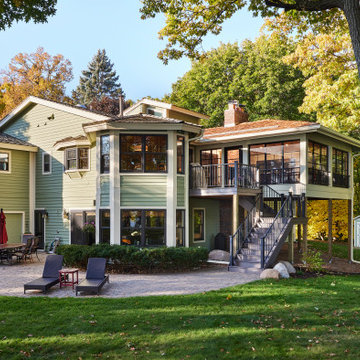
This remodel started out as a simple deck replacement. Most, strike that, ALL remodels have a tendency to start out with a conclusion. They tell us they want a new this or that. Simple right? And insufficient for the task at hand. That's when we start digging. We started asking why. And we keep asking. We do that to uncover the real motivation and desires that need to be satisfied. It’s how we define a meaningful scope of work.
Almost anyone can slap on a new countertop or replace an old deck. But if you want a new space that literally changes the way you live, that’s on a whole different level.
After several lengthy conversations, these homeowners realized they wanted something that was more of a living space they could use most of the year. But they also wanted it to be integrated into the surrounding nature and reflect the unique eclectic architecture of the house. And of course, they love to entertain, so it had to be inviting, comfortable, and mosquito-free.
Initial conclusion: we want a new deck. Final scope and design: we gave them a 3 ½ season bug-free porch with a panoramic view, a breeze on command, and a tree house to entertain in.
The Sunspace venting panels (not glass) provide unobstructed views with collapsible screens in multiple configurations to control the amount of airflow into the porch. The 18 x 20 footprint is large enough for large gatherings. The decking inside is Dektek concrete tiles with a beautiful stunning glaze and remarkable durability. On the outside, it's Wolf synthetic decking made of 94% recycled materials.
 Kerry Lewis Landscape Architecture
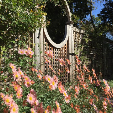
Chrysanthemum 'Sheffield' ablaze beside the entry gate in late October.
Inspiration for a farmhouse landscaping in Boston.
Inspiration for a farmhouse landscaping in Boston.
 Tracey Stephens Design, LLC
Wing Wong/Memories TTL
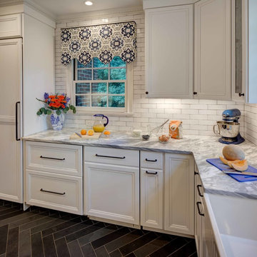
Example of a mid-sized transitional u-shaped slate floor and gray floor eat-in kitchen design in New York with a farmhouse sink, recessed-panel cabinets, white cabinets, marble countertops, white backsplash, brick backsplash, paneled appliances and a peninsula
Example of a mid-sized transitional u-shaped slate floor and gray floor eat-in kitchen design in New York with a farmhouse sink, recessed-panel cabinets, white cabinets, marble countertops, white backsplash, brick backsplash, paneled appliances and a peninsula
Find the right local pro for your project
 SYDfemMellE Design, Remodeling and Construction
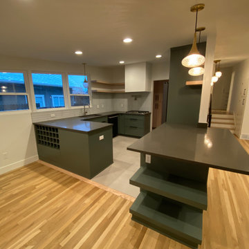
Elegance often starts with simplicity, regardless of the style of the space. This Midcentury Modern kitchen has a 24x48 porcelain floor tile installed. Bigger is better, even in the smallest of areas. When stepping to a 12x24 tile, the reality of that choice, often creates the space to date quicker due to the increased grout. Also, a product on the floor must appear to have the strength and depth to support the visual size of a room. That is created by size or by using tiles to work as a team. Stepping to a 12x24 tile will often cause a home owner to feel as if they must remodel once 3-4 years have passed. Simply, a larger format tile will often increase the longevity of a home, space or project, it's due to the simplicity and decrease in grout.
This home has porcelain countertops installed. Porcelain countertops are a choice many don't know they can make. Porcelain handles heat incredibly well, It looks incredible and handles abuse, with no real maintenance required, where stone requires a lot of up-keep. We have been walking on porcelain for decades. It's strange it has taken so long to create porcelain countertops. To be successful with the install of a porcelain countertop, you must hire the right company that specializes in installing that type of product. Not always, but often, a stone countertop installer is not interested or trained in the install of a porcelain countertop. Laminam is probably one of the most successful porcelain countertops to install. They don't have a tendency to hairline facture at install like the other bands.
 Jaeger & Ernst Custom Cabinetmakers
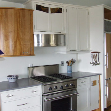
One of the subtle ways space was manipulated was to curve the wall behind the range. The stove wall divides the kitchen from the living room; at its' terminus in the living room it became the hallway entering the private section of the home. The curved natural upper cabinet at the beginning of the kitchen, mimics the curved wall in opposition but softens and eases the eye level entrance to the kitchen proper. This curved cabinet also offered tremendous storage space due to the unique design and construction of the door. The kitchen is in white excepting for defining areas of the same material the floor is constructed from: quartered sycamore. White enlarges one's perception of space and therefore should be used when the design is appropriate. One negative aspect of white is the tendency to create an antiseptic space. Due to the kitchens' small size and floor of sycamore it was easy to add natural wood as a focal point as well as enhance interest and flow of the whole space. The curving wall added to the depth of cabinets without being intrusive. The Sub Zero built in refrigerator anchored the narrow end of the kitchen but displayed a side of solid white to enhance the kitchen's termination. Good design, interesting design, requires some degree of attention but also the ability to be interpreted correctly by excellent craftsman. Jaeger & Ernst cabinetmakers have the best of both worlds: we design and create our work as well as collaborate with superlative designers and architects to emphasize their designs of beautiful homes. Jaeger & Ernst cabinetmakers seek custom work: call 434-973-7018

Encelia californica / Bush Sunflower
Photo: Bri Weldon, licensed under Creative Commons Attribution-2.0 Generic

 BAUFORMAT
Wavy mother of pearl porcelain tile, wavy white tile for bathroom shower or backsplash. Perfect for fireplace or accent wall
Example of a trendy bathroom design in Los Angeles
Example of a trendy bathroom design in Los Angeles

 Lands End Development - Designers & Builders
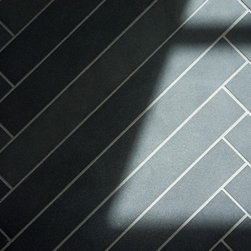
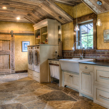
Dedicated laundry room - large rustic galley slate floor and multicolored floor dedicated laundry room idea in Minneapolis with a double-bowl sink, beaded inset cabinets, white cabinets, granite countertops, yellow walls, a side-by-side washer/dryer and black countertops
 Mutual Materials
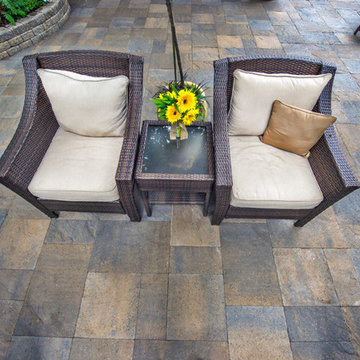
Patio plaza designed with curving natural shapes and made with Mutual Materials Columbia Slate Patio Stone in the color Summit Blend. Applying a paver sealant coating on top of the Columbia Slate intensifies the colors while providing protection from weather elements and fading.
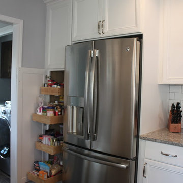
 Gary Brown Homes LLC
Mid-sized transitional u-shaped dark wood floor enclosed kitchen photo in Kansas City with an undermount sink, shaker cabinets, white cabinets, quartzite countertops, white backsplash, subway tile backsplash, stainless steel appliances and no island
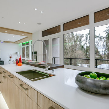
 Architectural Surfaces
Unique Design & Construction Co.
www.uniquedesignco.com
Counter: PentalQuartz Super White 2cm
Kitchen - modern kitchen idea in Seattle
Kitchen - modern kitchen idea in Seattle
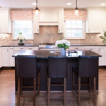
 The Creative Kitchen Company
Open kitchen layout designed as the central family gathering place. The Creative Kitchen Co. collaborated with the homeowners to design a kitchen to fit the needs of a busy family of four.
Photo credit: Ray LaVoie
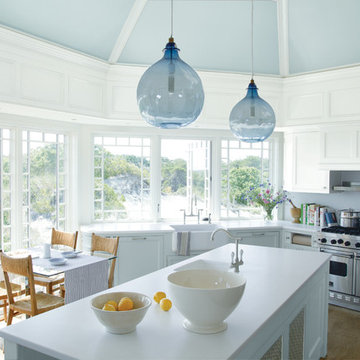
 Benjamin Moore
Walls: Distant Gray OC-68, Regal Select, Pearl
Ceiling: Constellation AF-540, Regal Select, Flat
Lower Cabinets: Gray Cloud 2126-60, Regal Select, Pearl
A beachy blue kitchen with white cabinetry and paneling details, accented by two glass blown light fixtures
 Kariouk Associates
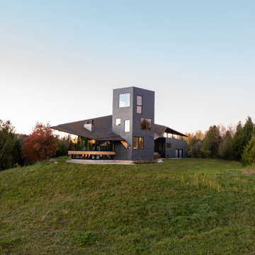
A Family Retreat in Rural Ontario
The clients for this project live abroad, and sought a Canadian homestead — an anchor — for their large, young family. During summer and winter holidays, the parents wanted their children immersed in an Ontario landscape like the one in which they were raised.
To this end, they requested a “rustic, modern retreat” for their 100-acre property of forest, wetland, and meadows.
The family sought a generous home to allow young teenagers and extended family to be comfortable in a remote area for long stays. They sought a casual, comfortable space for the family and their dogs that would encourage activities like hiking and snowshoeing — no fancy entertaining.
Under One Roof
The most powerful aspect of the design is the long, tent-like roof, which follows the site’s topography. The roof and its ridge beam became the design’s primary focus, shaping the circulation path through the home’s interior, ultimately extending a view toward the forest.
A primary technical challenge was the roof’s structure, which despite its 60-metre length needed to seem light. The folds and angles of the steel roof are supported by the meandering ridge-beam.
The roof cantilevers and tapers at all edges. At the entry side of the house, the roof lifts like a bird’s wing off the garage volume beneath, sheltering an outdoor terrace.
Playing with Heavy and Light
Monolithic slate-clad volumes anchor the home and define the space between the curtains of glass. These opaque volumes echo the property’s rock outcrops. The garage, bathrooms, stairs, and pantry are grouped inside, and appear to hold up the dynamic roof.
Steel construction was chosen to avoid using the expected material of heavy timber for this forest getaway. Being cognizant of the clients’ desire for a warm interior, it was also important to avoid modernist tendencies for box-like forms.
Because the main floor is lifted above the ground and the topography falls away, the main floor is in the treetops while simultaneously filling the lower recreation area with light.
A Contemporary Approach to Warmth and Closeness
The continuous space of the home, with only bedrooms and bathrooms closed off, is a layout that underscores closeness.
The family areas and parents’ area are on the main level. The kids’ bedrooms are bundled into a single slate-clad volume, suspended like a cocoon above the main floor from a 40’ steel beam and accessed by a catwalk.
Sustainability
To avoid cutting trees, the home was placed on an existing cleared ridge overlooking a wildflower meadow.
The home is heated and cooled via a geothermal unit with summer solar gain reduced by significant roof overhangs. The glass walls are triple-pane, and high-efficiency fixtures and equipment for the well and septic system help reduce the home’s environmental impact.
Historically, the Canadian identity has been defined by our relationship to the land. Fulfilling the client’s mandate, the home honours that emotional connection through visual and material harmonization with its surroundings.

 Caela McKeever
Photo: Caela McKeever © 2017 Houzz
Inspiration for an eclectic home design remodel in Seattle
Inspiration for an eclectic home design remodel in Seattle

 Borden Interiors & Associates
Riad Tile
Bathroom - contemporary cement tile floor and pink floor bathroom idea in Santa Barbara
Bathroom - contemporary cement tile floor and pink floor bathroom idea in Santa Barbara
 Colwynn Garden Design
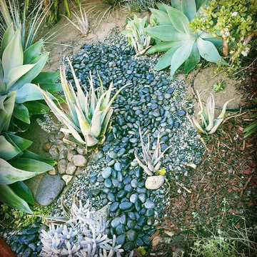
This section of the front yard was excavated and filled in with drainage rocks to create a Rain Garden. This is situated in a spot that captures storm-water flow coming down the hillside and provides a basin to store rainwater that normally would have run straight off the slope.
Blue River Rocks cover the area and create an illusion of water when wet.
 M Atelier
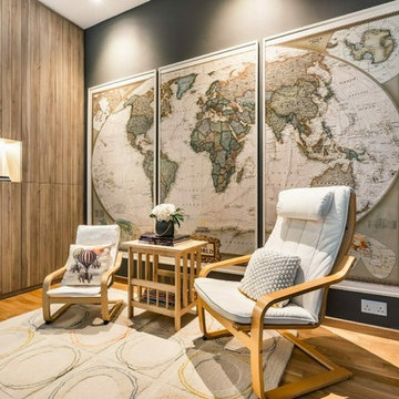
If there is one big mistake that homeowners make when carrying out the decoration tasks of their interior design project, that would be over-accessorising. Indeed, experts in interior design in Singapore agree that there are styles where “more is more,” and there are also those where “less is more.”
While as a homeowner you may choose either of these two style directions, you should first think about the different aspects of interior design and make sure that your style choice fits with these elements. Not doing so may not only result to a poorly executed renovation, but a home that you will find uncomfortable to live in.
So how do you avoid the tendency of over-accessorising? You may want to follow these pieces of advice coming from professionals in interior design in Singapore:
Mistake #1: Using the same fabric on almost all surfaces.
It is common practice among most homeowners to use almost the same fabric on all table surfaces, and sometimes even on sofa covers and drapes. Indeed, this can be cost effective, but it does not contribute to the development of the home’s overall design.
This is because there are fabrics are created to meet specific purposes. For example, lace is often used as table runners, as they give more definition and style to these specific furniture pieces. However, they do not do your windows any favours when used as curtains.
Opaque and heavy fabrics are often intended for curtains and drapes for rooms that require more privacy; in contrast, sheer and fabric materials are more suited for living room windows as they allow natural light and ventilation to move around the house.
Mistake #2: Placing more accents than you actually need.
Another mistake which homeowners are prone to make when decorating their home is placing more accents than needed. There are homes you can see side tables that are overpopulated with picture frames, trinkets, and fancy souvenirs that do not have any connection to each other. Sometimes, you can find numerous throw pillows occupying almost the entire sofa, to the point that all the seats are already occupied.
These are classic examples of “fear of empty spaces,” which is prevalent in most Asian societies, and even in some Western countries. But while it is common practice to occupy empty spaces, you may also want to think about what to do with the space first.
Instead of piling up all your memorabilia in the side tables of your bedroom or living room, why not use a tiered stand so that they can be presented in an organised manner? You may also want to choose a designated area for your trinkets, such as a wall or an unoccupied corner in your room.
Mistake #3: Overdoing the lighting fixtures.
Some homeowners want to imitate the homes of the celebrities they see on TV, and apart from following the same colour schemes and choice of furniture, they also choose to add more lights in their rooms than necessary.
Well, you should understand that the purpose of lighting fixtures is to illuminate the rooms of the house, but this doesn’t mean that you have to brighten up your home all the time. You may want to use lamps that spread the light across the room, rather than several smaller bulbs. The latter only lights up specific parts of the room, and when all these bulbs are lit simultaneously, they only spike up your electric bill.
It would be better to choose lighting fixtures according to your need and the function of the room. Doing so not only illuminates your home properly, but also creates an ambiance that gives you the comfort you are looking for in a dwelling space.

13