
Search results for "Traditionally caused" in Home Design Ideas
 TVL Creative Ltd.
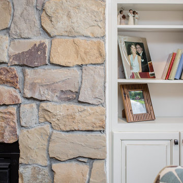
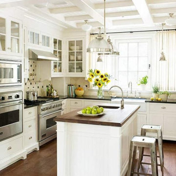
This project included a massive renovation to nearly all spaces in the home: the entry, living room, family room, dining room, kitchen, staircase, and master bathroom. Each space underwent a massive transformation in order to create the elegant & traditional aesthetic that our clients love. On the main level of the home, the original space layout was extremely compartmentalized and dark. Our clients wanted to open up and brighten the space as much as possible. In addition to this, a major goal was to increase function and to create a welcoming environment for guests and the clients alike. We started by opening up the space plan significantly. This allows for flowing space between the kitchen, front living room, and rear family room. Light is better carried through these spaces, and further emphasized with airy colors, light cabinetry, and a better lighting plan overall. We removed the old decorative ceiling beams and reworked closets and hallways to create a more open and functional main level. The kitchen offers a large amount of counter space and storage opportunity, but also welcomes guests at a sizable island and secondary peninsula. Beyond the kitchen, we designed a work nook where display storage and functional workspace are both present. We reworked both fireplaces in the home to create warm nooks for gathering: both fireplaces feature large format stone and are flanked with display shelving. The master bathroom upstairs was completely reworked as well. We eliminated the oversized drop-in tub and in-wall fireplace, and took away the steam shower that had been causing water and mildew issues for years. We relocated the toilet and developed a gorgeous vanity area in the space where the old bathtub and fireplace used to be. We then created a massive shower room in lieu of a tub/shower combination. The bathroom is adorned with warm tones and natural textures: marble subway tile runs up the entire wall behind the vanity, wood-look porcelain covers the floor and back wall of the shower, and simple artisan subway tiles in a creamy vanilla tone cover the shower walls. These spaces completely transformed the look and feel of the house, and we are so happy our amazing clients get to enjoy this home with their family for years to come!
 TVL Creative Ltd.
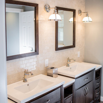
This project included a massive renovation to nearly all spaces in the home: the entry, living room, family room, dining room, kitchen, staircase, and master bathroom. Each space underwent a massive transformation in order to create the elegant & traditional aesthetic that our clients love. On the main level of the home, the original space layout was extremely compartmentalized and dark. Our clients wanted to open up and brighten the space as much as possible. In addition to this, a major goal was to increase function and to create a welcoming environment for guests and the clients alike. We started by opening up the space plan significantly. This allows for flowing space between the kitchen, front living room, and rear family room. Light is better carried through these spaces, and further emphasized with airy colors, light cabinetry, and a better lighting plan overall. We removed the old decorative ceiling beams and reworked closets and hallways to create a more open and functional main level. The kitchen offers a large amount of counter space and storage opportunity, but also welcomes guests at a sizable island and secondary peninsula. Beyond the kitchen, we designed a work nook where display storage and functional workspace are both present. We reworked both fireplaces in the home to create warm nooks for gathering: both fireplaces feature large format stone and are flanked with display shelving. The master bathroom upstairs was completely reworked as well. We eliminated the oversized drop-in tub and in-wall fireplace, and took away the steam shower that had been causing water and mildew issues for years. We relocated the toilet and developed a gorgeous vanity area in the space where the old bathtub and fireplace used to be. We then created a massive shower room in lieu of a tub/shower combination. The bathroom is adorned with warm tones and natural textures: marble subway tile runs up the entire wall behind the vanity, wood-look porcelain covers the floor and back wall of the shower, and simple artisan subway tiles in a creamy vanilla tone cover the shower walls. These spaces completely transformed the look and feel of the house, and we are so happy our amazing clients get to enjoy this home with their family for years to come!
 Advance Design Studio, Ltd.
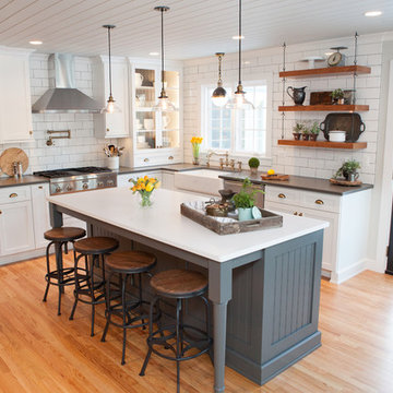
When this suburban family decided to renovate their kitchen, they knew that they wanted a little more space. Advance Design worked together with the homeowner to design a kitchen that would work for a large family who loved to gather regularly and always ended up in the kitchen! So the project began with extending out an exterior wall to accommodate a larger island and more moving-around space between the island and the perimeter cabinetry.
Style was important to the cook, who began collecting accessories and photos of the look she loved for months prior to the project design. She was drawn to the brightness of whites and grays, and the design accentuated this color palette brilliantly with the incorporation of a warm shade of brown woods that originated from a dining room table that was a family favorite. Classic gray and white cabinetry from Dura Supreme hits the mark creating a perfect balance between bright and subdued. Hints of gray appear in the bead board detail peeking just behind glass doors, and in the application of the handsome floating wood shelves between cabinets. White subway tile is made extra interesting with the application of dark gray grout lines causing it to be a subtle but noticeable detail worthy of attention.
Suede quartz Silestone graces the countertops with a soft matte hint of color that contrasts nicely with the presence of white painted cabinetry finished smartly with the brightness of a milky white farm sink. Old melds nicely with new, as antique bronze accents are sprinkled throughout hardware and fixtures, and work together unassumingly with the sleekness of stainless steel appliances.
The grace and timelessness of this sparkling new kitchen maintains the charm and character of a space that has seen generations past. And now this family will enjoy this new space for many more generations to come in the future with the help of the team at Advance Design Studio.
Photographer: Joe Nowak
Find the right local pro for your project
 FineLine Kitchens, Inc.
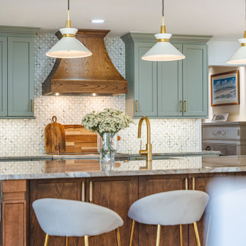
Hi everyone, I'm Sarah and Ogun we are here with fine line kitchens. So we are a couple working together. I do the interior design and remodeling of the space material selection meeting with the clients. And I handled operations outside, you know meaning all the construction work that is taking place the inside. The houses that we work in. I handle all the aspects of the construction, so today's project is very special. We're in Vienna and the client had a very big family. It's a family of seven that lives here. So we had a few aspects that we needed to keep in mind while designing this one. Having everybody be able to sit on the island. So we wanted plenty of seating all the way around. We didn't want anybody standing or anything like that. So what we did is we maximize the space. The center island is the biggest part of the kitchen. We use a natural stone to kind of give it a beautiful texture versus quartz. It's kind of standard white or kind of fabricated, so I wanted something very natural. We did this because I took my inspiration from the outside, so the inspiration if you look at the view right in front of me is there are so many greens there's a lot of brass accents and I wanted to bring this. Into this kitchen while designing it for my clients. She is very warm very. She wanted a very homey, comfy kind of look for the kitchen. So that's what we did today. As you can see, the cabinets are sage green, very light, so I still think it's a neutral, but it's a lighter color that again brings the outside in and we combine that with the oak right behind me so it's a slightly warm oak. It's not very dark. It's not very light. It's a medium brown and the same color went on the island. To kind of tie these two in and the backsplash, my favorite part is where you can see a little bit of design. It is, in my opinion still classic, but includes a pattern so the outside part is as we said in the beginning, is handled by my husband. I'd like him to speak a little bit about that. Thanks, Sarah, I want to talk to you guys a little bit about the construction part of this project. Originally this kitchen was located mostly in this area. They had their stove there sing. It was more of a peninsula layout in Sarah's and the customer vision they wanted. They wanted to get rid of the peninsula and they want to be able to have a huge island that can at least sit seven people because they're familiar with seven. So we wanted to make sure that we can achieve this design and bring it to life so that they can be happy with this layout. Some of the challenges we had, the house, the home being, you know, old home. There were a lot of you know the older electrical and plumbing that had to be replaced. We had to relocate the stove from here to this area. Over here we had put a nice foot fan that we had to relocate all the ductwork and the plumbing. Was being on the peninsula area. We had to relocate it to the center islands. So we achieved all this and kind of like bring it to bring in this kitchen up to date it looks beautiful. That's true, so yes, the old layout did not function for my clients because everything was kind of gathered on one side of the kitchen. So there was like a peninsula right there. So the end of this island kind of continued straight. And that was just the L shape. Kind of where everything was and there used to be another big table here, so they were using only kind of half of the space. So like I said at the beginning, our vision was to kind of feed everybody at the island, create some symmetry. 'cause I love that. So as you can see behind me, this is kind of the focal point symmetrical. Everything is kind of even we wanted to also panel the fridge here so it mimics the pantry and another size. So when you're looking at it, it is bringing again that symmetry back again. I hope you enjoyed this kitchen and this video and I'll see you soon. So how do you think this project turned out? It's nice. I like the color. I think it turned out nice. It's kind of like a little bit different color than what we always do. So I realize. Are you giving me a little bit of credit here that I did something different? Are you proud? I'm so proud of you. Other than that I like it. That they have kind of like a two sink. So if this was our kitchen, if we ever like you can have your own. I can have mine if we ever get into a fight then this can be like my own kitchen. Why are we gonna bring in a fight right now? So I'm cooking anyway. You're grilling most of the time, So what are you even talking about? My kitchen? That's my kitchen. You can just take the small sink. That's fine. It's always good to have your own space right there, so anyways. Thank you guys for watching. We hope to see you soon and if you have any questions please click the link below. It'll lead you to our website, house, YouTube and all of the social media is so nice to have you guys. We'll see you soon. Thanks bye bye-bye.
 Lauren Dunec Hoang
Photo: Lauren Dunec Hoang © 2017 Houzz
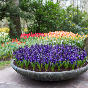
This is an example of a landscaping in Amsterdam.
This is an example of a landscaping in Amsterdam.
 AquaTerra Outdoors
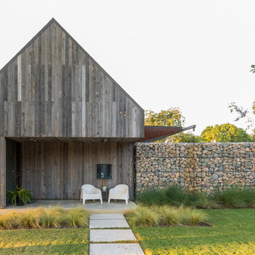
This minimalistic landscape design of grasses and concrete allow the dominate form of the residence shine.
Photography Credit: Wade Griffith
Mid-sized rustic brown wood gable roof idea in Dallas
Mid-sized rustic brown wood gable roof idea in Dallas


Sponsored
Columbus, OH
Free consultation for landscape design!

Peabody Landscape Group
Columbus' Reliable Landscape Design & Contracting
 Gill Design Co.
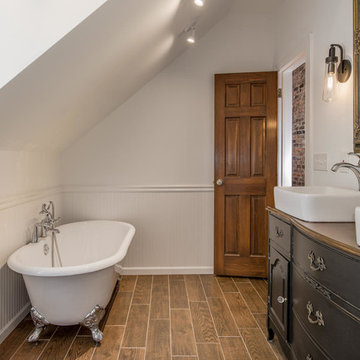
A leaky garden tub is replaced by a walk-in shower featuring marble bullnose accents. The homeowner found the dresser on Craigslist and refinished it for a shabby-chic vanity with sleek modern vessel sinks. Beadboard wainscoting dresses up the walls and lends the space a chabby-chic feel.
Garrett Buell
 Sarah Greenman
Photo: Sarah Greenman © 2014 Houzz
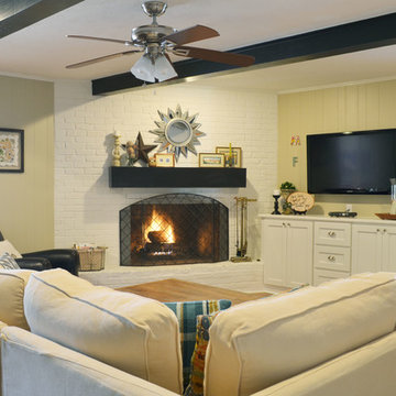
Living room - traditional living room idea in Dallas
Living room - traditional living room idea in Dallas
 Cathie Hong Interiors
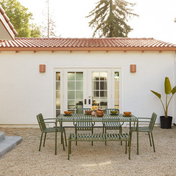
This traditional Spanish style home in Willow Glen was updated and transformed into a blend of Spanish and Japandi style, to honor both the architectural style of the home, as well as the owners' personal and cultural aesthetic. This was designed in collaboration with architect Story Build Design.

 Deep River Partners
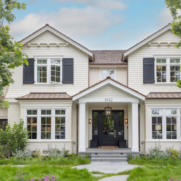
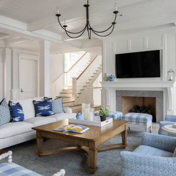
Airy, open, and connected to the lake...at our Lake Country Retreat, the Great Room captures the spirit of coastal living. We used a bright white palette, and tongue and groove ceiling panel framed by beams to set the design theme throughout. Each space is defined, yet the floorplan's open sightlines create a seamless sense of connection and maximize the lake views from every angle.
 Board & Vellum
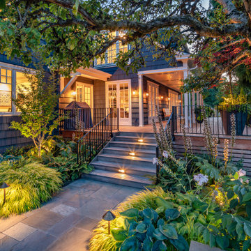
Even as night descends, the new deck and green plantings feel bright and lively.
Photo by Meghan Montgomery.
Large elegant backyard ground level privacy and metal railing deck photo in Seattle with a roof extension
Large elegant backyard ground level privacy and metal railing deck photo in Seattle with a roof extension

 InnovationLand
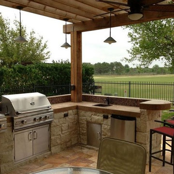
We love this rustic-modern Houston patio addition with an outdoor kitchen and double pergola!
It not only made the most of a long, narrow space while satisfying strict homeowners association rules, but did so affordably in a warm, timeless style.
“The client really enjoys outdoor living, but had a specific budget they wanted to meet,” explains Outdoor Homescapes owner Wayne Franks. “They also live on a golf course and had to meet particular HOA requirements.”
The HOA requirements restricted how far back the new 450-square-foot patio and pergola could extend back into the yard. The HOA also wanted to make sure the patio’s colors and materials matched the existing home and others around it.
“We chose colors and materials that offered texture and character, but that would go with just about anything around it,” says Wayne. “We found what we were looking for in the Fantastico travertine and Austin limestone – two materials clients love and just can’t go wrong with.”
The Austin limestone facing the 8-foot-square, L-shaped kitchen island is dry-stacked in a castle pattern for a naturalistic, rustic look. Yet its light, neutral color keeps the style fresh and modern.
Adding to the modern look are the stainless steel appliances: an RCS 30-inch stainless steel grill, double burner and outdoor fridge. Even though the finishes on the sink and light fixtures (Hunter pendant lamps and Hampton Bay light/fan combos) have a different finish – oil-rubbed-bronze – this actually follows the recent trend of mixing different metals, materials and finishes.
“The look’s not so matchy-matchy anymore,” explains Wayne. “Mixing it up makes it look more authentic and personalized.”
That’s why backsplashes like the one in this project – done in glass and metal mosaic – are also becoming more popular than traditional ceramic tile.
Another recent trend can be seen here, too – an amping up of color variation and texture.
“In addition to the split-face texture of the rock, you can definitely see the bold color variation in the travertine,” says Wayne.
The flooring is a Fantastico travertine, laid out in a Versailles pattern. “The Fantastico tile is killer,” says Wayne. “The warm reds go great with red brick, which we have a lot of around here.”
The countertop with the rounded, raised bar at the end is English walnut travertine.
The red bar stools also add a pop of exciting color that contrasts nicely with the greenery around the patio.
The double pergola, continues Wayne, is No. 2 pine stained a Minwax honey-gold. One side of the pergola – the side over the seating area – is covered with Lexan, a clear material that keeps out rain, heat and UV rays.
The pergola also juts further into the yard on that side. “It’s called a scallop, and it just lends some visual interest,” explains Wayne. “It prevents the pergola from just looking like one big rectangular hunk of wood.”
Wayne particularly likes how everything blended so well with the brick – which was a big concern – yet didn’t come off as too neutral or boring.
“The Fantastico travertine and red chairs do an excellent job of pulling the red from the brick and working with the warmth of that color to make a super-inviting space,” says Wayne. “We’re really pleased with how it all ties together so well.”
 Forward Design Build Remodel
Goals
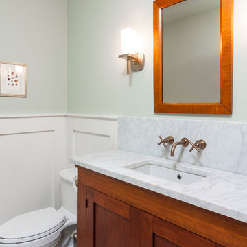
While their home provided them with enough square footage, the original layout caused for many rooms to be underutilized. The closed off kitchen and dining room were disconnected from the other common spaces of the home causing problems with circulation and limited sight-lines. A tucked-away powder room was also inaccessible from the entryway and main living spaces in the house.
Our Design Solution
We sought out to improve the functionality of this home by opening up walls, relocating rooms, and connecting the entryway to the mudroom. By moving the kitchen into the formerly over-sized family room, it was able to really become the heart of the home with access from all of the other rooms in the house. Meanwhile, the adjacent family room was made into a cozy, comfortable space with updated fireplace and new cathedral style ceiling with skylights. The powder room was relocated to be off of the entry, making it more accessible for guests.
A transitional style with rustic accents was used throughout the remodel for a cohesive first floor design. White and black cabinets were complimented with brass hardware and custom wood features, including a hood top and accent wall over the fireplace. Between each room, walls were thickened and archway were put in place, providing the home with even more character.
 Visbeen Architects
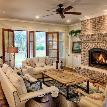
This well-proportioned two-story design offers simplistic beauty and functionality. Living, kitchen, and porch spaces flow into each other, offering an easily livable main floor. The master suite is also located on this level. Two additional bedroom suites and a bunk room can be found on the upper level. A guest suite is situated separately, above the garage, providing a bit more privacy.
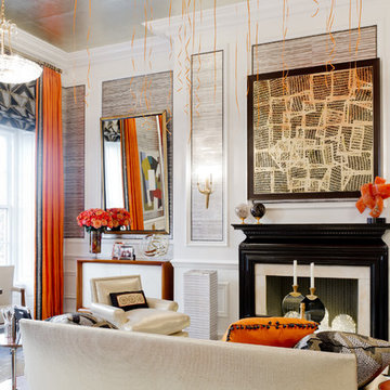
 Rikki Snyder
Cullman & Kravis, Bedroom
Holiday: 30th Anniversary
Photo: Rikki Snyder © 2013 Houzz
Inspiration for an eclectic living room remodel in New York
Inspiration for an eclectic living room remodel in New York



 Luster Custom Homes & Remodeling
Ryan Garvin Photography
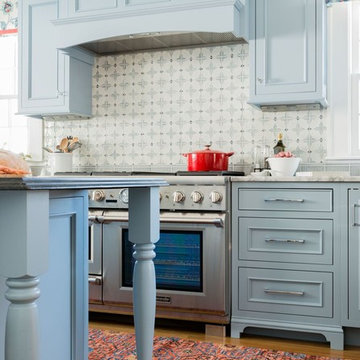
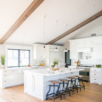
Large country medium tone wood floor and brown floor kitchen photo in Phoenix
Large country medium tone wood floor and brown floor kitchen photo in Phoenix
13