
Search results for "Typical challenges" in Home Design Ideas
 Bilotta Kitchen & Home
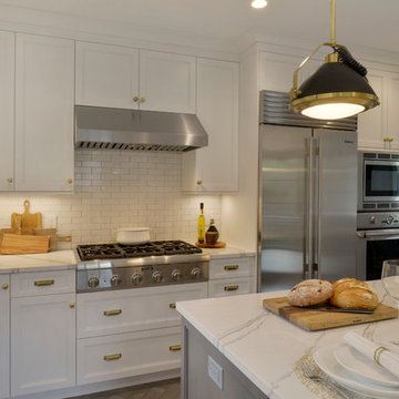
For this kitchen, designed by Peter Bittner, the client had a very clear idea of what she wanted right from the start. She did her research. The mother of a fast growing, young family, she wanted something as efficient as it was beautiful – on the simple, yet elegant side. Her requests were straightforward: white and light grey Bilotta cabinetry in a transitional style so as not to compete with the detailing inside her 1950s Tudor-style home; a heated tile floor (By Rye Ridge Tile); stainless appliances; white subway tile backsplash by Walker Zanger (again to keep it clean and not compete with its surroundings); and seating at the island for snacks and homework. The “pop” suggested by Peter was done through the satin brass hardware and lighting fixtures. The real challenge with this space was to fit as much as possible into the existing footprint which was overall on the smaller side. The solution was eliminating a doorway (with a swinging door that opened into the kitchen) and stairs from the kitchen to the basement. By moving the stairs and doorway, the usable space increased considerably. The typical working triangle became the focus for one side of the kitchen and the island overhang and seating became available on the other side. To make up for the limited amount of wall cabinets Peter designed shallow pantry-style cabinets along the back wall. Quartz Countertops by Rom Stone Fabrication. Designer: Peter Bittner Photographer: Peter Krupenye
 Renovisions
This client requested that we design her new kitchen space to look and function with her and her family’s usage in mind. She was not happy with her existing kitchen due to builder-grade ceramic flooring, lack of countertop space, poor lighting, inadequate and unorganized storage and the closed off feel of the area. Renovisions resolved all of these issues by designing and building an impressive, transitional styled kitchen; delivering a beautifully well thought-out space that provides a multi-functional approach and meets the needs of this busy and dynamic household.
Typically, we encounter challenges in every project, and this was no different. The upstairs bathroom plumbing ran across the entire length of the kitchen sink wall and it was necessary to work with it by moving the plumbing as far up as possible and then building a soffit to hide it.
Creating a space that has a more open feel was top of mind for our client. Installing a new wood floor that matched the existing dining room floor helped with this and in addition, warmed up the room. By relocating the refrigerator to the opposite wall and adding a bar area at the end toward the family room, the flow of traffic for family members and guests became more managed.
The open floor plan allowed for additional island cabinets to accommodate smart storage and better functionality when prepping meals, sitting to eat or gathering with friends and family. We believe having ample countertop surface space is a critical improvement in any renovation and this particular project now boasts a large countertop area with a stunning wide vein pattern that accentuates the design instead of overpowering it. The soft look of the Blanco Arabescato quartz enhances the space and looks lovely with the white inset styled cabinetry.
Beauty and function go hand-in-hand in this kitchen with several exceptional elements such as under-cabinet lighting with dimmers to control the mood light. Glass doors were added to the wall cabinets which flank the wine rack for displaying their decorative glassware and a beverage cooler below provided added convenience and access to cold beverages. The GE Café line of appliances in ‘Slate’ and ‘Stainless Steel’ finishes are a stunning contrast here.
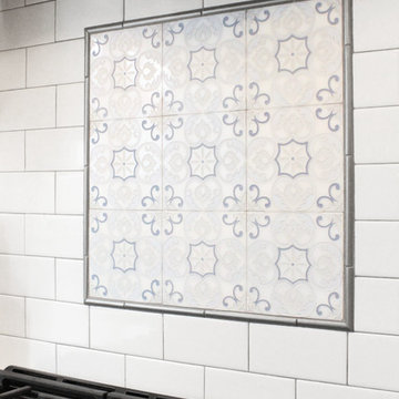
The sensational looking decorative marble 6”x6” backsplash tile over the gas range and in the bar area creates nice focal points by creating a unique look for her that family and guests love.
Convenient and functional elements were added such as a blind corner pull-out for easier pot/pan storage, a sweep-o-vac under cabinet vacuum system for those constant quick clean-ups, a pull-out caddy under the sink base for storage of cleaning products and a protective mat to collect potential spills.
Our client let us know it was time for a change and we listened. She shared a few pictures she loved from a home magazine, we shared our insight and then designed/built the kitchen of her dreams! … A fabulous and functional space.
 TKS Design Group
Free ebook, Creating the Ideal Kitchen. DOWNLOAD NOW
The Klimala’s and their three kids are no strangers to moving, this being their fifth house in the same town over the 20-year period they have lived there. “It must be the 7-year itch, because every seven years, we seem to find ourselves antsy for a new project or a new environment. I think part of it is being a designer, I see my own taste evolve and I want my environment to reflect that. Having easy access to wonderful tradesmen and a knowledge of the process makes it that much easier”.
This time, Klimala’s fell in love with a somewhat unlikely candidate. The 1950’s ranch turned cape cod was a bit of a mutt, but it’s location 5 minutes from their design studio and backing up to the high school where their kids can roll out of bed and walk to school, coupled with the charm of its location on a private road and lush landscaping made it an appealing choice for them.
“The bones of the house were really charming. It was typical 1,500 square foot ranch that at some point someone added a second floor to. Its sloped roofline and dormered bedrooms gave it some charm.” With the help of architect Maureen McHugh, Klimala’s gutted and reworked the layout to make the house work for them. An open concept kitchen and dining room allows for more frequent casual family dinners and dinner parties that linger. A dingy 3-season room off the back of the original house was insulated, given a vaulted ceiling with skylights and now opens up to the kitchen. This room now houses an 8’ raw edge white oak dining table and functions as an informal dining room. “One of the challenges with these mid-century homes is the 8’ ceilings. I had to have at least one room that had a higher ceiling so that’s how we did it” states Klimala.
The kitchen features a 10’ island which houses a 5’0” Galley Sink. The Galley features two faucets, and double tiered rail system to which accessories such as cutting boards and stainless steel bowls can be added for ease of cooking. Across from the large sink is an induction cooktop. “My two teen daughters and I enjoy cooking, and the Galley and induction cooktop make it so easy.” A wall of tall cabinets features a full size refrigerator, freezer, double oven and built in coffeemaker. The area on the opposite end of the kitchen features a pantry with mirrored glass doors and a beverage center below.
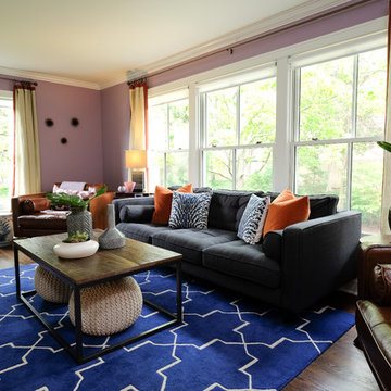
The rest of the first floor features an entry way, a living room with views to the front yard’s lush landscaping, a family room where the family hangs out to watch TV, a back entry from the garage with a laundry room and mudroom area, one of the home’s four bedrooms and a full bath. There is a double sided fireplace between the family room and living room. The home features pops of color from the living room’s peach grass cloth to purple painted wall in the family room. “I’m definitely a traditionalist at heart but because of the home’s Midcentury roots, I wanted to incorporate some of those elements into the furniture, lighting and accessories which also ended up being really fun. We are not formal people so I wanted a house that my kids would enjoy, have their friends over and feel comfortable.”
The second floor houses the master bedroom suite, two of the kids’ bedrooms and a back room nicknamed “the library” because it has turned into a quiet get away area where the girls can study or take a break from the rest of the family. The area was originally unfinished attic, and because the home was short on closet space, this Jack and Jill area off the girls’ bedrooms houses two large walk-in closets and a small sitting area with a makeup vanity. “The girls really wanted to keep the exposed brick of the fireplace that runs up the through the space, so that’s what we did, and I think they feel like they are in their own little loft space in the city when they are up there” says Klimala.
Designed by: Susan Klimala, CKD, CBD
Photography by: Carlos Vergara
For more information on kitchen and bath design ideas go to: www.kitchenstudio-ge.com
Find the right local pro for your project
 TKS Design Group
Free ebook, Creating the Ideal Kitchen. DOWNLOAD NOW
The Klimala’s and their three kids are no strangers to moving, this being their fifth house in the same town over the 20-year period they have lived there. “It must be the 7-year itch, because every seven years, we seem to find ourselves antsy for a new project or a new environment. I think part of it is being a designer, I see my own taste evolve and I want my environment to reflect that. Having easy access to wonderful tradesmen and a knowledge of the process makes it that much easier”.
This time, Klimala’s fell in love with a somewhat unlikely candidate. The 1950’s ranch turned cape cod was a bit of a mutt, but it’s location 5 minutes from their design studio and backing up to the high school where their kids can roll out of bed and walk to school, coupled with the charm of its location on a private road and lush landscaping made it an appealing choice for them.
“The bones of the house were really charming. It was typical 1,500 square foot ranch that at some point someone added a second floor to. Its sloped roofline and dormered bedrooms gave it some charm.” With the help of architect Maureen McHugh, Klimala’s gutted and reworked the layout to make the house work for them. An open concept kitchen and dining room allows for more frequent casual family dinners and dinner parties that linger. A dingy 3-season room off the back of the original house was insulated, given a vaulted ceiling with skylights and now opens up to the kitchen. This room now houses an 8’ raw edge white oak dining table and functions as an informal dining room. “One of the challenges with these mid-century homes is the 8’ ceilings. I had to have at least one room that had a higher ceiling so that’s how we did it” states Klimala.
The kitchen features a 10’ island which houses a 5’0” Galley Sink. The Galley features two faucets, and double tiered rail system to which accessories such as cutting boards and stainless steel bowls can be added for ease of cooking. Across from the large sink is an induction cooktop. “My two teen daughters and I enjoy cooking, and the Galley and induction cooktop make it so easy.” A wall of tall cabinets features a full size refrigerator, freezer, double oven and built in coffeemaker. The area on the opposite end of the kitchen features a pantry with mirrored glass doors and a beverage center below.
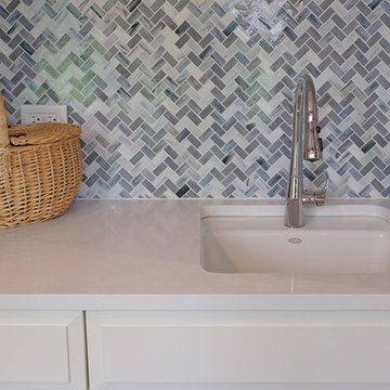
The rest of the first floor features an entry way, a living room with views to the front yard’s lush landscaping, a family room where the family hangs out to watch TV, a back entry from the garage with a laundry room and mudroom area, one of the home’s four bedrooms and a full bath. There is a double sided fireplace between the family room and living room. The home features pops of color from the living room’s peach grass cloth to purple painted wall in the family room. “I’m definitely a traditionalist at heart but because of the home’s Midcentury roots, I wanted to incorporate some of those elements into the furniture, lighting and accessories which also ended up being really fun. We are not formal people so I wanted a house that my kids would enjoy, have their friends over and feel comfortable.”
The second floor houses the master bedroom suite, two of the kids’ bedrooms and a back room nicknamed “the library” because it has turned into a quiet get away area where the girls can study or take a break from the rest of the family. The area was originally unfinished attic, and because the home was short on closet space, this Jack and Jill area off the girls’ bedrooms houses two large walk-in closets and a small sitting area with a makeup vanity. “The girls really wanted to keep the exposed brick of the fireplace that runs up the through the space, so that’s what we did, and I think they feel like they are in their own little loft space in the city when they are up there” says Klimala.
Designed by: Susan Klimala, CKD, CBD
Photography by: Carlos Vergara
For more information on kitchen and bath design ideas go to: www.kitchenstudio-ge.com
 Drewett Works
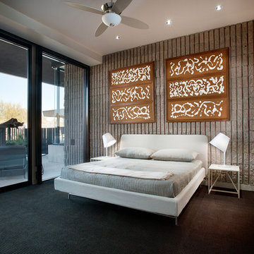
Believe it or not, this award-winning home began as a speculative project. Typically speculative projects involve a rather generic design that would appeal to many in a style that might be loved by the masses. But the project’s developer loved modern architecture and his personal residence was the first project designed by architect C.P. Drewett when Drewett Works launched in 2001. Together, the architect and developer envisioned a fictitious art collector who would one day purchase this stunning piece of desert modern architecture to showcase their magnificent collection.
The primary views from the site were southwest. Therefore, protecting the interior spaces from the southwest sun while making the primary views available was the greatest challenge. The views were very calculated and carefully managed. Every room needed to not only capture the vistas of the surrounding desert, but also provide viewing spaces for the potential collection to be housed within its walls.
The core of the material palette is utilitarian including exposed masonry and locally quarried cantera stone. An organic nature was added to the project through millwork selections including walnut and red gum veneers.
The eventual owners saw immediately that this could indeed become a home for them as well as their magnificent collection, of which pieces are loaned out to museums around the world. Their decision to purchase the home was based on the dimensions of one particular wall in the dining room which was EXACTLY large enough for one particular painting not yet displayed due to its size. The owners and this home were, as the saying goes, a perfect match!
Project Details | Desert Modern for the Magnificent Collection, Estancia, Scottsdale, AZ
Architecture: C.P. Drewett, Jr., AIA, NCARB | Drewett Works, Scottsdale, AZ
Builder: Shannon Construction | Phoenix, AZ
Interior Selections: Janet Bilotti, NCIDQ, ASID | Naples, FL
Custom Millwork: Linear Fine Woodworking | Scottsdale, AZ
Photography: Dino Tonn | Scottsdale, AZ
Awards: 2014 Gold Nugget Award of Merit
Feature Article: Luxe. Interiors and Design. Winter 2015, “Lofty Exposure”
 Studio 1200
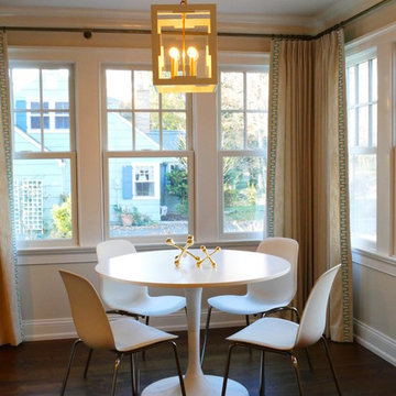
With a location right in the heart of vibrant Madison New Jersey, this house has a prime location in a charming and desirable neighborhood. The new owners’ dream for a Shingle Style house more typical of the size and style of other houses in the neighborhood was challenged by the fact that the building coverage was already maxed for the property. Any increases would have to be done within the existing footprint.
Studio 1200 was able to provide a more substantial and functional living experience for the family by adding one story and reconfiguring the first floor to create a better flow. A new kitchen and dining room were created and relocated to rear of the house, resulting in an easy egress to the private patio and backyard. A new mudroom, spare bedroom, powder room, office and covered porch completed the modern layout of the first floor, all within the same original footprint. The addition of a fireplace to the covered porch meant this space can be used practically year-round. The second floor also received an upgrade through redesign, introducing a special master suite with 2 separate walk-in closets as well as a bathroom with a dramatic soaking tub. Completing the second floor are three more bedrooms, two bathrooms, and a laundry room. Atop it all is an attic, providing storage space that was not in the original home’s design.
 Living with Lolo
Dining Room in Hodges Street | Room Type:
Whole Home Interior Design |
Project Name:
Hodges Street |
Key Feature:
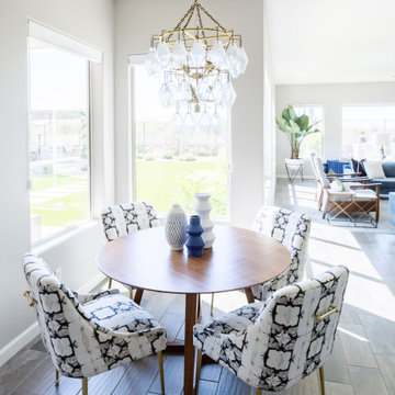
A builder-grade tract home transformed with personality through a playful mid-century modern design influence.
Challenge:
The home originally lacked character and felt like a typical builder-grade tract house. The goal was to elevate the space and create a more distinctive interior.
Solution:
The design introduced bold styling and mid-century modern touches throughout the home, adding personality and visual interest while creating a more elevated and cohesive interior.
Timeline:
Completed in 2018.


 Kariouk Associates
m.o.r.e. Cabin
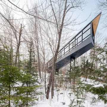
The paradigmatic North American cottage is romanticized as a wilderness log cabin. Nonetheless, typical cottages are “woodsy” versions of suburban homes with every modern convenience. These buildings sustain the myth that appearing to be one with the land equates to a reduced impact on the environment.
The m.o.r.e. Cabin inverts this idea through a separation from the landscape that is more sustainably constructed than other cottages. This unravelling of eco-fictions is not cynical, but optimistic: while organic environments are being degraded, what remains can be engaged more responsibly.
To this end, m.o.r.e. Cabin touches the land lightly through:
- Interpreting the law creatively to uphold its principles.
- Reducing foundation size through a steel mast.
- Low-waste cross-laminated timber (CLT) structure.
- Achieving greater tensile strength through a “folded” structure.
- Off-grid power and high-efficiency heating.
- Creating a home for endangered bats.
Interpreting the Law with Finesse
Zoning rules required a 100-foot (30-metre) setback from the lake. A cliff face at that 100-foot mark was incorporated into the design, whereas conventional construction approaches would entail blasting.
To minimize harm to the hillside and forest, a zoning variance was obtained to allow the front of m.o.r.e. Cabin to hover above, rather than sit on, the 100-foot (30-metre) mark.
The Mast
The technical solution to the environmental issue involved a single concrete footing and a steel “mast” placed within the required setback.
Avoiding a conventional large foundation preserved the watershed and prevented erosion, as did elevating the construction zone. Use of carbon-intensive concrete was also reduced for a lower carbon footprint.
m.o.r.e. Than One Way to Skin a Home
m.o.r.e. Cabin is built with suitably-sourced CLT panels and glulam beams.
The CLT was milled offsite then hoisted into place, avoiding damage to the landscape by the maneuvering of construction machinery.
Cabin-as-Beam
m.o.r.e. Cabin’s environmental considerations yielded structural innovation. Our challenge became to develop a structural strategy using cantilevered CLT panels as a response to the zoning variance that we obtained; CLT is fundamentally deployed in vertical/compressive sections, not horizontally in tension.
Conventional 5-ply CLT is too heavy to support itself over longer spans. The solution used thinner 3-ply CLT, with structural capacity ensured through “folding” (just like paper gains strength when folded).
Off-Grid
The home is solar-powered.
The elevated cottage catches more breezes and has excellent cross-ventilation. Heat is provided by a high-efficiency “green carbon” wood stove. Good R-value and thermal comfort are provided by CLT’s mass, and precise joinery provides air-tightness.
Inviting Over the Neighbours
One goal of the home was to create extensive lodging for endangered brown bats. Bat pods were integrated into the mast to provide safety from climbing predators and a clear flight path to the lake.
*“m.o.r.e.” stands for the clients’ grandmothers’ names; all of whom did more with less — and gracefully so.
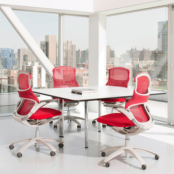
 Soft Square-Modern & Contemporary Furniture Store
Responding to ergonomic research that challenges the idea that we only sit in a single forward-facing position, Generation is designed to support the range of postures and work-styles typical of today's workplace, allowing you to sit how you want.
www.softsquare.com
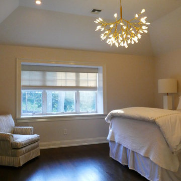 Studio 1200
With a location right in the heart of vibrant Madison New Jersey, this house has a prime location in a charming and desirable neighborhood. The new owners’ dream for a Shingle Style house more typical of the size and style of other houses in the neighborhood was challenged by the fact that the building coverage was already maxed for the property. Any increases would have to be done within the existing footprint.
Studio 1200 was able to provide a more substantial and functional living experience for the family by adding one story and reconfiguring the first floor to create a better flow. A new kitchen and dining room were created and relocated to rear of the house, resulting in an easy egress to the private patio and backyard. A new mudroom, spare bedroom, powder room, office and covered porch completed the modern layout of the first floor, all within the same original footprint. The addition of a fireplace to the covered porch meant this space can be used practically year-round. The second floor also received an upgrade through redesign, introducing a special master suite with 2 separate walk-in closets as well as a bathroom with a dramatic soaking tub. Completing the second floor are three more bedrooms, two bathrooms, and a laundry room. Atop it all is an attic, providing storage space that was not in the original home’s design.
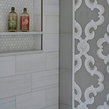
 Drury Design
The original idea was to update the tile floor and the tub. That’s it.
A further discussion of wants and needs revealed intentions for an eventual larger shower and an improved vanity storage. It made sense to map out the possibilities and design our update with potential next steps in mind. The process was exciting, ultimately leading to the decision to do a full primary bath remodel.
Design Objectives:
-Maintain existing locations for all major bathroom functions
-Make the shower larger and more open
-Use luxurious materials throughout
-Improve vanity storage and define accessories for specific items
-Incorporate luxury shower fixtures
-Include the latest technology
Design Challenges
-Enlarging the shower in a typical rectangular shape would block the view and light from the alcove windows behind the tub
-Logical placement of the built-in shower caddy and all shower components in accordance with how and where they were to be used
-Keeping the long, back wall free from any shower modules to maintain the decorative tile design
-Combining the owner’s existing smart home system with a comprehensive shower system
-Planning cabinetry for hidden storage and use for various small appliances and make-up
-Integrating expensive shower wall tile with less expensive wall tile for aesthetic and budget purposes
-Incorporating special design features to balance the highly decorative shower tile
Design solutions:
-A clipped corner was planned for the shower bench seat – this allowed for a larger glass wall. The glass wall at the angled bench also brought more natural light into the shower
-Thoughtful shower space design prevented the crowding of features – the shower caddy and handheld shower head were placed on the full-height wall by the shower bench, the regular shower head and body sprays remained on the opposite wall, and the rain head was placed in the center of the shower
-A multi-port DTV system was installed, providing control of all shower components, including chromotherapy and music inside and outside the shower
-The lavish water-jet stone and glass decorative tile was paired with a less-expensive glass tile found in the mosaic
-Pull-out grooming organizers and electrical docking stations were incorporated into the cabinetry
Additional storage was created in the lower corner cabinet
The homeowners are thrilled with their new primary bathroom. Clear goals and carefully evaluated materials informed a fun and functional design that is both thoughtful and sumptuous!
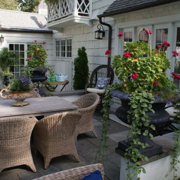
 Stonepocket Unique Landscapes
Landscape by Stonepocket located in Minnetonka, Minnesota Creating a elegant landscape to blend with a home with such character and charm was a challenge in controlled resistant. Did not want the landscape to overwhelm the home, nor did I want a typical landscape for this style that usually involves a box hedge. Utilizing light in the front to create a perennial garden give the home a sense of place. Keep the planting mostly to whites and greens in the back unifies the space.
photos by Stonepocket, Inc
 NY Plantings Irrigation and Landscape Lighting
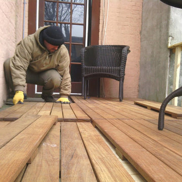
Terrace garden design nyc and hard woodscape design by Newyorkplantings. Greenroof is still in its infancy even though the concept has been around for a long time, even a hundred years or more.
NY plantings has the concept and business model to service the trade by providing expert contracting services, experienced professional staff and project management that effectively and efficiently gets the job done.
Landscape architects, designers, garden designers, landscape design professionals, general contractors, property owners, property management companies, project managers and anyone who requires a company that first is a master garden and NY landscaping company. Tree planting, garden installation and complete plantings installations including personalized design touches such as specimen shrubs, flowering trees, dwarf conifers and trees, landscape boulders and moss rock, flowers and climbers.
NY Plantings can work from a design concept only without requiring a detailed landscape drawing or garden plan. True enthusiasm and years of hands on experience mean that you don’t even need a detailed planting plan; in most cases lead designer, Todd Nappi makes suggestions or improvements to the typical NYC landscape Designer provided garden design plan that both achieve highly desirable results and can possibly even save money vs. the cost of the original rooftop garden design or traditional landscape.
A high technical aptitude with experience in building rooftop and terrace gardens from scratch, solving challenging issues onsite and the ability to make the right decisions prove that NY Plantings is a resource as a landscape or rooftop garden contractor to the Landscape Design trade.
Besides Gardening, Drip irrigation and landscape lighting NY Plantings has been also specializing in hard capes, outdoor construction such as decks, pergolas, custom built planter boxes, custom fence, lattice, trellis and living walls (vertical gardening)
Greenroof design and construction is the new frontier for any urban epicentre and NY Plantings green roofing installers are up to the task.
As the green roof industry becomes more mature so will NY Plantings remain a resource as a contractor for providing and installing greenroof systems in Manhattan and the NY Metro areas.
#newyorkplantings
New York Plantings Garden Designers and Landscape contracting
432 E 14st
New York, NY 10009
Call: 347-558-7051
site url: http://www.newyorkplantings.com/
info@newyorkplantings.com
 Authentic Kitchen & Design
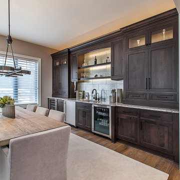
In this luxury, new construction home, our clients desired this custom ‘zen’ bar as part of their dining and living space. It was important to combine elegance with functionality. Tasking such a lovely, custom furniture piece with a long list of responsibilities was quite a challenge but we were able to get the job done beautifully with creativity and custom cabinetry. Together we created a space that had the duty of displaying priceless souvenirs, providing ample storage space, creating a fun, yet elegant ambiance, and keeping beverages chilled and ready to be served. The bar features a kegerator with built-in beer tap and a hammered nickel sink. With the goal of making this piece truly custom, glass floating shelves were designed that allow light to pass through and up-light anything on display but still have the appearance of typical 3” wooden shelves. The wooden pieces were routed to allow for both the lighting strip and the glass, creating the perfect display shelves for any memento.
 RAJ Kitchen and Bath, LLC
 “Full apartment design”.
IF you have not yet seen this apartment conversion before, we strongly urge you to go to the bottom left of this page and click on the short 2-minutes video. It would put a lot of things into perspective when you come back and continue reading this.
It is true we were literally handed the keys and told a list of things that they wanted to have happen and we were to go into the apartment, look at the space and come up with a design that would satisfy all of that need. UNTIL we showed up! The unit had really seen some better days but we knew we had to look past that and come up with a concept that would work for them.
The immediate challenges were centered around 3 big ideas:
1. Adding a second bedroom to the already small footprint
2. Figuring out a way to make the kitchen bigger, better and brighter
3. Creating a master room walk in closet
It’s always difficult to add new rooms into existing footprint without expanding out or up and not incurring any opportunity cost. In this case, that was exactly what we had to do. Item one and two above had to be tackled as one. We went ahead and switched out the location of the dining room and eliminating an area where there was a “nook” type eat-in area. By doing so, we were able to cut right into that footprint and change the layout of the kitchen.
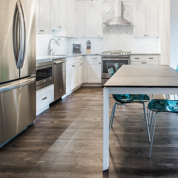
That one move allowed us to dig into the kitchen design because it was now the main focal point in the apartment. It was no longer an option to keep it in that tiny hole where it was, so we had to ensure that this design was functional and aesthetically pleasing at the same time. By adding the table into the space where an Island typically would go, we were able to both cut cost and still provide a dining experience. The Table serves as an Island as well when cooking.
We then proceeded to block in the existing doorway to the dining room. By doing this, we were able to create a full room which allowed us to put a door on the other side and called that room Bedroom #2. This was easier to do because all of the mechanicals were already in that space (light, heater and windows). By shifting things around, we also achieved a huge wall to wall closet from inside. PERFECT!
Then we moved into the Single bedroom. We thought it was a big room with a small closet, so by creatively adding an L shaped wall and steal some footprint into the bedroom side, we were able to put a door on that new room and design it for the walk-in closet. Even after this, the bedroom still holds a queen size bed with 2 night stands, a TV on the wall, a sitting chair and plenty of room to walk around. This was done by rethinking the location for the bed and night stands.
The bathroom was gutted to make sure there was no leaks and rebuild from the ground up. We kept all of the plumbing where it was, added a new vanity, medicine cabinet, tiles and lighting and it was done.
From there, the rest of the unit had new flooring all throughout, paint, and lighting. After completion and walk through, this project was handed over back to the clients.
Execution and collaboration between all the trades were: Reggie and his team from Premier Interiors and Rohan from RD Mechanical Services.
p.s. Please see our website to see the video.
 Maison Birmingham
The main goal of this renovation was to update an authentic mid-century home to suit a modern lifestyle, while still maintaining the original character and aesthetic of the home.
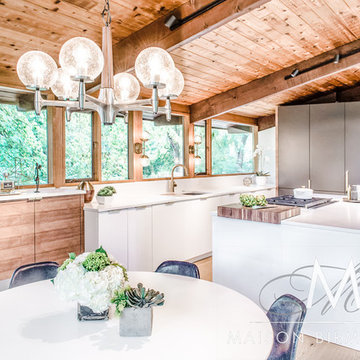
To create a more open, family friendly space also suitable for entertaining, walls between the kitchen, dining room and living room were removed to create an open area to house the 360-sq.-ft. kitchen. Upon demolition, it was noted that some areas of the original tongue and groove ceiling had aged much differently than the rest of the ceiling. Rather than stain the areas and cause them to age differently, we opted to apply oil to darken the wood so that it will all continue to age at the same pace.
Balancing new materials and tones with the existing abundance of wood was challenging, but in the end the balance was achieved with custom cabinetry in both white and anthracite matte lacquer, which is complemented by a custom floating walnut buffet in the dining area. Keeping the island and perimeter base cabinet finishes the same made the space feel more open, and presented the opportunity to create a dark focal wall for the refrigerator and pantry. These custom anthracite matte lacquer cabinets provide a striking yet subtle contrast with the white and wood, while incorporating well concealed pantry storage with microwave, as well as a Sub-Zero refrigerator.
In lieu of a typical exhaust hood, downdraft ventilation was installed in the island, and pendants were omitted to keep the space open, but also more consistent with the original design of the home. Brass globe sconces were installed on either side of the sink to bring in warmth, and frame the view of the gorgeous greenery outside.
This Project was a fantastic collaboration with Lauren Combs of The Neat Method Michigan
Proudly Featured in Detroit Home October 2017
Photography by Boswell Hardwick
 Footprint Architects Ltd
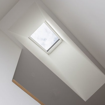
Footprint Architects were called upon to design a new road development in Faith Gardens, Poole. The site was originally a Brownfield site used by the Wyvern Cargo company, but set within a typically suburban surrounding. The challenge was to turn this derelict wasteland into a thriving affordable family housing development, with a modern twist.
The new houses had to fit coherently with the surrounding context as well as have a bold, elegant aesthetic. Phase 4 was completed in summer 2016.
 Kitchen Associates
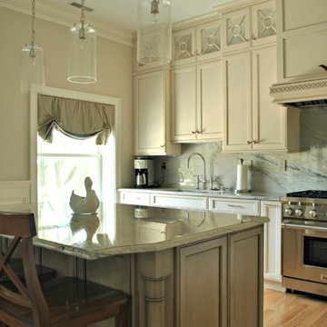
This old historic building in Belmont, MA was converted into beautiful luxury condos. While the high 10.5 foot ceilings are a great feature of the space, they also created a design challenge in the kitchen. We wanted to somehow fill the space between the reachable upper cabinets and the high ceiling avoiding an awkward "open" look in this area.
The homeowners wanted stacked cabinets, but rather than just doing typical glass doors, we installed cabinets with medallion mullion doors with antiqued mirror inserts. This not only gives the kitchen a classy look, but also creates some storage for those "once a year" items you can never find a place for.
Another exciting design element is the wood range hood with nautical trim molding. Come visit our showroom to see this same range hood in person!
Brand: Brookhaven
Door Style: Freemont Recessed
Finish: (main) Lace with Charcoal Glaze, (island) Harbor Mist with Pewter Glaze
Countertop: Marble
Hardware: Top Knobs - Polished Nickel (TK321PN & TK323PN)
 TKS Design Group
Free ebook, Creating the Ideal Kitchen. DOWNLOAD NOW
The Klimala’s and their three kids are no strangers to moving, this being their fifth house in the same town over the 20-year period they have lived there. “It must be the 7-year itch, because every seven years, we seem to find ourselves antsy for a new project or a new environment. I think part of it is being a designer, I see my own taste evolve and I want my environment to reflect that. Having easy access to wonderful tradesmen and a knowledge of the process makes it that much easier”.
This time, Klimala’s fell in love with a somewhat unlikely candidate. The 1950’s ranch turned cape cod was a bit of a mutt, but it’s location 5 minutes from their design studio and backing up to the high school where their kids can roll out of bed and walk to school, coupled with the charm of its location on a private road and lush landscaping made it an appealing choice for them.
“The bones of the house were really charming. It was typical 1,500 square foot ranch that at some point someone added a second floor to. Its sloped roofline and dormered bedrooms gave it some charm.” With the help of architect Maureen McHugh, Klimala’s gutted and reworked the layout to make the house work for them. An open concept kitchen and dining room allows for more frequent casual family dinners and dinner parties that linger. A dingy 3-season room off the back of the original house was insulated, given a vaulted ceiling with skylights and now opens up to the kitchen. This room now houses an 8’ raw edge white oak dining table and functions as an informal dining room. “One of the challenges with these mid-century homes is the 8’ ceilings. I had to have at least one room that had a higher ceiling so that’s how we did it” states Klimala.
The kitchen features a 10’ island which houses a 5’0” Galley Sink. The Galley features two faucets, and double tiered rail system to which accessories such as cutting boards and stainless steel bowls can be added for ease of cooking. Across from the large sink is an induction cooktop. “My two teen daughters and I enjoy cooking, and the Galley and induction cooktop make it so easy.” A wall of tall cabinets features a full size refrigerator, freezer, double oven and built in coffeemaker. The area on the opposite end of the kitchen features a pantry with mirrored glass doors and a beverage center below.
The rest of the first floor features an entry way, a living room with views to the front yard’s lush landscaping, a family room where the family hangs out to watch TV, a back entry from the garage with a laundry room and mudroom area, one of the home’s four bedrooms and a full bath. There is a double sided fireplace between the family room and living room. The home features pops of color from the living room’s peach grass cloth to purple painted wall in the family room. “I’m definitely a traditionalist at heart but because of the home’s Midcentury roots, I wanted to incorporate some of those elements into the furniture, lighting and accessories which also ended up being really fun. We are not formal people so I wanted a house that my kids would enjoy, have their friends over and feel comfortable.”
The second floor houses the master bedroom suite, two of the kids’ bedrooms and a back room nicknamed “the library” because it has turned into a quiet get away area where the girls can study or take a break from the rest of the family. The area was originally unfinished attic, and because the home was short on closet space, this Jack and Jill area off the girls’ bedrooms houses two large walk-in closets and a small sitting area with a makeup vanity. “The girls really wanted to keep the exposed brick of the fireplace that runs up the through the space, so that’s what we did, and I think they feel like they are in their own little loft space in the city when they are up there” says Klimala.
Designed by: Susan Klimala, CKD, CBD
Photography by: Carlos Vergara
For more information on kitchen and bath design ideas go to: www.kitchenstudio-ge.com
 Renovisions
This client requested that we design her new kitchen space to look and function with her and her family’s usage in mind. She was not happy with her existing kitchen due to builder-grade ceramic flooring, lack of countertop space, poor lighting, inadequate and unorganized storage and the closed off feel of the area. Renovisions resolved all of these issues by designing and building an impressive, transitional styled kitchen; delivering a beautifully well thought-out space that provides a multi-functional approach and meets the needs of this busy and dynamic household.
Typically, we encounter challenges in every project, and this was no different. The upstairs bathroom plumbing ran across the entire length of the kitchen sink wall and it was necessary to work with it by moving the plumbing as far up as possible and then building a soffit to hide it.
Creating a space that has a more open feel was top of mind for our client. Installing a new wood floor that matched the existing dining room floor helped with this and in addition, warmed up the room. By relocating the refrigerator to the opposite wall and adding a bar area at the end toward the family room, the flow of traffic for family members and guests became more managed.
The open floor plan allowed for additional island cabinets to accommodate smart storage and better functionality when prepping meals, sitting to eat or gathering with friends and family. We believe having ample countertop surface space is a critical improvement in any renovation and this particular project now boasts a large countertop area with a stunning wide vein pattern that accentuates the design instead of overpowering it. The soft look of the Blanco Arabescato quartz enhances the space and looks lovely with the white inset styled cabinetry.
Beauty and function go hand-in-hand in this kitchen with several exceptional elements such as under-cabinet lighting with dimmers to control the mood light. Glass doors were added to the wall cabinets which flank the wine rack for displaying their decorative glassware and a beverage cooler below provided added convenience and access to cold beverages. The GE Café line of appliances in ‘Slate’ and ‘Stainless Steel’ finishes are a stunning contrast here.
The sensational looking decorative marble 6”x6” backsplash tile over the gas range and in the bar area creates nice focal points by creating a unique look for her that family and guests love.
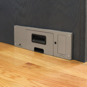
Convenient and functional elements were added such as a blind corner pull-out for easier pot/pan storage, a sweep-o-vac under cabinet vacuum system for those constant quick clean-ups, a pull-out caddy under the sink base for storage of cleaning products and a protective mat to collect potential spills.
Our client let us know it was time for a change and we listened. She shared a few pictures she loved from a home magazine, we shared our insight and then designed/built the kitchen of her dreams! … A fabulous and functional space.
25