
Search results for "Typical challenges" in Home Design Ideas
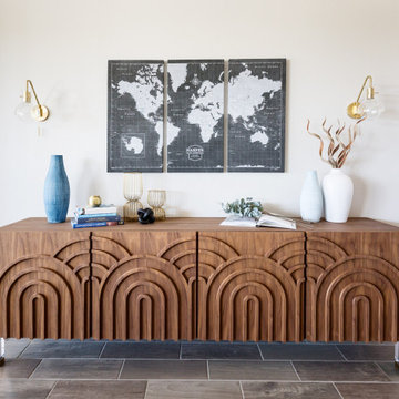
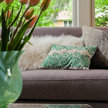
 Living with Lolo
Entry in Hodges Street | Room Type:
Whole Home Interior Design |
Project Name:
Hodges Street |
Key Feature:
A builder-grade tract home transformed with personality through a playful mid-century modern design influence.
Challenge:
The home originally lacked character and felt like a typical builder-grade tract house. The goal was to elevate the space and create a more distinctive interior.
Solution:
The design introduced bold styling and mid-century modern touches throughout the home, adding personality and visual interest while creating a more elevated and cohesive interior.
Timeline:
Completed in 2018.
 Natural Stone Institute
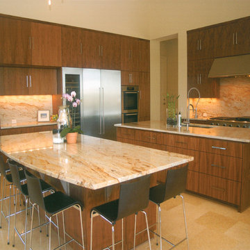
The challenge for this project was to find materials that fit into the owners' architectural style, selfentitled "Texas Hill Country Contemporary"; warm and inviting, but also clean and contemporary. The architect and the owners were determined not to copy the typical "Tuscan" style so popular for upscale homes in the Austin area. The main feature of the house is the use of both indoor and outdoor spaces and is designed so that everyday life flows through all of the spaces. The material selections had to be compatible to color schemes inside and out, blending with the local cut stone used on the exterior of the house, but also functional in their application.
Interior flooring: AG&M furnished hone finish Selina Gold limestone tile from Egypt for the majority of ground floor paving. This material has a wide range of color, the selection was made from a particular quarry and a particular layer within that quarry.
Exterior paving, pool coping, fireplace facing: Goldstone granite was chosen because it performs well in exterior applications and has the soft coloring of limestone. The paving and coping is chisel finish and the outdoor fireplace is clad with split face Goldstone to match.
Kitchen countertops: Apollo Storm granite in a polish finish with matching full-height, endmatched backsplash.
 Highland Design+Build
This typical 1980͛s master bath was a 5͛ x 8͛ foot space with a single vanity, small, angled shower and modest linen closet. The homeowner͛s desire was to have two sinks, a soaking tub, shower and toilet all in the same 5͛ x 8͛ space. This certainly posed a design challenge. Deleting the linen closet and relocating the toilet allowed for a ͚wet room͛ design concept. This enabled the homeowner͛s to incorporate both a soaking tub and a tile shower with a frameless glass enclosure. A sliding barn door replaced the old existing inswing door making room for his & her vanities opposite each other. The 12 x 24 porcelain tile covers the bath floor and wraps the shower walls to the ceiling. This adds visual depth to this small space. A glass and metal hexagon accent band create a pop of color and texture in the shower. This bath was made complete with Cambria Bellingham quartz countertops, glass vessel bowls and coordinating glass knobs on the vanity cabinetry.
205 Photography
Find the right local pro for your project
 Windy City Painters
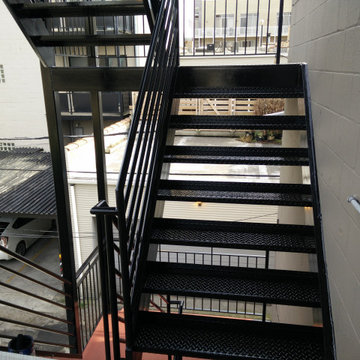
Iron Fence Painting Lincoln Park Chicago - Professional Metal Refinishing
Windy City Painters completed this comprehensive iron fence painting project for a beautiful Lincoln Park greystone property. Lincoln Park's historic architecture demands careful attention to detail, and furthermore, Chicago's harsh weather conditions require professional-grade materials and techniques for lasting protection.
We utilized premium Sherwin-Williams rust inhibiting primer and Benjamin Moore exterior metal paint for maximum durability. Additionally, our team employed specialized rust removal tools and surface preparation equipment to ensure optimal adhesion and longevity.
Our four-step process included complete rust removal and surface cleaning, minor repairs to damaged sections, premium primer application with proper curing time, and final topcoat application using spray and brush techniques for even coverage.
Chicago's unique challenges include extreme temperature fluctuations, salt exposure from winter treatments, and moisture from Lake Michigan. Moreover, older properties often have multiple paint layers requiring careful removal. Therefore, professional expertise ensures proper preparation and material selection.
The results exceeded client expectations with a smooth, durable finish that enhances the property's curb appeal. Subsequently, the fence now provides years of protection while complementing the neighborhood's architectural character perfectly.
Before starting similar projects, homeowners should understand that proper surface preparation accounts for 80% of project success. Additionally, weather conditions significantly impact application timing and results.
See more work and request free estimate at windypainters.com.
Frequently Asked Questions:
Q: How much does iron fence painting cost in Lincoln Park Chicago?
A: Iron fence painting costs vary based on fence size, existing condition, rust damage extent, and preparation requirements needed.
Q: What preparation is required for successful iron fence painting projects?
A: Iron fence painting requires thorough rust removal, surface cleaning, minor repairs, primer application, and proper weather conditions.
Q: How long does professional iron fence painting last in Chicago weather?
A: Professional iron fence painting typically lasts 8-12 years with quality materials, proper preparation, and regular maintenance.
Q: When is the best season for iron fence painting in Chicago?
A: Spring through early fall provides optimal conditions for iron fence painting with appropriate temperature and humidity levels.
Q: Can you match existing colors for iron fence painting restoration projects?
A: Yes, we provide custom color matching services for iron fence painting to complement existing architectural elements perfectly.
Q: Do you warranty iron fence painting work in Lincoln Park?
A: Windy City Painters provides comprehensive warranties on all iron fence painting projects ensuring quality and customer satisfaction.
Q: What makes professional iron fence painting worth the investment cost?
A: Professional iron fence painting ensures proper preparation, quality materials, expert application techniques, and significantly extended fence lifespan.
Q: How do you prevent rust from returning after iron fence painting?
A: Our iron fence painting process includes rust inhibiting primer, quality topcoats, and proper surface preparation for maximum protection.
Q: Can iron fence painting increase Lincoln Park property values significantly?
A: Professional iron fence painting enhances curb appeal, property aesthetics, and market value in desirable Lincoln Park neighborhood.
Q: What safety precautions are necessary during iron fence painting projects?
A: Iron fence painting requires proper ventilation, protective equipment, lead paint testing, and professional safety protocols throughout.
 Lagois Design Build Renovate
After moving into the home in the 80s, the homeowners had not invested much in upgrading their home, rather focusing on their careers and family. Now both retired and their family well established, it was time to invest in themselves and modernize their home into one that aligns with today’s goals as well as the future. A home that adapts with their life, a forever home.
Our clients’ goals included creating a home that was functional, comfortable, and accessible while integrating the indoor/outdoor environments.
Overall, the existing layout functioned well, but each area in the home had specific design goals to allow them to stay living in the home for years to come. Reimagining the arrangements of interior walls and removing sunken rooms accomplished single-level living that was accessible, comfortable, functional and cohesive.
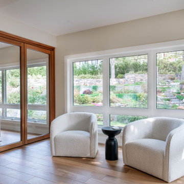
A more spacious and efficient kitchen and ensuite layout, wider interior doors, and expansive windows are just a few of the design elements that were incorporated to accomplish accessible living for aging in place. Expansive windows accomplished integrating the indoor with the outdoors while promoting natural light throughout the interior spaces.
While the existing home was very well built for its time, the insulation, windows, and mechanical systems were due for an upgrade to help create a more comfortable space throughout.
Our goal for this project is to accomplish Ottawa’s first Net-Zero Ready Renovation. In order for Lagois Design-Build-Renovate to accomplish this, we had to take a holistic approach, renovating a home for today while creating a home for the future. Insulation, windows, mechanical systems, and ventilation upgrades are for the most part simple to accomplish. The biggest challenge was creating an air-tight build with the existing envelope.
A Net Zero home is a home that can generate as much energy as it is going to consume, typically meaning little-to-no expenses for utilities for the homeowner. While this is fantastic, the true value is the comfort created in the home.
 Legendary Escapes Pools
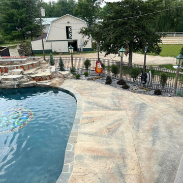
The design strategy included working within the footprint created by the home and backyard, wanting to incorporate a swimming pool “destination” within the backyard that would be large enough to fit the “larger than life” criteria, but without taking away any of the natural beauty or obstructing the view of the horse pastures, barn and nature surrounding the home.
Once the design work began, and the pool area was able to incorporate one of every feature the customer could have wanted, Curtis had some steel grates from a former tilt-a-whirl carnival ride that gave him the idea of suspending a stage over the pool. The initial idea was a modest stage with some waterfall/sheer decent features. With the idea of using steel to form the framework, the stage idea grew into something much more that would include a full stage set up, lighting trusses, a “green room” and staging area. Once the stage was designed to be so large, the pool size and scope needed to match including the patio surround, area underneath the stage, and all the additional features.
The home architecture is a Ranch with a full finished walkout basement adjacent to the pool area. An existing deck had to be removed to allow for the pool build and new Trex deck, as well as a 3 story tall observation tower that overlooks the pool and surrounding horse pastures.
The design strategy was to work within the footprint the house and decks provided to create an extension of the home for outdoor entertaining. Since the exterior of the house was quite long (and dull, the owner equating it to a 1970’s motel), our team needed to incorporate elements to make the space feel more like a backyard resort. The goal was maintaining a cozy at home feel in a grand expanse of space.
It takes a team and a unique blend of artistry to build this project. Sandi Maki, co-owner of the company is responsible for the business side of things, and marketing to reach exceptional customers who allow us to build these backyard dreams. The construction side of our company boasts a diverse, multi-geneational family business. Allan Curtis is the designer/builder and comes up with the fantastic pool plans and ideas. His team consists of his daughter Jesse Curtis, who is high right hand and manages the project just as much as Allan does. She is instrumental in everything from dig day, to tying the steel, pouring the concrete, stonework and tile work, forming the waterfall, applying ecoFinish, pouring and stamping patio, and everything in between. Allan’s nephew Mark Curtis installed and plumbed the three pool filtration systems. Allan’s wife Annie has become very good at stonework on walls and waterfalls adding the unique accents our projects have become known for. Allan’s sister-in-law, Karen Olson also does tile and stonework on the jobs and created the rockstar mural on the patio. Frank DiPiazza assists with structural elements and built the new deck, and college student Brendan Schafer assists where needed and maintains the pool and equipment during the summer on a weekly basis.
As with many homeowners who reach out to Legendary Escapes, this owner, Dale Walter, knew he wanted a “custom” pool without knowing what that really meant. He was able to show Curtis the space, and his initial ideas, and then allowed Allan and his team the freedom to dream and build. The majority of Legendary Escapes customers make the decision to hire the company after the first meeting with Curtis. As long as the project and design are challenging and interesting, the customer meets the criteria of being easy to work with, and is special in their own unique way Curtis will consider taking on their project. From the beginning it is important to Curtis that the customer understands they need to allow the project to take on a life of it’s own, and for Curtis to create without interference or asking too many questions – working together becomes a reality.
The design is typically presented on paper, a hand-colored, hand drawn design that outlines only the large elements, and an accompanying budget which outlines the structural elements and budgets and has a “theme” budget for items to be determined but doesn’t change once it is set.
Once that contract is signed, Curtis and his team over-deliver on what the customer could only have dreamed up in their wildest imagination. Projects proceed in an organic way- not every element is planned before the project begins. As the space begins to take shape, so do the details and finishing elements. When the Rockstar project began, there was no plan for the guitars on the fences, or guitar fire features. The VIP seating area wasn’t added until mid way through the patio pours as the space began to take shape. The murals both in the grotto and on the pool floor were planned just moments before each of them was to be installed. It’s this free-flowing combination of the customers and team’s dreams, ideas, elements and the Legendary Escapes team that creates backyard pools that are as much art as they are design and engineering masterpieces.
 Highland Design+Build
This typical 1980͛s master bath was a 5͛ x 8͛ foot space with a single vanity, small, angled shower and modest linen closet. The homeowner͛s desire was to have two sinks, a soaking tub, shower and toilet all in the same 5͛ x 8͛ space. This certainly posed a design challenge. Deleting the linen closet and relocating the toilet allowed for a ͚wet room͛ design concept. This enabled the homeowner͛s to incorporate both a soaking tub and a tile shower with a frameless glass enclosure. A sliding barn door replaced the old existing inswing door making room for his & her vanities opposite each other. The 12 x 24 porcelain tile covers the bath floor and wraps the shower walls to the ceiling. This adds visual depth to this small space. A glass and metal hexagon accent band create a pop of color and texture in the shower. This bath was made complete with Cambria Bellingham quartz countertops, glass vessel bowls and coordinating glass knobs on the vanity cabinetry.
205 Photography


 Studio 1200
With a location right in the heart of vibrant Madison New Jersey, this house has a prime location in a charming and desirable neighborhood. The new owners’ dream for a Shingle Style house more typical of the size and style of other houses in the neighborhood was challenged by the fact that the building coverage was already maxed for the property. Any increases would have to be done within the existing footprint.
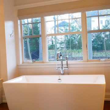
Studio 1200 was able to provide a more substantial and functional living experience for the family by adding one story and reconfiguring the first floor to create a better flow. A new kitchen and dining room were created and relocated to rear of the house, resulting in an easy egress to the private patio and backyard. A new mudroom, spare bedroom, powder room, office and covered porch completed the modern layout of the first floor, all within the same original footprint. The addition of a fireplace to the covered porch meant this space can be used practically year-round. The second floor also received an upgrade through redesign, introducing a special master suite with 2 separate walk-in closets as well as a bathroom with a dramatic soaking tub. Completing the second floor are three more bedrooms, two bathrooms, and a laundry room. Atop it all is an attic, providing storage space that was not in the original home’s design.
 Windy City Painters
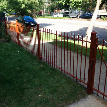
Ever notice how your iron fence looks worse every spring after another Chicago winter? That slow deterioration is not cosmetic - it is active metal failure that compounds every freeze-thaw cycle until replacement becomes the only option. Windy City Painters works with homeowners across the Chicago North Side and Near West Side to restore original iron fencing on greystones, two-flats, Victorian brownstones, and coach houses before that point is reached.
PROJECT OVERVIEW
This iron fence restoration involved a classic Chicago residential property with original wrought iron fencing showing surface rust across the majority of pickets, flaking previous paint coats, and localized deep pitting near the base rails. A structural check identified two loose pickets requiring welding before any surface preparation or coating began. Total linear footage fell in the mid-range for a standard Chicago residential lot.
MATERIALS AND PRODUCTS
Windy City Painters selected Ospho rust converter for chemically neutralizing active iron oxide before priming. Ospho reacts with rust to form a stable phosphate compound that stops corrosion progression rather than simply sealing over it. Sherwin-Williams DTM rust-inhibitive primer was applied to all bare and converted surfaces, followed by two finish coats of Rust-Oleum DTM in satin black. DTM - direct to metal - formulas provide corrosion inhibitors built into the coating matrix, which matters significantly in Chicago's climate.
THE PROCESS
Step 1 - Structural Assessment and Welding Coordination. Before any surface preparation begins, Windy City Painters inspects every picket and rail connection for structural integrity. Loose or cracked iron must be welded before coating. Paint applied over a compromised joint will fail within one season as movement continues to break the bond. On this project, two pickets were tack-welded by a coordinating welder before prep started.
Step 2 - Wire Wheel Grinding and Needle Gun Descaling. All rusted sections were ground to bare or near-bare metal using wire wheel attachments and needle gun descaling tools. This step removes loose scale, flaking previous coatings, and surface contamination that would prevent primer adhesion. Skipping mechanical prep is the single most common reason iron fence paint fails prematurely on Chicago properties.
Step 3 - Ospho Rust Converter Application. Ospho was brushed into all pitted and converted areas and allowed to cure fully. The phosphoric acid chemistry converts iron oxide into iron phosphate, arresting active rust and creating a surface that accepts primer more effectively than bare metal alone. Corroseal is an equivalent alternative used on projects with heavier pitting.
Step 4 - DTM Primer and Finish Coat Application. Sherwin-Williams DTM rust-inhibitive primer was applied across all prepared surfaces. Two topcoats of Rust-Oleum DTM in satin black followed after full primer cure. DTM finish coats add a second corrosion-inhibiting layer and provide the UV and weather resistance needed for Chicago exterior iron work.
CHICAGO-SPECIFIC CHALLENGES
Chicago iron fencing faces conditions that accelerate corrosion faster than most US markets. Lake humidity keeps metal surface moisture elevated through much of the year. Road salt splash from winter maintenance reaches fencing along parkways and sidewalk edges, introducing chlorides that aggressively attack iron. Freeze-thaw cycles expand any rust pocket that has formed under paint, lifting coatings from the inside and creating the classic bubbled-paint appearance homeowners notice every spring.
WHAT TO EXPECT LONG-TERM
With Ospho conversion, DTM primer, and two DTM finish coats properly applied over mechanically prepared surfaces, most Chicago residential iron fences hold 5-8 years before needing significant touch-up. Annual visual inspection for any chips or bare spots, with immediate touch-up using Rust-Oleum DTM, extends that window considerably.
PRO TIPS
Tip 1 - Address any bare metal spot the same season you notice it. A pinhole of exposed iron becomes a rust bubble within one Chicago winter and a flaking section by the following spring.
Tip 2 - Never paint over active rust without a converter step. Ospho or Corroseal is inexpensive insurance against a complete repaint two years early.
Tip 3 - Check picket bases at grade level every spring. Ground contact accelerates corrosion at the base faster than anywhere else on the fence. Catching it early keeps welding out of the equation.
Contact Windy City Painters at windypainters.com for a project estimate.
FAQ
Q: What does iron fence painting cost in Chicago? A: Residential iron fence painting with proper rust prep typically runs $300-$900 for standard lot footage. Windy City Painters provides itemized estimates based on linear footage, rust severity, and whether structural welding is required before surface preparation begins.
Q: Do you paint over rust or remove it first? A: Windy City Painters always addresses active rust before priming. Ospho or Corroseal rust converter chemically neutralizes iron oxide, and wire wheel grinding removes loose scale - coating over unaddressed rust guarantees early failure on Chicago iron fences.
Q: When does an iron fence need welding before painting? A: Loose pickets, cracked rails, or connections with visible movement require welding before any coating work begins. Paint cannot stabilize a structural joint - Windy City Painters coordinates with welders when this condition is identified during initial assessment.
Q: How long does iron fence paint last in Chicago? A: With mechanical prep, Ospho conversion, and Sherwin-Williams or Rust-Oleum DTM coatings, properly restored iron fencing holds 5-8 years in Chicago's freeze-thaw climate before needing significant maintenance.
Q: Is Ospho better than Corroseal for Chicago iron fences? A: Both are effective rust converters. Ospho is a liquid phosphoric acid treatment suited for moderate rust and pitting. Corroseal is a latex-based converter-primer hybrid better suited to heavier rust profiles. Windy City Painters selects based on site conditions.
Q: What finish sheen works best on iron fencing? A: Satin or semi-gloss black is the traditional and most durable choice for Chicago greystone and brownstone properties. Satin hides minor surface imperfections better than gloss while still providing adequate UV and moisture resistance.
Q: Can iron fence painting be done in spring or fall in Chicago? A: Yes. Windy City Painters schedules iron fence work in temperatures above 50 degrees Fahrenheit with low ambient humidity - spring and early fall are often ideal windows that avoid both winter cold and peak summer humidity.
 Dresner Design | Chicago Custom Kitchens Cabinets
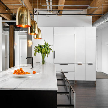
Dresner Design possesses the expertise to design cutting edge, cost-effective kitchens, baths and closets for developer’s multi-unit projects. They were recently part of the design team for The Ronsley, River North's best new luxury condominium development.
This former industrial timber loft building was transformed into an incredible 41-unit building, and Dresner Design was hired to design both the kitchens and baths using Italian cabinetry from Stosa Cucine.
Challenges:
All the units were the same but with varying configurations. The goal was to make all the units feel and look the same but each of the layouts was different- making 30 layouts in all.
Concept:
The kitchens and baths were designed to be sleek and modern, blending in with the loft style. The kitchen islands fabricated with wood compliments the wood ceilings and beams typical of loft living. White kitchens are always timeless and the Ronsley used the most beautiful and high-end cabinetry made of 100% lacquer.
Photography by Jim Tschetter
 Studio 1200
With a location right in the heart of vibrant Madison New Jersey, this house has a prime location in a charming and desirable neighborhood. The new owners’ dream for a Shingle Style house more typical of the size and style of other houses in the neighborhood was challenged by the fact that the building coverage was already maxed for the property. Any increases would have to be done within the existing footprint.
Studio 1200 was able to provide a more substantial and functional living experience for the family by adding one story and reconfiguring the first floor to create a better flow. A new kitchen and dining room were created and relocated to rear of the house, resulting in an easy egress to the private patio and backyard. A new mudroom, spare bedroom, powder room, office and covered porch completed the modern layout of the first floor, all within the same original footprint. The addition of a fireplace to the covered porch meant this space can be used practically year-round. The second floor also received an upgrade through redesign, introducing a special master suite with 2 separate walk-in closets as well as a bathroom with a dramatic soaking tub. Completing the second floor are three more bedrooms, two bathrooms, and a laundry room. Atop it all is an attic, providing storage space that was not in the original home’s design.
 Alderwood Landscape Architecture and Construction
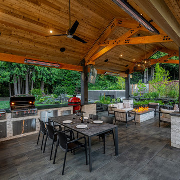
The homeowners wanted to better use their outdoor space to feel like an extension of their home with several separate lounge and entertaining spaces. While they desired to keep the lawn for their kids, they also wanted to ensure there were enough private areas for adults. While these factors are typical for an Alderwood project, the challenges of this landscape made the final design incredibly unique. Rather quickly, our design team learned that a large septic system ran right underneath most of the backyard. Coordinating with city workers, the building architect, and the clients, our landscape architect crafted a unique design that worked around the drain constraints and accomplished each desire on the clients' list.
 TKS Design Group
Free ebook, Creating the Ideal Kitchen. DOWNLOAD NOW
The Klimala’s and their three kids are no strangers to moving, this being their fifth house in the same town over the 20-year period they have lived there. “It must be the 7-year itch, because every seven years, we seem to find ourselves antsy for a new project or a new environment. I think part of it is being a designer, I see my own taste evolve and I want my environment to reflect that. Having easy access to wonderful tradesmen and a knowledge of the process makes it that much easier”.
This time, Klimala’s fell in love with a somewhat unlikely candidate. The 1950’s ranch turned cape cod was a bit of a mutt, but it’s location 5 minutes from their design studio and backing up to the high school where their kids can roll out of bed and walk to school, coupled with the charm of its location on a private road and lush landscaping made it an appealing choice for them.
“The bones of the house were really charming. It was typical 1,500 square foot ranch that at some point someone added a second floor to. Its sloped roofline and dormered bedrooms gave it some charm.” With the help of architect Maureen McHugh, Klimala’s gutted and reworked the layout to make the house work for them. An open concept kitchen and dining room allows for more frequent casual family dinners and dinner parties that linger. A dingy 3-season room off the back of the original house was insulated, given a vaulted ceiling with skylights and now opens up to the kitchen. This room now houses an 8’ raw edge white oak dining table and functions as an informal dining room. “One of the challenges with these mid-century homes is the 8’ ceilings. I had to have at least one room that had a higher ceiling so that’s how we did it” states Klimala.
The kitchen features a 10’ island which houses a 5’0” Galley Sink. The Galley features two faucets, and double tiered rail system to which accessories such as cutting boards and stainless steel bowls can be added for ease of cooking. Across from the large sink is an induction cooktop. “My two teen daughters and I enjoy cooking, and the Galley and induction cooktop make it so easy.” A wall of tall cabinets features a full size refrigerator, freezer, double oven and built in coffeemaker. The area on the opposite end of the kitchen features a pantry with mirrored glass doors and a beverage center below.
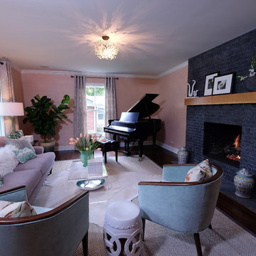
The rest of the first floor features an entry way, a living room with views to the front yard’s lush landscaping, a family room where the family hangs out to watch TV, a back entry from the garage with a laundry room and mudroom area, one of the home’s four bedrooms and a full bath. There is a double sided fireplace between the family room and living room. The home features pops of color from the living room’s peach grass cloth to purple painted wall in the family room. “I’m definitely a traditionalist at heart but because of the home’s Midcentury roots, I wanted to incorporate some of those elements into the furniture, lighting and accessories which also ended up being really fun. We are not formal people so I wanted a house that my kids would enjoy, have their friends over and feel comfortable.”
The second floor houses the master bedroom suite, two of the kids’ bedrooms and a back room nicknamed “the library” because it has turned into a quiet get away area where the girls can study or take a break from the rest of the family. The area was originally unfinished attic, and because the home was short on closet space, this Jack and Jill area off the girls’ bedrooms houses two large walk-in closets and a small sitting area with a makeup vanity. “The girls really wanted to keep the exposed brick of the fireplace that runs up the through the space, so that’s what we did, and I think they feel like they are in their own little loft space in the city when they are up there” says Klimala.
Designed by: Susan Klimala, CKD, CBD
Photography by: Carlos Vergara
For more information on kitchen and bath design ideas go to: www.kitchenstudio-ge.com
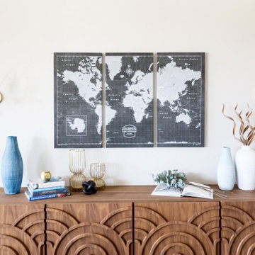 Living with Lolo
Living Room in Hodges Street | Room Type:
Whole Home Interior Design |
Project Name:
Hodges Street |
Key Feature:
A builder-grade tract home transformed with personality through a playful mid-century modern design influence.
Challenge:
The home originally lacked character and felt like a typical builder-grade tract house. The goal was to elevate the space and create a more distinctive interior.
Solution:
The design introduced bold styling and mid-century modern touches throughout the home, adding personality and visual interest while creating a more elevated and cohesive interior.
Timeline:
Completed in 2018.
 Renovisions
This client requested that we design her new kitchen space to look and function with her and her family’s usage in mind. She was not happy with her existing kitchen due to builder-grade ceramic flooring, lack of countertop space, poor lighting, inadequate and unorganized storage and the closed off feel of the area. Renovisions resolved all of these issues by designing and building an impressive, transitional styled kitchen; delivering a beautifully well thought-out space that provides a multi-functional approach and meets the needs of this busy and dynamic household.
Typically, we encounter challenges in every project, and this was no different. The upstairs bathroom plumbing ran across the entire length of the kitchen sink wall and it was necessary to work with it by moving the plumbing as far up as possible and then building a soffit to hide it.
Creating a space that has a more open feel was top of mind for our client. Installing a new wood floor that matched the existing dining room floor helped with this and in addition, warmed up the room. By relocating the refrigerator to the opposite wall and adding a bar area at the end toward the family room, the flow of traffic for family members and guests became more managed.
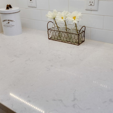
The open floor plan allowed for additional island cabinets to accommodate smart storage and better functionality when prepping meals, sitting to eat or gathering with friends and family. We believe having ample countertop surface space is a critical improvement in any renovation and this particular project now boasts a large countertop area with a stunning wide vein pattern that accentuates the design instead of overpowering it. The soft look of the Blanco Arabescato quartz enhances the space and looks lovely with the white inset styled cabinetry.
Beauty and function go hand-in-hand in this kitchen with several exceptional elements such as under-cabinet lighting with dimmers to control the mood light. Glass doors were added to the wall cabinets which flank the wine rack for displaying their decorative glassware and a beverage cooler below provided added convenience and access to cold beverages. The GE Café line of appliances in ‘Slate’ and ‘Stainless Steel’ finishes are a stunning contrast here.
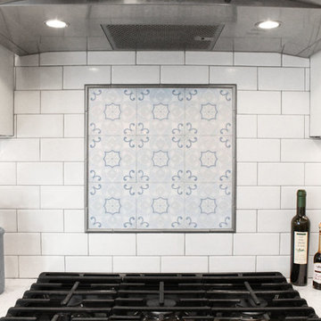
The sensational looking decorative marble 6”x6” backsplash tile over the gas range and in the bar area creates nice focal points by creating a unique look for her that family and guests love.
Convenient and functional elements were added such as a blind corner pull-out for easier pot/pan storage, a sweep-o-vac under cabinet vacuum system for those constant quick clean-ups, a pull-out caddy under the sink base for storage of cleaning products and a protective mat to collect potential spills.
Our client let us know it was time for a change and we listened. She shared a few pictures she loved from a home magazine, we shared our insight and then designed/built the kitchen of her dreams! … A fabulous and functional space.
 RAJ Kitchen and Bath, LLC
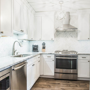
 “Full apartment design”.
IF you have not yet seen this apartment conversion before, we strongly urge you to go to the bottom left of this page and click on the short 2-minutes video. It would put a lot of things into perspective when you come back and continue reading this.
It is true we were literally handed the keys and told a list of things that they wanted to have happen and we were to go into the apartment, look at the space and come up with a design that would satisfy all of that need. UNTIL we showed up! The unit had really seen some better days but we knew we had to look past that and come up with a concept that would work for them.
The immediate challenges were centered around 3 big ideas:
1. Adding a second bedroom to the already small footprint
2. Figuring out a way to make the kitchen bigger, better and brighter
3. Creating a master room walk in closet
It’s always difficult to add new rooms into existing footprint without expanding out or up and not incurring any opportunity cost. In this case, that was exactly what we had to do. Item one and two above had to be tackled as one. We went ahead and switched out the location of the dining room and eliminating an area where there was a “nook” type eat-in area. By doing so, we were able to cut right into that footprint and change the layout of the kitchen.
That one move allowed us to dig into the kitchen design because it was now the main focal point in the apartment. It was no longer an option to keep it in that tiny hole where it was, so we had to ensure that this design was functional and aesthetically pleasing at the same time. By adding the table into the space where an Island typically would go, we were able to both cut cost and still provide a dining experience. The Table serves as an Island as well when cooking.
We then proceeded to block in the existing doorway to the dining room. By doing this, we were able to create a full room which allowed us to put a door on the other side and called that room Bedroom #2. This was easier to do because all of the mechanicals were already in that space (light, heater and windows). By shifting things around, we also achieved a huge wall to wall closet from inside. PERFECT!
Then we moved into the Single bedroom. We thought it was a big room with a small closet, so by creatively adding an L shaped wall and steal some footprint into the bedroom side, we were able to put a door on that new room and design it for the walk-in closet. Even after this, the bedroom still holds a queen size bed with 2 night stands, a TV on the wall, a sitting chair and plenty of room to walk around. This was done by rethinking the location for the bed and night stands.
The bathroom was gutted to make sure there was no leaks and rebuild from the ground up. We kept all of the plumbing where it was, added a new vanity, medicine cabinet, tiles and lighting and it was done.
From there, the rest of the unit had new flooring all throughout, paint, and lighting. After completion and walk through, this project was handed over back to the clients.
Execution and collaboration between all the trades were: Reggie and his team from Premier Interiors and Rohan from RD Mechanical Services.
p.s. Please see our website to see the video.
 TKS Design Group
Free ebook, Creating the Ideal Kitchen. DOWNLOAD NOW
The Klimala’s and their three kids are no strangers to moving, this being their fifth house in the same town over the 20-year period they have lived there. “It must be the 7-year itch, because every seven years, we seem to find ourselves antsy for a new project or a new environment. I think part of it is being a designer, I see my own taste evolve and I want my environment to reflect that. Having easy access to wonderful tradesmen and a knowledge of the process makes it that much easier”.
This time, Klimala’s fell in love with a somewhat unlikely candidate. The 1950’s ranch turned cape cod was a bit of a mutt, but it’s location 5 minutes from their design studio and backing up to the high school where their kids can roll out of bed and walk to school, coupled with the charm of its location on a private road and lush landscaping made it an appealing choice for them.
“The bones of the house were really charming. It was typical 1,500 square foot ranch that at some point someone added a second floor to. Its sloped roofline and dormered bedrooms gave it some charm.” With the help of architect Maureen McHugh, Klimala’s gutted and reworked the layout to make the house work for them. An open concept kitchen and dining room allows for more frequent casual family dinners and dinner parties that linger. A dingy 3-season room off the back of the original house was insulated, given a vaulted ceiling with skylights and now opens up to the kitchen. This room now houses an 8’ raw edge white oak dining table and functions as an informal dining room. “One of the challenges with these mid-century homes is the 8’ ceilings. I had to have at least one room that had a higher ceiling so that’s how we did it” states Klimala.
The kitchen features a 10’ island which houses a 5’0” Galley Sink. The Galley features two faucets, and double tiered rail system to which accessories such as cutting boards and stainless steel bowls can be added for ease of cooking. Across from the large sink is an induction cooktop. “My two teen daughters and I enjoy cooking, and the Galley and induction cooktop make it so easy.” A wall of tall cabinets features a full size refrigerator, freezer, double oven and built in coffeemaker. The area on the opposite end of the kitchen features a pantry with mirrored glass doors and a beverage center below.
The rest of the first floor features an entry way, a living room with views to the front yard’s lush landscaping, a family room where the family hangs out to watch TV, a back entry from the garage with a laundry room and mudroom area, one of the home’s four bedrooms and a full bath. There is a double sided fireplace between the family room and living room. The home features pops of color from the living room’s peach grass cloth to purple painted wall in the family room. “I’m definitely a traditionalist at heart but because of the home’s Midcentury roots, I wanted to incorporate some of those elements into the furniture, lighting and accessories which also ended up being really fun. We are not formal people so I wanted a house that my kids would enjoy, have their friends over and feel comfortable.”
The second floor houses the master bedroom suite, two of the kids’ bedrooms and a back room nicknamed “the library” because it has turned into a quiet get away area where the girls can study or take a break from the rest of the family. The area was originally unfinished attic, and because the home was short on closet space, this Jack and Jill area off the girls’ bedrooms houses two large walk-in closets and a small sitting area with a makeup vanity. “The girls really wanted to keep the exposed brick of the fireplace that runs up the through the space, so that’s what we did, and I think they feel like they are in their own little loft space in the city when they are up there” says Klimala.
Designed by: Susan Klimala, CKD, CBD
Photography by: Carlos Vergara
For more information on kitchen and bath design ideas go to: www.kitchenstudio-ge.com
 DesignbyRuchi
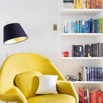
This project was for a young professional who had no tolerance for clutter but boy does she love to read. From the first site visit, I had my heart set on the books she had. She loves colors and is not scared of them. Client from heaven… She rents a typical railroad house in Brooklyn and it came with its own challenges as far as laying out the space. I created three zones for her and right in the middle sits her throne to read her gazillion books. Photography by Daniel Wang. The design classic WOMB chair in a beautiful Chartreuse Felt with chrome legs is the main feature in the room againt backdrop of this amazing bookshelf styled by color.
 Amy Pearson Design
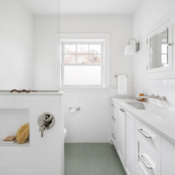
This classic Portland bungalow in the highly desirable Irvington neighborhood has been in the family for generations and lovingly cared for and updated throughout the years. It was now the main floor’s primary bathroom that needed to be addressed. A tight footprint made for some space planning challenges, but what we love so much about this project is that it demonstrates that so much can be done with a small space! Designing a shallower than typical vanity allowed us to extend the cabinetry and countertop as far as the door swing into the room would allow, adding much needed storage to the room. A narrow undermount sink combined with wall mount faucet ensures the vanity remains extremely functional. A tower cabinet at the end frames the sink and mirror, bringing an appreciated moment of symmetry while providing space for electric bathroom products and so much more. Where a two sided tub/shower once lived, now a walk in shower framed in glass makes the space feel, and live, significantly larger than its modest square footage. The use of glass on only the long side, and pony wall with glass above on the short end, visually expands the space allowing the eye to move freely around the room while still providing privacy at the toilet. Marmoleum flooring makes for easy cleaning while mosaic tile on the shower floor ensures traction in the wet environment. A classic penny tile accent around the shower walls, combined with the tile wainscot around the room speak to the classic architecture of the home. The bright and fresh palette is at once lively and calming, youthful and sophisticated, current and timeless!
 Renovisions
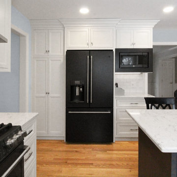
This client requested that we design her new kitchen space to look and function with her and her family’s usage in mind. She was not happy with her existing kitchen due to builder-grade ceramic flooring, lack of countertop space, poor lighting, inadequate and unorganized storage and the closed off feel of the area. Renovisions resolved all of these issues by designing and building an impressive, transitional styled kitchen; delivering a beautifully well thought-out space that provides a multi-functional approach and meets the needs of this busy and dynamic household.
Typically, we encounter challenges in every project, and this was no different. The upstairs bathroom plumbing ran across the entire length of the kitchen sink wall and it was necessary to work with it by moving the plumbing as far up as possible and then building a soffit to hide it.
Creating a space that has a more open feel was top of mind for our client. Installing a new wood floor that matched the existing dining room floor helped with this and in addition, warmed up the room. By relocating the refrigerator to the opposite wall and adding a bar area at the end toward the family room, the flow of traffic for family members and guests became more managed.
The open floor plan allowed for additional island cabinets to accommodate smart storage and better functionality when prepping meals, sitting to eat or gathering with friends and family. We believe having ample countertop surface space is a critical improvement in any renovation and this particular project now boasts a large countertop area with a stunning wide vein pattern that accentuates the design instead of overpowering it. The soft look of the Blanco Arabescato quartz enhances the space and looks lovely with the white inset styled cabinetry.
Beauty and function go hand-in-hand in this kitchen with several exceptional elements such as under-cabinet lighting with dimmers to control the mood light. Glass doors were added to the wall cabinets which flank the wine rack for displaying their decorative glassware and a beverage cooler below provided added convenience and access to cold beverages. The GE Café line of appliances in ‘Slate’ and ‘Stainless Steel’ finishes are a stunning contrast here.
The sensational looking decorative marble 6”x6” backsplash tile over the gas range and in the bar area creates nice focal points by creating a unique look for her that family and guests love.
Convenient and functional elements were added such as a blind corner pull-out for easier pot/pan storage, a sweep-o-vac under cabinet vacuum system for those constant quick clean-ups, a pull-out caddy under the sink base for storage of cleaning products and a protective mat to collect potential spills.
Our client let us know it was time for a change and we listened. She shared a few pictures she loved from a home magazine, we shared our insight and then designed/built the kitchen of her dreams! … A fabulous and functional space.
29