
Search results for "Typical challenges" in Home Design Ideas
 Studio 1200
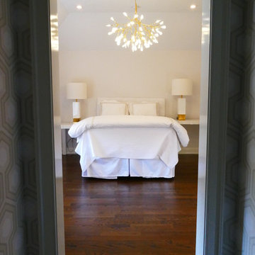
With a location right in the heart of vibrant Madison New Jersey, this house has a prime location in a charming and desirable neighborhood. The new owners’ dream for a Shingle Style house more typical of the size and style of other houses in the neighborhood was challenged by the fact that the building coverage was already maxed for the property. Any increases would have to be done within the existing footprint.
Studio 1200 was able to provide a more substantial and functional living experience for the family by adding one story and reconfiguring the first floor to create a better flow. A new kitchen and dining room were created and relocated to rear of the house, resulting in an easy egress to the private patio and backyard. A new mudroom, spare bedroom, powder room, office and covered porch completed the modern layout of the first floor, all within the same original footprint. The addition of a fireplace to the covered porch meant this space can be used practically year-round. The second floor also received an upgrade through redesign, introducing a special master suite with 2 separate walk-in closets as well as a bathroom with a dramatic soaking tub. Completing the second floor are three more bedrooms, two bathrooms, and a laundry room. Atop it all is an attic, providing storage space that was not in the original home’s design.
 Lagois Design Build Renovate
After moving into the home in the 80s, the homeowners had not invested much in upgrading their home, rather focusing on their careers and family. Now both retired and their family well established, it was time to invest in themselves and modernize their home into one that aligns with today’s goals as well as the future. A home that adapts with their life, a forever home.
Our clients’ goals included creating a home that was functional, comfortable, and accessible while integrating the indoor/outdoor environments.
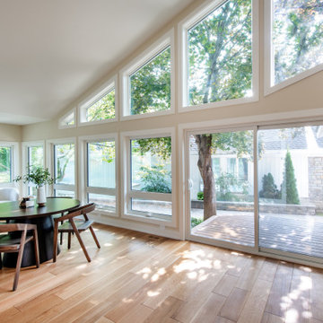
Overall, the existing layout functioned well, but each area in the home had specific design goals to allow them to stay living in the home for years to come. Reimagining the arrangements of interior walls and removing sunken rooms accomplished single-level living that was accessible, comfortable, functional and cohesive.
A more spacious and efficient kitchen and ensuite layout, wider interior doors, and expansive windows are just a few of the design elements that were incorporated to accomplish accessible living for aging in place. Expansive windows accomplished integrating the indoor with the outdoors while promoting natural light throughout the interior spaces.
While the existing home was very well built for its time, the insulation, windows, and mechanical systems were due for an upgrade to help create a more comfortable space throughout.
Our goal for this project is to accomplish Ottawa’s first Net-Zero Ready Renovation. In order for Lagois Design-Build-Renovate to accomplish this, we had to take a holistic approach, renovating a home for today while creating a home for the future. Insulation, windows, mechanical systems, and ventilation upgrades are for the most part simple to accomplish. The biggest challenge was creating an air-tight build with the existing envelope.
A Net Zero home is a home that can generate as much energy as it is going to consume, typically meaning little-to-no expenses for utilities for the homeowner. While this is fantastic, the true value is the comfort created in the home.
 Crystorama Lighting
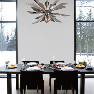
Like designer runway fashions, the Galaxy Collection is trendsetting, light-catching and beautifully inventive, challenging conventional notions of chandeliers. Sleek in design and contemporary in chrome accented with gunmetal is anything but typical. The orbital design is freely formed by rays of metal creating show-stopping chandeliers.
Find the right local pro for your project
 Drury Design
The original idea was to update the tile floor and the tub. That’s it.
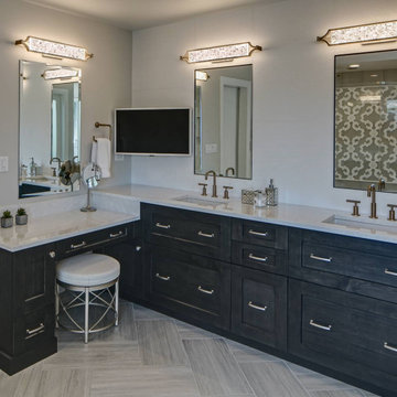
A further discussion of wants and needs revealed intentions for an eventual larger shower and an improved vanity storage. It made sense to map out the possibilities and design our update with potential next steps in mind. The process was exciting, ultimately leading to the decision to do a full primary bath remodel.
Design Objectives:
-Maintain existing locations for all major bathroom functions
-Make the shower larger and more open
-Use luxurious materials throughout
-Improve vanity storage and define accessories for specific items
-Incorporate luxury shower fixtures
-Include the latest technology
Design Challenges
-Enlarging the shower in a typical rectangular shape would block the view and light from the alcove windows behind the tub
-Logical placement of the built-in shower caddy and all shower components in accordance with how and where they were to be used
-Keeping the long, back wall free from any shower modules to maintain the decorative tile design
-Combining the owner’s existing smart home system with a comprehensive shower system
-Planning cabinetry for hidden storage and use for various small appliances and make-up
-Integrating expensive shower wall tile with less expensive wall tile for aesthetic and budget purposes
-Incorporating special design features to balance the highly decorative shower tile
Design solutions:
-A clipped corner was planned for the shower bench seat – this allowed for a larger glass wall. The glass wall at the angled bench also brought more natural light into the shower
-Thoughtful shower space design prevented the crowding of features – the shower caddy and handheld shower head were placed on the full-height wall by the shower bench, the regular shower head and body sprays remained on the opposite wall, and the rain head was placed in the center of the shower
-A multi-port DTV system was installed, providing control of all shower components, including chromotherapy and music inside and outside the shower
-The lavish water-jet stone and glass decorative tile was paired with a less-expensive glass tile found in the mosaic
-Pull-out grooming organizers and electrical docking stations were incorporated into the cabinetry
Additional storage was created in the lower corner cabinet
The homeowners are thrilled with their new primary bathroom. Clear goals and carefully evaluated materials informed a fun and functional design that is both thoughtful and sumptuous!
 Allreno
Bathroom Renovation: How Allreno Simplifies Your Remodel – Save Time and Money
When it comes to bathroom renovation, creating a space that’s functional, stylish, and tailored to your needs can feel like a daunting task. But with Allreno, the process becomes streamlined, efficient, and remarkably simple. Whether you’re planning a small update or a full-scale remodel, Allreno’s cutting-edge app and services are designed to help you achieve your dream bathroom with ease.
Why Choose Allreno for Your Bathroom Renovation?
Allreno stands out in the renovation industry by leveraging advanced artificial intelligence to automate complex processes, cutting down the time and cost typically associated with bathroom remodels. Through our platform, homeowners and professionals alike can design, plan, and execute renovations in a fraction of the time it takes with traditional methods.
Our innovative approach focuses on:
• Custom Designs: With Allreno, you can visualize your bathroom renovation in real-time, experimenting with layouts, finishes, and fixtures to find the perfect fit.
• Cost Efficiency: Our AI technology optimizes material use and labor planning, saving you money without compromising on quality.
• Seamless Execution: From selecting a bathroom vanity to finalizing the layout, Allreno simplifies every step of the process.
Comparing Allreno to Leading Competitors
When exploring bathroom renovation options, it’s important to consider the services and value offered by different providers. Here’s how Allreno stacks up against major players like Home Depot, Houzz, Block Renovation, and Angi.com:
• Home Depot: Known for its wide range of DIY and contractor-friendly products, Home Depot offers accessibility but lacks the personalized design and AI-powered planning that Allreno provides.
• Houzz: While Houzz excels in inspiration and connecting homeowners with professionals, its platform does not streamline the actual renovation process like Allreno’s app does.
• Block Renovation: Specializing in high-quality bathroom remodels, Block offers comprehensive services but often at a premium price. Allreno delivers comparable results with significant cost savings.
• Angi.com: Angi connects homeowners with contractors but doesn’t offer the integrated design-to-execution experience that sets Allreno apart.
Bathroom Vanity: The Centerpiece of Your Renovation
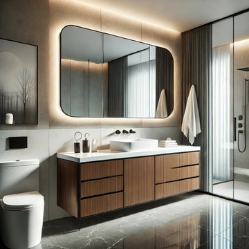
A bathroom vanity is often the focal point of any bathroom design. Choosing the right vanity can elevate the entire look and feel of your space. With Allreno, selecting the perfect bathroom vanity becomes an enjoyable experience. Our app allows you to browse a curated collection of high-quality vanities, customize dimensions, and visualize how they’ll look in your remodeled space.
Allreno’s vanities combine style, functionality, and durability, ensuring they not only look great but also stand the test of time. Whether you prefer a modern minimalist design or a classic, timeless aesthetic, Allreno has options to suit every taste.
Expert Tips for Bathroom Renovation
Renovating a bathroom requires careful planning and attention to detail. Here are some expert tips to keep in mind:
1. Set a Realistic Budget: Determine how much you’re willing to spend and allocate funds for unexpected expenses.
2. Plan the Layout: Consider functionality and flow when designing the space. Allreno’s app makes this step easy with AI-generated layouts tailored to your needs.
3. Choose Durable Materials: Bathrooms face moisture and wear, so opt for high-quality, water-resistant materials.
4. Focus on Lighting: Proper lighting enhances both the functionality and ambiance of your bathroom.
5. Hire Professionals: While DIY can be tempting, working with experienced contractors ensures the job is done right.
Explore Our Complete Guide to New York Bathroom Remodels
For New York homeowners, bathroom renovations come with unique challenges and opportunities. Explore our complete guide to New York bathroom remodels, with expert tips on bathroom renovation and a breakdown of costs to help you plan. From navigating small spaces to complying with building codes, our guide provides all the insights you need for a successful project.
Why Allreno is the Future of Bathroom Renovation
With Allreno, you’re not just renovating a bathroom—you’re transforming the way renovations are done. Our app eliminates the stress and inefficiency of traditional methods, empowering you to achieve stunning results in less time and with less hassle.
Ready to start your bathroom renovation journey? Download the Allreno app today and experience the difference for yourself. Whether it’s finding the perfect bathroom vanity or planning a complete remodel, Allreno is here to make your dream bathroom a reality.
Tags: ai design, bathroom renovation, renovation, bathroom design, interior design
 Bilotta Kitchen & Home
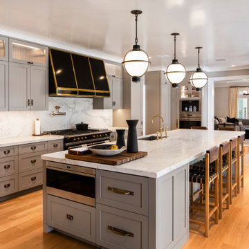
This kitchen was designed for a family who decided to leave life in the big city and move up to Westchester for more room. The large space exuberates a calm, clean and classic feeling. “I love being brought in as a collaborative partner with both the architect and homeowner. It becomes my job as the kitchen designer to deliver on the vision of which the architect and homeowner are dreaming” says Bilotta Designer Randy O’Kane. The details become the focus, such as in this case, using just the right fluted Bendheim low iron Pyramid textured glass with just the correct proportions. Understanding the appliances (a mix of SubZero, Wolf and Miele) and their exterior panel and space requirements is critical. Framing out each doorway while lining up all the reveals can only happen when the architect has an eye for detail. Ira of Ira Grandberg Architects focuses on how all the surrounding rooms center on the kitchen so that from every angle you see one cohesive space, interfacing with the adjacent rooms. The client had specific "asks" as it related to the door style and color as well as the range and hood (a La Canche French Range by Art Culinaire in Matte Black with Brass Trim with a Custom Hood by Rangecraft.) Kismet is when there are "just the right" number of cooks creating this amazing kitchen. The challenge for the architect was designing a larger eat-in kitchen that did not feel overpowering. With all the light coming in from the many windows they wanted to keep the space bright but not use the typical white paint and so opted for a soft grey for the custom cabinetry. They decided to forgo the cabinet and countertop surfaces on the exterior wall so that they could have a large table for the family to eat meals at together. This also brought an enormous amount of light into the space – very inviting.
Bilotta Designer: Randy O’Kane
Photographer: Kirt Washington
Architect: Ira Grandberg Architects
Builder: ABC Construction
 Living with Lolo
Kitchen in Hodges Street | Room Type:
Whole Home Interior Design |
Project Name:
Hodges Street |
Key Feature:
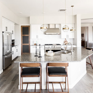
A builder-grade tract home transformed with personality through a playful mid-century modern design influence.
Challenge:
The home originally lacked character and felt like a typical builder-grade tract house. The goal was to elevate the space and create a more distinctive interior.
Solution:
The design introduced bold styling and mid-century modern touches throughout the home, adding personality and visual interest while creating a more elevated and cohesive interior.
Timeline:
Completed in 2018.


 TKS Design Group
Free ebook, Creating the Ideal Kitchen. DOWNLOAD NOW
The Klimala’s and their three kids are no strangers to moving, this being their fifth house in the same town over the 20-year period they have lived there. “It must be the 7-year itch, because every seven years, we seem to find ourselves antsy for a new project or a new environment. I think part of it is being a designer, I see my own taste evolve and I want my environment to reflect that. Having easy access to wonderful tradesmen and a knowledge of the process makes it that much easier”.
This time, Klimala’s fell in love with a somewhat unlikely candidate. The 1950’s ranch turned cape cod was a bit of a mutt, but it’s location 5 minutes from their design studio and backing up to the high school where their kids can roll out of bed and walk to school, coupled with the charm of its location on a private road and lush landscaping made it an appealing choice for them.
“The bones of the house were really charming. It was typical 1,500 square foot ranch that at some point someone added a second floor to. Its sloped roofline and dormered bedrooms gave it some charm.” With the help of architect Maureen McHugh, Klimala’s gutted and reworked the layout to make the house work for them. An open concept kitchen and dining room allows for more frequent casual family dinners and dinner parties that linger. A dingy 3-season room off the back of the original house was insulated, given a vaulted ceiling with skylights and now opens up to the kitchen. This room now houses an 8’ raw edge white oak dining table and functions as an informal dining room. “One of the challenges with these mid-century homes is the 8’ ceilings. I had to have at least one room that had a higher ceiling so that’s how we did it” states Klimala.
The kitchen features a 10’ island which houses a 5’0” Galley Sink. The Galley features two faucets, and double tiered rail system to which accessories such as cutting boards and stainless steel bowls can be added for ease of cooking. Across from the large sink is an induction cooktop. “My two teen daughters and I enjoy cooking, and the Galley and induction cooktop make it so easy.” A wall of tall cabinets features a full size refrigerator, freezer, double oven and built in coffeemaker. The area on the opposite end of the kitchen features a pantry with mirrored glass doors and a beverage center below.
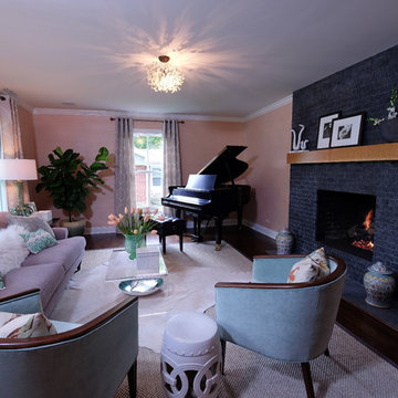
The rest of the first floor features an entry way, a living room with views to the front yard’s lush landscaping, a family room where the family hangs out to watch TV, a back entry from the garage with a laundry room and mudroom area, one of the home’s four bedrooms and a full bath. There is a double sided fireplace between the family room and living room. The home features pops of color from the living room’s peach grass cloth to purple painted wall in the family room. “I’m definitely a traditionalist at heart but because of the home’s Midcentury roots, I wanted to incorporate some of those elements into the furniture, lighting and accessories which also ended up being really fun. We are not formal people so I wanted a house that my kids would enjoy, have their friends over and feel comfortable.”
The second floor houses the master bedroom suite, two of the kids’ bedrooms and a back room nicknamed “the library” because it has turned into a quiet get away area where the girls can study or take a break from the rest of the family. The area was originally unfinished attic, and because the home was short on closet space, this Jack and Jill area off the girls’ bedrooms houses two large walk-in closets and a small sitting area with a makeup vanity. “The girls really wanted to keep the exposed brick of the fireplace that runs up the through the space, so that’s what we did, and I think they feel like they are in their own little loft space in the city when they are up there” says Klimala.
Designed by: Susan Klimala, CKD, CBD
Photography by: Carlos Vergara
For more information on kitchen and bath design ideas go to: www.kitchenstudio-ge.com
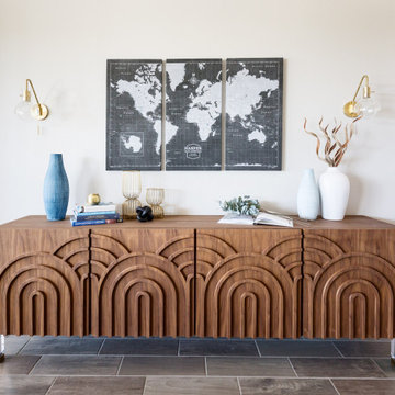 Living with Lolo
Entry in Hodges Street | Room Type:
Whole Home Interior Design |
Project Name:
Hodges Street |
Key Feature:
A builder-grade tract home transformed with personality through a playful mid-century modern design influence.
Challenge:
The home originally lacked character and felt like a typical builder-grade tract house. The goal was to elevate the space and create a more distinctive interior.
Solution:
The design introduced bold styling and mid-century modern touches throughout the home, adding personality and visual interest while creating a more elevated and cohesive interior.
Timeline:
Completed in 2018.
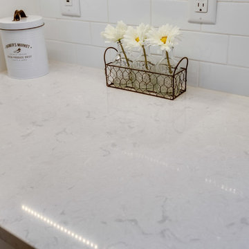
 Highland Design+Build
This typical 1980͛s master bath was a 5͛ x 8͛ foot space with a single vanity, small, angled shower and modest linen closet. The homeowner͛s desire was to have two sinks, a soaking tub, shower and toilet all in the same 5͛ x 8͛ space. This certainly posed a design challenge. Deleting the linen closet and relocating the toilet allowed for a ͚wet room͛ design concept. This enabled the homeowner͛s to incorporate both a soaking tub and a tile shower with a frameless glass enclosure. A sliding barn door replaced the old existing inswing door making room for his & her vanities opposite each other. The 12 x 24 porcelain tile covers the bath floor and wraps the shower walls to the ceiling. This adds visual depth to this small space. A glass and metal hexagon accent band create a pop of color and texture in the shower. This bath was made complete with Cambria Bellingham quartz countertops, glass vessel bowls and coordinating glass knobs on the vanity cabinetry.
205 Photography
 Legendary Escapes Pools
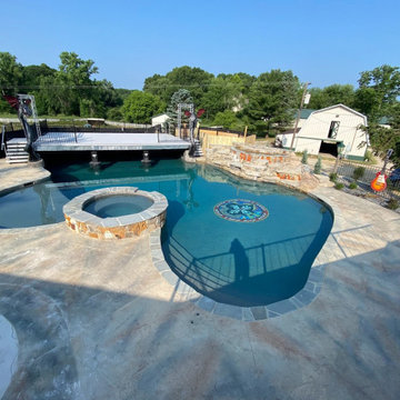
The design strategy included working within the footprint created by the home and backyard, wanting to incorporate a swimming pool “destination” within the backyard that would be large enough to fit the “larger than life” criteria, but without taking away any of the natural beauty or obstructing the view of the horse pastures, barn and nature surrounding the home.
Once the design work began, and the pool area was able to incorporate one of every feature the customer could have wanted, Curtis had some steel grates from a former tilt-a-whirl carnival ride that gave him the idea of suspending a stage over the pool. The initial idea was a modest stage with some waterfall/sheer decent features. With the idea of using steel to form the framework, the stage idea grew into something much more that would include a full stage set up, lighting trusses, a “green room” and staging area. Once the stage was designed to be so large, the pool size and scope needed to match including the patio surround, area underneath the stage, and all the additional features.
The home architecture is a Ranch with a full finished walkout basement adjacent to the pool area. An existing deck had to be removed to allow for the pool build and new Trex deck, as well as a 3 story tall observation tower that overlooks the pool and surrounding horse pastures.
The design strategy was to work within the footprint the house and decks provided to create an extension of the home for outdoor entertaining. Since the exterior of the house was quite long (and dull, the owner equating it to a 1970’s motel), our team needed to incorporate elements to make the space feel more like a backyard resort. The goal was maintaining a cozy at home feel in a grand expanse of space.
It takes a team and a unique blend of artistry to build this project. Sandi Maki, co-owner of the company is responsible for the business side of things, and marketing to reach exceptional customers who allow us to build these backyard dreams. The construction side of our company boasts a diverse, multi-geneational family business. Allan Curtis is the designer/builder and comes up with the fantastic pool plans and ideas. His team consists of his daughter Jesse Curtis, who is high right hand and manages the project just as much as Allan does. She is instrumental in everything from dig day, to tying the steel, pouring the concrete, stonework and tile work, forming the waterfall, applying ecoFinish, pouring and stamping patio, and everything in between. Allan’s nephew Mark Curtis installed and plumbed the three pool filtration systems. Allan’s wife Annie has become very good at stonework on walls and waterfalls adding the unique accents our projects have become known for. Allan’s sister-in-law, Karen Olson also does tile and stonework on the jobs and created the rockstar mural on the patio. Frank DiPiazza assists with structural elements and built the new deck, and college student Brendan Schafer assists where needed and maintains the pool and equipment during the summer on a weekly basis.
As with many homeowners who reach out to Legendary Escapes, this owner, Dale Walter, knew he wanted a “custom” pool without knowing what that really meant. He was able to show Curtis the space, and his initial ideas, and then allowed Allan and his team the freedom to dream and build. The majority of Legendary Escapes customers make the decision to hire the company after the first meeting with Curtis. As long as the project and design are challenging and interesting, the customer meets the criteria of being easy to work with, and is special in their own unique way Curtis will consider taking on their project. From the beginning it is important to Curtis that the customer understands they need to allow the project to take on a life of it’s own, and for Curtis to create without interference or asking too many questions – working together becomes a reality.
The design is typically presented on paper, a hand-colored, hand drawn design that outlines only the large elements, and an accompanying budget which outlines the structural elements and budgets and has a “theme” budget for items to be determined but doesn’t change once it is set.
Once that contract is signed, Curtis and his team over-deliver on what the customer could only have dreamed up in their wildest imagination. Projects proceed in an organic way- not every element is planned before the project begins. As the space begins to take shape, so do the details and finishing elements. When the Rockstar project began, there was no plan for the guitars on the fences, or guitar fire features. The VIP seating area wasn’t added until mid way through the patio pours as the space began to take shape. The murals both in the grotto and on the pool floor were planned just moments before each of them was to be installed. It’s this free-flowing combination of the customers and team’s dreams, ideas, elements and the Legendary Escapes team that creates backyard pools that are as much art as they are design and engineering masterpieces.
 Bilotta Kitchen & Home
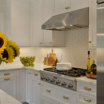
For this kitchen, designed by Peter Bittner, the client had a very clear idea of what she wanted right from the start. She did her research. The mother of a fast growing, young family, she wanted something as efficient as it was beautiful – on the simple, yet elegant side. Her requests were straightforward: white and light grey Bilotta cabinetry in a transitional style so as not to compete with the detailing inside her 1950s Tudor-style home; a heated tile floor (By Rye Ridge Tile); stainless appliances; white subway tile backsplash by Walker Zanger (again to keep it clean and not compete with its surroundings); and seating at the island for snacks and homework. The “pop” suggested by Peter was done through the satin brass hardware and lighting fixtures. The real challenge with this space was to fit as much as possible into the existing footprint which was overall on the smaller side. The solution was eliminating a doorway (with a swinging door that opened into the kitchen) and stairs from the kitchen to the basement. By moving the stairs and doorway, the usable space increased considerably. The typical working triangle became the focus for one side of the kitchen and the island overhang and seating became available on the other side. To make up for the limited amount of wall cabinets Peter designed shallow pantry-style cabinets along the back wall. Quartz Countertops by Rom Stone Fabrication. Designer: Peter Bittner Photographer: Peter Krupenye
 Drewett Works
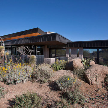
Believe it or not, this award-winning home began as a speculative project. Typically speculative projects involve a rather generic design that would appeal to many in a style that might be loved by the masses. But the project’s developer loved modern architecture and his personal residence was the first project designed by architect C.P. Drewett when Drewett Works launched in 2001. Together, the architect and developer envisioned a fictitious art collector who would one day purchase this stunning piece of desert modern architecture to showcase their magnificent collection.
The primary views from the site were southwest. Therefore, protecting the interior spaces from the southwest sun while making the primary views available was the greatest challenge. The views were very calculated and carefully managed. Every room needed to not only capture the vistas of the surrounding desert, but also provide viewing spaces for the potential collection to be housed within its walls.
The core of the material palette is utilitarian including exposed masonry and locally quarried cantera stone. An organic nature was added to the project through millwork selections including walnut and red gum veneers.
The eventual owners saw immediately that this could indeed become a home for them as well as their magnificent collection, of which pieces are loaned out to museums around the world. Their decision to purchase the home was based on the dimensions of one particular wall in the dining room which was EXACTLY large enough for one particular painting not yet displayed due to its size. The owners and this home were, as the saying goes, a perfect match!
Project Details | Desert Modern for the Magnificent Collection, Estancia, Scottsdale, AZ
Architecture: C.P. Drewett, Jr., AIA, NCARB | Drewett Works, Scottsdale, AZ
Builder: Shannon Construction | Phoenix, AZ
Interior Selections: Janet Bilotti, NCIDQ, ASID | Naples, FL
Custom Millwork: Linear Fine Woodworking | Scottsdale, AZ
Photography: Dino Tonn | Scottsdale, AZ
Awards: 2014 Gold Nugget Award of Merit
Feature Article: Luxe. Interiors and Design. Winter 2015, “Lofty Exposure”
 Align Design LLC
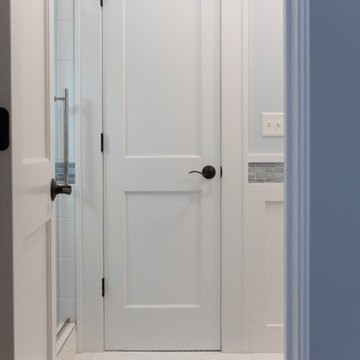
This project was focused on eeking out space for another bathroom for this growing family. The three bedroom, Craftsman bungalow was originally built with only one bathroom, which is typical for the era. The challenge was to find space without compromising the existing storage in the home. It was achieved by claiming the closet areas between two bedrooms, increasing the original 29" depth and expanding into the larger of the two bedrooms. The result was a compact, yet efficient bathroom. Classic finishes are respectful of the vernacular and time period of the home.
 Kitchen Associates
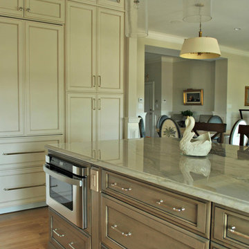
This old historic building in Belmont, MA was converted into beautiful luxury condos. While the high 10.5 foot ceilings are a great feature of the space, they also created a design challenge in the kitchen. We wanted to somehow fill the space between the reachable upper cabinets and the high ceiling avoiding an awkward "open" look in this area.
The homeowners wanted stacked cabinets, but rather than just doing typical glass doors, we installed cabinets with medallion mullion doors with antiqued mirror inserts. This not only gives the kitchen a classy look, but also creates some storage for those "once a year" items you can never find a place for.
Another exciting design element is the wood range hood with nautical trim molding. Come visit our showroom to see this same range hood in person!
Brand: Brookhaven
Door Style: Freemont Recessed
Finish: (main) Lace with Charcoal Glaze, (island) Harbor Mist with Pewter Glaze
Countertop: Marble
Hardware: Top Knobs - Polished Nickel (TK321PN & TK323PN)
 Drewett Works
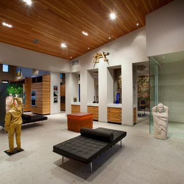
Believe it or not, this award-winning home began as a speculative project. Typically speculative projects involve a rather generic design that would appeal to many in a style that might be loved by the masses. But the project’s developer loved modern architecture and his personal residence was the first project designed by architect C.P. Drewett when Drewett Works launched in 2001. Together, the architect and developer envisioned a fictitious art collector who would one day purchase this stunning piece of desert modern architecture to showcase their magnificent collection.
The primary views from the site were southwest. Therefore, protecting the interior spaces from the southwest sun while making the primary views available was the greatest challenge. The views were very calculated and carefully managed. Every room needed to not only capture the vistas of the surrounding desert, but also provide viewing spaces for the potential collection to be housed within its walls.
The core of the material palette is utilitarian including exposed masonry and locally quarried cantera stone. An organic nature was added to the project through millwork selections including walnut and red gum veneers.
The eventual owners saw immediately that this could indeed become a home for them as well as their magnificent collection, of which pieces are loaned out to museums around the world. Their decision to purchase the home was based on the dimensions of one particular wall in the dining room which was EXACTLY large enough for one particular painting not yet displayed due to its size. The owners and this home were, as the saying goes, a perfect match!
Project Details | Desert Modern for the Magnificent Collection, Estancia, Scottsdale, AZ
Architecture: C.P. Drewett, Jr., AIA, NCARB | Drewett Works, Scottsdale, AZ
Builder: Shannon Construction | Phoenix, AZ
Interior Selections: Janet Bilotti, NCIDQ, ASID | Naples, FL
Custom Millwork: Linear Fine Woodworking | Scottsdale, AZ
Photography: Dino Tonn | Scottsdale, AZ
Awards: 2014 Gold Nugget Award of Merit
Feature Article: Luxe. Interiors and Design. Winter 2015, “Lofty Exposure”
 Renovisions
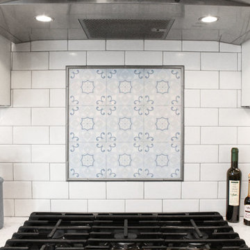
This client requested that we design her new kitchen space to look and function with her and her family’s usage in mind. She was not happy with her existing kitchen due to builder-grade ceramic flooring, lack of countertop space, poor lighting, inadequate and unorganized storage and the closed off feel of the area. Renovisions resolved all of these issues by designing and building an impressive, transitional styled kitchen; delivering a beautifully well thought-out space that provides a multi-functional approach and meets the needs of this busy and dynamic household.
Typically, we encounter challenges in every project, and this was no different. The upstairs bathroom plumbing ran across the entire length of the kitchen sink wall and it was necessary to work with it by moving the plumbing as far up as possible and then building a soffit to hide it.
Creating a space that has a more open feel was top of mind for our client. Installing a new wood floor that matched the existing dining room floor helped with this and in addition, warmed up the room. By relocating the refrigerator to the opposite wall and adding a bar area at the end toward the family room, the flow of traffic for family members and guests became more managed.
The open floor plan allowed for additional island cabinets to accommodate smart storage and better functionality when prepping meals, sitting to eat or gathering with friends and family. We believe having ample countertop surface space is a critical improvement in any renovation and this particular project now boasts a large countertop area with a stunning wide vein pattern that accentuates the design instead of overpowering it. The soft look of the Blanco Arabescato quartz enhances the space and looks lovely with the white inset styled cabinetry.
Beauty and function go hand-in-hand in this kitchen with several exceptional elements such as under-cabinet lighting with dimmers to control the mood light. Glass doors were added to the wall cabinets which flank the wine rack for displaying their decorative glassware and a beverage cooler below provided added convenience and access to cold beverages. The GE Café line of appliances in ‘Slate’ and ‘Stainless Steel’ finishes are a stunning contrast here.
The sensational looking decorative marble 6”x6” backsplash tile over the gas range and in the bar area creates nice focal points by creating a unique look for her that family and guests love.
Convenient and functional elements were added such as a blind corner pull-out for easier pot/pan storage, a sweep-o-vac under cabinet vacuum system for those constant quick clean-ups, a pull-out caddy under the sink base for storage of cleaning products and a protective mat to collect potential spills.
Our client let us know it was time for a change and we listened. She shared a few pictures she loved from a home magazine, we shared our insight and then designed/built the kitchen of her dreams! … A fabulous and functional space.
 Drury Design
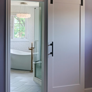
The original idea was to update the tile floor and the tub. That’s it.
A further discussion of wants and needs revealed intentions for an eventual larger shower and an improved vanity storage. It made sense to map out the possibilities and design our update with potential next steps in mind. The process was exciting, ultimately leading to the decision to do a full primary bath remodel.
Design Objectives:
-Maintain existing locations for all major bathroom functions
-Make the shower larger and more open
-Use luxurious materials throughout
-Improve vanity storage and define accessories for specific items
-Incorporate luxury shower fixtures
-Include the latest technology
Design Challenges
-Enlarging the shower in a typical rectangular shape would block the view and light from the alcove windows behind the tub
-Logical placement of the built-in shower caddy and all shower components in accordance with how and where they were to be used
-Keeping the long, back wall free from any shower modules to maintain the decorative tile design
-Combining the owner’s existing smart home system with a comprehensive shower system
-Planning cabinetry for hidden storage and use for various small appliances and make-up
-Integrating expensive shower wall tile with less expensive wall tile for aesthetic and budget purposes
-Incorporating special design features to balance the highly decorative shower tile
Design solutions:
-A clipped corner was planned for the shower bench seat – this allowed for a larger glass wall. The glass wall at the angled bench also brought more natural light into the shower
-Thoughtful shower space design prevented the crowding of features – the shower caddy and handheld shower head were placed on the full-height wall by the shower bench, the regular shower head and body sprays remained on the opposite wall, and the rain head was placed in the center of the shower
-A multi-port DTV system was installed, providing control of all shower components, including chromotherapy and music inside and outside the shower
-The lavish water-jet stone and glass decorative tile was paired with a less-expensive glass tile found in the mosaic
-Pull-out grooming organizers and electrical docking stations were incorporated into the cabinetry
Additional storage was created in the lower corner cabinet
The homeowners are thrilled with their new primary bathroom. Clear goals and carefully evaluated materials informed a fun and functional design that is both thoughtful and sumptuous!
 RAJ Kitchen and Bath, LLC
 “Full apartment design”.
IF you have not yet seen this apartment conversion before, we strongly urge you to go to the bottom left of this page and click on the short 2-minutes video. It would put a lot of things into perspective when you come back and continue reading this.
It is true we were literally handed the keys and told a list of things that they wanted to have happen and we were to go into the apartment, look at the space and come up with a design that would satisfy all of that need. UNTIL we showed up! The unit had really seen some better days but we knew we had to look past that and come up with a concept that would work for them.
The immediate challenges were centered around 3 big ideas:
1. Adding a second bedroom to the already small footprint
2. Figuring out a way to make the kitchen bigger, better and brighter
3. Creating a master room walk in closet
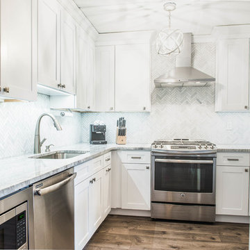
It’s always difficult to add new rooms into existing footprint without expanding out or up and not incurring any opportunity cost. In this case, that was exactly what we had to do. Item one and two above had to be tackled as one. We went ahead and switched out the location of the dining room and eliminating an area where there was a “nook” type eat-in area. By doing so, we were able to cut right into that footprint and change the layout of the kitchen.
That one move allowed us to dig into the kitchen design because it was now the main focal point in the apartment. It was no longer an option to keep it in that tiny hole where it was, so we had to ensure that this design was functional and aesthetically pleasing at the same time. By adding the table into the space where an Island typically would go, we were able to both cut cost and still provide a dining experience. The Table serves as an Island as well when cooking.
We then proceeded to block in the existing doorway to the dining room. By doing this, we were able to create a full room which allowed us to put a door on the other side and called that room Bedroom #2. This was easier to do because all of the mechanicals were already in that space (light, heater and windows). By shifting things around, we also achieved a huge wall to wall closet from inside. PERFECT!
Then we moved into the Single bedroom. We thought it was a big room with a small closet, so by creatively adding an L shaped wall and steal some footprint into the bedroom side, we were able to put a door on that new room and design it for the walk-in closet. Even after this, the bedroom still holds a queen size bed with 2 night stands, a TV on the wall, a sitting chair and plenty of room to walk around. This was done by rethinking the location for the bed and night stands.
The bathroom was gutted to make sure there was no leaks and rebuild from the ground up. We kept all of the plumbing where it was, added a new vanity, medicine cabinet, tiles and lighting and it was done.
From there, the rest of the unit had new flooring all throughout, paint, and lighting. After completion and walk through, this project was handed over back to the clients.
Execution and collaboration between all the trades were: Reggie and his team from Premier Interiors and Rohan from RD Mechanical Services.
p.s. Please see our website to see the video.
 Natural Stone Institute
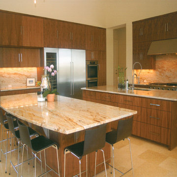
The challenge for this project was to find materials that fit into the owners' architectural style, selfentitled "Texas Hill Country Contemporary"; warm and inviting, but also clean and contemporary. The architect and the owners were determined not to copy the typical "Tuscan" style so popular for upscale homes in the Austin area. The main feature of the house is the use of both indoor and outdoor spaces and is designed so that everyday life flows through all of the spaces. The material selections had to be compatible to color schemes inside and out, blending with the local cut stone used on the exterior of the house, but also functional in their application.
Interior flooring: AG&M furnished hone finish Selina Gold limestone tile from Egypt for the majority of ground floor paving. This material has a wide range of color, the selection was made from a particular quarry and a particular layer within that quarry.
Exterior paving, pool coping, fireplace facing: Goldstone granite was chosen because it performs well in exterior applications and has the soft coloring of limestone. The paving and coping is chisel finish and the outdoor fireplace is clad with split face Goldstone to match.
Kitchen countertops: Apollo Storm granite in a polish finish with matching full-height, endmatched backsplash.
26