
Search results for "Typical challenges" in Home Design Ideas
 Amy Pearson Design
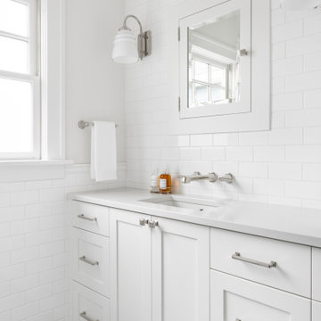
This classic Portland bungalow in the highly desirable Irvington neighborhood has been in the family for generations and lovingly cared for and updated throughout the years. It was now the main floor’s primary bathroom that needed to be addressed. A tight footprint made for some space planning challenges, but what we love so much about this project is that it demonstrates that so much can be done with a small space! Designing a shallower than typical vanity allowed us to extend the cabinetry and countertop as far as the door swing into the room would allow, adding much needed storage to the room. A narrow undermount sink combined with wall mount faucet ensures the vanity remains extremely functional. A tower cabinet at the end frames the sink and mirror, bringing an appreciated moment of symmetry while providing space for electric bathroom products and so much more. Where a two sided tub/shower once lived, now a walk in shower framed in glass makes the space feel, and live, significantly larger than its modest square footage. The use of glass on only the long side, and pony wall with glass above on the short end, visually expands the space allowing the eye to move freely around the room while still providing privacy at the toilet. Marmoleum flooring makes for easy cleaning while mosaic tile on the shower floor ensures traction in the wet environment. A classic penny tile accent around the shower walls, combined with the tile wainscot around the room speak to the classic architecture of the home. The bright and fresh palette is at once lively and calming, youthful and sophisticated, current and timeless!
 Renovisions
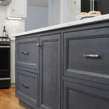
This client requested that we design her new kitchen space to look and function with her and her family’s usage in mind. She was not happy with her existing kitchen due to builder-grade ceramic flooring, lack of countertop space, poor lighting, inadequate and unorganized storage and the closed off feel of the area. Renovisions resolved all of these issues by designing and building an impressive, transitional styled kitchen; delivering a beautifully well thought-out space that provides a multi-functional approach and meets the needs of this busy and dynamic household.
Typically, we encounter challenges in every project, and this was no different. The upstairs bathroom plumbing ran across the entire length of the kitchen sink wall and it was necessary to work with it by moving the plumbing as far up as possible and then building a soffit to hide it.
Creating a space that has a more open feel was top of mind for our client. Installing a new wood floor that matched the existing dining room floor helped with this and in addition, warmed up the room. By relocating the refrigerator to the opposite wall and adding a bar area at the end toward the family room, the flow of traffic for family members and guests became more managed.
The open floor plan allowed for additional island cabinets to accommodate smart storage and better functionality when prepping meals, sitting to eat or gathering with friends and family. We believe having ample countertop surface space is a critical improvement in any renovation and this particular project now boasts a large countertop area with a stunning wide vein pattern that accentuates the design instead of overpowering it. The soft look of the Blanco Arabescato quartz enhances the space and looks lovely with the white inset styled cabinetry.
Beauty and function go hand-in-hand in this kitchen with several exceptional elements such as under-cabinet lighting with dimmers to control the mood light. Glass doors were added to the wall cabinets which flank the wine rack for displaying their decorative glassware and a beverage cooler below provided added convenience and access to cold beverages. The GE Café line of appliances in ‘Slate’ and ‘Stainless Steel’ finishes are a stunning contrast here.
The sensational looking decorative marble 6”x6” backsplash tile over the gas range and in the bar area creates nice focal points by creating a unique look for her that family and guests love.
Convenient and functional elements were added such as a blind corner pull-out for easier pot/pan storage, a sweep-o-vac under cabinet vacuum system for those constant quick clean-ups, a pull-out caddy under the sink base for storage of cleaning products and a protective mat to collect potential spills.
Our client let us know it was time for a change and we listened. She shared a few pictures she loved from a home magazine, we shared our insight and then designed/built the kitchen of her dreams! … A fabulous and functional space.
 Living with Lolo
Entry in Hodges Street | Room Type:
Whole Home Interior Design |
Project Name:
Hodges Street |
Key Feature:
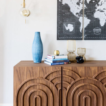
A builder-grade tract home transformed with personality through a playful mid-century modern design influence.
Challenge:
The home originally lacked character and felt like a typical builder-grade tract house. The goal was to elevate the space and create a more distinctive interior.
Solution:
The design introduced bold styling and mid-century modern touches throughout the home, adding personality and visual interest while creating a more elevated and cohesive interior.
Timeline:
Completed in 2018.
Find the right local pro for your project
 Highland Design+Build
This typical 1980͛s master bath was a 5͛ x 8͛ foot space with a single vanity, small, angled shower and modest linen closet. The homeowner͛s desire was to have two sinks, a soaking tub, shower and toilet all in the same 5͛ x 8͛ space. This certainly posed a design challenge. Deleting the linen closet and relocating the toilet allowed for a ͚wet room͛ design concept. This enabled the homeowner͛s to incorporate both a soaking tub and a tile shower with a frameless glass enclosure. A sliding barn door replaced the old existing inswing door making room for his & her vanities opposite each other. The 12 x 24 porcelain tile covers the bath floor and wraps the shower walls to the ceiling. This adds visual depth to this small space. A glass and metal hexagon accent band create a pop of color and texture in the shower. This bath was made complete with Cambria Bellingham quartz countertops, glass vessel bowls and coordinating glass knobs on the vanity cabinetry.
205 Photography
 Studio 1200
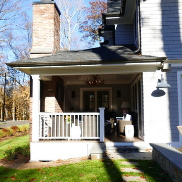
With a location right in the heart of vibrant Madison New Jersey, this house has a prime location in a charming and desirable neighborhood. The new owners’ dream for a Shingle Style house more typical of the size and style of other houses in the neighborhood was challenged by the fact that the building coverage was already maxed for the property. Any increases would have to be done within the existing footprint.
Studio 1200 was able to provide a more substantial and functional living experience for the family by adding one story and reconfiguring the first floor to create a better flow. A new kitchen and dining room were created and relocated to rear of the house, resulting in an easy egress to the private patio and backyard. A new mudroom, spare bedroom, powder room, office and covered porch completed the modern layout of the first floor, all within the same original footprint. The addition of a fireplace to the covered porch meant this space can be used practically year-round. The second floor also received an upgrade through redesign, introducing a special master suite with 2 separate walk-in closets as well as a bathroom with a dramatic soaking tub. Completing the second floor are three more bedrooms, two bathrooms, and a laundry room. Atop it all is an attic, providing storage space that was not in the original home’s design.
 Renovisions
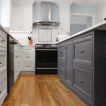
This client requested that we design her new kitchen space to look and function with her and her family’s usage in mind. She was not happy with her existing kitchen due to builder-grade ceramic flooring, lack of countertop space, poor lighting, inadequate and unorganized storage and the closed off feel of the area. Renovisions resolved all of these issues by designing and building an impressive, transitional styled kitchen; delivering a beautifully well thought-out space that provides a multi-functional approach and meets the needs of this busy and dynamic household.
Typically, we encounter challenges in every project, and this was no different. The upstairs bathroom plumbing ran across the entire length of the kitchen sink wall and it was necessary to work with it by moving the plumbing as far up as possible and then building a soffit to hide it.
Creating a space that has a more open feel was top of mind for our client. Installing a new wood floor that matched the existing dining room floor helped with this and in addition, warmed up the room. By relocating the refrigerator to the opposite wall and adding a bar area at the end toward the family room, the flow of traffic for family members and guests became more managed.
The open floor plan allowed for additional island cabinets to accommodate smart storage and better functionality when prepping meals, sitting to eat or gathering with friends and family. We believe having ample countertop surface space is a critical improvement in any renovation and this particular project now boasts a large countertop area with a stunning wide vein pattern that accentuates the design instead of overpowering it. The soft look of the Blanco Arabescato quartz enhances the space and looks lovely with the white inset styled cabinetry.
Beauty and function go hand-in-hand in this kitchen with several exceptional elements such as under-cabinet lighting with dimmers to control the mood light. Glass doors were added to the wall cabinets which flank the wine rack for displaying their decorative glassware and a beverage cooler below provided added convenience and access to cold beverages. The GE Café line of appliances in ‘Slate’ and ‘Stainless Steel’ finishes are a stunning contrast here.
The sensational looking decorative marble 6”x6” backsplash tile over the gas range and in the bar area creates nice focal points by creating a unique look for her that family and guests love.
Convenient and functional elements were added such as a blind corner pull-out for easier pot/pan storage, a sweep-o-vac under cabinet vacuum system for those constant quick clean-ups, a pull-out caddy under the sink base for storage of cleaning products and a protective mat to collect potential spills.
Our client let us know it was time for a change and we listened. She shared a few pictures she loved from a home magazine, we shared our insight and then designed/built the kitchen of her dreams! … A fabulous and functional space.
 Gravel To Gold, Inc.
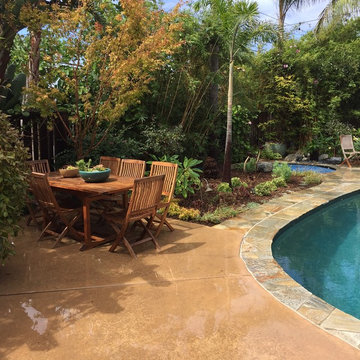
When we envisioned the new landscape within the outdoor living space at Solana Beach Coastal Oasis, we imagined we were sitting poolside at a lushly planted Baja Zen style retreat.
The owners of this Solana Beach home wanted plenty of space for outdoor dining and lounging by the pool. We enjoy creating innovative outdoor spaces for clients that can check both boxes. The outcome of this serene coastal landscape design has just the right combination of sleek and rustic elements, while being low maintenance.
This outdoor renovation also included some eco-friendly upgrades. We renovated an existing sprinkler system so that it uses 60% less water than traditional systems.
To keep it easy for the client, we added a custom Ipe wood pool cover box that also serves as a bench. This box contains the solar pool cover that was a challenge to store and an eyesore in the scenery.
We introduced succulents and other low water plants in order to reduce the amount of water that is typically required to keep landscapes thriving in Southern California.
Additional Design Elements:
Potted plants including Citrus and Japanese Maple trees
Custom Redwood entry gates and privacy fence
Custom Ipe wood bench box that also stores the unsightly solar pool cover
Fire pit table installed for enjoying cool evenings
Stone veneered outdoor BBQ
Stone veneered columns and retaining walls
Pool with waterfall
Spa
Stained concrete walkways and patios with inlaid stone bands
Low voltage lighting
Bistro lights
Teak patio furniture
Eco-Friendly Upgrades


 Natural Stone Institute
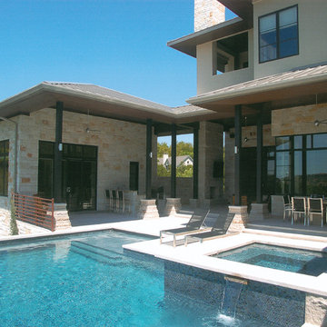
The challenge for this project was to find materials that fit into the owners' architectural style, selfentitled "Texas Hill Country Contemporary"; warm and inviting, but also clean and contemporary. The architect and the owners were determined not to copy the typical "Tuscan" style so popular for upscale homes in the Austin area. The main feature of the house is the use of both indoor and outdoor spaces and is designed so that everyday life flows through all of the spaces. The material selections had to be compatible to color schemes inside and out, blending with the local cut stone used on the exterior of the house, but also functional in their application.
Interior flooring: AG&M furnished hone finish Selina Gold limestone tile from Egypt for the majority of ground floor paving. This material has a wide range of color, the selection was made from a particular quarry and a particular layer within that quarry.
Exterior paving, pool coping, fireplace facing: Goldstone granite was chosen because it performs well in exterior applications and has the soft coloring of limestone. The paving and coping is chisel finish and the outdoor fireplace is clad with split face Goldstone to match.
Kitchen countertops: Apollo Storm granite in a polish finish with matching full-height, endmatched backsplash.
 Living with Lolo
Kitchen in Hodges Street | Room Type:
Whole Home Interior Design |
Project Name:
Hodges Street |
Key Feature:
A builder-grade tract home transformed with personality through a playful mid-century modern design influence.
Challenge:
The home originally lacked character and felt like a typical builder-grade tract house. The goal was to elevate the space and create a more distinctive interior.
Solution:
The design introduced bold styling and mid-century modern touches throughout the home, adding personality and visual interest while creating a more elevated and cohesive interior.
Timeline:
Completed in 2018.
 Renovisions
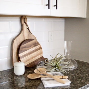
This client requested that we design her new kitchen space to look and function with her and her family’s usage in mind. She was not happy with her existing kitchen due to builder-grade ceramic flooring, lack of countertop space, poor lighting, inadequate and unorganized storage and the closed off feel of the area. Renovisions resolved all of these issues by designing and building an impressive, transitional styled kitchen; delivering a beautifully well thought-out space that provides a multi-functional approach and meets the needs of this busy and dynamic household.
Typically, we encounter challenges in every project, and this was no different. The upstairs bathroom plumbing ran across the entire length of the kitchen sink wall and it was necessary to work with it by moving the plumbing as far up as possible and then building a soffit to hide it.
Creating a space that has a more open feel was top of mind for our client. Installing a new wood floor that matched the existing dining room floor helped with this and in addition, warmed up the room. By relocating the refrigerator to the opposite wall and adding a bar area at the end toward the family room, the flow of traffic for family members and guests became more managed.
The open floor plan allowed for additional island cabinets to accommodate smart storage and better functionality when prepping meals, sitting to eat or gathering with friends and family. We believe having ample countertop surface space is a critical improvement in any renovation and this particular project now boasts a large countertop area with a stunning wide vein pattern that accentuates the design instead of overpowering it. The soft look of the Blanco Arabescato quartz enhances the space and looks lovely with the white inset styled cabinetry.
Beauty and function go hand-in-hand in this kitchen with several exceptional elements such as under-cabinet lighting with dimmers to control the mood light. Glass doors were added to the wall cabinets which flank the wine rack for displaying their decorative glassware and a beverage cooler below provided added convenience and access to cold beverages. The GE Café line of appliances in ‘Slate’ and ‘Stainless Steel’ finishes are a stunning contrast here.
The sensational looking decorative marble 6”x6” backsplash tile over the gas range and in the bar area creates nice focal points by creating a unique look for her that family and guests love.
Convenient and functional elements were added such as a blind corner pull-out for easier pot/pan storage, a sweep-o-vac under cabinet vacuum system for those constant quick clean-ups, a pull-out caddy under the sink base for storage of cleaning products and a protective mat to collect potential spills.
Our client let us know it was time for a change and we listened. She shared a few pictures she loved from a home magazine, we shared our insight and then designed/built the kitchen of her dreams! … A fabulous and functional space.
 Bear Trap Design
Catch-all Storage Closet Transforms into Elegant Wine Cellar
It was a typical unused space with bare studs and exposed insulation located at the base of the lower level stairs, next to the mechanical room. The entire lower level floor is covered with multi-color slate which contained in-floor heat. This posed a problem for the new wine cellar.
The challenge was overcome by placing a layer of foam insulation with a vapor barrier over the slate floor, walls, and ceiling. Then, a plywood subfloor was glued in. A wall space vented into the adjacent laundry room was created to house a cooling unit, which maintains a perfect temperature within the wine cellar.
The location of this wine cellar was a wonderful opportunity to create a showpiece that could be viewed from the upper level. An old fashioned store front, complete with two large windows and a faux painted shingle roof, was designed and built to draw attention and allow the viewer to see inside.
Tami found a wall mural of an authentic wine cave and had it sized to fit the side wall of the new wine cellar, providing an illusion of continuing space and setting the tone of what was about to come.
A rustic wood floor and a tongue and groove barrel ceiling, faux painted to resemble brick, were installed - all coinciding with the wall mural.
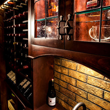
Custom cabinetry filled the interior, holding wine bottles and boxes of such. A copper sink was inlayed into a wood counter top. Faux painted bricks highlight an oiled rubbed bronze faucet and a leaded seedy glass cabinet above is designed to hold various types of scotch whiskey.
Ambient lighting enhances the cabinetry while a rustic mini chandelier hangs from the center of the barrel ceiling. This once “catch-all” storage closet is no more. A small, old world wine cellar has emerged and now, is quite a show piece.
 Dresner Design | Chicago Custom Kitchens Cabinets
Dresner Design possesses the expertise to design cutting edge, cost-effective kitchens, baths and closets for developer’s multi-unit projects. They were recently part of the design team for The Ronsley, River North's best new luxury condominium development.
This former industrial timber loft building was transformed into an incredible 41-unit building, and Dresner Design was hired to design both the kitchens and baths using Italian cabinetry from Stosa Cucine.
Challenges:
All the units were the same but with varying configurations. The goal was to make all the units feel and look the same but each of the layouts was different- making 30 layouts in all.
Concept:
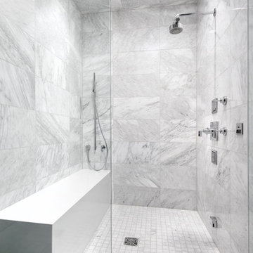
The kitchens and baths were designed to be sleek and modern, blending in with the loft style. The kitchen islands fabricated with wood compliments the wood ceilings and beams typical of loft living. White kitchens are always timeless and the Ronsley used the most beautiful and high-end cabinetry made of 100% lacquer.
Photography by Jim Tschetter
 Maison Birmingham
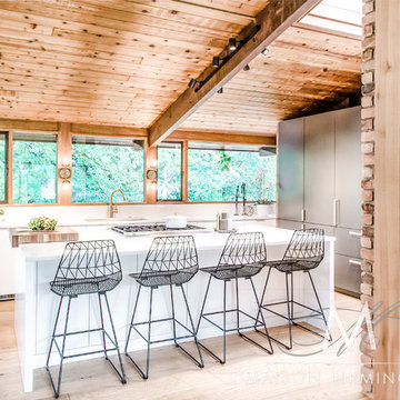
The main goal of this renovation was to update an authentic mid-century home to suit a modern lifestyle, while still maintaining the original character and aesthetic of the home.
To create a more open, family friendly space also suitable for entertaining, walls between the kitchen, dining room and living room were removed to create an open area to house the 360-sq.-ft. kitchen. Upon demolition, it was noted that some areas of the original tongue and groove ceiling had aged much differently than the rest of the ceiling. Rather than stain the areas and cause them to age differently, we opted to apply oil to darken the wood so that it will all continue to age at the same pace.
Balancing new materials and tones with the existing abundance of wood was challenging, but in the end the balance was achieved with custom cabinetry in both white and anthracite matte lacquer, which is complemented by a custom floating walnut buffet in the dining area. Keeping the island and perimeter base cabinet finishes the same made the space feel more open, and presented the opportunity to create a dark focal wall for the refrigerator and pantry. These custom anthracite matte lacquer cabinets provide a striking yet subtle contrast with the white and wood, while incorporating well concealed pantry storage with microwave, as well as a Sub-Zero refrigerator.
In lieu of a typical exhaust hood, downdraft ventilation was installed in the island, and pendants were omitted to keep the space open, but also more consistent with the original design of the home. Brass globe sconces were installed on either side of the sink to bring in warmth, and frame the view of the gorgeous greenery outside.
This Project was a fantastic collaboration with Lauren Combs of The Neat Method Michigan
Proudly Featured in Detroit Home October 2017
Photography by Boswell Hardwick
 Pace Construction Services/Aging in Place
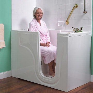
This is a lovely walk-in tub that can be installed in a corner of your home. The door closes to safely hold a warm bath while sitting. This is the perfect solution for anyone who is having mobility issues with a typical tub design. I have installed hundreds of these tubs for those agin in place or handicapped. My clients always have a such a beautiful smile when they sit in their tub for the first time ; - )
 Bear Trap Design
Catch-all Storage Closet Transforms into Elegant Wine Cellar
It was a typical unused space with bare studs and exposed insulation located at the base of the lower level stairs, next to the mechanical room. The entire lower level floor is covered with multi-color slate which contained in-floor heat. This posed a problem for the new wine cellar.
The challenge was overcome by placing a layer of foam insulation with a vapor barrier over the slate floor, walls, and ceiling. Then, a plywood subfloor was glued in. A wall space vented into the adjacent laundry room was created to house a cooling unit, which maintains a perfect temperature within the wine cellar.
The location of this wine cellar was a wonderful opportunity to create a showpiece that could be viewed from the upper level. An old fashioned store front, complete with two large windows and a faux painted shingle roof, was designed and built to draw attention and allow the viewer to see inside.
Tami found a wall mural of an authentic wine cave and had it sized to fit the side wall of the new wine cellar, providing an illusion of continuing space and setting the tone of what was about to come.
A rustic wood floor and a tongue and groove barrel ceiling, faux painted to resemble brick, were installed - all coinciding with the wall mural.
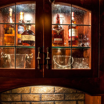
Custom cabinetry filled the interior, holding wine bottles and boxes of such. A copper sink was inlayed into a wood counter top. Faux painted bricks highlight an oiled rubbed bronze faucet and a leaded seedy glass cabinet above is designed to hold various types of scotch whiskey.
Ambient lighting enhances the cabinetry while a rustic mini chandelier hangs from the center of the barrel ceiling. This once “catch-all” storage closet is no more. A small, old world wine cellar has emerged and now, is quite a show piece.
 Living with Lolo
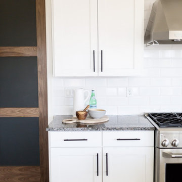
Kitchen in Hodges Street | Room Type:
Whole Home Interior Design |
Project Name:
Hodges Street |
Key Feature:
A builder-grade tract home transformed with personality through a playful mid-century modern design influence.
Challenge:
The home originally lacked character and felt like a typical builder-grade tract house. The goal was to elevate the space and create a more distinctive interior.
Solution:
The design introduced bold styling and mid-century modern touches throughout the home, adding personality and visual interest while creating a more elevated and cohesive interior.
Timeline:
Completed in 2018.
 Deskins Group LLC
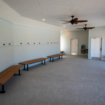
This project took us a bit off our usual path—and we loved the challenge. It began as a straightforward bid to re-side a local HOA’s swimming pool patio using Hardie stucco panels. But as the scope expanded, so did our role. We were tapped to completely rebuild their bathrooms to meet ADA compliance standards.
With no air conditioning in the space, we chose materials built to perform: Hardie stucco sheet paired with Sherwin Williams Rain Refresh Paint throughout. It was a project outside our typical scope, but thanks to our versatile and skilled team, we delivered results that exceeded expectations.
Got a unique project in mind? Let’s talk about how our team can bring your vision to life—no matter how outside the box it may be.
 Stonepocket Unique Landscapes
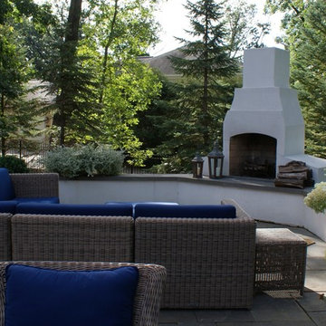
Landscape by Stonepocket located in Minnetonka, Minnesota Creating a elegant landscape to blend with a home with such character and charm was a challenge in controlled resistant. Did not want the landscape to overwhelm the home, nor did I want a typical landscape for this style that usually involves a box hedge. Utilizing light in the front to create a perennial garden give the home a sense of place. Keep the planting mostly to whites and greens in the back unifies the space.
photos by Stonepocket, Inc
 Bilotta Kitchen & Home
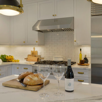
For this kitchen, designed by Peter Bittner, the client had a very clear idea of what she wanted right from the start. She did her research. The mother of a fast growing, young family, she wanted something as efficient as it was beautiful – on the simple, yet elegant side. Her requests were straightforward: white and light grey Bilotta cabinetry in a transitional style so as not to compete with the detailing inside her 1950s Tudor-style home; a heated tile floor (By Rye Ridge Tile); stainless appliances; white subway tile backsplash by Walker Zanger (again to keep it clean and not compete with its surroundings); and seating at the island for snacks and homework. The “pop” suggested by Peter was done through the satin brass hardware and lighting fixtures. The real challenge with this space was to fit as much as possible into the existing footprint which was overall on the smaller side. The solution was eliminating a doorway (with a swinging door that opened into the kitchen) and stairs from the kitchen to the basement. By moving the stairs and doorway, the usable space increased considerably. The typical working triangle became the focus for one side of the kitchen and the island overhang and seating became available on the other side. To make up for the limited amount of wall cabinets Peter designed shallow pantry-style cabinets along the back wall. Quartz Countertops by Rom Stone Fabrication. Designer: Peter Bittner Photographer: Peter Krupenye
 RAJ Kitchen and Bath, LLC
 “Full apartment design”.
IF you have not yet seen this apartment conversion before, we strongly urge you to go to the bottom left of this page and click on the short 2-minutes video. It would put a lot of things into perspective when you come back and continue reading this.
It is true we were literally handed the keys and told a list of things that they wanted to have happen and we were to go into the apartment, look at the space and come up with a design that would satisfy all of that need. UNTIL we showed up! The unit had really seen some better days but we knew we had to look past that and come up with a concept that would work for them.
The immediate challenges were centered around 3 big ideas:
1. Adding a second bedroom to the already small footprint
2. Figuring out a way to make the kitchen bigger, better and brighter
3. Creating a master room walk in closet
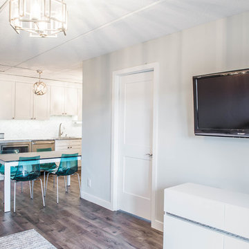
It’s always difficult to add new rooms into existing footprint without expanding out or up and not incurring any opportunity cost. In this case, that was exactly what we had to do. Item one and two above had to be tackled as one. We went ahead and switched out the location of the dining room and eliminating an area where there was a “nook” type eat-in area. By doing so, we were able to cut right into that footprint and change the layout of the kitchen.
That one move allowed us to dig into the kitchen design because it was now the main focal point in the apartment. It was no longer an option to keep it in that tiny hole where it was, so we had to ensure that this design was functional and aesthetically pleasing at the same time. By adding the table into the space where an Island typically would go, we were able to both cut cost and still provide a dining experience. The Table serves as an Island as well when cooking.
We then proceeded to block in the existing doorway to the dining room. By doing this, we were able to create a full room which allowed us to put a door on the other side and called that room Bedroom #2. This was easier to do because all of the mechanicals were already in that space (light, heater and windows). By shifting things around, we also achieved a huge wall to wall closet from inside. PERFECT!
Then we moved into the Single bedroom. We thought it was a big room with a small closet, so by creatively adding an L shaped wall and steal some footprint into the bedroom side, we were able to put a door on that new room and design it for the walk-in closet. Even after this, the bedroom still holds a queen size bed with 2 night stands, a TV on the wall, a sitting chair and plenty of room to walk around. This was done by rethinking the location for the bed and night stands.
The bathroom was gutted to make sure there was no leaks and rebuild from the ground up. We kept all of the plumbing where it was, added a new vanity, medicine cabinet, tiles and lighting and it was done.
From there, the rest of the unit had new flooring all throughout, paint, and lighting. After completion and walk through, this project was handed over back to the clients.
Execution and collaboration between all the trades were: Reggie and his team from Premier Interiors and Rohan from RD Mechanical Services.
p.s. Please see our website to see the video.
27