
Search results for "Untouched" in Home Design Ideas
 Lindy Design Build
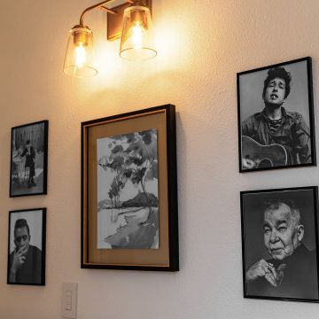
The primary bedroom didn’t go untouched. We anchored the space with Benjamin Moore Dragon’s Breath on the accent wall—a moody, rich tone that adds instant depth. It sets a stunning backdrop for the Rejuvenation Imbrie Articulating Sconces, which bring a classic brass-and-enamel moment into the mix. Paired with Buster + Punch dimmer switches, the lighting now responds intuitively to any mood, from soft nighttime reading to bright morning motivation.
Grounding the room is Dreamweaver’s Finishing Touch carpet in Shortbread, a soft, neutral foundation that keeps the room feeling cozy and connected to the palette of the bath.
 Kylie M Interiors
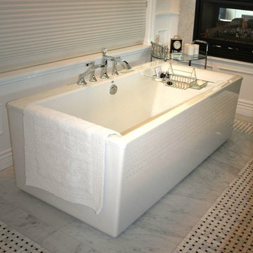
Gorgeous ensuite bathroom in a new home. With a basketweave marble tile path leading you throughout the space, from the water closet to the sauna, this bathroom leaves no details untouched. We mixed marble with affordable porcelain tile that looks like marble to achieve a high end look. Dark cabinets, freestanding tub, walk in shower and a gas fireplace complete this stunning bathroom that is an open layout space with the master bedroom.
 Erica Peale Design
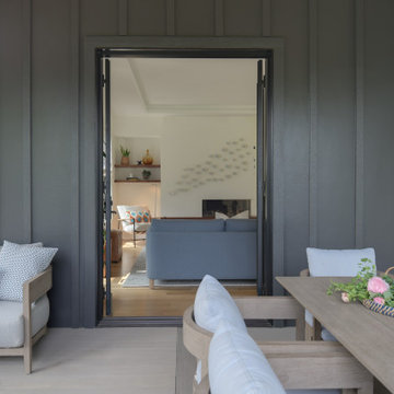
This modern custom home is a beautiful blend of thoughtful design and comfortable living. No detail was left untouched during the design and build process. Taking inspiration from the Pacific Northwest, this home in the Washington D.C suburbs features a black exterior with warm natural woods. The home combines natural elements with modern architecture and features clean lines, open floor plans with a focus on functional living.
Find the right local pro for your project
 Castle Building & Remodeling
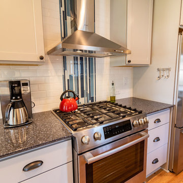
The homeowners of this 1922 Standish neighborhood bungalow wanted to accomplish two things for their Minneapolis home; make their tiny 96SF kitchen larger, and add a dining area next to the kitchen.
Since the room to the kitchen was used as a living space, they wanted to expand out of the back, utilizing the deck space for the dining room kitchen, and allowing for more storage, natural light, and functionality.
To achieve their goals, the chimney was removed, and a small addition was added on which allowed a galley style kitchen to take form and a nice, bright dining area. The challenge was leaving their living room and surrounding spaces untouched, and work around the existing stairs to the basement.
The solution was to extend the wall out next to the stairway to grant more wall space to the kitchen and create a “hall” to the basement stairs. Creating an entrance in to the dining/kitchen area from the garage also helped tie in their most common point of entry to the new design.
Check out this project on the 2018 Castle Home Tour, September 29 – 30th, 2018.
 Design Q&A
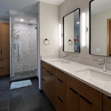
This home's owners are reverse snowbirds who love birding. They bought this home for the wooded lot but unfortunately couldn't see much from the inside. The home was dated throughout so there wasn’t a surface in this house left untouched. Besides all walls, ceilings, and floors being addressed, projects included three bath remodels and stairway railing replacement. But, the story became the kitchen where we combined it with the formal dining room and changed the orientation to add large windows towards the trees. Now the house feels like a tree house.
 Erica Peale Design
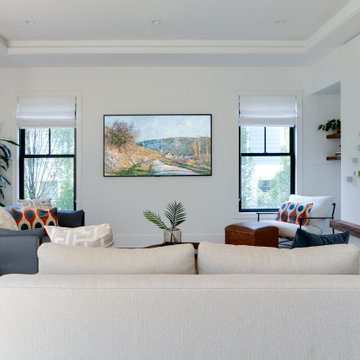
This modern custom home is a beautiful blend of thoughtful design and comfortable living. No detail was left untouched during the design and build process. Taking inspiration from the Pacific Northwest, this home in the Washington D.C suburbs features a black exterior with warm natural woods. The home combines natural elements with modern architecture and features clean lines, open floor plans with a focus on functional living.
 Kelly Darling Spadoni - Darling Interiors
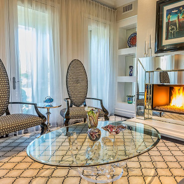
This living room went from drab to fab and no area of it went untouched. I designed the custom mirrored fireplace surround and the mirrored, lighted niches flanking the fireplace. The niches were designed to showcase the client's beautiful art glass collection. Sheer draperies soften the window wall and create privacy while still letting plenty of light in. The patterned carpet with black border is the perfect background for the elegant furniture. The lounge chairs, cocktail table and metallic upholstered pouf were custom designed especially for the room.
 Tapis Rouge
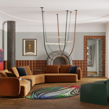
In 17th century Isaac Newton identified the colors (red, orange, yellow, green, blue, indigo, and violet) that make up the visible spectrum. And as his discovery at a time shocked the world and became a first step for a new era of discoveries and world evolution, we believe that the new Electric collection, creation of which is based on a solid theory of photon spectrum and physical characteristics of 4 speeds of rays which travel between Gamma as form of nuclear and cosmic radiation to infrared rays, a result of movement of lower-energy photons, will become a breakthrough of contemporary interior design.
This collection reflects a principally new approach to perception of rug in interior making it an art object at the first place. Nevertheless, very important value that remains untouched whatever we do and however futuristic our works are is extreme care about ecologic background and sustainability of our product. Through all the history of Atelier Tapis Rouge each of our rugs has been manually drawn by the team of our designers and afterwards tinted and knotted by hands of best Nepalese craftsmen, who carefully maintain tradition of rug knotting throughout the centuries.
The world has gone through a very hard time during last 2 years and perception of things, behavior, philosophic approach of people has changed drastically. We all need a recharge of energy and inspiration to restart our live paths in a new reality and there is no better place where we get energetic feed as home and family. Therefore, having created Electtrico we meant to boost the homes with warm solar energy – eternal source of life and continuity and we believe that it is a good start for new conquests.
Designed by Natalia Enze
 Apex Design & Drafting
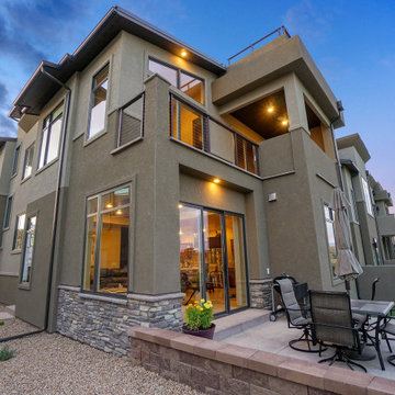
A sophisticated and alluring contemporary exterior gives way to a thoughtful interior that leaves no detail untouched. The spacious foyer opens up to an elegant u-shaped staircase, where large windows provide tons of natural light. The main living space is an open floor plan with thoughtful tray ceiling details. Upstairs the master suite enjoys nothing but luxurious living at its finest.
 River Woodcraft
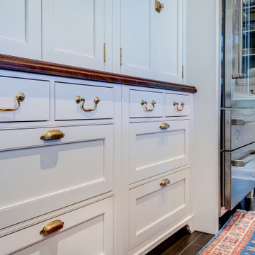
This kitchen was designed for the MAXIMALIST in mind. A homeowner who enjoys displaying all their antiques and chosen novelties from all over the world. No space was to be left untouched. Special attention was designed around custom detail beaded inset cabinetry, walnut countertops, polished lacquered bar with a tribute to their Naval background. Even the refrigerator is to be displayed through the glass
 Jennifer Ott Design
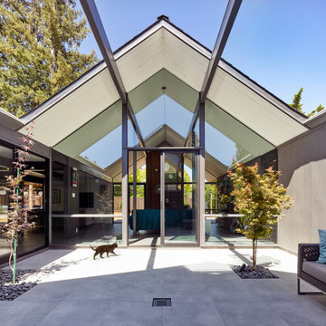
Originally built in 1970, this later-model Eichler—designed by architect Claude Oakland—features a distinctive “Model 14” roofline with a clipped gable, a subtle nod to the charm of English thatch-roof cottages.
Acquired from the original owner, the home remained in untouched, original condition—offering a rare opportunity for restoration, but also presenting an urgent need for updates.
Our approach was grounded in respect for Oakland’s original design intent, while thoughtfully incorporating essential upgrades to meet modern building codes and today’s lifestyle expectations.
Eichler homes were originally built using modest, cost-effective materials to make modern architecture accessible to the growing mid-century middle class. While iconic, elements like laminate countertops, particle board cabinetry, and vinyl composition tile flooring haven’t stood the test of time. We carefully replaced these with more durable, high-quality alternatives—granite countertops, maple-ply cabinets, and luxury vinyl tile—ensuring the home remains true to its spirit while standing strong for decades to come.
All images © Ken Gutmaker
 Tradition Outdoor Living
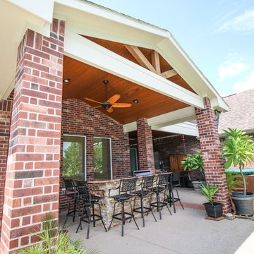
We built a Covered Patio with an Outdoor Kitchen to fit the requirements of our client in Cypress, TX. This space was specifically designed to entertain, while leaving the beautiful view untouched. Our clients are able to soak in their appealing landscaping and maintain a view of the lake from within the home as well as in their outdoor kitchen.
This structure was built to look original to the home, as brick, trim, and gutters were matched to the home. Tongue and Groove pre-stained wood were also added to the balcony and existing patio ceilings to match the new addition. The gable and truss style roof enhances this covered patio, adding height for a roomier feel.
The outdoor kitchen boasts a stone face with lovely Bordeaux Dark granite countertops and ample seating. Grilling is not hindered, with a large grill and plenty of storage and counter space, the only thing missing is the meat!
Finally, recessed lighting and ceiling fans create the perfect dining outdoors environment.
 Fiorito Interior Design
You don't have to own a big celebrity mansion to have a beautifully appointed house finished with unique and special materials. When my clients bought an average condo kitted out with all the average builder-grade things that average builders stuff into spaces like that, they longed to make it theirs. Being collectors of colorful Fiesta tableware and lovers of extravagant stone, we set about infusing the space with a dose of their fun personality.
There wasn’t a corner of the house that went untouched in this extensive renovation. The ground floor got a complete make-over with a new Calacatta Gold tile floor, and I designed a very special border of Lunada Bay glass mosaic tiles that outlines the edge of every room.
We ripped out a solid walled staircase and replaced it with a visually lighter cable rail system, and a custom hanging chandelier now shines over the living room.
The kitchen was redesigned to take advantage of a wall that was previously just shallow pantry storage. By opening it up and installing cabinetry, we doubled the counter space and made the kitchen much more spacious and usable. We also removed a low hanging set of upper cabinets that cut off the kitchen from the rest of the ground floor spaces. Acquarella Fantasy quartzite graces the counter surfaces and continues down in a waterfall feature in order to enjoy as much of this stone’s natural beauty as possible.
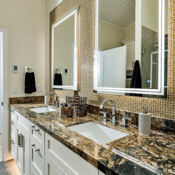
One of my favorite spaces turned out to be the primary bathroom. The scheme for this room took shape when we were at a slab warehouse shopping for material. We stumbled across a packet of a stunning quartzite called Fusion Wow Dark and immediately fell in love. We snatched up a pair of slabs for the counter as well as the back wall of the shower. My clients were eager to be rid of a tub-shower alcove and create a spacious curbless shower, which meant a full piece of stone on the entire long wall would be stunning. To compliment it, I found a neutral, sandstone-like tile for the return walls of the shower and brought it around the remaining walls of the space, capped with a coordinating chair rail. But my client's love of gold and all things sparkly led us to a wonderful mosaic. Composed of shifting hues of honey and gold, I envisioned the mosaic on the vanity wall and as a backing for the niche in the shower. We chose a dark slate tile to ground the room, and designed a luxurious, glass French door shower enclosure. Little touches like a motion-detected toe kick night light at the vanity, oversized LED mirrors, and ultra-modern plumbing fixtures elevate this previously simple bathroom.
And I designed a watery-themed guest bathroom with a deep blue vanity, a large LED mirror, toe kick lights, and customized handmade porcelain tiles illustrating marshland scenes and herons.
All photos by Bernardo Grijalva
 H2D Architecture + Design
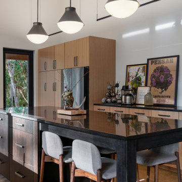
The owners of this wooded property on Whidbey Island came to H2D Architecture + Design with a vision to build a high-performance compact new home on the site. The goal of the design was to limit the impact and footprint on the site in order to maintain as many of the trees as possible. A select number of trees were removed to accommodate the new driveway, house and shed location, and a small yard area. The remainder of the site has been left untouched to remain a wooded sanctuary around the home. The home design was developed around a desire for creating only the minimum amount of space necessary for this family of two. The final design is a one-story home with approximately 1350 sf including two bedrooms, two bathrooms, laundry, storage, mechanical, and open living area. The open living area has a vaulted ceiling, wall of windows looking out to the yard, and connection directly out to a covered patio area. The structure of the home was designed to be built with SIPS (Structurally Insulated Panel System). Both the walls and roof were built with the SIPS panels creating a highly energy efficient building envelope. The cabinetry in the home was built by the homeowner.
+ Architecture: H2D Architecture + Design
+ Interior Design: H2D Architecture + Design
www.h2darchitects.com
+ Green Consultantation and Built by: Zero Energy Homes and Clifton View Homes
+ Photography: Anastasiya Homes
 Simply Home Decorating
There are not many things better than a room full of your favourite people. As you gather you smell dinner cooking in the kitchen and music playing in the background, as joyful conversation and laughter fill the room. I feel so grateful that we are inching our way back to these days. How about you?
The project I’m sharing with you today has beautiful moments like these at its heart. Spaces that invite people in, foster connection, and make everyday living so simple that it’s impossible not to enjoy...
Meet our Delightful Clients:
The family behind this 1950s North Vancouver home transformation enjoy entertaining friends just as much as cosying up to watch a movie together. A professional couple (I'll call them Jon and Anna) with two elementary school-aged sons, Anna and Jon approached us with the task of furnishing the main floor living spaces and the basement of their family home.
Anna is a busy lawyer who is now working almost full time from home, and Jon works in the film industry. With full careers, two active boys, and a love of gathering, they craved a home that could support their everyday lifestyle.
Design and Lifestyle Goals:
Our central goal for this project was simple: to uncover the hidden potential in their home and create a family-friendly space that functioned well and flowed seamlessly.
On the main floor, our clients tasked us with creating an area for the family to relax and entertain, along with crafting a work and play space for the boys. They also dreamed of a more functional and bright basement, which they envisioned as a dual purpose family room and home office for Anna.
Reveal: Comfortable and Welcoming Entryway & Living Room:
Imagine you are coming home, and you walk through a bright, sunny front door like this one. You are met by this entryway of calming earth and sea tones, paired with warm, natural wood flooring. You feel instantly welcomed and eager to venture further inside... The same is now true for our clients!
The simple details in their entryway are thoughtfully arranged with clean lines and colourful art as the focal point, achieving a timeless and friendly aesthetic. Dried wheat brings movement into the space and plays up the beauty of nature, while the vibrant yet warm colours and textures evoke feelings of comfort and homecoming.
The entry flows seamlessly into this connected living area, which is adorned with ample seating strategically arranged to host and accommodate joyful conversations. With the fireplace and wood mantel as the focal point, these natural elements and hues warm up the room to make it feel beautifully lived-in (not like an untouchable museum).
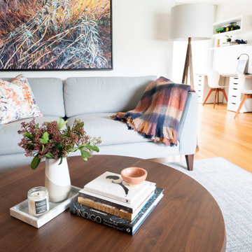
Another colourful work of art graces the space above Jon’s and Anna’s sofa, and we used decorative pillows and a throw blanket to tempt those colours into the rest of the room. A simply styled coffee table keeps the space feeling open and engaged. Reading material, anyone?
Just beyond this living area, you get a glimpse of the second space our clients requested on their main floor...
A Collected Space for Children to Work + Play:
When Jon and Anna realised that their formal dining area wasn’t being used to its full potential, they imagined creating a work and play space for their boys instead. We came up with a plan to create a shared desk area with plentiful storage.
This timeless natural wood desk was the perfect way to maximise surface area and give the boys plenty of space to do homework during the school year, or spend time crafting or building LEGOs during the summers. The drawers provide storage for all the wonderful items that fuel their productivity or creativity. Or both.
I also love how the white floating shelves display a collection of nostalgic toys, providing just the right amount of childhood endearment to this sophisticated and functional space. This workspace now has endless possibilities for the boys, and it helps Jon and Anna keep their minds and spaces clear, too. Which brings us to...
Basement Family Room & Home Office:
In general, we knew we had to maximise surface area in this ‘50s home, and this was especially true for our clients’ basement. I’m happy to say that we designed an effortlessly comfortable space that focuses on family and makes it simple to settle in and work… or leave the workday behind.
Welcome to this dual-function office and family room. Toward the back of the room, we strategically positioned Anna’s wraparound desk facing out into the room and gave her a wallpaper-and-art backdrop for stunning Zoom calls (she has already received glowing compliments). There is plenty of storage for easy organization including a space to store the family’s shared printer near the door… so they don’t have to interrupt “Mom” to get to it.
Anna also wanted the freedom to be able to relax in this space with her family and turn her back on the work day — quite literally! The sofa is perfectly positioned backing onto the desk allowing her to do just that.
We relocated an existing mustard yellow chair and used pops of the same colour to integrate it into the overall scheme. The wood armrests on this modular sectional provide surfaces for snacks and drinks where there was no room for an end table. The walnut finish carries the theme of natural comfort from the upstairs spaces down into the family room.
The view from the sectional is less business and more pleasure, featuring cosy seating and throw pillows in cheerful colours and patterns.
The highlight of this space? A wallpapered accent wall where we were able to achieve the high-end feel of custom built-in shelving with a simple IKEA hack. The shelves and cabinetry around the television offer plenty of much needed storage space to house family games and movies at a budget price point.
This fun room is the perfect balance of work and play, accommodating and supporting our clients’ daily family adventures.
What Our Clients Had to Say...
Our clients could not be happier with their warm yet functional new rooms. With thoughtful consideration and a plan of action, we were able to transform two areas of their home into spaces that function well and feel good. In fact, they had this to say:
“Lori and her team were everything we were looking for: great listeners, wonderfully creative and highly professional. We couldn't be happier with our interior makeover.” — Clients
That is why we do what we do. If you're ready to start your redesign project, we would love to help. Reach out to us here, and let's get to know more about each other.
 Chaplin Design Co.
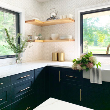
Located in the countryside, Cedar Side House was originally built in the 1950s and intended as staff quarters for a large estate. Untouched since then and now a rental property, Chaplin & Co. designed the house to accommodate visitors hoping to escape the city for some well-deserved R&R. With this in mind, the design centred on creating a functional yet aesthetically pleasing space with a modern farmhouse feel. Also central to the design was large picture windows to frame the outdoor landscaping and highlight the natural beauty of the property.
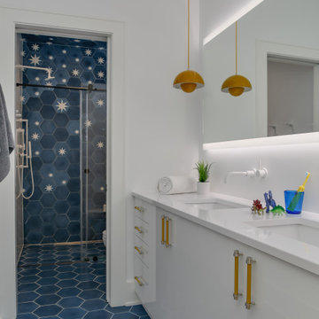 Erica Peale Design
This modern custom home is a beautiful blend of thoughtful design and comfortable living. No detail was left untouched during the design and build process. Taking inspiration from the Pacific Northwest, this home in the Washington D.C suburbs features a black exterior with warm natural woods. The home combines natural elements with modern architecture and features clean lines, open floor plans with a focus on functional living.
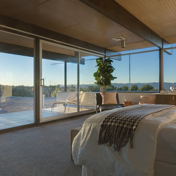
 Teague Hunziker Photography
©Teague Hunziker.
With just one owner, this mid-century masterpiece is largely untouched and remains much as it originally looked in 1972.
Example of a 1950s master carpeted and beige floor bedroom design in Los Angeles with white walls
Example of a 1950s master carpeted and beige floor bedroom design in Los Angeles with white walls
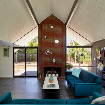 Jennifer Ott Design
Originally built in 1970, this later-model Eichler—designed by architect Claude Oakland—features a distinctive “Model 14” roofline with a clipped gable, a subtle nod to the charm of English thatch-roof cottages.
Acquired from the original owner, the home remained in untouched, original condition—offering a rare opportunity for restoration, but also presenting an urgent need for updates.
Our approach was grounded in respect for Oakland’s original design intent, while thoughtfully incorporating essential upgrades to meet modern building codes and today’s lifestyle expectations.
Eichler homes were originally built using modest, cost-effective materials to make modern architecture accessible to the growing mid-century middle class. While iconic, elements like laminate countertops, particle board cabinetry, and vinyl composition tile flooring haven’t stood the test of time. We carefully replaced these with more durable, high-quality alternatives—granite countertops, maple-ply cabinets, and luxury vinyl tile—ensuring the home remains true to its spirit while standing strong for decades to come.
All images © Ken Gutmaker
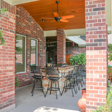 Tradition Outdoor Living
We built a Covered Patio with an Outdoor Kitchen to fit the requirements of our client in Cypress, TX. This space was specifically designed to entertain, while leaving the beautiful view untouched. Our clients are able to soak in their appealing landscaping and maintain a view of the lake from within the home as well as in their outdoor kitchen.
This structure was built to look original to the home, as brick, trim, and gutters were matched to the home. Tongue and Groove pre-stained wood were also added to the balcony and existing patio ceilings to match the new addition. The gable and truss style roof enhances this covered patio, adding height for a roomier feel.
The outdoor kitchen boasts a stone face with lovely Bordeaux Dark granite countertops and ample seating. Grilling is not hindered, with a large grill and plenty of storage and counter space, the only thing missing is the meat!
Finally, recessed lighting and ceiling fans create the perfect dining outdoors environment.
52