
Search results for "Useable" in Home Design Ideas
 Foran Interior Design
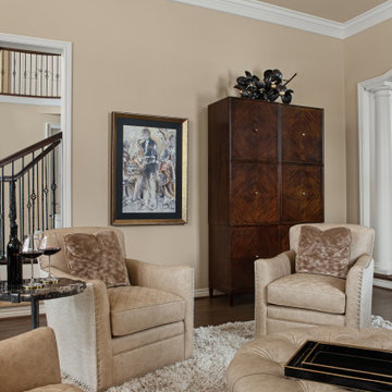
This was a little used living room that was turn into the favorite room in the house. The room was designed to be a music/wine lounge. We used four comfortable chairs facing each other for great conversation. The chairs have quilted leather seats and down silk velvet pillows. The artsy fireplace screen appears to be floating on their black granite hearth. The beautiful spot tables have petrified wood tops.
This client wanted to update their home to light and Modern from dark and Old World.
The whole house was painted in a light color and the wood floor and stair railing were refinished in a brown/grey stain.. We also made the rooms more useable. We changed the unused living room into a music/wine lounge.
The kitchen cabinets were painted off white and we put in new counter tops, backsplash, lighting, bar stools and hardware. The rest of the home was also updated.
 Building Designers Association of Australia
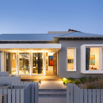
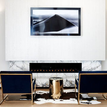
Located on a heritage-lined street in Melbourne’s Williamstown, a young family were seeking a contemporary home with ample room to grow. Benni Trajcevski of Achieve Design Group answered their call, creating the epitome of modern living concealed behind a modest façade. To achieve the long wish list including large indoor and outdoor gathering spaces to entertain family and friends, separate adult and children living and sleeping zones, and a pool suitable for year-round use, Benni has maximised every inch of the block. Seamless transitional spaces link inside with out. This flow between the indoors and outdoors is a key feature of the home, achieved through generous open floor planning and glazing. For example, large hidden sliding doors allow the pool to be closed-off for use in winter; acrylic glass panels link the pool with the sunken lounge, which includes a fire pit for year-round comfort. The inclusion of a courtyard and voids throughout create separate useable zones while maintaining the feeling of spaciousness. Orientated to the north and surrounded with floor to ceiling windows to optimise natural light, the courtyard divides the formal lounge area with the informal living area, while the first floor is divided into four separate wings for privacy and functionality. The interiors are detailed with quality materials and finishes to achieve a sleek and sophisticated aesthetic. Contrasting materials in muted tones, including tiles, steel and lightweight timbers are featured throughout. Corian and a moss green wall are unexpected features.
 Landscape Plus Ltd
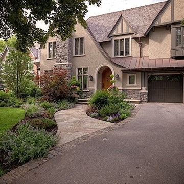
Our challenge was to take a new build and create a setting that says it isn't. Dramatic tasteful lines, great textures and material choices made this home a pleasure to work with.
Granite from the house was taken as a lead and pulled down as part of the stone mix into everything from the driveway borders to columns to walling and finally to the barbeque. Gentle but confident lines mixed with deep plantings and a lovely sunken backyard sitting area creates a solid,
well-grounded useable space.
Find the right local pro for your project
 American Porch, LLC
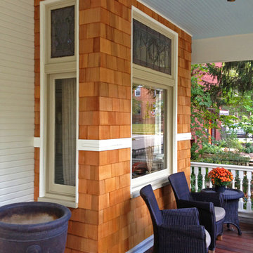
This home make full use of Victorian Porch Spindles, paneled column pedestals, and round tapered columns, which come together to offer great curb appeal as well as useability.
 Mottram Architecture
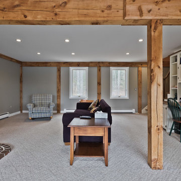
Timber frame homes offer unique challenges during a remodel. What often makes them beautiful and attractive to most homeowners, also makes them challenging for space requirements.
Context: The lovely couple that owned this home were struggling with some interesting floor plan challenges that just didn't work for their family. The loved the beautiful timbers and woodwork of their home, but the dramatically sloping ceilings on the second floor, particularly in the bathroom, just didn't work for this 1 1/2 bath home. Needing to use the skylight to approach the toilet was a less then ideal scenario. Although the bathroom footprint was more then adequate, the sloped ceiling only made half of the space useable. Check out the Before/After post on our blog to see the photos of the house pre-renovation. As much as they loved all the wood features in their home, another challenge they had was light. The wood ceiling made everything inside the house darker, even with a fantastic array of south facing windows, there were spaces in the home that felt dark and small. When they contacted us they wanted to know how could they make their brighter and more inviting, were there solutions to the 2nd floor sloped ceiling issues, and if they were going to do all of this work, how could they make their home more comfortable and efficient. A nagging water leak in the upstairs bathroom spurred them into action and here is how we solved their dilemma.
Conclusion: First, we added a little dormer to the rear of the house so we could get full headroom in nearly all of the upstairs bathroom! Then we decided to extend that dormer one more timber bay over to create a walk in closet with natural light and plenty of space. Since we were contemplating energy efficiency, we resolved a nagging issue that is present in a lot of timber frame construction, air tightness. Commonly found in timber frame construction, fiberglass insulation is installed in the rafter bays and board ceilings are installed over top. Unfortunately, board ceilings are anything but air tight, and fiberglass insulation needs to be in an airtight cavity for maximum effectiveness. So we were able to solve two issues at the same time for this homeowner. We removed the board ceiling and fiberglass insulation, we dense packed the rafter bays with cellulose insulation, and installed sheetrock in place of the boards. The boards were salvaged for re-use by the homeowner, and the space and light quality was dramatically improved. Some may think that losing the board ceiling took something away from the space, but what you'll see in the pictures is that it highly accentuates the heavy timbers and really makes them stand out in a beautiful way. Now with this added airtightness, better insulation, and brighter space, the homeowner hardly runs their wood stove, and it's so quiet in the space, an added bonus from changing the insulation. It became necessary to also add a sheetrock ceiling to the living room to hide the plumbing from the new bathroom layout above. Changing this ceiling gave the homeowner some real quality lighting that was lacking in the living room before. The brighter ceiling and new lighting layout completely transforms the living room into a space you want to hang out, even though the layout didn't change at all. When the homeowner saw the finished spaces she said "I can't believe this is my house, I want to live in this house"
Energy Efficiency: I touched a little on the efficiency above, but like all projects done with Mottram Architecture, we always want to leave you with a little extra. Timber frame construction with board ceilings and fiberglass insulation are notoriously leaky! If you want to know what we think about fiberglass insulation, check our our blog post on Why Fiberglass Insulation Sucks. By installing cellulose insulation and covering it with sheetrock we were able to greatly reduce the heat flowing out of this home. It not only improves cashflow it improves the comfort level in the space. Who wants to sit in their living room and feel a draft? Let us remind you, we are not saying cellulose insulation is an air barrier, we use the sheetrock to help with that, but it does significantly reduce the air flow over fiberglass insulation. And when we reduce the airflow, we reduce the heat flow. And when we reduce the heat flow, we reduce the need to re-heat that drafty air from outside. When it comes to energy efficiency the first and best place to start is air infiltration. We greatly reduced the air infiltration with the new insulation, but we also added a hat and warm boots. What I mean by that is, we improved the insulation in the roof, and we installed insulation in the basement. Maybe it's a silly analogy, but when you think about keeping warm, we always start with the hat and boots! With sustainability in mind, the next project will be to add a deck to the front of this house with rain catchment barrels from the metal roof. They are planning to plant a garden in the spring and the rain catchment system will help to irrigate the new garden.
Builder: East Shore Builders
Photographer: Michael Eric Berube
 CLS Landscape Supply
A Plant Lover Garden Oasis
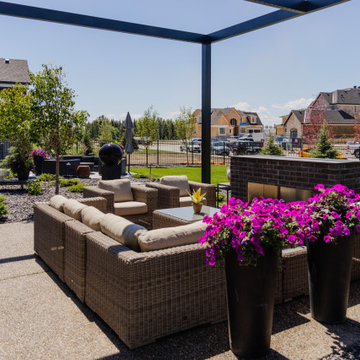
This home in the Watermark community includes a fantastic landscape design that adds curb appeal to the front of the yard with places to relax and unwind in the backyard. Three seating areas were incorporated into the backyard with easy access to the outdoor kitchen. Concrete pads were poured for the entertaining spaces and are connected by paving stones in between. Along the pathway, you’ll also find a unique circular water feature that matches the circular potted plants in the front yard. The entertaining spaces include an outdoor dining area, a propane fireplace, and a wood-burning fireplace. The mixture of shrubs, trees, and flowers creates an oasis-like feel to this yard that is useable for a large part of the year.
This project includes:
25 trees, 72 shrubs, and an assortment of perennials
Trees have in-lite spotlights
Three smooth modern concrete slabs seating areas
40mm Rundle Rock garden beds
24x24 Charcoal Slabs pathways lit with in-lite
PVC edging
Woodburning fireplace
 Lifestyle Homes, Home Builders
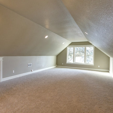
Third floor finished and designed to be useable attic space. Owners will set up their HD TV and sound system here.
Inspiration for a craftsman gender-neutral carpeted kids' room remodel in Portland with beige walls
Inspiration for a craftsman gender-neutral carpeted kids' room remodel in Portland with beige walls

 Distinctive Designs Today
William Morris Wreath Design
19th century shown in documented color
80% Worsted Wool, 20% Nylon
Suitable for heavy traffic
Useable for stair runners, area rug and wall to wall
Borders and custom colors available
Cut or loop pile
 Planscape, An Outdoor Design Company
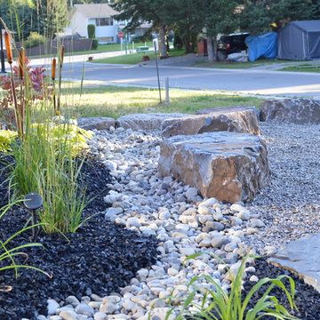
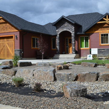
Another design that creates a useable front yard that includes a fire pit, a large rock retaining wall, and easy low maintenance plants creating amazing curb appeal. The side yard has beautiful large steps and a false creek. The back yard is a simple sodded area for kids and grandkids to play.
 Planscape, An Outdoor Design Company
Another design that creates a useable front yard that includes a fire pit, a large rock retaining wall, and easy low maintenance plants creating amazing curb appeal. The side yard has beautiful large steps and a false creek. The back yard is a simple sodded area for kids and grandkids to play.
 Tim Austin LLC
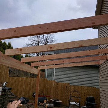
We built this Patio Cover from Select Fir lumber. To help this customer gain some useable exterior space in the rainy oregon winters. Photos by Tim Austin
 The Boutique Real Estate Group
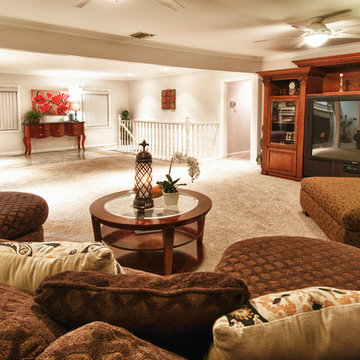
La Habra Heights at its finest. This home has everything you can ask for in a Heights property. Useable land, pool, views and has been tastefully upgraded. This home has been completely remodeled within the last 10 years. Newer kitchen, windows, bathrooms, driveway and patio. Entertainers dream with large living areas that all flow seamlessly to the outdoor oasis. Fire pit, built in BBQ, fenced in pool with slide and lots of space for lounging around on those lazy summer days. There is also a bonus room that is not connected to the house that can be used for a game room or man cave. Easy access from Hacienda Rd. Come see this one before it's too late.
 Carl Mattison Design
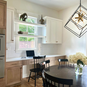
open shelves across the window (not needed for egress or ingress) was all that was needed to give the space it's custom look. desk area for kids or adults next to breakfast table makes communal space much more useable.
 Ashley Farrell Landscape Design
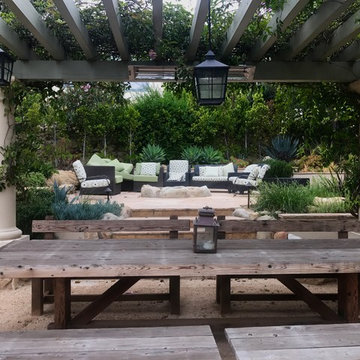
Wood Arbor with Stone Pillars and a Large Farm Table. Ashley Farrell Landscape Design
Patio - mediterranean patio idea in Santa Barbara
Patio - mediterranean patio idea in Santa Barbara
 Level Custom Build
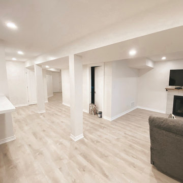
In 2022 Level Custom Build completed the full renovation of this unfinished basement. The clients were looking to add more useable square-footage to their home and increase the long-term resale value. The result was a bright, functional space with a perfect layout and amenities for hosting guests.
 PETER E DESIGNS
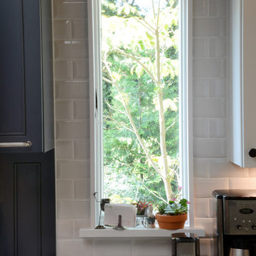
We replaced one large window with two smaller ones in new locations to accomplish:
1. More even natural light distribution.
2. Increased useable wall area.
3. Improved privacy - the old window perfectly aligned with a one next door.
4. Provide a view outside.
We emphasized the outside view by using a simple window frame, a proud sill and the absence of trims.
 RFK Kitchens
Objectives
Having lived with the kitchen as supplied by the builder since buying the property new they had finally had enough of its poor and inadequate design that provided only a basic L shape layout, no dining area and only a single built under oven.
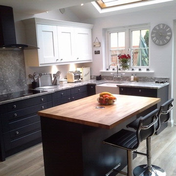
At our initial design brief meeting it became clear that the Gardner’s wanted more light in the kitchen, more useable work surface, more storage, high level built in cooking appliances, an island with somewhere to sit and socialise but not to compromise on the aesthetic which was all important.
What We Did
They liked the whole look of the Second Nature 1909 in frame painted style but were concerned about price.
We suggested breaking into the pitched roof and introducing a long bank of Velux’s to create a much lighter, airier feel to the whole room; he also suggested removing the existing radiator and replacing it with a plinth heater thus freeing up an otherwise difficult to use wall.
To keep cost down he also suggested using the Second Nature Milbourne painted foil wrapped shaker door in contrasting colour ways shown.
The Result
We created the desired look but keeping within the budget. As you can see from the photos, the room is much lighter.
Testimonial
We were planning to renew our kitchen and had already visited some of the usual DIY stores to get ideas and estimates.
We then went along to Rugby Fitted Kitchens to see what they could offer and were immediately impressed by the showroom; the variety of kitchen styles and design ideas on display were inspirational and brought the prospect of a new kitchen to life, far better than flicking through brochures.
Trevor understood our requirements and guided us through the design process suggesting options for the cupboard configurations and fitments that maximised our storage space, in addition to which the pricing for the Neff appliances was second to none either matching or bettering the best buys I could find online.
The installation was expertly undertaken by Daniel & Daniel (yes they really do have the same Christian names!!) and nothing was too much trouble for them.
We are absolutely delighted with the finished product and would have no hesitation in recommending RFK to our friends.”
 Building Designers Association of Australia
Located on a heritage-lined street in Melbourne’s Williamstown, a young family were seeking a contemporary home with ample room to grow. Benni Trajcevski of Achieve Design Group answered their call, creating the epitome of modern living concealed behind a modest façade. To achieve the long wish list including large indoor and outdoor gathering spaces to entertain family and friends, separate adult and children living and sleeping zones, and a pool suitable for year-round use, Benni has maximised every inch of the block. Seamless transitional spaces link inside with out. This flow between the indoors and outdoors is a key feature of the home, achieved through generous open floor planning and glazing. For example, large hidden sliding doors allow the pool to be closed-off for use in winter; acrylic glass panels link the pool with the sunken lounge, which includes a fire pit for year-round comfort. The inclusion of a courtyard and voids throughout create separate useable zones while maintaining the feeling of spaciousness. Orientated to the north and surrounded with floor to ceiling windows to optimise natural light, the courtyard divides the formal lounge area with the informal living area, while the first floor is divided into four separate wings for privacy and functionality. The interiors are detailed with quality materials and finishes to achieve a sleek and sophisticated aesthetic. Contrasting materials in muted tones, including tiles, steel and lightweight timbers are featured throughout. Corian and a moss green wall are unexpected features.
 KMSalter Design
Cameron St. Photography
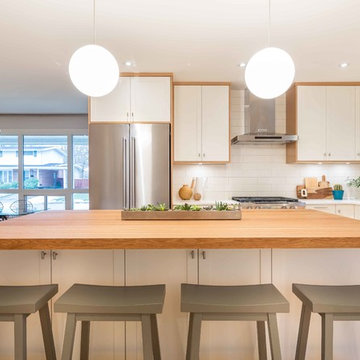
Open concept kitchen - small 1950s l-shaped light wood floor open concept kitchen idea in Toronto with a farmhouse sink, recessed-panel cabinets, white cabinets, solid surface countertops, white backsplash, subway tile backsplash, stainless steel appliances and an island
Open concept kitchen - small 1950s l-shaped light wood floor open concept kitchen idea in Toronto with a farmhouse sink, recessed-panel cabinets, white cabinets, solid surface countertops, white backsplash, subway tile backsplash, stainless steel appliances and an island

 FTC - Final Touch Construction of Colorado
This beautiful 1950's craftsman needed a redo, inside and out. After gutting it down to it's studs, the main floor and basement were redesigned for much more useable space. Three tiny bedrooms upstairs became a large master with a double sink on suite and a guest bedroom with a beautiful new bathroom. The stairway that was in the kitchen was relocated so the kitchen became larger and much more usable. The basement went from a red and orange monstrosity to a soothing family room, bedroom and new bathroom as well as an updated laundry room and storage closet. New windows and doors, as well as an egress window was added to make it code compliant. A new roof and fireplace finished off the remodel of this cozy, colorful craftsman cottage. Photos were taken by Moore House Photos by Jett (Jett Moore Photographer).
57