Software
Houzz Logo Print
ann23941

Looking for the perfect neutral interior paint color?

12 years ago
So, it's about time to paint the inside of the whole house. Would like the perfect fairly light, warm gray with no pink or yellow undertones. I was decided on Edgecomb Gray but a bit unsure now since there was a recent discussion saying it looked lavender. Also like Pale Oak and Balboa Mist. Saw Camouflage, Stingray and Spring Thaw today (on Houzz) and they look pretty nice too. Suggestions and thoughts?

Comments (296)

  • PRO
    12 years ago
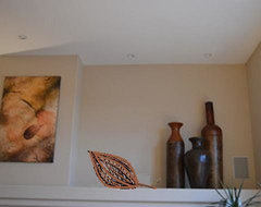
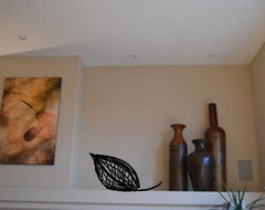
    This is the sketch of the Pod decor possibility
    Niche Decor Bronze Pod · More Info

    Niche Decor Black Pod · More Info
    Ann thanked LB Interiors
  • PRO
    12 years ago
    That purple is used for the focal wall in that room. So our treatment is used for a different reason. We are camouflaging and balancing visual weight. Ideas are not really used in the same way. Your charcoal is not meant to be a focal, but instead a balance for the lightweight TV stand.
    Ann thanked LB Interiors
  • 12 years ago
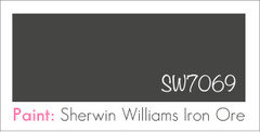
    Love this thread! Take a look at Sherwin-Williams iron ore for the back of the tv niche. Nice charcoal shade that I used on my stair risers.
    Ann thanked tgb1
  • 12 years ago
    So, my light color will be Accessible Beige, then the accent color for all accents will be Tony Taupe which is two steps darker. Then, dark charcoal behind TV only. Charcoal color to be determined but here are Accessible Beige and Tony Taupe.
  • PRO
    12 years ago
    Ann, is there a midtone color between the 2 colors? Accessible Beige and Tony Taupe?

    I meant 3 colors in a row on the palette. Dark charcoal was not to be considered in my 3 color evaluation : )

    Dark charcoal is put aside, Not included in my comment above as part of 3 colors,
  • 12 years ago
    Iron Ore looks really good tgb1! I'll definitely check that out. Yeah, the Houzz gang definitely works hard on my dilemmas. They start with ideas and then my questions just keep getting more and more specific and they hang in there with me. It's amazing!
  • 12 years ago
    Yeah, LB, balanced beige is the color in between AB and TT. It's a nice color - I'd be willing to bring it into the mix.
  • 12 years ago
    It almost looks like iron ore might even look pretty nice with my other two colors:)
  • 12 years ago
    This is going to be fun. I bet I'm going to love it when it is all figured out and done!
  • PRO
    12 years ago
    On my iPhone so brief. Congrats to lb who somehow convinced what I coulda not. I am no seeing the sides of the niche on the right. I am not sure leaving sides light under tv is good. I would recommend buying a piece of black poster board and trying it both ways. No harm done.
    Ann thanked CDR Design, LLC
  • PRO
    12 years ago
    last modified: 12 years ago
    I'll do this the other way for now. Lights to darks
    3 colors + dark charcoal for TV niche backwall.

    1. Accessible beige - Main Color throughout home on the largest areas.
    2.Balanced Beige - any other smaller accents in any other rooms (your choice for highlights).
    3.Tony Taupe - Art Wall & Fireplace Wall & Surround Wall
    ... and/or darkest accent in any smaller accents in any other rooms (your choice for highlights).
    Ann thanked LB Interiors
  • 12 years ago
    Previously, I didn't realize I had "permission" to wander from the same color strip and I didn't like the dark brown idea. Once I heard I could treat that little area completely separately (with charcoal), it felt better. Maybe I just wasn't understanding well enough before:):) Poster board is a good idea for a test.
  • PRO
    12 years ago
    last modified: 12 years ago
    CDR has a point, although the entire niche in black and dark charcoal may become somewhat of another focal to the vertical Art Wall and FP Wall? Because of all black and charcoal colors.
  • 12 years ago
    Recessed rectangle above TV (where large vases are) in Accessible Beige, right?
  • 12 years ago
    I think I'll try to do just the back of the TV wall in charcoal, but I'm open to doing the sides if necessary.
  • 12 years ago
    I'm off to clean the house for a few hours. Thanks a bunch everyone - nice forward progress today:)
  • PRO
    12 years ago
    last modified: 12 years ago
    This will sound weird. If you get the black poster board, try it on just the back TV wall. Then (from a distance by the sofa) walk from far left to far right and look at the total area at once for a feeling.

    Then try the black poster board on back and sides too.
    Repeat the walk through for a feeling of the the total area.

    I think it will change and you will be able to make a sound decision as you move through the room. Not from just standing stationary directly in front of the space.
    Ann thanked LB Interiors
  • PRO
    12 years ago
    last modified: 12 years ago
    I have to go out too. Catch you all later. Yay, I'm so glad you are seeing what CDR & I were for the looooongest time LOL
    Ann thanked LB Interiors
  • PRO
    12 years ago
    last modified: 12 years ago
    Darkest - Tony Taupe - Art Wall & FP Wall surround

    Midtone - Balanced Beige - Largest Niche (vases)
    Because the Art wall, FP Wall, Large Niche - are one unit and are focal together.

    Lightest - Accessible Beige - all the other walls in that room. Main color
    Ann thanked LB Interiors
  • PRO
    12 years ago
    last modified: 12 years ago
    Second thought - before I leave home...

    Darkest - Tony Taupe - Art Wall & FP Wall surround
    This will make the FP wall the MOST FOCAL of the area.

    Lightest - Accessible Beige - Large Niche & all the other walls in that room. Main color
    Ann thanked LB Interiors
  • PRO
    12 years ago
    Hi,

    Paint for fireplace area: think of this as a regular fireplace with a mantle, chimney breast, etc.

    Tony Taupe: the entire area where the wall juts out. So, the fireplace wall where art is and the return (the chimney breast). Also, the bottom portion underneath the art, which also juts out and its return area (the fireplace itself), including the area to the right with all the components and tv)

    Accessible beige: the niche. The niche is not part of the fireplace. It is part of the wall. It should be accessible beige.

    Charcoal: the inside of the tv niche, including the sides and the baseboard.(alternative would be to get some sort of black doors but on the bottom and you could use this area for storage)

    Mantle shelf: I would love to see the mantle shelf painted an alternate color. If nothing else, it should be left accessible beige to stand out.
    Ann thanked CDR Design, LLC
  • PRO
    12 years ago
    I am not sure how much you can do on the BM tool, if you load in your photo of the fireplace and can paint various areas. That is one idea.

    But, maybe easier would to literally print copies of your fireplace area on regular computer paper. Then, get out your magic markers and "paint" the areas.

    I think you are going to be stunned how awesome the fireplace area is going to look.
    Ann thanked CDR Design, LLC
  • PRO
    12 years ago
    Box and vases. I think they are find like they are and you don't need anything more in there.

    If you like the pod, consider it for the shelves you showed us before, that need some major editing. (too many little things in there)
    Ann thanked CDR Design, LLC
  • 12 years ago
    So, whether I paint the back and sides of the TV area charcoal or just the back charcoal, are both of you thinking the corresponding baseboard trim should also be charcoal?
  • PRO
    Ann thanked CDR Design, LLC
  • PRO
    12 years ago
    I think the baseboard is going to really stick out if you do not paint it charcoal. Try the test with the black project board.
    Ann thanked CDR Design, LLC
  • 12 years ago
    Just my 2 cents - I think u have to paint that baseboard charcoal also or it will stick out like a sore thumb. I have white woodwork but I painted my base trim (below my charcoal riser) the iron ore so it would all blend in. Someday I'll learn how to attach pics : (
    Ann thanked tgb1
  • 12 years ago
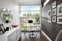
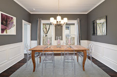
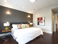
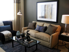
    OK, there's no doubt the baseboard would stick out if left white, but I do like the white baseboard on my dark brown bedroom wall. Let me post some pics (with white baseboard) so I can begin to ponder this a bit more. In these last two, the charcoal walls are joining a lighter wall similar to how my charcoal wall will join a TT wall.
    [houzz=
    office with a view · More Info
    ]
    [houzz=
    Modern yet Traditional Dining Room · More Info
    ]
    [houzz=
    Vancover Home · More Info
    ]
    [houzz=
    Michelle Salz-Smith, ASID, CID · More Info
    ]
  • 12 years ago
    I'm so glad I posted this dilemma. I knew I planned to paint soon but figured I could choose a paint color. I had something much like AB in mind. But I mentioned painting on someone elses dilemma and caremore thought I should start a painting dilemma. I'm sure glad I did. I would have just done AB everywhere. I think this improved plan will be much, much nicer:)
  • PRO
    12 years ago
    The difference between pics you posted above and your tv area is that you want your tv area to be a "black hole". No attention drawn there.
    Ann thanked CDR Design, LLC
  • PRO
    12 years ago
    Baseboard in charcoal. The FP and shelving and niche are considered one unit. Plus they are on a different protruding plane. If this entire area were built-in (flat adjoining the left side of the room) and the baseboard were on the same plane, then most likely would leave them white.
  • 12 years ago
    I must say I love the idea of painting the back and possibly sides in charcoal, but I don't feel convinced about charcoal baseboard trim in that area. The trim is all connected and works its way all the way through the living room and into and around the breakfast nook on the right. Also, the white trim looks very nice against the walnut floor. Of course, if I leave it white and change my mind later, it's about a 15 minute job, so it's not a critical decision at this point.
  • PRO
    12 years ago
    Sure, you can try it that way.
  • PRO
    12 years ago
    Yes, wait and paint later if you're not sure of the charcoal trim.
  • 12 years ago
    I'm checking back in to see how the painting is progressing - can't wait to see your color picks on the walls! SW is having a sale this weekend so I'm buying samples of some of the colors you mentioned for my own home. :)
  • 11 years ago
    I'm in the exact situation. I've been looking for a warm, light, & airy gray. After trying out many, many samples I've settled down on Benjamin Moore American White. Don't be fooled by the name, when it goes up on the wall you will see the colour (also, in pics it looks lighter than in reality). It has very low colour saturation, but just enough to make the gray have a warm undertone. It looks great in the day light, I'm waiting for tonight to see how it looks with incandescent lighting in the evenings. Try out a sample on the wall. Good luck, I understand the pain of finding the perfect gray.
  • 11 years ago
    I would check out Gray Owl.....great neutral. Then accessorize with colors of your choice. It is a great neutral.
  • 11 years ago

    Old post!

  • 11 years ago

    Hey Ann, I know this is an old post, but how did you like the accessible beige in your house? I have very similar colors to you and read this entire thread. I am thinking about going the same route :)

  • 11 years ago

    Loll5, I love it! Great neutral that goes with everything (well, maybe not goldish shades), but it's great with reds, blues, greens, wood tones, etc. We've loved it!

  • 11 years ago

    Here it is in my house where you can see lots of wall.

    My House · More Info

  • 11 years ago

    It's beautiful! Thanks for your help Ann

  • 11 years ago
    last modified: 11 years ago

    Please Help I need to find a beige paint with brown undertones I have bought every beige paint color that is popular from bm and sw and all i get is undertones it is a large room with a big wall of windows and 3 sky lights with north light Thank You

  • 11 years ago
    last modified: 11 years ago

    Generally, an LRV around 50 is considered optimal for main interior wall colors. An accent wall should generally be around 25-30 points darker for the best visually appealing ratio.


  • 10 years ago
    last modified: 10 years ago

    Realize this is a very old post but shall add my two cents anyways. IMHO; if you are working with gray decide on what undertone you want which can consist of: blue, red, green and yellow which in turn can have hints of purple, pink and even orange. Simply; blue is generally cool, red is warmer whereas green and yellow are the warmest and basically the most neutral. Also shall add, the easiest way to determine a colour's undertone, is a hold it against a 'white' background ... not a coloured one.

    P.S.: To determine what undertone a 'white' may have; hold it against Benjamin Moore OC-65 Chantilly Lace.

  • 10 years ago

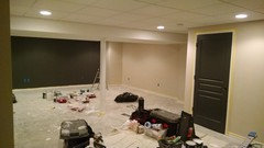
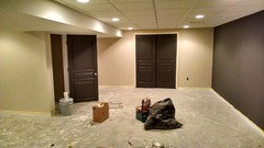
    Still in progress, dark doors and accent wall (Sherwin Williams Peppercorn) and Sherwin Williams Natural Tan for the other walls with white trim.

  • 10 years ago

    Another angle. I was nervous to contrast between the light and dark colors at first, but I am really loving how it is coming together.

  • 10 years ago
    I just painted a bedroom Ben Moore Pale Oak and love it!! Very warm gray and very light!! I was about to use revere pewter but wanted something a little lighter and could not be happier with Pale Oak.
  • 10 years ago

    Hi, Ann! What color did you decide to go with for the main walls in your house? Please post some pics. I love the way you decorate!

  • 10 years ago

    I am going to pop in for a moment as Ann is traveling right now, but she went with Accessible Beige and loves it in every way. Gosh, I know she has lots of house pics on here, too......but where are they?