
Search results for "Accomplish" in Home Design Ideas

 Versa Style Design
The clients asked for a dedicated play zone with a seating arrangement for the adults to keep an eye on their children. The children are various ages so there are many different areas for each one of them to express themselves. We recommended a combination of open and closed storage modules to help the children organize their toys with plenty of room to work on projects. Their artwork is displayed on the wall, the floor is comfy, and the colours are vibrant and exciting. Mission accomplished!

 design styles architecture
The DSA Residential Team designed this 4,000 SF Coastal Contemporary Spec Home. The two-story home was designed with an open concept for the living areas, maximizing the waterfront views and incorporating as much natural light as possible. The home was designed with a circular drive entrance and concrete block / turf courtyard, affording access to the home's two garages. DSA worked within the community's HOA guidelines to accomplish the look and feel the client wanted to achieve for the home. The team provided architectural renderings for the spec home to help with marketing efforts and to help future buyers envision the final product.

 Hillside Nurseries
Our clients wanted an expansive patio space to entertain their large family. We constructed a 1,400 sq. ft. bluestone patio, 250 sq. ft. of fieldstone wall to accomplish this. Over 100 ton of base materials was used to create this raised patio space. Selective plants with architectural interest round out and soften the hardscape work.
Marc D. Depoto (Hillside Nurseries Inc.)
Find the right local pro for your project

 Paper Moon Painting
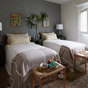
Here's a view of this kitchen from the other angle. We love the transformation accomplished by paint and a new tile backsplash! We painted the upper cabinets in Sherwin Williams 6252 "Ice Cube", and the lower cabinets in SW 7602 "Indigo Batik". Don't forget to check out the "Before" pic!
 KitchenLab Interiors
Coconut Grove is Southwest of Miami beach near coral gables and south of downtown. It’s a very lush and charming neighborhood. It’s one of the oldest neighborhoods and is protected historically. It hugs the shoreline of Biscayne Bay. The 10,000sft project was originally built
17 years ago and was purchased as a vacation home. Prior to the renovation the owners could not get past all the brown. He sails and they have a big extended family with 6 kids in between them. The clients wanted a comfortable and causal vibe where nothing is too precious. They wanted to be able to sit on anything in a bathing suit. KitchenLab interiors used lots of linen and indoor/outdoor fabrics to ensure durability. Much of the house is outside with a covered logia.
The design doctor ordered the 1st prescription for the house- retooling but not gutting. The clients wanted to be living and functioning in the home by November 1st with permits the construction began in August. The KitchenLab Interiors (KLI) team began design in May so it was a tight timeline! KLI phased the project and did a partial renovation on all guest baths. They waited to do the master bath until May. The home includes 7 bathrooms + the master. All existing plumbing fixtures were Waterworks so KLI kept those along with some tile but brought in Tabarka tile. The designers wanted to bring in vintage hacienda Spanish with a small European influence- the opposite of Miami modern. One of the ways they were able to accomplish this was with terracotta flooring that has patina. KLI set out to create a boutique hotel where each bath is similar but different. Every detail was designed with the guest in mind- they even designed a place for suitcases.

 John Dvorsack Architect
Designed to look like it’s always been there, this 4 bedroom shingle style farm house sits on a beautiful private parcel in West Falmouth. The biggest challenge for this project was to take advantage of the primary water views which in this case were in the front of the home. To accomplish this, the main entrance to the house and the outdoor entertainment spaces were all on the front of the house. A screen room resides at the intersection of the wings of the wraparound porch for evening relaxation overlooking the water. The stair to the third floor roof deck provides sweeping views of the Elizabethan Island chain and Buzzards Bay.

 Scottsdale Window Coverings-Hunter Douglas
For the Living Room, Scottsdale Window Coverings helped the interior designer to choose an elegant feature allowing the furniture of the dining room to stand out more while complimented by light fabric shades. Light-filtering is accomplished among the living space as well while mastering privacy and room darkening.

 AIBD - American Institute of Building Design
To facilitate the builder's desire to create a successful model home in this large site development with expansive natural preserves, this design creates a sense of presence far greater than its actual size. This was accomplished by a wide yet shallow layout that allows most rooms to look out to rear of home and preserve views beyond. Designed with a West Indies flavor, this thoroughly modern home's layout flows seamlessly from space to space. Each room is bright with lots of natural light, creating a home that takes fullest potential of this unique site.
An ARDA for Model Home Design goes to
The Stater Group, Inc.
Designer: The Sater Group, Inc.
From: Bonita Springs, Florida

 Fish Creek Finish Carpentry
These homeowners came to us through a recommendation from a client who was extremely happy with the work we did for them in the past. This project was in the inner city and the homeowners tore down their old house and built their new home in its place. Keeping with the charm of the original home, the main goal for the home was to make it look like a brand new 100 year old home. We were brought on to work on the entire home with the exception of the kitchen (entry, family room, ceiling work, office/ den, living room, fireplace, window trims, 5 bedrooms, and 4 bathrooms).
In addition to our custom woodworking, these homeowners leaned heavily on our design suggestions. From an execution standpoint, this home was extremely detailed, and getting the balance from room to room and throughout the entire home was crucial for achieving the correct look. In addition, the methods and materials used 100 years ago have since had drastic improvements, making the lifetime and quality of the finished product substantially better, but also adding a higher degree of difficulty to accomplish accurate looking details.
The end result of this project was a work of art. A home that thad the appearance of a 100 year old home, with modern materials and methods to ensure quality and longevity. Everything from their dramatic entry and staircase to their floor-to-ceiling hand-finished den showcases a skill set and eye for detail essential to accomplishing the lofty goals of this home.


 Allard Jansen Architects, Inc.
Perched on the highest property in Rancho Santa Fe, this residence is an authentic “Lillian Rice” home listed on the National Registry of Historical Homes. Preserving original design intent, scale and detail were the primary focus for the project team. Renovation to the existing Main House and designing a new Carriage House and Pool House were the tasks at hand. Additionally, extensive site and landscaping enhancements were accomplished. The natural blending of land and building led to the great success of this project. This delightful home embodies the character and spirit of the Rancho Santa Fe Covenant and was awarded the Lily Award for outstanding architectural Design by the Rancho Santa Fe Association

 Design Spectrum, LLC
For this project, we were brought on to update this 1920's home and open up multiple small rooms into one great room. Some of the features incorporated with this were new pocket doors, all new flooring, lighting, cabinets, countertops, windows, backsplashes, and updated paint. Another unique way we accomplished opening up the home was by repositioning the stairway which provided more square footage in the kitchen and create a better traffic flow throughout the house.
Alongside of opening up the main level, we also totally renovated both upstairs bathrooms by performing a complete gut and remodel.
 Synergy Design & Construction
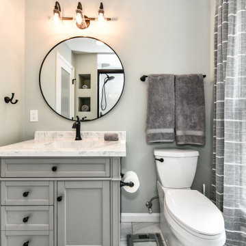
After. Mission accomplished! The new James Martin “Brittany” vanity in “Urban Gray,” solid-surface countertop and sink from Tere-Stone (in marble-look “Platinum Mist”) and American Standard “Estate” faucet in matte black (all from Ferguson) were joined with a round black mirror and “Milldale” sconce in “Carbon Bronze” from Signature Hardware.

 Angelisse Karol Color & Design
Before Photo.
Beautiful but old worn out bright turquoise tile bathroom in need of a makeover to utilize the space and integrate with the more modern traditional house style. Accomplished by replacing with bigger Tub shower corner and a Full custom vanity for storage and counter. area making better use of the spacious old layout. Changed to an up dated but traditional elegant look.
Photo by ©Angelisse Karol Color & Design
 Scottsdale Window Coverings-Hunter Douglas
For the Living Room, Scottsdale Window Coverings helped the interior designer to choose an elegant feature allowing the furniture of the dining room to stand out more while complimented by light fabric shades. Light-filtering is accomplished among the living space as well while mastering privacy and room darkening.
 Garden Lights Landscape and Pool Development Inc.
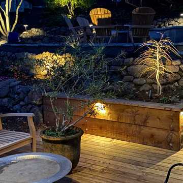
Great hillside woodland setting, very difficult hillside to accomplish all the client needs and wants.
This is an example of a mid-sized traditional partial sun backyard landscaping in San Francisco with a fire pit and decking for fall.
This is an example of a mid-sized traditional partial sun backyard landscaping in San Francisco with a fire pit and decking for fall.

 Criss Kline, AKBD
As you entered through the front door, I envisioned an open view of the kitchen, dining and living spaces. I wanted visitors' eyes to be immediately drawn through the space and look out through two large sets of glass doors into the back yard of the property. We needed a real "wow" factor to pull off having a kitchen in the front of the home. Opening up this wall accomplished the task.
Mark Carr, REALTOR of Carr, Cleaver & Flinchbaugh Realtors
 Design Spectrum, LLC
For this project, we were brought on to update this 1920's home and open up multiple small rooms into one great room. Some of the features incorporated with this were new pocket doors, all new flooring, lighting, cabinets, countertops, windows, backsplashes, and updated paint. Another unique way we accomplished opening up the home was by repositioning the stairway which provided more square footage in the kitchen and create a better traffic flow throughout the house.
Alongside of opening up the main level, we also totally renovated both upstairs bathrooms by performing a complete gut and remodel.

 Gabriel Nolle Architecture Workshop
Located in the Highland Park neighborhood of Pittsburgh, this Sheridan Avenue residence had a funky 1970s kitchen remodel with an eccentric angle of cabinets that blocked views to the outdoors and closed itself off from the rest of the house. We were asked to accomplish two things: provide a functional layout and provide views to the backyard from the dining room. Taking advantage of previous structural additions, we created a large opening that allows for the counter to stretch between the kitchen and the dining room. By relocating the cooking surfaces and adding a large island, we restored a sense of place and functionality.
Photos © Marvista Kitchen & Bath
© Gabriel Nolle Architecture Workshop
 Twelve Stones Designs, LLC
The owners of this kitchen had spent the money to upgrade the finishes in their kitchen upon building the home 12 years ago, but after living in the space for several years they realized how nonfunctional the layout really was. The (then) two preschool aged children had grown into busy, hungry teenagers with many friends who also liked to hang out at the house. So the family needed a more functional kitchen with better traffic flow, space for daily activities revolving around the kitchen at different times of day, and a kitchen that could accommodate cooking for and serving large groups. Furthermore, the dark, traditional finishes no longer reflected the homeowners’ style. They requested a brighter, more relaxed, coastal style that reflected their love of the seaside cities they like to visit.
Originally, the kitchen was U-shaped with a narrow island in the middle. The island created narrow aisles that bottle-necked at the dishwasher, refrigerator, and cooktop areas. There was a pass-through from the foyer into the kitchen, but the owners never liked that the pass-through was also located so close to the powder room. The awkward proximity was unappealing and made guests feel uncomfortable.
The kitchen’s storage was made up of lots of narrow cabinets, apothecary drawers, clipped corner units, and very few drawers. It lacked useful storage for the larger items the family used on a daily basis. And the kitchen’s only pantry was small closet that had only builder-grade, narrow shelving with no illumination to be able to see the contents inside.
Overall, the kitchen’s lighting plan was poorly executed. Only six recessed cans illuminated the entire kitchen and nook areas. The under cabinet lighting was not evenly distributed either. In fact, the builder had mis-placed the under cabinet lighting around the decorative pilasters which made for choppy, dark cubbies. Further, the builder didn’t include any lighting over the sink or the bar area, which meant whoever was doing the dishes was always in their own shadow. That, coupled with the steep overhang of the game room above made the bar area feel like a dim, cavernous space that wasn’t inviting or task oriented. The kitchen looked out into the main living space, but the raised bar and a narrow wall (which held the only large cabinet in the kitchen) created more of a barrier than a relationship to the living room or breakfast nook. In fact, one couldn’t even see the breakfast nook from the cooktop or sink areas due to its orientation. The raised bar top was too narrow to comfortably sit to either dine at or chat from due to the lack of knee space. The the homeowners confided that the kitchen felt more like a dark, dirty prison than place where the family, or their guests, wanted to gather and commune.
The clients' needs and desires were:
➢ to create a kitchen that would be a space the family loved to be in; to relate to the adjacent spaces all around, and to have better flow for entertaining large groups
➢ to remove the walls between the breakfast nook and living area and to be able to utilize the natural light from the windows in both those areas
➢ to incorporate a functional chopping block for prepping fresh food for home cooked meals, an island with a large sink and drain board, 2 pull out trash cans, and seating for at least the 2 teens to eat or do homework
➢ to design a kitchen and breakfast nook with an airy, coastal, relaxed vibe that blended with the rest of the house's coastal theme
➢ to integrate a layered lighting plan which would include ample general illumination, specific task lighting, decorative lighting, and lots of illuminated storage
➢ to design a kitchen with not only more storage for all the husband’s kitchen gadgets and collection of oils and spices, but smart storage, including a coffee/breakfast bar and a place to store and conceal the toaster oven and microwave
➢ to find a way to utilize the large open space between the kitchen, pantry area, and breakfast nook
Twelve Stones Designs achieved the owner's goals by:
➢ removing the walls between the kitchen and living room to allow the natural light to filter in from the adjacent rooms and to create a connection between the kitchen, nook, and living spaces for a sense of unity and communion
➢ removing the existing pantry and designing 3 large pantry style cabinets with LED tape lights and rollout drawers to house lots of kitchen appliances, gadgets, and tons of groceries. We also took the cabinets all the way up to the 9’ ceiling for additional storage for seasonal items and bulk storage.
➢ designing 2 islands - 1 with a gorgeous black walnut chopping block that houses a drawer for chopping and carving knives and a custom double pull out trash unit for point of use utilization - and 1 that houses the dishwasher, a large Blanco Gourmet sink with integrated drain board, woven baskets for fresh root vegetables and kitchen towels, plenty of drawer storage for kitchen items, and bar seating for up to 4 diners.
➢ closing off the space between the kitchen and the powder room to create a beautiful new private alcove for the powder room as well as adding some decorative storage. This also gave us space to include more tall storage near the new range for precision placement of the husband’s extensive oil and spice collection as well as a location for a combo-steam oven the wife wanted for baking and cooking healthy meals.
The project is enhanced functionally by:
➢ incorporated USB and standard receptacles for the kids’ laptops and phone charging in the large island
➢ designing the small island to include additional open shelving for items used on a daily basis such as a variety of bowls, plates, and colanders. This set up also works well for the husband who prefers to “plate” his dinners in restaurant-style fashion before presenting them to the table.
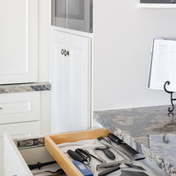
➢ the integration of specific storage units, such as double stacked cutlery drawers, a custom spice pull-out, a Kuerig coffee and tea pod drawer, and custom double stacked utensil drawers
➢ moving the refrigerator to the old oven location - this eliminated the bottle neck as well as created a better relationship to the eating table. It also utilizes the floor space between the pantry, nook, and kitchen
➢ creating a banquet style breakfast nook - this banquette seating not only doubles the amount of seating for large gatherings but it better utilizes the odd space between the kitchen and the previous nook area. It also helps to create a distinct pathway from the mudroom room through the pantry area, kitchen, nook, and living room.
➢ the coffee/breakfast bar area which includes the perfect location for the concealed microwave and toaster oven, convenient storage for the coffee pods and tea accoutrements. Roll-out drawers below also house the smoothie maker, hot water kettle, and a plethora of smoothie-making ingredients such as protein powders, smoothie additives, etc. Furthermore, the drawers below the Keurig house measuring utensil, cutlery, baking supplies and tupperware storage.
➢ incorporating lots of wide drawers and pullouts to accommodate large cookware.
➢ utilizing as much vertical space as possible by building storage to the ceiling which accommodates the family’s abundant amount of serving platters, baking sheets, bakeware, casserole dishes, and additional cutting boards.
The project is enhanced aesthetically by:
➢ new 5-piece Versailles pattern porcelain tile that now seamlessly joins the entire down stairs area together creating a bright, cohesiveness feeling instead of choppy separated spaces - it also adds a coastal feeling
➢ designing a cabinet to conceal the microwave and toaster oven
➢ the coastal influenced light fixtures over the nook table and island
➢ the sandy colors of the Langdon Cambria countertops. The swirling pattern and sparkling quartz pieces remind the homeowner of black-and-tan sandy beaches
➢ the striped banquet seating whose creamy white background and blue-green stripes were the inspiration for the cabinet and wall colors.
➢ All the interior doors were painted black to coordinate with the blacks and grays in the backsplash tile and countertop. This also adds a hint of tailored formality to an otherwise casual space.
➢ the use of WAC's Oculux small aperture LED units for the overhead lighting complimented with Diode LED strips for task lighting under the cabinets and inside the pantry and glass wall cabinets. All of the lighting applications are on separate dimmer switches.
Innovative uses of materials or construction methods by Realty Restoration LLC:
➢ Each 1-1/2” x 3” block of reclaimed end-grain black walnut that makes up the center island chopping block was hand milled and built in the shop. It was designed to look substantial and proportional to the surrounding elements, executed by creating the 4 inch tall top with a solid wood chamfered edge band.
➢ The metal doors on either side of the vent hood were also custom designed for this project and built in the Realty Restoration LLC shop. They are made 1x2, 11-gauge mild steel with ribbed glass. Weighing 60 lbs a piece, heavy duty cabinet hinges were added to support the weight of the door and keep them from sagging.
➢ Under-cabinet receptacles were added along the range wall in order to have a clean, uninterrupted backsplash.
Design obstacles to overcome:
➢ Because we were removing the demising walls between the kitchen and living room, we had to find a way to plumb and vent the new island. We did this by tunneling through the slab (the slab had post tension cables which prevented us from just trenching) to run a new wet vent through a nearby structural wall. We pulled the existing hot and cold lines between upper floor joists and ran them down the structural wall as well and up through a conduit in the tunnel.
➢ Since we were converting from wall overs to a gas range it allowed us to utilize the 220 feed for the wall ovens to provide a new sub panel for all the new kitchen circuits
➢ Due to framing deficiencies inherited from the original build there was a 1-1/2” differential in the floor-to-ceiling height over a 20 foot span; by utilizing the process of cutting and furring coupled with the crown moulding details on the cabinet elevations we were able to mask the problem and provide seamless transitions between the cabinet components.
Evidence of superior craftsmanship:
➢ uniquely designed, one-of-a-kind metal “X” end panels on the large island. The end panels were custom made in the Realty Restoration LLC shop and fitted to the exact dimensions of the island. The welding seams are completely indistinguishable - the posts look like they are cut from a single sheet of metal
➢ square metal posts on the small island were also custom made and designed to compliment and carry through the metal element s throughout the kitchen
➢ the beautiful, oversized end panels on the pantry cabinets which give the breakfast nook a tailored look
➢ integrating a large format 5 piece Versailles tile pattern to seamlessly flow from the existing spaces into the new kitchen space
➢ By constructing a custom cabinet that jogged around a corner we could not remodel (housing the entry way coat closet) we were able to camouflage the adjacent wall offset within the upper and lower cabinets. By designing around the existing jog in the structural walls we accomplished a few things: we were able to find the space to house, and hide, the microwave and toaster oven yet still have a clean cohesive appearance from the kitchen side. Additionally, the owners were able to keep their much needed coat closet and we didn’t have to increase the budget with unnecessary structural work.
148