
Search results for "Additionally mentioned" in Home Design Ideas
 Alair Homes Plano
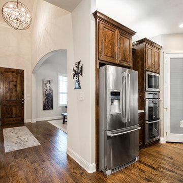
Our clients house was built in 2012, so it was not that outdated, it was just dark. The clients wanted to lighten the kitchen and create something that was their own, using more unique products. The master bath needed to be updated and they wanted the upstairs game room to be more functional for their family.
The original kitchen was very dark and all brown. The cabinets were stained dark brown, the countertops were a dark brown and black granite, with a beige backsplash. We kept the dark cabinets but lightened everything else. A new translucent frosted glass pantry door was installed to soften the feel of the kitchen. The main architecture in the kitchen stayed the same but the clients wanted to change the coffee bar into a wine bar, so we removed the upper cabinet door above a small cabinet and installed two X-style wine storage shelves instead. An undermount farm sink was installed with a 23” tall main faucet for more functionality. We replaced the chandelier over the island with a beautiful Arhaus Poppy large antique brass chandelier. Two new pendants were installed over the sink from West Elm with a much more modern feel than before, not to mention much brighter. The once dark backsplash was now a bright ocean honed marble mosaic 2”x4” a top the QM Calacatta Miel quartz countertops. We installed undercabinet lighting and added over-cabinet LED tape strip lighting to add even more light into the kitchen.
We basically gutted the Master bathroom and started from scratch. We demoed the shower walls, ceiling over tub/shower, demoed the countertops, plumbing fixtures, shutters over the tub and the wall tile and flooring. We reframed the vaulted ceiling over the shower and added an access panel in the water closet for a digital shower valve. A raised platform was added under the tub/shower for a shower slope to existing drain. The shower floor was Carrara Herringbone tile, accented with Bianco Venatino Honed marble and Metro White glossy ceramic 4”x16” tile on the walls. We then added a bench and a Kohler 8” rain showerhead to finish off the shower. The walk-in shower was sectioned off with a frameless clear anti-spot treated glass. The tub was not important to the clients, although they wanted to keep one for resale value. A Japanese soaker tub was installed, which the kids love! To finish off the master bath, the walls were painted with SW Agreeable Gray and the existing cabinets were painted SW Mega Greige for an updated look. Four Pottery Barn Mercer wall sconces were added between the new beautiful Distressed Silver leaf mirrors instead of the three existing over-mirror vanity bars that were originally there. QM Calacatta Miel countertops were installed which definitely brightened up the room!
Originally, the upstairs game room had nothing but a built-in bar in one corner. The clients wanted this to be more of a media room but still wanted to have a kitchenette upstairs. We had to remove the original plumbing and electrical and move it to where the new cabinets were. We installed 16’ of cabinets between the windows on one wall. Plank and Mill reclaimed barn wood plank veneers were used on the accent wall in between the cabinets as a backing for the wall mounted TV above the QM Calacatta Miel countertops. A kitchenette was installed to one end, housing a sink and a beverage fridge, so the clients can still have the best of both worlds. LED tape lighting was added above the cabinets for additional lighting. The clients love their updated rooms and feel that house really works for their family now.
Design/Remodel by Hatfield Builders & Remodelers | Photography by Versatile Imaging
 Kitchen Design Concepts
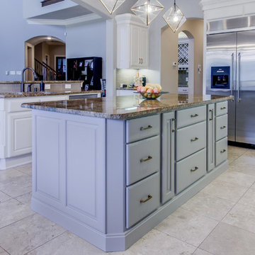
One of the biggest investments you can make in your home is in your kitchen. Now with the Revive model, you don’t have to break the bank to get an updated kitchen with new finishes and a whole new look! This powder blue kitchen we are sharing today is a classic example of such a space! The kitchen had a great layout, the cabinets had good bones, and all it needed were some simple updates. To learn more about what we did, continue reading below!
Cabinets
As previously mentioned, the kitchen cabinetry already had great bones. So, in this case, we were able to refinish them to a painted cream on the perimeter. As for the island, we created a new design where new cabinetry was installed. New cabinets are from WWWoods Shiloh, with a raised panel door style, and a custom painted finish for these powder blue cabinets.
Countertops
The existing kitchen countertops were able to remain because they were already in great condition. Plus, it matched the new finishes perfectly. This is a classic case of “don’t fix it if it ain’t broke”!
Backsplash
For the backsplash, we kept it simple with subway tile but played around with different sizes, colors, and patterns. The main backsplash tile is a Daltile Modern Dimensions, in a 4.5×8.5 size, in the color Elemental Tan, and installed in a brick-lay formation. The splash over the cooktop is a Daltile Rittenhouse Square, in a 3×6 size, in the color Arctic White, and installed in a herringbone pattern.
Fixtures and Finishes
The plumbing fixtures we planned to reuse from the start since they were in great condition. In addition, the oil-rubbed bronze finish went perfectly with the new finishes of the kitchen. We did, however, install new hardware because the original kitchen did not have any. So, from Amerock we selected Muholland pulls which were installed on all the doors and drawers.
 Weslei Costa General Contractor
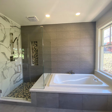
Our clients priority was to have a more functional bathroom & optimize storage.
See our project scope:
-Change the tub faucet location, before they had to “jump” over it to get in and out the tub.
-Change the shower head to a handheld spray.
-New ceiling recessed lights layout
-Add a LED Mirror and Wall Sconces
-Floor Heating System
-Towel Warmer
-Quartz/Solid Surface Tub Deck and Shower Bench
-Add a Shampoo Niche
-Linear Shower Drain
-Custom Floating Vanity w/ (2) Towers for additional storage and convenient access to skin care and daily used products.
-Wall Mounted Faucets to clear up vanity space.
-Exhaust Fan w/ Bluetooth Speaker
And more.
This master bathroom has everything they needed and more, not to mention the stunning finishes and eye catching wall tiles.
Interior Designer: Vivian Costa
General Contractor: Weslei Costa
Find the right local pro for your project
 Designs by KS
Project: Hamilton Street – New Westminster
About this Project
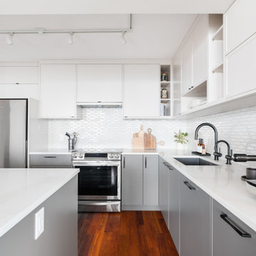
The snow had melted, and our past clients were ready to have us back! This time, to transform their kitchen from its cookie cutter aesthetic to a space that was sophisticated and timeless.
Kitchen:
The previous kitchen had a layout that worked well but was in serious need of a makeover. The visual focus in this renovation is the harmony of the materials used; how the cool and warm tones come together to create this inviting space. The backsplash adds a sense of personality along with the carefully placed open shelving in both the upper cabinets and island.
Working around the existing sprinklers was one of the obstacles we faced while designing this kitchen. At the fridge, we worked around this by setting back the upper cabinets and creating a landing space above the fridge. One of our favourite things about this kitchen is the use of interior organization. These custom additions make for a well equipped and organized kitchen.
Special Mentions:
The black plumbing fixtures by Riobel and sink by Blanco offer some contrast against the white countertops and backsplash.
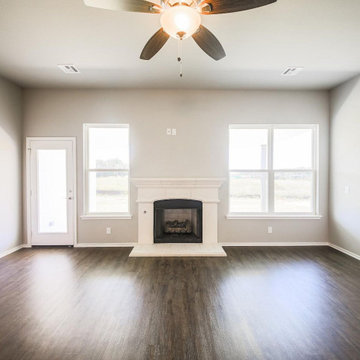
We jazzed up the old fireplace mantle and surround by using White Oak for the mantle and tile from Julian Tile.
 Turner Home Remodeling
As general contractors in San Jose, we understand that designer homes in big cities seek the best in home renovation in San Jose, as performed by experts like Turner Home Remodeling that specializes in custom upgrades & improvements. It can be in the area of kitchen & bath remodels, ADU design & construction, room addition or backyard services, to mention a few.
General Contractors in San Jose at Home Remodeling in San Jose, CA - https://www.turnerhomeremodeling.com/
ZIP Code 95002, ZIP Code 95101, ZIP Code 95103, ZIP Code 95106, ZIP Code 95108, ZIP Code 95109 ,ZIP Code 95110, ZIP Code 95111, ZIP Code 95112, ZIP Code 95113, ZIP Code 95115, ZIP Code 95116, ZIP Code 95117, ZIP Code 95118, ZIP Code 95119, ZIP Code 95120, ZIP Code 95121, ZIP Code 95122, ZIP Code 95123, ZIP Code 95124, ZIP Code 95125, ZIP Code 95126, ZIP Code 95127 ,ZIP Code 95128, ZIP Code 95129, ZIP Code 95130, ZIP Code 95131, ZIP Code 95132, ZIP Code 95133
 Saltwater Kitchen & Bath Studio
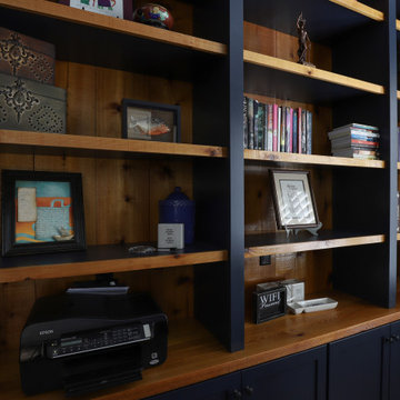
This home originally had a Mediterranean inspired interior...wrought iron, heavy wood and Travertine everywhere. The office not only wasn't the homeowners taste but wasn't functional. While brainstorming ideas I mentioned cedar and he immediately said "Yes" as it reminded him of his childhood home. Additionally a request for a stand-up desk with storage for his bad back and a navy paint finished off this space.
 Big Bear Remodeling
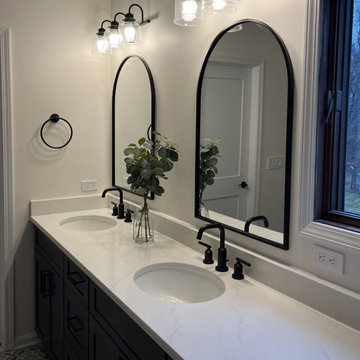
This master bathroom was expanded into a dressing room that was unused space for this family. This allowed for the addition of a larger double sink vanity and linen closet in Fabuwood Galaxy Indigo. The vanity is topped off with a Calcutta Enora Quartz countertop and matte black fixture accents throughout. The shower was also enlarged and finished with an embossed BCI Acrylic surround. Finally, we’d be remiss not to mention the beautiful detail in the new Decora Vetrate floor tiles.

Sponsored
Columbus, OH
Free consultation for landscape design!

Peabody Landscape Group
Columbus' Reliable Landscape Design & Contracting
 Cure Design Group
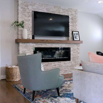
a classic city home, built in the 50’s. Her family moved in August of ’18, and in less than a year, she’s already completed a number of remodel projects including additions to the master bedroom and 2-bedroom + bath “kids’ wing.” She’s opened walls from the kitchen to the living and dining rooms creating a massive open floor plan and refinished all the original hardwood floors. After seeing her beautifully furnished space and hearing her listing everything she’s done to get her house the way it looks today, I had so many exciting ideas to help her add the finishing touches she was needing and to give her the look she was going for.
Referencing her inspiration pics saved to Houzz and Pinterest, the first item on the list was to add window treatments. These were presented in a soft, crisp white fabric which maintains the brightness for each room, diffusing the sunlight throughout, keeping each space light and airy. The simple functional panels give her the privacy she wanted from all the passersby walking the park, which are lined to help regulate the temperature differences she needed. The hardware for these panels is something to mention –simple, modern, matte black rods and brackets, highlighted with acrylic finials and gold rings. This combination is an exclamation point showcasing what custom window treatments can really do for a room. The main dining room window boasts a striking contrast of rich black wide leather tape, drawing your eye right to the beautiful picture window, which in and of itself is a perfect accent to this space.
From there, adding the right wall hangings and artwork, task lighting, accessories, and accents layered throughout, mixing lots of textures, metal finishes, and varying shades of color synchronizes one room to the next buttoning up the entire design concept she was striving to achieve.
 BluPath Design
Blau-Thompson Residence
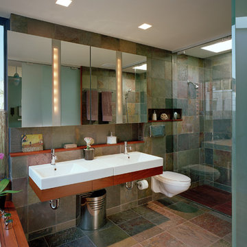
This Civil War era, 1680-square-foot three-story row house is located in the Italian Market section of Philadelphia. The BluPath Design principals and their young child were the clients. The project goal was to upgrade a traditional housing type to meet a contemporary lifestyle, applying both sustainable criteria and clean, modern yet sensual aesthetics. The challenge of the property (only 830 square feet in lot size) was to create a design that was small, but smart.
The structure formerly housed a luncheonette with two apartments above. The interior was gutted and renovated into a single family home. The construction of a small rear addition added a new kitchen on the first floor and new bathrooms on the second and third levels. The east-west orientation of the home was ideal for the roof-mounted solar collectors, which were installed to provide domestic hot water and supplement the new radiant floor heating system. Exterior sensors improve the efficiency of the heating system's response to fluctuations in outside temperature. A new white-coated, rubber membrane roof reduced the structure's heat gain by 20 percent. A water catch system collects rainwater and air conditioner condensation to water the home's small rear garden.
Large windows and skylights bring light deep into the row house and reduce the use of light fixtures. The rear yard garden features ipe decking (a dense, water-repellent hardwood) on permeable compacted gravel to minimize storm water runoff. BluPath Design’s principals used the project to demonstrate how sustainability can be integrated with beauty and function, with sensual materials and colors, well-proportioned and light-filled rooms, economic use of space, and thoughtful details. Cherry flooring and custom stairs complement the Indian slate tile in the kitchen and bathrooms. The kitchen features custom walnut cabinets with blue granite counters and backsplashes. The first floor dining area is illuminated by a BluPath-designed fiber-optic chandelier. Ipe hardwood is also used for the master bath tub-surround and shower floor. Sliding frosted glass panels separating the master bath from other living areas allows light from the corner windows to naturally illuminate the adjacent room.
Awards
Honorable Mention for Sustainability and Energy Efficiency
IIDA Philadelphia City Center Chapter 3rd Annual Interior Design Awards, June 2007
Bronze 2006 Commonwealth Design Award
10,000 Friends of PA, May 2006
Media
HGTV ‘What You Get for the Money’ February 2007
Philadelphia Style Magazine March/April 2007
Philadelphia Inquirer June 11, 2006
Philadelphia CityPaper September 25-October 2, 2003
Photography by Barry Halkin
 Designs by KS
Project: Hamilton Street – New Westminster
About this Project
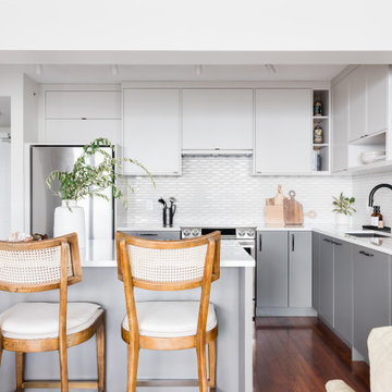
The snow had melted, and our past clients were ready to have us back! This time, to transform their kitchen from its cookie cutter aesthetic to a space that was sophisticated and timeless.
Kitchen:
The previous kitchen had a layout that worked well but was in serious need of a makeover. The visual focus in this renovation is the harmony of the materials used; how the cool and warm tones come together to create this inviting space. The backsplash adds a sense of personality along with the carefully placed open shelving in both the upper cabinets and island.
Working around the existing sprinklers was one of the obstacles we faced while designing this kitchen. At the fridge, we worked around this by setting back the upper cabinets and creating a landing space above the fridge. One of our favourite things about this kitchen is the use of interior organization. These custom additions make for a well equipped and organized kitchen.
Special Mentions:
The black plumbing fixtures by Riobel and sink by Blanco offer some contrast against the white countertops and backsplash.
We jazzed up the old fireplace mantle and surround by using White Oak for the mantle and tile from Julian Tile.
 CSW Studio Interior Design
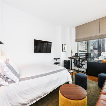
This bedroom was designed to accommodate a teenager boy who will be pursuing in the music industry. We took in consideration the need to have a additional queen size bed for guests. This space can be used for gatherings to listen him playing tracks or just to have friends over to play video game.
The use of this space is endless! The rare picture of Basquiat in the desk area and a very interesting table lamp, vintage, and made of clay welcomes everyone who walks in, without forget to mentioned, we incorporated the hall entrance with the rest of the room, adding the ceiling pendant that reflects an abstract interesting pattern in the ceiling, making even more artsy and fun!
 AMS Fireplace, Inc.
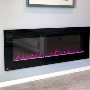
The modern and minimalist look of a linear electric fireplace is a great addition to any indoor or outdoor contemporary living space. Benefits of an electric fireplace include energy savings, venting elimination and installation flexibility – not to mention its sleek and head turning look!
Customize this simplistic look with your choice of fire glass and log set.
 komandor
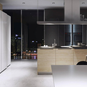
Kitchen, Sliding Doors & Storage by Komandor. With any good kitchen layout, storage and flow are key. Continuing from last week’s theme…sliding doors can be a great addition to your kitchen or pantry. The main features being the increase in flow and the decrease in clutter in the kitchen. An open cabinet door protruding into your space is always cumbersome. Sliding doors can save valuable space and increase flow in high traffic areas. Not to mention that they are right on trend! Sliding doors can also be used to create a work station with a counter top and extra storage above and below. Food prep and frequently working appliances can be hidden away with the push of a door. Unexpected guests…no problem…with sliding doors a tidy kitchen is always just a slide away!
Sponsored
Columbus, OH

Trish Takacs Design
Award Winning & Highly Skilled Kitchen & Bath Designer in Columbus
 Beige and Bleu Design Studio
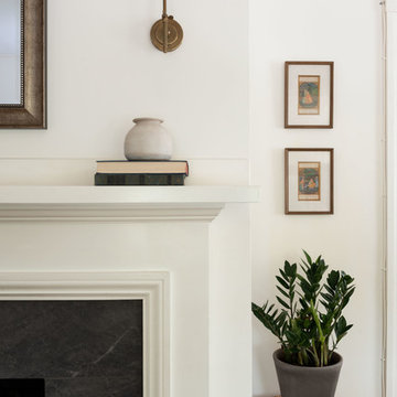
Our clients came to us with a few pieces they wanted to incorporate in their living room- to mention just a few: Their unique art, photography by their sister, and unique collected pieces that had been passed down from family and found through their travels. We took what they had, and provided them with additional pieces to really make the space come together, down to styling the space, replacing major furniture pieces, and creating a custom built in to house their electronics. This is one of our favorites because of the uniqueness in the eclectic collection of pieces.
Photography: Tamara Flanagan Photography
 Sunspace Design, Inc.
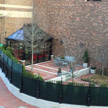
Most of our projects are completed in residential areas ranging from rural to suburban, but we occasionally have an opportunity to do work in the heart of a metropolitan space. This project represents one such opportunity. Sunspace Design was tasked with the construction of a gorgeous, private greenhouse in the center of Boston’s historic Beacon Hill neighborhood, and we’re thrilled to show you the results.
The project required the introduction of a brick greenhouse foundation and granite cap. The structure was framed on top of this in black, powder-coated aluminum, and eventually outfitted with large glass panes. An additional ridge crest gives the Victorian structure provides an amazing silhouette.
A number of great features warrant mentioning. The project includes motorized, thermostatically controlled ridge vents and a full HVAC split system to ensure top thermal performance. The client’s ease of operation was also addressed via the installation of remote controlled shades. Smoked privacy glass in the rear of the structure offers some solitude, and a mirage window wall with accordion doors at the front of the structure blend beauty and functionality.
 Turner Home Remodeling
As general contractors in San Jose, we understand that designer homes in big cities seek the best in home renovation in San Jose, as performed by experts like Turner Home Remodeling that specializes in custom upgrades & improvements. It can be in the area of kitchen & bath remodels, ADU design & construction, room addition or backyard services, to mention a few.
General Contractors in San Jose at Home Remodeling in San Jose, CA - https://www.turnerhomeremodeling.com/
 Kitchen Design Concepts
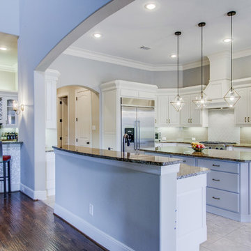
One of the biggest investments you can make in your home is in your kitchen. Now with the Revive model, you don’t have to break the bank to get an updated kitchen with new finishes and a whole new look! This powder blue kitchen we are sharing today is a classic example of such a space! The kitchen had a great layout, the cabinets had good bones, and all it needed were some simple updates. To learn more about what we did, continue reading below!
Cabinets
As previously mentioned, the kitchen cabinetry already had great bones. So, in this case, we were able to refinish them to a painted cream on the perimeter. As for the island, we created a new design where new cabinetry was installed. New cabinets are from WWWoods Shiloh, with a raised panel door style, and a custom painted finish for these powder blue cabinets.
Countertops
The existing kitchen countertops were able to remain because they were already in great condition. Plus, it matched the new finishes perfectly. This is a classic case of “don’t fix it if it ain’t broke”!
Backsplash
For the backsplash, we kept it simple with subway tile but played around with different sizes, colors, and patterns. The main backsplash tile is a Daltile Modern Dimensions, in a 4.5×8.5 size, in the color Elemental Tan, and installed in a brick-lay formation. The splash over the cooktop is a Daltile Rittenhouse Square, in a 3×6 size, in the color Arctic White, and installed in a herringbone pattern.
Fixtures and Finishes
The plumbing fixtures we planned to reuse from the start since they were in great condition. In addition, the oil-rubbed bronze finish went perfectly with the new finishes of the kitchen. We did, however, install new hardware because the original kitchen did not have any. So, from Amerock we selected Muholland pulls which were installed on all the doors and drawers.
Sponsored
Columbus, OH

Structural Remodeling
Franklin County's Heavy Timber Specialists | Best of Houzz 2020!
 TOUCH Architect Co., Ltd.
PROJECT | Duplicate-Duplex
TYPE | private residence / home-studio
LOCATION | Phayathai Rd., Bangkok, Thailand
OWNER | Ms. Najaree Ratanajiajaroen / Chanon Treenet
ARCHITECT | TOUCH Architect Co.,Ltd.
FLOOR AREA | 64 sq.m.
FLOOR AREA (by proposing) | 75 sq.m.
COMPLETION | 2018
PHOTOGRAPHER | Chalermwat Wongchompoo
CONTRACTOR | Legend Construction Group
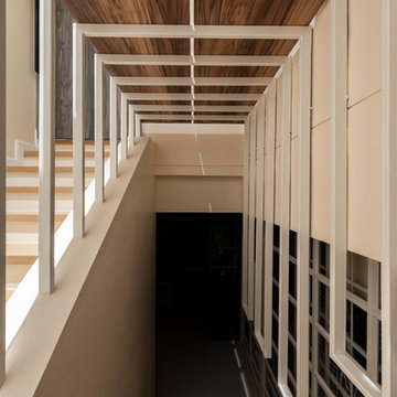
A major pain point of staying in 64 sq.m. of duplex condominium unit, which is used for a home-studio for an animator and an artist, is that there is not enough space for dwelling. Moreover, a double-volume space of living area with a huge glass curtain wall, faces West. High temperature occurs all day long, since it allows direct sunlight to come inside.
In order to solve both mentioned problems, three addition items are proposed which are, GRID PARTITION, EXTENSION DECK, and STEPPING SPACE.
A glass partition not only dividing space between kitchen and living, but also helps reduce electricity charge from air-condition. Grid-like of double glass frame is for stuff and stationery hanging, as to serve the owners’ activities.
Extension deck would help filtrating heat from direct sunlight, since an existing high glass facade facing West.
An existing staircase for going up to the second-floor bedroom, is added by a proposed space above, since this condominium unit has no enough space for dwelling or storage. In order to utilize the space in a small condominium, creating another staircase above the existing one helps increase the space.
The grid partition and the extension deck help ‘decrease’ the electricity charge, while the extension deck and the stepping space help ‘increase’ the space for 11 sq.m.
 Alair Homes Plano
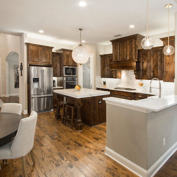
Our clients house was built in 2012, so it was not that outdated, it was just dark. The clients wanted to lighten the kitchen and create something that was their own, using more unique products. The master bath needed to be updated and they wanted the upstairs game room to be more functional for their family.
The original kitchen was very dark and all brown. The cabinets were stained dark brown, the countertops were a dark brown and black granite, with a beige backsplash. We kept the dark cabinets but lightened everything else. A new translucent frosted glass pantry door was installed to soften the feel of the kitchen. The main architecture in the kitchen stayed the same but the clients wanted to change the coffee bar into a wine bar, so we removed the upper cabinet door above a small cabinet and installed two X-style wine storage shelves instead. An undermount farm sink was installed with a 23” tall main faucet for more functionality. We replaced the chandelier over the island with a beautiful Arhaus Poppy large antique brass chandelier. Two new pendants were installed over the sink from West Elm with a much more modern feel than before, not to mention much brighter. The once dark backsplash was now a bright ocean honed marble mosaic 2”x4” a top the QM Calacatta Miel quartz countertops. We installed undercabinet lighting and added over-cabinet LED tape strip lighting to add even more light into the kitchen.
We basically gutted the Master bathroom and started from scratch. We demoed the shower walls, ceiling over tub/shower, demoed the countertops, plumbing fixtures, shutters over the tub and the wall tile and flooring. We reframed the vaulted ceiling over the shower and added an access panel in the water closet for a digital shower valve. A raised platform was added under the tub/shower for a shower slope to existing drain. The shower floor was Carrara Herringbone tile, accented with Bianco Venatino Honed marble and Metro White glossy ceramic 4”x16” tile on the walls. We then added a bench and a Kohler 8” rain showerhead to finish off the shower. The walk-in shower was sectioned off with a frameless clear anti-spot treated glass. The tub was not important to the clients, although they wanted to keep one for resale value. A Japanese soaker tub was installed, which the kids love! To finish off the master bath, the walls were painted with SW Agreeable Gray and the existing cabinets were painted SW Mega Greige for an updated look. Four Pottery Barn Mercer wall sconces were added between the new beautiful Distressed Silver leaf mirrors instead of the three existing over-mirror vanity bars that were originally there. QM Calacatta Miel countertops were installed which definitely brightened up the room!
Originally, the upstairs game room had nothing but a built-in bar in one corner. The clients wanted this to be more of a media room but still wanted to have a kitchenette upstairs. We had to remove the original plumbing and electrical and move it to where the new cabinets were. We installed 16’ of cabinets between the windows on one wall. Plank and Mill reclaimed barn wood plank veneers were used on the accent wall in between the cabinets as a backing for the wall mounted TV above the QM Calacatta Miel countertops. A kitchenette was installed to one end, housing a sink and a beverage fridge, so the clients can still have the best of both worlds. LED tape lighting was added above the cabinets for additional lighting. The clients love their updated rooms and feel that house really works for their family now.
Design/Remodel by Hatfield Builders & Remodelers | Photography by Versatile Imaging
 Michael Nash Design, Build & Homes
2011 NARI CAPITAL COTY HONORABLE MENTION AWARD WINNER
Since moving into their home 10 years ago, the lady of the house has been unhappy with her kitchen, dining room and entryway. The layout wasn’t efficient and the formal dining room was rarely used. With two children and a dog, a mud room made more sense for their lifestyle.
To make best use of the space, the design team at Michael Nash Design, Build & Homes removed the dining room altogether. Four feet of that space went to the kitchen to make it more spacious and functional. The rest went to creating a mud room for the kids with locker style storage.
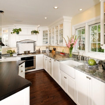
The highlight of the renovation is, however, the new kitchen. Featuring a large center island with distressed curved wood countertop, it provides an anchor around which the rest of the room flows. Stark white cabinets run along two walls, providing significant kitchen storage, as well as several display cabinets for the homeowner’s fine china.
A white farmer’s sink sits below a large window looking out over the backyard and the counters are topped with complementary stone counter and tile backsplash. Stainless steel appliances include a gas cooktop with custom wood hood that matches the cabinets. Matching crown molding tops the flush-to-the-ceiling cabinets.
In addition to natural light from the windows, the kitchen features pendant lights over the island, under-cabinet lighting and LED lights. The added lighting along with the white cabinets make the room look even more spacious.
Being a gourmet cook, the homeowner enjoys her time in kitchen while the mud room makes her daily chores a lot simpler.
22