
Search results for "Amplifying" in Home Design Ideas
 Dwellify
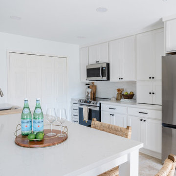
This Coastal kitchen renovation was a detail-oriented renovation, as every small detail made up the greater difference between an outdated kitchen and a Coastal-inspired gathering place. Every detail was meticulously tailored to open up the space and harness the natural light, culminating in a sanctuary of timeless elegance. With the removal of overhead cabinets, dark appliances and a cluttered backsplash, the kitchen instantly opened up, creating an airy, light-filled atmosphere. From white walls to white countertops, predominantly white features were strategically chosen to reflect and amplify the abundant natural light streaming through the expansive windows, creating a luminous and inviting environment. The backsplash, positioned horizontally to visually widen the space, creates a visual sense of expansiveness. Silver appliances contribute to a cool tone which ultimately creates a calm feeling. The accentual wood elements bring warmth and charm, seamlessly blending with the Coastal theme while adding a cozy ambiance. From the removal of clutter to the strategic use of white hues and natural materials, small details contributed to the greater whole to create a serene haven for culinary creativity and cherished gatherings to come to this kitchen.
 Century Stair Company
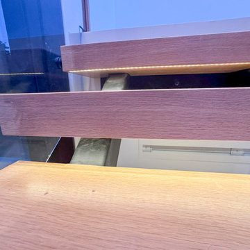
This contemporary home features two striking staircases with integrated LED lighting, glass railing, and thick wood treads. The color-changing LEDs shift from red to blue to yellow, transforming the staircases into dynamic focal points throughout the day. Wood treads and handrails are paired with frameless glass balustrades secured by black pins. Open risers amplify the LED lighting effect while maximizing transparency.
The first-level staircase uses cantilevered and field-supported construction, while the second rises on dual metal stringers. Glass railing continues on the second-floor balcony, creating a cohesive system where light and glass elevate the design beyond the purely functional.
1976-2026 © Century Stair Company
 Chervin Kitchen & Bath Inc.
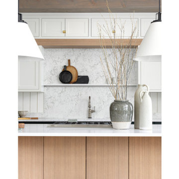
Welcome to a luminous cottage kitchen, where the focal point lies in the striking white central cabinets and full-height backsplash. These pristine features stand as pillars of elegance and functionality, reflecting light and amplifying the sense of space. Against this backdrop, accents of dark green punctuate the design, infusing depth and character into the room. Bathed in natural light, the kitchen exudes a sense of freshness and modernity, while retaining a cozy cottage charm. With its seamless blend of timeless aesthetics and practicality, this kitchen beckons for culinary adventures and shared moments with loved ones.
Find the right local pro for your project
 Unpatterned
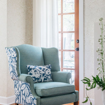
These clients had a hodgepodge of furniture mixed with a few great features and pieces - such as the William Morris wallpaper and vintage Chinese rug. We sourced a mix of vintage, new, and custom pieces to amplify the best parts of the existing features and create a space that felt less “formal” and more warm and inviting. We gutted the powder bath and created a fun statement with bright crocodile tile and subtle details. The kitchen needed a little facelift to stand up to the rest of the first floor, so we updated the tile, range, counters, hardware, plumbing fixtures, and lighting to bring the space to life.
FUN FACT: The fireplace was a dated yellow brick with a massive TV mounted above that was never used. We replaced the TV with some colorful art and framed out and Venetian Plastered the fireplace to compliment the elegance of the room.
Photography: Margaret Rajic
 Eugene Pintail LLC
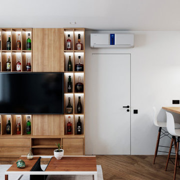
Gylden æra embraces the timeless elegance of Scandinavian minimalism in a compact apartment. By streamlining layout and materials, it creates a serene, deliberate environment where simplicity speaks volumes.
Every detail is intentionally crafted—from the seamless integration of functional areas to the uncluttered circulation paths. The design presents a visual calm that enhances both daily living and quiet reflection.
Soft woods, matte surfaces, and warm neutrals anchor the scheme. Subtle use of light tones amplifies natural light and expands spatial perception. Textural variations—like woven textiles, fine-grain wood, and matte finishes—add depth without compromising simplicity.
Minimalist lighting design—wall-mounted fixtures, linear pendants—complements the space's architectural rhythm without drawing attention away. Strategic layering of natural and ambient light enhances mood while maintaining visual clarity.
Gylden æra feels both peaceful and poised—moderated yet expressive. It captures a balance of restrained luxury and everyday comfort, honoring Scandinavian roots.
 Dream Coast Builders
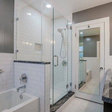
This thoughtfully designed modern bathroom combines style and functionality with a sleek walk-in shower enclosed by glass shower doors that maintain an airy, open feel. The shower with bench provides added comfort, while the adjacent deep bathtub and shower setup offers a spa-like retreat within a compact footprint. Hexagonal tile flooring flows seamlessly into the crisp white subway tiles, creating a visually clean and cohesive aesthetic. A full-length bathroom mirror door enhances depth and reflects natural light, amplifying the room’s brightness. Polished chrome fixtures and a contrasting marble ledge bring a refined finish to this elegant bathroom space, perfect for homeowners seeking timeless design with a luxurious twist. The integration of a bathroom with tub alongside a walk-in shower maximizes practicality without sacrificing the visual harmony of the space.
 dmg Martinez Group
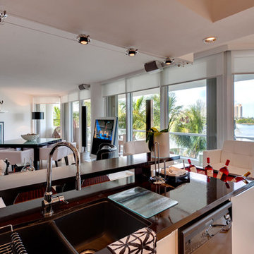
This condo is located in Williams Island Aventura, Florida. It features a complex integration with a four link music distribution system. Stereo in the Master Bedroom, Master Bathroom, Patio; and Dolby pro & DTS 5.1 Surround Sound in the Living Room. Using a swivel free standing TV from Bang & Olufsen the BeoVision 5 TV has a "1080p Broadcast grade Plasma display", built in BeoSystem 1 scaler and decoder, built in BeoLab 4000 as center channel. BeoSound 9000 as an Audio Source, a wall mounted iMac as media server source in the kitchen bar, Bang & Olufsen BeoLab 1, and Martin Logan speakers, this home theater has a great sound reproduction and a clean modern look.
V. Gonzalo Martinez
 Vigini Paint and Design
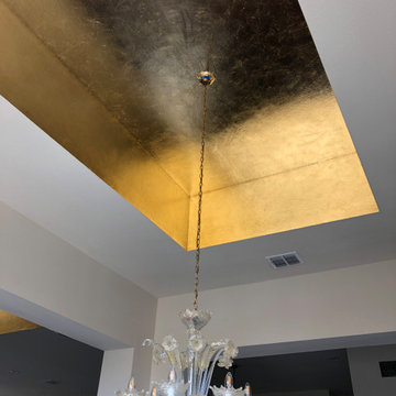
Fabulous view of schaibin broken leaf gilded ceiling, luminosity amplified by a murano chandelier.
Minimalist dining room photo in Other
Minimalist dining room photo in Other
 Interiors by Maite Granda
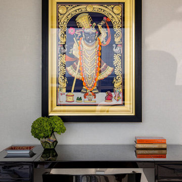
This project uses a neutral color palette to enhance the sea view, allowing the natural beauty outside to participate in the apartment's design. The soft whites, beiges, and creams throughout create a calming, cohesive backdrop that amplifies the light and airy ambiance of each space. To add vibrancy and personality, carefully selected artwork and decor pieces introduce pops of color, serving as focal points without disrupting the serene atmosphere. Thoughtfully incorporated biophilic design elements—such as fresh greenery and organic shapes—bring a natural feel indoors, fostering a connection with nature. The outcome is a sophisticated space that feels both luxurious and inviting.
 Room Envy
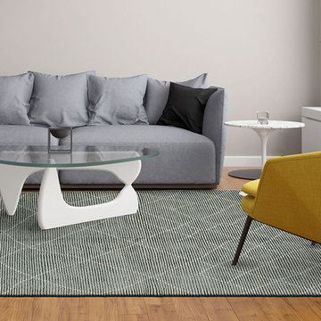
Striking Moroccan designs marry amplified texture for maximum impact in the Vail collection. Hand-knotted in India of 100% wool, each rug displays the intricate lines of traditional textiles with updated details like thickly-braided tassels that elevate design to chic new levels. A neutral color palette of greys charcoals and ivories make the Vail collection a fit for any decor plus durable construction ensures that each rug stays the darling of the busiest of rooms.
 Go Modern Furniture
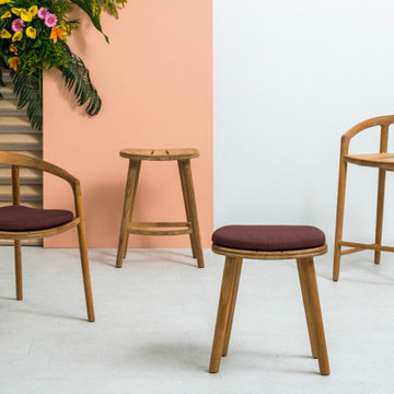
New for 2020, the Solid garden stool is made in Belgium by luxury garden furniture brand Manutti.
Created by the world famous Lionel Doyen, the design of the stool perfectly balances technological innovation and authentic craftsmanship. It's graceful wooden frame and delicately crafted seat simultaneously suggest solidity and comfort – a sensation that is further amplified by its sensual shape, which moulds to the body.
Available in natural teak, or in brushed nero teak. For extra comfort why not add a cushion with outdoor, quick dry foam fillings and covers in a great choice of water resistant outdoor fabrics. The seams are welded as well as sewn, so if a drop of water does manage to get through it will drain away through the specially designed cushions.
 Century Stair Company
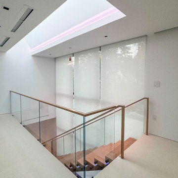
This contemporary home features two striking staircases with integrated LED lighting, glass railing, and thick wood treads. The color-changing LEDs shift from red to blue to yellow, transforming the staircases into dynamic focal points throughout the day. Wood treads and handrails are paired with frameless glass balustrades secured by black pins. Open risers amplify the LED lighting effect while maximizing transparency.
The first-level staircase uses cantilevered and field-supported construction, while the second rises on dual metal stringers. Glass railing continues on the second-floor balcony, creating a cohesive system where light and glass elevate the design beyond the purely functional.
1976-2026 © Century Stair Company
 United Porte Inc
Our doors have several superior features:
- Metal-plastic doors – lighter than iron and steel doors, but no less strong and reliable! Scratch and impact resistance, easy of care and environmentally friendly
- In principle, we use only all-welded reinforcement, 1/10" thick (!) for the entrance doors. Such reinforcement is a necessary condition for real burglary resistance.
- We use an aluminum threshold with a special thermal insert that cuts off the cold from the room. We also complete with an amplifier to securely fix the bottom of the door and cut off the cold.
- HPL sandwich panel, consists of foamed extruded Styrofoam, with rigid PVC overlays high pressure on both sides.
- Energy savings double-glazed safety windows.
- Quality insulation serves to reduce unwanted external noise, as well as protect against extreme heat, and severe cold.
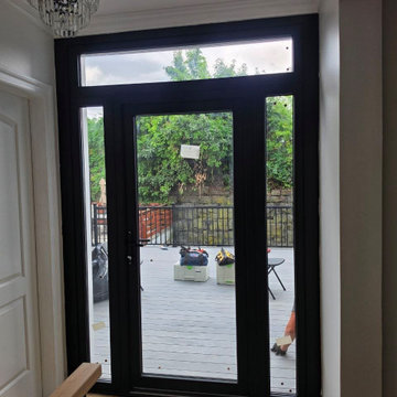
Introducing the Manux collection of modern metal-plastic doors in a stunning white silk color. These doors are expertly crafted from durable metal-plastic material and feature European roller hinges and an aluminum threshold, ensuring both longevity and security for your home.
Model - 8666 Manux
Color - Black
Glass - Safety Tempered Clear glass.
Door thickness - 2 3/4"
Frame thickness - 2 3/4"
Exterior design - Coating of the door - Matte Black finish, Full clear glass.
Interior design - Coating of the door - Matte Black finish, Full clear glass.
Hardware included:
- Aluminum frame 2 3/4" thick - dimensions of the door 72" x 80" with the frame is 74" x 82".
- Aluminum threshold.
- Plate-type, primary lock for armoured type of metal-plastic (uPVC) doors, doors are captured in 3 places. The lock has replaceable core and 5 keys.
- Cylinder.
- 3D Hinges.
- Turnknob for cylinder.
- Handles
Each door comes prehung in a sturdy frame for easy installation. Sidelites (if included) can be installed on either the right or left side of the door - the design is universal. Please note: sidelites ship separately and require simple assembly on site.
A canopy over the door is recommended to maintain the warranty.
 Flooret
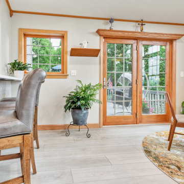
Influenced by classic Nordic design. Surprisingly flexible with furnishings. Amplify by continuing the clean modern aesthetic, or punctuate with statement pieces. With the Modin Collection, we have raised the bar on luxury vinyl plank. The result is a new standard in resilient flooring. Modin offers true embossed in register texture, a low sheen level, a rigid SPC core, an industry-leading wear layer, and so much more.
 Sixth Sense Studio
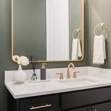
This bathroom vanity embodies a modern and minimalist aesthetic. The clean lines and smooth surface, crafted from light-colored wood with a warm finish, create a sense of understated elegance. A large mirror sits above the vanity, amplifying the feeling of spaciousness. The single sink boasts a modern chrome faucet, and the countertop, made from a light-colored material like white marble or quartz, appears refreshingly uncluttered. This design prioritizes a sleek look and streamlined functionality, perfect for a bathroom seeking a touch of sophisticated simplicity.
 Dennis Hill Architect
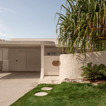
Nestled in the dunes of northern Peregian Beach, with sweeping views of the Pacific Ocean, Kestrel is an extensive and carefully curated reimagining of a dated 1990s Mediterranean-style home.
The original floor plan was highly compartmentalized, prioritizing ocean views at the expense of functional layout and connection to the site. With young children in tow, the new owners envisioned a more open design - one that establishes a clear visual link between the sea views at the rear and a playful front yard. This re-prioritisation of the front yard not only strengthens the home’s relationship to the landscape but also allows for a seamless transition between indoor and outdoor living, a quality the original home lacked.
From the street, the house presents as a sleek, single-storey form - its introverted façade concealing the expansive ocean views revealed only upon entering through the front gate. Upon entry the home openly reveals its communal spaces whilst concealing secondary programming behind a series of hidden doors. The lower level hosts a collection of bedrooms and living spaces that flow effortlessly to the pool area and native vegetation beyond.
Through a series of deliberate architectural interventions and a renewed connection to its surrounding landscape, Kestrel amplifies the experience of coastal living in this sublime location.
 RAJ Kitchen and Bath, LLC
**Check out the video of this transformation on our website**
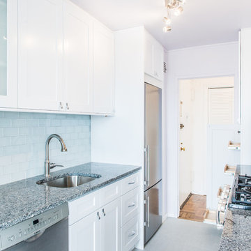
This small kitchen was way too small for this 2 bedrooms, 2 bathrooms apartment. Not only was it a very small kitchen, but the physical location of it made it very difficult to make it any bigger. There wasn't much that could have been done without incurring astronomical cost, which would get little or no return on the investment. The client wanted a kitchen that can be optimized in its current location to add a ton of value for resale.
This was difficult to do, because there was no moving of any mechanical around in the kitchen and even if we wanted to, the management of the building would not allow. For those of you who live in condos, co-ops or apartment building, you know how difficult it is to rework these foot prints. When we showed up, we saw the problems, but we also saw a huge opportunity where we can achieve those goals in the small space. This was accomplished by making some key changes and to incorporate some new things that was not possible when this kitchen was built years ago.
The crucial part of the design that would drive the entire new layout, was selecting the only appliance; that was the Refrigerator. Once we nailed down that refrigerator, we then proceeded to design the kitchen around it. We moved it to the other side of the wall where the sink was so that we can tap into the water line from the sink plumbing. It was crucial that it stays exactly 24" deep, not an inch more because we had to keep the entry as open as possible. Also, it was going to be directly in front of another big storage unit - The pantry. It is not ideal in most cases, but we needed the rest of the space to ramp up the design and open feel towards the side where all of the activities would take place, which happend to be the dining room and the view.
Once all that was figured out, we re-positioned the sink, dishwasher and the range and proceeded to wrap the cabinets around the columns to integrate them into the space. Thirty- six inches cabinets height was used so that they can be installed higher towards the ceiling height to give more room rather than the standard 18" required height between the counter tops. This was done to make the room feel a lot bigger than it really was. Not to mention, we also didn't want the faucet to be buried under the cabinets so that was also a necessary design detail for the space.
We then lowered both knee walls so that the counter top can sit on top of them, by removing that stop point that would have otherwise defined the kitchen area. This allowed us to pick up that extra footprint into the room for added prep space and enabled us to create the illusion of a kitchen that is looking longer than it really is. Every inch mattered when designing this kitchen and we made a conscious decision to use every one of that inch.
White cabinets were selected to do just what white cabinets are design to do; make a small or dark room appear bigger, brighter and more open. In this kitchen, this was amplified the more because of the kitchen location. It was perfect! We knew we did justice to the space because while we were there taking some photos, a few potential buyers walked in and went straight for the kitchen! They said its design just to fit the apartment.
Pantry roll out shelving, Double recycle bin, fancy handles, LED lighting, Quartz counter top, beautiful backslash tiles and grey linen floors finished off the kitchen which looked over a beautiful view of the George Washington Bridge from the top of this lovely 4th floor apartment.
Credit to Masterpiece Tile and Marble (Annmarie on the selection of Tiles and countertop and Val on the Construction to complete this project).
Davor Kokic Photography
 Amp AV
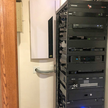
Everything is good to go! System install is complete and fully functional!
Home theater - southwestern home theater idea in Phoenix
Home theater - southwestern home theater idea in Phoenix
 Nicole Arnold Interiors
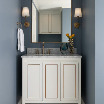
This high-rise condominium at The Mayfair longed for the renewal conceptualized in its 3 bathrooms. Each was a complete renovation, adding relevant aesthetic updates and much-needed functionality and storage. We capitalized on the immense amount of natural light in the primary bath and we amplified it throughout the space by opening up walls to the shower, lining the vanity with full-sized, built-in vanity mirrors, and distributing electrified lighting throughout. Custom cabinetry was designed to capture every inch of usable perimeter space and incorporate the elevated tub platform. The guest bath emulates a classic, luxury hotel feel infused with color, a great tile pattern on the focal shower wall, a furniture-style vanity, and a fun floor design. The powder bath is dark and moody with textural wallpaper and an espresso-colored porcelain floor tile emulating marble. All of the appointments throughout exude the luxury look and feel the client desired, are maintenance friendly and will stand the test of time.
 Keystone Vintage Lumber
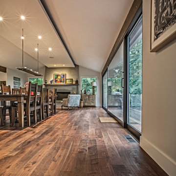
The warmth and beauty of Hillary's New Jersey home was unmistakably amplified by the installation of the black walnut flooring that she purchased from Keystone Vintage Lumber. This salvaged material was cut into random plank widths of up to 8" for delivery in the fall of 2011.
31