
Search results for "Clarify" in Home Design Ideas
 User
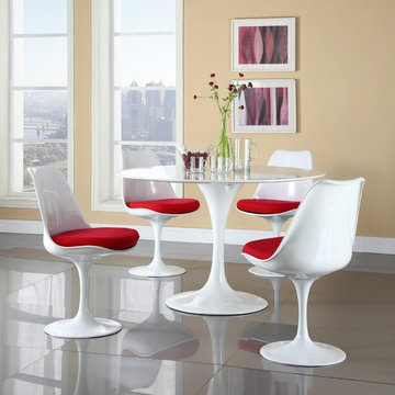
UserThe celebrated design of the Tulip Chair is inspired by the petals of the flower, marking its individual visual characteristic. Created in 1956, the Finnish architect and industrial designer Saarinen made the Tulip Chair following his principles for simple and rational design. His ambition was to reduce clutter and simplify the shape of the chair to a functional, but still aesthetically pleasing form. The clarified structure of the Tulip Chair is designed to provide perfect comfort and stability along with a touch of elegance. Recognized for its great design features, the chair has won a number of awards from art institutions like the Museum of Modern Art, the Design Center Stuttgart and the Federal Award for Industrial design. The Tulip Chair is not by Knoll®. Poly & Bark is in no way affiliated with Knoll®.
Poly & Bark reproduces the classic design with great precision detail. The stable structure consists of a light coated metal alloy foot and hand-molded ABS bowl seat. The cushion comes in quality cloth material.
 JRP Design & Remodel
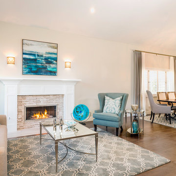
This transitional-meets-glam revival home blends hints of traditional inspiration with chic and glamorous details to create a timeless and class design. The clean, deliberate lines of the architectures meet ornate and organic shapes in the design elements to achieve a pristine yet comfortable environment. Mixing rich and contemporary materials-such as Carrera Marble with Caesarstone-along with glitzy lighting, furnishings and accessories result in a vision of vintage glamour and classic living.
Photographer: Clarified Studios
 JRP Design & Remodel
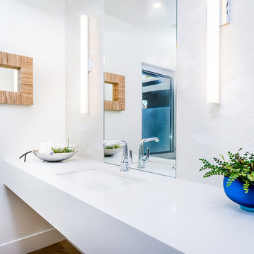
This mid-century masterpiece showcases simple, fuss-free design with modern elements and hints of retro-glam. The clean, simple lines and minimalist inspiration are a nod to the timelessness of the era and each room is bright with windows that all open to marry the outdoors and indoors. Natural light together with unique design elements achieve a relationship between privacy and transparency from the moment you walk into this home without sacrificing functionality. Organic and quirky details are the perfect finishing touches reflecting a sense of nostalgia and modern individuality that this home deserves.
Photo Credit: Clarified Studios
Find the right local pro for your project
 Clarke - New England’s Sub-Zero & Wolf Showroom
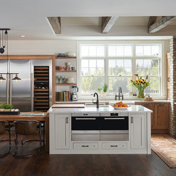
Starting a kitchen design project for many people begins with dreaming about cabinets. While it’s helpful (and fun!) to clarify your personal style with online research, browsing through magazines and talking to friends, great kitchen layouts actually start by researching appliances. In fact, many kitchen designers will want your appliance list before they put pen to paper on design concepts. When you think about it, it makes sense. Your layout may be very different if you select a Wolf 48” Dual-Fuel Range than it would be if you envision a contemporary induction cooktop and built-in wall ovens. Would you like to incorporate Sub-Zero refrigerator drawers for point-of-use convenience or perhaps integrate wine storage into your kitchen design plans?
 JRP Design & Remodel
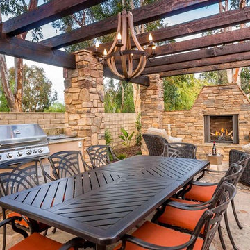
The outdoor dining is accompanied by an exterior kitchen, featuring a Jenn Air- Stainless Steel 4-Burner, Built-In Gas Grill, and a variety of Vintage BBQ items, such as a 24” Outdoor Refrigerator, Ice Chest, and Trash Center. The exterior kitchen is covered with a beautiful slab of Typhoon Bordeaux Granite, which is extended vertically into a backsplash, and lit from a recycled 6-Light Wine Barrel Chandelier from Gracefully Restored. The surrounding elements of the Country Cypress Ridge stacked stone and the Sweetwater flagstone connect all elements of the backyard, yet still allowing each space to be utilized independently. The fireplace is a good example of this. After dinner, one can cozy up with a glass of wine next to the 42” Carolina Gas Fireplace and stargaze.
Tom Clary -Clarified Studios
 JRP Design & Remodel
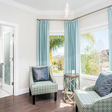
This transitional-meets-glam revival home blends hints of traditional inspiration with chic and glamorous details to create a timeless and class design. The clean, deliberate lines of the architectures meet ornate and organic shapes in the design elements to achieve a pristine yet comfortable environment. Mixing rich and contemporary materials-such as Carrera Marble with Caesarstone-along with glitzy lighting, furnishings and accessories result in a vision of vintage glamour and classic living.
Photographer: Clarified Studios
 JRP Design & Remodel
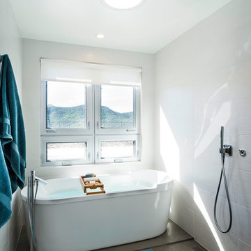
This mid-century masterpiece showcases simple, fuss-free design with modern elements and hints of retro-glam. The clean, simple lines and minimalist inspiration are a nod to the timelessness of the era and each room is bright with windows that all open to marry the outdoors and indoors. Natural light together with unique design elements achieve a relationship between privacy and transparency from the moment you walk into this home without sacrificing functionality. Organic and quirky details are the perfect finishing touches reflecting a sense of nostalgia and modern individuality that this home deserves.
Photo Credit: Clarified Studios
 Sheila Rich Interiors, LLC
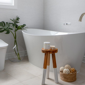
Transform your relaxation space into a sanctuary of elegance and wellness. White is pure and clarifying to the senses as well as the mind. This freestanding air-jet tub has thin and modern lines. The compact, streamlined one-piece intelligent toilet has integrated personal cleaning.
 Donald Lococo Architects
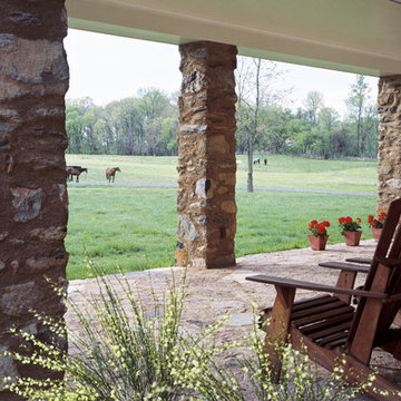
©️Maxwell MacKenzie THE HOME, ESSENTIALLY A RUIN WAS PRESERVED THROUGH NEGLECT. A CLARIFIED HISTORIC RENOVATION REMOVES BAY WINDOWS AND 1950’S WINDOWS FROM THE MAIN FAÇADE. TWO WINGS AND A THIRD FLOOR AND A SYMPATHETIC STAIRWAY ACCOMMODATE MODERN LIFE. MASONS WERE TASKED TO MAKE THE STONE WORK LOOK AS THOUGH “A FARMER BUILT THE WALLS DURING THE NON-PLANTING SEASON,” THE FINAL DESIGN SIMPLIFIES THE FIRST FLOOR PLAN AND LEAVES LOGICAL LOCATIONS FOR EXPANSION INTO COMING DECADES. AMONG OTHER AWARDS, THIS TRADITIONAL YET HISTORIC RENOVATION LOCATED IN MIDDLEBURG, VA HAS RECEIVED 2 AWARDS FROM THE AMERICAN INSTITUTE OF ARCHITECTURE.. AND A NATIONAL PRIVATE AWARD FROM VETTE WINDOWS
WASHINGTON DC ARCHITECT DONALD LOCOCO UPDATED THIS HISTORIC STONE HOUSE IN MIDDLEBURG, VA.lauded by the American Institute of Architects with an Award of Excellence for Historic Architecture, as well as an Award of Merit for Residential Architecture
 Architectural Designs
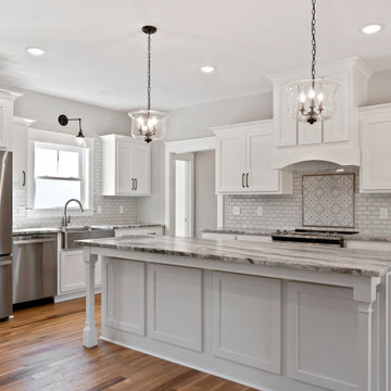
#houseplan Exclusive 56447SM comes to life in Virginia Specs-at-a-glance 3 beds 3 baths 1,800+ sq. ft. #56447SM #readywhenyouare #houseplan #modernfarmhouse #homesweethome
 Donald Lococo Architects
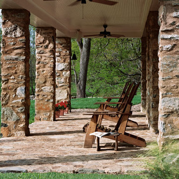
©️Maxwell MacKenzie THE HOME, ESSENTIALLY A RUIN WAS PRESERVED THROUGH NEGLECT. A CLARIFIED HISTORIC RENOVATION REMOVES BAY WINDOWS AND 1950’S WINDOWS FROM THE MAIN FAÇADE. TWO WINGS AND A THIRD FLOOR AND A SYMPATHETIC STAIRWAY ACCOMMODATE MODERN LIFE. MASONS WERE TASKED TO MAKE THE STONE WORK LOOK AS THOUGH “A FARMER BUILT THE WALLS DURING THE NON-PLANTING SEASON,” THE FINAL DESIGN SIMPLIFIES THE FIRST FLOOR PLAN AND LEAVES LOGICAL LOCATIONS FOR EXPANSION INTO COMING DECADES. AMONG OTHER AWARDS, THIS TRADITIONAL YET HISTORIC RENOVATION LOCATED IN MIDDLEBURG, VA HAS RECEIVED 2 AWARDS FROM THE AMERICAN INSTITUTE OF ARCHITECTURE.. AND A NATIONAL PRIVATE AWARD FROM VETTE WINDOWS
WASHINGTON DC ARCHITECT DONALD LOCOCO UPDATED THIS HISTORIC STONE HOUSE IN MIDDLEBURG, VA.lauded by the American Institute of Architects with an Award of Excellence for Historic Architecture, as well as an Award of Merit for Residential Architecture
 Kirshman Kitchen Design Studio
Kristian Walker
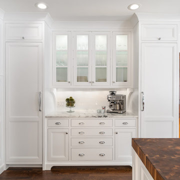
Example of a mid-sized classic l-shaped medium tone wood floor and brown floor enclosed kitchen design in Grand Rapids with a farmhouse sink, recessed-panel cabinets, white cabinets, quartzite countertops, white backsplash, subway tile backsplash, stainless steel appliances, an island and white countertops
Example of a mid-sized classic l-shaped medium tone wood floor and brown floor enclosed kitchen design in Grand Rapids with a farmhouse sink, recessed-panel cabinets, white cabinets, quartzite countertops, white backsplash, subway tile backsplash, stainless steel appliances, an island and white countertops
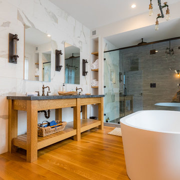
Inspiration for a cottage master gray tile and marble tile medium tone wood floor and brown floor freestanding bathtub remodel in Burlington with open cabinets, a hinged shower door, black countertops, light wood cabinets, an undermount sink and soapstone countertops
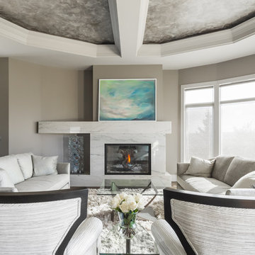
 LD&A
LD&AInspiration for a huge transitional formal and open concept medium tone wood floor and brown floor living room remodel in Calgary with gray walls, a standard fireplace, a stone fireplace and no tv
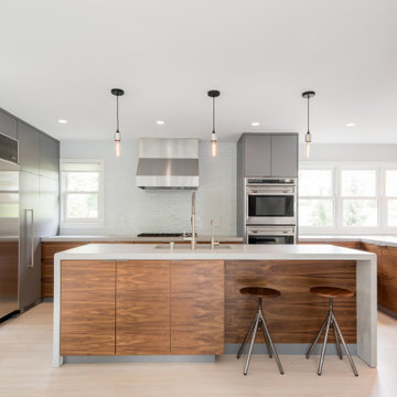
 CITYDESKSTUDIO, Inc.
Built in 1949, this Edina home had a strong horizontal presence on the site, but through subsequent renovations the overall massing was lacking clarity and refinement and the entry was diminutive and uninviting. The roof and siding materials were aging, and important interior spaces were cramped and closed in. The house needed better light, better connection internally and out, and exterior updates to clarify and enhance the strengths of the home.
The primary design evolved out of a celebration of the existing horizontality of the home and a recognition that a bigger home was not needed. By layering materiality and color, a new identity was created. A new cedar entry canopy slips out from under the previous roof line, extending further towards the street. This added warmth at the entry is echoed along the facade, creating a graceful rhythm and texture. The previous additions were re-clad with a darker material palette in order to anchor and unify the ends of the home. As the grade slopes down towards the back yard, horizontal bands are exposed, revealing the layering top to bottom. Combined, these few shifts in color and materiality allowed for a complete transformation of the home.
The interior is reflective of the material and color palette used outside. The main living spaces are opened up and connected while strengthening the original symmetry of the more formal linear alignment of rooms. A whole new kitchen relocates the center of the home and makes more fluid the daily life of this young family. The house is fully transformed inside and out, all without adding more square feet.
Project Team:
Ben Awes, AIA, Principal-in-Charge
Nate Dodge
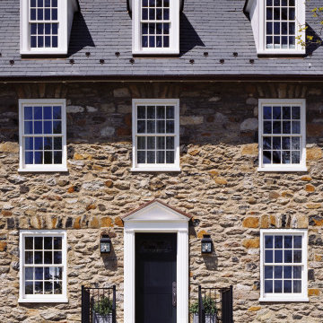 Donald Lococo Architects
©️Maxwell MacKenzie THE HOME, ESSENTIALLY A RUIN WAS PRESERVED THROUGH NEGLECT. A CLARIFIED HISTORIC RENOVATION REMOVES BAY WINDOWS AND 1950’S WINDOWS FROM THE MAIN FAÇADE. TWO WINGS AND A THIRD FLOOR AND A SYMPATHETIC STAIRWAY ACCOMMODATE MODERN LIFE. MASONS WERE TASKED TO MAKE THE STONE WORK LOOK AS THOUGH “A FARMER BUILT THE WALLS DURING THE NON-PLANTING SEASON,” THE FINAL DESIGN SIMPLIFIES THE FIRST FLOOR PLAN AND LEAVES LOGICAL LOCATIONS FOR EXPANSION INTO COMING DECADES. AMONG OTHER AWARDS, THIS TRADITIONAL YET HISTORIC RENOVATION LOCATED IN MIDDLEBURG, VA HAS RECEIVED 2 AWARDS FROM THE AMERICAN INSTITUTE OF ARCHITECTURE.. AND A NATIONAL PRIVATE AWARD FROM VETTE WINDOWS
WASHINGTON DC ARCHITECT DONALD LOCOCO UPDATED THIS HISTORIC STONE HOUSE IN MIDDLEBURG, VA.lauded by the American Institute of Architects with an Award of Excellence for Historic Architecture, as well as an Award of Merit for Residential Architecture
 Donald Lococo Architects
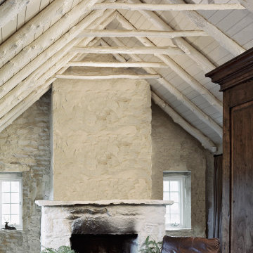
©️Maxwell MacKenzie THE HOME, ESSENTIALLY A RUIN WAS PRESERVED THROUGH NEGLECT. A CLARIFIED HISTORIC RENOVATION REMOVES BAY WINDOWS AND 1950’S WINDOWS FROM THE MAIN FAÇADE. TWO WINGS AND A THIRD FLOOR AND A SYMPATHETIC STAIRWAY ACCOMMODATE MODERN LIFE. MASONS WERE TASKED TO MAKE THE STONE WORK LOOK AS THOUGH “A FARMER BUILT THE WALLS DURING THE NON-PLANTING SEASON,” THE FINAL DESIGN SIMPLIFIES THE FIRST FLOOR PLAN AND LEAVES LOGICAL LOCATIONS FOR EXPANSION INTO COMING DECADES. AMONG OTHER AWARDS, THIS TRADITIONAL YET HISTORIC RENOVATION LOCATED IN MIDDLEBURG, VA HAS RECEIVED 2 AWARDS FROM THE AMERICAN INSTITUTE OF ARCHITECTURE.. AND A NATIONAL PRIVATE AWARD FROM VETTE WINDOWS
WASHINGTON DC ARCHITECT DONALD LOCOCO UPDATED THIS HISTORIC STONE HOUSE IN MIDDLEBURG, VA.lauded by the American Institute of Architects with an Award of Excellence for Historic Architecture, as well as an Award of Merit for Residential Architecture
 CITYDESKSTUDIO, Inc.
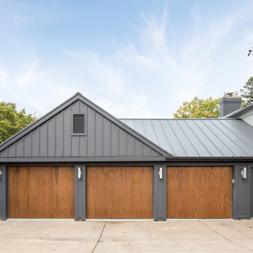
Built in 1949, this Edina home had a strong horizontal presence on the site, but through subsequent renovations the overall massing was lacking clarity and refinement and the entry was diminutive and uninviting. The roof and siding materials were aging, and important interior spaces were cramped and closed in. The house needed better light, better connection internally and out, and exterior updates to clarify and enhance the strengths of the home.
The primary design evolved out of a celebration of the existing horizontality of the home and a recognition that a bigger home was not needed. By layering materiality and color, a new identity was created. A new cedar entry canopy slips out from under the previous roof line, extending further towards the street. This added warmth at the entry is echoed along the facade, creating a graceful rhythm and texture. The previous additions were re-clad with a darker material palette in order to anchor and unify the ends of the home. As the grade slopes down towards the back yard, horizontal bands are exposed, revealing the layering top to bottom. Combined, these few shifts in color and materiality allowed for a complete transformation of the home.
The interior is reflective of the material and color palette used outside. The main living spaces are opened up and connected while strengthening the original symmetry of the more formal linear alignment of rooms. A whole new kitchen relocates the center of the home and makes more fluid the daily life of this young family. The house is fully transformed inside and out, all without adding more square feet.
Project Team:
Ben Awes, AIA, Principal-in-Charge
Nate Dodge
 CITYDESKSTUDIO, Inc.
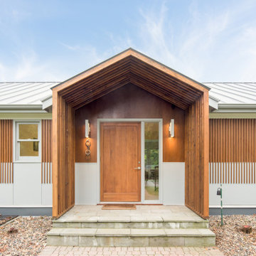
Built in 1949, this Edina home had a strong horizontal presence on the site, but through subsequent renovations the overall massing was lacking clarity and refinement and the entry was diminutive and uninviting. The roof and siding materials were aging, and important interior spaces were cramped and closed in. The house needed better light, better connection internally and out, and exterior updates to clarify and enhance the strengths of the home.
The primary design evolved out of a celebration of the existing horizontality of the home and a recognition that a bigger home was not needed. By layering materiality and color, a new identity was created. A new cedar entry canopy slips out from under the previous roof line, extending further towards the street. This added warmth at the entry is echoed along the facade, creating a graceful rhythm and texture. The previous additions were re-clad with a darker material palette in order to anchor and unify the ends of the home. As the grade slopes down towards the back yard, horizontal bands are exposed, revealing the layering top to bottom. Combined, these few shifts in color and materiality allowed for a complete transformation of the home.
The interior is reflective of the material and color palette used outside. The main living spaces are opened up and connected while strengthening the original symmetry of the more formal linear alignment of rooms. A whole new kitchen relocates the center of the home and makes more fluid the daily life of this young family. The house is fully transformed inside and out, all without adding more square feet.
Project Team:
Ben Awes, AIA, Principal-in-Charge
Nate Dodge
 CITYDESKSTUDIO, Inc.
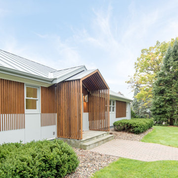
Built in 1949, this Edina home had a strong horizontal presence on the site, but through subsequent renovations the overall massing was lacking clarity and refinement and the entry was diminutive and uninviting. The roof and siding materials were aging, and important interior spaces were cramped and closed in. The house needed better light, better connection internally and out, and exterior updates to clarify and enhance the strengths of the home.
The primary design evolved out of a celebration of the existing horizontality of the home and a recognition that a bigger home was not needed. By layering materiality and color, a new identity was created. A new cedar entry canopy slips out from under the previous roof line, extending further towards the street. This added warmth at the entry is echoed along the facade, creating a graceful rhythm and texture. The previous additions were re-clad with a darker material palette in order to anchor and unify the ends of the home. As the grade slopes down towards the back yard, horizontal bands are exposed, revealing the layering top to bottom. Combined, these few shifts in color and materiality allowed for a complete transformation of the home.
The interior is reflective of the material and color palette used outside. The main living spaces are opened up and connected while strengthening the original symmetry of the more formal linear alignment of rooms. A whole new kitchen relocates the center of the home and makes more fluid the daily life of this young family. The house is fully transformed inside and out, all without adding more square feet.
Project Team:
Ben Awes, AIA, Principal-in-Charge
Nate Dodge
15