
Search results for "Clashing" in Home Design Ideas
 Stonecrafters USA INC
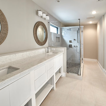
Here is a home we installed LG's Minuet Quartz in 3cm. Credit to the home goes to Care for Your Castle and Gerie Gilbert
Example of a trendy bathroom design in Atlanta
Example of a trendy bathroom design in Atlanta
 TKS Design Group
Download our free ebook, Creating the Ideal Kitchen. DOWNLOAD NOW
This family from Wheaton was ready to remodel their kitchen, dining room and powder room. The project didn’t call for any structural or space planning changes but the makeover still had a massive impact on their home. The homeowners wanted to change their dated 1990’s brown speckled granite and light maple kitchen. They liked the welcoming feeling they got from the wood and warm tones in their current kitchen, but this style clashed with their vision of a deVOL type kitchen, a London-based furniture company. Their inspiration came from the country homes of the UK that mix the warmth of traditional detail with clean lines and modern updates.
To create their vision, we started with all new framed cabinets with a modified overlay painted in beautiful, understated colors. Our clients were adamant about “no white cabinets.” Instead we used an oyster color for the perimeter and a custom color match to a specific shade of green chosen by the homeowner. The use of a simple color pallet reduces the visual noise and allows the space to feel open and welcoming. We also painted the trim above the cabinets the same color to make the cabinets look taller. The room trim was painted a bright clean white to match the ceiling.
In true English fashion our clients are not coffee drinkers, but they LOVE tea. We created a tea station for them where they can prepare and serve tea. We added plenty of glass to showcase their tea mugs and adapted the cabinetry below to accommodate storage for their tea items. Function is also key for the English kitchen and the homeowners. They requested a deep farmhouse sink and a cabinet devoted to their heavy mixer because they bake a lot. We then got rid of the stovetop on the island and wall oven and replaced both of them with a range located against the far wall. This gives them plenty of space on the island to roll out dough and prepare any number of baked goods. We then removed the bifold pantry doors and created custom built-ins with plenty of usable storage for all their cooking and baking needs.
The client wanted a big change to the dining room but still wanted to use their own furniture and rug. We installed a toile-like wallpaper on the top half of the room and supported it with white wainscot paneling. We also changed out the light fixture, showing us once again that small changes can have a big impact.
As the final touch, we also re-did the powder room to be in line with the rest of the first floor. We had the new vanity painted in the same oyster color as the kitchen cabinets and then covered the walls in a whimsical patterned wallpaper. Although the homeowners like subtle neutral colors they were willing to go a bit bold in the powder room for something unexpected. For more design inspiration go to: www.kitchenstudio-ge.com

Find the right local pro for your project

 Impluvium Architecture
Impluvium Architecture
Alamo, CA, USA
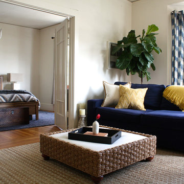
The realtor who sold the property to the Dinstells mentioned that an Architect just bought the property next door (we were neighbors for our first house - found under Houzz Projects = Haley 3)
I was the Architect and helped coordinate with various sub-contractors. I also co-designed the project with various consultants including Interior and Landscape Design (+our house concurrently being built next door)
This project I had to put professional ethics above my personal needs for my new house concurrently built next door. I originally wanted a Modern House and the Dinstell's wanted a French Country but I knew that they would clash next to each other so I redesigned our house to be a Contemporary Craftsman style.
 Tactile Interior Architecture
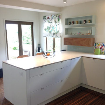
New kitchen with bespoke cabinetry from New Image Kitchens, Whitford. Lacquer door and drawer finish with Blum soft close hinges.
Caesarstone "Frosty Carinna" bench, 20mm. Negative edge detail was routed by 10x25mm and clashed with Meranti negative detail.
Integrated dishwasher.
Fabric from Marimeko, Newmarket, Auckland
Over bench lighting Brightgreen D900 SHX Curve, supplied by ECC, Newmarket, Auckland
 Cherry Creek, Inc.
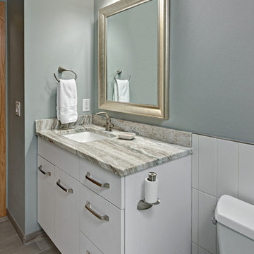
Example of a small trendy 3/4 green tile and glass tile porcelain tile and gray floor walk-in shower design in Minneapolis with flat-panel cabinets, white cabinets, a two-piece toilet, green walls, an undermount sink, quartzite countertops and a hinged shower door
 Archadeck of Northeast Dallas
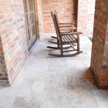
These Heath, TX homeowners were looking to breathe life back into what had become slightly outdated tile on their front porch entryway. The existing tile was very dark and had a very inorganic feel to it. The grid layout did not play well against the very organic feel of the multi-colored brick façade, and we worked to find a way to complement the saturated colors of the brick and the dark door and windows, without clashing or overpowering either. With that in mind, a combination of walnut and noche Travertine was the chosen medium. The mix of light and medium earth tones is a great way to create a whisper of pattern and movement without becoming too busy. We think you’ll agree that this home now has a warm and inviting front porch entryway.


 Stairworks
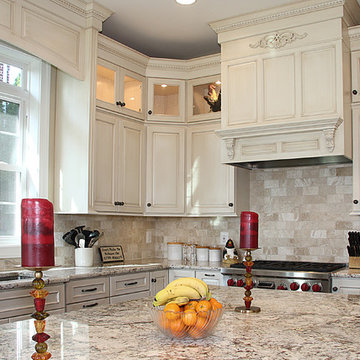
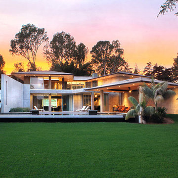
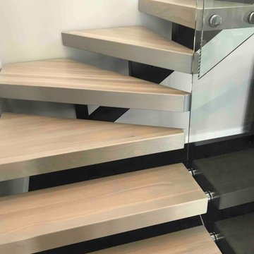
We were asked by a house builder to build a steel staircase as the centrepiece for their new show home in Auckland. Although they had already decided on the central mono-stringer style staircase (also known as a floating staircase), with solid oak treads and glass balustrades, when we met with them we also made some suggestions. This was in order to help nest the stairs in their desired location, which included having to change the layout to avoid clashing with the existing structure.
The stairs lead from a reception area up to a bedroom, so one of our first suggestions, was to have the glass balustrade on the side of the staircase finishing, and finish at the underside of the ground-floor ceiling, and then building an independent balustrade in the bedroom. The intention behind this was to give some separation between the living and sleeping areas, whilst maximising the full width of the opening for the stairs. Additionally, this also helps hide the staircase from inside the bedroom, as you don’t see the balustrade coming up from the floor below.
We also recommended the glass on the first floor was face fixed directly to the boundary beam, and the fixings covered with a painted fascia panel. This was in order to avoid using a large floor fixed glazing channel or reduce the opening width with stand-off pin fixings.
 FabricSeen
Designer: John Sacchi, Fine and Decorative Art Advisor, Beverly Hills and Palm Springs
Upholstery Work by: Bernice of Palm Desert
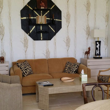
Seats and pillows created with Kuba in Carbon (sold out).
The tribal print upholstery fabric used for the accent pillows and side chairs sets a warm, natural tone. Because the fabric is used throughout the room, it gives movement to the desert savannah interior design. The fabric has beige undertones that accentuate the rich tan and taupe hues of the other upholstery and furniture, while the black geometric pattern pulls the eye to the black lamps, mirror, and dining chairs in the foreground. When paired with the light-colored wallpaper, the exotic print adds just the right amount of pattern clash.

 Kirby Mast of Hartville Hardware
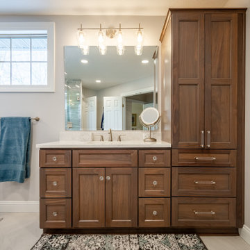
Dramatically updated and reconfigured master bathroom.
The new design includes his and hers separate sinks for added convenience, a linen cabinet for extra storage, and a luxurious shower featuring a herringbone mosaic tile floor, 3x12 tile walls with a built-in bench and niche, and heated tile flooring for added comfort.
 Kitchens Made Simple
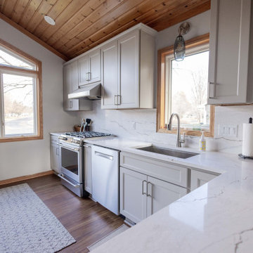
Connect already elements with adding new and not clashing the two together.
Example of a kitchen design in Minneapolis
Example of a kitchen design in Minneapolis
 Arhist
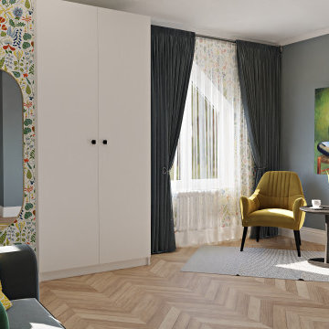
Key Needs: The clients want to combine modern and traditional design elements to create a cohesive and visually striking living space.
Key Problems: The challenge was to find a balance between the two styles and to ensure that they complemented each other without clashing.
Workflow: The design team carefully selected furnishings, fabrics, and decor accents that bridged the gap between modern and traditional styles. They also focused on creating a harmonious color scheme that tied the different design elements together.
Result: The final design seamlessly integrated modern and traditional pieces to create a unique and personalized living space that reflected the clients' tastes and preferences.
Experience the revolution in interior design creation with Arhist.com Check it out now and get a 14-day free trial to see for yourself!

 Blown Glass Collective, Inc
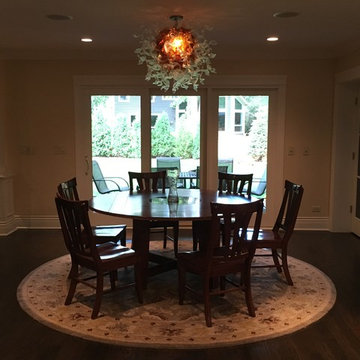
This hand blown glass chandelier was inspired by the Medusa character from the 1982 classic, "Clash of the Titans". In shades of Amber, fading to clear, the individual glass pieces are mixed with either small tips or bulbous, snake head shaped tips. A great addition to a Traditional, Contemporary, or Mediterranean design.
 Connecticut Kitchen & Bath Studio
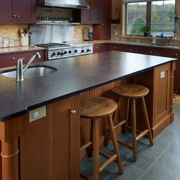
Inspiration for a mid-sized cottage u-shaped ceramic tile eat-in kitchen remodel in Bridgeport with an undermount sink, shaker cabinets, dark wood cabinets, granite countertops, beige backsplash, cement tile backsplash, stainless steel appliances and an island
 Alexandra Lauren Interior Design
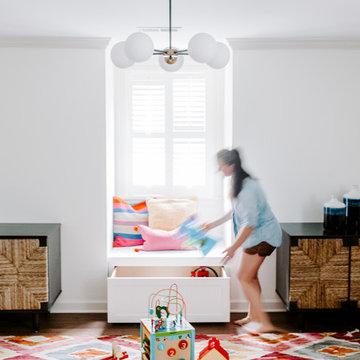
Playrooms are all about FUN! When we started this room was a family theatre room. With baby number three on the way, and two twins already on board, it was important for this family to have a space for the children to do what children do best…. PLAY!
Children prefer bright colors from an early age because their eyes are not fully developed yet. They perceive these colors better than fainter shades. Brighter colors and high contrasting colors stand out more in their field of vision; this is why we see so many primary brightly colored children’s toys. I wanted to set a stage where we didn’t feel like we constantly needed to clean up. We wanted to design a room that allowed you to live a realistic life over the design layer. I love how the children’s toys don’t clash with our playful rug. We customized large built ins underneath the windows seats to provide ample storage for large toys, and a space to sit and read.
We framed out an existing book case, and wired two adjustable one arm wall lamps above. The added shiplap to the back of the bookcase provided texture, dimension and interest to an ordinary bookcase. The Adjustable one arm wall lamps are available at www.AlexandraLauren.com and the Sputnick Ceiling fixture is from Wayfair.com. We framed the window with two natural woven sideboards in black for additional toy storage.
The Root Coffee table was one of my favorite features of this room. I loved bringing in a natural elements through woven doors on cabinets, a natural root coffee table, shiplap and floating natural wood shelving. I chose to do Benjamin Moore Simply White on the shiplap. It's a modern, bright, yet warm white, that absorbs and reflects beautifully on both wood and walls.
33