
Search results for "Coordinating viewing" in Home Design Ideas
 Arizona Tile
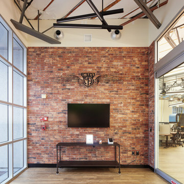
The Castle Brick Series offers five colors with beautiful variety. A coordinating corner piece provides increased flexibility for design applications. Because this material is a porcelain product, minimal maintenance is required. There can be noticeable variances between pieces, so it is important and recommended that a range of this product be viewed before finalizing a purchase.

 Gates & Croft Horticultural Design
The mural continues into the master bath with closet mirrors reflecting the corner to create a graphic, 3D view. (Evidently, the color-coordinated Cockapoo was more interested in being the primary decor.) Photos by Jane C. Gates

 Alderwood Landscape Architecture and Construction
The rustic, traditional color of the pavers and fire pit coordinate with the style of the home. Alderwood architects made sure to place the fire pit lounge area in such a way that offered privacy while still being within view of the house and sport court.
Find the right local pro for your project

 Dianne Davant and Associates
Kevin Meechan, Meechan Architectural Photography
Bedroom - traditional bedroom idea in Charlotte
Bedroom - traditional bedroom idea in Charlotte

 Michael James Design, Inc.
This view of the Powder Room vanity shows how well it was sized for the small space. The red & gold faux finish on the walls coordinates perfectly with the tones in the vanity as well as with the "Typhoon Bordeaux" granite top.

 Interiors on Fox Farm Road
Another guest suite is outfitted with lodge-style furniture, and upscale bedding coordinates and valances with a bear motif. Photo by Junction Image Co.

 R&R Outdoors
This gorgeous South Beach table was recently installed on a picture perfect rooftop space in Puerto Rico. We love the White legs and benches coordinated with the Shimmer River top and Dining table conversion. The Melon and Aruba Sunbrella playing surface and rails provide the perfect tropical contrast and coordinate beautifully with the Carousel Confetti Sunbrella bench cushions. How custom would you like us to make your next project?
Sponsored
Delaware, OH

Buckeye Basements, Inc.
Central Ohio's Basement Finishing ExpertsBest Of Houzz '13-'21
 TKS Design Group
Download our free ebook, Creating the Ideal Kitchen. DOWNLOAD NOW
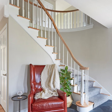
Lakefront property in the northwest suburbs of Chicago is hard to come by, so when we were hired by this young family with exactly that, we were immediately inspired by not just the unusually large footprint of this 1950’s colonial revival but also the lovely views of the manmade lake it was sited on. The large 5-bedroom home was solidly stuck in the 1980’s, but we saw tons of potential. We started out by updating the existing staircase with a fresh coat of paint and adding new herringbone slate to the entry hall.
The powder room off the entryway also got a refresh - new flooring, new cabinets and fixtures. We ran the new slate right through into this space for some consistency. A fun wallpaper and shiplap trim add a welcoming feel and set the tone for the home.
Next, we tackled the kitchen. Located away from the rest of the first floor, the kitchen felt a little isolated, so we immediately began planning for how to better connect it to the rest of the first floor. We landed on removing the wall between the kitchen and dining room and designed a modified galley style space with separate cooking and clean up zones. The cooking zone consists of the refrigerator, prep sink and cooktop, along with a nice long run of prep space at the island. The cleanup side of the kitchen consists of the main sink and dishwasher. Both areas are situated so that the user can view the lake during prep work and cleanup!
One of the home’s main puzzles was how to incorporate the mudroom and area in front of the patio doors at the back of the house. We already had a breakfast table area, so the space by the patio doors was a bit of a no man’s land. We decided to separate the kitchen proper from what became the new mudroom with a large set of barn doors. That way you can quickly hide any mudroom messes but have easy access to the light coming in through the patio doors as well as the outdoor grilling station. We also love the impact the barn doors add to the overall space.
The homeowners’ first words to us were “it’s time to ditch the brown,” so we did! We chose a lovely blue pallet that reflects the home’s location on the lake which is also vibrant yet easy on the eye. Countertops are white quartz, and the natural oak floor works well with the other honey accents. The breakfast table was given a refresh with new chairs, chandelier and window treatments that frame the gorgeous views of the lake out the back.
We coordinated the slate mudroom flooring with that used in the home’s main entrance for a consistent feel. The storage area consists of open and closed storage to allow for some clutter control as needed.
Next on our “to do” list was revamping the dated brown bar area in the neighboring dining room. We eliminated the clutter by adding some closed cabinets and did some easy updates to help the space feel more current. One snag we ran into here was the discovery of a beam above the existing open shelving that had to be modified with a smaller structural beam to allow for our new design to work. This was an unexpected surprise, but in the end we think it was well worth it!
We kept the colors here a bit more muted to blend with the homeowner’s existing furnishings. Open shelving and polished nickel hardware add some simple detail to the new entertainment zone which also looks out onto the lake!
Next we tackled the upstairs starting with the homeowner’s son’s bath. The bath originally had both a tub shower and a separate shower, so we decided to swap out the shower for a new laundry area. This freed up some space downstairs in what used to be the mudroom/laundry room and is much more convenient for daily laundry needs.
We continued the blue palette here with navy cabinetry and the navy tile in the shower. Porcelain floor tile and chrome fixtures keep maintenance to a minimum while matte black mirrors and lighting add some depth the design. A low maintenance runner adds some warmth underfoot and ties the whole space together.
We added a pocket door to the bathroom to minimize interference with the door swings. The left door of the laundry closet is on a 180 degree hinge to allow for easy full access to the machines. Next we tackled the master bath which is an en suite arrangement. The original was typical of the 1980’s with the vanity outside of the bathroom, situated near the master closet. And the brown theme continued here with multiple shades of brown.
Our first move was to segment off the bath and the closet from the master bedroom. We created a short hall from the bedroom to the bathroom with his and hers walk-in closets on the left and right as well as a separate toilet closet outside of the main bathroom for privacy and flexibility.
The original bathroom had a giant soaking tub with steps (dangerous!) as well as a small shower that did not work well for our homeowner who is 6’3”. With other bathtubs in the home, they decided to eliminate the tub and create an oversized shower which takes up the space where the old tub was located. The double vanity is on the opposite wall and a bench is located under the window for morning conversations and a place to set a couple of towels.
The pallet in here is light and airy with a mix of blond wood, creamy porcelain and marble tile, and brass accents. A simple roman shade adds some texture and it’s top-down mechanism allows for light and privacy.
This large whole house remodel gave our homeowners not only the ability to maximize the potential of their home but also created a lovely new frame from which to view their fabulous lake views.
Designed by: Susan Klimala, CKD, CBD
Photography by: Michael Kaskel
For more information on kitchen and bath design ideas go to: www.kitchenstudio-ge.com

 Flawless Painting Southeast Texas
Before view of Kitchen Cabinet Buffet in medium stained oak.
Example of a classic l-shaped eat-in kitchen design in Houston with a double-bowl sink, raised-panel cabinets, white cabinets, granite countertops, white backsplash, ceramic backsplash and stainless steel appliances
Example of a classic l-shaped eat-in kitchen design in Houston with a double-bowl sink, raised-panel cabinets, white cabinets, granite countertops, white backsplash, ceramic backsplash and stainless steel appliances

 Element Custom Builders
Example of a 1960s medium tone wood floor kitchen design in Denver with flat-panel cabinets, dark wood cabinets, marble countertops, white backsplash, marble backsplash, paneled appliances, an island and white countertops
 Angela Wells Interior Design
Trent Teigen
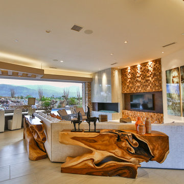
Example of a huge trendy open concept porcelain tile and beige floor home design design in Los Angeles with beige walls and a media wall
Example of a huge trendy open concept porcelain tile and beige floor home design design in Los Angeles with beige walls and a media wall

 Dana Schaefer Home
New double doors lead to the Master where an accent wall in vibrant green anchors the headboard and new chandelier coordinates with the bed linens. Window coverings are kept minimal and consistent with the rest of the condominium allowing the million dollar view of Mount Hood and Union Station to shine.
Photography by 22 pages

Sponsored
Westerville, OH

Custom Home Works
Franklin County's Award-Winning Design, Build and Remodeling Expert

 Shabnam Gupta
A home where tradition, art and innovation reside; and the design reflected just that.
Living room - living room idea in Mumbai
Living room - living room idea in Mumbai


 Kimball Starr Interior Design
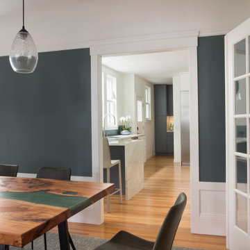
View from the dining room through the kitchen and into the laundry room, with coordinated gray-green wall paint, subway tiling, and cabinetry.
Mid-sized trendy multicolored floor kitchen/dining room combo photo in San Francisco with gray walls
Mid-sized trendy multicolored floor kitchen/dining room combo photo in San Francisco with gray walls

 Seasons Garden Design LLC
Here is a close-up view of a couple of the large columns in the water feature. Note the simplicity of planting, using a mass of black Mondo grass here-to carry out the Zen theme of the garden. Behind the grass are Japanese painted ferns which beautifully coordinate with the Mondo grass.
Photo: Vanessa Gardner Nagel, APLD
Sponsored
Delaware, OH
Buckeye Basements, Inc.
Central Ohio's Basement Finishing ExpertsBest Of Houzz '13-'21

 Interior Coordinates
Our client is a pilot and world traveler. She wanted her space to feel elegant and comfortable so she can really relax between work. We were inspired by British Colonial decor and layered some neutral textures and fabrics to make it feel more contemporary and comfortable. Here is a view of the dining room, which is opens into the family room.

 Kitchen Design Studio
View of the kitchen below the exposed loft space. The stainless steel trims the floor above and coordinates with the kitchen appliances. Designed by Vicki Lichtenstein.

 Mark Brand Architecture
Spectacular views, a tricky site and the desirability of maintaining views and light for adjacent neighbors inspired our design for this new house in Clarendon Heights. The facade features subtle shades of stucco, coordinating dark aluminum windows and a bay element which twists to capture views of the Golden Gate Bridge. Built into an upsloping site, retaining walls allowed us to create a bi-level rear yard with the lower part at the main living level and an elevated upper deck with sweeping views of San Francisco. The interiors feature an open plan, high ceilings, luxurious finishes and a dramatic curving stair with metal railings which swoop up to a second-floor sky bridge. Well-placed windows, including clerestories flood all of the interior spaces with light.
49