
Search results for "Decide sheet s" in Home Design Ideas


 Sebastian Construction Group
Bedroom - farmhouse carpeted and beige floor bedroom idea in Dallas with green walls and no fireplace
 Kimberlee Marie Interiors
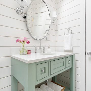
It’s always a blessing when your clients become friends - and that’s exactly what blossomed out of this two-phase remodel (along with three transformed spaces!). These clients were such a joy to work with and made what, at times, was a challenging job feel seamless. This project consisted of two phases, the first being a reconfiguration and update of their master bathroom, guest bathroom, and hallway closets, and the second a kitchen remodel.
In keeping with the style of the home, we decided to run with what we called “traditional with farmhouse charm” – warm wood tones, cement tile, traditional patterns, and you can’t forget the pops of color! The master bathroom airs on the masculine side with a mostly black, white, and wood color palette, while the powder room is very feminine with pastel colors.
When the bathroom projects were wrapped, it didn’t take long before we moved on to the kitchen. The kitchen already had a nice flow, so we didn’t need to move any plumbing or appliances. Instead, we just gave it the facelift it deserved! We wanted to continue the farmhouse charm and landed on a gorgeous terracotta and ceramic hand-painted tile for the backsplash, concrete look-alike quartz countertops, and two-toned cabinets while keeping the existing hardwood floors. We also removed some upper cabinets that blocked the view from the kitchen into the dining and living room area, resulting in a coveted open concept floor plan.
Our clients have always loved to entertain, but now with the remodel complete, they are hosting more than ever, enjoying every second they have in their home.
Find the right local pro for your project


 Gregory Thomas Residential Architecture
Front Yard
The original 1950s split level was expanded and completely reworked. A front porch was added, siding and stone are new, as are all the windows. The substantial addition at the rear of the home is barely visible here--the only hint being that the main ridge is a little higher from this point of view. Landscaping is new. The front yard tree was protected and preserved through the construction period.
At twilight the house comes aglow with warmth. The remodel welcomes a covered front porch that was absent in the original. To the right of the front door is a tiny window allowing peek-a-boo views of guest arrivals from inside the daughter's closet. Planters surrounding the home are made from raw sheet steel. Garage doors are clad in metal. The south roof slope of the home hosts a large solar array, barely visible here.
fiber cement siding painted Cleveland Green (7" siding), Sweet Vibrations (4" siding), and Texas Leather (11" siding)—all by Benjamin Moore • window trim and clerestory band painted Night Horizon by Benjamin Moore • soffit & fascia painted Camouflage by Benjamin Moore.
Construction by CG&S Design-Build.
Photography by Tre Dunham, Fine focus Photography
 TKS Design Group
Download our free ebook, Creating the Ideal Kitchen. DOWNLOAD NOW
Lakefront property in the northwest suburbs of Chicago is hard to come by, so when we were hired by this young family with exactly that, we were immediately inspired by not just the unusually large footprint of this 1950’s colonial revival but also the lovely views of the manmade lake it was sited on. The large 5-bedroom home was solidly stuck in the 1980’s, but we saw tons of potential. We started out by updating the existing staircase with a fresh coat of paint and adding new herringbone slate to the entry hall.
The powder room off the entryway also got a refresh - new flooring, new cabinets and fixtures. We ran the new slate right through into this space for some consistency. A fun wallpaper and shiplap trim add a welcoming feel and set the tone for the home.
Next, we tackled the kitchen. Located away from the rest of the first floor, the kitchen felt a little isolated, so we immediately began planning for how to better connect it to the rest of the first floor. We landed on removing the wall between the kitchen and dining room and designed a modified galley style space with separate cooking and clean up zones. The cooking zone consists of the refrigerator, prep sink and cooktop, along with a nice long run of prep space at the island. The cleanup side of the kitchen consists of the main sink and dishwasher. Both areas are situated so that the user can view the lake during prep work and cleanup!
One of the home’s main puzzles was how to incorporate the mudroom and area in front of the patio doors at the back of the house. We already had a breakfast table area, so the space by the patio doors was a bit of a no man’s land. We decided to separate the kitchen proper from what became the new mudroom with a large set of barn doors. That way you can quickly hide any mudroom messes but have easy access to the light coming in through the patio doors as well as the outdoor grilling station. We also love the impact the barn doors add to the overall space.
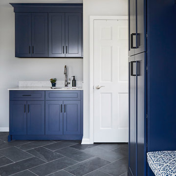
The homeowners’ first words to us were “it’s time to ditch the brown,” so we did! We chose a lovely blue pallet that reflects the home’s location on the lake which is also vibrant yet easy on the eye. Countertops are white quartz, and the natural oak floor works well with the other honey accents. The breakfast table was given a refresh with new chairs, chandelier and window treatments that frame the gorgeous views of the lake out the back.
We coordinated the slate mudroom flooring with that used in the home’s main entrance for a consistent feel. The storage area consists of open and closed storage to allow for some clutter control as needed.
Next on our “to do” list was revamping the dated brown bar area in the neighboring dining room. We eliminated the clutter by adding some closed cabinets and did some easy updates to help the space feel more current. One snag we ran into here was the discovery of a beam above the existing open shelving that had to be modified with a smaller structural beam to allow for our new design to work. This was an unexpected surprise, but in the end we think it was well worth it!
We kept the colors here a bit more muted to blend with the homeowner’s existing furnishings. Open shelving and polished nickel hardware add some simple detail to the new entertainment zone which also looks out onto the lake!
Next we tackled the upstairs starting with the homeowner’s son’s bath. The bath originally had both a tub shower and a separate shower, so we decided to swap out the shower for a new laundry area. This freed up some space downstairs in what used to be the mudroom/laundry room and is much more convenient for daily laundry needs.
We continued the blue palette here with navy cabinetry and the navy tile in the shower. Porcelain floor tile and chrome fixtures keep maintenance to a minimum while matte black mirrors and lighting add some depth the design. A low maintenance runner adds some warmth underfoot and ties the whole space together.
We added a pocket door to the bathroom to minimize interference with the door swings. The left door of the laundry closet is on a 180 degree hinge to allow for easy full access to the machines. Next we tackled the master bath which is an en suite arrangement. The original was typical of the 1980’s with the vanity outside of the bathroom, situated near the master closet. And the brown theme continued here with multiple shades of brown.
Our first move was to segment off the bath and the closet from the master bedroom. We created a short hall from the bedroom to the bathroom with his and hers walk-in closets on the left and right as well as a separate toilet closet outside of the main bathroom for privacy and flexibility.
The original bathroom had a giant soaking tub with steps (dangerous!) as well as a small shower that did not work well for our homeowner who is 6’3”. With other bathtubs in the home, they decided to eliminate the tub and create an oversized shower which takes up the space where the old tub was located. The double vanity is on the opposite wall and a bench is located under the window for morning conversations and a place to set a couple of towels.
The pallet in here is light and airy with a mix of blond wood, creamy porcelain and marble tile, and brass accents. A simple roman shade adds some texture and it’s top-down mechanism allows for light and privacy.
This large whole house remodel gave our homeowners not only the ability to maximize the potential of their home but also created a lovely new frame from which to view their fabulous lake views.
Designed by: Susan Klimala, CKD, CBD
Photography by: Michael Kaskel
For more information on kitchen and bath design ideas go to: www.kitchenstudio-ge.com

 Anne Michaelsen Design
Photography by Paul Rollins
Example of a large trendy open concept and formal living room design in San Francisco with gray walls
Example of a large trendy open concept and formal living room design in San Francisco with gray walls

 Kimberlee Marie Interiors
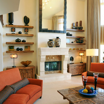
This early 90's contemporary home was in need of some major updates and when my clients purchased it they were ready to make it their own. The home features large open rooms, great natural light and stunning views of Lake Washington. These clients love bold vibrant colors and clean modern lines so the goal was to incorporate those in the design without it overwhelming the space. Balance was key. The end goal was for the home to feel open and airy yet warm and inviting. This was achieved by bringing in punches of color to an otherwise white or neutral palate. Texture and visual interest were achieved throughout the house through the use of wallpaper, fabrics, and a few one of a kind artworks.
 Deskins Group LLC
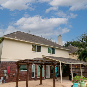
This is yet another mid-90's house that had press board sheet siding that was disintegrating. The owner previously replaced the siding on the sides with James Hardie Sierra 8 sheets. We replaced the siding on the back of the house and chimney and painted the entire house with Sherwin Williams Emerald Rain Refresh. The paint overspray was existing and we pointed it out to the homeowner before we started.

 Lehigh Valley Interior Construction
Mid-sized mountain style underground concrete floor and beige floor basement photo in Philadelphia with brown walls
 Kimberlee Marie Interiors
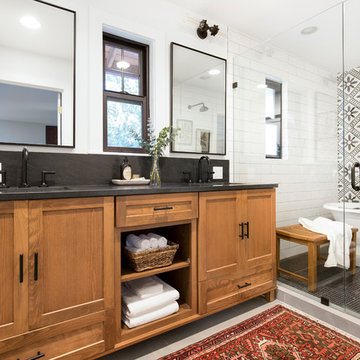
It’s always a blessing when your clients become friends - and that’s exactly what blossomed out of this two-phase remodel (along with three transformed spaces!). These clients were such a joy to work with and made what, at times, was a challenging job feel seamless. This project consisted of two phases, the first being a reconfiguration and update of their master bathroom, guest bathroom, and hallway closets, and the second a kitchen remodel.
In keeping with the style of the home, we decided to run with what we called “traditional with farmhouse charm” – warm wood tones, cement tile, traditional patterns, and you can’t forget the pops of color! The master bathroom airs on the masculine side with a mostly black, white, and wood color palette, while the powder room is very feminine with pastel colors.
When the bathroom projects were wrapped, it didn’t take long before we moved on to the kitchen. The kitchen already had a nice flow, so we didn’t need to move any plumbing or appliances. Instead, we just gave it the facelift it deserved! We wanted to continue the farmhouse charm and landed on a gorgeous terracotta and ceramic hand-painted tile for the backsplash, concrete look-alike quartz countertops, and two-toned cabinets while keeping the existing hardwood floors. We also removed some upper cabinets that blocked the view from the kitchen into the dining and living room area, resulting in a coveted open concept floor plan.
Our clients have always loved to entertain, but now with the remodel complete, they are hosting more than ever, enjoying every second they have in their home.

 Alexandra Crafton
Photo: Alexandra Crafton © 2016 Houzz
Wall paint: Moonlight White, Benjamin Moore; trim: Simply White, Benjamin Moore; bed: JC Penney; blinds: Lowe's (in store, cut to size); dressers: Askvoll, Ikea; duvet: Pottery Barn; sheets: Target; Mexican blanket: Gunn and Swain;
wallpaper: Kalahari Vignettes, Anthropologie; shelving: Home Depot

 M House Development
Transitional u-shaped light wood floor and beige floor kitchen photo in Chicago with a farmhouse sink, shaker cabinets, gray backsplash, an island, white countertops and gray cabinets


 Habitar Design
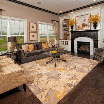
Our designer, Hannah Tindall, worked with the homeowners to create a contemporary kitchen, living room, master & guest bathrooms and gorgeous hallway that truly highlights their beautiful and extensive art collection. The entire home was outfitted with sleek, walnut hardwood flooring, with a custom Frank Lloyd Wright inspired entryway stairwell. The living room's standout pieces are two gorgeous velvet teal sofas and the black stone fireplace. The kitchen has dark wood cabinetry with frosted glass and a glass mosaic tile backsplash. The master bathrooms uses the same dark cabinetry, double vanity, and a custom tile backsplash in the walk-in shower. The first floor guest bathroom keeps things eclectic with bright purple walls and colorful modern artwork.

 Dannielle Albrecht Designs
Small beach style powder room photo in Los Angeles with shaker cabinets, gray cabinets, a two-piece toilet, an undermount sink, quartz countertops, beige walls and white countertops


 Melissa Hill Home Design
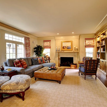
When our clients moved into their already built home they decided to live in it for a while before making any changes. Once they were settled they decided to hire us as their interior designers to renovate and redesign various spaces of their home. As they selected the spaces to be renovated they expressed a strong need for storage and customization. They allowed us to design every detail as well as oversee the entire construction process directing our team of skilled craftsmen. The home is a traditional home so it was important for us to retain some of the traditional elements while incorporating our clients style preferences.
Custom designed by Hartley and Hill Design.
All materials and furnishings in this space are available through Hartley and Hill Design. www.hartleyandhilldesign.com
888-639-0639
Neil Landino Photography
Sponsored
Columbus, OH

Snider & Metcalf Interior Design, LTD
Leading Interior Designers in Columbus, Ohio & Ponte Vedra, Florida

 Michael Nash Design, Build & Homes
2013 CHRYSALIS AWARD SOUTH REGION WINNER, RESIDENTIAL EXTERIOR
This 1970’s split-level single-family home in an upscale Arlington neighborhood had been neglected for years. With his surrounding neighbors all doing major exterior and interior remodeling, however, the owner decided it was time to renovate his property as well. After several consultation meetings with the design team at Michael Nash Design, Build & Homes, he settled on an exterior layout to create an Art & Craft design for the home.
It all got started by excavating the front and left side of the house and attaching a wrap-around stone porch. Key design attributes include a black metal roof, large tapered columns, blue and grey random style flag stone, beaded stain ceiling paneling and an octagonal seating area on the left side of this porch. The front porch has a wide stairway and another set of stairs leads to the back yard.
All exterior walls of homes were modified with new headers to allow much larger custom-made windows, new front doors garage doors, and French side and back doors. A custom-designed mahogany front door with leaded glass provides more light and offers a wider entrance into the home’s living area.
Design challenges included removing the entire face of the home and then adding new insulation, Tyvek and Hardiplank siding. The use of high-efficiency low-e windows makes the home air tight.
The Arts & Crafts design touches include the front gable over the front porch, the prairie-style grill pattern on the windows and doors, the use of tapered columns sitting over stone columns and the leaded glass front door. Decorative exterior lighting provides the finishing touches to this look.

 Alison Kandler Interior Design
Kathryn Russell
Inspiration for a mid-sized timeless single-wall dark wood floor and brown floor eat-in kitchen remodel in Los Angeles with beaded inset cabinets, wood countertops and white cabinets
Inspiration for a mid-sized timeless single-wall dark wood floor and brown floor eat-in kitchen remodel in Los Angeles with beaded inset cabinets, wood countertops and white cabinets

 J M G CONSTRUCTION
This 1920's Spanish style home needed an upgrade from it's 1970's remodel. The homeowner decided to work from a design she found on some vintage sconces shown here. All of the tile is custom colored and patterned with a sun burst theme and shower mosaic shown in mirror. The cabinets were custom as well, duplicated from a photo given to me by the client.
153