
Search results for "Disconnect" in Home Design Ideas

 Pine Street Carpenters & The Kitchen Studio
John Welsh
Example of a trendy medium tone wood floor and brown floor kitchen design in Wilmington
Example of a trendy medium tone wood floor and brown floor kitchen design in Wilmington

 Visbeen Architects
Building a new home in an old neighborhood can present many challenges for an architect. The Warren is a beautiful example of an exterior, which blends with the surrounding structures, while the floor plan takes advantage of the available space.
A traditional façade, combining brick, shakes, and wood trim enables the design to fit well in any early 20th century borough. Copper accents and antique-inspired lanterns solidify the home’s vintage appeal.
Despite the exterior throwback, the interior of the home offers the latest in amenities and layout. Spacious dining, kitchen and hearth areas open to a comfortable back patio on the main level, while the upstairs offers a luxurious master suite and three guests bedrooms.
 Mansfield + O'Neil
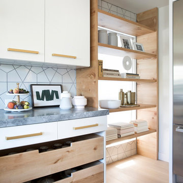
One of the biggest challenges on this project was a floor-to-ceiling window that landed smack-dab in the kitchen’s perimeter cabinetry, driving a physical and visual disconnect between the working countertop and the fridge/pantry area. We designed floor-to-ceiling open shelves, with a sheer metallic window treatment behind, to provide additional kitchen storage and display space, and to add a natural warmth and organic element. This shelving casework became an artistic focal point in the room, and we connected it to the rest of the space by adding natural wood pot drawers and counter stools with a beached wood base.
Find the right local pro for your project

 SCJ Studio Landscape Architecture
The existing landscape of this Queen Anne backyard contained a series of cramped, disconnected spaces on multiple levels with little space to spread out or entertain. We designed a new deck that allows a smooth flow from the adjacent kitchen to this generous and flexible outdoor space. Built-in bench seating, centered around a gas firepit, maximizes space and incorporates storage while integrated planters define the space into distinct but connected outdoor rooms. A lower platform provides ample space for grilling and an integrated stair connects the deck to the adjacent garage. We chose two shades of gray composite for the deck surface, a neutral palette that allows the vibrant planting scheme to pop. Photography by Miranda Estes.

 Charles Martin Custom Homes
Home built by Charles Martin Custom Homes. photo by Wade Blissard
Inspiration for a large mediterranean white two-story stone exterior home remodel in Austin
Inspiration for a large mediterranean white two-story stone exterior home remodel in Austin
 Green Sheep Collective
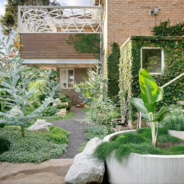
50/50s House is a love letter to the 1950’s. Our clients, Gina and David have a love for books and found objects and wanted to display their collections with pride. The brief also called for a home that would afford them and their teenagers the ability to occupy different spaces without feeling disconnected. Bold lines and playful geometry work in tandem with the charm of the existing house to create a beautiful healthy home that is as endearing as it is enduring.

 WC STUDIO architecture agency
Walnut fronts for the custom cabinets were chosen for their rich texture and visual depth, balanced by the light-colored quartz countertops and clean lines of the millwork and fixtures. The backsplash tile from Heath Ceramics provides a splash of color in the otherwise neutral palette.
A walnut butcher block bartop floating against a generous work island both divides and connects the kitchen with the living area in the new open plan. In competition for favorite gathering spot will be the hearth, where a custom steel panel chimney wrap and a new gas-powered fireplace insert can create coziness on-demand.
Throughout the main level, entry landing, and stair, new engineered hardwood flooring replaced worn carpet and linoleum. New trim, a fresh coat of paint, and an updated lighting package were also specified to unify the previously disconnected spaces and harmonize with the existing details of the home.

 Mark S. Garff, Landscape Architect
On Lake Washington, an existing pool terrace was disconnected from the rest of the yard and and waterfront. The site had a challenging slope, but it was no match for a thoughtful design and some earth moving equipment! A retaining wall at the edge of the existing pool was replaced with a wide, generous stair welcoming guests to a new, bocce-style terrace below complete with gas fire pit and stunning views. A gentle, winding path leads down to a waters-edge patio with intersecting stone and concrete patterns creating a visually dynamic experience. A small sandy beach and generous lawn complete the experience. A California style planting palette with beach groundcover, perennials and elegant, flowing grasses highlighted with LED low-voltage outdoor lighting complete the vacation-home-in-the-city feel.
Photography by: Miranda Estes

 Sidell Pakravan Architects
This remodel negotiates the owner’s desire for a modern home with the municipality’s desire to maintain the home’s ‘historic’ character. To satisfy these potentially conflicting interests, our strategy restores the house’s shell while completely gutting the interior to achieve greater connections to the landscape beyond and between previously disconnected levels on the interior.
A new Henrybuilt Kitchen.
 SCJ Studio Landscape Architecture
The existing landscape of this Queen Anne backyard contained a series of cramped, disconnected spaces on multiple levels with little space to spread out or entertain. We designed a new deck that allows a smooth flow from the adjacent kitchen to this generous and flexible outdoor space. Built-in bench seating, centered around a gas firepit, maximizes space and incorporates storage while integrated planters define the space into distinct but connected outdoor rooms. A lower platform provides ample space for grilling and an integrated stair connects the deck to the adjacent garage. We chose two shades of gray composite for the deck surface, a neutral palette that allows the vibrant planting scheme to pop. Photography by Miranda Estes.

 MC Design LLC
By mirroring the furniture layout of the indoor living area opposite this long and relatively narrow covered outdoor patio, it created a synergy between the formerly disconnected areas. By laying 24" x 24" indoor-outdoor adhesive carpet tiles in an alternating pattern over the concrete slab, it adds warmth and depth.
 Green Sheep Collective
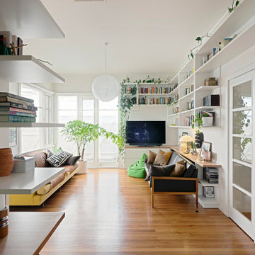
50/50s House is a love letter to the 1950’s. Our clients, Gina and David have a love for books and found objects and wanted to display their collections with pride. The brief also called for a home that would afford them and their teenagers the ability to occupy different spaces without feeling disconnected. Bold lines and playful geometry work in tandem with the charm of the existing house to create a beautiful healthy home that is as endearing as it is enduring.

 Cerno
CernoIt’s a 3 sided box, which has been carefully deconstructed to a sculptural state. The careful composition of overlap and void create interest and complexity to a very straightforward, well-functioning wall sconce. The tectonic disconnection in form allows you to witness the solid American black walnut’s grain as it travels through each solid block.
 Cerno
CernoIt’s a 3 sided box, which has been carefully deconstructed to a sculptural state. The careful composition of overlap and void create interest and complexity to a very straightforward, well-functioning wall sconce. The tectonic disconnection in form allows you to witness the solid American black walnut’s grain as it travels through each solid block.
 Phoenix Home Remodeling
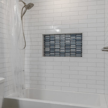
Elizabeth and Shawn felt that their guest bathroom was a space of missed opportunities—functional but unexciting, it lacked the charm and luxury that they were looking for. Basic fixtures and dated items made the room feel disconnected from the rest of their home.
The homeowners were eager to bring the same level of elegance to their guest bathroom, so they selected the same cabinets, mirror, shower wall tile, quartz countertops, and faucets to achieve consistency with their master bathroom.
The shower bathtub was updated with a Kohler Alcove soaking bathtub and Delta Kayra shower fixtures.
Elizabeth and Shawn are overjoyed with their newly renovated master and guest bathrooms. They now have spaces that are not only updated and functional, but also designed exactly to their liking. Each day now feels like a spa day!
 Poore & Company
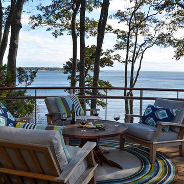
The original house was built as a kit on the coast. The potential view was spectacular but the existing house suffered from a deep sense of tunnel vision and the interior was a maze of disconnected spaces. By changing the location of the kitchen to a more commanding location and unfolding the spaces into a more logical flow the house not only captures the panoramic view but feels twice as big without adding one square foot to the building footprint. Small changes in the deck sizes with some sweeping curves and more logical exterior stair locations connect the interior with the surrounding natural landscape. An “away” space, affectionately called the Quiet Room, is crowned with a sculptural plaster ceiling that evokes a wave, or a shell, or a soft sky canopy floating above this unusual living area. Outdoors is an infinity edge spa overlooking Gloucester’s Eastern Point Lighthouse and the ocean beyond.
 Kitchen Solvers of Fort Lauderdale
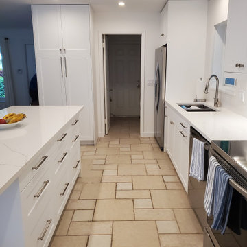
Our client contacted us because he wanted to remodel his kitchen. The original kitchen was small and very disconnected from the rest of the rooms. They wanted to remove the wall that divided the kitchen from the living room and make it into one big area. We installed all new cabinets in a Matte white color to make the new space lighter and give it a more open feel. All the new cabinets were moved to one wall and then we installed a new island in the center of the kitchen with two large pantries on either end of the kitchen. To complete the beautiful transformation, we installed an Alabaster White Quartz countertop and backsplash along with LED lights under the wall cabinets. Now the kitchen has the new look they were dreaming of.
 Phoenix Home Remodeling
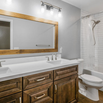
Elizabeth and Shawn felt that their guest bathroom was a space of missed opportunities—functional but unexciting, it lacked the charm and luxury that they were looking for. Basic fixtures and dated items made the room feel disconnected from the rest of their home.
The homeowners were eager to bring the same level of elegance to their guest bathroom, so they selected the same cabinets, mirror, shower wall tile, quartz countertops, and faucets to achieve consistency with their master bathroom.
The shower bathtub was updated with a Kohler Alcove soaking bathtub and Delta Kayra shower fixtures.
Elizabeth and Shawn are overjoyed with their newly renovated master and guest bathrooms. They now have spaces that are not only updated and functional, but also designed exactly to their liking. Each day now feels like a spa day!
 Tiger Lily Landscapes, LLC
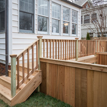
The client's yard was completely disconnected and the only way to access one side from the other was via the front yard. There is a driveway that divides the rear yard. Envisioning that someday a family with young children may inhabit this place, we constructed a bridge to connect both sides. We also installed a shorter fence along both sides of the driveway so that each side of the yard can be viewed from either side.
Photo by Melissa Clark Photography and Consulting
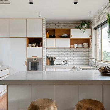 Green Sheep Collective
50/50s House is a love letter to the 1950’s. Our clients, Gina and David have a love for books and found objects and wanted to display their collections with pride. The brief also called for a home that would afford them and their teenagers the ability to occupy different spaces without feeling disconnected. Bold lines and playful geometry work in tandem with the charm of the existing house to create a beautiful healthy home that is as endearing as it is enduring.
27