
Search results for "Distinct unusual" in Home Design Ideas
 Two Hands Interiors
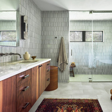
Natural walnut cabinetry grounds this primary bathroom in warm, organic materials while the simple, artisan tile choice feels distinctly mid-century. A steam shower and soaking tub provide a serene escape.
 Visbeen Architects
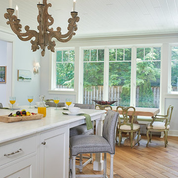
One of the few truly American architectural styles, the Craftsman/Prairie style was developed around the turn of the century by a group of Midwestern architects who drew their inspiration from the surrounding landscape. The spacious yet cozy Thompson draws from features from both Craftsman/Prairie and Farmhouse styles for its all-American appeal. The eye-catching exterior includes a distinctive side entrance and stone accents as well as an abundance of windows for both outdoor views and interior rooms bathed in natural light.
The floor plan is equally creative. The large floor porch entrance leads into a spacious 2,400-square-foot main floor plan, including a living room with an unusual corner fireplace. Designed for both ease and elegance, it also features a sunroom that takes full advantage of the nearby outdoors, an adjacent private study/retreat and an open plan kitchen and dining area with a handy walk-in pantry filled with convenient storage. Not far away is the private master suite with its own large bathroom and closet, a laundry area and a 800-square-foot, three-car garage. At night, relax in the 1,000-square foot lower level family room or exercise space. When the day is done, head upstairs to the 1,300 square foot upper level, where three cozy bedrooms await, each with its own private bath.
Photographer: Ashley Avila Photography
Builder: Bouwkamp Builders
 Visbeen Architects
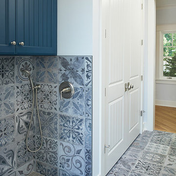
One of the few truly American architectural styles, the Craftsman/Prairie style was developed around the turn of the century by a group of Midwestern architects who drew their inspiration from the surrounding landscape. The spacious yet cozy Thompson draws from features from both Craftsman/Prairie and Farmhouse styles for its all-American appeal. The eye-catching exterior includes a distinctive side entrance and stone accents as well as an abundance of windows for both outdoor views and interior rooms bathed in natural light.
The floor plan is equally creative. The large floor porch entrance leads into a spacious 2,400-square-foot main floor plan, including a living room with an unusual corner fireplace. Designed for both ease and elegance, it also features a sunroom that takes full advantage of the nearby outdoors, an adjacent private study/retreat and an open plan kitchen and dining area with a handy walk-in pantry filled with convenient storage. Not far away is the private master suite with its own large bathroom and closet, a laundry area and a 800-square-foot, three-car garage. At night, relax in the 1,000-square foot lower level family room or exercise space. When the day is done, head upstairs to the 1,300 square foot upper level, where three cozy bedrooms await, each with its own private bath.
Photographer: Ashley Avila Photography
Builder: Bouwkamp Builders
Find the right local pro for your project

 AquaTerra Outdoors
Daniel Driensky
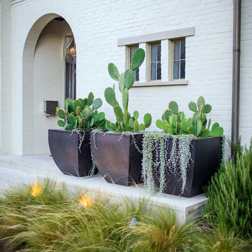
Photo of a small transitional partial sun front yard landscaping in Dallas for summer.
Photo of a small transitional partial sun front yard landscaping in Dallas for summer.
 J. Stephens Interiors
Hamptons-Inspired Kitchen
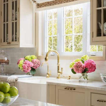
One cannot help but feel a distinct sense of serenity and timeless beauty when entering this Hamptons-style kitchen. Bathed in natural light and shimmering with inspired accents and details, this complete kitchen transformation is at once elegant and inviting. Plans and elevations were conceived to create balance and function without sacrificing harmony and visual intrigue.
A metal custom hood, with an eye-catching brass band and impeccably balanced cabinets on either side, provides a strong focal point for the kitchen, which can be viewed from the adjacent living room. Brass faucets, hardware and light fixtures complement and draw further attention to this anchoring element. A wall of glass cabinetry enhances the existing windows and pleasantly expands the sense of openness in the space.
Taj Mahal quartzite blends gracefully with the cabinet finishes. Cream-tone, herringbone tiles are custom-cut into different patterns to create a sense of visual movement as the eyes move across the room. An elegant, marble-top island paired with sumptuous, leather-covered stools, not only offers extra counterspace, but also an ideal gathering place for loved ones to enjoy.
This unforgettable kitchen gem shines even brighter with the addition of glass cabinets, designed to display the client’s collection of Portmeirion china. Careful consideration was given to the selection of stone for the countertops, as well as the color of paint for the cabinets, to highlight this inspiring collection.
Breakfast room
A thoughtfully blended mix of furniture styles introduces a splash of European charm to this Hamptons-style kitchen, with French, cane-back chairs providing a sense of airy elegance and delight.
A performance velvet adorns the banquette, which is piled high with lush cushions for optimal comfort while lounging in the room. Another layer of texture is achieved with a wool area rug that defines and accentuates this gorgeous breakfast nook with sprawling views of the outdoors.
Finishing features include drapery fabric and Brunschwig and Fils Bird and Thistle paper, whose natural, botanic pattern combines with the beautiful vistas of the backyard to inspire a sense of being in a botanical, outdoor wonderland.
 User
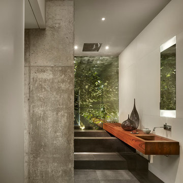
UserThe Clients contacted Cecil Baker + Partners to reconfigure and remodel the top floor of a prominent Philadelphia high-rise into an urban pied-a-terre. The forty-five story apartment building, overlooking Washington Square Park and its surrounding neighborhoods, provided a modern shell for this truly contemporary renovation. Originally configured as three penthouse units, the 8,700 sf interior, as well as 2,500 square feet of terrace space, was to become a single residence with sweeping views of the city in all directions.
The Client’s mission was to create a city home for collecting and displaying contemporary glass crafts. Their stated desire was to cast an urban home that was, in itself, a gallery. While they enjoy a very vital family life, this home was targeted to their urban activities - entertainment being a central element.
The living areas are designed to be open and to flow into each other, with pockets of secondary functions. At large social events, guests feel free to access all areas of the penthouse, including the master bedroom suite. A main gallery was created in order to house unique, travelling art shows.
Stemming from their desire to entertain, the penthouse was built around the need for elaborate food preparation. Cooking would be visible from several entertainment areas with a “show” kitchen, provided for their renowned chef. Secondary preparation and cleaning facilities were tucked away.
The architects crafted a distinctive residence that is framed around the gallery experience, while also incorporating softer residential moments. Cecil Baker + Partners embraced every element of the new penthouse design beyond those normally associated with an architect’s sphere, from all material selections, furniture selections, furniture design, and art placement.
Barry Halkin and Todd Mason Photography
 User
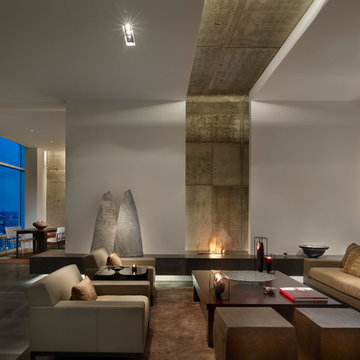
UserThe Clients contacted Cecil Baker + Partners to reconfigure and remodel the top floor of a prominent Philadelphia high-rise into an urban pied-a-terre. The forty-five story apartment building, overlooking Washington Square Park and its surrounding neighborhoods, provided a modern shell for this truly contemporary renovation. Originally configured as three penthouse units, the 8,700 sf interior, as well as 2,500 square feet of terrace space, was to become a single residence with sweeping views of the city in all directions.
The Client’s mission was to create a city home for collecting and displaying contemporary glass crafts. Their stated desire was to cast an urban home that was, in itself, a gallery. While they enjoy a very vital family life, this home was targeted to their urban activities - entertainment being a central element.
The living areas are designed to be open and to flow into each other, with pockets of secondary functions. At large social events, guests feel free to access all areas of the penthouse, including the master bedroom suite. A main gallery was created in order to house unique, travelling art shows.
Stemming from their desire to entertain, the penthouse was built around the need for elaborate food preparation. Cooking would be visible from several entertainment areas with a “show” kitchen, provided for their renowned chef. Secondary preparation and cleaning facilities were tucked away.
The architects crafted a distinctive residence that is framed around the gallery experience, while also incorporating softer residential moments. Cecil Baker + Partners embraced every element of the new penthouse design beyond those normally associated with an architect’s sphere, from all material selections, furniture selections, furniture design, and art placement.
Barry Halkin and Todd Mason Photography
 Visbeen Architects
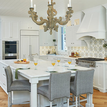
One of the few truly American architectural styles, the Craftsman/Prairie style was developed around the turn of the century by a group of Midwestern architects who drew their inspiration from the surrounding landscape. The spacious yet cozy Thompson draws from features from both Craftsman/Prairie and Farmhouse styles for its all-American appeal. The eye-catching exterior includes a distinctive side entrance and stone accents as well as an abundance of windows for both outdoor views and interior rooms bathed in natural light.
The floor plan is equally creative. The large floor porch entrance leads into a spacious 2,400-square-foot main floor plan, including a living room with an unusual corner fireplace. Designed for both ease and elegance, it also features a sunroom that takes full advantage of the nearby outdoors, an adjacent private study/retreat and an open plan kitchen and dining area with a handy walk-in pantry filled with convenient storage. Not far away is the private master suite with its own large bathroom and closet, a laundry area and a 800-square-foot, three-car garage. At night, relax in the 1,000-square foot lower level family room or exercise space. When the day is done, head upstairs to the 1,300 square foot upper level, where three cozy bedrooms await, each with its own private bath.
Photographer: Ashley Avila Photography
Builder: Bouwkamp Builders
 MossCreek
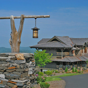
High in the Blue Ridge Mountains of North Carolina, this majestic lodge was custom designed by MossCreek to provide rustic elegant living for the extended family of our clients. Featuring four spacious master suites, a massive great room with floor-to-ceiling windows, expansive porches, and a large family room with built-in bar, the home incorporates numerous spaces for sharing good times.
Unique to this design is a large wrap-around porch on the main level, and four large distinct and private balconies on the upper level. This provides outdoor living for each of the four master suites.
We hope you enjoy viewing the photos of this beautiful home custom designed by MossCreek.
Photo by Todd Bush
 GAYLA BECHTOL ARCHITECT
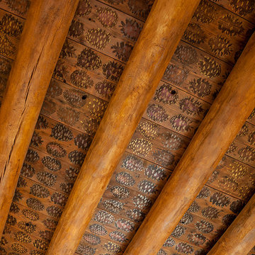
This close-up captures one of the most distinctive elements of Santa Fe Style Architecture — hand-hewn vigas paired with intricately painted decking. The vigas, crafted from natural logs, bring structural honesty and warmth, while the painted patterns on the latillas add artistry rooted in regional tradition. This ceiling treatment highlights the marriage of craftsmanship and cultural storytelling, an approach central to Historic Adobe Rehabilitation and Custom Residential Design Santa Fe. Such detailing ensures that every surface, even above, becomes part of the home’s narrative, reflecting the timeless beauty of Adobe Architecture.
 TKS Design Group
Download our free ebook, Creating the Ideal Kitchen. DOWNLOAD NOW
Lakefront property in the northwest suburbs of Chicago is hard to come by, so when we were hired by this young family with exactly that, we were immediately inspired by not just the unusually large footprint of this 1950’s colonial revival but also the lovely views of the manmade lake it was sited on. The large 5-bedroom home was solidly stuck in the 1980’s, but we saw tons of potential. We started out by updating the existing staircase with a fresh coat of paint and adding new herringbone slate to the entry hall.
The powder room off the entryway also got a refresh - new flooring, new cabinets and fixtures. We ran the new slate right through into this space for some consistency. A fun wallpaper and shiplap trim add a welcoming feel and set the tone for the home.
Next, we tackled the kitchen. Located away from the rest of the first floor, the kitchen felt a little isolated, so we immediately began planning for how to better connect it to the rest of the first floor. We landed on removing the wall between the kitchen and dining room and designed a modified galley style space with separate cooking and clean up zones. The cooking zone consists of the refrigerator, prep sink and cooktop, along with a nice long run of prep space at the island. The cleanup side of the kitchen consists of the main sink and dishwasher. Both areas are situated so that the user can view the lake during prep work and cleanup!
One of the home’s main puzzles was how to incorporate the mudroom and area in front of the patio doors at the back of the house. We already had a breakfast table area, so the space by the patio doors was a bit of a no man’s land. We decided to separate the kitchen proper from what became the new mudroom with a large set of barn doors. That way you can quickly hide any mudroom messes but have easy access to the light coming in through the patio doors as well as the outdoor grilling station. We also love the impact the barn doors add to the overall space.
The homeowners’ first words to us were “it’s time to ditch the brown,” so we did! We chose a lovely blue pallet that reflects the home’s location on the lake which is also vibrant yet easy on the eye. Countertops are white quartz, and the natural oak floor works well with the other honey accents. The breakfast table was given a refresh with new chairs, chandelier and window treatments that frame the gorgeous views of the lake out the back.
We coordinated the slate mudroom flooring with that used in the home’s main entrance for a consistent feel. The storage area consists of open and closed storage to allow for some clutter control as needed.
Next on our “to do” list was revamping the dated brown bar area in the neighboring dining room. We eliminated the clutter by adding some closed cabinets and did some easy updates to help the space feel more current. One snag we ran into here was the discovery of a beam above the existing open shelving that had to be modified with a smaller structural beam to allow for our new design to work. This was an unexpected surprise, but in the end we think it was well worth it!
We kept the colors here a bit more muted to blend with the homeowner’s existing furnishings. Open shelving and polished nickel hardware add some simple detail to the new entertainment zone which also looks out onto the lake!
Next we tackled the upstairs starting with the homeowner’s son’s bath. The bath originally had both a tub shower and a separate shower, so we decided to swap out the shower for a new laundry area. This freed up some space downstairs in what used to be the mudroom/laundry room and is much more convenient for daily laundry needs.
We continued the blue palette here with navy cabinetry and the navy tile in the shower. Porcelain floor tile and chrome fixtures keep maintenance to a minimum while matte black mirrors and lighting add some depth the design. A low maintenance runner adds some warmth underfoot and ties the whole space together.
We added a pocket door to the bathroom to minimize interference with the door swings. The left door of the laundry closet is on a 180 degree hinge to allow for easy full access to the machines. Next we tackled the master bath which is an en suite arrangement. The original was typical of the 1980’s with the vanity outside of the bathroom, situated near the master closet. And the brown theme continued here with multiple shades of brown.
Our first move was to segment off the bath and the closet from the master bedroom. We created a short hall from the bedroom to the bathroom with his and hers walk-in closets on the left and right as well as a separate toilet closet outside of the main bathroom for privacy and flexibility.
The original bathroom had a giant soaking tub with steps (dangerous!) as well as a small shower that did not work well for our homeowner who is 6’3”. With other bathtubs in the home, they decided to eliminate the tub and create an oversized shower which takes up the space where the old tub was located. The double vanity is on the opposite wall and a bench is located under the window for morning conversations and a place to set a couple of towels.
The pallet in here is light and airy with a mix of blond wood, creamy porcelain and marble tile, and brass accents. A simple roman shade adds some texture and it’s top-down mechanism allows for light and privacy.
This large whole house remodel gave our homeowners not only the ability to maximize the potential of their home but also created a lovely new frame from which to view their fabulous lake views.
Designed by: Susan Klimala, CKD, CBD
Photography by: Michael Kaskel
For more information on kitchen and bath design ideas go to: www.kitchenstudio-ge.com
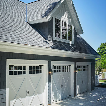 Visbeen Architects
One of the few truly American architectural styles, the Craftsman/Prairie style was developed around the turn of the century by a group of Midwestern architects who drew their inspiration from the surrounding landscape. The spacious yet cozy Thompson draws from features from both Craftsman/Prairie and Farmhouse styles for its all-American appeal. The eye-catching exterior includes a distinctive side entrance and stone accents as well as an abundance of windows for both outdoor views and interior rooms bathed in natural light.
The floor plan is equally creative. The large floor porch entrance leads into a spacious 2,400-square-foot main floor plan, including a living room with an unusual corner fireplace. Designed for both ease and elegance, it also features a sunroom that takes full advantage of the nearby outdoors, an adjacent private study/retreat and an open plan kitchen and dining area with a handy walk-in pantry filled with convenient storage. Not far away is the private master suite with its own large bathroom and closet, a laundry area and a 800-square-foot, three-car garage. At night, relax in the 1,000-square foot lower level family room or exercise space. When the day is done, head upstairs to the 1,300 square foot upper level, where three cozy bedrooms await, each with its own private bath.
Photographer: Ashley Avila Photography
Builder: Bouwkamp Builders
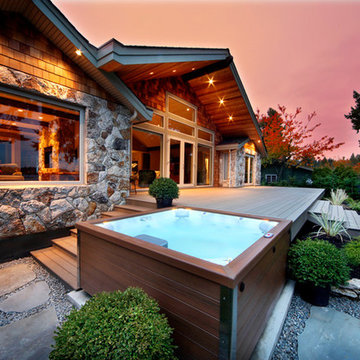
 GALAXY OUTDOOR LLC
Whether it’s arthritis, joint or back pain, restless leg syndrome, muscle injuries or fibromyalgia, hot tubs are a proven form of chronic pain relief. The heat of the water increases blood flow and relaxes the body, while the massaging action of the jets and the water’s buoyancy loosen muscle tension and soothe sore joints.
The New England Journal of Medicine (08-16-1999) found that, after just 10 days, patients with Type 2 Diabetes who used hot tubs 30 minutes a day/6 days per week required reduced doses of insulin, lost weight, slept better and showed distinct decreases in plasma glucose and glycosylated hemoglobin.
Hot tubs can be a great fix for those suffering from insomnia, helping your body to wind down before bed and get the natural sleep you need. Even if you don’t suffer from chronic sleep problems, the Better Sleep Council recommends establishing a relaxing bedtime routine, such as soaking in hot water to help maintain a healthy sleep cycle. According to the Council’s findings, warm water releases muscle tension and increases blood flow, both of which contribute to a relaxed and deeper, more comfortable sleep.
Whether it’s a new exercise routine or an unusually active day on your feet, most of us know the “day after” feeling of sore, overworked muscles that make it hurt to move, period. The water pressure from hot tub jets relieves muscle tightness and soreness by removing lactic acid, opening up the blood vessels and promoting the flow of endorphins. LPGA Sports Medicine Director Caroline Nichols and former President of the American Orthopedic Society of Sports Medicine Dr. James Andrews recommend hydrotherapeutic activity for athletes at every level. Nichols says that hot tubs especially help with recovery since jets focus on overused muscle and joint regions, while Andrews supports hydrotherapy as a good tool for improved circulation, sensory impulses and stiff joints.
Whether you’re looking to alleviate stress, feel healthier or simply spend more time with your loved ones, you’d be amazed at how as little as 10 minutes in a hot tub can help you relax and put everything in perspective. There are hot tubs for every type of user, regardless of whether it’s just you or it’s the entire gang piling in, looking for some much-needed relief after a long day.
 Grace Home Furnishings
Lance Gerber
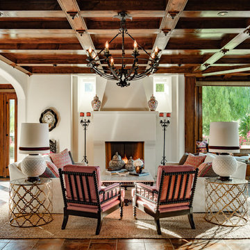
Living room - mediterranean brown floor living room idea in Los Angeles with white walls and a standard fireplace
Living room - mediterranean brown floor living room idea in Los Angeles with white walls and a standard fireplace
 General Assembly
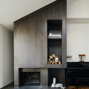
Living room - mid-sized scandinavian open concept light wood floor living room idea in New York with white walls, a standard fireplace, a metal fireplace and no tv
 Nicole Arnold Interiors
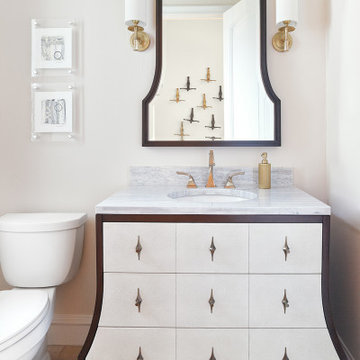
Of utmost importance to this client was a home boasting an elegant vibe – highlighting sophisticated furnishings without pretension – but with little-to-no-maintenance. Throughout the house, the designers incorporated performance fabrics that are sustainable for pets and children, offering an elegant ease that transitions from outdoor to indoor. They also focused heavily on the convenience factor, bringing the home deep into technology with media seating for a true media room; custom motorized shades in every room; TVs that reveal with a simple push of a button; and even desks that transition from a standing to seated position. Of course, you can’t have convenience without some glamour, and a former sitting room that was converted into a dressing room will make any woman’s eyes pop with envy. The to-die-for closet features power rods that float down for easy reach, a dressing mirror with wings that fold in and LED lights that change colors, a bench covered in couture fabric for distinctive perching, decadent carpeting and tons of shoe storage.

 FormLA Landscaping
Hot Lips Salvia blooms look more like those of snapdragons than the notable wands of its sister salvias. It gets its name from the white and red tips of it's blooms that look like "Hot Lips". In spring, its fiesta red blooms seem to fill the garden.
In winter, Hot Lips' foliage also brings something distinctive to the garden. Its woodier stalks and delicate, deep green leaves create a dramatic backdrop for the silvery foliage of Salvia Clevelandii and cassia.
Photo: Orly Olivier
 User
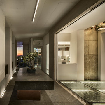
UserThe Clients contacted Cecil Baker + Partners to reconfigure and remodel the top floor of a prominent Philadelphia high-rise into an urban pied-a-terre. The forty-five story apartment building, overlooking Washington Square Park and its surrounding neighborhoods, provided a modern shell for this truly contemporary renovation. Originally configured as three penthouse units, the 8,700 sf interior, as well as 2,500 square feet of terrace space, was to become a single residence with sweeping views of the city in all directions.
The Client’s mission was to create a city home for collecting and displaying contemporary glass crafts. Their stated desire was to cast an urban home that was, in itself, a gallery. While they enjoy a very vital family life, this home was targeted to their urban activities - entertainment being a central element.
The living areas are designed to be open and to flow into each other, with pockets of secondary functions. At large social events, guests feel free to access all areas of the penthouse, including the master bedroom suite. A main gallery was created in order to house unique, travelling art shows.
Stemming from their desire to entertain, the penthouse was built around the need for elaborate food preparation. Cooking would be visible from several entertainment areas with a “show” kitchen, provided for their renowned chef. Secondary preparation and cleaning facilities were tucked away.
The architects crafted a distinctive residence that is framed around the gallery experience, while also incorporating softer residential moments. Cecil Baker + Partners embraced every element of the new penthouse design beyond those normally associated with an architect’s sphere, from all material selections, furniture selections, furniture design, and art placement.
Barry Halkin and Todd Mason Photography
 User
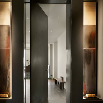
UserThe Clients contacted Cecil Baker + Partners to reconfigure and remodel the top floor of a prominent Philadelphia high-rise into an urban pied-a-terre. The forty-five story apartment building, overlooking Washington Square Park and its surrounding neighborhoods, provided a modern shell for this truly contemporary renovation. Originally configured as three penthouse units, the 8,700 sf interior, as well as 2,500 square feet of terrace space, was to become a single residence with sweeping views of the city in all directions.
The Client’s mission was to create a city home for collecting and displaying contemporary glass crafts. Their stated desire was to cast an urban home that was, in itself, a gallery. While they enjoy a very vital family life, this home was targeted to their urban activities - entertainment being a central element.
The living areas are designed to be open and to flow into each other, with pockets of secondary functions. At large social events, guests feel free to access all areas of the penthouse, including the master bedroom suite. A main gallery was created in order to house unique, travelling art shows.
Stemming from their desire to entertain, the penthouse was built around the need for elaborate food preparation. Cooking would be visible from several entertainment areas with a “show” kitchen, provided for their renowned chef. Secondary preparation and cleaning facilities were tucked away.
The architects crafted a distinctive residence that is framed around the gallery experience, while also incorporating softer residential moments. Cecil Baker + Partners embraced every element of the new penthouse design beyond those normally associated with an architect’s sphere, from all material selections, furniture selections, furniture design, and art placement.
Barry Halkin and Todd Mason Photography
1