
Search results for "Extending" in Home Design Ideas
 A Designed Space
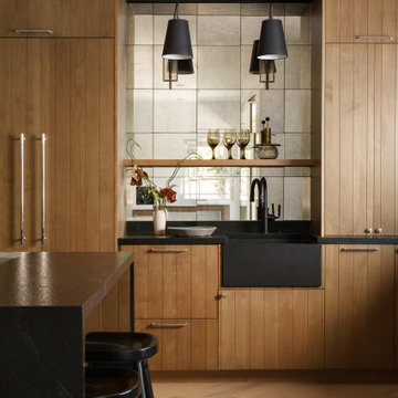
When we met this family of 5 (months from being a family of 6!), their first floor felt outdated and disconnected. They dreamed of a space that felt light and airy, yet infused with rich, earthy materials to create warmth and add bold character. More than just a refresh, they needed a functional layout that worked for everyday life—cooking, laundry, entertaining friends, and even unwinding with a cocktail at the end of the day.
Extending the kitchen into the morning room seating area enhanced both flow and functionality, while a spacious island became the heart of the home—ideal for casual family meals, meal prep, and hosting friends. A dedicated beverage station with a sink, refrigeration, and an awning window for indoor-outdoor entertaining allows for an effortless transition from morning routines to afternoon snacks on the patio.
The laundry room was designed with designated storage for all four kids, creating an organized and functional space. It also serves as a practical landing zone when entering the home, seamlessly extending the light and airy theme with thoughtful design details and playful touches.
 Klopf Architecture
Nestled in the hills of Orinda, California, this 1951 residence is one of only seven extant homes, now known as “The Magnificent Seven”, designed by architect Olof Dahlstrand, a protégé of Frank Lloyd Wright. With its low-slung rooflines, natural materials, and deep integration with the sloping landscape, the home is a pristine example of mid-century modern design inspired by Wright’s organic principles. Over the years, prior homeowners have emphasized preservation, ensuring that the house remained relatively untouched. Each owner has respected the original architecture and stayed true to Dahlstrand’s intent. When a family of five—two college-aged sons and a middle school-aged daughter—acquired the property, they were captivated by its history, legacy of care, and architectural significance. While they appreciated Dahlstrand’s original vision, they also recognized the need to adapt the home for contemporary living while preserving its design integrity.
The remodel was conceived as a thoughtful response to the past—an effort to bring the house into the 21st century without compromising its soul. The primary mandate was to maintain architectural continuity while improving the functionality, comfort, and livability for a modern family. The design team—architects and contractor alike—worked with a shared reverence for the original architecture, allowing that mindset to guide even the most technical or pragmatic decisions.
A key objective was to increase natural light in the kitchen—a departure from Wrightian principles of enclosed, intimate cooking spaces—while maintaining the home’s architectural language. The kitchen was reconfigured to foster a stronger connection to adjacent living spaces while retaining the underlying concept of spatial separation. One of the most transformative architectural changes was the removal of a ridge beam that was originally planned to remain visible through the kitchen. During construction, the team collaborated on a better solution: a wide-flanged steel beam concealed within the roof envelope. This subtle move preserved the clean lines and ceiling continuity, a modern update carried out with utmost respect for the existing framework.
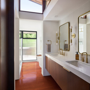
The home’s original powder room, previously accessible only through the kitchen, was relocated for better flow and privacy. A new powder room was carved out of former kitchen cabinetry—a narrow, interior space that could have felt dark and enclosed. To avoid this, the design extended the line of original transom windows into the new powder room and added a skylight above the vanity. The result is a bright and airy space that feels consistent with the rest of the home. Other updates included the installation of new solid-core interior doors with veneers carefully matched to the original mahogany, enhancing the continuity of the interiors. Even smaller decisions, such as placing the door knobs at 42 inches high, mirrored the original proportions. Every choice reflected a shared belief between the architect, contractor, and client: that new work should serve the integrity of the old.
The home’s extensive interior redwood millwork and paneling was meticulously restored. Where new materials were introduced—such as the replacement redwood soffit paneling—the contractor took pains to find finish nails that matched the original, rather than using modern equivalents. This level of craftsmanship and collaboration defined the project. It extended even to the detailing of a blind door to the new powder room, which had to disappear into the existing redwood board-and-batten wall. It was a team effort: the owner found a suitable handle, the architects devised the custom in-swing mechanism, and the contractor executed it so the door aligned precisely with the battens. Throughout, the homeowners were deeply engaged in the design process. One, a meticulous design enthusiast, focused on aesthetic integrity and historic detail. The other brought a practical and function-driven perspective, ensuring that new fixtures and materials would be durable and require minimal maintenance.
While the home’s location posed no major site challenges, sustainability was a key concern. The team upgraded the roof insulation, installed solar panels with battery storage, and added ductless mini-split cooling systems. Lighting was another area where modern technology was woven into a historic framework: new square LED fixtures echo the original custom perimeter soffit lights, maintaining the design language while offering advanced performance.
A planned expansion of a bedroom into suite with a bathroom had to be shelved due to budget constraints and the high cost of below-grade foundation work. Still, the team focused their efforts on making the most of the existing footprint, resolving constraints through design ingenuity rather than adding square footage. This renovation represents a collaborative achievement in preserving and evolving a historically significant home. Every decision was shaped by a shared ethos among clients, architects, and contractor: to maintain the home’s architectural soul while updating it for contemporary life. The result is a timeless modernist residence that continues Olof Dahlstrand’s legacy, remaining grounded in nature, craftsmanship, and human-scale design.
Klopf Architecture Team: John Klopf, AIA, Klara Kevane, Fernanda Bernardes
Interior Architectural Design: Klopf Architecture
Structural Engineer: Daniel Bastiao
Contractor: Don Larwood, Larwood Construction
Photography: Mariko Reed
Year Completed: 2022
 lavish
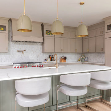
This stunning kitchen transformation proves that warm, earthy tones can be just as striking as classic white — and far more personal. The result is a sophisticated, chef-caliber space that feels layered, collected, and completely livable, with a color story rooted in nature and elevated by thoughtful material choices throughout.
The perimeter cabinetry is finished in a rich warm greige — that perfect blend of gray and beige that feels both current and timeless — running floor to ceiling with generous crown molding detail and brushed brass bar pulls that catch the light beautifully. The custom range hood, painted to match and finished with elegant curved molding, anchors the cooking wall and creates an architectural focal point that draws the eye immediately upon entering the room.
The central island makes a bold and confident design statement in a contrasting sage green, a color choice that bridges the warm cabinetry and cool marble-look quartz countertops with unexpected harmony. The island countertop — a striking Calacatta-style quartz with dramatic gold veining — extends across all perimeter surfaces, tying the entire kitchen together under one cohesive material story. A large white farmhouse apron-front sink sits within the island, paired with a brushed champagne bronze gooseneck faucet and matching pot filler above the range — hardware details that elevate the space from beautiful to truly bespoke.
The backsplash deserves its own moment: a full-field installation of a tone-on-tone marble mosaic tile in soft white, warm gray, and hints of gold runs wall to wall and floor to ceiling behind the range — a shimmering, textural surface that catches the light throughout the day and gives the kitchen an almost jewel-box quality up close. Three oversized sage green dome pendant lights with brass interiors and gold rods hang above the island, echoing the island color and creating a perfectly coordinated, designer-curated look.
The professional-grade Wolf dual-fuel range with signature red knobs commands the cooking wall — a statement appliance that signals serious culinary intent while adding a pop of bold color that energizes the otherwise soft palette. Panel-ready refrigerator cabinetry seamlessly integrates the appliance wall into the overall design, maintaining the clean, furniture-like quality of the custom cabinetry throughout.
The remodel extends into the adjacent family room, where a full fireplace surround tiled in the same marble mosaic as the kitchen backsplash creates a cohesive design thread between the two spaces. A warm wood mantel, linen drapery, and a mix of cognac leather and cream upholstery complete a sitting area that feels like a natural, harmonious extension of the kitchen beyond.
Find the right local pro for your project
 Deslaurier Custom Cabinets
 kitchen
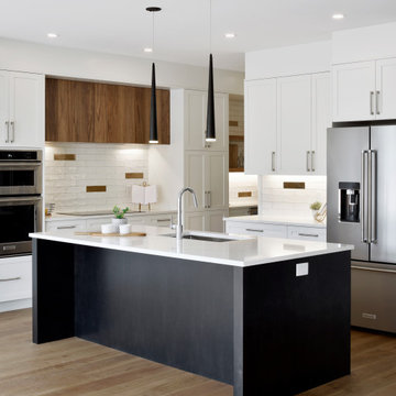
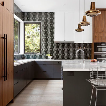
At the center of this sophisticated home is a clean, bright kitchen that is full of personality. The large contrasting island is wrapped in ebony cabinetry and topped with a Calacatta Gold quartz countertop; creating the perfect gathering place for friends and family. The highlight of this kitchen must be the custom walnut exhaust hood. Extended the full width of the counterspace, the vertical grain walnut conceals the exhaust hood as well as recessed lighting. This is wrapped on all sides by deep pantries, finished in a warm white cabinetry to match the base cabinets below. On the left, a double wall oven is perfectly positioned for ease of cooking while providing visual balance to the fridge on the opposite wall. A tall pantry to the right of the cooktop delineates an adjacent bar area, complete with wine fridge and open shelving to match the kitchen. Warm hardwood flooring extends seamlessly into the kitchen space, complimenting the warmth of the walnut and contrasting the black and white cabinetry. The backsplash tile is a spin on the classic subway, the hand-made white tiles dotted with copper accents. Together, the contrast of dark and light, warm and cool finishes come together in this kitchen to create a space that can truly be described as the heart of the home.

 Kitchen Intuitions
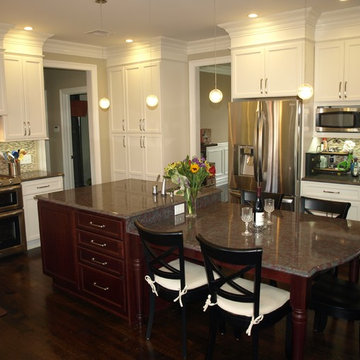
Open two-toned kitchen with white perimeter and a dark colored island that extends into a kitchen table. Dark granite countertops that contrast with the white and pair nicely with the dark island.
 Studio Industrielle
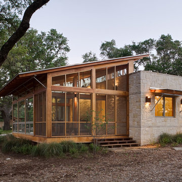
The program consists of a detached Guest House with full Kitchen, Living and Dining amenities, Carport and Office Building with attached Main house and Master Bedroom wing. The arrangement of buildings was dictated by the numerous majestic oaks and organized as a procession of spaces leading from the Entry arbor up to the front door. Large covered terraces and arbors were used to extend the interior living spaces out onto the site.
All the buildings are clad in Texas limestone with accent bands of Leuders limestone to mimic the local limestone cliffs in the area. Steel was used on the arbors and fences and left to rust. Vertical grain Douglas fir was used on the interior while flagstone and stained concrete floors were used throughout. The flagstone floors extend from the exterior entry arbors into the interior of the Main Living space and out onto the Main house terraces.

 CB Architecture + Design
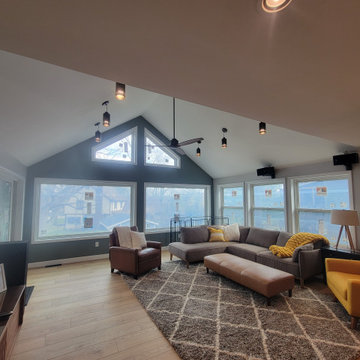
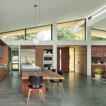
Great room interior of a new construction single-level home. The signature butterfly shed roofline is fully expressed inside as a series of black-framed clerestory windows running the full width of the great room, admitting a continuous band of natural light and redwood canopy views above the interior wall line while maintaining privacy at eye level. Warm walnut flat-front cabinetry runs the full perimeter of the kitchen at left, with slate blue upper cabinets visible beyond and a full-height walnut appliance tower with integrated stainless steel refrigerator and double oven anchoring the center. A blue kitchen island with white quartz countertop extends into a cantilevered walnut butcher block dining table with a distinctive slatted walnut fluted base. Black molded shell chairs with oak legs surround the dining extension. Single white globe pendant hangs above. The terracotta red front entry door with cedar-clad entry volume is visible through the interior opening at center, connecting the street threshold to the deepest interior space in one axial view. Family room with cognac leather sofa, walnut credenza, and slatted walnut room divider panels visible to the right. Charcoal polished concrete radiant slab floors extend throughout.
 Andrew Mikhael Architect
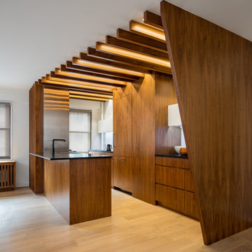
Inspiration for a galley medium tone wood floor and brown floor open concept kitchen remodel in New York with an undermount sink, flat-panel cabinets, medium tone wood cabinets, quartz countertops, white backsplash, glass sheet backsplash, paneled appliances, an island and black countertops
 David Coulson Design Ltd.
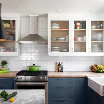
Example of a 1960s l-shaped light wood floor eat-in kitchen design in Other with a farmhouse sink, shaker cabinets, blue cabinets, wood countertops, white backsplash, subway tile backsplash, stainless steel appliances and an island

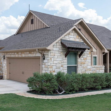
 Rostrata Builders, Inc.
Example of a mid-sized classic beige one-story mixed siding gable roof design in Austin
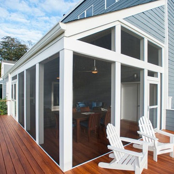
 Design Builders, Inc.
Large transitional screened-in back porch idea in DC Metro with decking and a roof extension
 Advance Design Studio, Ltd.
After six years of living in their Huntley IL home, Chris and Meghan were tired of their dark, dingy, outdated kitchen and it was finally time for a long-anticipated change. “The kitchen is the place where we live, it’s where we do everything,” Meghan said. “It was important that it be a space where we wanted to be.” Meghan loves cooking and enjoys including their girls in healthy meal prepping, this led them to want a brighter, more enjoyable kitchen with increased functionality and improved storage.
For Chris especially, the laundry room was an entirely dysfunctional eyesore. “We had a washer and a dryer, but it was all kind-of cobbled together!” Chris said. “There were always laundry piles everywhere, we weren’t really sure what we wanted to do in there, but it was time for us to make a change.” The mess of the space was stressful every time they walked in the door from the garage each day. Kids’ backpacks and shoes piled up haphazardly in the makeshift boot-bench closet left the family feeling disorganized and stressed. They needed space for folding clothes and locker cubbies to help keep the family organized.
Having known Christine and Todd in the Huntley community for years, Chris and Meghan were familiar with their work. “We already trusted them personally and having seen their projects for years we knew they did top notch work. After we reviewed the initial round of designs, we knew that hiring them was definitely the right choice,” Meghan and Chris said. Although Chris had done a lot of work in their home himself, the kitchen and laundry room renovation was such a large undertaking that he didn’t want to steal time away from his family to spend what would surely be many long weekends doing the job himself. “That would not have been a wise choice for us,” Chris laughed.
“Our designer, Michelle was very, very, easy to work with; anything we wanted to see or weren’t sure about, she went above and beyond to make this easy for us. She was easy to get hold of and always quick to respond,” the couple said. Michelle pulled ideas that mirrored the couple’s taste and style and was adept at directing the couple to limited choices that didn’t overwhelm them and kept the process moving. “I have a hard time making decisions. Michelle made the decision-making process so easy. I loved how she listened to what I liked and then presented three great options for me to choose from,” Meghan said.
The main objectives for the kitchen were better storage solutions, they wanted the space to reflect their lifestyle and taste, and they wanted it to last for years with low maintenance. One of the first steps in creating a more functional kitchen was relocating the refrigerator, creating an improved workflow for the busy family.
“We didn’t know that we could even move the refrigerator to a new location where it is now, that was something that we never would have thought of,” Chris said. “The new refrigerator location makes the kitchen feel so much bigger. We didn’t add any space, but our whole kitchen with the new design just seems like it’s so much larger than before!” Meghan said.
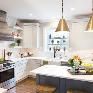
The perimeter mist colored cabinets helped warm and brighten the entire room, while the graphite colored cabinets on the island added contrast. Using this fresh, clean color palette satisfied the couple’s desire for a bright space that was the exact opposite of what they had before. Organization accessories were also added to the cabinets such as a spice drawer tray and roll outs to create hidden convenience.
“I absolutely love the hidden spices – it makes cooking so much more enjoyable!” Chris said. “And all the pull outs, and the double trash bin, who would think you could get so excited about organization!” the couple said in unison.
One thing they hated in their original kitchen was how dark the space felt. Added lighting on the ceiling with the new light fixtures combined with the lighter cabinetry colors throughout solved this problem. “Our new kitchen has this warm, almost cozy feeling that our old kitchen never had, it’s just a space that I love spending my time in now,” Meghan said. The light airy feeling was accentuated with the use of floating white shelves on either side of the decorative range hood. “We have so much cabinetry space, the new design is amazing we actually have more storage space than we will ever need,” Meghan said.
The island was extended to create more work surface and added space for stool seating. “The new island changes how we live. Now the kids can be in the kitchen with us, doing homework, eating breakfast, and the three of us have special dinners there when Chris is working late,” Meghan said.
The Carrara Marmi Quartz countertops were chosen because they are, not only beautiful, but are made from hard-working material that doesn’t require maintenance. The white subway tile backsplash that wraps to the ceiling behind the focal point cooktop range/hood compliments the crisp white countertops perfectly, while brushed brass hardware and light fixtures keep the design fresh and new.
The couple had a few fears at the beginning of the project, as most homeowners do. Their biggest fear was being out of their kitchen and laundry room for an extended time. The crew made it very easy for the family to work in a limited space keeping the washer and dryer hooked up the majority of the time, and also getting appliances working with minimal downtime.
“They above and beyond accommodated us to get us through the process,” Meghan said. “They did a great job making sure we were as comfortable as possible throughout the process,” Chris added.
“Our project manager DJ did a great job. He was very good at updating us on schedule changes, getting guys in as quickly as possible. Everyone that stepped in the house was nice and did great work,” said Chris. They thought Advance’s carpenter was phenomenal and were impressed when he took a conceptual idea from a photograph and worked with designer Michelle to create a one of a kind range/hood that has become the topic of conversation with friends and family who visit the new kitchen. “He was in our house literally every day for several weeks. He was easy to work with and good at what he did,” Meghan and Chris said.
The focal point of the kitchen; a hand-crafted, custom-built ventilation hood was clad with handpicked reclaimed barnwood. Advance Design’s carpenter built the framework and the cladding to create a one-of-a-kind design element that the couple loves.
“I think it was especially fun for him to create something unique from scratch, showcasing his talent in this area,” Meghan said. “I love that my kitchen is not like everyone else’s. I got to pick out the wood on my hood and watch it being built and was able to choose what pieces of wood went where on it. It’s totally unique.”
Red Oak flooring was toothed-in throughout the kitchen and the rest of the first floor anywhere changes were made. Then the whole floor was refinished to tone down the orange undertones in the existing floor stain, ultimately changing the color complexion of the entire first floor. The result is a completely new feeling to the entire home.
Renovating the laundry room was extremely important to Meghan and Chris, but they had trouble visualizing what the possibilities were for the seemingly small space. Michelle produced beautiful 3D illustrations that helped them envision the space in a whole new way.
“I must have told Michelle 100 times that I am a visual person, seeing the designs in 3D made it so easy to make decisions and see what we could really do with our space,” Meghan said.
A dividing wall and doorway were removed between the existing laundry room and hallway formerly containing a coat closet, providing space to design specialized graphite colored cabinetry matching the kitchen island to house custom storage cubbies for each family member. Adding the tall utility cabinetry in the new laundry area helped solve the storage issue, tucking away cleaning supplies, household items, and even the cat got its own cubby.
“I love how everything is now hidden in its own space. I can’t tell you how much I hated coming home and seeing everything sitting around on counters,” Chris said.
Electrical outlets were planned for the inside of utility cabinets, so devices could charge in hidden locations. Stacking the washer and dryer allowed for wider countertop space to provide a folding area and a special space for clothes to hang. “The way I do laundry has been completely transformed! I can actually fold clothes and hang them now right out of the washer and dryer,” Meghan said.
“The end result in the kitchen and the laundry/mud room was an updated light and bright space, with a smarter work flow that better meets the needs of this family,” Michelle said.
“I would totally recommend Advance Design,” Meghan said. “Sometimes I sit and just look at my kitchen and laundry room and think ‘Wow, I can’t believe I get to live here!’ It’s an understatement to say we love our new space.”
 Sweetlake Interior Design LLC
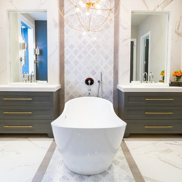
Master bathroom design & build in Houston Texas. This master bathroom was custom designed specifically for our client. She wanted a luxurious bathroom with lots of detail, down to the last finish. Our original design had satin brass sink and shower fixtures. The client loved the satin brass plumbing fixtures, but was a bit apprehensive going with the satin brass plumbing fixtures. Feeling it would lock her down for a long commitment. So we worked a design out that allowed us to mix metal finishes. This way our client could have the satin brass look without the commitment of the plumbing fixtures. We started mixing metals by presenting a chandelier made by Curry & Company, the "Zenda Orb Chandelier" that has a mix of silver and gold. From there we added the satin brass, large round bar pulls, by "Lewis Dolin" and the satin brass door knobs from Emtek. We also suspended a gold mirror in the window of the makeup station. We used a waterjet marble from Tilebar, called "Abernethy Marble." The cobalt blue interior doors leading into the Master Bath set the gold fixtures just right.
 CubeDepot
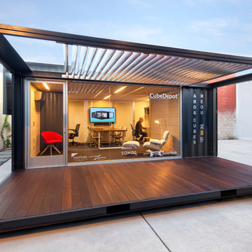
Structurally sound and aesthetically pleasing, this modular office space offers a rare blend of style, security, and simplicity. This modular office space is self- contained, contemporary, and cost- efficient. Installed with sliding glass windows and glass door for a clean and modern look.


 Flavin Architects
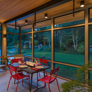
A modern screen porch beautifully links this Wellesley home to its Garden. Extending overhangs that are clad in red cedar emphasize the indoor – outdoor connection and keep direct sun out of the interior. The grey granite floor pavers extend seamlessly from the inside to the outside. A custom designed steel truss with stainless steel cable supports the roof. The insect screen is black nylon for maximum transparency.
Photo by: Nat Rea Photography
 Case Architects & Remodelers
Photography by Stacy Zarin Goldberg
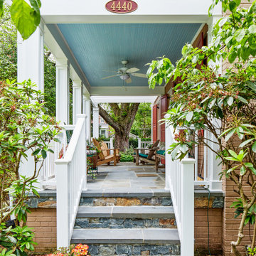
Elegant exterior home photo in DC Metro
Elegant exterior home photo in DC Metro
 Ginkgo Leaf Studio
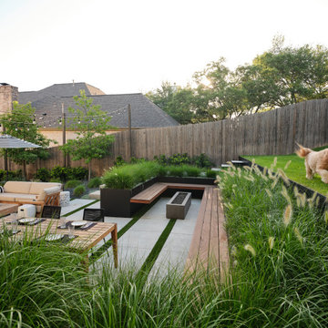
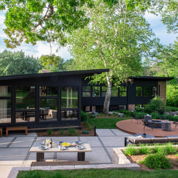
The new patio space is greatly expanded over what was original to the home.
Renn Kuhnen Photography
This is an example of a mid-sized mid-century modern full sun backyard landscaping in Milwaukee for summer.
This is an example of a mid-sized mid-century modern full sun backyard landscaping in Milwaukee for summer.
43