
Search results for "Feel intentional" in Home Design Ideas

 Metro Interiors
I first came to Mary Beth’s home to help with her living room. But that changed when we looked at the office, and started talking about how it wasn’t working. When I stepped it to take a look, I immediately noticed how heavy and cramped it felt. Too many large pieces and clutter created a feeling of overwhelm.
It needed to be redone. Since Mary Beth works full time from home, I wanted to help her make this a space where she could be productive, and feel good about being in for long periods of time.
The end result is an impressive transformation – and it was done very affordably. “Prior to the re-design, my office was a cluttered, disorganized mess that really said nothing about who I am. I tended to use it as a catch all for things I didn’t know where to put or what to do with,” tells Mary Beth. Now, she says it feels so much better working in there, and even got rave reviews from her family when they visited for the Holidays. “It’s now well-organized, bright and seems to flow in the way it’s laid out”.
To remove clutter and the “heavy” feeling, two large bookcases and the couch were removed, and lots of time was spent decluttering. A nicer bookcase was moved to a place that made more sense; together with a cozy rug and upholstered chair we created a lovely reading area, a place she can also relax.
A neutral green on the walls is also soothing, and brings an element of nature inside. Groupings of photos from her travels hang on the walls now, and a larger piece of art creates a focal point. A piece I was delighted to help her find – hand-painted but affordably priced – it makes Mary Beth feel happy, “The art above the desk is beautiful, and it showed me that big doesn’t have to be overwhelming”.
A new desk, relocated to the “command position” in the room (a more powerful placement) is also less weighty than what she had before, but functionally allows for more workspace. We upgraded her desk chair to a high-back leather one. In total, this setup was intentional, for an enhanced feeling of being in control. Mary Beth notes, “I love the desk and how it sits. I can either work by the window and look out at the garden and at the birds, which I love to do, or look out into the living room and be part of anything going on there”.
On the windows we replaced metal blinds with woven roman shades, also with a natural look. They’re cordless, so nothing hangs in front of the beautiful backyard view, and they feel lighter. With the new office design, we also gave Mary Beth plenty of places for storage. Now the things she does use and need don’t need to be out in plain sight, cluttering things up.
In the end, we accomplished our goal of creating a space for Mary Beth conducive to work and also enjoyable. She says, “My work attitude and feeling of what the office is has definitely changed – I like to be there even when I’m not working. It doesn’t feel only like an office but is actually a relaxing place to be”.
 MAVERICK DESIGN
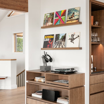
Custom oak millwork creates a dedicated listening zone with an integrated turntable stand, open record storage, and floating display shelves. Designed to feel intentional yet effortless, this built-in balances function and personal expression while maintaining clean lines and visual calm. Warm wood tones, simple detailing, and thoughtful proportions reflect Maverick Design’s modern West Coast approach to residential interiors in Victoria, BC.

 Remodel Works Bath & Kitchen
This small guest bathroom was remodeled with the intent to create a modern atmosphere. Floating vanity and a floating toilet complement the modern bathroom feel. With a touch of color on the vanity backsplash adds to the design of the shower tiling. www.remodelworks.com
Find the right local pro for your project
 Susan Yeley Homes
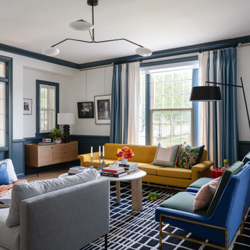
We honored the building’s history where possible, keeping original bones and character wherever possible, then layered in the clients’ distinct creative identity. On the main floor, we designed spaces that shift seamlessly from workday to reception-ready. Lighting was planned with intention, to preserve the original plaster ceilings and spotlight rotating installations without sacrificing ambient warmth. Custom built-ins maximize functionality while maintaining a distinctly un-officey feel. Upstairs, the artist apartment is a thoughtful retreat: adaptable, light-filled, and comfortable, with just enough quirk to spark inspiration. Even the basement—home to a full photography studio and workroom—balances technical needs with aesthetic ease. Throughout, we used color, texture, and collected pieces to ensure each room feels curated, not staged. Personal, not polished.

 Regan Baker Design Inc.
Intentional. Elevated. Artisanal.
With three children under the age of 5, our clients were starting to feel the confines of their Pacific Heights home when the expansive 1902 Italianate across the street went on the market. After learning the home had been recently remodeled, they jumped at the chance to purchase a move-in ready property. We worked with them to infuse the already refined, elegant living areas with subtle edginess and handcrafted details, and also helped them reimagine unused space to delight their little ones.
Elevated furnishings on the main floor complement the home’s existing high ceilings, modern brass bannisters and extensive walnut cabinetry. In the living room, sumptuous emerald upholstery on a velvet side chair balances the deep wood tones of the existing baby grand. Minimally and intentionally accessorized, the room feels formal but still retains a sharp edge—on the walls moody portraiture gets irreverent with a bold paint stroke, and on the the etagere, jagged crystals and metallic sculpture feel rugged and unapologetic. Throughout the main floor handcrafted, textured notes are everywhere—a nubby jute rug underlies inviting sofas in the family room and a half-moon mirror in the living room mixes geometric lines with flax-colored fringe.
On the home’s lower level, we repurposed an unused wine cellar into a well-stocked craft room, with a custom chalkboard, art-display area and thoughtful storage. In the adjoining space, we installed a custom climbing wall and filled the balance of the room with low sofas, plush area rugs, poufs and storage baskets, creating the perfect space for active play or a quiet reading session. The bold colors and playful attitudes apparent in these spaces are echoed upstairs in each of the children’s imaginative bedrooms.
Architect + Developer: McMahon Architects + Studio, Photographer: Suzanna Scott Photography
 Remodel Works Bath & Kitchen
This small guest bathroom was remodeled with the intent to create a modern atmosphere. Floating vanity and a floating toilet complement the modern bathroom feel. With a touch of color on the vanity backsplash adds to the design of the shower tiling. www.remodelworks.com
 Armitage Interiors - Home Design & Renovation
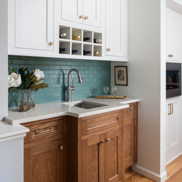
This carefully guided renovation brought cohesion and clarity, blending timeless detail with modern functionality for a home that feels refreshed, intentional, and enduring. A bright, craftsman-inspired kitchen with white upper cabinets, warm wood bases, a teal tile backsplash, and a central island topped with leathered quartz, blending warmth and modern polish.
Sponsored
Delaware, OH

Buckeye Basements, Inc.
Central Ohio's Basement Finishing ExpertsBest Of Houzz '13-'21
 Make Your Place Livable LLC
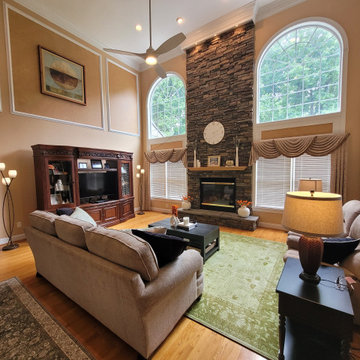
This traditional living room redecoration was designed to create a brighter, more inviting space while maintaining the home's classic character and architectural features. The homeowners wanted the room to feel less dark and visually heavy and better reflect their current lifestyle.
The redesign focused on lightening the furniture, introducing stronger contrast, and incorporating a statement area rug to anchor the seating arrangement. By balancing color, texture, and scale, the room gained a more cohesive and intentional feel while allowing the stone fireplace to remain a focal point.
The result is a comfortable, elegant living room that feels open, welcoming, and well-suited for both everyday living and entertaining.

 DK Homes
This stand-alone condominium takes a bold step with dark, modern farmhouse exterior features. Once again, the details of this stand alone condominium are where this custom design stands out; from custom trim to beautiful ceiling treatments and careful consideration for how the spaces interact. The exterior of the home is detailed with dark horizontal siding, vinyl board and batten, black windows, black asphalt shingles and accent metal roofing. Our design intent behind these stand-alone condominiums is to bring the maintenance free lifestyle with a space that feels like your own.
 Susan Yeley Homes
We honored the building’s history where possible, keeping original bones and character wherever possible, then layered in the clients’ distinct creative identity. On the main floor, we designed spaces that shift seamlessly from workday to reception-ready. Lighting was planned with intention, to preserve the original plaster ceilings and spotlight rotating installations without sacrificing ambient warmth. Custom built-ins maximize functionality while maintaining a distinctly un-officey feel. Upstairs, the artist apartment is a thoughtful retreat: adaptable, light-filled, and comfortable, with just enough quirk to spark inspiration. Even the basement—home to a full photography studio and workroom—balances technical needs with aesthetic ease. Throughout, we used color, texture, and collected pieces to ensure each room feels curated, not staged. Personal, not polished.
 Regan Baker Design Inc.
Intentional. Elevated. Artisanal.
With three children under the age of 5, our clients were starting to feel the confines of their Pacific Heights home when the expansive 1902 Italianate across the street went on the market. After learning the home had been recently remodeled, they jumped at the chance to purchase a move-in ready property. We worked with them to infuse the already refined, elegant living areas with subtle edginess and handcrafted details, and also helped them reimagine unused space to delight their little ones.
Elevated furnishings on the main floor complement the home’s existing high ceilings, modern brass bannisters and extensive walnut cabinetry. In the living room, sumptuous emerald upholstery on a velvet side chair balances the deep wood tones of the existing baby grand. Minimally and intentionally accessorized, the room feels formal but still retains a sharp edge—on the walls moody portraiture gets irreverent with a bold paint stroke, and on the the etagere, jagged crystals and metallic sculpture feel rugged and unapologetic. Throughout the main floor handcrafted, textured notes are everywhere—a nubby jute rug underlies inviting sofas in the family room and a half-moon mirror in the living room mixes geometric lines with flax-colored fringe.
On the home’s lower level, we repurposed an unused wine cellar into a well-stocked craft room, with a custom chalkboard, art-display area and thoughtful storage. In the adjoining space, we installed a custom climbing wall and filled the balance of the room with low sofas, plush area rugs, poufs and storage baskets, creating the perfect space for active play or a quiet reading session. The bold colors and playful attitudes apparent in these spaces are echoed upstairs in each of the children’s imaginative bedrooms.
Architect + Developer: McMahon Architects + Studio, Photographer: Suzanna Scott Photography

 David R. Lamb, Landscape Architect
This propery is situated on the south side of Centre Island at the edge of an oak and ash woodlands. orignally, it was three properties having one house and various out buildings. topographically, it more or less continually sloped to the water. Our task was to creat a series of terraces that were to house various functions such as the main house and forecourt, cottage, boat house and utility barns.
The immediate landscape around the main house was largely masonry terraces and flower gardens. The outer landscape was comprised of heavily planted trails and intimate open spaces for the client to preamble through. As the site was largely an oak and ash woods infested with Norway maple and japanese honey suckle we essentially started with tall trees and open ground. Our planting intent was to introduce a variety of understory tree and a heavy shrub and herbaceous layer with an emphisis on planting native material. As a result the feel of the property is one of graciousness with a challenge to explore.
 Regan Baker Design Inc.
Intentional. Elevated. Artisanal.
With three children under the age of 5, our clients were starting to feel the confines of their Pacific Heights home when the expansive 1902 Italianate across the street went on the market. After learning the home had been recently remodeled, they jumped at the chance to purchase a move-in ready property. We worked with them to infuse the already refined, elegant living areas with subtle edginess and handcrafted details, and also helped them reimagine unused space to delight their little ones.
Elevated furnishings on the main floor complement the home’s existing high ceilings, modern brass bannisters and extensive walnut cabinetry. In the living room, sumptuous emerald upholstery on a velvet side chair balances the deep wood tones of the existing baby grand. Minimally and intentionally accessorized, the room feels formal but still retains a sharp edge—on the walls moody portraiture gets irreverent with a bold paint stroke, and on the the etagere, jagged crystals and metallic sculpture feel rugged and unapologetic. Throughout the main floor handcrafted, textured notes are everywhere—a nubby jute rug underlies inviting sofas in the family room and a half-moon mirror in the living room mixes geometric lines with flax-colored fringe.
On the home’s lower level, we repurposed an unused wine cellar into a well-stocked craft room, with a custom chalkboard, art-display area and thoughtful storage. In the adjoining space, we installed a custom climbing wall and filled the balance of the room with low sofas, plush area rugs, poufs and storage baskets, creating the perfect space for active play or a quiet reading session. The bold colors and playful attitudes apparent in these spaces are echoed upstairs in each of the children’s imaginative bedrooms.
Architect + Developer: McMahon Architects + Studio, Photographer: Suzanna Scott Photography

Sponsored
Sunbury, OH

J.Holderby - Renovations
Franklin County's Leading General Contractors - 2X Best of Houzz!
 Robinson Environmental Design
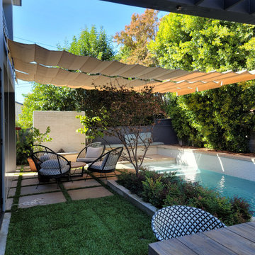
A thoughtfully designed small backyard transformed into a refined outdoor living space. Every element was carefully composed to maximize functionality without compromising on design.
Large-format concrete pavers set in a structured grid create a sense of order and openness, while turf joints soften the layout and introduce contrast. A linear pool runs along the edge of the space, visually elongating the yard and enhancing the feeling of depth.
Overhead, a custom fabric shade system filters light and adds movement, creating a comfortable lounge environment throughout the day. A smooth, light-toned fireplace acts as a subtle focal point, anchoring the seating area without overwhelming the scale of the garden.
Layered planting and vertical greenery provide privacy and softness, helping the space feel intimate yet open. The result is a highly efficient, modern landscape—where every square foot is intentional, and the garden feels larger than it is.
 Make Your Place Livable LLC
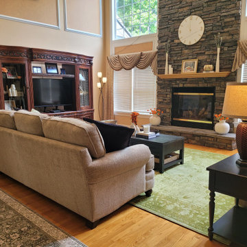
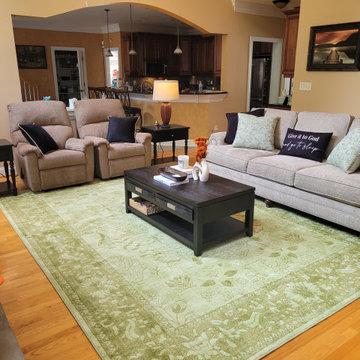
This traditional living room redecoration was designed to create a brighter, more inviting space while maintaining the home's classic character and architectural features. The homeowners wanted the room to feel less dark and visually heavy and better reflect their current lifestyle.
The redesign focused on lightening the furniture, introducing stronger contrast, and incorporating a statement area rug to anchor the seating arrangement. By balancing color, texture, and scale, the room gained a more cohesive and intentional feel while allowing the stone fireplace to remain a focal point.
The result is a comfortable, elegant living room that feels open, welcoming, and well-suited for both everyday living and entertaining.
 Make Your Place Livable LLC
This traditional living room redecoration was designed to create a brighter, more inviting space while maintaining the home's classic character and architectural features. The homeowners wanted the room to feel less dark and visually heavy and better reflect their current lifestyle.
The redesign focused on lightening the furniture, introducing stronger contrast, and incorporating a statement area rug to anchor the seating arrangement. By balancing color, texture, and scale, the room gained a more cohesive and intentional feel while allowing the stone fireplace to remain a focal point.
The result is a comfortable, elegant living room that feels open, welcoming, and well-suited for both everyday living and entertaining.
 Susan Yeley Homes
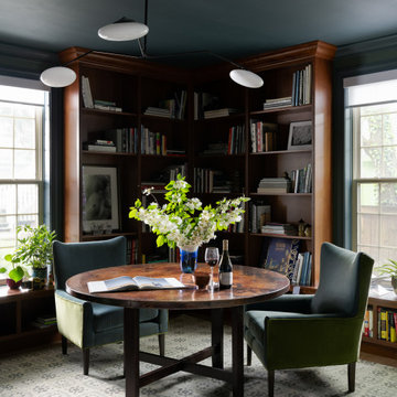
We honored the building’s history where possible, keeping original bones and character wherever possible, then layered in the clients’ distinct creative identity. On the main floor, we designed spaces that shift seamlessly from workday to reception-ready. Lighting was planned with intention, to preserve the original plaster ceilings and spotlight rotating installations without sacrificing ambient warmth. Custom built-ins maximize functionality while maintaining a distinctly un-officey feel. Upstairs, the artist apartment is a thoughtful retreat: adaptable, light-filled, and comfortable, with just enough quirk to spark inspiration. Even the basement—home to a full photography studio and workroom—balances technical needs with aesthetic ease. Throughout, we used color, texture, and collected pieces to ensure each room feels curated, not staged. Personal, not polished.

 Regan Baker Design Inc.
Intentional. Elevated. Artisanal.
With three children under the age of 5, our clients were starting to feel the confines of their Pacific Heights home when the expansive 1902 Italianate across the street went on the market. After learning the home had been recently remodeled, they jumped at the chance to purchase a move-in ready property. We worked with them to infuse the already refined, elegant living areas with subtle edginess and handcrafted details, and also helped them reimagine unused space to delight their little ones.
Elevated furnishings on the main floor complement the home’s existing high ceilings, modern brass bannisters and extensive walnut cabinetry. In the living room, sumptuous emerald upholstery on a velvet side chair balances the deep wood tones of the existing baby grand. Minimally and intentionally accessorized, the room feels formal but still retains a sharp edge—on the walls moody portraiture gets irreverent with a bold paint stroke, and on the the etagere, jagged crystals and metallic sculpture feel rugged and unapologetic. Throughout the main floor handcrafted, textured notes are everywhere—a nubby jute rug underlies inviting sofas in the family room and a half-moon mirror in the living room mixes geometric lines with flax-colored fringe.
On the home’s lower level, we repurposed an unused wine cellar into a well-stocked craft room, with a custom chalkboard, art-display area and thoughtful storage. In the adjoining space, we installed a custom climbing wall and filled the balance of the room with low sofas, plush area rugs, poufs and storage baskets, creating the perfect space for active play or a quiet reading session. The bold colors and playful attitudes apparent in these spaces are echoed upstairs in each of the children’s imaginative bedrooms.
Architect + Developer: McMahon Architects + Studio, Photographer: Suzanna Scott Photography

 Artisan Kitchens and Baths
Cabinetry – Kemper Echo Cabinetry
Hardware- Jeffrey Alexander stainless bar pulls
Countertops- Cambria Quartz Torquay
Sinks and Faucets- Blanco Anthracite undermount Silgranite sink. Moen Faucet Nickel
Appliances- Samsung French door refrigerator in stainless, Samsung slide in gas range, Whirlpool wall Oven/ Microwave combination, Bosch 500 series dishwasher, and Broan Elite series pro range hood.
Flooring- prefinished 3/4 oak hardwood.
Backsplash- Natural stone subway tile.
-Inspiration and Design Challenges
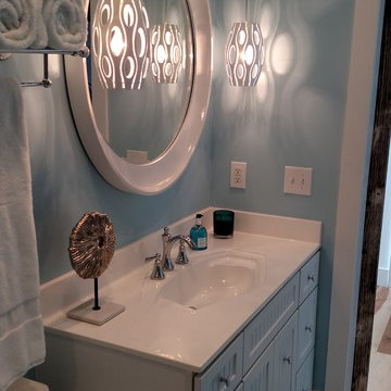
The Original kitchen in this 1970’s raised ranch was bright an open yet left the dining room closed off from the home and wasn’t large enough for the island that Joe and his wife would have liked. Joe and Tim from THI Co. had developed a plan relocate the kitchen to one exterior wall and allow for an island that would function for both seating and entertaining. The challenge we faced was the original windows of the kitchen had to completely go. Relying solely on the open floor plan for natural light, Tim opened up the Dining room wall, removed the dividing half wall to the family room and widened doorways to the great room leading from the kitchen and dining room. The removal of the soffits and consistent wood flooring help tie together the adjacent rooms. The plan was for simple clean lines with subtle detail brought out in the trim on the cabinetry and custom 10ft island back panel. Finding a set of appliances was the next task. The kitchen was designed with the intention of being used. The Whirlpool convection wall ovens give the kitchen 3 possible functioning ovens with along with the Samsung 5 burner range. The end result is a simple elegant design that has all the functionality of galley kitchen yet the feel of an open kitchen with twice the square footage.
 TR Construction Group
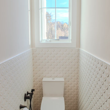
Minimal but architectural. This bathroom feels clean, sculptural, and quietly luxurious — very serene. It's a narrow space, but the design makes it feel intentional and elevated. The walls are adorned with white 3D tile featuring a repeating petal pattern. The tile is hard and solid, but the carved-in geometry creates soft shadows, giving it that tactile, hand-carved feel. A tall window above the toilet floods the room with natural light, which really brings out the depth of the tile pattern and keeps everything feeling airy and calm. The floor tile is neutral and mute, grounding the room so the walls don't feel busy. Right outside this room, a full seated shower with a duo sink.
60