
Search results for "Inefficient" in Home Design Ideas
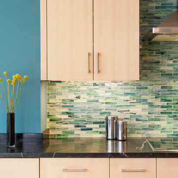
 Byggmeister Inc
Photo by Mike Casey
Cramped, uncomfortable, and out of date: when the owners of this home approached us about renovating their kitchen and adjoining sunroom, these were high on their list of complaints.
OPENING UP THE KITCHEN
Our plan kept the kitchen in the same location but took down the walls between both the dining room and the sunroom to create an expansive multi-purpose space with spectacular views to conservation land along the back of the property. We removed the powder room and in its place created a window-lined hallway to the living room—opening up direct access between these two previously disconnected spaces. We then built a new half bath between these two rooms, with a door along the back hallway. The result is a more private powder room that is easier to access than before.
Significantly improved cabinetry provides ample storage for both human and canine needs. An island countertop is functional and pleasant, enabling the owners to prep for and clean up from dinner all while enjoying the view of the woods behind their house.
CREATING COMFORT
We also completely rebuilt the sunroom, thickening the framing to allow for extra insulation and raising the roof to accommodate a higher ceiling and tall windows that let in as much natural light as the skylights they replaced, but much less of the solar gain that had made the room so intolerable in the summer.
We improved visual connections between spaces and admitted more natural light by converting the framing of the main stairway from full to half walls. We also insulated the attic and replaced an aging, inefficient central air conditioning system with ductless minisplit heat pumps, which can also be used as supplemental heat.
All in all, this was our kind of project: we made the home more attractive, more comfortable, and more energy-efficient—all over the course of a single, well-integrated project.
 Simmons and Company
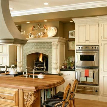
French manor styling was the result of the client's love of all things French, down to the chandelier found in a little shop in Paris. The focus on a serious working kitchen required plenty of attention to detail while layering on the opulence. It's really a French pastry.
The teak butcher block island top provides a lifetime of food preparation. Not able to find a hood with the right proportions Simmons & Co. designed a custom stainless hood with the correct gentle curve. Authentic French hardware was plated in pewter to soften the hardware's impact. Generous pantry storage and the oven wall replaced an inefficient walk in pantry. A dust bin access to the central vacuum system is tucked into the toe kick under the pantry and an emphasis was placed on the toe kick designs to eliminate the typical awkward appliance toe kick resolutions. Note the paneled dishwasher door to the right and left of the sink. When closed, the dishwasher disappears entirely. For those chilly winter mornings in Lake Sherwood an authentic English coal fire basket adding both beauty and function with the tile selection and color coordination completing the "Interior Hardscape".
The chandelier is symbolic of the fun we all had working with a client whose shining spirit and creativity guided our goal of "doing the right thing" at each and every a decision. What a creative project should be all about. Oh, yes, the chandelier. Look closely to find old colanders, pie tins, tea cups and parts and pieces from and old working kitchen.
 TVL Creative Ltd.
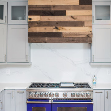
This project is an incredible transformation and the perfect example of successful style mixing! This client, and now a good friend of TVL (as they all become), is a wonderfully eclectic and adventurous one with immense interest in texture play, pops of color, and unique applications. Our scope in this home included a full kitchen renovation, main level powder room renovation, and a master bathroom overhaul. Taking just over a year to complete from the first design phases to final photos, this project was so insanely fun and packs an amazing amount of fun details and lively surprises. The original kitchen was large and fairly functional. However, the cabinetry was dated, the lighting was inefficient and frankly ugly, and the space was lacking personality in general. Our client desired maximized storage and a more personalized aesthetic. The existing cabinets were short and left the nice height of the space under-utilized. We integrated new gray shaker cabinets from Waypoint Living Spaces and ran them to the ceiling to really exaggerate the height of the space and to maximize usable storage as much as possible. The upper cabinets are glass and lit from within, offering display space or functional storage as the client needs. The central feature of this space is the large cobalt blue range from Viking as well as the custom made reclaimed wood range hood floating above. The backsplash along this entire wall is vertical slab of marble look quartz from Pental Surfaces. This matches the expanse of the same countertop that wraps the room. Flanking the range, we installed cobalt blue lantern penny tile from Merola Tile for a playful texture that adds visual interest and class to the entire room. We upgraded the lighting in the ceiling, under the cabinets, and within cabinets--we also installed accent sconces over each window on the sink wall to create cozy and functional illumination. The deep, textured front Whitehaven apron sink is a dramatic nod to the farmhouse aesthetic from KOHLER, and it's paired with the bold and industrial inspired Tournant faucet, also from Kohler. We finalized this space with other gorgeous appliances, a super sexy dining table and chair set from Room & Board, the Paxton dining light from Pottery Barn and a small bar area and pantry on the far end of the space. In the small powder room on the main level, we converted a drab builder-grade space into a super cute, rustic-inspired washroom. We utilized the Bonner vanity from Signature Hardware and paired this with the cute Ashfield faucet from Pfister. The most unique statements in this room include the water-drop light over the vanity from Shades Of Light, the copper-look porcelain floor tile from Pental Surfaces and the gorgeous Cashmere colored Tresham toilet from Kohler. Up in the master bathroom, elegance abounds. Using the same footprint, we upgraded everything in this space to reflect the client's desire for a more bright, patterned and pretty space. Starting at the entry, we installed a custom reclaimed plank barn door with bold large format hardware from Rustica Hardware. In the bathroom, the custom slate blue vanity from Tharp Cabinet Company is an eye catching statement piece. This is paired with gorgeous hardware from Amerock, vessel sinks from Kohler, and Purist faucets also from Kohler. We replaced the old built-in bathtub with a new freestanding soaker from Signature Hardware. The floor tile is a bold, graphic porcelain tile with a classic color scheme. The shower was upgraded with new tile and fixtures throughout: new clear glass, gorgeous distressed subway tile from the Castle line from TileBar, and a sophisticated shower panel from Vigo. We finalized the space with a small crystal chandelier and soft gray paint. This project is a stunning conversion and we are so thrilled that our client can enjoy these personalized spaces for years to come.
Find the right local pro for your project
 Castle Building & Remodeling
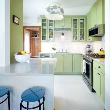
With sustainability in mind, this cheery and bright eclectic kitchen reused some elements from their old space to minimize their footprint. This craftsman bungalow had an old updated kitchen that offered a very inefficient layout with an awkward opening to the existing dining room. There was also a very shallow coat closet between the kitchen and living room that could not even fit a coat.
The new kitchen layout captured that unusable closet space, as well as chimney space that was no longer needed for mechanical venting. A more traditional work triangle was created by rearranging the placement of the sink, gas range and refrigerator. A new archway that mimics an original archway at the dining room built-in now highlights the bright and cheery kitchen space while providing a new seating area at a peninsula that is opened up between the kitchen and dining room.
The homeowner loved the vintage green color in their old cabinetry and wanted to keep that electric vintage styling in their new space. A custom, handmade tile backsplash in a neutral color adds texture while still letting the cabinetry be the star of the kitchen. Sustainability in mind, choices like Marmoleum flooring, formaldehyde free plywood cabinet boxes, and local sourcing for the tile were important to the clients. In addition to the kitchen project, they also added solar panels from All Energy Solar.
The clients reused some elements from their old space also to keep their footprint minimal. The old gas range was reused, the cabinetry hardware, and a beautiful patterned drum shade light that sits in the center of the ceiling adding even more charm to the design. In the end, the thoughtfulness of style, materials and function, helped to give this special house an equally special place to cook and entertain.
 Dwellify
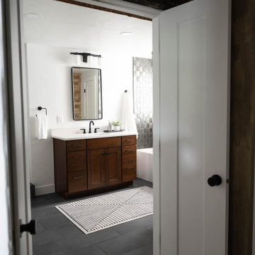
In this home remodeling project, the homeowners sought to transform their bathroom into an Industrial-style space. The original bathroom was dark, dated, and inefficient in its layout, prompting a complete overhaul to achieve a modern and functional feel. To optimize the space, unnecessary walls were knocked down, opening the area and allowing for a more logical flow. To preserve some of the home's historical elements, carefully selected materials were used, seamlessly blending the old with the new. A distinctive feature of the design was the incorporation of exposed pipes, not only as an industrial aesthetic element but also to create more space in the shower. The result is a bathroom that pays homage to the history of the home while introducing eye-catching tiles and a stylish vanity area, successfully combining industrial design elements with the practicality and aesthetics desired by the homeowners.
 The Builder Spot
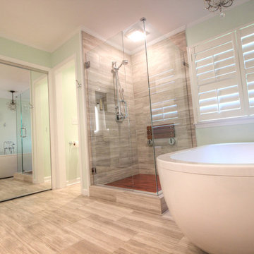
After photos of this master bathroom renovation. We took your standard 90s bathroom, with inefficient use of space and made it cleaner, brighter, and a little more modern.
 Sosna Inc
This Kitchen renovation was created for a busy family who wanted their home to better support the way they lived.
With two children, a dog, and demanding professional schedules, the Kitchen was the heart of their home. However, the existing space felt outdated, inefficient, and disconnected from their personal style. The heavy wood finishes and worn materials no longer reflected the look or functionality they wanted.
The goal was to create a Kitchen that felt fresh and elevated, while still looking like it had always belonged in the home.
The new design focused on improving functionality while carefully selecting materials that blended seamlessly with the existing finishes. White oak veneer Kitchen cabinetry brought warmth and timeless character, while a natural dolomite countertop became the centrepiece of the space.
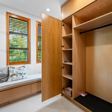
Custom cabinetry was also added to the Mudroom, creating additional storage and helping the home function better for everyday life.
The Clients had a strong vision and a preference for natural materials rather than standard builder-grade finishes. Through thoughtful conversations and careful sourcing, we helped bring that vision to life while balancing design goals and budget considerations.
The finished Kitchen is warm, functional, and timeless. It is a space designed not only to look beautiful but to support busy mornings, family meals, and everyday moments.
Project Details:
? Kitchen Renovation
? White Oak Veneer Cabinetry
? Natural Dolomite Countertop
? Custom Mudroom Cabinetry
? Timeless, Functional Design
Sosna Home Renovations
7250 Keele Street, Unit 372
Vaughan, ON L4K 1Z8
website: www.sosna.ca
phone: 416-888-7366 extension 1
email: contact@sosna.ca
 Chester County Kitchen & Bath
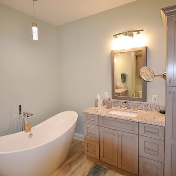
This client's builder grade original bathroom needed to be brought back to life. We took this bathrooms original small stall shower and expanded the size. Using a neo angle shape allowed us to expand the shower size without having to relocate the toilet. The original large tiled tub deck was an inefficient use of space. We installed a freestanding tub which allowed us to add a linen pantry and increase the vanity sizes. New granite countertops and shower wall caps along with Fabuwood cabinetry in the Galaxy Horizon door style complement the new tiled shower. The client chose vinyl plank flooring and it looks great as well as being water proof, warmer and softer under foot, and ultra durable. What a huge transformation! Now this bath is revitalized.
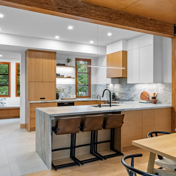 Sosna Inc
This Kitchen renovation was created for a busy family who wanted their home to better support the way they lived.
With two children, a dog, and demanding professional schedules, the Kitchen was the heart of their home. However, the existing space felt outdated, inefficient, and disconnected from their personal style. The heavy wood finishes and worn materials no longer reflected the look or functionality they wanted.
The goal was to create a Kitchen that felt fresh and elevated, while still looking like it had always belonged in the home.
The new design focused on improving functionality while carefully selecting materials that blended seamlessly with the existing finishes. White oak veneer Kitchen cabinetry brought warmth and timeless character, while a natural dolomite countertop became the centrepiece of the space.
Custom cabinetry was also added to the Mudroom, creating additional storage and helping the home function better for everyday life.
The Clients had a strong vision and a preference for natural materials rather than standard builder-grade finishes. Through thoughtful conversations and careful sourcing, we helped bring that vision to life while balancing design goals and budget considerations.
The finished Kitchen is warm, functional, and timeless. It is a space designed not only to look beautiful but to support busy mornings, family meals, and everyday moments.
Project Details:
? Kitchen Renovation
? White Oak Veneer Cabinetry
? Natural Dolomite Countertop
? Custom Mudroom Cabinetry
? Timeless, Functional Design
Sosna Home Renovations
7250 Keele Street, Unit 372
Vaughan, ON L4K 1Z8
website: www.sosna.ca
phone: 416-888-7366 extension 1
email: contact@sosna.ca
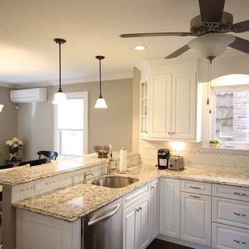
 Alure Home Improvements
Off in the corner is the Mini Split Air Conditioning unit. Convenient, powerful and out of the way it can maintain cooler temperatures for the entire first floor. Plus , the mini split unit does not create an ugly sight on the outside of the house nor does it block any of the abundant natural light from the existing windows.
 Horwitz A+D
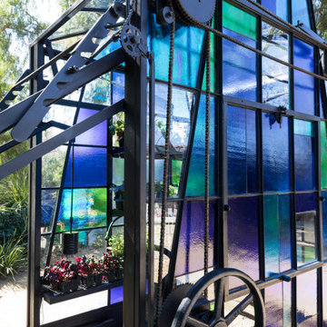
[?????? ??????????] At the intersection of art and architecture lives our Mobile Greenhouse. This seeming love-child of tom fruin & olson kundig was assembled with salvaged pieces including Sunkist-steel-factory windows, a motorcycle trailer, an old factory hand wheel, a rooftop solar water tank, a kid’s single speed bicycle front/rear sprockets, a chain from a retractable entry gate along with new metal stock from @ims_metals and beautiful art glass from @pacificartglass. p.c. Gary Moss Photography
Function is elevated through beauty and now our herb garden is protected from the adorable bunnies of this Conejo Valley while the structure throws pools of liquid blue and green on the DG. All while re-using leftover parts, some of a bygone era. (Sigh. Oh, single-paned steel windows, we love you - even though you are completely energy inefficient) The parabolic angle-iron arch was critical to the design so we sallied forth through the tantrums it caused. As lovers of #stainedglass in general, we loved seeing this larger scale project come together.
 Maverick City Builders
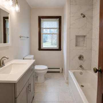
This bathroom remodel in Clinton, MA focused on upgrading an outdated and inefficient space into a clean, modern, and highly functional bathroom. The project included full demolition, plumbing updates, new tile installation, vanity replacement, lighting upgrades, and detailed finish work.
Our team maintained a clean and organized job site throughout the entire process, ensuring each phase was completed efficiently and with attention to detail. The layout was optimized to improve usability, while the selected materials provided durability and a timeless appearance.
The final result is a bright, refreshed bathroom designed for everyday comfort, featuring improved lighting, clean finishes, and a practical layout suited for a typical residential home.
 Corinthian Fine Homes
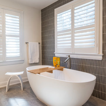
Our homeowner had worked with us in the past and asked us to design and renovate their 1980’s style master bathroom and closet into a modern oasis with a more functional layout. The original layout was chopped up and an inefficient use of space. Keeping the windows where they were, we simply swapped the vanity and the tub, and created an enclosed stool room. The shower was redesigned utilizing a gorgeous tile accent wall which was also utilized on the tub wall of the bathroom. A beautiful free-standing tub with modern tub filler were used to modernize the space and added a stunning focal point in the room. Two custom tall medicine cabinets were built to match the vanity and the closet cabinets for additional storage in the space with glass doors. The closet space was designed to match the bathroom cabinetry and provide closed storage without feeling narrow or enclosed. The outcome is a striking modern master suite that is not only functional but captures our homeowners’ great style.
 Ryann Reed Design Build
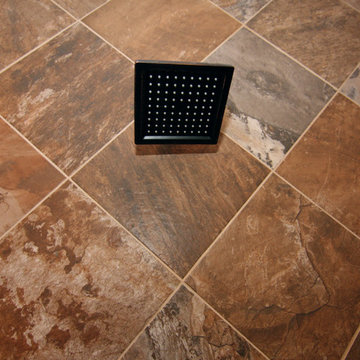
We transformed an inefficient walk-in closet/bathroom into a luxury master bathroom. The walk-in closet was relocated to another area. Our customers were looking for an open concept bathroom with lots of natural light but with some privacy. This beautiful master bathroom has a custom walk in shower with half walls for privacy. It also creates a nice hidden space for the toilet. Photographer: Ilona Kalimov
 Satterberg Desonier Dumo Interior Design, Inc.
The goal for the owners of this Blue Ridge home was to remodel their traditional Blue Ridge home to open up rooms to improve flow and update the finishes. The separate formal living room was a rarely used space so the wall between living and family rooms was opened up and the stairwell was updated to transform how the family use these rooms. The doorway from the entry to the kitchen was also opened up to welcome guests into the heart of the home.
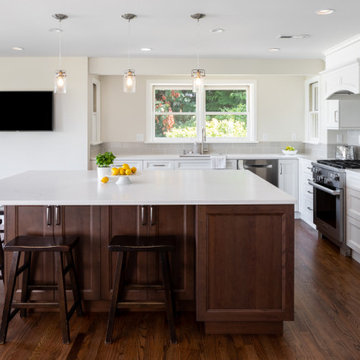
The existing dated and inefficient kitchen was redesigned to include a large island with dining, light filled sink area and decorative hood at the range. A tall pantry cabinet and additional mud room cabinets were installed to provide storage for this busy family. The new kitchen is bright and modern with white Columbia cabinetry complimented by a dark wood island. The Pental quartz countertops feature a light marble design and the soft grey backsplash completes this kitchen transformation.
The tiny powder room received a face lift with a custom shallow vanity that is big on style. The existing living room fireplace, which was too large and out of scale with the space, was updated with new tile and painted wood surround.
The success of this gorgeous remodel was a true team effort with the clients, Model Remodel on the construction and our firm on design.
Contractor: Model Remodel
Photography: Cindy Apple Photography

 True Carpentry and Cabinetry
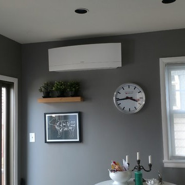
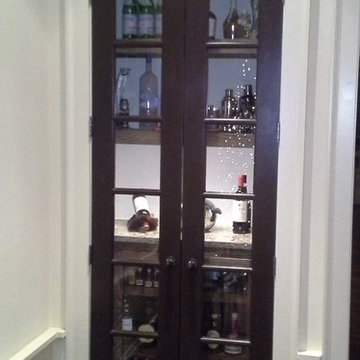
Customer's idea. The design was worked out between us. Closet with glass doors already existed but used inefficiently. Customer installed their own lights under the bottom floating shelf.
 Re-Mix Home Designs
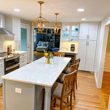
This kitchen was transformed from a dark, inefficient space into a bright welcoming area full of countertop space and storage. Accented with brass fixtures, lighting and hardware this transitional meets modern farmhouse kitchen space now offers this family lots of new amenities such as a 4-seat island, coffee/entertaining bar area as well as tons of storage. Two lantern style lights are the perfect touch to this 7' island space. Opening up the doorway to the dining area helped bring these two rooms back together.
 Saikley Architects
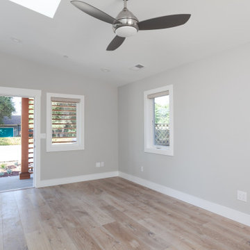
The clients wanted to update their ranch house and make good use of their unusually large site next to downtown Mountain View. We sketched several options for design and scope of work to assess feasibility and value to the clients.
The chosen design retains an existing bedroom wing, while the layout of the living spaces is re-worked to an open plan flooded with light, with vaulted ceilings and strong indoor-outdoor connection to a yard optimized for outdoor living. Awkward angles and inefficient spaces of the former house have been replaced with a clear, simple floor plan designed for ease of everyday living.
One end of the site is used for a two-bedroom ADU (Accessory Dwelling Unit) with its own face to the street and its own back yard. Income from the ADU will go a long way toward financing the rebuild of the main house.
Photography: Kurt Manley
https://saikleyarchitects.com/portfolio/open-ranch-adu/
 Eclectic Design Inc.
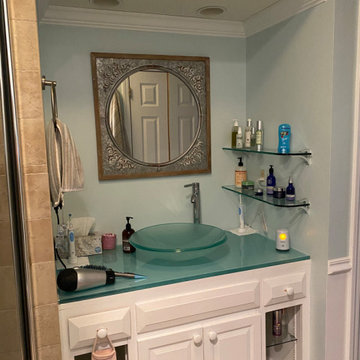
This small, inefficient bathroom vanity was no longer working for the homeowners.
Bathroom - small transitional bathroom idea in Bridgeport
Bathroom - small transitional bathroom idea in Bridgeport
34