
Search results for "Master any space" in Home Design Ideas
 Haven Design and Construction
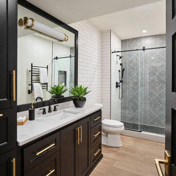
This sophisticated black and white bath belongs to the clients' teenage son. He requested a masculine design with a warming towel rack and radiant heated flooring. A few gold accents provide contrast against the black cabinets and pair nicely with the matte black plumbing fixtures. A tall linen cabinet provides a handy storage area for towels and toiletries. The focal point of the room is the bold shower tile accent wall that provides a welcoming surprise when entering the bath from the basement hallway.

 South Haven Homes
Walk-in closet - large country gender-neutral medium tone wood floor and brown floor walk-in closet idea in Salt Lake City with flat-panel cabinets and white cabinets

 HT Home Design
Photographer: Aaron Czeszynsk
Large beach style master blue tile and mosaic tile porcelain tile walk-in shower photo in San Francisco with an undermount sink, flat-panel cabinets, white cabinets, quartz countertops and blue walls
Large beach style master blue tile and mosaic tile porcelain tile walk-in shower photo in San Francisco with an undermount sink, flat-panel cabinets, white cabinets, quartz countertops and blue walls
Find the right local pro for your project

 Traci Connell Interiors
This custom bathroom showcases a beautiful mosaic along the back wall of the "wet room" shower enclosure. A freestanding tub sits inside the wet room for a sauna spa-like experience.

 MA Peterson Design Build, Inc.
MA Peterson
www.mapeterson.com
Inspiration for a small transitional single-wall medium tone wood floor laundry closet remodel in Minneapolis with open cabinets, white cabinets, wood countertops, white walls and a side-by-side washer/dryer
Inspiration for a small transitional single-wall medium tone wood floor laundry closet remodel in Minneapolis with open cabinets, white cabinets, wood countertops, white walls and a side-by-side washer/dryer

 Modern Organic Interiors
Photographer: Isabelle Eubanks
Interiors: Modern Organic Interiors, Architect: Simpson Design Group, Builder: Milne Design and Build
Bathroom - country kids' white tile and subway tile bathroom idea in San Francisco with a trough sink and multicolored walls
Bathroom - country kids' white tile and subway tile bathroom idea in San Francisco with a trough sink and multicolored walls

 BCB Homes, Inc.
Lori Hamilton Photography
Freestanding bathtub - coastal master multicolored floor freestanding bathtub idea with shaker cabinets, white cabinets, an undermount sink and gray countertops
Freestanding bathtub - coastal master multicolored floor freestanding bathtub idea with shaker cabinets, white cabinets, an undermount sink and gray countertops


 Murphy Moon
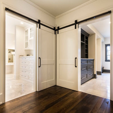
Concrete tile in a matte black color pairs perfectly with a creamy white subway tile. Throw in some darkened brass fittings, and honed black granite countertop, and modern lighting and you've got a beautiful study in contrasts.

 TKS Design Group
Free ebook, CREATING THE IDEAL KITCHEN
Download now → http://bit.ly/idealkitchen
The hall bath for this client started out a little dated with its 1970’s color scheme and general wear and tear, but check out the transformation!
The floor is really the focal point here, it kind of works the same way wallpaper would, but -- it’s on the floor. I love this graphic tile, patterned after Moroccan encaustic, or cement tile, but this one is actually porcelain at a very affordable price point and much easier to install than cement tile.
Once we had homeowner buy-in on the floor choice, the rest of the space came together pretty easily – we are calling it “transitional, Moroccan, industrial.” Key elements are the traditional vanity, Moroccan shaped mirrors and flooring, and plumbing fixtures, coupled with industrial choices -- glass block window, a counter top that looks like cement but that is actually very functional Corian, sliding glass shower door, and simple glass light fixtures.
The final space is bright, functional and stylish. Quite a transformation, don’t you think?
Designed by: Susan Klimala, CKD, CBD
Photography by: Mike Kaskel
For more information on kitchen and bath design ideas go to: www.kitchenstudio-ge.com

 Classic Homeworks
The basement batthroom is bright and open. There is plenty of room for the laundry facilities and additional cabinetry.
Corner shower - large traditional corner shower idea in Denver with beige walls, a vessel sink, shaker cabinets and green cabinets
Corner shower - large traditional corner shower idea in Denver with beige walls, a vessel sink, shaker cabinets and green cabinets

 Lion Builder Construction Inc
Alcove shower - contemporary black and white tile cement tile floor and multicolored floor alcove shower idea in Orange County with white walls
 FineLine Kitchens, Inc.
Hi everyone, I'm Sarah and Ogun we are here with fine line kitchens. So we are a couple working together. I do the interior design and remodeling of the space material selection meeting with the clients. And I handled operations outside, you know meaning all the construction work that is taking place the inside. The houses that we work in. I handle all the aspects of the construction, so today's project is very special. We're in Vienna and the client had a very big family. It's a family of seven that lives here. So we had a few aspects that we needed to keep in mind while designing this one. Having everybody be able to sit on the island. So we wanted plenty of seating all the way around. We didn't want anybody standing or anything like that. So what we did is we maximize the space. The center island is the biggest part of the kitchen. We use a natural stone to kind of give it a beautiful texture versus quartz. It's kind of standard white or kind of fabricated, so I wanted something very natural. We did this because I took my inspiration from the outside, so the inspiration if you look at the view right in front of me is there are so many greens there's a lot of brass accents and I wanted to bring this. Into this kitchen while designing it for my clients. She is very warm very. She wanted a very homey, comfy kind of look for the kitchen. So that's what we did today. As you can see, the cabinets are sage green, very light, so I still think it's a neutral, but it's a lighter color that again brings the outside in and we combine that with the oak right behind me so it's a slightly warm oak. It's not very dark. It's not very light. It's a medium brown and the same color went on the island. To kind of tie these two in and the backsplash, my favorite part is where you can see a little bit of design. It is, in my opinion still classic, but includes a pattern so the outside part is as we said in the beginning, is handled by my husband. I'd like him to speak a little bit about that. Thanks, Sarah, I want to talk to you guys a little bit about the construction part of this project. Originally this kitchen was located mostly in this area. They had their stove there sing. It was more of a peninsula layout in Sarah's and the customer vision they wanted. They wanted to get rid of the peninsula and they want to be able to have a huge island that can at least sit seven people because they're familiar with seven. So we wanted to make sure that we can achieve this design and bring it to life so that they can be happy with this layout. Some of the challenges we had, the house, the home being, you know, old home. There were a lot of you know the older electrical and plumbing that had to be replaced. We had to relocate the stove from here to this area. Over here we had put a nice foot fan that we had to relocate all the ductwork and the plumbing. Was being on the peninsula area. We had to relocate it to the center islands. So we achieved all this and kind of like bring it to bring in this kitchen up to date it looks beautiful. That's true, so yes, the old layout did not function for my clients because everything was kind of gathered on one side of the kitchen. So there was like a peninsula right there. So the end of this island kind of continued straight. And that was just the L shape. Kind of where everything was and there used to be another big table here, so they were using only kind of half of the space. So like I said at the beginning, our vision was to kind of feed everybody at the island, create some symmetry. 'cause I love that. So as you can see behind me, this is kind of the focal point symmetrical. Everything is kind of even we wanted to also panel the fridge here so it mimics the pantry and another size. So when you're looking at it, it is bringing again that symmetry back again. I hope you enjoyed this kitchen and this video and I'll see you soon. So how do you think this project turned out? It's nice. I like the color. I think it turned out nice. It's kind of like a little bit different color than what we always do. So I realize. Are you giving me a little bit of credit here that I did something different? Are you proud? I'm so proud of you. Other than that I like it. That they have kind of like a two sink. So if this was our kitchen, if we ever like you can have your own. I can have mine if we ever get into a fight then this can be like my own kitchen. Why are we gonna bring in a fight right now? So I'm cooking anyway. You're grilling most of the time, So what are you even talking about? My kitchen? That's my kitchen. You can just take the small sink. That's fine. It's always good to have your own space right there, so anyways. Thank you guys for watching. We hope to see you soon and if you have any questions please click the link below. It'll lead you to our website, house, YouTube and all of the social media is so nice to have you guys. We'll see you soon. Thanks bye bye-bye.

 Melissa Hill Home Design
This client was so much fun to design for. Their project was all about color, texture and creating a master bedroom and guest bedroom that compliments their passion for traveling and eclectic style. We created a seating area in the master bedroom where the family can gather at night to read and spend time quality time. Their desire for deep color and bold pattern allowed us to create a casual space that is both warm and inviting at the end of a long day. Guests often visit and stay for a bit. They wanted to give their family and friends the same cozy feel in their guest bedroom. We were able to use a combination of patterns, textures and colors with our custom-made bedding and pillows. We also love to repurpose where we can and painted furniture is a great place to start. The depth of color used here is a true reflection of our clients' warm and friendly personality that says "welcome to our home."
Custom designed by Hartley and Hill Design
All materials and furnishings in this space are available through Hartley and Hill Design. www.hartleyandhilldesign.com
888-639-0639
Neil Landino Photography
Sponsored
Sunbury, OH

J.Holderby - Renovations
Franklin County's Leading General Contractors - 2X Best of Houzz!


 Pinemar, Inc
.- Philadelphia General Contractor & Home Builder.
Edge grain Maple butcher block countertop on the Kitchen Island, hands free kitchen faucet.
Photos © Paul S. Bartholomew Photography

 Aspire Fine Homes
Felix Sanchez (www.felixsanchez.com)
Claw-foot bathtub - huge victorian master white tile dark wood floor and brown floor claw-foot bathtub idea in Houston with a hinged shower door
Claw-foot bathtub - huge victorian master white tile dark wood floor and brown floor claw-foot bathtub idea in Houston with a hinged shower door
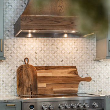 FineLine Kitchens, Inc.
Hi everyone, I'm Sarah and Ogun we are here with fine line kitchens. So we are a couple working together. I do the interior design and remodeling of the space material selection meeting with the clients. And I handled operations outside, you know meaning all the construction work that is taking place the inside. The houses that we work in. I handle all the aspects of the construction, so today's project is very special. We're in Vienna and the client had a very big family. It's a family of seven that lives here. So we had a few aspects that we needed to keep in mind while designing this one. Having everybody be able to sit on the island. So we wanted plenty of seating all the way around. We didn't want anybody standing or anything like that. So what we did is we maximize the space. The center island is the biggest part of the kitchen. We use a natural stone to kind of give it a beautiful texture versus quartz. It's kind of standard white or kind of fabricated, so I wanted something very natural. We did this because I took my inspiration from the outside, so the inspiration if you look at the view right in front of me is there are so many greens there's a lot of brass accents and I wanted to bring this. Into this kitchen while designing it for my clients. She is very warm very. She wanted a very homey, comfy kind of look for the kitchen. So that's what we did today. As you can see, the cabinets are sage green, very light, so I still think it's a neutral, but it's a lighter color that again brings the outside in and we combine that with the oak right behind me so it's a slightly warm oak. It's not very dark. It's not very light. It's a medium brown and the same color went on the island. To kind of tie these two in and the backsplash, my favorite part is where you can see a little bit of design. It is, in my opinion still classic, but includes a pattern so the outside part is as we said in the beginning, is handled by my husband. I'd like him to speak a little bit about that. Thanks, Sarah, I want to talk to you guys a little bit about the construction part of this project. Originally this kitchen was located mostly in this area. They had their stove there sing. It was more of a peninsula layout in Sarah's and the customer vision they wanted. They wanted to get rid of the peninsula and they want to be able to have a huge island that can at least sit seven people because they're familiar with seven. So we wanted to make sure that we can achieve this design and bring it to life so that they can be happy with this layout. Some of the challenges we had, the house, the home being, you know, old home. There were a lot of you know the older electrical and plumbing that had to be replaced. We had to relocate the stove from here to this area. Over here we had put a nice foot fan that we had to relocate all the ductwork and the plumbing. Was being on the peninsula area. We had to relocate it to the center islands. So we achieved all this and kind of like bring it to bring in this kitchen up to date it looks beautiful. That's true, so yes, the old layout did not function for my clients because everything was kind of gathered on one side of the kitchen. So there was like a peninsula right there. So the end of this island kind of continued straight. And that was just the L shape. Kind of where everything was and there used to be another big table here, so they were using only kind of half of the space. So like I said at the beginning, our vision was to kind of feed everybody at the island, create some symmetry. 'cause I love that. So as you can see behind me, this is kind of the focal point symmetrical. Everything is kind of even we wanted to also panel the fridge here so it mimics the pantry and another size. So when you're looking at it, it is bringing again that symmetry back again. I hope you enjoyed this kitchen and this video and I'll see you soon. So how do you think this project turned out? It's nice. I like the color. I think it turned out nice. It's kind of like a little bit different color than what we always do. So I realize. Are you giving me a little bit of credit here that I did something different? Are you proud? I'm so proud of you. Other than that I like it. That they have kind of like a two sink. So if this was our kitchen, if we ever like you can have your own. I can have mine if we ever get into a fight then this can be like my own kitchen. Why are we gonna bring in a fight right now? So I'm cooking anyway. You're grilling most of the time, So what are you even talking about? My kitchen? That's my kitchen. You can just take the small sink. That's fine. It's always good to have your own space right there, so anyways. Thank you guys for watching. We hope to see you soon and if you have any questions please click the link below. It'll lead you to our website, house, YouTube and all of the social media is so nice to have you guys. We'll see you soon. Thanks bye bye-bye.
Sponsored
Columbus, OH

Structural Remodeling
Franklin County's Heavy Timber Specialists | Best of Houzz 2020!

 Stoneridge Custom Development
Spin Photography
Inspiration for a mid-sized contemporary master gray tile and mosaic tile marble floor and white floor alcove shower remodel in Portland with an undermount sink, flat-panel cabinets, dark wood cabinets, a two-piece toilet, white walls, solid surface countertops and a hinged shower door
Inspiration for a mid-sized contemporary master gray tile and mosaic tile marble floor and white floor alcove shower remodel in Portland with an undermount sink, flat-panel cabinets, dark wood cabinets, a two-piece toilet, white walls, solid surface countertops and a hinged shower door
 TKS Design Group
Download our free ebook, Creating the Ideal Kitchen. DOWNLOAD NOW
Lakefront property in the northwest suburbs of Chicago is hard to come by, so when we were hired by this young family with exactly that, we were immediately inspired by not just the unusually large footprint of this 1950’s colonial revival but also the lovely views of the manmade lake it was sited on. The large 5-bedroom home was solidly stuck in the 1980’s, but we saw tons of potential. We started out by updating the existing staircase with a fresh coat of paint and adding new herringbone slate to the entry hall.
The powder room off the entryway also got a refresh - new flooring, new cabinets and fixtures. We ran the new slate right through into this space for some consistency. A fun wallpaper and shiplap trim add a welcoming feel and set the tone for the home.
Next, we tackled the kitchen. Located away from the rest of the first floor, the kitchen felt a little isolated, so we immediately began planning for how to better connect it to the rest of the first floor. We landed on removing the wall between the kitchen and dining room and designed a modified galley style space with separate cooking and clean up zones. The cooking zone consists of the refrigerator, prep sink and cooktop, along with a nice long run of prep space at the island. The cleanup side of the kitchen consists of the main sink and dishwasher. Both areas are situated so that the user can view the lake during prep work and cleanup!
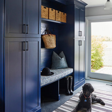
One of the home’s main puzzles was how to incorporate the mudroom and area in front of the patio doors at the back of the house. We already had a breakfast table area, so the space by the patio doors was a bit of a no man’s land. We decided to separate the kitchen proper from what became the new mudroom with a large set of barn doors. That way you can quickly hide any mudroom messes but have easy access to the light coming in through the patio doors as well as the outdoor grilling station. We also love the impact the barn doors add to the overall space.
The homeowners’ first words to us were “it’s time to ditch the brown,” so we did! We chose a lovely blue pallet that reflects the home’s location on the lake which is also vibrant yet easy on the eye. Countertops are white quartz, and the natural oak floor works well with the other honey accents. The breakfast table was given a refresh with new chairs, chandelier and window treatments that frame the gorgeous views of the lake out the back.
We coordinated the slate mudroom flooring with that used in the home’s main entrance for a consistent feel. The storage area consists of open and closed storage to allow for some clutter control as needed.
Next on our “to do” list was revamping the dated brown bar area in the neighboring dining room. We eliminated the clutter by adding some closed cabinets and did some easy updates to help the space feel more current. One snag we ran into here was the discovery of a beam above the existing open shelving that had to be modified with a smaller structural beam to allow for our new design to work. This was an unexpected surprise, but in the end we think it was well worth it!
We kept the colors here a bit more muted to blend with the homeowner’s existing furnishings. Open shelving and polished nickel hardware add some simple detail to the new entertainment zone which also looks out onto the lake!
Next we tackled the upstairs starting with the homeowner’s son’s bath. The bath originally had both a tub shower and a separate shower, so we decided to swap out the shower for a new laundry area. This freed up some space downstairs in what used to be the mudroom/laundry room and is much more convenient for daily laundry needs.
We continued the blue palette here with navy cabinetry and the navy tile in the shower. Porcelain floor tile and chrome fixtures keep maintenance to a minimum while matte black mirrors and lighting add some depth the design. A low maintenance runner adds some warmth underfoot and ties the whole space together.
We added a pocket door to the bathroom to minimize interference with the door swings. The left door of the laundry closet is on a 180 degree hinge to allow for easy full access to the machines. Next we tackled the master bath which is an en suite arrangement. The original was typical of the 1980’s with the vanity outside of the bathroom, situated near the master closet. And the brown theme continued here with multiple shades of brown.
Our first move was to segment off the bath and the closet from the master bedroom. We created a short hall from the bedroom to the bathroom with his and hers walk-in closets on the left and right as well as a separate toilet closet outside of the main bathroom for privacy and flexibility.
The original bathroom had a giant soaking tub with steps (dangerous!) as well as a small shower that did not work well for our homeowner who is 6’3”. With other bathtubs in the home, they decided to eliminate the tub and create an oversized shower which takes up the space where the old tub was located. The double vanity is on the opposite wall and a bench is located under the window for morning conversations and a place to set a couple of towels.
The pallet in here is light and airy with a mix of blond wood, creamy porcelain and marble tile, and brass accents. A simple roman shade adds some texture and it’s top-down mechanism allows for light and privacy.
This large whole house remodel gave our homeowners not only the ability to maximize the potential of their home but also created a lovely new frame from which to view their fabulous lake views.
Designed by: Susan Klimala, CKD, CBD
Photography by: Michael Kaskel
For more information on kitchen and bath design ideas go to: www.kitchenstudio-ge.com

 Pedersen Associates
Barbara Ries Photography
Example of a trendy patio design in San Francisco with a bbq area
Example of a trendy patio design in San Francisco with a bbq area
230