
Search results for "Master typically" in Home Design Ideas
 ZeroEnergy Design
This modern green home offers both a vacation destination on Cape Cod near local family members and an opportunity for rental income.
FAMILY ROOTS. A West Coast couple living in the San Francisco Bay Area sought a permanent East Coast vacation home near family members living on Cape Cod. As academic professionals focused on sustainability, they sought a green, energy efficient home that was well-aligned with their values. With no green homes available for sale on Cape Cod, they decided to purchase land near their family and build their own.
SLOPED SITE. Comprised of a 3/4 acre lot nestled in the pines, the steeply sloping terrain called for a plan that embraced and took advantage of the slope. Of equal priority was optimizing solar exposure, preserving privacy from abutters, and creating outdoor living space. The design accomplished these goals with a simple, rectilinear form, offering living space on the both entry and lower/basement levels. The stepped foundation allows for a walk-out basement level with light-filled living space on the down-hill side of the home. The traditional basement on the eastern, up-hill side houses mechanical equipment and a home gym. The house welcomes natural light throughout, captures views of the forest, and delivers entertainment space that connects indoor living space to outdoor deck and dining patio.
MODERN VISION. The clean building form and uncomplicated finishes pay homage to the modern architectural legacy on the outer Cape. Durable and economical fiber cement panels, fixed with aluminum channels, clad the primary form. Cedar clapboards provide a visual accent at the south-facing living room, which extends a single roof plane to cover the entry porch.
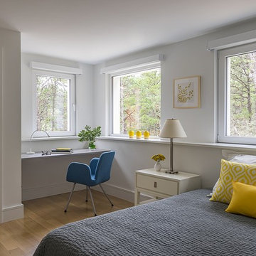
SMART USE OF SPACE. On the entry level, the “L”-shaped living, dining, and kitchen space connects to the exterior living, dining, and grilling spaces to effectively double the home’s summertime entertainment area. Placed at the western end of the entry level (where it can retain privacy but still claim expansive downhill views) is the master suite with a built-in study. The lower level has two guest bedrooms, a second full bathroom, and laundry. The flexibility of the space—crucial in a house with a modest footprint—emerges in one of the guest bedrooms, which doubles as home office by opening the barn-style double doors to connect it to the bright, airy open stair leading up to the entry level. Thoughtful design, generous ceiling heights and large windows transform the modest 1,100 sf* footprint into a well-lit, spacious home. *(total finished space is 1800 sf)
RENTAL INCOME. The property works for its owners by netting rental income when the owners are home in San Francisco. The house especially caters to vacationers bound for nearby Mayo Beach and includes an outdoor shower adjacent to the lower level entry door. In contrast to the bare bones cottages that are typically available on the Cape, this home offers prospective tenants a modern aesthetic, paired with luxurious and green features. Durable finishes inside and out will ensure longevity with the heavier use that comes with a rental property.
COMFORT YEAR-ROUND. The home is super-insulated and air-tight, with mechanical ventilation to provide continuous fresh air from the outside. High performance triple-paned windows complement the building enclosure and maximize passive solar gain while ensuring a warm, draft-free winter, even when sitting close to the glass. A properly sized air source heat pump offers efficient heating & cooling, and includes a carefully designed the duct distribution system to provide even comfort throughout the house. The super-insulated envelope allows us to significantly reduce the equipment capacity, duct size, and airflow quantities, while maintaining unparalleled thermal comfort.
ENERGY EFFICIENT. The building’s shell and mechanical systems play instrumental roles in the home’s exceptional performance. The building enclosure reduces the most significant energy glutton: heating. Continuous super-insulation, thorough air sealing, triple-pane windows, and passive solar gain work together to yield a miniscule heating load. All active energy consumers are extremely efficient: an air source heat pump for heating and cooling, a heat pump hot water heater, LED lighting, energy recovery ventilation (ERV), and high efficiency appliances. The result is a home that uses 70% less energy than a similar new home built to code requirements.
OVERALL. The home embodies the owners’ goals and values while comprehensively enabling thermal comfort, energy efficiency, a vacation respite, and supplementary income.
PROJECT TEAM
ZeroEnergy Design - Architect & Mechanical Designer
A.F. Hultin & Co. - Contractor
Pamet Valley Landscape Design - Landscape & Masonry
Lisa Finch - Original Artwork
European Architectural Supply - Windows
Eric Roth Photography - Photography

 UpperKey
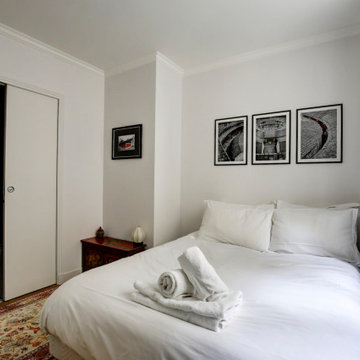
The master bedroom in a Parisian apartment is often a luxurious and functional space that is carefully designed to provide residents with a comfortable retreat. With attention paid to every detail, these rooms are typically spacious and airy, featuring a blend of classic and contemporary decor.
One of the defining features of master bedrooms in Paris apartments is their emphasis on functionality, with ample storage space and often an en-suite bathroom with modern fixtures and luxurious amenities. The decor is typically elegant and sophisticated, with plush bedding, ornate molding, and tasteful artwork.
Overall, the master bedroom in a Parisian apartment is the ultimate in luxury and comfort, offering a welcoming retreat for residents to unwind and recharge in style.
Find the right local pro for your project
 O’Hara Interiors
Martha O'Hara Interiors, Interior Design & Photo Styling | Stellar Homes | Troy Thies, Photography
Please Note: All “related,” “similar,” and “sponsored” products tagged or listed by Houzz are not actual products pictured. They have not been approved by Martha O’Hara Interiors nor any of the professionals credited. For information about our work, please contact design@oharainteriors.com.
 Axis Mundi | Chicago
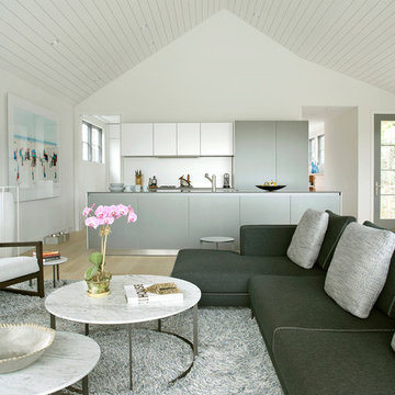
Axis Mundi typically decided not to play by the rules. Instead of de rigeur nautical artifacts, floppy sofas and wicker furniture, the firm responded to Makoid’s all-white interior envelope by injecting rooms with comfortable modern elegance that’s more contemporary Cap Ferrat than Eastern Long Island. Clean furniture silhouettes—from Cassina, Poltrona Frau and B&B Italia—a Massimo Vitali beach scene, a Moooi chandelier and industrial finishes (such as the steel of the fireplace surround and the anodized aluminum of a sleek Bulthaup kitchen) spark a creative tension between indoors and out. The gray palette provides a quiet backdrop for the nature outside, except for the master suite, where custom oak panels and blue shades create a reassuring warmth conducive to sleep.
Size: 1,920 sf
Project Team: John Beckmann, Nick Messerlian and Richard Rosenbloom
Architect: Blaze Makoid Architecture
Contractor: Greg D'Angelo Construction Inc.
Photographer: Mark Roskams
© Axis Mundi Design LLC.
 Organized Living
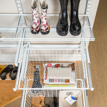
Organized Living freedomRail home storage systems are an adjustable solution for mudrooms and entry ways. When you organize an entryway, it keeps clutter like school bags, books, umbrellas and accessories from entering the rest of the home. Easy to install and incredibly strong. Discover more ways to organize your space in our image gallery here: http://www.organizedliving.com/home/get-inspired/areas-of-the-home/mudroom
 User
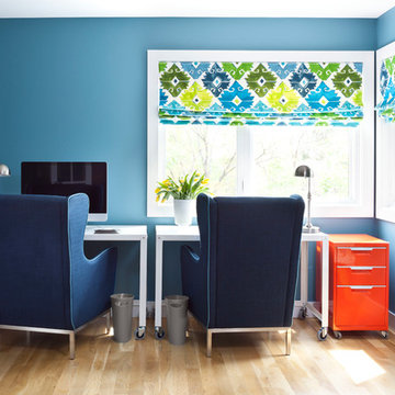
UserInspiration for a contemporary freestanding desk light wood floor home office remodel in Denver with blue walls


 John Rogers Renovations
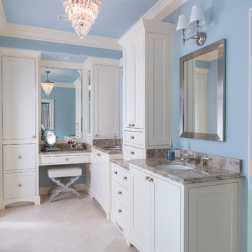
This dreamy master bath remodel in East Cobb offers generous space without going overboard in square footage. The homeowner chose to go with a large double vanity with a custom seated space as well as a nice shower with custom features and decided to forgo the typical big soaking tub.
The vanity area shown in the photos has plenty of storage within the wall cabinets and the large drawers below.
The countertop is Cedar Brown slab marble with undermount sinks. The brushed nickel metal details were done to work with the theme through out the home. The floor is a 12x24 honed Crema Marfil.
The stunning crystal chandelier draws the eye up and adds to the simplistic glamour of the bath.
The shower was done with an elegant combination of tumbled and polished Crema Marfil, two rows of Emperador Light inlay and Mirage Glass Tiles, Flower Series, Polished.
 Advance Design Studio, Ltd.
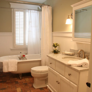
Located on a partially wooded lot in Elburn, Illinois, this home needed an eye-catching interior redo to match the unique period exterior. The residence was originally designed by Bow House, a company that reproduces the look of 300-year old bow roof Cape-Cod style homes. Since typical kitchens in old Cape Cod-style homes tend to run a bit small- or as some would like to say, cozy – this kitchen was in need of plenty of efficient storage to house a modern day family of three.
Advance Design Studio, Ltd. was able to evaluate the kitchen’s adjacent spaces and determine that there were several walls that could be relocated to allow for more usable space in the kitchen. The refrigerator was moved to the newly excavated space and incorporated into a handsome dinette, an intimate banquette, and a new coffee bar area. This allowed for more countertop and prep space in the primary area of the kitchen. It now became possible to incorporate a ball and claw foot tub and a larger vanity in the elegant new full bath that was once just an adjacent guest powder room.
Reclaimed vintage Chicago brick paver flooring was carefully installed in a herringbone pattern to give the space a truly unique touch and feel. And to top off this revamped redo, a handsome custom green-toned island with a distressed black walnut counter top graces the center of the room, the perfect final touch in this charming little kitchen.
 Cooke Interiors Studio
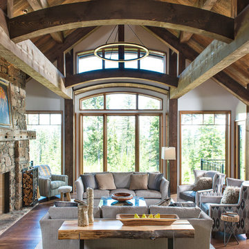
Mountain style formal dark wood floor and brown floor living room photo with white walls, a standard fireplace and a stone fireplace
 MastersTouch Construction, Inc.
Bart Edson
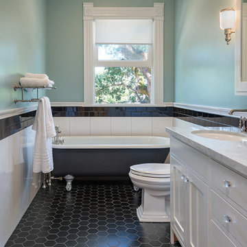
Freestanding bathtub - victorian master porcelain tile ceramic tile and black floor freestanding bathtub idea in San Francisco with shaker cabinets, white cabinets, a one-piece toilet, green walls and marble countertops
Freestanding bathtub - victorian master porcelain tile ceramic tile and black floor freestanding bathtub idea in San Francisco with shaker cabinets, white cabinets, a one-piece toilet, green walls and marble countertops
 J.P. DiMisa Luxury Homes, Inc.
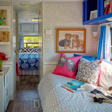
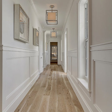
Inspiration for a large coastal light wood floor and beige floor hallway remodel in Miami with white walls
Sponsored
Columbus, OH

Hope Restoration & General Contracting
Columbus Design-Build, Kitchen & Bath Remodeling, Historic Renovations
 Shelli Dierck - Closet Factory DFW
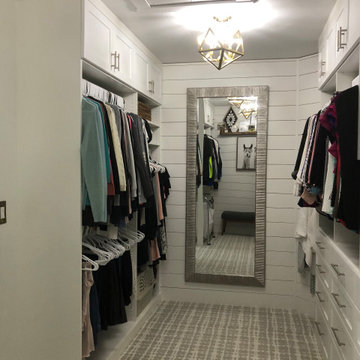
Typical builder closet with fixed rods and shelves, all sprayed the same color as the ceiling and walls.
Inspiration for a mid-sized country gender-neutral carpeted and white floor walk-in closet remodel with shaker cabinets and white cabinets
Inspiration for a mid-sized country gender-neutral carpeted and white floor walk-in closet remodel with shaker cabinets and white cabinets
 John Rogers Renovations
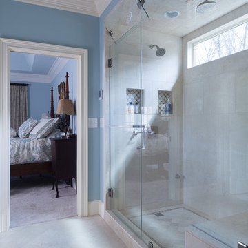
This dreamy master bath remodel in East Cobb offers generous space without going overboard in square footage. The homeowner chose to go with a large double vanity with a custom seated space as well as a nice shower with custom features and decided to forgo the typical big soaking tub.
The vanity area shown in the photos has plenty of storage within the wall cabinets and the large drawers below.
The countertop is Cedar Brown slab marble with undermount sinks. The brushed nickel metal details were done to work with the theme through out the home. The floor is a 12x24 honed Crema Marfil.
The stunning crystal chandelier draws the eye up and adds to the simplistic glamour of the bath.
The shower was done with an elegant combination of tumbled and polished Crema Marfil, two rows of Emperador Light inlay and Mirage Glass Tiles, Flower Series, Polished.


 TKS Design Group
Download our free ebook, Creating the Ideal Kitchen. DOWNLOAD NOW
Lakefront property in the northwest suburbs of Chicago is hard to come by, so when we were hired by this young family with exactly that, we were immediately inspired by not just the unusually large footprint of this 1950’s colonial revival but also the lovely views of the manmade lake it was sited on. The large 5-bedroom home was solidly stuck in the 1980’s, but we saw tons of potential. We started out by updating the existing staircase with a fresh coat of paint and adding new herringbone slate to the entry hall.
The powder room off the entryway also got a refresh - new flooring, new cabinets and fixtures. We ran the new slate right through into this space for some consistency. A fun wallpaper and shiplap trim add a welcoming feel and set the tone for the home.
Next, we tackled the kitchen. Located away from the rest of the first floor, the kitchen felt a little isolated, so we immediately began planning for how to better connect it to the rest of the first floor. We landed on removing the wall between the kitchen and dining room and designed a modified galley style space with separate cooking and clean up zones. The cooking zone consists of the refrigerator, prep sink and cooktop, along with a nice long run of prep space at the island. The cleanup side of the kitchen consists of the main sink and dishwasher. Both areas are situated so that the user can view the lake during prep work and cleanup!
One of the home’s main puzzles was how to incorporate the mudroom and area in front of the patio doors at the back of the house. We already had a breakfast table area, so the space by the patio doors was a bit of a no man’s land. We decided to separate the kitchen proper from what became the new mudroom with a large set of barn doors. That way you can quickly hide any mudroom messes but have easy access to the light coming in through the patio doors as well as the outdoor grilling station. We also love the impact the barn doors add to the overall space.
The homeowners’ first words to us were “it’s time to ditch the brown,” so we did! We chose a lovely blue pallet that reflects the home’s location on the lake which is also vibrant yet easy on the eye. Countertops are white quartz, and the natural oak floor works well with the other honey accents. The breakfast table was given a refresh with new chairs, chandelier and window treatments that frame the gorgeous views of the lake out the back.
We coordinated the slate mudroom flooring with that used in the home’s main entrance for a consistent feel. The storage area consists of open and closed storage to allow for some clutter control as needed.
Next on our “to do” list was revamping the dated brown bar area in the neighboring dining room. We eliminated the clutter by adding some closed cabinets and did some easy updates to help the space feel more current. One snag we ran into here was the discovery of a beam above the existing open shelving that had to be modified with a smaller structural beam to allow for our new design to work. This was an unexpected surprise, but in the end we think it was well worth it!
We kept the colors here a bit more muted to blend with the homeowner’s existing furnishings. Open shelving and polished nickel hardware add some simple detail to the new entertainment zone which also looks out onto the lake!
Next we tackled the upstairs starting with the homeowner’s son’s bath. The bath originally had both a tub shower and a separate shower, so we decided to swap out the shower for a new laundry area. This freed up some space downstairs in what used to be the mudroom/laundry room and is much more convenient for daily laundry needs.
We continued the blue palette here with navy cabinetry and the navy tile in the shower. Porcelain floor tile and chrome fixtures keep maintenance to a minimum while matte black mirrors and lighting add some depth the design. A low maintenance runner adds some warmth underfoot and ties the whole space together.
We added a pocket door to the bathroom to minimize interference with the door swings. The left door of the laundry closet is on a 180 degree hinge to allow for easy full access to the machines. Next we tackled the master bath which is an en suite arrangement. The original was typical of the 1980’s with the vanity outside of the bathroom, situated near the master closet. And the brown theme continued here with multiple shades of brown.
Our first move was to segment off the bath and the closet from the master bedroom. We created a short hall from the bedroom to the bathroom with his and hers walk-in closets on the left and right as well as a separate toilet closet outside of the main bathroom for privacy and flexibility.
The original bathroom had a giant soaking tub with steps (dangerous!) as well as a small shower that did not work well for our homeowner who is 6’3”. With other bathtubs in the home, they decided to eliminate the tub and create an oversized shower which takes up the space where the old tub was located. The double vanity is on the opposite wall and a bench is located under the window for morning conversations and a place to set a couple of towels.
The pallet in here is light and airy with a mix of blond wood, creamy porcelain and marble tile, and brass accents. A simple roman shade adds some texture and it’s top-down mechanism allows for light and privacy.
This large whole house remodel gave our homeowners not only the ability to maximize the potential of their home but also created a lovely new frame from which to view their fabulous lake views.
Designed by: Susan Klimala, CKD, CBD
Photography by: Michael Kaskel
For more information on kitchen and bath design ideas go to: www.kitchenstudio-ge.com
Sponsored
Delaware, OH

Buckeye Basements, Inc.
Central Ohio's Basement Finishing ExpertsBest Of Houzz '13-'21
 Dana Borcoman, Registered Architect
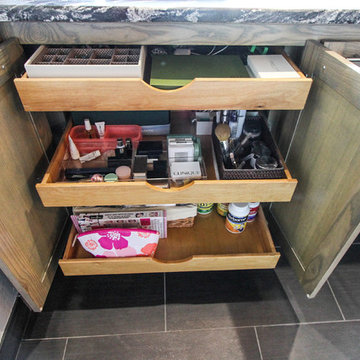
Custom cabinetry - Ash with semi transparent gray stain
Photo by Beth Swan of Swan Photography
Example of a small trendy master black tile and ceramic tile ceramic tile home design design in Dallas with an undermount sink, flat-panel cabinets, gray cabinets, granite countertops, a two-piece toilet and gray walls
Example of a small trendy master black tile and ceramic tile ceramic tile home design design in Dallas with an undermount sink, flat-panel cabinets, gray cabinets, granite countertops, a two-piece toilet and gray walls
 Klopf Architecture
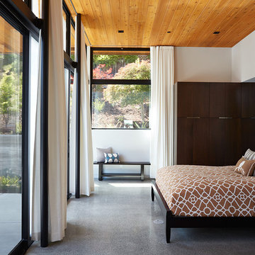
Klopf Architecture, Arterra Landscape Architects and Henry Calvert of Calvert Ventures Designed and built a new warm, modern, Eichler-inspired, open, indoor-outdoor home on a deeper-than-usual San Mateo Highlands property where an original Eichler house had burned to the ground.
The owners wanted multi-generational living and larger spaces than the original home offered, but all parties agreed that the house should respect the neighborhood and blend in stylistically with the other Eichlers. At first the Klopf team considered re-using what little was left of the original home and expanding on it. But after discussions with the owner and builder, all parties agreed that the last few remaining elements of the house were not practical to re-use, so Klopf Architecture designed a new home that pushes the Eichler approach in new directions.
One disadvantage of Eichler production homes is that the house designs were not optimized for each specific lot. A new custom home offered the team a chance to start over. In this case, a longer house that opens up sideways to the south fit the lot better than the original square-ish house that used to open to the rear (west). Accordingly, the Klopf team designed an L-shaped “bar” house with a large glass wall with large sliding glass doors that faces sideways instead of to the rear like a typical Eichler. This glass wall opens to a pool and landscaped yard designed by Arterra Landscape Architects.
Driving by the house, one might assume at first glance it is an Eichler because of the horizontality, the overhanging flat roof eaves, the dark gray vertical siding, and orange solid panel front door, but the house is designed for the 21st Century and is not meant to be a “Likeler.” You won't see any posts and beams in this home. Instead, the ceiling decking is a western red cedar that covers over all the beams. Like Eichlers, this cedar runs continuously from inside to out, enhancing the indoor / outdoor feeling of the house, but unlike Eichlers it conceals a cavity for lighting, wiring, and insulation. Ceilings are higher, rooms are larger and more open, the master bathroom is light-filled and more generous, with a separate tub and shower and a separate toilet compartment, and there is plenty of storage. The garage even easily fits two of today's vehicles with room to spare.
A massive 49-foot by 12-foot wall of glass and the continuity of materials from inside to outside enhance the inside-outside living concept, so the owners and their guests can flow freely from house to pool deck to BBQ to pool and back.
During construction in the rough framing stage, Klopf thought the front of the house appeared too tall even though the house had looked right in the design renderings (probably because the house is uphill from the street). So Klopf Architecture paid the framer to change the roofline from how we had designed it to be lower along the front, allowing the home to blend in better with the neighborhood. One project goal was for people driving up the street to pass the home without immediately noticing there is an "imposter" on this lot, and making that change was essential to achieve that goal.
This 2,606 square foot, 3 bedroom, 3 bathroom Eichler-inspired new house is located in San Mateo in the heart of the Silicon Valley.
Klopf Architecture Project Team: John Klopf, AIA, Klara Kevane
Landscape Architect: Arterra Landscape Architects
Contractor: Henry Calvert of Calvert Ventures
Photography ©2016 Mariko Reed
Location: San Mateo, CA
Year completed: 2016
 Metropolis Drafting and Construction Inc
Another update project we did in the same Townhome community in Culver city. This time more towards Modern Farmhouse / Transitional design.
Kitchen cabinets were completely refinished with new hardware installed. The black island is a great center piece to the white / gold / brown color scheme.
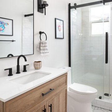
The hallway Guest bathroom was partially updated with new fixtures, vanity, toilet, shower door and floor tile.
that's what happens when older style white subway tile came back into fashion. They fit right in with the other updates.
27