
Search results for "Mistake" in Home Design Ideas
 Hadley-Irvine General Contracting LTD
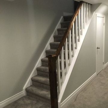
Staircase - mid-sized traditional carpeted and underground carpeted and gray floor staircase idea in Toronto with wooden risers, gray walls and no fireplace
 MDT, Inc.
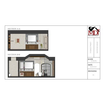
These elevations are the backbone of a seamless renovation process. Here's why they matter:
1. For Trades:
Every inch is accounted for—elevations give electricians, plumbers, tile setters, and millworkers exact placement, height, and alignment details. No guesswork means fewer mistakes, no back-and-forth, and smoother scheduling.
2. For Pricing Accuracy:
Clear elevations eliminate the “it depends” from vendor bids. You get real, fixed quotes instead of vague estimates. Every finish, fixture, and feature is detailed upfront for smarter budgeting and better scope control.
3. For the Client Experience:
It’s hard to envision a design from words or even moodboards alone. These elevations show your space—exactly how it will feel and function. Clients can confidently sign off on layout, storage, lighting, and flow because they can see it.
TL;DR:
Want peace of mind and precision at every phase? This is how we build intelligently.
And don’t worry—you don’t have to know every detail. We got you.
 Bilotta Kitchen & Home
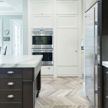
This expansive kitchen was done by Bilotta senior designer in collaboration with Nancy Epstein, founder and CEO of Artistic Tile, for Nancy’s son and daughter-in-law’s home. Frameless Rutt Regency cabinetry is featured in two different finishes: linen white paint on the perimeter and stained walnut on the island. Almost all surfaces are Calacatta Gold marble but in a variety of formats and finishes, obviously all by Artistic Tile. The backsplash, including the dramatic arched wall the houses the range and hood, features elongated brick tiles with a honed finish. The underside of the arch is lined with polished mosaics and the countertops are 2” thick slabs, polished. The flooring is the only surface in a different material – for that they used Artistic Tile’s “Vestige Ash”, a limestone with a brushed finish in a chevron pattern that creates texture and really shows the stone’s veining. In an article in Traditional Home, written by Amy Elbert, Nancy commented, “Everything has some weight, some girth to it. A common design mistake is making things too skinny. You want to feel the tile’s majesty and its beauty.” Rita added, “We always played with a delicate balance between contemporary and traditional elements.” The two stainless steel undermount sinks are Franke with Dornbracht faucets. There are various different work zones making it also a very functional space, aside from being sophisticated and elegant overall. There is the cooking area with the 36” range and custom hood on one wall; the island holds the main sink and a dishwasher; another wall houses the full height, 36” wide stainless steel refrigerator and freezer; and the sink wall (with a beautiful view to the backyard) has another dishwasher as well as refrigerator drawers. The circular dining table for six is by Zoffany and the chairs are “Normandie” by Artistic Frame with Duralee fabric.
Photo Credit Francesco Lagnese
Find the right local pro for your project
 User
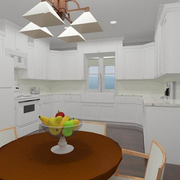
UserKitchen in small-scale farmhouse style cottage. Perfect retirement house.
Small farmhouse u-shaped dark wood floor open concept kitchen photo in Orlando with a farmhouse sink, shaker cabinets, white cabinets, marble countertops, green backsplash, subway tile backsplash, white appliances and no island
Small farmhouse u-shaped dark wood floor open concept kitchen photo in Orlando with a farmhouse sink, shaker cabinets, white cabinets, marble countertops, green backsplash, subway tile backsplash, white appliances and no island
 Robert Granoff
ARCHONSTRUCT LLC
© Robert Granoff
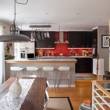
Inspiration for a contemporary galley eat-in kitchen remodel in New York with flat-panel cabinets, black cabinets, red backsplash and subway tile backsplash
Inspiration for a contemporary galley eat-in kitchen remodel in New York with flat-panel cabinets, black cabinets, red backsplash and subway tile backsplash
 Bilotta Kitchen & Home
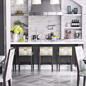
This expansive kitchen was done by Bilotta senior designer in collaboration with Nancy Epstein, founder and CEO of Artistic Tile, for Nancy’s son and daughter-in-law’s home. Frameless Rutt Regency cabinetry is featured in two different finishes: linen white paint on the perimeter and stained walnut on the island. Almost all surfaces are Calacatta Gold marble but in a variety of formats and finishes, obviously all by Artistic Tile. The backsplash, including the dramatic arched wall the houses the range and hood, features elongated brick tiles with a honed finish. The underside of the arch is lined with polished mosaics and the countertops are 2” thick slabs, polished. The flooring is the only surface in a different material – for that they used Artistic Tile’s “Vestige Ash”, a limestone with a brushed finish in a chevron pattern that creates texture and really shows the stone’s veining. In an article in Traditional Home, written by Amy Elbert, Nancy commented, “Everything has some weight, some girth to it. A common design mistake is making things too skinny. You want to feel the tile’s majesty and its beauty.” Rita added, “We always played with a delicate balance between contemporary and traditional elements.” The two stainless steel undermount sinks are Franke with Dornbracht faucets. There are various different work zones making it also a very functional space, aside from being sophisticated and elegant overall. There is the cooking area with the 36” range and custom hood on one wall; the island holds the main sink and a dishwasher; another wall houses the full height, 36” wide stainless steel refrigerator and freezer; and the sink wall (with a beautiful view to the backyard) has another dishwasher as well as refrigerator drawers. The circular dining table for six is by Zoffany and the chairs are “Normandie” by Artistic Frame with Duralee fabric.
Photo Credit Francesco Lagnese
 Katie Hutchison Studio
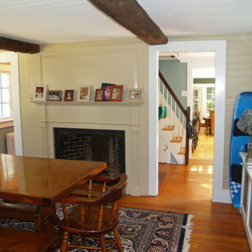
With two small children and a third on the way, the owners of an original eighteenth century Cape were quickly out-growing it, but they had no desire to move away from the Cape Cod home and location they loved. They simply needed a reconfigured layout and more space. Their goals included repurposing some existing rooms, adding a new kitchen/family area plus screen porch on the first level, and creating a master suite and roof deck with an outdoor shower on the second level, connected by a new stair.
Our challenge was to improve the flow between existing spaces, and design the two-story addition without overwhelming the pint-sized original Cape. We took advantage of the lower grade at the rear of the property to step the first floor of the addition down two steps from the existing main level. This allowed us to align the second floor in the addition with the existing second floor, while gaining ceiling height in the new first-floor kitchen/family area. We composed a cross-gabled form for the addition to improve the second floor headroom, while maintaining the existing eave line. We then extended some existing shed dormers to gain headroom and enhance function. We also expanded the outdoor living area with privacy walls along the roof deck.
New, larger, double–hung windows that match the lite configuration of the existing windows, along with new side-wall shingles and trim which resemble the existing exterior treatment help to tie the new addition to the old Cape. Though there’s no mistaking the new for the old, the two are simpatico.
Katie Hutchison Studio collaborated with Geoffrey Koper Architect of Yarmouth Port, Mass. on the Yarmouth Port Antique Cape Renovation and Addition. Kitchen fit-out and interior finishes, fixtures, and furnishings by others.
photo by Katie Hutchison
 DESIGN SOLUTIONS
Grossman
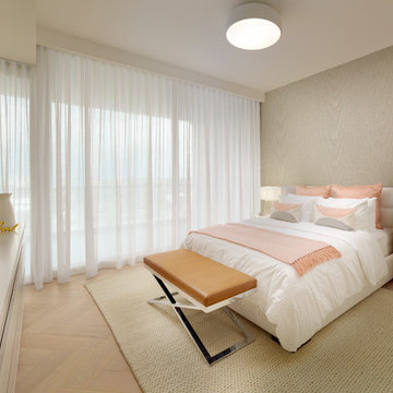
Example of a mid-sized minimalist guest bedroom design in Miami with beige walls
Example of a mid-sized minimalist guest bedroom design in Miami with beige walls
 Design Details
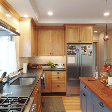
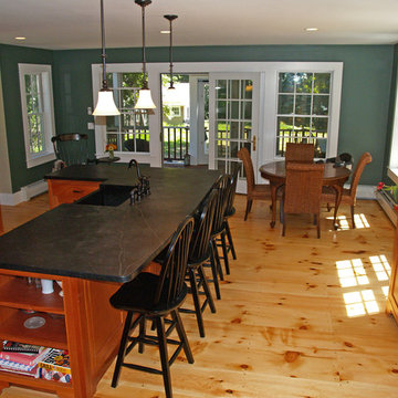
Red birch cabinetry, Soapstone countertops and recycled fir flooring contribute to the natural feel of the project.
Example of a mid-sized trendy l-shaped light wood floor and beige floor eat-in kitchen design with a single-bowl sink, shaker cabinets, light wood cabinets, soapstone countertops, white backsplash, subway tile backsplash, stainless steel appliances, an island and gray countertops
Example of a mid-sized trendy l-shaped light wood floor and beige floor eat-in kitchen design with a single-bowl sink, shaker cabinets, light wood cabinets, soapstone countertops, white backsplash, subway tile backsplash, stainless steel appliances, an island and gray countertops
 Bilotta Kitchen & Home
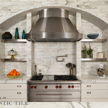
This expansive kitchen was done by Bilotta senior designer in collaboration with Nancy Epstein, founder and CEO of Artistic Tile, for Nancy’s son and daughter-in-law’s home. Frameless Rutt Regency cabinetry is featured in two different finishes: linen white paint on the perimeter and stained walnut on the island. Almost all surfaces are Calacatta Gold marble but in a variety of formats and finishes, obviously all by Artistic Tile. The backsplash, including the dramatic arched wall the houses the range and hood, features elongated brick tiles with a honed finish. The underside of the arch is lined with polished mosaics and the countertops are 2” thick slabs, polished. The flooring is the only surface in a different material – for that they used Artistic Tile’s “Vestige Ash”, a limestone with a brushed finish in a chevron pattern that creates texture and really shows the stone’s veining. In an article in Traditional Home, written by Amy Elbert, Nancy commented, “Everything has some weight, some girth to it. A common design mistake is making things too skinny. You want to feel the tile’s majesty and its beauty.” Rita added, “We always played with a delicate balance between contemporary and traditional elements.” The two stainless steel undermount sinks are Franke with Dornbracht faucets. There are various different work zones making it also a very functional space, aside from being sophisticated and elegant overall. There is the cooking area with the 36” range and custom hood on one wall; the island holds the main sink and a dishwasher; another wall houses the full height, 36” wide stainless steel refrigerator and freezer; and the sink wall (with a beautiful view to the backyard) has another dishwasher as well as refrigerator drawers. The circular dining table for six is by Zoffany and the chairs are “Normandie” by Artistic Frame with Duralee fabric.
Photo Credit Francesco Lagnese

 ArcWest Architects
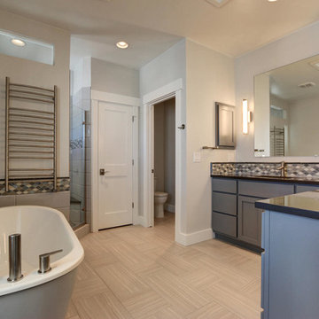
New residential project completed in Parker, Colorado in early 2016 This project is well sited to take advantage of tremendous views to the west of the Rampart Range and Pikes Peak. A contemporary home with a touch of craftsman styling incorporating a Wrap Around porch along the Southwest corner of the house.
Photographer: Nathan Strauch at Hot Shot Pros
 MDT, Inc.
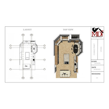
The top view shown in this design presentation provides a full-color, scaled 3D overview of the final kitchen layout. It allows clients and trade professionals to visualize the spatial relationships between key elements—such as the two islands, perimeter cabinetry, appliance zones, custom banquette, and bar area—in a single glance.
Why It’s Important:
Clarifies Functionality: The top view reveals how traffic will flow, how different zones (cooking, prep, dining, entertaining) interact, and how open the space feels after removing the dividing wall.
Enhances Communication: It serves as a bridge between the technical floor plan and the client’s understanding—making it easier for everyone from homeowners to electricians and cabinet installers to be on the same page.
Reduces Mistakes: With every element clearly placed and proportioned, it helps avoid on-site guesswork and ensures proper measurements and installations from day one.
Sets Expectations: It visually confirms the final design intent, so clients know exactly what to expect—eliminating surprises later in construction.
This top view is a vital part of MDT’s seamless preconstruction process, ensuring our vision is fully aligned with our clients’ goals before we even break ground.
 Katie Hutchison Studio
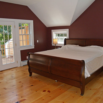
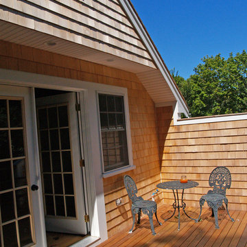
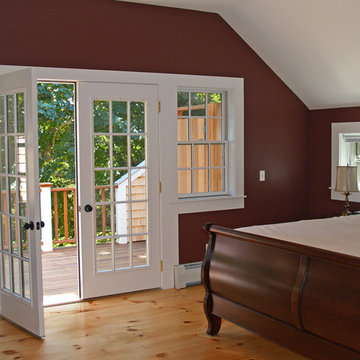
With two small children and a third on the way, the owners of an original eighteenth century Cape were quickly out-growing it, but they had no desire to move away from the Cape Cod home and location they loved. They simply needed a reconfigured layout and more space. Their goals included repurposing some existing rooms, adding a new kitchen/family area plus screen porch on the first level, and creating a master suite and roof deck with an outdoor shower on the second level, connected by a new stair.
Our challenge was to improve the flow between existing spaces, and design the two-story addition without overwhelming the pint-sized original Cape. We took advantage of the lower grade at the rear of the property to step the first floor of the addition down two steps from the existing main level. This allowed us to align the second floor in the addition with the existing second floor, while gaining ceiling height in the new first-floor kitchen/family area. We composed a cross-gabled form for the addition to improve the second floor headroom, while maintaining the existing eave line. We then extended some existing shed dormers to gain headroom and enhance function. We also expanded the outdoor living area with privacy walls along the roof deck.
New, larger, double–hung windows that match the lite configuration of the existing windows, along with new side-wall shingles and trim which resemble the existing exterior treatment help to tie the new addition to the old Cape. Though there’s no mistaking the new for the old, the two are simpatico.
Katie Hutchison Studio collaborated with Geoffrey Koper Architect of Yarmouth Port, Mass. on the Yarmouth Port Antique Cape Renovation and Addition. Kitchen fit-out and interior finishes, fixtures, and furnishings by others.
photo by Katie Hutchison
 Katie Hutchison Studio
With two small children and a third on the way, the owners of an original eighteenth century Cape were quickly out-growing it, but they had no desire to move away from the Cape Cod home and location they loved. They simply needed a reconfigured layout and more space. Their goals included repurposing some existing rooms, adding a new kitchen/family area plus screen porch on the first level, and creating a master suite and roof deck with an outdoor shower on the second level, connected by a new stair.
Our challenge was to improve the flow between existing spaces, and design the two-story addition without overwhelming the pint-sized original Cape. We took advantage of the lower grade at the rear of the property to step the first floor of the addition down two steps from the existing main level. This allowed us to align the second floor in the addition with the existing second floor, while gaining ceiling height in the new first-floor kitchen/family area. We composed a cross-gabled form for the addition to improve the second floor headroom, while maintaining the existing eave line. We then extended some existing shed dormers to gain headroom and enhance function. We also expanded the outdoor living area with privacy walls along the roof deck.
New, larger, double–hung windows that match the lite configuration of the existing windows, along with new side-wall shingles and trim which resemble the existing exterior treatment help to tie the new addition to the old Cape. Though there’s no mistaking the new for the old, the two are simpatico.
Katie Hutchison Studio collaborated with Geoffrey Koper Architect of Yarmouth Port, Mass. on the Yarmouth Port Antique Cape Renovation and Addition. Kitchen fit-out and interior finishes, fixtures, and furnishings by others.
photo by Katie Hutchison
 Katie Hutchison Studio
With two small children and a third on the way, the owners of an original eighteenth century Cape were quickly out-growing it, but they had no desire to move away from the Cape Cod home and location they loved. They simply needed a reconfigured layout and more space. Their goals included repurposing some existing rooms, adding a new kitchen/family area plus screen porch on the first level, and creating a master suite and roof deck with an outdoor shower on the second level, connected by a new stair.
Our challenge was to improve the flow between existing spaces, and design the two-story addition without overwhelming the pint-sized original Cape. We took advantage of the lower grade at the rear of the property to step the first floor of the addition down two steps from the existing main level. This allowed us to align the second floor in the addition with the existing second floor, while gaining ceiling height in the new first-floor kitchen/family area. We composed a cross-gabled form for the addition to improve the second floor headroom, while maintaining the existing eave line. We then extended some existing shed dormers to gain headroom and enhance function. We also expanded the outdoor living area with privacy walls along the roof deck.
New, larger, double–hung windows that match the lite configuration of the existing windows, along with new side-wall shingles and trim which resemble the existing exterior treatment help to tie the new addition to the old Cape. Though there’s no mistaking the new for the old, the two are simpatico.
Katie Hutchison Studio collaborated with Geoffrey Koper Architect of Yarmouth Port, Mass. on the Yarmouth Port Antique Cape Renovation and Addition. Kitchen fit-out and interior finishes, fixtures, and furnishings by others.
photo by Katie Hutchison
 Katie Hutchison Studio
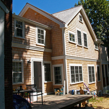
With two small children and a third on the way, the owners of an original eighteenth century Cape were quickly out-growing it, but they had no desire to move away from the Cape Cod home and location they loved. They simply needed a reconfigured layout and more space. Their goals included repurposing some existing rooms, adding a new kitchen/family area plus screen porch on the first level, and creating a master suite and roof deck with an outdoor shower on the second level, connected by a new stair.
Our challenge was to improve the flow between existing spaces, and design the two-story addition without overwhelming the pint-sized original Cape. We took advantage of the lower grade at the rear of the property to step the first floor of the addition down two steps from the existing main level. This allowed us to align the second floor in the addition with the existing second floor, while gaining ceiling height in the new first-floor kitchen/family area. We composed a cross-gabled form for the addition to improve the second floor headroom, while maintaining the existing eave line. We then extended some existing shed dormers to gain headroom and enhance function. We also expanded the outdoor living area with privacy walls along the roof deck.
New, larger, double–hung windows that match the lite configuration of the existing windows, along with new side-wall shingles and trim which resemble the existing exterior treatment help to tie the new addition to the old Cape. Though there’s no mistaking the new for the old, the two are simpatico.
Katie Hutchison Studio collaborated with Geoffrey Koper Architect of Yarmouth Port, Mass. on the Yarmouth Port Antique Cape Renovation and Addition. Kitchen fit-out and interior finishes, fixtures, and furnishings by others.
photo by Katie Hutchison

 Katie Hutchison Studio
With two small children and a third on the way, the owners of an original eighteenth century Cape were quickly out-growing it, but they had no desire to move away from the Cape Cod home and location they loved. They simply needed a reconfigured layout and more space. Their goals included repurposing some existing rooms, adding a new kitchen/family area plus screen porch on the first level, and creating a master suite and roof deck with an outdoor shower on the second level, connected by a new stair.
Our challenge was to improve the flow between existing spaces, and design the two-story addition without overwhelming the pint-sized original Cape. We took advantage of the lower grade at the rear of the property to step the first floor of the addition down two steps from the existing main level. This allowed us to align the second floor in the addition with the existing second floor, while gaining ceiling height in the new first-floor kitchen/family area. We composed a cross-gabled form for the addition to improve the second floor headroom, while maintaining the existing eave line. We then extended some existing shed dormers to gain headroom and enhance function. We also expanded the outdoor living area with privacy walls along the roof deck.
New, larger, double–hung windows that match the lite configuration of the existing windows, along with new side-wall shingles and trim which resemble the existing exterior treatment help to tie the new addition to the old Cape. Though there’s no mistaking the new for the old, the two are simpatico.
Katie Hutchison Studio collaborated with Geoffrey Koper Architect of Yarmouth Port, Mass. on the Yarmouth Port Antique Cape Renovation and Addition. Kitchen fit-out and interior finishes, fixtures, and furnishings by others.
photo by Katie Hutchison
 Bilotta Kitchen & Home
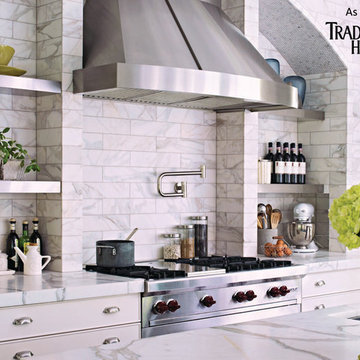
This expansive kitchen was done by Bilotta senior designer in collaboration with Nancy Epstein, founder and CEO of Artistic Tile, for Nancy’s son and daughter-in-law’s home. Frameless Rutt Regency cabinetry is featured in two different finishes: linen white paint on the perimeter and stained walnut on the island. Almost all surfaces are Calacatta Gold marble but in a variety of formats and finishes, obviously all by Artistic Tile. The backsplash, including the dramatic arched wall the houses the range and hood, features elongated brick tiles with a honed finish. The underside of the arch is lined with polished mosaics and the countertops are 2” thick slabs, polished. The flooring is the only surface in a different material – for that they used Artistic Tile’s “Vestige Ash”, a limestone with a brushed finish in a chevron pattern that creates texture and really shows the stone’s veining. In an article in Traditional Home, written by Amy Elbert, Nancy commented, “Everything has some weight, some girth to it. A common design mistake is making things too skinny. You want to feel the tile’s majesty and its beauty.” Rita added, “We always played with a delicate balance between contemporary and traditional elements.” The two stainless steel undermount sinks are Franke with Dornbracht faucets. There are various different work zones making it also a very functional space, aside from being sophisticated and elegant overall. There is the cooking area with the 36” range and custom hood on one wall; the island holds the main sink and a dishwasher; another wall houses the full height, 36” wide stainless steel refrigerator and freezer; and the sink wall (with a beautiful view to the backyard) has another dishwasher as well as refrigerator drawers. The circular dining table for six is by Zoffany and the chairs are “Normandie” by Artistic Frame with Duralee fabric.
Photo Credit Francesco Lagnese
46