
Search results for "Offering brand new" in Home Design Ideas
 ZeroEnergy Design
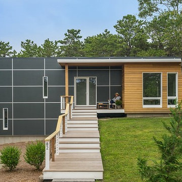
This modern green home offers both a vacation destination on Cape Cod near local family members and an opportunity for rental income.
FAMILY ROOTS. A West Coast couple living in the San Francisco Bay Area sought a permanent East Coast vacation home near family members living on Cape Cod. As academic professionals focused on sustainability, they sought a green, energy efficient home that was well-aligned with their values. With no green homes available for sale on Cape Cod, they decided to purchase land near their family and build their own.
SLOPED SITE. Comprised of a 3/4 acre lot nestled in the pines, the steeply sloping terrain called for a plan that embraced and took advantage of the slope. Of equal priority was optimizing solar exposure, preserving privacy from abutters, and creating outdoor living space. The design accomplished these goals with a simple, rectilinear form, offering living space on the both entry and lower/basement levels. The stepped foundation allows for a walk-out basement level with light-filled living space on the down-hill side of the home. The traditional basement on the eastern, up-hill side houses mechanical equipment and a home gym. The house welcomes natural light throughout, captures views of the forest, and delivers entertainment space that connects indoor living space to outdoor deck and dining patio.
MODERN VISION. The clean building form and uncomplicated finishes pay homage to the modern architectural legacy on the outer Cape. Durable and economical fiber cement panels, fixed with aluminum channels, clad the primary form. Cedar clapboards provide a visual accent at the south-facing living room, which extends a single roof plane to cover the entry porch.
SMART USE OF SPACE. On the entry level, the “L”-shaped living, dining, and kitchen space connects to the exterior living, dining, and grilling spaces to effectively double the home’s summertime entertainment area. Placed at the western end of the entry level (where it can retain privacy but still claim expansive downhill views) is the master suite with a built-in study. The lower level has two guest bedrooms, a second full bathroom, and laundry. The flexibility of the space—crucial in a house with a modest footprint—emerges in one of the guest bedrooms, which doubles as home office by opening the barn-style double doors to connect it to the bright, airy open stair leading up to the entry level. Thoughtful design, generous ceiling heights and large windows transform the modest 1,100 sf* footprint into a well-lit, spacious home. *(total finished space is 1800 sf)
RENTAL INCOME. The property works for its owners by netting rental income when the owners are home in San Francisco. The house especially caters to vacationers bound for nearby Mayo Beach and includes an outdoor shower adjacent to the lower level entry door. In contrast to the bare bones cottages that are typically available on the Cape, this home offers prospective tenants a modern aesthetic, paired with luxurious and green features. Durable finishes inside and out will ensure longevity with the heavier use that comes with a rental property.
COMFORT YEAR-ROUND. The home is super-insulated and air-tight, with mechanical ventilation to provide continuous fresh air from the outside. High performance triple-paned windows complement the building enclosure and maximize passive solar gain while ensuring a warm, draft-free winter, even when sitting close to the glass. A properly sized air source heat pump offers efficient heating & cooling, and includes a carefully designed the duct distribution system to provide even comfort throughout the house. The super-insulated envelope allows us to significantly reduce the equipment capacity, duct size, and airflow quantities, while maintaining unparalleled thermal comfort.
ENERGY EFFICIENT. The building’s shell and mechanical systems play instrumental roles in the home’s exceptional performance. The building enclosure reduces the most significant energy glutton: heating. Continuous super-insulation, thorough air sealing, triple-pane windows, and passive solar gain work together to yield a miniscule heating load. All active energy consumers are extremely efficient: an air source heat pump for heating and cooling, a heat pump hot water heater, LED lighting, energy recovery ventilation (ERV), and high efficiency appliances. The result is a home that uses 70% less energy than a similar new home built to code requirements.
OVERALL. The home embodies the owners’ goals and values while comprehensively enabling thermal comfort, energy efficiency, a vacation respite, and supplementary income.
PROJECT TEAM
ZeroEnergy Design - Architect & Mechanical Designer
A.F. Hultin & Co. - Contractor
Pamet Valley Landscape Design - Landscape & Masonry
Lisa Finch - Original Artwork
European Architectural Supply - Windows
Eric Roth Photography - Photography

 TKS Design Group
Download our free ebook, Creating the Ideal Kitchen. DOWNLOAD NOW
This client was referred to us from a past client. They are a busy 2-career household with young children and enjoy entertaining friends and family in their home. They have a beautiful open concept home but unfortunately the kitchen was not fitting for the rest of the home. They were not quite sure what to do with the space. We talked about trying to refresh it or do more of a minor remodel, but in the end they decided a full gut would get them to where they wanted to be.
One problem was there was no place for guests to hang out other than the large and awkward banquette area. The brick wall and tiled hood area were feeling a bit dated and tired. The space was just not functional for their lifestyle. There was no prep space near the cooktop and no landing area for items coming out of the ovens or refrigerator, plus a big dead zone in the center of the room.
Banquettes, like the one they previously had in the space, are great for small spaces, but when they get really large like this one, it makes getting in and out of the seating area awkward and uncomfortable. Plus, there was room for a large table, so we eliminated the awkward built in.
We started by removing the faux brick wall between the kitchen and back entry. We relocated the entry to the garage over a couple feet in order to get every last inch out of the new kitchen. We also made the decision to close up the primary window that faced the pretty ho hum brick wall of the neighbor’s house. There was plenty of light coming in from the seating area, so we just didn’t feel the window was adding much to the room.
Construction went smoothy. There was a bit of rework with electrical, flooring and HVAC, but in the end, we think it was well worth it.
The clients really wanted a sleek contemporary look, and we originally had planned for a full height slab backsplash, but due to it’s size, it was a budget buster. Instead, we got creative and settled on large format porcelain tiles that have a similar feel but were a fraction of the cost. We made sure the wall was plumb and level so that the fit and finish would mimic that of slab material.
The final space was quite a change. A large prep sink sits directly across from the new pro-style range with plenty additional prep space on the large island. The refrigerator and ovens now have miles of landing space, and a nice tight work triangle makes cooking a breeze.
Since we wanted a more contemporary feel, not many wall cabinets were included. Instead, we outfitted some of the drawers for dish storage with a peg system. Two large pantries flanking the refrigerator hold baking supplies and small appliances. Large drawers by the cooktop hold pots and pans, and an appliance garage tucked away to the left of the range hides away miscellaneous items. The large island also houses a microwave drawer and tons of storage, most of which is drawers offering maximum convenience.
The island now seats 5-6 people comfortably along with the new table in the seating area which can seat up to 8. Entertaining will be a breeze in this space. With such a clean backdrop, we knew we would need some drama with the lighting, so we chose two sets of staggered pendants, which we adjusted for the right visual balance above the island.
We also included a small coffee station to the right of the main kitchen, which helps keep the coffee clutter out of the kitchen proper. Two tones of complimentary gray are featured in this kitchen. The perimeter is a light gray that reads almost white. The island is a gray stain that adds some depth and interest with the visible wood texture. The countertops are clean white quartz, and the hardware, barstools and light fixtures add warm brass tones. I see lots of cooking and entertaining with family and friends in the near future in this bright and airy new space.
Designed by: Susan Klimala, CKD, CBD
Photography by: Michael Kaskel
For more information on kitchen and bath design ideas go to: www.kitchenstudio-ge.com
 David Heide Design Studio
In coming to Minnesota from Iceland, the owners of Home 4 found themselves more than 3,000 miles away from home, hoping to build something new – literally and figuratively – that would feel like home for their family of five. They purchased a scenic piece of land in Rochester and identified a general idea of the spaces they would need, but they struggled with how to define a sense of character that would incorporate their culture and identity into the design. The architect-led design team was tasked with creating a house that would help establish the homeowners’ roots in a new country while still recalling familiar comforts of their heritage.
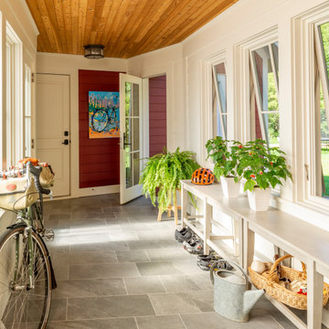
The result is a warm family home that combines elements of Nordic design with a touch of American farmhouse aesthetic. Gracious proportions, custom woodworking, and cheerful details create a welcoming atmosphere, while modern conveniences like a large mudroom and second-floor laundry help day-to-day life feel easy.
Around each corner, a new detail greets the eye, from the Lundie-inspired column at the staircase, to the double-heart detail inscribed in the woodwork, to the custom table designed for the breakfast nook. Each element is lovely individually, but experiencing the holistic effect as the details intentionally pair and play together helps to craft a house that feels like home.
Most important, the homeowners’ history, heritage, and hopes are melded together into a home that represents their family. Each unique element and carefully considered material combine to form a house that feels as if it could have belonged to this family for generations, even though it is brand new.
Find the right local pro for your project

 Pineapple House Interior Design
-The kitchen was isolated but was key to project’s success, as it is the central axis of the first level
-The designers renovated the entire lower level to create a configuration that opened the kitchen to every room on lower level, except for the formal dining room
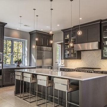
-New double islands tripled the previous counter space and doubled previous storage
-Six bar stools offer ample seating for casual family meals and entertaining
-With a nod to the children, all upholstery in the Kitchen/ Breakfast Room are indoor/outdoor fabrics
-Removing & shortening walls between kitchen/family room/informal dining allows views, a total house connection, plus the architectural changes in these adjoining rooms enhances the kitchen experience
-Design aesthetic was to keep everything neutral with pops of color and accents of dark elements
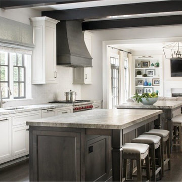
-Cream cabinetry contrasts with dark stain accents on the island, hood & ceiling beams
-Back splash is over-scaled subway tile; pewter cabinetry hardware
-Fantasy Brown granite counters have a "leather-ed" finish
-The focal point and center of activity now stems from the kitchen – it’s truly the Heart of this Home.
Galina Coada Photography
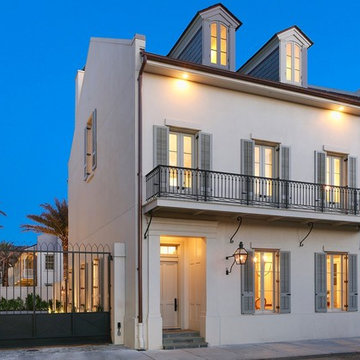
 BEVOLO GAS & ELECTRIC LIGHTS
Step inside this rare & magnificent new construction French Quarter home filled with historic style and contemporary ease & elegance.
Set within Maison Du Parc, this community offers the perfect blend of old and new with the combination of completely renovated historic structures and brand new ground up construction. This seamless integration of traditional New Orleans design with modern luxury creates an exclusive retreat within the cherished New Orleans Vieux Carre. Take the tour! http://ow.ly/ClEZ30nBGOX
Featured Lanterns: http://ow.ly/hEVD30nBGyX | http://ow.ly/DGH330nBGEe
 Drury Design
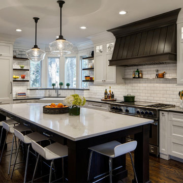
A low bay window and a second unnecessary door to the backyard limited options for reworking the layout. The solution was to replace the window with a new unit that would offer a great spot for a new farm sink. Eliminating the unused back door enabled us to locate a large new pantry and fridge in its place. (A second door to the backyard remained intact).
Connecting the kitchen to the dining room was also a priority. A wide new cased opening makes the dining and kitchen flow beautifully, allowing the cook to chat with guests.
New gourmet appliances and a large island offer all the amenities an avid cook could want. On the seating side of the island, lap drawers keep school supplies handy. A tall “between the studs” cabinet offers dedicated storage for kids snacks and a handy spot for mail and school info, so the counters stay free of papers. A charging drawer also helps keep the kitchen tidy.
The palette for the new kitchen features fresh white perimeter cabinets, with a contrasting dark stained island, open shelves, and custom hood.
The homeowners could not be happier with their new kitchen, which has gone from almost unusable to being the true heart of their home!

Sponsored
Columbus, OH
Free consultation for landscape design!

Peabody Landscape Group
Franklin County's Reliable Landscape Design & Contracting
 Milgard Windows & Doors
The Kiguchi family moved into their Austin, Texas home in 1994. Built in the 1980’s as part of a neighborhood development, they happily raised their family here but longed for something more contemporary. Once they became empty nesters, they decided it was time for a major remodel. After spending many years visiting Austin AIA Home Tours that highlight contemporary residential architecture, they had a lot of ideas and in 2013 were ready to interview architects and get their renovation underway.
The project turned into a major remodel due to an unstable foundation. Architects Ben Arbib and Ed Hughey, of Arbib Hughey Design were hired to solve the structural issue and look for inspiration in the bones of the house, which sat on top of a hillside and was surrounded by great views.
Unfortunately, with the old floor plan, the beautiful views were hidden by small windows that were poorly placed. In order to bring more natural light into the house the window sizes and configurations had to be addressed, all while keeping in mind the homeowners desire for a modern look and feel.
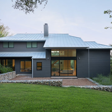
To achieve a more contemporary and sophisticated front of house, a new entry was designed that included removing a two-story bay window and porch. The entrance of the home also became more integrated with the landscape creating a template for new foliage to be planted. Older exterior materials were updated to incorporate a more muted palette of colors with a metal roof, dark grey siding in the back and white stucco in the front. Deep eaves were added over many of the new large windows for clean lines and sun protection.
“Inside it was about opening up the floor plan, expanding the views throughout the house, and updating the material palette to get a modern look that was also warm and inviting,” said Ben from Arbib Hughey Design. “Prior to the remodel, the house had the typical separation of rooms. We removed the walls between them and changed all of the windows to Milgard Thermally Improved Aluminum to connect the inside with the outside. No matter where you are you get nice views and natural light.”
The architects wanted to create some drama, which they accomplished with the window placement and opening up the interior floor plan to an open concept approach. Cabinetry was used to help delineate intimate spaces. To add warmth to an all-white living room, white-washed oak wood floors were installed and pine planks were used around the fireplace. The large windows served as artwork bringing the color of nature into the space.
An octagon shaped, elevated dining room, (named “the turret”), had a big impact on the design of the house. They architects rounded the corners and added larger window openings overlooking a new sunken garden. The great room was also softened by rounding out the corners and that circular theme continued throughout the house, being picked up in skylight wells and kitchen cabinetry. A staircase leading to a catwalk was added and the result was a two-story window wall that flooded the home with natural light.
When asked why Milgard® Thermally Improved Aluminum windows were selected, the architectural team listed many reasons:
1) Aesthetics: “We liked the slim profiles and narrow sightlines. The window frames never get in the way of the view and that was important to us. They also have a very contemporary look that went well with our design.”
2) Options: “We liked that we could get large sliding doors that matched the windows, giving us a very cohesive look and feel throughout the project.”
3) Cost Effective: “Milgard windows are affordable. You get a good product at a good price.”
4) Custom Sizes: “Milgard windows are customizable, which allowed us to get the right window for each location.”
Ready to take on your own traditional to modern home remodeling project? Arbib Hughey Design advises, “Work with a good architect. That means picking a team that is creative, communicative, listens well and is responsive. We think it’s important for an architect to listen to their clients and give them something they want, not something the architect thinks they should have. At the same time you want an architect who is willing and able to think outside the box and offer up design options that you may not have considered. Design is about a lot of back and forth, trying out ideas, getting feedback and trying again.”
The home was completely transformed into a unique, contemporary house perfectly integrated with its site. Internally the home has a natural flow for the occupants and externally it is integrated with the surroundings taking advantage of great natural light. As a side note, it was highly praised as part of the Austin AIA homes tour.
 Urbanology Designs
A captivating transformation in the coveted neighborhood of University Park, Dallas
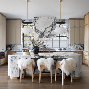
The heart of this home lies in the kitchen, where we embarked on a design endeavor that would leave anyone speechless. By opening up the main kitchen wall, we created a magnificent window system that floods the space with natural light and offers a breathtaking view of the picturesque surroundings. Suspended from the ceiling, a steel-framed marble vent hood floats a few inches from the window, showcasing a mesmerizing Lilac Marble. The same marble is skillfully applied to the backsplash and island, featuring a bold combination of color and pattern that exudes elegance.
Adding to the kitchen's allure is the Italian range, which not only serves as a showstopper but offers robust culinary features for even the savviest of cooks. However, the true masterpiece of the kitchen lies in the honed reeded marble-faced island. Each marble strip was meticulously cut and crafted by artisans to achieve a half-rounded profile, resulting in an island that is nothing short of breathtaking. This intricate process took several months, but the end result speaks for itself.
To complement the grandeur of the kitchen, we designed a combination of stain-grade and paint-grade cabinets in a thin raised panel door style. This choice adds an elegant yet simple look to the overall design. Inside each cabinet and drawer, custom interiors were meticulously designed to provide maximum functionality and organization for the day-to-day cooking activities. A vintage Turkish runner dating back to the 1960s, evokes a sense of history and character.
The breakfast nook boasts a stunning, vivid, and colorful artwork created by one of Dallas' top artist, Kyle Steed, who is revered for his mastery of his craft. Some of our favorite art pieces from the inspiring Haylee Yale grace the coffee station and media console, adding the perfect moment to pause and loose yourself in the story of her art.
The project extends beyond the kitchen into the living room, where the family's changing needs and growing children demanded a new design approach. Accommodating their new lifestyle, we incorporated a large sectional for family bonding moments while watching TV. The living room now boasts bolder colors, striking artwork a coffered accent wall, and cayenne velvet curtains that create an inviting atmosphere. Completing the room is a custom 22' x 15' rug, adding warmth and comfort to the space. A hidden coat closet door integrated into the feature wall adds an element of surprise and functionality.
This project is not just about aesthetics; it's about pushing the boundaries of design and showcasing the possibilities. By curating an out-of-the-box approach, we bring texture and depth to the space, employing different materials and original applications. The layered design achieved through repeated use of the same material in various forms, shapes, and locations demonstrates that unexpected elements can create breathtaking results.
The reason behind this redesign and remodel was the homeowners' desire to have a kitchen that not only provided functionality but also served as a beautiful backdrop to their cherished family moments. The previous kitchen lacked the "wow" factor they desired, prompting them to seek our expertise in creating a space that would be a source of joy and inspiration.
Inspired by well-curated European vignettes, sculptural elements, clean lines, and a natural color scheme with pops of color, this design reflects an elegant organic modern style. Mixing metals, contrasting textures, and utilizing clean lines were key elements in achieving the desired aesthetic. The living room introduces bolder moments and a carefully chosen color scheme that adds character and personality.
The client's must-haves were clear: they wanted a show stopping centerpiece for their home, enhanced natural light in the kitchen, and a design that reflected their family's dynamic. With the transformation of the range wall into a wall of windows, we fulfilled their desire for abundant natural light and breathtaking views of the surrounding landscape.
Our favorite rooms and design elements are numerous, but the kitchen remains a standout feature. The painstaking process of hand-cutting and crafting each reeded panel in the island to match the marble's veining resulted in a labor of love that emanates warmth and hospitality to all who enter.
In conclusion, this tastefully lux project in University Park, Dallas is an extraordinary example of a full gut remodel that has surpassed all expectations. The meticulous attention to detail, the masterful use of materials, and the seamless blend of functionality and aesthetics create an unforgettable space. It serves as a testament to the power of design and the transformative impact it can have on a home and its inhabitants.
Project by Texas' Urbanology Designs. Their North Richland Hills-based interior design studio serves Dallas, Highland Park, University Park, Fort Worth, and upscale clients nationwide.
 Décor Aid
New Yorkers are always on the prowl for innovative ways to make the most of the space they have. An upper east side couple, challenged with a slightly narrow L shaped apartment sought out Decor Aid’s help to make the most of their Manhattan condo. Paired with one of our senior designer, Kimberly P., we learned that the clients wanted a space that looked beautiful, comfortable and also packed with functionality for everyday living.
“Immediately upon seeing the space, I knew that we needed to create a narrative that allowed the design to control how you moved through the space,” reports Kimberly, senior interior designer.
After surveying each room and learning a bit more about their personal style, we started with the living room remodel. It was clear that the couple wanted to infuse mid-century modern into the design plan. Sourcing the Room & Board Jasper Sofa with its narrow arms and tapered legs, it offered the mid-century look, with the modern comfort the clients are used to. Velvet accent pillows from West Elm and Crate & Barrel add pops of colors but also a subtle touch of luxury, while framed pictures from the couple’s honeymoon personalize the space.
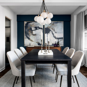
Moving to the dining room next, Kimberly decided to add a blue accent wall to emphasize the Horchow two piece Percussion framed art that was to be the focal point of the dining area. The Seno sideboard from Article perfectly accentuated the mid-century style the clients loved while providing much-needed storage space. The palette used throughout both rooms were very New York style, grays, blues, beiges, and whites, to add depth, Kimberly sourced decorative pieces in a mixture of different metals.
“The artwork above their bureau in the bedroom is photographs that her father took,”
Moving into the bedroom renovation, our designer made sure to continue to stick to the client’s style preference while once again creating a personalized, warm and comforting space by including the photographs taken by the client’s father. The Avery bed added texture and complimented the other colors in the room, while a hidden drawer at the foot pulls out for attached storage, which thrilled the clients. A deco-inspired Faceted mirror from West Elm was a perfect addition to the bedroom due to the illusion of space it provides. The result was a bedroom that was full of mid-century design, personality, and area so they can freely move around.
The project resulted in the form of a layered mid-century modern design with touches of luxury but a space that can not only be lived in but serves as an extension of the people who live there. Our designer was able to take a very narrowly shaped Manhattan apartment and revamp it into a spacious home that is great for sophisticated entertaining or comfortably lazy nights in.
 Heather Garrett Design
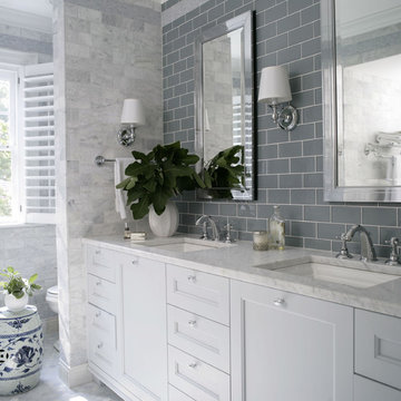
A growing family, a rambling Georgian estate. The question: how to imbue tradition with a fresh spirit? The charge was to maintain the idea of old school charm without the interior feeling just… old. An illustration could be found in picture molding (which we added, then painted to disappear into the walls) or a modern plaster sculpture teetering upon an old barrister bookcase. Charm, with a wink.
Photography by John Bessler
 41 West
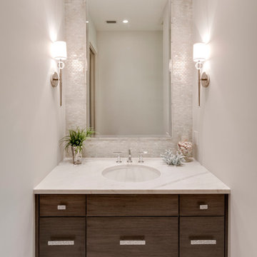
41 West Coastal Retreat Series reveals creative, fresh ideas, for a new look to define the casual beach lifestyle of Naples.
More than a dozen custom variations and sizes are available to be built on your lot. From this spacious 3,000 square foot, 3 bedroom model, to larger 4 and 5 bedroom versions ranging from 3,500 - 10,000 square feet, including guest house options.

 Change Your Bathroom©
The goal of this project was to upgrade the builder grade finishes and create an ergonomic space that had a contemporary feel. This bathroom transformed from a standard, builder grade bathroom to a contemporary urban oasis. This was one of my favorite projects, I know I say that about most of my projects but this one really took an amazing transformation. By removing the walls surrounding the shower and relocating the toilet it visually opened up the space. Creating a deeper shower allowed for the tub to be incorporated into the wet area. Adding a LED panel in the back of the shower gave the illusion of a depth and created a unique storage ledge. A custom vanity keeps a clean front with different storage options and linear limestone draws the eye towards the stacked stone accent wall.
Houzz Write Up: https://www.houzz.com/magazine/inside-houzz-a-chopped-up-bathroom-goes-streamlined-and-swank-stsetivw-vs~27263720
The layout of this bathroom was opened up to get rid of the hallway effect, being only 7 foot wide, this bathroom needed all the width it could muster. Using light flooring in the form of natural lime stone 12x24 tiles with a linear pattern, it really draws the eye down the length of the room which is what we needed. Then, breaking up the space a little with the stone pebble flooring in the shower, this client enjoyed his time living in Japan and wanted to incorporate some of the elements that he appreciated while living there. The dark stacked stone feature wall behind the tub is the perfect backdrop for the LED panel, giving the illusion of a window and also creates a cool storage shelf for the tub. A narrow, but tasteful, oval freestanding tub fit effortlessly in the back of the shower. With a sloped floor, ensuring no standing water either in the shower floor or behind the tub, every thought went into engineering this Atlanta bathroom to last the test of time. With now adequate space in the shower, there was space for adjacent shower heads controlled by Kohler digital valves. A hand wand was added for use and convenience of cleaning as well. On the vanity are semi-vessel sinks which give the appearance of vessel sinks, but with the added benefit of a deeper, rounded basin to avoid splashing. Wall mounted faucets add sophistication as well as less cleaning maintenance over time. The custom vanity is streamlined with drawers, doors and a pull out for a can or hamper.
A wonderful project and equally wonderful client. I really enjoyed working with this client and the creative direction of this project.
Brushed nickel shower head with digital shower valve, freestanding bathtub, curbless shower with hidden shower drain, flat pebble shower floor, shelf over tub with LED lighting, gray vanity with drawer fronts, white square ceramic sinks, wall mount faucets and lighting under vanity. Hidden Drain shower system. Atlanta Bathroom.

Sponsored
Columbus, OH

Hope Restoration & General Contracting
Columbus Design-Build, Kitchen & Bath Remodeling, Historic Renovations
 Cummings Architecture + Interiors
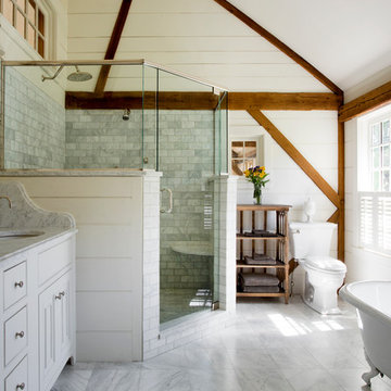
The beautiful, old barn on this Topsfield estate was at risk of being demolished. Before approaching Mathew Cummings, the homeowner had met with several architects about the structure, and they had all told her that it needed to be torn down. Thankfully, for the sake of the barn and the owner, Cummings Architects has a long and distinguished history of preserving some of the oldest timber framed homes and barns in the U.S.
Once the homeowner realized that the barn was not only salvageable, but could be transformed into a new living space that was as utilitarian as it was stunning, the design ideas began flowing fast. In the end, the design came together in a way that met all the family’s needs with all the warmth and style you’d expect in such a venerable, old building.
On the ground level of this 200-year old structure, a garage offers ample room for three cars, including one loaded up with kids and groceries. Just off the garage is the mudroom – a large but quaint space with an exposed wood ceiling, custom-built seat with period detailing, and a powder room. The vanity in the powder room features a vanity that was built using salvaged wood and reclaimed bluestone sourced right on the property.
Original, exposed timbers frame an expansive, two-story family room that leads, through classic French doors, to a new deck adjacent to the large, open backyard. On the second floor, salvaged barn doors lead to the master suite which features a bright bedroom and bath as well as a custom walk-in closet with his and hers areas separated by a black walnut island. In the master bath, hand-beaded boards surround a claw-foot tub, the perfect place to relax after a long day.
In addition, the newly restored and renovated barn features a mid-level exercise studio and a children’s playroom that connects to the main house.
From a derelict relic that was slated for demolition to a warmly inviting and beautifully utilitarian living space, this barn has undergone an almost magical transformation to become a beautiful addition and asset to this stately home.
 MainStreet Design Build
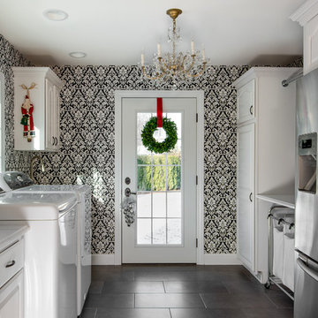
On April 22, 2013, MainStreet Design Build began a 6-month construction project that ended November 1, 2013 with a beautiful 655 square foot addition off the rear of this client's home. The addition included this gorgeous custom kitchen, a large mudroom with a locker for everyone in the house, a brand new laundry room and 3rd car garage. As part of the renovation, a 2nd floor closet was also converted into a full bathroom, attached to a child’s bedroom; the formal living room and dining room were opened up to one another with custom columns that coordinated with existing columns in the family room and kitchen; and the front entry stairwell received a complete re-design.
KateBenjamin Photography
 Studio Dearborn
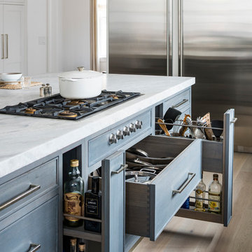
A young family moving from NYC tackled a lightning fast makeover of their new colonial revival home before the arrival of their second child. The kitchen area was quite spacious but needed a facelift and new layout. Painted cabinetry matched to Benjamin Moore’s Light Pewter is balanced by grey glazed rift oak cabinetry on the island. Shiplap paneling on the island and cabinet lend a slightly contemporary edge. White bronze hardware by Schaub & Co. in a contemporary bar shape offer clean lines with some texture in a warm metallic tone.
White Marble countertops in “Alpine Mist” create a harmonious color palette while the pale blue/grey Waterworks backsplash adds a touch of color. Kitchen design and custom cabinetry by Studio Dearborn. Countertops by Rye Marble. Refrigerator, freezer and wine refrigerator--Subzero; Ovens--Wolf. Cooktop--Gaggenau. Ventilation—Sirius. Hardware--Schaub & Company. Sink--Kohler Strive. Sink faucet--Rohl. Tile--Waterworks. Stools--Palacek. Flooring—Sota Floors. Window treatments: www.horizonshades.com in “Northbrook Birch.” Photography Adam Kane Macchia.
 InnovationLand
This Houston kitchen remodel turned an outdated bachelor pad into a contemporary dream fit for newlyweds.
The client wanted a contemporary, somewhat commercial look, but also something homey with a comfy, family feel. And they couldn't go too contemporary, since the style of the home is so traditional.
The clean, contemporary, white-black-and-grey color scheme is just the beginning of this transformation from the previous kitchen,
The revamped 20-by-15-foot kitchen and adjoining dining area also features new stainless steel appliances by Maytag, lighting and furnishings by Restoration Hardware and countertops in white Carrara marble and Absolute Black honed granite.
The paneled oak cabinets are now painted a crisp, bright white and finished off with polished nickel pulls. The center island is now a cool grey a few shades darker than the warm grey on the walls. On top of the grey on the new sheetrock, previously covered in a camel-colored textured paint, is Sherwin Williams' Faux Impressions sparkly "Striae Quartz Stone."
Ho-hum 12-inch ceramic floor tiles with a western motif border have been replaced with grey tile "planks" resembling distressed wood. An oak-paneled flush-mount light fixture has given way to recessed lights and barn pendant lamps in oil rubbed bronze from Restoration Hardware. And the section housing clunky upper and lower banks of cabinets between the kitchen an dining area now has a sleek counter-turned-table with custom-milled legs.
At first, the client wanted to open up that section altogether, but then realized they needed more counter space. The table - a continuation of the granite countertop - was the perfect solution. Plus, it offered space for extra seating.
The black, high-back and low-back bar stools are also from Restoration Hardware - as is the new round chandelier and the dining table over which it hangs.
Outdoor Homescapes of Houston also took out a wall between the kitchen and living room and remodeled the adjoining living room as well. A decorative cedar beam stained Minwax Jacobean now spans the ceiling where the wall once stood.
The oak paneling and stairway railings in the living room, meanwhile, also got a coat of white paint and new window treatments and light fixtures from Restoration Hardware. Staining the top handrailing with the same Jacobean dark stain, however, boosted the new contemporary look even more.
The outdoor living space also got a revamp, with a new patio ceiling also stained Jacobean and new outdoor furniture and outdoor area rug from Restoration Hardware. The furniture is from the Klismos collection, in weathered zinc, with Sunbrella fabric in the color "Smoke."

Sponsored
Delaware, OH

Buckeye Basements, Inc.
Central Ohio's Basement Finishing ExpertsBest Of Houzz '13-'21
 TKS Design Group
Free ebook, Creating the Ideal Kitchen. DOWNLOAD NOW
Collaborations with builders on new construction is a favorite part of my job. I love seeing a house go up from the blueprints to the end of the build. It is always a journey filled with a thousand decisions, some creative on-the-spot thinking and yes, usually a few stressful moments. This Naperville project was a collaboration with a local builder and architect. The Kitchen Studio collaborated by completing the cabinetry design and final layout for the entire home.
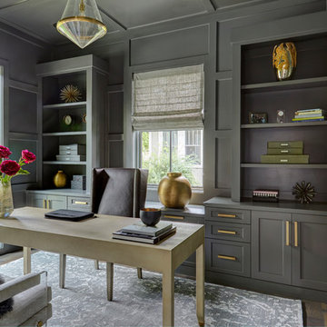
Around the corner is the home office that is painted a custom color to match the cabinetry. The wall of cabinetry along the back of the room features a roll out printer cabinet, along with drawers and open shelving for books and display. We are pretty sure a lot of work must get done in here with all these handy features!
If you are building a new home, The Kitchen Studio can offer expert help to make the most of your new construction home. We provide the expertise needed to ensure that you are getting the most of your investment when it comes to cabinetry, design and storage solutions. Give us a call if you would like to find out more!
Designed by: Susan Klimala, CKBD
Builder: Hampton Homes
Photography by: Michael Alan Kaskel
For more information on kitchen and bath design ideas go to: www.kitchenstudio-ge.com
 41 West
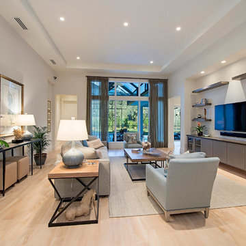
View of Great Room/Living Room from front entry: 41 West Coastal Retreat Series reveals creative, fresh ideas, for a new look to define the casual beach lifestyle of Naples.
More than a dozen custom variations and sizes are available to be built on your lot. From this spacious 3,000 square foot, 3 bedroom model, to larger 4 and 5 bedroom versions ranging from 3,500 - 10,000 square feet, including guest house options.
 TVL Creative Ltd.
[Our Clients]
We were so excited to help these new homeowners re-envision their split-level diamond in the rough. There was so much potential in those walls, and we couldn’t wait to delve in and start transforming spaces. Our primary goal was to re-imagine the main level of the home and create an open flow between the space. So, we started by converting the existing single car garage into their living room (complete with a new fireplace) and opening up the kitchen to the rest of the level.
[Kitchen]
The original kitchen had been on the small side and cut-off from the rest of the home, but after we removed the coat closet, this kitchen opened up beautifully. Our plan was to create an open and light filled kitchen with a design that translated well to the other spaces in this home, and a layout that offered plenty of space for multiple cooks. We utilized clean white cabinets around the perimeter of the kitchen and popped the island with a spunky shade of blue. To add a real element of fun, we jazzed it up with the colorful escher tile at the backsplash and brought in accents of brass in the hardware and light fixtures to tie it all together. Through out this home we brought in warm wood accents and the kitchen was no exception, with its custom floating shelves and graceful waterfall butcher block counter at the island.
[Dining Room]
The dining room had once been the home’s living room, but we had other plans in mind. With its dramatic vaulted ceiling and new custom steel railing, this room was just screaming for a dramatic light fixture and a large table to welcome one-and-all.
[Living Room]
We converted the original garage into a lovely little living room with a cozy fireplace. There is plenty of new storage in this space (that ties in with the kitchen finishes), but the real gem is the reading nook with two of the most comfortable armchairs you’ve ever sat in.
[Master Suite]
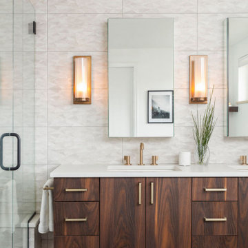
This home didn’t originally have a master suite, so we decided to convert one of the bedrooms and create a charming suite that you’d never want to leave. The master bathroom aesthetic quickly became all about the textures. With a sultry black hex on the floor and a dimensional geometric tile on the walls we set the stage for a calm space. The warm walnut vanity and touches of brass cozy up the space and relate with the feel of the rest of the home. We continued the warm wood touches into the master bedroom, but went for a rich accent wall that elevated the sophistication level and sets this space apart.
[Hall Bathroom]
The floor tile in this bathroom still makes our hearts skip a beat. We designed the rest of the space to be a clean and bright white, and really let the lovely blue of the floor tile pop. The walnut vanity cabinet (complete with hairpin legs) adds a lovely level of warmth to this bathroom, and the black and brass accents add the sophisticated touch we were looking for.
[Office]
We loved the original built-ins in this space, and knew they needed to always be a part of this house, but these 60-year-old beauties definitely needed a little help. We cleaned up the cabinets and brass hardware, switched out the formica counter for a new quartz top, and painted wall a cheery accent color to liven it up a bit. And voila! We have an office that is the envy of the neighborhood.
2