
Search results for "Potential returns" in Home Design Ideas

 Battle Associates, Architects
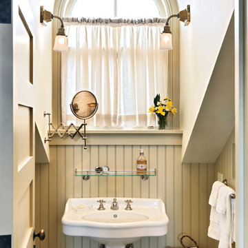
This project was an historic renovation located on Narragansett Point in Newport, RI returning the structure to a single family house. The stunning porch running the length of the first floor and overlooking the bay served as the focal point for the design work. The view of the bay from the great octagon living room and outdoor porch is the heart of this waterfront home. The exterior was restored to 19th century character. Craftsman inspired details directed the character of the interiors. The entry hall is paneled in butternut, a traditional material for boat interiors.
 LifeHouse Construction
These owners know craftsmanship and appreciate high-quality details. The owner hand crafted some of the furniture pieces included in this remodel, including the master bed frame. To update the home and do justice to the owner’s own furniture pieces, we installed a sky light in the upstairs bedroom hallway to bathe the space in light and added new doors with brass hardware. The master bathroom was transformed into an oasis and the kitchen underwent a remodel to make it more functional with modern appliances.
Photos by Kimberly Gavin Photography
Find the right local pro for your project

 Jeff King & Company
Paul Dyer Photography
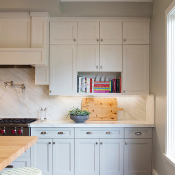
Beach style dark wood floor kitchen photo in San Francisco with recessed-panel cabinets, an island, marble countertops and marble backsplash
Beach style dark wood floor kitchen photo in San Francisco with recessed-panel cabinets, an island, marble countertops and marble backsplash
 Alcon Lighting
1. Safety
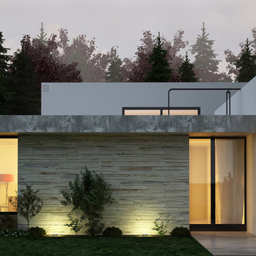
Light is an amazing thing. It illuminates everything around us and allows us to see. Unfortunately, every night the sun removes itself along with its full spectrum of light. Now those things that we would normally see like steps, trees, or pools become difficult to see. Climbing stairs without lighting is a great way to fall. Even worse is if you miss the stairs and run face first into a tree. Worse than that is if you fall into the pool. You can see where this is going. Lighting up a landscape is important for safety. Any family or friends who aren’t familiar with the property could be endangered without a properly lit environment.
2. Security
I promise these aren’t scare tactics, but security is a valid concern. Thieves prospecting a property will look in from the street. A well-lit building will have a better chance of scaring off a potential burglar compared to a non-lit darker front-yard. It is much easier to sneak around in the dark than in a well-lit beautiful landscape.
3. Beauty and Value
LED Directional Landscape Flood Lights are experiences with several tactics to create a beautiful, safe, and secure landscape. Through up lights, down lights, accents, and path lights there are several great ways to improve a yard. Lights can provide, shadows, highlights, silhouettes, wall-washes, and a moonlight effect. Those are plenty of options for a great designer to make something beautiful. Beyond that, crafted fixtures with specific textures can change the environment substantially. Alcon Lighting provides the widest expanse of great products to set the mood for your landscape. Not only does great lighting make a great experience, it also adds value to the property. A beautiful property with a well-lit architecture and landscape can completely change the outer appearance of a property. This kind of value can provide a great return on your investment.
4. You’ve been doing it for years
You’ve probably been managing lighting design and landscape lighting for years. If you celebrate Christmas, you can appreciate the hard work and the resulting beauty of a well-lit or elegantly glowing property. Every year, it becomes a competition to light the most extravagant lights and get the biggest luminous trees. Landscape lighting is like a tasteful and all year Christmas experience. If you’ve already been lighting up your house once a year, why not make it a full-time experience?
 RAJ Kitchen and Bath, LLC
**Check out the video of this transformation on our website**
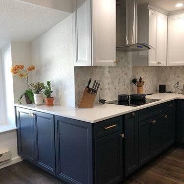
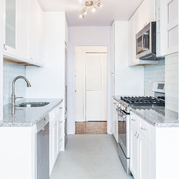
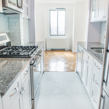
This small kitchen was way too small for this 2 bedrooms, 2 bathrooms apartment. Not only was it a very small kitchen, but the physical location of it made it very difficult to make it any bigger. There wasn't much that could have been done without incurring astronomical cost, which would get little or no return on the investment. The client wanted a kitchen that can be optimized in its current location to add a ton of value for resale.
This was difficult to do, because there was no moving of any mechanical around in the kitchen and even if we wanted to, the management of the building would not allow. For those of you who live in condos, co-ops or apartment building, you know how difficult it is to rework these foot prints. When we showed up, we saw the problems, but we also saw a huge opportunity where we can achieve those goals in the small space. This was accomplished by making some key changes and to incorporate some new things that was not possible when this kitchen was built years ago.
The crucial part of the design that would drive the entire new layout, was selecting the only appliance; that was the Refrigerator. Once we nailed down that refrigerator, we then proceeded to design the kitchen around it. We moved it to the other side of the wall where the sink was so that we can tap into the water line from the sink plumbing. It was crucial that it stays exactly 24" deep, not an inch more because we had to keep the entry as open as possible. Also, it was going to be directly in front of another big storage unit - The pantry. It is not ideal in most cases, but we needed the rest of the space to ramp up the design and open feel towards the side where all of the activities would take place, which happend to be the dining room and the view.
Once all that was figured out, we re-positioned the sink, dishwasher and the range and proceeded to wrap the cabinets around the columns to integrate them into the space. Thirty- six inches cabinets height was used so that they can be installed higher towards the ceiling height to give more room rather than the standard 18" required height between the counter tops. This was done to make the room feel a lot bigger than it really was. Not to mention, we also didn't want the faucet to be buried under the cabinets so that was also a necessary design detail for the space.
We then lowered both knee walls so that the counter top can sit on top of them, by removing that stop point that would have otherwise defined the kitchen area. This allowed us to pick up that extra footprint into the room for added prep space and enabled us to create the illusion of a kitchen that is looking longer than it really is. Every inch mattered when designing this kitchen and we made a conscious decision to use every one of that inch.
White cabinets were selected to do just what white cabinets are design to do; make a small or dark room appear bigger, brighter and more open. In this kitchen, this was amplified the more because of the kitchen location. It was perfect! We knew we did justice to the space because while we were there taking some photos, a few potential buyers walked in and went straight for the kitchen! They said its design just to fit the apartment.
Pantry roll out shelving, Double recycle bin, fancy handles, LED lighting, Quartz counter top, beautiful backslash tiles and grey linen floors finished off the kitchen which looked over a beautiful view of the George Washington Bridge from the top of this lovely 4th floor apartment.
Credit to Masterpiece Tile and Marble (Annmarie on the selection of Tiles and countertop and Val on the Construction to complete this project).
Davor Kokic Photography
Sponsored
Delaware, OH

Buckeye Basements, Inc.
Central Ohio's Basement Finishing ExpertsBest Of Houzz '13-'21



 Cavé Studio
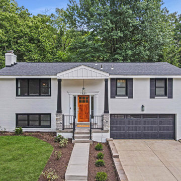
The exterior of the home received a major facelift and transformation, including new light fixtures, updated roof and facia, updated wood beams, wood door, wood ceiling and stone added to the entrance and more. This took the home from a dated look to an updated and fresh "modern farmhouse" aesthetic.
The kitchen layout remained intact, while appliances, fixtures, hardware, countertops and backsplashes were upgraded . All three bathrooms in the house were also renovated, original hardwood floors were refinished and carpet and tile flooring throughout replaced. Additionally, the dated built-in brick fireplace on the ground floor game room was redesigned. The new fireplace design would now directly tie in with the modern farmhouse style of the exterior, complete with the addition of a large wooden mantle.
DTSH Interiors formulated a plan for six rooms; the living room, dining room, master bedroom, two children's bedrooms and ground floor game room, with the inclusion of the complete fireplace re-design.
The interior also received major upgrades during the whole-house renovation. All of the walls and ceilings were resurfaced, the windows, doors and all interior trim was re-done.
The end result was a giant leap forward for this family; in design, style and functionality. The home felt completely new and refreshed, and once fully furnished, all elements of the renovation came together seamlessly and seemed to make all of the renovations shine.
During the "big reveal" moment, the day the family finally returned home for their summer away, it was difficult for me to decide who was more excited, the adults or the kids!
The home owners kept saying, with a look of delighted disbelief "I can't believe this is our house!"
As a designer, I absolutely loved this project, because it shows the potential of an average, older Pittsburgh area home, and how it can become a well designed and updated space.
It was rewarding to be part of a project which resulted in creating an elegant and serene living space the family loves coming home to everyday, while the exterior of the home became a standout gem in the neighborhood.
 Greenleaf Construction | Home
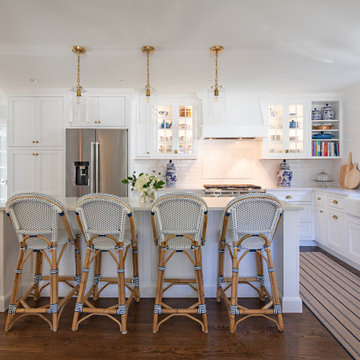
This whole house renovation was a successful collaboration of design and construction between Greenleaf craftsmen, Analogue Design, and Mill Valley Kitchens with interior design and decorating by the client. We upgraded almost every room in this home including an expanded kitchen, built-in cabinetry, a basement renovation, three bathroom renovations, four bedrooms, an office, a laundry and mudroom, and a sewing/craft room. The walls on the first floor were opened up and reconfigured to allow for better flow, and the second floor was completely restructured to create enough space for four bedrooms. The basement was remodeled and also includes a powder room and sewing/craft room. A former breeezway was completely rebuilt with a new mudroom and laundry area. New Marvin French doors were installed to capture natural light and connect the space to an outdoor stone patio.
 A.S.D. Interiors - Shirry Dolgin, Owner
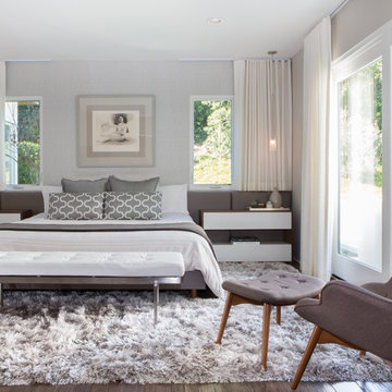
Trendy dark wood floor bedroom photo in Los Angeles with gray walls and no fireplace
 Randy Heller Pure and Simple Interior Design
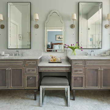
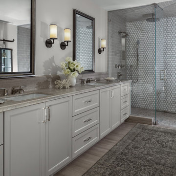
I love the oversized runner that we placed in this master bathroom. Something that you don't always see in a bathroom. The soft mushroom painted cabinets play off the cabinets in the kitchen and the polished nickel faucets mix lovely with the oil rubbed bronze wall sconces. Oversized mirror frames add additional interest opposed to glueing mirrors to the wall and the mosaic tiled wall in the shower adds a beautiful pattern to the room.
Photo credit: Janet Mesic Mackie

 RAJ Kitchen and Bath, LLC
**Check out the video of this transformation on our website**
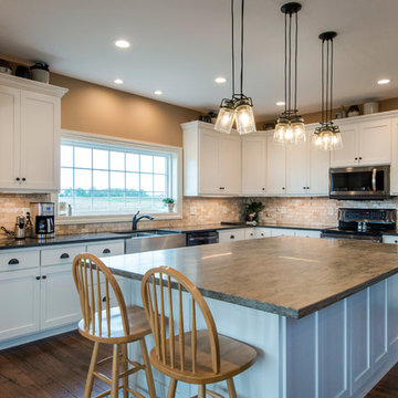
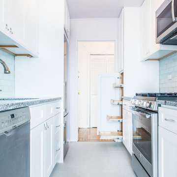
This small kitchen was way too small for this 2 bedrooms, 2 bathrooms apartment. Not only was it a very small kitchen, but the physical location of it made it very difficult to make it any bigger. There wasn't much that could have been done without incurring astronomical cost, which would get little or no return on the investment. The client wanted a kitchen that can be optimized in its current location to add a ton of value for resale.
This was difficult to do, because there was no moving of any mechanical around in the kitchen and even if we wanted to, the management of the building would not allow. For those of you who live in condos, co-ops or apartment building, you know how difficult it is to rework these foot prints. When we showed up, we saw the problems, but we also saw a huge opportunity where we can achieve those goals in the small space. This was accomplished by making some key changes and to incorporate some new things that was not possible when this kitchen was built years ago.
The crucial part of the design that would drive the entire new layout, was selecting the only appliance; that was the Refrigerator. Once we nailed down that refrigerator, we then proceeded to design the kitchen around it. We moved it to the other side of the wall where the sink was so that we can tap into the water line from the sink plumbing. It was crucial that it stays exactly 24" deep, not an inch more because we had to keep the entry as open as possible. Also, it was going to be directly in front of another big storage unit - The pantry. It is not ideal in most cases, but we needed the rest of the space to ramp up the design and open feel towards the side where all of the activities would take place, which happend to be the dining room and the view.
Once all that was figured out, we re-positioned the sink, dishwasher and the range and proceeded to wrap the cabinets around the columns to integrate them into the space. Thirty- six inches cabinets height was used so that they can be installed higher towards the ceiling height to give more room rather than the standard 18" required height between the counter tops. This was done to make the room feel a lot bigger than it really was. Not to mention, we also didn't want the faucet to be buried under the cabinets so that was also a necessary design detail for the space.
We then lowered both knee walls so that the counter top can sit on top of them, by removing that stop point that would have otherwise defined the kitchen area. This allowed us to pick up that extra footprint into the room for added prep space and enabled us to create the illusion of a kitchen that is looking longer than it really is. Every inch mattered when designing this kitchen and we made a conscious decision to use every one of that inch.
White cabinets were selected to do just what white cabinets are design to do; make a small or dark room appear bigger, brighter and more open. In this kitchen, this was amplified the more because of the kitchen location. It was perfect! We knew we did justice to the space because while we were there taking some photos, a few potential buyers walked in and went straight for the kitchen! They said its design just to fit the apartment.
Pantry roll out shelving, Double recycle bin, fancy handles, LED lighting, Quartz counter top, beautiful backslash tiles and grey linen floors finished off the kitchen which looked over a beautiful view of the George Washington Bridge from the top of this lovely 4th floor apartment.
Credit to Masterpiece Tile and Marble (Annmarie on the selection of Tiles and countertop and Val on the Construction to complete this project).
Davor Kokic Photography
 RAJ Kitchen and Bath, LLC
**Check out the video of this transformation on our website**
This small kitchen was way too small for this 2 bedrooms, 2 bathrooms apartment. Not only was it a very small kitchen, but the physical location of it made it very difficult to make it any bigger. There wasn't much that could have been done without incurring astronomical cost, which would get little or no return on the investment. The client wanted a kitchen that can be optimized in its current location to add a ton of value for resale.
This was difficult to do, because there was no moving of any mechanical around in the kitchen and even if we wanted to, the management of the building would not allow. For those of you who live in condos, co-ops or apartment building, you know how difficult it is to rework these foot prints. When we showed up, we saw the problems, but we also saw a huge opportunity where we can achieve those goals in the small space. This was accomplished by making some key changes and to incorporate some new things that was not possible when this kitchen was built years ago.
The crucial part of the design that would drive the entire new layout, was selecting the only appliance; that was the Refrigerator. Once we nailed down that refrigerator, we then proceeded to design the kitchen around it. We moved it to the other side of the wall where the sink was so that we can tap into the water line from the sink plumbing. It was crucial that it stays exactly 24" deep, not an inch more because we had to keep the entry as open as possible. Also, it was going to be directly in front of another big storage unit - The pantry. It is not ideal in most cases, but we needed the rest of the space to ramp up the design and open feel towards the side where all of the activities would take place, which happend to be the dining room and the view.
Once all that was figured out, we re-positioned the sink, dishwasher and the range and proceeded to wrap the cabinets around the columns to integrate them into the space. Thirty- six inches cabinets height was used so that they can be installed higher towards the ceiling height to give more room rather than the standard 18" required height between the counter tops. This was done to make the room feel a lot bigger than it really was. Not to mention, we also didn't want the faucet to be buried under the cabinets so that was also a necessary design detail for the space.
We then lowered both knee walls so that the counter top can sit on top of them, by removing that stop point that would have otherwise defined the kitchen area. This allowed us to pick up that extra footprint into the room for added prep space and enabled us to create the illusion of a kitchen that is looking longer than it really is. Every inch mattered when designing this kitchen and we made a conscious decision to use every one of that inch.
White cabinets were selected to do just what white cabinets are design to do; make a small or dark room appear bigger, brighter and more open. In this kitchen, this was amplified the more because of the kitchen location. It was perfect! We knew we did justice to the space because while we were there taking some photos, a few potential buyers walked in and went straight for the kitchen! They said its design just to fit the apartment.
Pantry roll out shelving, Double recycle bin, fancy handles, LED lighting, Quartz counter top, beautiful backslash tiles and grey linen floors finished off the kitchen which looked over a beautiful view of the George Washington Bridge from the top of this lovely 4th floor apartment.
Credit to Masterpiece Tile and Marble (Annmarie on the selection of Tiles and countertop and Val on the Construction to complete this project).
Davor Kokic Photography

 RAJ Kitchen and Bath, LLC
**Check out the video of this transformation on our website**
This small kitchen was way too small for this 2 bedrooms, 2 bathrooms apartment. Not only was it a very small kitchen, but the physical location of it made it very difficult to make it any bigger. There wasn't much that could have been done without incurring astronomical cost, which would get little or no return on the investment. The client wanted a kitchen that can be optimized in its current location to add a ton of value for resale.
This was difficult to do, because there was no moving of any mechanical around in the kitchen and even if we wanted to, the management of the building would not allow. For those of you who live in condos, co-ops or apartment building, you know how difficult it is to rework these foot prints. When we showed up, we saw the problems, but we also saw a huge opportunity where we can achieve those goals in the small space. This was accomplished by making some key changes and to incorporate some new things that was not possible when this kitchen was built years ago.
The crucial part of the design that would drive the entire new layout, was selecting the only appliance; that was the Refrigerator. Once we nailed down that refrigerator, we then proceeded to design the kitchen around it. We moved it to the other side of the wall where the sink was so that we can tap into the water line from the sink plumbing. It was crucial that it stays exactly 24" deep, not an inch more because we had to keep the entry as open as possible. Also, it was going to be directly in front of another big storage unit - The pantry. It is not ideal in most cases, but we needed the rest of the space to ramp up the design and open feel towards the side where all of the activities would take place, which happend to be the dining room and the view.
Once all that was figured out, we re-positioned the sink, dishwasher and the range and proceeded to wrap the cabinets around the columns to integrate them into the space. Thirty- six inches cabinets height was used so that they can be installed higher towards the ceiling height to give more room rather than the standard 18" required height between the counter tops. This was done to make the room feel a lot bigger than it really was. Not to mention, we also didn't want the faucet to be buried under the cabinets so that was also a necessary design detail for the space.
We then lowered both knee walls so that the counter top can sit on top of them, by removing that stop point that would have otherwise defined the kitchen area. This allowed us to pick up that extra footprint into the room for added prep space and enabled us to create the illusion of a kitchen that is looking longer than it really is. Every inch mattered when designing this kitchen and we made a conscious decision to use every one of that inch.
White cabinets were selected to do just what white cabinets are design to do; make a small or dark room appear bigger, brighter and more open. In this kitchen, this was amplified the more because of the kitchen location. It was perfect! We knew we did justice to the space because while we were there taking some photos, a few potential buyers walked in and went straight for the kitchen! They said its design just to fit the apartment.
Pantry roll out shelving, Double recycle bin, fancy handles, LED lighting, Quartz counter top, beautiful backslash tiles and grey linen floors finished off the kitchen which looked over a beautiful view of the George Washington Bridge from the top of this lovely 4th floor apartment.
Credit to Masterpiece Tile and Marble (Annmarie on the selection of Tiles and countertop and Val on the Construction to complete this project).
Davor Kokic Photography

Sponsored
Westerville, OH

Custom Home Works
Franklin County's Award-Winning Design, Build and Remodeling Expert
 Pennsylvania Landscape & Nursery Association
Keeping It Green http://keepingitgreenoutdoors.com
2014 PLNA Awards for Landscape Excellence Winner
Category: Residential $0-$15,000
Award Level: Honorable Mention
Project Description:
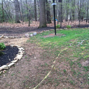
The objective of this project was to match the surrounding natural woodland setting with the new landscaping and outdoor area. The homeowners enjoy being outside and wanted an extension of their house that they could enjoy with family and friends. After returning from vacations in their cabin, they wanted to re-create the same feeling at their home. To complete their new cabin feel they wanted somewhere to have a camp fire with good company. I wanted to create flow from each area, and maximize space in a very limited area. The overall look of the project needed to blend with the natural environment and appear as though is has been there for years. The clients were very open minded and great to work with through the design process and we were able to achieve everything we needed while working with budgets and preferences.
The area was shaded with very poor drainage, which created a unusable space full of mud. The wet area made an already tight area with difficult access more challenging. It was also important to place the fire-pit at a safe distance from the house, and the tree canopy. The area was regarded to allow for better drainage and the downspouts were buried. A decorative river stone was selected to aide with drainage.
All plant material needed to be shade tolerant and provide color. As a result, I chose plants with terrific foliage color, and texture; Aucuba, Heuchera, Athyrium and Hosta. The construction materials to build the steps, walls and fire-pit needed to be a stone that would match the existing stone and environment. For this I chose PA flagstone and fieldstone of varying sizes for interest and to create a more natural look.
This project is special because of the limited space that needed to have its potential discovered and created. With the strong wooded environment the new outdoor area had to blend into that while working with the house and existing concrete patio. We exceeded our clients expectations by creating a new area that looked like it had been there forever.
Plant List:
5 Astilbe chinensis ‘Vision in Pink’
6 Heuchera x villosa ‘Citronella’
6 Hosta x ‘Sum and Substance’
2 Hydrangea macrophylla ‘Endless Summer
5 Buxus x ‘Green Velvet’
1 Leucothoe fontsiana ‘Rainbow’
4 Rhododendron ‘PJM’
2 Chamaecyparis obtusa ‘Aurea Nana’
1 Aucuba japonica ‘Variegata’
3 Athyrium filix-femina
24 Pachysandra terminalis
16 Torenia fournieri
Photo Credit:
Keeping It Green
 Cavé Studio
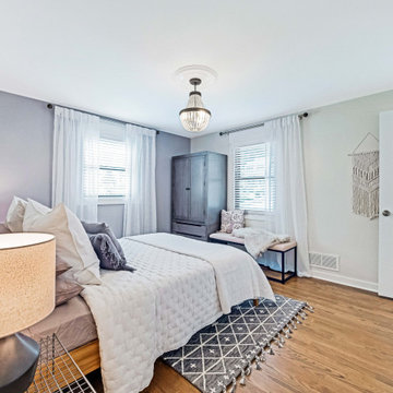
This was the Master Bedroom design, DTSH Interiors selected the bedding as well as the window treatments design.
DTSH Interiors selected the furniture and arrangement, as well as the window treatments.
DTSH Interiors formulated a plan for six rooms; the living room, dining room, master bedroom, two children's bedrooms and ground floor game room, with the inclusion of the complete fireplace re-design.
The interior also received major upgrades during the whole-house renovation. All of the walls and ceilings were resurfaced, the windows, doors and all interior trim was re-done.
The end result was a giant leap forward for this family; in design, style and functionality. The home felt completely new and refreshed, and once fully furnished, all elements of the renovation came together seamlessly and seemed to make all of the renovations shine.
During the "big reveal" moment, the day the family finally returned home for their summer away, it was difficult for me to decide who was more excited, the adults or the kids!
The home owners kept saying, with a look of delighted disbelief "I can't believe this is our house!"
As a designer, I absolutely loved this project, because it shows the potential of an average, older Pittsburgh area home, and how it can become a well designed and updated space.
It was rewarding to be part of a project which resulted in creating an elegant and serene living space the family loves coming home to everyday, while the exterior of the home became a standout gem in the neighborhood.

2