
Search results for "Removing unused" in Home Design Ideas
 Glenwood Carpentry
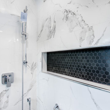
Glenwood Carpentry took an old drab master bathroom with an oversized and unused Jacuzzi tub and maximized the space with a huge walk in shower with center point drain, hexagonal mosaic tiles and custom shower niche. shower is completely waterproofed also. This is a luxury shower that will last a lifetime.
 Ambition Custom Homes, LLC
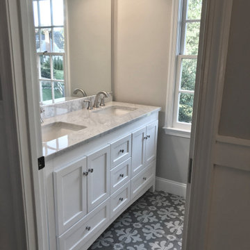
Full removal of all finishes and fixtures.
Relocated the shower and toilet areas and removed an unused bathtub to free up lots of space to add a double vanity and a large tile walk in shower with a built in and hidden storage niche in the knee wall, a bench seat, and multi-functional shower controls.
Finished things off with a beautiful octagonal floor tile, granite countertops, tilting mirrors, and more.
We also took care of updating the kids hall bathroom too.
 KBF Design Gallery
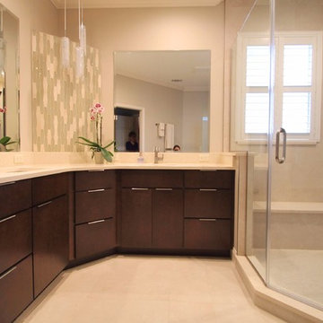
Flat-panel cabinets, modern finger-pull hardware, and glass and stone accent tile between frameless mirrors add a sleek look to this master bath remodeled by KBF.
Removing the unused tub in the corner of the room made way for this spacious shower.
Find the right local pro for your project
 Ambition Custom Homes, LLC
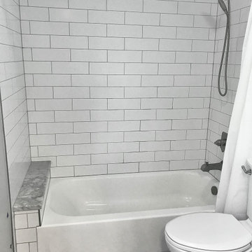
Full removal of all finishes and fixtures.
Relocated the shower and toilet areas and removed an unused bathtub to free up lots of space to add a double vanity and a large tile walk in shower with a built in and hidden storage niche in the knee wall, a bench seat, and multi-functional shower controls.
Finished things off with a beautiful octagonal floor tile, granite countertops, tilting mirrors, and more.
We also took care of updating the kids hall bathroom too.
 Red House Remodeling
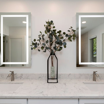
A remodel is the perfect time to have a space designed for your unique needs and tastes. In this master bath, the homeowners wanted to remove an unused tub to expand the vanity for more storage. They also chose to eliminate a wall so they would have room for a larger, more luxurious shower. From the 80s to 2018, this master bath will provide a relaxing retreat for many years. Photography by Jake Boyd Photo.
 Glenwood Carpentry
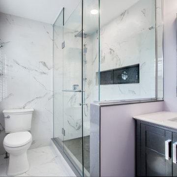
Glenwood Carpentry took an old drab master bathroom with an oversized and unused Jacuzzi tub and maximized the space with a huge walk in shower with center point drain, hexagonal mosaic tiles and custom shower niche. shower is completely waterproofed also. This is a luxury shower that will last a lifetime.
 Amy Pearson Design
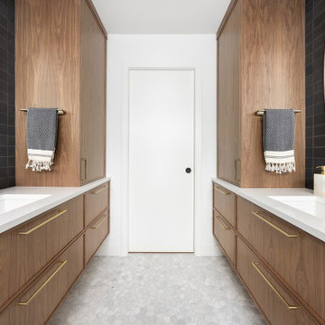
The primary bedroom and bathroom are the showstoppers of this phase! Unused and awkwardly located closets in both the bedroom and bathroom were removed to make way for additional square-footage in the bath and replaced with a sizable and functional reach-in closet in the bedroom. A dated and cramped shower stall was removed in favor for an expansive step in shower spanning the width of the bathroom and a new transom window washes the room in natural light. While the previous bathroom was only able to accommodate a single vanity, the new layout allowed us to create double matching vanities mirrored across from each other - a much appreciated addition for a primary bath. Floating walnut vanities boast impressive storage and are capped with tower cabinets with hidden outlets for charging and storing electronic bathroom tools. While the color palette is restrained - black, white, gray, and brown - the result is a timelessly modern and masculine space that is at once striking and warm. Modern geometric patterns play with each other throughout the material selections.


 Creative Cabinets & Design LLC
Photographer: Brendon Pinola
Contractor: Lovette Construction
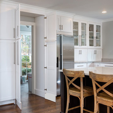
This Tanglewood home originally had a very tiny kitchen separated from the family room and dining area. Several walls were removed to create this gorgeous open plan. The laundry was in the back corner by the bay window where ovens are currently located. The laundry was relocated to the front of the house where they had an unused formal sitting room. The laundry is now inside the walk in HIDDEN pantry that is concealed by cabinet doors. The large island is an incredible work surface and social gathering area. The cabinets are Wellborn's shaker door style with Glacier on the perimeter and Shadow Charcoal for the hood and island. This turned out to be one of my favorite projects of all time! Great clients to work with.
 Studio Z Architecture
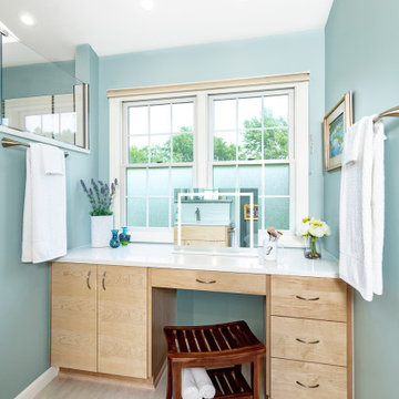
We removed an unused soaking tub to provide space for a sit-down makeup area and additional storage. The existing windows above the makeup area provide lots of daylight. The paint is Benjamin Moore gossamer blue 2123-40.
 Schloegel Design Remodel
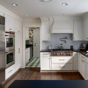
While usually we’re huge advocates of a kitchen island that wasn’t true for this Mission Hills home. The island actually created a bottle neck in the kitchen traffic. A new layout better utilized the kitchen’s square footage including a previously unused wall in the dining room. Removing the island and adding a peninsula created better work zones and space to move between those zones. Beautiful white cabinetry, gold hardware, a backsplash taken to the ceiling, and a stunning matte quartz counter helped to create a stunning and timeless kitchen.
 Studio KZ- Architecture
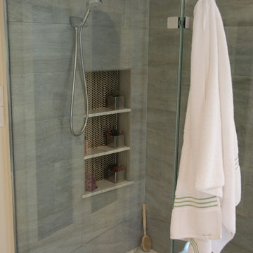
To update this previously cramped bathroom, Studio KZ removed an interior wall and an unused bathtub, created a spacious glass shower, and a showpiece dual sink vanity to frame the existing stained glass window. Using luxurious finishes such as carrera marble, and circular metallic brown tiles, this bathroom is now a wonderful place to relax in!
 Forest Landscaping
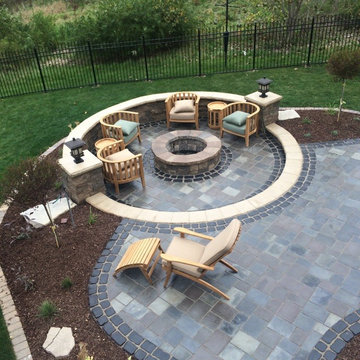
This client contacted us with a two fold purpose. The first was that his yard was constantly wet no matter how much or how little he irrigated, which kept him and his pets from enjoying the yard. The second was to give him and his wife a patio that fit the space well. We designed a retaining wall that diverted water away from his property that was draining off several neighbor's lots onto his. Along with excavating and removing some poor soils, this succeeded in drying out what had previously been a saturated and largely unusable backyard. We also designed a spacious, curved layout that compliments the rolling nearby terrain. We also sealed the hardscape elements to give it a lustrous, wet look without making it slippery!
 KCBR Design | Remodel
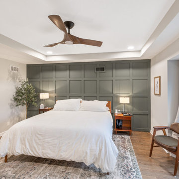
This primary suite was reconfigured to significantly increase the space of both the primary bathroom and closet. We removed two closets from the bedroom and deleted an unused guest bedroom giving our clients some much needed space. With a Modern Traditional design style using a mix of metal finishes, custom white oak cabinets, and a contrasting dark tile floor ties the space together.

 Randy Trainor
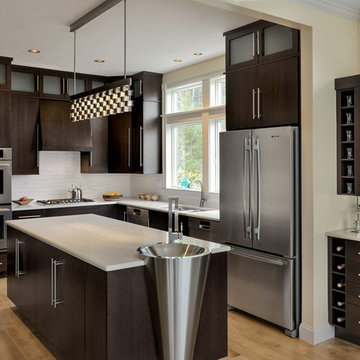
These homeowners decided to turn their ski home into a full-time home only to find that what was perfect as a vacation home, didn't function well for year-round living. In the master bathroom an unused tub was removed to make room for a larger vanity with storage. Using the same large format tiles on the floor and the walls provide the desired spa-like feel to the space. Floor to ceiling cabinets provide loads of storage for this kosher kitchen. Two dishwashers, two utensil drawers, a divided sink and two ovens are also included so that meat and dairy could be kept separated.
 KCBR Design | Remodel
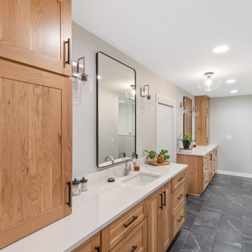
This primary suite was reconfigured to significantly increase the space of both the primary bathroom and closet. We removed two closets from the bedroom and deleted an unused guest bedroom giving our clients some much needed space. With a Modern Traditional design style using a mix of metal finishes, custom white oak cabinets, and a contrasting dark tile floor ties the space together.
 KCBR Design | Remodel
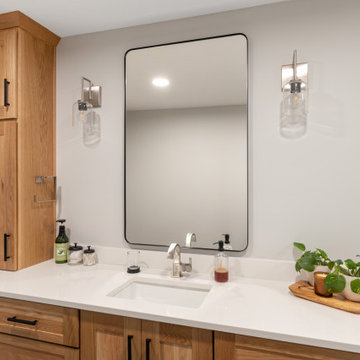
This primary suite was reconfigured to significantly increase the space of both the primary bathroom and closet. We removed two closets from the bedroom and deleted an unused guest bedroom giving our clients some much needed space. With a Modern Traditional design style using a mix of metal finishes, custom white oak cabinets, and a contrasting dark tile floor ties the space together.
 FA Design Build
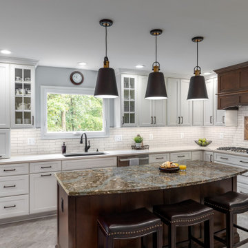
Our clients had enjoyed their home for more than 25 years, but little had changed during that time. They were ready for a full main level renovation. We started by working collaboratively to re-envision the kitchen space to ensure we achieved key goals: open sight lines to the eating area and family room; space for an island with seating; new locations for the range and refrigerator; and removal of an awkward pantry and unused desk. The redesigned space called for removing a load bearing wall to allow space for the island and to repurpose the pantry and desk square footage for wall ovens, refrigerator, and pantry. The clients selected a warm white paint for the perimeter cabinetry (Medallion Cabinetry, White Icing) and balanced the design with a stained cherry island and hood (Medallion Cabinetry, French Roast). The dramatic Cambria Helmsley was chosen for the island countertop, with the serene Silestone Eternal Marfil for the perimeter. The simple subway backsplash ensures the bronze metal tile, laid in a herringbone pattern over the range, is the focal point on the perimeter walls. Bronze accents with the sink (Elkay, Mocha), lighting, cabinetry hardware, and furniture reinforce the warm atmosphere. Our clients chose beautiful, yet durable, Armstrong Alterna luxury vinyl tile in Artisan Forge for the kitchen. For the other spaces — living room, dining room, foyer, family room, office, and powder room — we laid Armstrong Paragon Oak hardwood in Countryside Brown. Final touches included a buffet in the eating area, new hardwood staircase with iron balusters, wool stair runner, two custom area rugs, and new powder room vanity and accessories.
 Studio KZ- Architecture
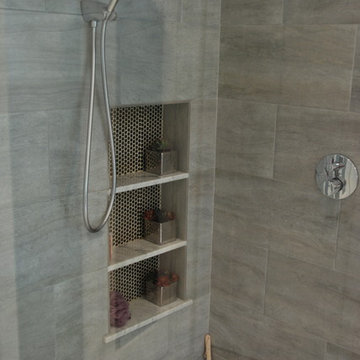
To update this previously cramped bathroom, Studio KZ removed an interior wall and an unused bathtub, created a spacious glass shower, and a showpiece dual sink vanity to frame the existing stained glass window. Using luxurious finishes such as carrera marble, and circular metallic brown tiles, this bathroom is now a wonderful place to relax in!
 TVL Creative Ltd.
Cramped kitchen be gone! That was the project motto and top priority. The goal was to transform the current layout from multiple smaller spaces into a connected whole that would activate the main level for our clients, a young family of four.
The biggest obstacle was the wall dividing the kitchen and the dining room. Removing this wall was central to opening up and integrating the main living spaces, but the existing ductwork that ran right through the center of the wall posed a design challenge, er design opportunity. The resulting design solution features a central pantry that captures the ductwork and provides valuable storage- especially when compared to the original kitchen's 18" wide pantry cabinet. The pantry also anchors the kitchen island and serves as a visual separation of space between the kitchen and homework area.
Through our design development process, we learned the formal living room was of no service to their lifestyle and therefore space they rarely spent time in. With that in mind, we proposed to eliminate the unused living room and make it the new dining room. Relocating the dining room to this space inherently felt right given the soaring ceiling and ample room for holiday dinners and celebrations. The new dining room was spacious enough for us to incorporate a conversational seating area in the warm, south-facing window alcove.
Now what to do with the old dining room?! To answer that question we took inspiration from our clients' shared profession in education and developed a craft area/homework station for both of their boys. The semi-custom cabinetry of the desk area carries over to the adjacent wall and forms window bench base with storage that we topped with butcher block for a touch of warmth. While the boys are young, the bench drawers are the perfect place for a stash of toys close to the kitchen.
The kitchen begins just beyond the window seat with their refrigerator enclosure. Opposite the refrigerator is the new pantry with twenty linear feet of shelving and space for brooms and a stick vacuum. Extending from the backside of the pantry the kitchen island design incorporates counter seating on the family room side and a cabinetry configuration on the kitchen side with drawer storage, a trashcan center, farmhouse sink, and dishwasher.
We took careful time in design and execution to align the range and sink because while it might seem like a small detail, it plays an important role in supporting the symmetrical configuration of the back wall of the kitchen. The rear wall design utilizes an appliance garage mirrors the visual impact of the refrigerator enclosure and helps keep the now open kitchen tidy. Between the appliance garage and refrigerator enclosure is the cooking zone with 30" of cabinetry and work surface on either side of the range, a chimney style vent hood, and a bold graphic tile backsplash.
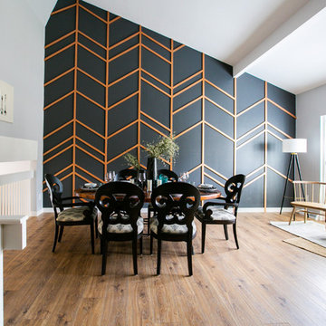
The backsplash is just one of many personal touches we added to the space to reflect our client's modern eclectic style and love of color. Swooping lines of the mid-mod style barstools compliment the pendants and backsplash pattern. A pop of vibrant green on the frame of the pantry door adds a fresh wash of color to an otherwise neutral space. The big show stopper is the custom charcoal gray and copper chevron wall installation in the dining room. This was an idea our clients softly suggested, and we excitedly embraced the opportunity. It is also a kickass solution to the head-scratching design dilemma of how to fill a large and lofty wall.
We are so grateful to bring this design to life for our clients and now dear friends.
 Schloegel Design Remodel
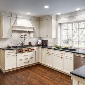
While usually we’re huge advocates of a kitchen island that wasn’t true for this Mission Hills home. The island actually created a bottle neck in the kitchen traffic. A new layout better utilized the kitchen’s square footage including a previously unused wall in the dining room. Removing the island and adding a peninsula created better work zones and space to move between those zones. Beautiful white cabinetry, gold hardware, a backsplash taken to the ceiling, and a stunning matte quartz counter helped to create a stunning and timeless kitchen.
23