
Search results for "Simply creating" in Home Design Ideas
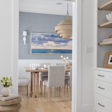
 Simply Home Decorating
This charming West Vancouver home belongs to Robert and Elizabeth (names changed), a professional couple with three high school and university-aged sons and two beloved golden retrievers who are very much part of the family. Known for their love of outdoor pursuits—boating, skiing, basketball, tennis and more—they wanted their home to reflect their active lifestyle while providing comfortable, stylish spaces for gathering and unwinding.
The couple came to us with a clear vision: to embrace a modern coastal style, incorporate personal touches, showcase cherished artwork, and create a sanctuary where Elizabeth could relax with her dogs.
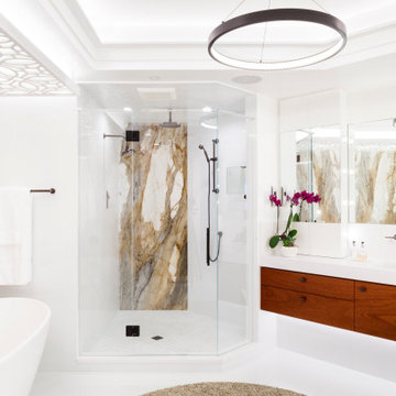
 Strobel Design Build
Creating an elegant spa-like retreat suitable for a multi-million-dollar high-rise condo was the request of our client. Leaving the details to the design team, our client simply said she envisioned a bright white contemporary design with warm contrasts, a bathtub that is actually inviting, and the ability to look out at the waterfront view from the shower. Given the “triangle” shape of the bathroom, we decided to design the bathroom around straight lines to juxtapose the angles in a modern aesthetic. Sleek floating cabinetry with accent lighting and glossy white floors give this bathroom a relaxing light feel, as if you are floating in the clouds.
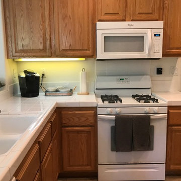
 Grace Designs OC
Photography: Grace Designs OC
The kitchen was a simple clean up job. There was a lot of items on the counter tops, which created less room and a more complicated set up. By simply cleaning up the tile counter tops and appliances and setting up a coffee bar, created all in the world of a difference. Some soft charcoal grey hand towels were added, as well as the conch shell which continued to keep the coastal image to the house.
Find the right local pro for your project
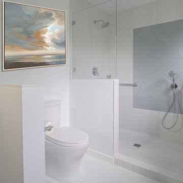
 Fiorito Interior Design
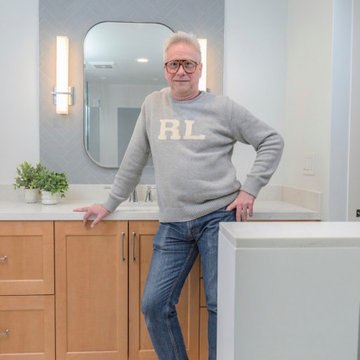
When purchasing a new home, clients often inherit outdated spaces that are either dysfunctional or simply unappealing. Such was the case for a couple who came to me with a cramped primary bathroom. Defined by an unmistakable 1980s aesthetic and a truly perplexing layout, the space was divided into a maze of enclosed areas, including a walled-in shower and an awkward corner vanity.
By fully gutting the room, we were able to reimagine it from the ground up, creating a space that feels open, expansive, and inviting. With the partition walls removed, natural light now flows freely throughout. The design direction, guided by the clients, centers on calm and serenity. A restrained palette of pale marble and sky-blue accent tiles—laid in a herringbone pattern at the vanity and echoed in the generous shower—creates a quiet sense of rhythm and ease.
There is nothing to distract, nothing to disrupt—just a soothing space to begin the day or unwind in the evening.
Photos: Bernardo Grijalva
 Fiorito Interior Design
When purchasing a new home, clients often inherit outdated spaces that are either dysfunctional or simply unappealing. Such was the case for a couple who came to me with a cramped primary bathroom. Defined by an unmistakable 1980s aesthetic and a truly perplexing layout, the space was divided into a maze of enclosed areas, including a walled-in shower and an awkward corner vanity.
By fully gutting the room, we were able to reimagine it from the ground up, creating a space that feels open, expansive, and inviting. With the partition walls removed, natural light now flows freely throughout. The design direction, guided by the clients, centers on calm and serenity. A restrained palette of pale marble and sky-blue accent tiles—laid in a herringbone pattern at the vanity and echoed in the generous shower—creates a quiet sense of rhythm and ease.
There is nothing to distract, nothing to disrupt—just a soothing space to begin the day or unwind in the evening.
Photos: Bernardo Grijalva
 Ranieri Construction LLC
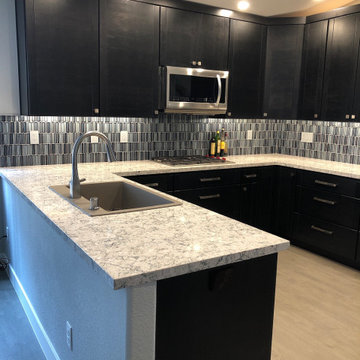
The flow and function of this kitchen was completely transformed by simply moving the refrigerator and creating an appliance wall. Countertop prep space is maximized and the blue glass backsplash becomes the focal point of the kitchen, instead of the old bulky fridge. The overall look is sleek and modern for this homeowner that cooks and entertains often.
 Integrated Systems Design
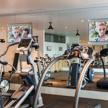
Example of a large classic brown floor home weight room design in Los Angeles with white walls

Sponsored
Columbus, OH

Hope Restoration & General Contracting
Columbus Design-Build, Kitchen & Bath Remodeling, Historic Renovations
 Sandra Hambley
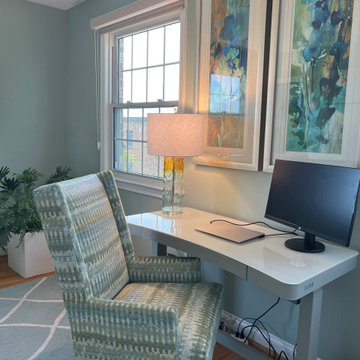
Another finished space in our Adams Morgan client's condo. We created a multifunctional guest room and office space featuring an adjustable height desk, office chair, beautiful new artwork, area rug, and queen size wall bed with integrated love seat. Simply remove the back cushions of the love seat and the bed lowers directly over the seat cushions. Voila!
 HomeClick
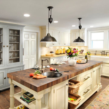
Elk Lighting Farmhouse 70"x14" 1 Light Pendant in Oiled Bronze
Inspired by antique lighting, this series recalls turn-of-the-century design where simple aesthetics and mechanical function combined to create charming, yet versatile fixtures. These classic pull-downs have a decorative weight that counterbalances the fixture for easy height adjustability anytime by simply pulling down or lifting up on the fixture.
 Hallmark Floors
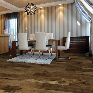
Hallmark Floors Monterey Gaucho.
Creating a New demand for random width, by using tomorrows technology, has lead to the development of the Monterey Hardwood Collection. Available in maple and hickory, with a combined width of 4”, 6”, and 8” and random lengths up to 6’. Using proprietary Trueslice® technology, Hallmark is producing a very stable 2mm sliced face on a 1/2” thick (total) engineered plank making it simply savvy.
The slice face visuals mimic that of sawn face with a tighter, higher-end grain look than typical rotary cut products currently offered by the competition. Topped off with our incredibly durable Truemark Glaze Tek Poly Finish, Monterey is a definite game changer.
Simply Better…Discover Why.
www.hallmarkfloors.com
 Crystal Kitchen + Bath
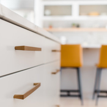
Infusing this once, drab 80’s kitchen with light and color was one goal in this extensive remodel. By removing the wall separating the dining room from the kitchen, the space doubled in size and allowed natural light to flood it.
Creating a design that filled the space yet remained very functional to the homeowner was extremely important. By implementing the two working triangles, one homeowner can be using the sink, cooktop and refrigerator while the other uses the secondary island for food prep as it has an additional sink.
A large soffit housing HVAC runs through the middle of the townhome and seemed intrusive to the space at first. After embracing it in the design, it’s as if it were meant to be. Three aluminum framed cabinets hang below, one directly underneath the soffit to create an asymmetrical design.
On a budget but still wanting a beautiful design, Crystal’s semi-custom line of cabinetry came into play. Simply White and Light Grey provide the perfect backdrop for natural maple, brushed gold hardware and accessories that infuse the space with color. Inside the cabinetry, the best storage solutions make for an extremely functional kitchen!
What a dream it is to have a kitchen that boasts quality, functionality and makes a person feel inspired within it.
Photography: Paige Kilgore
 Marc Pridmore Interiors
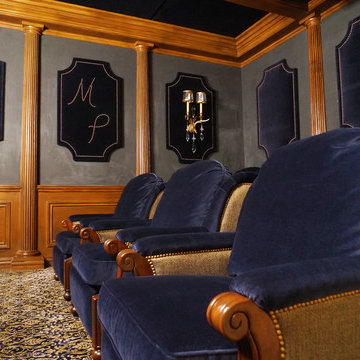
This home theater has been created in the Marc Pridmore Designs Showroom in Costa Mesa, CA to display the capabilities of turning any room into a home theater. This 15 x 17 space was simply white walls and commercial tile ceilings with tracklighting prior to it's conception. The carpet, faux finished walls, wall paneling, coffered ceiling, custom made velvet auto reclining theater chairs and fully automated austrian shades and were all built into this room. Not one part of this home theater is an original part of the room.
 AGA & Fired Earth Danmark
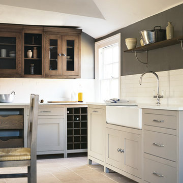
The stylistic origins of our Vermont kitchen, with its East Coast USA sensibility, country styled sink and textured wood options, seems perfectly up to date with the magpie like attitude our customers have to decorating.Wooden and painted cabinets juxtaposed with functional cookers and beautiful tiles epitomise the eclectic mix we have fallen in love with in the West over recent years.
This is our most accessible kitchen to date and works wonderfully with the relaxed and unfussy interiors we create today.The kitchen looks perfect in homes where themes and styles are picked from across the globe in palettes of colours that layer wonderfully together.
So many of us adore the soft whites and creams associated with Scandinavian style, the distressed woods of the French country look, and the sophisticated tailored look of US coastal homes with their wide variety of interiors finishes that we simply had to design a kitchen to meet this demand.The freestanding Vermont is that Kitchen.

Sponsored
Delaware, OH

Buckeye Basements, Inc.
Central Ohio's Basement Finishing ExpertsBest Of Houzz '13-'21
 EURO Design Build
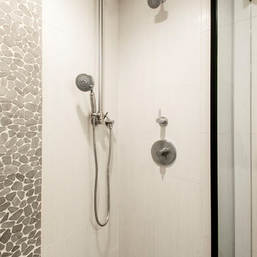
As the primary bathroom used by guests in the household, it was important to redesign the space to flow with their new kitchen, dining, and family rooms. By simply updating the cabinetry, materials, and fixtures in this guest bathroom we were able to create a modern yet welcoming retreat for both guests and family.
 Wall Theory
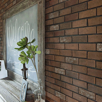
Close-up of the faux Classic Brick panels used in this project. This Wall Theory client used our DIY friendly faux brick panels to create a feature wall that gives this rustic-chic dining room texture and dimension. The distressed wood picnic table and metal chairs play off the brick, and a large chalk board sign is displayed in the centre. These panels are simply glued or screwed to the surface, and can be installed in an afternoon.
 Ann Lowengart Interiors
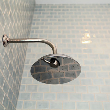
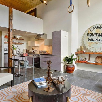
The rain showerhead offers a luxurious stream of water. Blue tiles from Ann Sacks create a dreamy aesthetic, making it feel as though you’re bathing in a cloud.


Sponsored
Delaware, OH
Buckeye Basements, Inc.
Central Ohio's Basement Finishing ExpertsBest Of Houzz '13-'21
 Simply Home Decorating
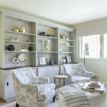
When our clients completed a renovation of their mid-century rancher in North Vancouver's Edgemont Village neighbourhood, their home felt anything but finished. Their traditional furnishings looked dated and tired in the newly updated spaces, so they called on us for help. As a busy professional couple with grown children, our clients were looking for a polished, sophisticated look for their home. We used their collection of artwork as a jumping off point for each room, developing a colour scheme for the main living areas in neutral greys and beiges with a generous dose of rich burnt orange tones. We created interest by layering patterned wallpaper, textured fabrics and a mix of metals and designed several custom pieces including the large library wall unit that defines one end of the living space. The result is a lively, sophisticated and classic decor that suit our clients perfectly.
Tracey Ayton Photography
 Mint Decor Inc.
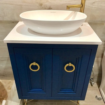
This Cabana bath got a full makeover and became the star of the show with its unique mix of color and materials. A combination of blue coin tiles and long planks of distressed wood-like tile create a seamless look with a pop of bright blue hues. Accents include: Custom cabinetry in Benjamin Moore Downpour Blue, Braided leather mirror, Satin gold accents. The result is simply stunning!
 Simply Home Decorating
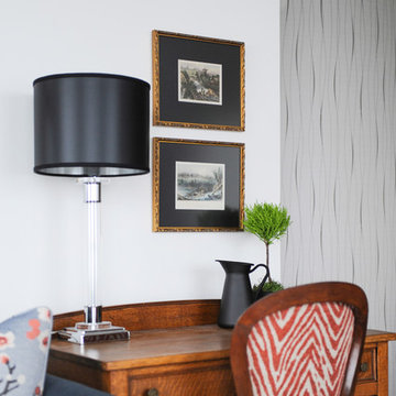
The homeowners of this condo sought our assistance when downsizing from a large family home on Howe Sound to a small urban condo in Lower Lonsdale, North Vancouver. They asked us to incorporate many of their precious antiques and art pieces into the new design. Our challenges here were twofold; first, how to deal with the unconventional curved floor plan with vast South facing windows that provide a 180 degree view of downtown Vancouver, and second, how to successfully merge an eclectic collection of antique pieces into a modern setting. We began by updating most of their artwork with new matting and framing. We created a gallery effect by grouping like artwork together and displaying larger pieces on the sections of wall between the windows, lighting them with black wall sconces for a graphic effect. We re-upholstered their antique seating with more contemporary fabrics choices - a gray flannel on their Victorian fainting couch and a fun orange chenille animal print on their Louis style chairs. We selected black as an accent colour for many of the accessories as well as the dining room wall to give the space a sophisticated modern edge. The new pieces that we added, including the sofa, coffee table and dining light fixture are mid century inspired, bridging the gap between old and new. White walls and understated wallpaper provide the perfect backdrop for the colourful mix of antique pieces. Interior Design by Lori Steeves, Simply Home Decorating. Photos by Tracey Ayton Photography
89