
Search results for "Simply remove" in Home Design Ideas
 Classic Kitchens Designs & Renovations Ltd.
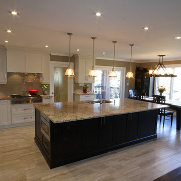
We started with an older home that had a very dated kitchen with an older closed room design that needed to change to open concept to work with how today's families live in their home. To walls were removed to open the floorplan and new porcilain tile and 3/4 oak hardwood were installed to visually separate the family room from the kitchen area. New, custom coloured Benjamin Moore painted Cabinetry was then installed with a custom Island In Alderwood "Espresso" colour. Granite countertops were selected and a Glass Subway tile was installed, complete with a Pot filler over the stove and high volume exhaust fan. The result is simply stunning!! We have also included before pictures to show where we started, and this new kitchen has really come a long way. What a Game Changer!!!!
 Forward Design Build Remodel
Goals
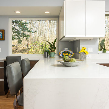
Our clients loved the functionality of their kitchen, however, not the outdated look. They desired to keep the kitchen’s original layout while simply bringing in a modern aesthetic.
Our Design Solution
We began by removing the rounded cabinets and countertops and replacing them with a modern flat paneled cabinet and a large white counter. We brought the counter down the side of the cabinet for a unique modern element. Enlarging the window behind the sink allowed for more natural light to flood the space and warm up the new light gray walls. Making the counters one level instead of two opened up the space as well. All the appliances were updated and the fridge was hidden behind cabinet doors for a modern finish.
 Total Home
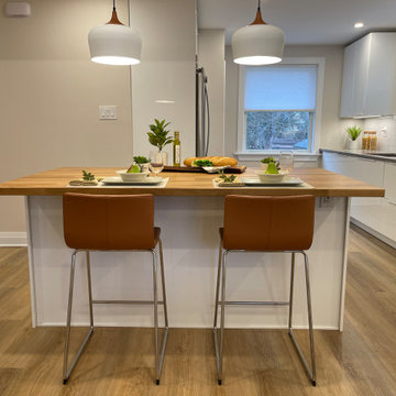
We are very proud of this kitchen renovation, for an older home in Kemptville. The house as you can see from the before photos, was quite dated, to the original kitchen, so it was time for an upgrade.
We removed a wall, separating the dining area to the kitchen, and had to install a beam above the island. We simply clad it in drywall for a clean aesthetic.
You would not know that these two spaces were one and the same.
The quality and care Gilbert executed in this renovation is top notch!
Another quality project by Total Home.
Find the right local pro for your project
 Drury Design
THE SETUP
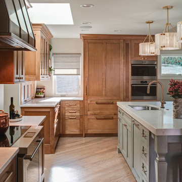
Senior Designer Diana Burton’s client loved her sixties-era home – it just needed some work. The cozy galley kitchen was narrow and mostly closed off from the family room. A pass-through window served as a limited pipeline for treats and chatter. The appliances were failing, too. It was simply time for an overhaul.
Design Objectives:
Remove load bearing wall and open kitchen to the family room
Omit large unused fireplace in family room
Increase work surfaces and overall storage solutions
Dedicated small countertop appliance storage
Seating for 3 or 4 at island
Add pantry storage
Offer solution for lack of mudroom
Upgrade all appliances
THE REMODEL
Design Challenges:
Finding a location to hide structural support for new beam
Reworking awkward configuration of existing walls
Adding a walk-in pantry
Creating mudroom storage
Allowing room for large sectional in family room
Design Solutions:
Add a discreet column by the fridge to hide essential support
Flush out wall by bath to be even with the range wall, where the new walk in pantry exists
Use void space behind new wall for large appliance garage
Create combination walk in pantry/mudroom by adding bench with shoe storage and hooks
Maintain island depth for comfortable seating without infringing on space for the sectional
THE RENEWED SPACE
This cramped, dated kitchen has a new lease on life! Opening it to the family room dramatically transformed the space. Diana’s client now has plenty of storage, a big island for food prep, and an open-concept space that’s perfect for entertaining and hanging out with friends and family.
 Forward Design Build Remodel
Goals
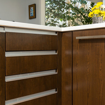
Our clients loved the functionality of their kitchen, however, not the outdated look. They desired to keep the kitchen’s original layout while simply bringing in a modern aesthetic.
Our Design Solution
We began by removing the rounded cabinets and countertops and replacing them with a modern flat paneled cabinet and a large white counter. We brought the counter down the side of the cabinet for a unique modern element. Enlarging the window behind the sink allowed for more natural light to flood the space and warm up the new light gray walls. Making the counters one level instead of two opened up the space as well. All the appliances were updated and the fridge was hidden behind cabinet doors for a modern finish.

 Crystal Kitchen + Bath
Infusing this once, drab 80’s kitchen with light and color was one goal in this extensive remodel. By removing the wall separating the dining room from the kitchen, the space doubled in size and allowed natural light to flood it.
Creating a design that filled the space yet remained very functional to the homeowner was extremely important. By implementing the two working triangles, one homeowner can be using the sink, cooktop and refrigerator while the other uses the secondary island for food prep as it has an additional sink.
A large soffit housing HVAC runs through the middle of the townhome and seemed intrusive to the space at first. After embracing it in the design, it’s as if it were meant to be. Three aluminum framed cabinets hang below, one directly underneath the soffit to create an asymmetrical design.
On a budget but still wanting a beautiful design, Crystal’s semi-custom line of cabinetry came into play. Simply White and Light Grey provide the perfect backdrop for natural maple, brushed gold hardware and accessories that infuse the space with color. Inside the cabinetry, the best storage solutions make for an extremely functional kitchen!
What a dream it is to have a kitchen that boasts quality, functionality and makes a person feel inspired within it.
Photography: Paige Kilgore
 Globe Electric
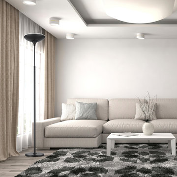
A revolution in lighting, Globe Electric's LED Floor Lamp is a truly perfect marriage of design and functionality without compromise. Solid iron construction and state of the art easy connect system makes this the long-lasting, adjustable LED floor lamp you’ve been waiting for. A reinvented classic for the modern era. The simple minimalist design allows you to have it upright and running in no time. Simply screw together the connecting poles and you’re ready to use your lamp. No wires to hassle with. Remove the middle pole to make the lamp shorter – perfect for your couch, tea table, bedside table and even a kid’s room! Height options are 55 in. or 71 in. (140cm or 180cm). Energy Star certified, Globe's LED Floor Lamp uses 85% less energy and always stays cool to the touch. The specialized power adapter with a built-in surge protector consumes zero energy when turned off. Adjust the brightness with the touch-sensitive dimmer to achieve your desired mood and setting. The built-in memory function will remember your previous settings for the next time you turn on your floor lamp. Easily change the level of brightness from 30 to 3010 lumens at increments of 1% to get the perfect level for you. The 180° halo beam spread disperses the light perfectly to deliver a one of a kind crisp even light output. Safe, attractive, affordable; easy to assemble and easier to love, Globe Electric’s LED torchiere captivates all your lighting needs and desires. Comes with a 5-year warranty.


 House of Meraki
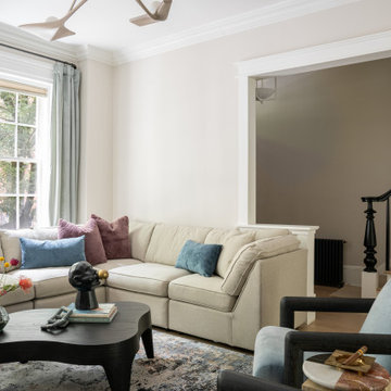
Classic meets Modern in this West Village historic home renovation! Preserving the character and architectural integrity of this home while updating it for this modern busy family, we infused the design with old world charm but make it hip. We started by ripping everything down to the studs, re-arranging the kitchen for a more open feel, adding an oversized accordion door facing the backyard, and adding a powder room where the hallway used to be.
Opening up the 1st floor from front to back allowed the eye to carry along from the entry to the patio. While maintaining a neutral background, we played around with pops of jewel-tones in the accent furniture and art. The stunning Thomas Newman Pearl Chandelier centered the sitting area around the original fireplace. The original vestibule was removed creating an open welcoming foyer, fitted with checkerboard marble floor. While the stairs for all 3 floors of the home were completely reconstructed, we were able to keep the original spindles and handrail, simply updating it with a dramatic black stain.
 PK Painting and Contracting LLC
Common Mistakes in Exterior Door Refinishing
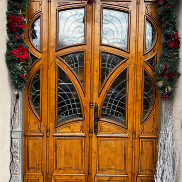
Refinishing an exterior wood door is an excellent way to prolong it’s lifespan while improving its appearance. However, there are a few common mistakes that can render a refinishing ineffective, or even damage your door. Learn what to avoid while working on your exterior wood door to ensure a successful refinishing.
1. Poor Sanding
Sanding against the grain or leaving power sander marks can leave unsightly marks on the surface that will appear in the finished product. Pay attention to how you’re sanding, and use finer grit sandpaper to eliminate any marks.
2. Scratching the Glass
Leaving glass unprotected during the sanding process can result in accidentally scratching the surface. These marks are difficult to remove, and can be avoided by simply protecting the glass before you sand.
3. Bad Varnish
A varnish could be bad for a variety of reasons; bad prep work, mixing incompatible products, etc. Make sure you know the product you are working with, and do not cut corners.
4. Sanding Through the Veneer
Many exterior doors are constructed from a solid core with a decorative veneer applied on top. Sanding too far into the veneer can show unsightly layers and seriously reduce the lifespan of your door. Know how your door is made, and don’t sand too much.
 Jennifer Gilmer Kitchen & Bath
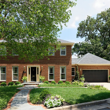
Alexandria, Virginia Transitional Kitchen Design with Intriguing Zinc Accents by #MeghanBrowne4JenniferGilmer. Taking a holistic approach to the space, we moved the doorway to the garage first and created a new entrance with a mini-mud room with shelving and catch-all space that helps contain clutter as people enter the home. With the doorway removed from the center of the kitchen, we were also able to create an expansive countertop run with the zinc hood and blue range centered in the space for an ideal work zone. On the adjacent wall, we simply replaced the windows with shorter windows to allow for the sink to sit underneath and overlook the backyard.
Photography by Bob Narod. http://www.gilmerkitchens.com/
 Classic Kitchens Designs & Renovations Ltd.
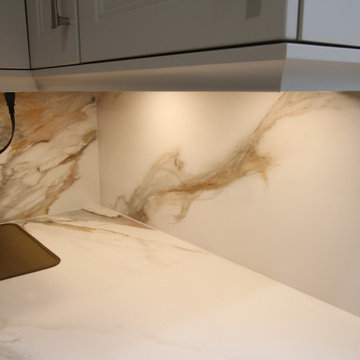
Our client had a dark kitchen that was very popular back in the day, however times change and it was time for something brighter and more airy, with better functionality. We started by removing bulkheads and changing out the flooring to a modern, 24x24 porcelain tile. Custom, Benjamin Moore painted cabinetry was then installed, following by stunning Porcelain countertops with matching backsplash. The result is simply stunning! Be sure to have a look at the before pics to see where we started.
 THE Remodel Group
A luxurious en suite bath was created within this classic 1925 Portland bungalow by reconfiguring the second story’s original small bedrooms and tiny half bath. In this welcoming new urban boho space, eclectic finishes mingle harmoniously, integrated through subtle repetition of shapes and materials.
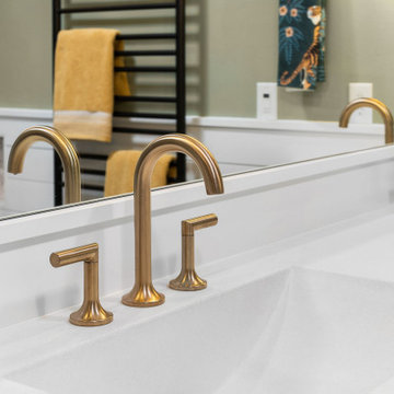
A furniture-style vanity sets the tone for this luxurious space, introducing materials, colors, shapes, and textures that repeat throughout. Individual walnut hexagons join to create distinctive vanity doors, offset beautifully by horizontal-grain drawers. Topping the cabinetry is a simple concrete countertop with integral sinks. An expansive framed mirror above enlarges and brightens the room. Within the mirror, sconces float, their globes a nod to the hexagons below. Champagne bronze fixtures reflect the warm walnut glow. Nestled into the back corner, a stunning shower features waterjet tiles in a double herringbone pattern, each precisely cut and laid to maintain design integrity at every surface transition. Teak floor tiles and a pebbled niche hint at the classic spa experience. Across from the shower, a large hexagonal window provides a treetop view from the free-standing tub below. The gentle oval of the tub and the beaded chandelier above provide a pleasing contrast to the strong lines surrounding it, as do the softly-shaded pebbles in the full-length niche. Shiplap wainscotting wraps the room, creating an illusion of height in the compact space. Subtle flooring and soft green walls create an understated backdrop for the bold mix of materials, unifying them into a serene oasis.
Asking a century-old home to accommodate a modern luxury bath is a tall order. Asbestos-laden plaster and flooring had to be abated. The subfloor had to be leveled and reinforced to increase strength and prevent deflection. Water lines and multiple electrical circuits had to be brought across and up without disturbing a beautifully-paneled ceiling, something we accomplished by firring out stair walls to hide the chases. Our client had visions of a leafy view from her tub, but the new layout eliminated existing windows. Placing a new window was complicated by deep eaves and flat soffits. By pushing the header into the roofline, however, we were able to accommodate a picture window. The flat soffit was replaced by an inverse hip lined with stained tongue and groove cedar, tying it to the bathroom finishes. Bringing materials up a narrow staircase became truly challenging when it was time to install the big items. However, strategic removal of drywall around the landing got the job done. Our attention to detail is showcased in the shower tile, where precise cuts were required at surface transitions to maintain the integrity of a complex double herringbone lay. The project was delivered on time.
Savvy layout choices minimized spending on structural changes. Because we were dealing with dormer space, head height was an issue. Raising the ceiling would have been complex and expensive so our design accommodated the constraints – tub on the low outside wall, shower on the full-height interior wall. The vanity spanned the spread, accommodating our petite client on the exterior side and her taller husband on the interior side. An under-eave closet was closed off to create room for both a freestanding tub and a separate shower. Rather than building replacement storage elsewhere, we simply added a new door into the closet from the primary bedroom. This was made possible by absorbing the short hallway separating the existing bed and bathroom into the primary bedroom. This new layout also created an en suite relationship between the primary bedroom and the new bath. We saved additional dollars by selecting a furniture-style vanity rather than using custom cabinetry, and the countertop with integral sinks provided a cost savings over a more traditional quartz countertop with undermount sinks. Affordable shower tiles allowed us to put more money into a dynamic tile layout. The project was delivered within budget.
 House of Meraki
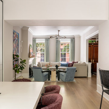
Classic meets Modern in this West Village historic home renovation! Preserving the character and architectural integrity of this home while updating it for this modern busy family, we infused the design with old world charm but make it hip. We started by ripping everything down to the studs, re-arranging the kitchen for a more open feel, adding an oversized accordion door facing the backyard, and adding a powder room where the hallway used to be.
Opening up the 1st floor from front to back allowed the eye to carry along from the entry to the patio. While maintaining a neutral background, we played around with pops of jewel-tones in the accent furniture and art. The stunning Thomas Newman Pearl Chandelier centered the sitting area around the original fireplace. The original vestibule was removed creating an open welcoming foyer, fitted with checkerboard marble floor. While the stairs for all 3 floors of the home were completely reconstructed, we were able to keep the original spindles and handrail, simply updating it with a dramatic black stain.

 Kitchen Tune-Up Franchise System
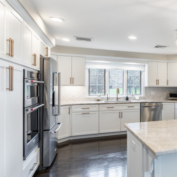
Your kitchen is the heart of your home, but if it's outdated and in desperate need of a makeover, it can be difficult to enjoy spending time in it. Fortunately, a kitchen reface update can completely transform your space and give it a fresh, modern look without the need for a full remodel. And if you're looking for a timeless and elegant design, a white shaker reface may be just what you need.
Why Choose a White Shaker Reface?
The white shaker style is a classic design that has been popular for decades. It features clean, simple lines and a versatile color that can be easily paired with a wide range of decor styles. White shaker cabinets are also a great choice for those who want a bright and airy kitchen, as the light color reflects natural light and makes the space feel larger.
When it comes to a reface update, choosing a white shaker design can help to modernize your kitchen and make it feel more up-to-date. Whether your existing cabinets are dark and dated, or simply in need of a refresh, a white shaker reface can give them a fresh new look that will stand the test of time.
The Refacing Process
One of the benefits of a reface update is that it is a much quicker and less invasive process than a full remodel. Instead of tearing out your existing cabinets and starting from scratch, a reface involves removing the doors and drawers and replacing them with new ones that are custom-made to fit your existing cabinets.
In the case of a white shaker reface, your new doors and drawers will feature the classic shaker style, with clean lines and a fresh white finish. You may also choose to update other elements of your kitchen, such as the hardware or countertops, to complete the look.
 The Parklane
Summer in Houston has a way of changing the rhythm of everyday life. Mornings start a little earlier, evenings stretch a little longer, and weekends seem to invite you outside. It is a season for enjoying the city, slowing down when you can, and making the most of the time you have.
For those considering Houston high rise condos, summer can also offer a fresh perspective on what it means to choose a home.
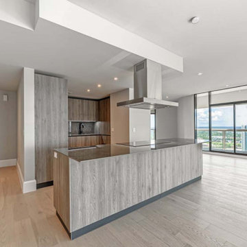
At The Parklane, life is not simply about living above the city. It is about having Houston's green spaces, cultural destinations, dining, recreation, and everyday conveniences woven into the experience of home. Located alongside Hermann Park in the Museum District, The Parklane offers a setting where summer can feel both connected and wonderfully removed from the pace of the city.
 Boyenga Team / Compass
Eichler X-100 Living Room: A Masterclass in Light, Space, and Modern Living
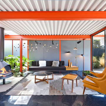
The living room of the Eichler X-100 is where architecture becomes art—an expansive, light-filled environment that captures the pure essence of mid-century modern design. Conceived by A. Quincy Jones and Frederick Emmons for Joseph Eichler, this space is both visually striking and effortlessly livable.
A Space Defined by Freedom
At its core, the living room is made possible by the X-100’s revolutionary steel-frame construction, which removes the need for interior structural walls. The result is a completely open, uninterrupted volume—a rarity even by today’s standards.
This structural freedom allows the room to feel expansive yet grounded, with clean lines and an unmistakable sense of architectural clarity.
Light as the Primary Material
In the X-100, light is not an afterthought—it is the defining element. The living room is wrapped in floor-to-ceiling glass walls, drawing in natural light and framing the surrounding landscape like a series of ever-changing artworks.
Above, continuous skylights introduce a soft, diffused glow that shifts throughout the day, giving the space a dynamic, almost ethereal quality.
The result is a room that feels alive—constantly evolving with the light.
Seamless Indoor-Outdoor Connection
The living room opens directly to outdoor spaces through large sliding glass panels, creating a fluid transition between interior and exterior living. Whether fully opened or closed, the connection to nature is always present.
This is California Modernism at its best:
a lifestyle built around openness, air, and light.
Framed Views and Architectural Alignment
Every sightline within the living room has been carefully considered. Views extend through the home toward interior gardens, atriums, and beyond, reinforcing a sense of continuity and connection.
Even the structure—expressed through exposed steel elements—becomes part of the visual composition, anchoring the openness with a subtle industrial elegance.
A Space for Gathering and Reflection
While expansive, the living room remains intimate in its experience. It is equally suited for entertaining as it is for quiet moments—reading, relaxing, or simply appreciating the architecture itself.
There is a calmness here, a balance between openness and comfort that defines the very best of Eichler design.
The Heart of the Vision
The living room of the Eichler X-100 is not just a place to sit—it is a manifestation of a larger idea: that space, light, and structure can come together to create something both functional and deeply inspiring.
It is, in every sense, a living expression of the future Eichler imagined.
 RAJ Kitchen and Bath, LLC
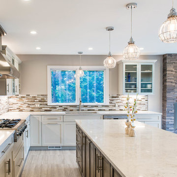
There were a few difficulties in making this kitchen any better than how it was. There was a separate staircase that had access to the second floor which was located in the kitchen. This left just enough room to push the dining room to one side. Then, there was the porch. A really nice panoramic view of the back, but was somehow under-used by the family during the summer months. Then, it was the size of the kitchen. It simply was way too small for a growing family, and while it had a peninsular in place, the flow just didn’t work. I remember watching them one day demonstrating how awkward it was using the kitchen. We got it! We had our marching orders to go and figure out how to make this kitchen work for this family.
Everything in the room was fair play. The design was done to make the kitchen very open. For a few ideas, we incorporated the porch in the kitchen by using the nana wall idea but it ended up being too cost prohibitive to do so. We then decided to do a permanent fix by using a commercial glass wall application. Once we figured that out, we moved back inside and removed the staircase. This gave us two added benefits. One allowed us to really reconfigure the kitchen and the other opened up the second floor for a huge built in closet system.
We relocated the windows, added a fire place with a built In TV above. From there, it was onto the kitchen itself which contained a huge Island with seating, large kitchen sink and built in appliances which was set up in a way to take advantage of the new layout. We re-positioned the kitchen facing the beautiful views outside rather than looking towards a wall. Now, when you enter the house up the entry stairs, the kitchen now draws you into the magnificent new open space. This is now setup for entertaining, relaxation, hanging out and most of all, preparing meals in a room where you only have to leave if you want to.
This one was all about the design. Design was what made this space. Setting this space up for success was crucial, and this kitchen is a great example of how design can cover a multitude of sins in Kitchen designs.
… Just close your eyes for a second and imagine waking up one winter morning and having a cup of coffee and watching the snow fall through those huge windows, leaning up against those 3D feature walls while watching the kids sitting around the table enjoying those warm radiant heated floors in this spacious kitchen…..

 The Amendola Group, Inc.
At THE AMENDOLA GROUP, INC., we design + build landscapes and outdoor living spaces with attention to detail, style, and high-quality craftsmanship that is unmatched in the industry.
There are many aspects to consider when hiring a landscaping company for your home or business. Whether you are looking for more privacy, an outdoor living area fit for entertaining, or you simply want to enhance the aesthetics of your property, the team at Amendola Landscapes, Inc. can design the perfect landscape for you.
Your vision is our top priority. We are not satisfied with our work until we have exceeded our client's expectations. We take pride in the quality of our work and it shows—much of our new business is based on client referrals.
No matter the size of the job, Amendola Landscapes, Inc. can take care of all your needs. From the design phase right through the final product, we are always professional and we always over-deliver.
THE AMENDOLA GROUP, INC. — a partner with Amendola Landscapes, Inc. — is a full-service landscape design, build, and maintenance firm located in Dutchess County, NY.
OUR SERVICES INCLUDE: Landscape design | 3d renderings | Custom stonework including both natural stone and UNILOCK pavers and wall stone | Excavation | Custom decking | Landscape lighting | Waterscapes | Commercial snow removal | Professional lawn and garden maintenance
 Classic Kitchens Designs & Renovations Ltd.
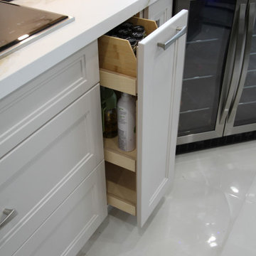
Our client had a dark kitchen that was very popular back in the day, however times change and it was time for something brighter and more airy, with better functionality. We started by removing bulkheads and changing out the flooring to a modern, 24x24 porcelain tile. Custom, Benjamin Moore painted cabinetry was then installed, following by stunning Porcelain countertops with matching backsplash. The result is simply stunning! Be sure to have a look at the before pics to see where we started.
 Classic Kitchens Designs & Renovations Ltd.
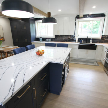
Our homeowner came to us with an older backsplit bungalow with 3 traditionally divided rooms which they wanted to unify into one large kitchen and family room space. After removing all the walls and bulkheads we were able to put new plank flooring throughout the new open space. We then installed new, Benjamin Moore painted custom cabinetry in the kitchen area followed by stunning Cambria quartz countertops in the "Portrush" colour. Glazed backsplash was then installed to complete the look. The colour combinations and the final look and feel is simply stunning! Have a look at the before pics to see where we started.
46