
Search results for "Visual elements" in Home Design Ideas
 Charity Swanson Buchika
Alice G Patterson Photography
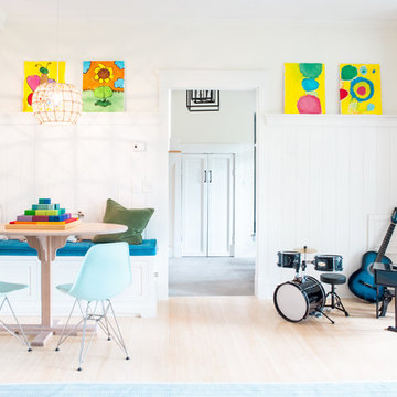
Example of a mid-sized transitional enclosed light wood floor kids' room design in Burlington with white walls and no fireplace
Example of a mid-sized transitional enclosed light wood floor kids' room design in Burlington with white walls and no fireplace
 Spaces Designed, Interior Design Studio, LLC
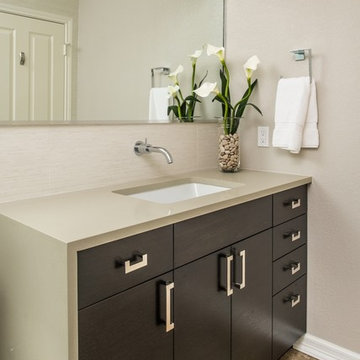
Modern, simple and with an element of pizzazz. That was the motto behind this Travis Country project. In this bathroom, our challenge was to extend the relatively small space while keeping the integrity of the existing floor tiles. Our expertise in color combinations and experience with patterns and textures helped us overcome the hurdle. The result was a clutter-free bathroom without being full-on minimalistic, and yet another happy customer.
 TKS Design Group
Free ebook, Creating the Ideal Kitchen. DOWNLOAD NOW
One of my favorite things to work on is older homes with a bit of history because I find it an interesting challenge to marry the historical architectural features of a home with modern design elements that work well for my client’s current lifestyle.
This home was particularly fun because it was the second kitchen we had done for this family and was quite a departure from the style of the first kitchen.
The before shot of the kitchen shows a view from the family room. See the dropped ceiling? We were curious, was this just part of the design or was the dropped ceiling there to hide mechanicals? Well we soon found out that it was mostly decorative (yay!), and with the exception of a little bit of work to some plumbing from an upstairs bathroom and rerouting of the ventilation system within the original floor joists, we were in the clear, phew! The shot of the completed kitchen from roughly the same vantage point shows how much taller the ceilings are. It makes a huge difference in the feel of the space. Dark and gloomy turned fresh and light!
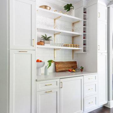
Another serious consideration was what do we do with the skinny transom window above the refrigerator. After much back and forth, we decided to eliminate it and do some open shelving instead. This ended up being one of the nicest areas in the room. I am calling it the “fun zone” because it houses all the barware, wine cubbies and a bar fridge — the perfect little buffet spot for entertaining. It is flanked on either side by pull out pantries that I’m sure will get a ton of use. Since the neighboring room has literally three walls of almost full height windows, the kitchen gets plenty of light.
The gold shelving brackets, large pendant fixtures over the island and the tile mural behind the range all pay subtle homage to the home’s prairie style architecture and bring a bit of sparkle to the room.
Even though the room is quite large, the work triangle is very tight with the large Subzero fridge, sink and range all nearby for easy maneuvering during meal prep. There is seating for four at the island, and work aisles are generous.
Designed by: Susan Klimala, CKD, CBD
Photography by: LOMA Studios
For more information on kitchen and bath design ideas go to: www.kitchenstudio-ge.com
Find the right local pro for your project
 Owen Homes LLC
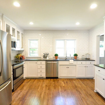
Eat-in kitchen - large transitional l-shaped light wood floor and brown floor eat-in kitchen idea in Kansas City with an undermount sink, shaker cabinets, white cabinets, quartz countertops, white backsplash, subway tile backsplash, stainless steel appliances, no island and gray countertops
 HOME DEKO
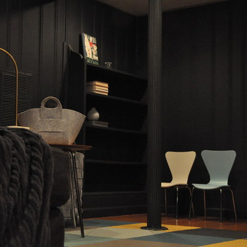
The deep gray/black walls create a strong visual element, giving the impression of a larger space.
Photography: homedekostudio.com
Danish carpeted and multicolored floor basement photo in New York with gray walls
Danish carpeted and multicolored floor basement photo in New York with gray walls
 Spaces Renewed
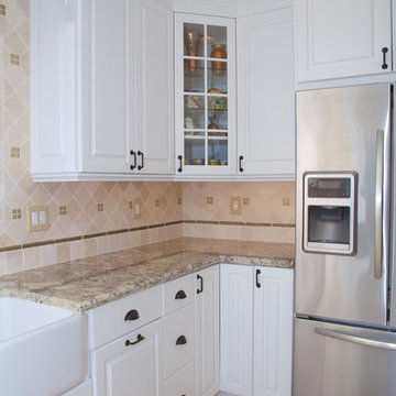
This kitchen is a light bright traditional space. Its light and neutral color pallet is warm and inviting, while staying true to traditional design. The space doesn’t feel heavy or ornate, but still carries custom and visually interesting elements. The farmhouse sink both classically beautiful and functional. The back splash is tumbled marble and by changing formats from square to diamond, we add interest without creating visually busy or completing elements. The glass rope and inset glass tiles are a custom element that adds to the custom elegance of the space. The arched raised panel valance over the sink marries the two areas of the kitchen and creates visual interest and dimension
The clear glass mullion door is clean and timeless
 Regan Baker Design Inc.
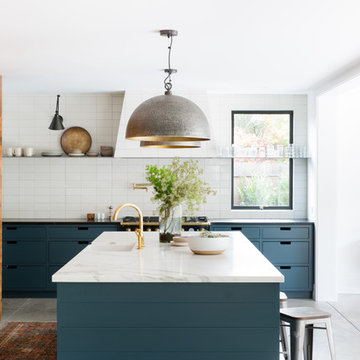
Inspiration for a country concrete floor eat-in kitchen remodel in San Francisco with a farmhouse sink, flat-panel cabinets, blue cabinets, white backsplash, black appliances and an island

Sponsored
Columbus, OH

Snider & Metcalf Interior Design, LTD
Leading Interior Designers in Columbus, Ohio & Ponte Vedra, Florida
 sticklab
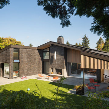
mid-modern urban home.
Rear Yard.
Inspiration for a large 1960s black two-story brick gable roof remodel in Seattle
Inspiration for a large 1960s black two-story brick gable roof remodel in Seattle
 The Brooklyn Studio
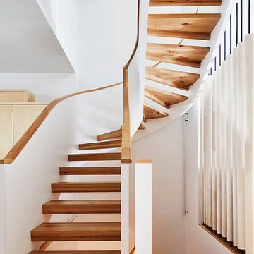
This residence was a complete gut renovation of a 4-story row house in Park Slope, and included a new rear extension and penthouse addition. The owners wished to create a warm, family home using a modern language that would act as a clean canvas to feature rich textiles and items from their world travels. As with most Brooklyn row houses, the existing house suffered from a lack of natural light and connection to exterior spaces, an issue that Principal Brendan Coburn is acutely aware of from his experience re-imagining historic structures in the New York area. The resulting architecture is designed around moments featuring natural light and views to the exterior, of both the private garden and the sky, throughout the house, and a stripped-down language of detailing and finishes allows for the concept of the modern-natural to shine.
Upon entering the home, the kitchen and dining space draw you in with views beyond through the large glazed opening at the rear of the house. An extension was built to allow for a large sunken living room that provides a family gathering space connected to the kitchen and dining room, but remains distinctly separate, with a strong visual connection to the rear garden. The open sculptural stair tower was designed to function like that of a traditional row house stair, but with a smaller footprint. By extending it up past the original roof level into the new penthouse, the stair becomes an atmospheric shaft for the spaces surrounding the core. All types of weather – sunshine, rain, lightning, can be sensed throughout the home through this unifying vertical environment. The stair space also strives to foster family communication, making open living spaces visible between floors. At the upper-most level, a free-form bench sits suspended over the stair, just by the new roof deck, which provides at-ease entertaining. Oak was used throughout the home as a unifying material element. As one travels upwards within the house, the oak finishes are bleached to further degrees as a nod to how light enters the home.
The owners worked with CWB to add their own personality to the project. The meter of a white oak and blackened steel stair screen was designed by the family to read “I love you” in Morse Code, and tile was selected throughout to reference places that hold special significance to the family. To support the owners’ comfort, the architectural design engages passive house technologies to reduce energy use, while increasing air quality within the home – a strategy which aims to respect the environment while providing a refuge from the harsh elements of urban living.
This project was published by Wendy Goodman as her Space of the Week, part of New York Magazine’s Design Hunting on The Cut.
Photography by Kevin Kunstadt
 Spaces Designed, Interior Design Studio, LLC
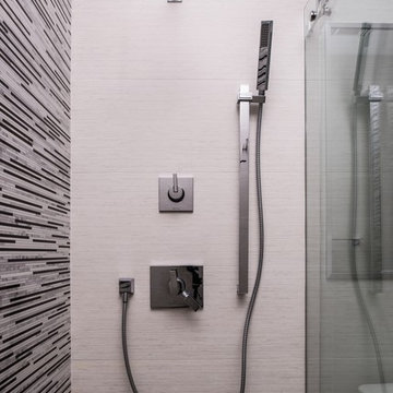
Modern, simple and with an element of pizzazz. That was the motto behind this Travel Heights project. In this bathroom, our challenge was to extend the relatively small space while keeping the integrity of the existing floor tiles.Our expertise in color combinations and experience with patterns and textures helped us overcome the hurdle. The result was a clutter-free bathroom without being full-on minimalist, and yet another happy costumer. As a first step, large lenin tiles were installed on all the bathroom from floor to ceiling to create the continuity and to make the bathroom seem larger than it is. Large accent black and white 13x40 porcelain tiles were selected which a "wow" effect to the bathroom and maintain the color palette flow with the existing patterned floor tiles. Moreover, to create a modern, creative aesthetic, these were installed on the entire shower wall. A frame less shower affords the viewer the full visual draw of the stunning accent wall. The waterfall counter top on the side creatively frames the cabinets and provides protection to the beautiful mahogany wood from water spills. The cabinet details also included a small full-out rod from the left front side of the vanity for toilet paper, so no holes have to drilled on the beautiful counter-top side. The sink faucet was installed in the wall to create a clean, no-frills appearance. Additionally, we included upscale amenities like a stainless steel rain shower head with hand shower, an energy-efficient LED light fixture, floating drawer pulls and shower door with aluminum framing to give more strength. The result is an interesting mix of "something old" and "something new."
Bee Creek Photography
 The Artisans Group, Inc.
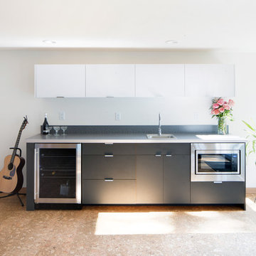
Winner of the 2018 Tour of Homes Best Remodel, this whole house re-design of a 1963 Bennet & Johnson mid-century raised ranch home is a beautiful example of the magic we can weave through the application of more sustainable modern design principles to existing spaces.
We worked closely with our client on extensive updates to create a modernized MCM gem.
Extensive alterations include:
- a completely redesigned floor plan to promote a more intuitive flow throughout
- vaulted the ceilings over the great room to create an amazing entrance and feeling of inspired openness
- redesigned entry and driveway to be more inviting and welcoming as well as to experientially set the mid-century modern stage
- the removal of a visually disruptive load bearing central wall and chimney system that formerly partitioned the homes’ entry, dining, kitchen and living rooms from each other
- added clerestory windows above the new kitchen to accentuate the new vaulted ceiling line and create a greater visual continuation of indoor to outdoor space
- drastically increased the access to natural light by increasing window sizes and opening up the floor plan
- placed natural wood elements throughout to provide a calming palette and cohesive Pacific Northwest feel
- incorporated Universal Design principles to make the home Aging In Place ready with wide hallways and accessible spaces, including single-floor living if needed
- moved and completely redesigned the stairway to work for the home’s occupants and be a part of the cohesive design aesthetic
- mixed custom tile layouts with more traditional tiling to create fun and playful visual experiences
- custom designed and sourced MCM specific elements such as the entry screen, cabinetry and lighting
- development of the downstairs for potential future use by an assisted living caretaker
- energy efficiency upgrades seamlessly woven in with much improved insulation, ductless mini splits and solar gain
 Hammond Design
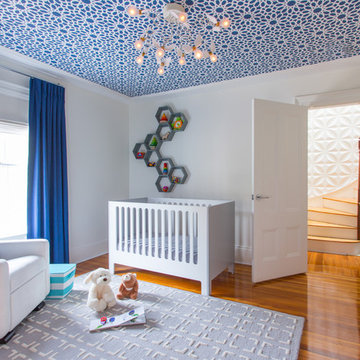
The nursery is a study in bold geometry with Moroccan-style wallpaper on the ceiling, honeycomb wall shelves, and repeating squares in the rug and bookcase. The glider is the perfect spot to read a story and snuggle. Custom blackout draperies and roman shades keep the light in control for nap time.
Photo: Eric Roth
 GDC Construction
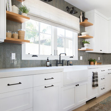
Example of a mid-sized transitional l-shaped light wood floor and beige floor kitchen design in San Diego with a farmhouse sink, shaker cabinets, white cabinets, solid surface countertops, gray backsplash, subway tile backsplash, paneled appliances and an island


 Showplace Cabinetry
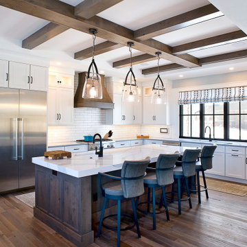
Simultaneously comfortable and elegant, this executive home makes excellent use of Showplace Cabinetry throughout its open floor plan. The contrasting design elements found within this newly constructed home are very intentional, blending bright and clean sophistication with splashes of earthy colors and textures. In this home, painted white kitchen cabinets are anything but ordinary.
Visually stunning from every angle, the homeowners have created an open space that not only reflects their personal sense of informed design, but also ensures it will feel livable to younger family members and approachable to their guests. A home where sweet little moments will create lasting memories.
Kitchen Perimeter
- Door Style: Edgewater
- Construction: International+/Full Overlay
- Wood Type: Paint Grade
- Paint: Showplace Paints - Heron Plume
Kitchen Island | Hood
- Door Style: Edgewater
- Construction: International+/Full Overlay
- Wood Type: Rustic Alder
- Finish: Driftwood
 TVL Creative Ltd.
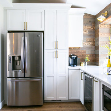
This kitchen took a tired, 80’s builder kitchen and revamped it into a personalized gathering space for our wonderful client. The existing space was split up by the dated configuration of eat-in kitchen table area to one side and cramped workspace on the other. It didn’t just under-serve our client’s needs; it flat out discouraged them from using the space. Our client desired an open kitchen with a central gathering space where family and friends could connect. To open things up, we removed the half wall separating the kitchen from the dining room and the wall that blocked sight lines to the family room and created a narrow hallway to the kitchen. The old oak cabinets weren't maximizing storage and were dated and dark. We used Waypoint Living Spaces cabinets in linen white to brighten up the room. On the east wall, we created a hutch-like stack that features an appliance garage that keeps often used countertop appliance on hand but out of sight. The hutch also acts as a transition from the cooking zone to the coffee and wine area. We eliminated the north window that looked onto the entry walkway and activated this wall as storage with refrigerator enclosure and pantry. We opted to leave the east window as-is and incorporated it into the new kitchen layout by creating a window well for growing plants and herbs. The countertops are Pental Quartz in Carrara. The sleek cabinet hardware is from our friends at Amerock in a gorgeous satin champagne bronze. One of the most striking features in the space is the pattern encaustic tile from Tile Shop. The pop of blue in the backsplash adds personality and contrast to the champagne accents. The reclaimed wood cladding surrounding the large east-facing window introduces a quintessential Colorado vibe, and the natural texture balances the crisp white cabinetry and geometric patterned tile. Minimalist modern lighting fixtures from Mitzi by Hudson Valley Lighting provide task lighting over the sink and at the wine/ coffee station. The visual lightness of the sink pendants maintains the openness and visual connection between the kitchen and dining room. Together the elements make for a sophisticated yet casual vibe-- a comfortable chic kitchen. We love the way this space turned out and are so happy that our clients now have such a bright and welcoming gathering space as the heart of their home!
 Ben Herzog
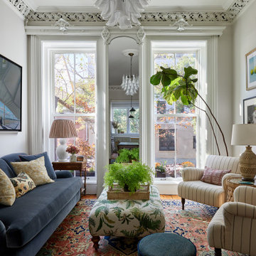
Living room - mid-sized traditional formal and enclosed medium tone wood floor and brown floor living room idea in New York with beige walls and a wall-mounted tv
 Randy Angell Designs
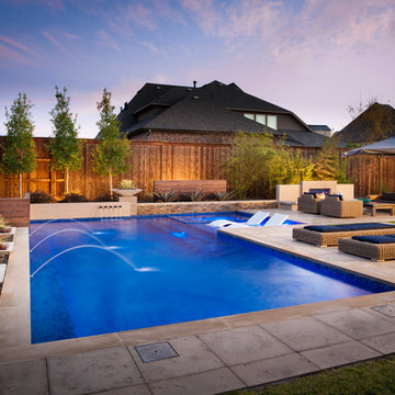
This organic modern design is built in an area known for having notable issues with ground movement. After speaking with the developer and reviewing the soil report with our Structural Engineer, we made our recommendations to the client.
Since the budget for a full-blown pier and beam structure with void boxes under the pool was well beyond the comfort level of our client, they elected to have us utilize a float shell construction method.
For this, we over-excavated the hole and placed a 12" layer of gravel beneath the shell of the pool. Drain lines lead from the deepest point under the pool down into a culvert, placed off to the side of the pool. A sump pump removes any excess water from the culvert as it accumulates.
For the shell of the pool, we utilized a double matt of steel and increased the wall thickness to a minimum of 12". This gave added strength to withstand the volatile soil.
The elements of fire, water, wood and stone were very important in creating the organic modern feel of this design. The layered effect along the back wall creates a visual stimulation across the length of the yard, without overwhelming the senses.
Rather than creating walls only of hard materials, we used Ipe wood to create horizontal screen walls of a more organic nature. At either end, the raised wall and the fire feature are finished in a large-scale porcelain tile, with the look of stained concrete.
Custom stainless steel scuppers, made by a local fabricator, create a soothing sound of falling water. The low wall at the center of the project is faced in natural ledgestone, and carries a color palette that set the tone for the entire project.
Behind this wall and in front of one of the Ipe screens are three Desert Steel Giant Agave sculptures. The unique fire feature isn't quite a fire place, nor is it a fire pit. It is a linear fire burner, surrounded by a 4" thick cantilevered Leuder limestone hearth, with a backdrop wall of blue glazed clay tile.
Although the pool was initially planned as a plaster pool, as the project began to take shape, the client elected to go all the way and finish it in a beautiful blue glass mosaic.
Custom fabricated stainless steel cannon jets send a delicate arch of water over this deep blue, and draw attention to the three square wok planters on the far side of the yard.
For the decking on this project, we elected to work with Mother Nature rather than against her. Two and a half inch thick concrete pavers, set on a bed of compacted, decomposed granite allow for movement around the pool that is easily fixed. If an area of deck moves around, we can simply lift the affected areas, re-level with DG bed, and re-set the pavers.


 Hillstar Construction Services
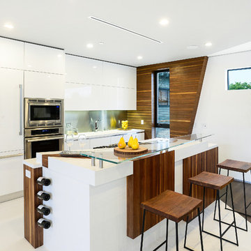
Example of a mid-sized trendy single-wall porcelain tile and white floor kitchen design in Los Angeles with flat-panel cabinets, white cabinets, metallic backsplash, stainless steel appliances, an island, an undermount sink, solid surface countertops and metal backsplash
 Suzanne MacCrone Rogers
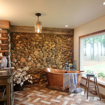
Renovation of a master bath suite, dressing room and laundry room in a log cabin farm house. Project involved expanding the space to almost three times the original square footage, which resulted in the attractive exterior rock wall becoming a feature interior wall in the bathroom, accenting the stunning copper soaking bathtub.
A two tone brick floor in a herringbone pattern compliments the variations of color on the interior rock and log walls. A large picture window near the copper bathtub allows for an unrestricted view to the farmland. The walk in shower walls are porcelain tiles and the floor and seat in the shower are finished with tumbled glass mosaic penny tile. His and hers vanities feature soapstone counters and open shelving for storage.
Concrete framed mirrors are set above each vanity and the hand blown glass and concrete pendants compliment one another.
Interior Design & Photo ©Suzanne MacCrone Rogers
Architectural Design - Robert C. Beeland, AIA, NCARB
 Cathie Hong Interiors
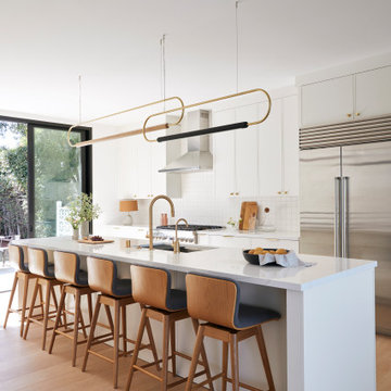
Our clients decided to take their childhood home down to the studs and rebuild into a contemporary three-story home filled with natural light. We were struck by the architecture of the home and eagerly agreed to provide interior design services for their kitchen, three bathrooms, and general finishes throughout. The home is bright and modern with a very controlled color palette, clean lines, warm wood tones, and variegated tiles.
80