
Search results for "Well informed decisions" in Home Design Ideas
 Fabco Sanctuary
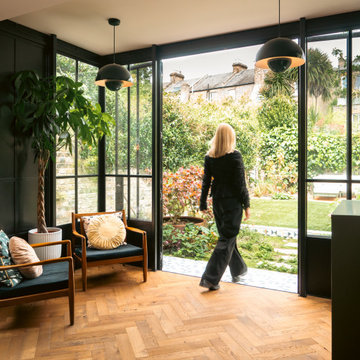
The architect and designer Guy Derwent was approached by his client with a clear and compelling brief: to completely transform a grand Victorian terrace house they were planning to renovate. The client envisioned something far beyond a standard renovation – this was to be a bold and dramatic reimagining of a family home that could grow with them over time.
With the property having remained largely untouched for more than fifty years, the architects saw an opportunity to unlock its potential and deliver a contemporary design that would contrast beautifully with its Victorian heritage.
The existing layout consisted of a series of small, disconnected rooms to the rear of the house. To respond to the client’s need for openness and flexibility, the architect proposed a radical restructuring of the ground floor:
The rear rooms were completely removed
Suspended timber floors were lowered by up to two metres to align with the garden
Two bold extensions were added
The first extension filled in the side return with a London stock brick facade and a glazed roof, while the second – a striking black steel and glass pavilion was glazed on three sides and placed along the garden elevation.
This new pavilion redefined the building’s relationship with the garden. Its steel-framed glazing created a seamless dialogue between interior and exterior, offering a sense of immersion in the surrounding landscape.
At the heart of the plan sits a dramatic, five-metre-tall dining space that acts as a transition from the original entrance hall into the new addition. A large, circular cast-glass window, framed in steel, provides a visual and spatial link between old and new, allowing light and movement to travel through the depth of the home.
Throughout the project, a series of black metal elements were introduced as sculptural interventions – each marking moments of transformation within the house. These included the bespoke steel framed circular window, a custom metal staircase, a cylindrical support column, and the striking steel and glass garden pavilion. Together, they formed a coherent architectural language that underscored the project’s bold intent.
Our steel windows and doors played a vital role in delivering the project’s vision. The architects chose steel for its refined sight lines and distinctive material character, which helped bridge the gap between the historical context of the building and the bold new additions.
The black steel frames provided a crisp contrast to the pale London stock brick and added definition to the glazed pavilion, reinforcing the sense of architectural precision. In particular, the fine steel profiles of the garden room allowed the extension to feel both lightweight and immersive, blurring the boundary between the house and its garden.
The architect drew inspiration from the Bauhaus Movement, particularly the work of Walter Gropius, whose approach to functional beauty and industrial materials informed the design of the garden pavilion.
Here, our glazing system was used not just for transparency, but as an expressive architectural element. The carefully proportioned panels help to conceal the roof thickness and reinforce the pavilion’s industrial yet abstract character – a deliberate nod to product design and modernist detailing.
Sustainability was an important factor in the selection of materials. Our steel systems, made from 99% recycled content and 100% recyclable, aligned with the project’s broader environmental goals.
The architects noted that this commitment to material longevity and circularity was central to their decision to use steel. The durability and recyclability of the windows and doors ensured the project met both aesthetic and ethical criteria.
This London terrace house now stands as a celebration of contrast – between heritage and innovation, solidity and transparency, tradition and transformation. Our steel windows and doors were not simply components; they were essential tools in crafting a home that is as bold and expressive as it is functional.
The result is a home designed for modern family life, where light, space, and materiality come together in perfect harmony.
 Brad Ramsey Interiors
Well-Traveled Alys Beach Home
Photo: Jack Gardner
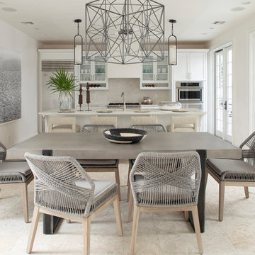
Example of a large beach style beige floor kitchen/dining room combo design with white walls
Example of a large beach style beige floor kitchen/dining room combo design with white walls
 LD&A
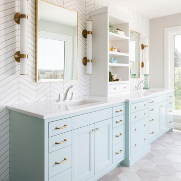
LD&AExample of a large transitional master white tile and porcelain tile gray floor bathroom design in Calgary with recessed-panel cabinets, blue cabinets, an undermount sink, white countertops, white walls, quartz countertops and a hinged shower door
Find the right local pro for your project
 Beth Dotolo, ASID, RID, NCIDQ
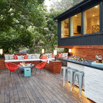
Stephen Karlisch // This lakeside home was completely refurbished inside and out to accommodate 16 guests in a stylish, hotel-like setting. Owned by a long-time client of Pulp, this home reflects the owner's personal style -- well-traveled and eclectic -- while also serving as a landing pad for her large family. With spa-like guest bathrooms equipped with robes and lotions, guest bedrooms with multiple beds and high-quality comforters, and a party deck with a bar/entertaining area, this is the ultimate getaway.
 RS | MANNINO Architecture + Construction
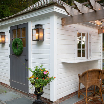
The informal bar area of the cabana
Example of a farmhouse shed design in New York
Example of a farmhouse shed design in New York
 TKS Design Group
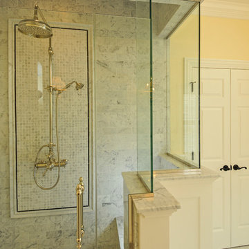
If ever there was an ugly duckling, this master bath was it. While the master bedroom was spacious, the bath was anything but with its 30” shower, ugly cabinetry and angles everywhere. To become a beautiful swan, a bath with enlarged shower open to natural light and classic design materials that reflect the homeowners’ Parisian leanings was conceived. After all, some fairy tales do have a happy ending.
By eliminating an angled walk-in closet and relocating the commode, valuable space was freed to make an enlarged shower with telescoped walls resulting in room for toiletries hidden from view, a bench seat, and a more gracious opening into the bath from the bedroom. Also key was the decision for a single vanity thereby allowing for two small closets for linens and clothing. A lovely palette of white, black, and yellow keep things airy and refined. Charming details in the wainscot, crown molding, and six-panel doors as well as cabinet hardware, Laurent door style and styled vanity feet continue the theme. Custom glass shower walls permit the bather to bask in natural light and feel less closed in; and beautiful carrera marble with black detailing are the perfect foil to the polished nickel fixtures in this luxurious master bath.
Designed by: The Kitchen Studio of Glen Ellyn
Photography by: Carlos Vergara
For more information on kitchen and bath design ideas go to: www.kitchenstudio-ge.com
URL http://www.kitchenstudio-ge.com
 TKS Design Group
Download our free ebook, Creating the Ideal Kitchen. DOWNLOAD NOW
Lakefront property in the northwest suburbs of Chicago is hard to come by, so when we were hired by this young family with exactly that, we were immediately inspired by not just the unusually large footprint of this 1950’s colonial revival but also the lovely views of the manmade lake it was sited on. The large 5-bedroom home was solidly stuck in the 1980’s, but we saw tons of potential. We started out by updating the existing staircase with a fresh coat of paint and adding new herringbone slate to the entry hall.
The powder room off the entryway also got a refresh - new flooring, new cabinets and fixtures. We ran the new slate right through into this space for some consistency. A fun wallpaper and shiplap trim add a welcoming feel and set the tone for the home.
Next, we tackled the kitchen. Located away from the rest of the first floor, the kitchen felt a little isolated, so we immediately began planning for how to better connect it to the rest of the first floor. We landed on removing the wall between the kitchen and dining room and designed a modified galley style space with separate cooking and clean up zones. The cooking zone consists of the refrigerator, prep sink and cooktop, along with a nice long run of prep space at the island. The cleanup side of the kitchen consists of the main sink and dishwasher. Both areas are situated so that the user can view the lake during prep work and cleanup!
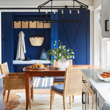
One of the home’s main puzzles was how to incorporate the mudroom and area in front of the patio doors at the back of the house. We already had a breakfast table area, so the space by the patio doors was a bit of a no man’s land. We decided to separate the kitchen proper from what became the new mudroom with a large set of barn doors. That way you can quickly hide any mudroom messes but have easy access to the light coming in through the patio doors as well as the outdoor grilling station. We also love the impact the barn doors add to the overall space.
The homeowners’ first words to us were “it’s time to ditch the brown,” so we did! We chose a lovely blue pallet that reflects the home’s location on the lake which is also vibrant yet easy on the eye. Countertops are white quartz, and the natural oak floor works well with the other honey accents. The breakfast table was given a refresh with new chairs, chandelier and window treatments that frame the gorgeous views of the lake out the back.
We coordinated the slate mudroom flooring with that used in the home’s main entrance for a consistent feel. The storage area consists of open and closed storage to allow for some clutter control as needed.
Next on our “to do” list was revamping the dated brown bar area in the neighboring dining room. We eliminated the clutter by adding some closed cabinets and did some easy updates to help the space feel more current. One snag we ran into here was the discovery of a beam above the existing open shelving that had to be modified with a smaller structural beam to allow for our new design to work. This was an unexpected surprise, but in the end we think it was well worth it!
We kept the colors here a bit more muted to blend with the homeowner’s existing furnishings. Open shelving and polished nickel hardware add some simple detail to the new entertainment zone which also looks out onto the lake!
Next we tackled the upstairs starting with the homeowner’s son’s bath. The bath originally had both a tub shower and a separate shower, so we decided to swap out the shower for a new laundry area. This freed up some space downstairs in what used to be the mudroom/laundry room and is much more convenient for daily laundry needs.
We continued the blue palette here with navy cabinetry and the navy tile in the shower. Porcelain floor tile and chrome fixtures keep maintenance to a minimum while matte black mirrors and lighting add some depth the design. A low maintenance runner adds some warmth underfoot and ties the whole space together.
We added a pocket door to the bathroom to minimize interference with the door swings. The left door of the laundry closet is on a 180 degree hinge to allow for easy full access to the machines. Next we tackled the master bath which is an en suite arrangement. The original was typical of the 1980’s with the vanity outside of the bathroom, situated near the master closet. And the brown theme continued here with multiple shades of brown.
Our first move was to segment off the bath and the closet from the master bedroom. We created a short hall from the bedroom to the bathroom with his and hers walk-in closets on the left and right as well as a separate toilet closet outside of the main bathroom for privacy and flexibility.
The original bathroom had a giant soaking tub with steps (dangerous!) as well as a small shower that did not work well for our homeowner who is 6’3”. With other bathtubs in the home, they decided to eliminate the tub and create an oversized shower which takes up the space where the old tub was located. The double vanity is on the opposite wall and a bench is located under the window for morning conversations and a place to set a couple of towels.
The pallet in here is light and airy with a mix of blond wood, creamy porcelain and marble tile, and brass accents. A simple roman shade adds some texture and it’s top-down mechanism allows for light and privacy.
This large whole house remodel gave our homeowners not only the ability to maximize the potential of their home but also created a lovely new frame from which to view their fabulous lake views.
Designed by: Susan Klimala, CKD, CBD
Photography by: Michael Kaskel
For more information on kitchen and bath design ideas go to: www.kitchenstudio-ge.com

Sponsored
Sunbury, OH

J.Holderby - Renovations
Franklin County's Leading General Contractors - 2X Best of Houzz!
 TKS Design Group
Free ebook, Creating the Ideal Kitchen. DOWNLOAD NOW
One of my favorite things to work on is older homes with a bit of history because I find it an interesting challenge to marry the historical architectural features of a home with modern design elements that work well for my client’s current lifestyle.
This home was particularly fun because it was the second kitchen we had done for this family and was quite a departure from the style of the first kitchen.
The before shot of the kitchen shows a view from the family room. See the dropped ceiling? We were curious, was this just part of the design or was the dropped ceiling there to hide mechanicals? Well we soon found out that it was mostly decorative (yay!), and with the exception of a little bit of work to some plumbing from an upstairs bathroom and rerouting of the ventilation system within the original floor joists, we were in the clear, phew! The shot of the completed kitchen from roughly the same vantage point shows how much taller the ceilings are. It makes a huge difference in the feel of the space. Dark and gloomy turned fresh and light!
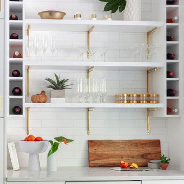
Another serious consideration was what do we do with the skinny transom window above the refrigerator. After much back and forth, we decided to eliminate it and do some open shelving instead. This ended up being one of the nicest areas in the room. I am calling it the “fun zone” because it houses all the barware, wine cubbies and a bar fridge — the perfect little buffet spot for entertaining. It is flanked on either side by pull out pantries that I’m sure will get a ton of use. Since the neighboring room has literally three walls of almost full height windows, the kitchen gets plenty of light.
The gold shelving brackets, large pendant fixtures over the island and the tile mural behind the range all pay subtle homage to the home’s prairie style architecture and bring a bit of sparkle to the room.
Even though the room is quite large, the work triangle is very tight with the large Subzero fridge, sink and range all nearby for easy maneuvering during meal prep. There is seating for four at the island, and work aisles are generous.
Designed by: Susan Klimala, CKD, CBD
Photography by: LOMA Studios
For more information on kitchen and bath design ideas go to: www.kitchenstudio-ge.com
 Décor Aid
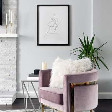
Having a small child, loving to entertain and looking to declutter and kid-proof the gathering spaces of their home in the quaint village of Rockville Centre, Long Island, a stone’s throw from Manhattan, our client’s main objective was to have their living room and den transformed with a family friendly home makeover with mid-century modern tones boasting a formal, yet relaxed spirit
Stepping into the home we found their living room and den both architecturally well appointed yet in need of modern transitional furniture pieces and the pops of color our clients admired, as there was a substantial amount of cool, cold grays in the rooms.
Decor Aid designer Vivian C. approached the design and placement of the pieces sourced to be kid-friendly while remaining sophisticated and practical for entertaining.
“We played off of the clients love for blush pinks, mid-century modern and turquoise. We played with the use of gold and silver metals to mix it up.”
In the living room, we used the prominent bay window and its illuminating natural light as the main architectural focal point, while the fireplace and mantels soft white tone helped inform the minimalist color palette for which we styled the room around.
To add warmth to the living room we played off of the clients love for blush pinks and turquoise while elevating the room with flashes of gold and silver metallic pieces. For a sense of play and to tie the space together we punctuated the kid-friendly living room with an eclectic juxtaposition of colors and materials, from a beautifully patchworked geometric cowhide rug from All Modern, to a whimsical mirror placed over an unexpected, bold geometric credenza, to the blush velvet barrel chair and abstract blue watercolor pillows.
“When sourcing furniture and objects, we chose items that had rounded edges and were shatter proof as it was vital to keep each room’s decor childproof.” Vivian ads.
Their vision for the den remained chic, with comfort and practical functionality key to create an area for the young family to come together.
For the den, our main challenge was working around the pre-existing dark gray sectional sofa. To combat its chunkiness, we played off of the hues in the cubist framed prints placed above and focused on blue and orange accents which complement and play off of each other well. We selected orange storage ottomans in easy to clean, kid-friendly leather to maximize space and functionality. To personalize the appeal of the den we included black and white framed family photos. In the end, the result created a fun, relaxed space where our clients can enjoy family moments or watch a game while taking in the scenic view of their backyard.
For harmony between the rooms, the overall tone for each room is mid-century modern meets bold, yet classic contemporary through the use of mixed materials and fabrications including marble, stone, metals and plush velvet, creating a cozy yet sophisticated enough atmosphere for entertaining family and friends and raising a young children.
“The result od this family friendly room was really fantastic! Adding some greenery, more pillows and throws really made the space pop.” Vivian C. Decor Aid’s Designer
 Waterview Kitchens
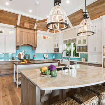
The ultimate coastal beach home situated on the shoreintracoastal waterway. The kitchen features white inset upper cabinetry balanced with rustic hickory base cabinets with a driftwood feel. The driftwood v-groove ceiling is framed in white beams. he 2 islands offer a great work space as well as an island for socializng.
 TKS Design Group
Download our free ebook, Creating the Ideal Kitchen. DOWNLOAD NOW
The homeowners came to us looking to update the kitchen in their historic 1897 home. The home had gone through an extensive renovation several years earlier that added a master bedroom suite and updates to the front façade. The kitchen however was not part of that update and a prior 1990’s update had left much to be desired. The client is an avid cook, and it was just not very functional for the family.
The original kitchen was very choppy and included a large eat in area that took up more than its fair share of the space. On the wish list was a place where the family could comfortably congregate, that was easy and to cook in, that feels lived in and in check with the rest of the home’s décor. They also wanted a space that was not cluttered and dark – a happy, light and airy room. A small powder room off the space also needed some attention so we set out to include that in the remodel as well.
See that arch in the neighboring dining room? The homeowner really wanted to make the opening to the dining room an arch to match, so we incorporated that into the design.
Another unfortunate eyesore was the state of the ceiling and soffits. Turns out it was just a series of shortcuts from the prior renovation, and we were surprised and delighted that we were easily able to flatten out almost the entire ceiling with a couple of little reworks.
Other changes we made were to add new windows that were appropriate to the new design, which included moving the sink window over slightly to give the work zone more breathing room. We also adjusted the height of the windows in what was previously the eat-in area that were too low for a countertop to work. We tried to keep an old island in the plan since it was a well-loved vintage find, but the tradeoff for the function of the new island was not worth it in the end. We hope the old found a new home, perhaps as a potting table.
Designed by: Susan Klimala, CKD, CBD
Photography by: Michael Kaskel
For more information on kitchen and bath design ideas go to: www.kitchenstudio-ge.com

 Eldorado Stone
“This design originated with the client’s desire to duplicate the warmth of Tuscan Architecture,” says Stolz. “The vision that South Coast Architects set forth was to create the feel of an old Tuscan Village as a private residence at their golf community, ‘The Hideaway’ in La Quinta, California. However, we had to keep in mind that we were still designing for a desert lifestyle, which meant an emphasis on indoor/outdoor living and capturing the spectacular views of the golf course and neighboring mountains,” Stolz adds.
“The owners had spent a lot of time in Europe and knew exactly what they wanted when it came to the overall look of the home, especially the stone,” says Muth. “The mason ended up creating a dozen mock-ups of various stone profiles and blends to help the family decide what really worked for them. Ultimately, they selected Eldorado Stone’s Orchard Cypress Ridge profile that offers a beautiful blend of stone sizes and colors.”
“The generous use of Eldorado Stone with brick detailing over the majority of the exterior of the home added the authenticity and timelessness that we were striving for in the design,” says Stolz.
“Our clients want the very best, but if we can duplicate something and save money, what client would say no? That’s why we use Eldorado Stone whenever we can. It gives us the opportunity to save money and gives clients exactly the look they desire so we can use more of their budget in other areas.”
Stolz explained that Eldorado Stone was also brought into the interior to continue that feel of authenticity and historical accuracy. Stone is used floor to ceiling in the kitchen for a pizza oven, as well as on the fireplace in the Great Room and on an entire wall in the master bedroom. “Using a material like Eldorado Stone allows for the seamless continuation of space” says Stolz.
“Stone is what made the house so authentic-looking” says Muth. “It’s such an integral part of the house that it either was going to be a make or break scenario if we made the wrong choice. Luckily, Eldorado Stone really made it!”
Eldorado Stone Profile Featured: Orchard Cypress Ridge with a khaki grout color (overgrout technique)
Eldorado Brick Profile Featured: Cassis ModenaBrick with a khaki grout color (overgrout technique)
Architect: South Coast Architects
Website: www.southcoastarchitects.com
Builder: Andrew Pierce Corporation, Palm Desert, CA
Website: www. andrewpiercecorp.com
Mason: RAS Masonry, Inc. Bob Serna, Corona, CA
Phone: 760-774-0090
Photography: Eric Figge Photography, Inc.

 Studio 511
The facade of this 1840's Victorian Townhouse was restored to its original elegance. The front stoop and entry doors were rebuilt as well as the cornice and window details. Interior Design by Barbara Gisel and Mary Macelree.
Sponsored
Columbus, OH

Snider & Metcalf Interior Design, LTD
Leading Interior Designers in Columbus, Ohio & Ponte Vedra, Florida

 safe ZOnea
Staging a home for sale or for a major transition is a strange in-between state. You are still living in the space, but you are also preparing it to impress strangers, support showings, and remain functional until the final move-out day. That tension between “home” and “product” is where storage quietly becomes one of your smartest tools. Used well, storage lets you reduce clutter, protect important items, and create the kind of rooms that photograph beautifully and feel calm when buyers walk through the door.
A staged move is rarely just about shifting boxes from one address to another. It is about managing timing, presentation, and stress at the same time. When storage is built into the plan from day one, the entire process feels less rushed and more strategic. Rooms open up gradually, essentials stay accessible, and you never feel like you are drowning in half-packed chaos. Understanding how to use storage as a staging partner, not just a place to dump excess stuff, is what turns a messy transition into a controlled, professional-looking move.
Why Storage Is the Backbone of Every Staged Move
Visual space is emotional space. When every surface is covered, and every corner is full, buyers feel crowded before they have even evaluated the layout. Storage gives you a way to pull back without making drastic decisions about what to keep or donate. Seasonal décor, bulky furniture, duplicate items, archives, and personal collections can be moved out early, so the home reads cleaner and more open while still feeling lived-in. That balance between warmth and simplicity is exactly what good staging tries to achieve.
In more complex situations, such as live-work properties or home offices, storage becomes even more important. You may need to keep a business running while also presenting a polished environment to viewers. Partnering with local movers in Boston makes it easier to shift equipment, files, and nonessential pieces into storage in phases, so work can continue while the visible areas of the property stay controlled and presentable.
How Staging and Storage Work Together to Control Visual Impact
Staging works best when every object in a room has a clear purpose. A sofa frames a conversation. A table suggests gathering. A lamp softens the mood. Everything else that is not essential to that story competes for attention. Storage supports staging by giving you a clean staging bench off-site, where nonessential items can wait without being constantly shuffled between rooms or piled into overstuffed closets.
The art lies in deciding what stays and what goes. Family photos, extensive collections, excess seating, and rarely used appliances often move into storage first. What remains should be enough to show scale, comfort, and function without revealing the full weight of daily life. Commercial properties go through a similar filtering process. Extra desks, surplus equipment, outdated signage, and inactive files often move out early so the active workspace feels lean, efficient, and future-ready before a relocation supported by commercial movers takes place.
Strategic Timing of Storage before the Actual Move
The worst time to think about storage is when boxes are already stacked in the hallway. In a staged move, storage decisions ideally begin as soon as you know the property will be listed or the space will be transitioned. That might be a month or more before the main moving date. Starting early gives you time to sort, label, and prioritize instead of throwing things together in a panic.
An early storage phase also helps you test how the home feels with less in it. You may discover that removing a few large pieces transforms a cramped room into an open, inviting space. For commercial spaces, early storage lets operations continue with fewer interruptions. Departments can send nonessential items out in waves. When the main relocation comes, much of the excess is already safely stored, and what remains is easier for a commercial movers Boston team to handle with speed and care.
The Emotional Psychology behind Letting Storage Hold Your Belongings
Letting belongings leave the house ahead of you can feel unsettling. There is always a quiet fear that once something is out of sight, it will be forgotten, damaged, or harder to reclaim. That is why some people resist using storage even when they know it would make the staging process easier. Acknowledging that emotion instead of dismissing it helps you plan more honestly and avoids last-minute regret.
The reality is that good storage is not a black hole; it is a temporary pause. When items are packed thoughtfully, labeled clearly, and placed in an environment you trust, they become easier to manage than when they are tucked into random cupboards or stacked in spare rooms. For many people, living with fewer visible possessions during staging actually reduces tension. The home feels lighter and easier to maintain. Businesses notice the same effect when storage removes outdated equipment and clutter from the floor. The workspace looks more focused, and staff can concentrate on current tasks instead of navigating around accumulated history.
Protecting Assets While They Live in Storage
Sending belongings into storage is only a good idea if they come back in the same or better condition. That is where quality control matters. Furniture, textiles, electronics, files, and artwork each have different vulnerabilities. Moisture, temperature swings, dust, and rough handling can all damage them in ways that only become obvious later. Choosing the right type of storage and packing accordingly is central to the genius of using storage as part of a staged move rather than as a desperate overflow container.
Climate-controlled units, padded wrapping, elevated pallets, careful stacking, and clearly marked boxes all reduce risk. The goal is to handle items fewer times, not more. When storage is integrated into the move plan, belongings can travel directly from the home to storage and later from storage to the new address with minimal extra movement. Many owners coordinate those transfers through a well trusted movers in Boston, so the same team that moves items out early also manages their final delivery, preserving continuity and accountability.
How Storage Reduces Risk during Multi-Phase Moves
Few staged moves happen in a single clean step. There are often gaps between listing and selling, between selling and closing, between closing and final move-out. If renovations, inspections, or office reconfigurations are involved, the timeline becomes even more layered. Storage absorbs those gaps, so you are not forced to live among towers of boxes or stack equipment in hallways waiting for the next phase.
By treating storage as a flexible middle ground, you can move things out gradually while still having access when needed. For example, archived files can go first, followed by seasonal décor, then surplus furniture. As each stage ends, fewer items remain to be shifted on the final date. This phased approach reduces the risk of rushed, late-night packing sessions, careless stacking, and damaged items. It also makes it easier for commercial moving crews to work efficiently because they are handling a manageable volume of goods at each phase rather than everything at once.
Using Storage to Maintain Clean Show-Ready Conditions
One of the hardest parts of staging is keeping the property consistently show-ready. Every viewing becomes its own small event. Floors need to be cleared, surfaces wiped, and personal items tucked away. When too many belongings remain in the home, each showing takes a heavy amount of effort. Storage cuts that workload dramatically by taking nonessentials completely off the stage.
With fewer items to move and hide, maintaining a neutral, inviting look becomes much more realistic. You are not scrambling to stuff things into closets or push items under the bed. Instead, the home sits closer to show condition all the time, and the final touches before a viewing are minimal. In commercial environments, using storage helps maintain a professional appearance for clients and staff, even while the space is being prepared for a larger transition. Active tools and furniture stay in play, while inactive pieces quietly support the future from storage.
Storage as a Strategic Tool in Business Relocation Planning
For businesses, storage is more than a convenience; it is part of risk management. Office relocations and staged commercial moves have to juggle lease deadlines, equipment deliveries, IT cutovers, and staffing realities. Trying to shift everything in one move often results in downtime, lost files, and strained teams. Storage turns the move into a series of controlled steps instead of a single disruptive jump.
Unused furniture, archived documents, and non-critical inventory can be moved into storage weeks ahead of the main relocation. As the new space becomes ready, items can move out of storage and directly into position. This reduces double-handling and keeps the old and new locations from filling with half-unpacked material. A business that coordinates these flows with professional commercial movers in Boston usually experiences smoother transitions, because storage is treated as a working part of the operational plan rather than a leftover problem.
The Hidden Cost Benefits of Proper Storage Planning
On paper, storage looks like an extra expense. In reality, poorly managed moves cost far more. When everything is rushed into boxes at the last minute, items are damaged, misplaced, or transported multiple times. Extra labor hours, emergency packing supplies, replacement furniture, and extended timelines quickly outweigh the cost of well-used storage. Staging without storage also tends to keep homes and offices crowded longer, which can hurt impressions and, in the case of a sale, influence offers.
When storage is integrated from the beginning, you minimize waste. You handle items fewer times, you know where things are, and you avoid paying people to shift the same objects repeatedly. Staged homes that look better often sell faster or draw stronger interest, which helps recover investment on the back end. Businesses benefit from less downtime, safer handling of equipment, and predictable work schedules. Those gains are why many clients prefer partnering with a commercial moving company in Boston that understands storage as a cost-control tool, not just a place to park overflow.
Conclusion
The true genius of using storage during a staged home move is that it quietly rewrites the rules of transition. Instead of treating space as something that must absorb every box and belonging until the last possible moment, you treat storage as a flexible extension of the home or office. This shift in thinking opens rooms, clears sightlines, and makes every phase of the move more intentional. Staging becomes easier, maintenance becomes lighter, and the stress of living in a half-moved environment drops noticeably. When storage is chosen carefully, used early, and coordinated with the overall moving plan, it protects both physical assets and emotional energy. Buyers and visitors see a calm, collected space. You experience a less chaotic path from “here” to “there.” Whether you are selling a home, repositioning a business, or managing a complex phased relocation, storage can turn a disruptive event into a managed, almost elegant process.
For people who want that level of control and care during a staged move, Stairhopper movers have built a strong reputation by treating storage, timing, and transport as parts of one connected strategy. Their team is known for listening closely, planning around real-life constraints, and moving both residential and commercial clients through transitions with calm, steady execution. They approach every project as a partnership, aligning storage use, staging needs, and final delivery so that what matters most arrives safely, on schedule, and with as little disruption as possible.
Frequently Asked Questions
Q1. When should I arrange storage for a staged home move?
Ideally, four to six weeks before listing or transition, so clearing, packing, and staging can happen gradually without rushed decisions or last-minute stress.
Q2. Is climate-controlled storage necessary for staged moves?
It is highly recommended for wood furniture, electronics, artwork, and documents, since temperature and humidity swings can quietly damage materials over time.
Q3. How does storage help keep a home show-ready?
By moving nonessential items off-site, daily tidying becomes simpler, and each room can stay closer to a staged condition between viewings or inspections.
Q4. Can storage reduce the length of the final moving day?
Yes. When many items are moved into storage in advance, the final moving day focuses on essentials, which shortens timelines and reduces physical and mental strain.
Q5. Is storage useful for short-term business relocations?
Even in short relocations, storage helps prevent overcrowded offices and allows departments to move in phases without interrupting everyday operations.
Q6. How do I decide what should go into storage first?
Start with rarely used items, seasonal décor, surplus furniture, and archived materials, then work toward pieces that are visually distracting or make rooms feel cramped.
Q7. Will using storage make it harder to find things later?
Not if packing and labeling are done carefully. Clear categories, room-based labels, and simple inventories make stored items easier to locate than when scattered at home.
Q8. Does storage still make sense if my move happens in one day?
Yes, because staging and preparation begin well before that day. Storage keeps the home functional and attractive during the weeks leading up to the final move.
 Archer & Buchanan Architecture, Ltd.
Angle Eye Photography
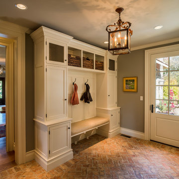
Inspiration for a large timeless brick floor entryway remodel in Philadelphia with gray walls and a white front door
Inspiration for a large timeless brick floor entryway remodel in Philadelphia with gray walls and a white front door
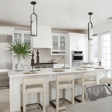 Brad Ramsey Interiors
Well-Traveled Alys Beach Home
Photo: Jack Gardner
Example of a large beach style galley beige floor eat-in kitchen design with a single-bowl sink, shaker cabinets, white cabinets, marble countertops, marble backsplash, stainless steel appliances, an island, white countertops and multicolored backsplash
Example of a large beach style galley beige floor eat-in kitchen design with a single-bowl sink, shaker cabinets, white cabinets, marble countertops, marble backsplash, stainless steel appliances, an island, white countertops and multicolored backsplash
 Advance Design Studio, Ltd.
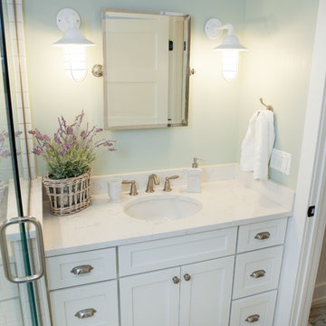
This 1930's Barrington Hills farmhouse was in need of some TLC when it was purchased by this southern family of five who planned to make it their new home. The renovation taken on by Advance Design Studio's designer Scott Christensen and master carpenter Justin Davis included a custom porch, custom built in cabinetry in the living room and children's bedrooms, 2 children's on-suite baths, a guest powder room, a fabulous new master bath with custom closet and makeup area, a new upstairs laundry room, a workout basement, a mud room, new flooring and custom wainscot stairs with planked walls and ceilings throughout the home.
The home's original mechanicals were in dire need of updating, so HVAC, plumbing and electrical were all replaced with newer materials and equipment. A dramatic change to the exterior took place with the addition of a quaint standing seam metal roofed farmhouse porch perfect for sipping lemonade on a lazy hot summer day.
In addition to the changes to the home, a guest house on the property underwent a major transformation as well. Newly outfitted with updated gas and electric, a new stacking washer/dryer space was created along with an updated bath complete with a glass enclosed shower, something the bath did not previously have. A beautiful kitchenette with ample cabinetry space, refrigeration and a sink was transformed as well to provide all the comforts of home for guests visiting at the classic cottage retreat.
The biggest design challenge was to keep in line with the charm the old home possessed, all the while giving the family all the convenience and efficiency of modern functioning amenities. One of the most interesting uses of material was the porcelain "wood-looking" tile used in all the baths and most of the home's common areas. All the efficiency of porcelain tile, with the nostalgic look and feel of worn and weathered hardwood floors. The home’s casual entry has an 8" rustic antique barn wood look porcelain tile in a rich brown to create a warm and welcoming first impression.
Painted distressed cabinetry in muted shades of gray/green was used in the powder room to bring out the rustic feel of the space which was accentuated with wood planked walls and ceilings. Fresh white painted shaker cabinetry was used throughout the rest of the rooms, accentuated by bright chrome fixtures and muted pastel tones to create a calm and relaxing feeling throughout the home.
Custom cabinetry was designed and built by Advance Design specifically for a large 70” TV in the living room, for each of the children’s bedroom’s built in storage, custom closets, and book shelves, and for a mudroom fit with custom niches for each family member by name.
The ample master bath was fitted with double vanity areas in white. A generous shower with a bench features classic white subway tiles and light blue/green glass accents, as well as a large free standing soaking tub nestled under a window with double sconces to dim while relaxing in a luxurious bath. A custom classic white bookcase for plush towels greets you as you enter the sanctuary bath.


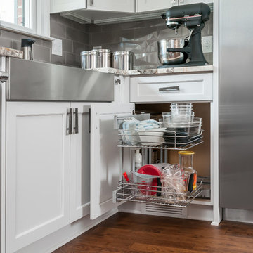
 Innovative Design Build
Five stars isn’t enough! Our project was to reconfigure and update the main floor of a house we recently purchased that was built in 1961. We wanted to maintain some of the unique feeling it originally had but bring it up-to-date and eliminate the closed-in rooms and downright weird layout that was the result of multiple, partial remodeling projects. We began with a long wishlist of changes which also required replacement of very antiquated plumbing, electrical wiring and HVAC. We even found a fireplace that had been walled in and needed major re-construction. Many other aspects and details on this incredible list we made included an all new kitchen layout, converting a bedroom into a master closet, adding new half-bath, completely rebuilding the master bath, and adding stone, tile and custom built cabinetry. Our design plans included many fixtures and details that we specified and required professional installation and careful handling. Innovative helped us make reasonable decisions. Their skilled staff took us through a design process that made sense. There were many questions and all were answered with sincere conversation and positive – innovation – on how we could achieve our goals. Innovative provided us with professional consultants, who listened and were courteous and creative, with solid knowledge and informative judgement. When they didn’t have an answer, they did the research. They developed a comprehensive project plan that exceeded our expectations. Every item on our long list was checked-off. All agreed on work was fulfilled and they completed all this in just under four months. Innovative took care of putting together a team of skilled professional specialists who were all dedicated to make everything right. Engineering, construction, supervision, and I cannot even begin to describe how much thanks we have for the demolition crew! Our multiple, detailed project designs from Raul and professional design advice from Mindy and the connections she recommended are all of the best quality. Diego Jr., Trevor and his team kept everything on track and neat and tidy every single day and Diego Sr., Mark, Ismael, Albert, Santiago and team are true craftsmen who follow-up and make the most minuscule woodworking details perfect. The cabinets by Tim and electrical work and installation of fixtures by Kemchan Harrilal-BB and Navindra Doolratram, and Augustine and his crew on tile and stone work – all perfection. Aisling and the office crew were always responsive to our calls and requests. And of course Clark and Eric who oversaw everything and gave us the best of the best! Apologies if we didn’t get everyone on this list – you’re all great! Thank you for your hard work and dedication. We can’t thank you enough Innovative Construction – we kind of want to do it again!
Dave Hallman & Matt DeGraffenreid
 Brad Ramsey Interiors
Well-Traveled Alys Beach Home
Photo: Jack Gardner
Inspiration for a mid-sized coastal master beige floor bedroom remodel with white walls
Inspiration for a mid-sized coastal master beige floor bedroom remodel with white walls
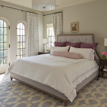
 O’Hara Interiors
Martha O'Hara Interiors, Interior Design | John Kraemer & Sons, Builder | Troy Thies, Photography | Shannon Gale, Photo Styling
Transitional master bedroom photo in Minneapolis
Transitional master bedroom photo in Minneapolis
33