
Search results for "Well placed shot" in Home Design Ideas
 EasyClosets
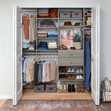
Use every inch of available storage space with a well-planned Reach-In Closet. EasyClosets' wall-mounted solutions allow for additional storage above and below the installed material. Stow away off-season clothing on the top shelf and place shoes on the floor for easy, everyday access.
 Décor Aid
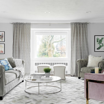
Having a small child, loving to entertain and looking to declutter and kid-proof the gathering spaces of their home in the quaint village of Rockville Centre, Long Island, a stone’s throw from Manhattan, our client’s main objective was to have their living room and den transformed with a family friendly home makeover with mid-century modern tones boasting a formal, yet relaxed spirit
Stepping into the home we found their living room and den both architecturally well appointed yet in need of modern transitional furniture pieces and the pops of color our clients admired, as there was a substantial amount of cool, cold grays in the rooms.
Decor Aid designer Vivian C. approached the design and placement of the pieces sourced to be kid-friendly while remaining sophisticated and practical for entertaining.
“We played off of the clients love for blush pinks, mid-century modern and turquoise. We played with the use of gold and silver metals to mix it up.”
In the living room, we used the prominent bay window and its illuminating natural light as the main architectural focal point, while the fireplace and mantels soft white tone helped inform the minimalist color palette for which we styled the room around.
To add warmth to the living room we played off of the clients love for blush pinks and turquoise while elevating the room with flashes of gold and silver metallic pieces. For a sense of play and to tie the space together we punctuated the kid-friendly living room with an eclectic juxtaposition of colors and materials, from a beautifully patchworked geometric cowhide rug from All Modern, to a whimsical mirror placed over an unexpected, bold geometric credenza, to the blush velvet barrel chair and abstract blue watercolor pillows.
“When sourcing furniture and objects, we chose items that had rounded edges and were shatter proof as it was vital to keep each room’s decor childproof.” Vivian ads.
Their vision for the den remained chic, with comfort and practical functionality key to create an area for the young family to come together.
For the den, our main challenge was working around the pre-existing dark gray sectional sofa. To combat its chunkiness, we played off of the hues in the cubist framed prints placed above and focused on blue and orange accents which complement and play off of each other well. We selected orange storage ottomans in easy to clean, kid-friendly leather to maximize space and functionality. To personalize the appeal of the den we included black and white framed family photos. In the end, the result created a fun, relaxed space where our clients can enjoy family moments or watch a game while taking in the scenic view of their backyard.
For harmony between the rooms, the overall tone for each room is mid-century modern meets bold, yet classic contemporary through the use of mixed materials and fabrications including marble, stone, metals and plush velvet, creating a cozy yet sophisticated enough atmosphere for entertaining family and friends and raising a young children.
“The result od this family friendly room was really fantastic! Adding some greenery, more pillows and throws really made the space pop.” Vivian C. Decor Aid’s Designer
 Oscar Interiors
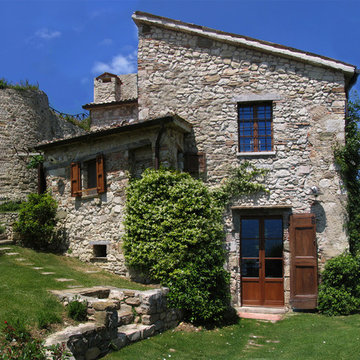
Hideaway, Le Marche - San Marino, Italy
A historical Hideaway.
A well-hidden place where the spirit finds its peace, nested between the Romagna, the Marches and Tuscany. Entering the gate, one leaves behind the pace of chaotic lives, and abandons itself to the joy of living of this ancient land. It is meant to be understood as a site of experience, where nature, culture, history and pleasure are elevated to the centre of things in order to finally rediscover it in oneself. A sort of “back to the simplicity”, aiming to dedicate oneself to observation and drawing from it valuable experiences for one’s life. Each of the three houses presents itself as an unexpected world in its own right, closed in on itself and yet a harmonious part of the whole, waiting to be enlivened by lively laughter, animated conversation and playfulness. This territory is a paradise for lovers of nature and the great outdoors. The sheer variety of places and landscapes enables visitors to take excursions on foot, on horseback or by mountain bike. History and architecture enthusiasts can follow an itinerary of strongholds and castles dotted around the area. Lovers of gourmet food will discover a full range of traditional dishes and quality local produce all year round. The rich variety of museums enables exploration into the rural arts, medieval architecture, archaeological finds and contemporary art.
Find the right local pro for your project

 Twelve Stones Designs, LLC
The owners of this kitchen had spent the money to upgrade the finishes in their kitchen upon building the home 12 years ago, but after living in the space for several years they realized how nonfunctional the layout really was. The (then) two preschool aged children had grown into busy, hungry teenagers with many friends who also liked to hang out at the house. So the family needed a more functional kitchen with better traffic flow, space for daily activities revolving around the kitchen at different times of day, and a kitchen that could accommodate cooking for and serving large groups. Furthermore, the dark, traditional finishes no longer reflected the homeowners’ style. They requested a brighter, more relaxed, coastal style that reflected their love of the seaside cities they like to visit.
Originally, the kitchen was U-shaped with a narrow island in the middle. The island created narrow aisles that bottle-necked at the dishwasher, refrigerator, and cooktop areas. There was a pass-through from the foyer into the kitchen, but the owners never liked that the pass-through was also located so close to the powder room. The awkward proximity was unappealing and made guests feel uncomfortable.
The kitchen’s storage was made up of lots of narrow cabinets, apothecary drawers, clipped corner units, and very few drawers. It lacked useful storage for the larger items the family used on a daily basis. And the kitchen’s only pantry was small closet that had only builder-grade, narrow shelving with no illumination to be able to see the contents inside.
Overall, the kitchen’s lighting plan was poorly executed. Only six recessed cans illuminated the entire kitchen and nook areas. The under cabinet lighting was not evenly distributed either. In fact, the builder had mis-placed the under cabinet lighting around the decorative pilasters which made for choppy, dark cubbies. Further, the builder didn’t include any lighting over the sink or the bar area, which meant whoever was doing the dishes was always in their own shadow. That, coupled with the steep overhang of the game room above made the bar area feel like a dim, cavernous space that wasn’t inviting or task oriented. The kitchen looked out into the main living space, but the raised bar and a narrow wall (which held the only large cabinet in the kitchen) created more of a barrier than a relationship to the living room or breakfast nook. In fact, one couldn’t even see the breakfast nook from the cooktop or sink areas due to its orientation. The raised bar top was too narrow to comfortably sit to either dine at or chat from due to the lack of knee space. The the homeowners confided that the kitchen felt more like a dark, dirty prison than place where the family, or their guests, wanted to gather and commune.
The clients' needs and desires were:
➢ to create a kitchen that would be a space the family loved to be in; to relate to the adjacent spaces all around, and to have better flow for entertaining large groups
➢ to remove the walls between the breakfast nook and living area and to be able to utilize the natural light from the windows in both those areas
➢ to incorporate a functional chopping block for prepping fresh food for home cooked meals, an island with a large sink and drain board, 2 pull out trash cans, and seating for at least the 2 teens to eat or do homework
➢ to design a kitchen and breakfast nook with an airy, coastal, relaxed vibe that blended with the rest of the house's coastal theme
➢ to integrate a layered lighting plan which would include ample general illumination, specific task lighting, decorative lighting, and lots of illuminated storage
➢ to design a kitchen with not only more storage for all the husband’s kitchen gadgets and collection of oils and spices, but smart storage, including a coffee/breakfast bar and a place to store and conceal the toaster oven and microwave
➢ to find a way to utilize the large open space between the kitchen, pantry area, and breakfast nook
Twelve Stones Designs achieved the owner's goals by:
➢ removing the walls between the kitchen and living room to allow the natural light to filter in from the adjacent rooms and to create a connection between the kitchen, nook, and living spaces for a sense of unity and communion
➢ removing the existing pantry and designing 3 large pantry style cabinets with LED tape lights and rollout drawers to house lots of kitchen appliances, gadgets, and tons of groceries. We also took the cabinets all the way up to the 9’ ceiling for additional storage for seasonal items and bulk storage.
➢ designing 2 islands - 1 with a gorgeous black walnut chopping block that houses a drawer for chopping and carving knives and a custom double pull out trash unit for point of use utilization - and 1 that houses the dishwasher, a large Blanco Gourmet sink with integrated drain board, woven baskets for fresh root vegetables and kitchen towels, plenty of drawer storage for kitchen items, and bar seating for up to 4 diners.
➢ closing off the space between the kitchen and the powder room to create a beautiful new private alcove for the powder room as well as adding some decorative storage. This also gave us space to include more tall storage near the new range for precision placement of the husband’s extensive oil and spice collection as well as a location for a combo-steam oven the wife wanted for baking and cooking healthy meals.
The project is enhanced functionally by:
➢ incorporated USB and standard receptacles for the kids’ laptops and phone charging in the large island
➢ designing the small island to include additional open shelving for items used on a daily basis such as a variety of bowls, plates, and colanders. This set up also works well for the husband who prefers to “plate” his dinners in restaurant-style fashion before presenting them to the table.
➢ the integration of specific storage units, such as double stacked cutlery drawers, a custom spice pull-out, a Kuerig coffee and tea pod drawer, and custom double stacked utensil drawers
➢ moving the refrigerator to the old oven location - this eliminated the bottle neck as well as created a better relationship to the eating table. It also utilizes the floor space between the pantry, nook, and kitchen
➢ creating a banquet style breakfast nook - this banquette seating not only doubles the amount of seating for large gatherings but it better utilizes the odd space between the kitchen and the previous nook area. It also helps to create a distinct pathway from the mudroom room through the pantry area, kitchen, nook, and living room.
➢ the coffee/breakfast bar area which includes the perfect location for the concealed microwave and toaster oven, convenient storage for the coffee pods and tea accoutrements. Roll-out drawers below also house the smoothie maker, hot water kettle, and a plethora of smoothie-making ingredients such as protein powders, smoothie additives, etc. Furthermore, the drawers below the Keurig house measuring utensil, cutlery, baking supplies and tupperware storage.
➢ incorporating lots of wide drawers and pullouts to accommodate large cookware.
➢ utilizing as much vertical space as possible by building storage to the ceiling which accommodates the family’s abundant amount of serving platters, baking sheets, bakeware, casserole dishes, and additional cutting boards.
The project is enhanced aesthetically by:
➢ new 5-piece Versailles pattern porcelain tile that now seamlessly joins the entire down stairs area together creating a bright, cohesiveness feeling instead of choppy separated spaces - it also adds a coastal feeling
➢ designing a cabinet to conceal the microwave and toaster oven
➢ the coastal influenced light fixtures over the nook table and island
➢ the sandy colors of the Langdon Cambria countertops. The swirling pattern and sparkling quartz pieces remind the homeowner of black-and-tan sandy beaches
➢ the striped banquet seating whose creamy white background and blue-green stripes were the inspiration for the cabinet and wall colors.
➢ All the interior doors were painted black to coordinate with the blacks and grays in the backsplash tile and countertop. This also adds a hint of tailored formality to an otherwise casual space.
➢ the use of WAC's Oculux small aperture LED units for the overhead lighting complimented with Diode LED strips for task lighting under the cabinets and inside the pantry and glass wall cabinets. All of the lighting applications are on separate dimmer switches.
Innovative uses of materials or construction methods by Realty Restoration LLC:
➢ Each 1-1/2” x 3” block of reclaimed end-grain black walnut that makes up the center island chopping block was hand milled and built in the shop. It was designed to look substantial and proportional to the surrounding elements, executed by creating the 4 inch tall top with a solid wood chamfered edge band.
➢ The metal doors on either side of the vent hood were also custom designed for this project and built in the Realty Restoration LLC shop. They are made 1x2, 11-gauge mild steel with ribbed glass. Weighing 60 lbs a piece, heavy duty cabinet hinges were added to support the weight of the door and keep them from sagging.
➢ Under-cabinet receptacles were added along the range wall in order to have a clean, uninterrupted backsplash.
Design obstacles to overcome:
➢ Because we were removing the demising walls between the kitchen and living room, we had to find a way to plumb and vent the new island. We did this by tunneling through the slab (the slab had post tension cables which prevented us from just trenching) to run a new wet vent through a nearby structural wall. We pulled the existing hot and cold lines between upper floor joists and ran them down the structural wall as well and up through a conduit in the tunnel.
➢ Since we were converting from wall overs to a gas range it allowed us to utilize the 220 feed for the wall ovens to provide a new sub panel for all the new kitchen circuits
➢ Due to framing deficiencies inherited from the original build there was a 1-1/2” differential in the floor-to-ceiling height over a 20 foot span; by utilizing the process of cutting and furring coupled with the crown moulding details on the cabinet elevations we were able to mask the problem and provide seamless transitions between the cabinet components.
Evidence of superior craftsmanship:
➢ uniquely designed, one-of-a-kind metal “X” end panels on the large island. The end panels were custom made in the Realty Restoration LLC shop and fitted to the exact dimensions of the island. The welding seams are completely indistinguishable - the posts look like they are cut from a single sheet of metal
➢ square metal posts on the small island were also custom made and designed to compliment and carry through the metal element s throughout the kitchen
➢ the beautiful, oversized end panels on the pantry cabinets which give the breakfast nook a tailored look
➢ integrating a large format 5 piece Versailles tile pattern to seamlessly flow from the existing spaces into the new kitchen space
➢ By constructing a custom cabinet that jogged around a corner we could not remodel (housing the entry way coat closet) we were able to camouflage the adjacent wall offset within the upper and lower cabinets. By designing around the existing jog in the structural walls we accomplished a few things: we were able to find the space to house, and hide, the microwave and toaster oven yet still have a clean cohesive appearance from the kitchen side. Additionally, the owners were able to keep their much needed coat closet and we didn’t have to increase the budget with unnecessary structural work.
 River Valley Landscapes
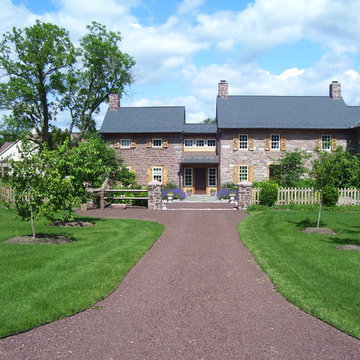
This project presented unique opportunities that are not often found in residential landscaping. The homeowners were not only restoring their 1840's era farmhouse, a piece of their family’s history, but also enlarging and updating the home for modern living. The landscape designers continued this idea by creating a space that is a modern day interpretation of an 1840s era farm rather then a strict recreation. The resulting design combines elements of farm living from that time, as well as acknowledging the property’s history as a horse farm, with staples of 21st century landscapes such as space for outdoor living, lighting, and newer plant varieties.
Guests approach from the main driveway which winds through the property and ends at the main barn. There is secondary gated driveway just for the homeowners. Connected to this main driveway is a narrower gravel lane which leads directly to the residence. The lane passes near fruit trees planted in broken rows to give the illusion that they are the remains of an orchard that once existed on the site. The lane widens at the entrance to the gardens where there is a hitching post built into the fence that surrounds the gardens and a watering trough. The widened section is intended as a place to park a golf cart or, in a nod to the home’s past, tie up horses before entering. The gravel lane passes between two stone pillars and then ends at a square gravel court edged in cobblestones. The gravel court transitions into a wide flagstone walk bordered with yew hedges and lavender leading to the front door.
Directly to the right, upon entering the gravel court, is located a gravel and cobblestone edged walk leading to a secondary entrance into the residence. The walk is gated where it connects with the gravel court to close it off so as not to confuse visitors and guests to the main residence and to emphasize the primary entrance. An area for a bench is provided along this walk to encourage stopping to view and enjoy the gardens.
On either side of the front door, gravel and cobblestone walks branch off into the garden spaces. The one on the right leads to a flagstone with cobblestone border patio space. Since the home has no designated backyard like most modern suburban homes the outdoor living space had to be placed in what would traditionally be thought of as the front of the house. The patio is separated from the entrance walk by the yew hedge and further enclosed by three Amelanchiers and a variety of plantings including modern cultivars of old fashioned plants such as Itea and Hydrangea. A third entrance, the original front door to the 1840’s era section, connects to the patio from the home’s kitchen, making the space ideal for outdoor dining.
The gravel and cobblestone walk branching off to the left of the front door leads to the vegetable and perennial gardens. The idea for the vegetable garden was to recreate the tradition of a kitchen garden which would have been planted close to the residence for easy access. The vegetable garden is surrounded by mixed perennial beds along the inside of the wood picket fence which surrounds the entire garden space. Another area designated for a bench is provided here to encourage stopping and viewing. The home’s original smokehouse, completely restored and used as a garden shed, provides a strong architectural focal point to the vegetable garden. Behind the smokehouse is planted lilacs and other plants to give mass and balance to the corner and help screen the garden from the neighboring subdivision. At the rear corner of the garden a wood arbor was constructed to provide a structure on which to grow grapes or other vines should the homeowners choose to.
The landscape and gardens for this restored farmhouse and property are a thoughtfully designed and planned recreation of a historic landscape reinterpreted for modern living. The idea was to give a sense of timelessness when walking through the gardens as if they had been there for years but had possibly been updated and rejuvenated as lifestyles changed. The attention to materials and craftsmanship blend seamlessly with the residence and insure the gardens and landscape remain an integral part of the property. The farm has been in the homeowner’s family for many years and they are thrilled at the results and happy to see respect given to the home’s history and to its meticulous restoration.
 FINNE Architects
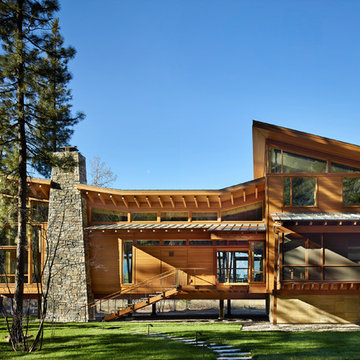
The Mazama house is located in the Methow Valley of Washington State, a secluded mountain valley on the eastern edge of the North Cascades, about 200 miles northeast of Seattle.
The house has been carefully placed in a copse of trees at the easterly end of a large meadow. Two major building volumes indicate the house organization. A grounded 2-story bedroom wing anchors a raised living pavilion that is lifted off the ground by a series of exposed steel columns. Seen from the access road, the large meadow in front of the house continues right under the main living space, making the living pavilion into a kind of bridge structure spanning over the meadow grass, with the house touching the ground lightly on six steel columns. The raised floor level provides enhanced views as well as keeping the main living level well above the 3-4 feet of winter snow accumulation that is typical for the upper Methow Valley.
To further emphasize the idea of lightness, the exposed wood structure of the living pavilion roof changes pitch along its length, so the roof warps upward at each end. The interior exposed wood beams appear like an unfolding fan as the roof pitch changes. The main interior bearing columns are steel with a tapered “V”-shape, recalling the lightness of a dancer.
The house reflects the continuing FINNE investigation into the idea of crafted modernism, with cast bronze inserts at the front door, variegated laser-cut steel railing panels, a curvilinear cast-glass kitchen counter, waterjet-cut aluminum light fixtures, and many custom furniture pieces. The house interior has been designed to be completely integral with the exterior. The living pavilion contains more than twelve pieces of custom furniture and lighting, creating a totality of the designed environment that recalls the idea of Gesamtkunstverk, as seen in the work of Josef Hoffman and the Viennese Secessionist movement in the early 20th century.
The house has been designed from the start as a sustainable structure, with 40% higher insulation values than required by code, radiant concrete slab heating, efficient natural ventilation, large amounts of natural lighting, water-conserving plumbing fixtures, and locally sourced materials. Windows have high-performance LowE insulated glazing and are equipped with concealed shades. A radiant hydronic heat system with exposed concrete floors allows lower operating temperatures and higher occupant comfort levels. The concrete slabs conserve heat and provide great warmth and comfort for the feet.
Deep roof overhangs, built-in shades and high operating clerestory windows are used to reduce heat gain in summer months. During the winter, the lower sun angle is able to penetrate into living spaces and passively warm the exposed concrete floor. Low VOC paints and stains have been used throughout the house. The high level of craft evident in the house reflects another key principle of sustainable design: build it well and make it last for many years!
Photo by Benjamin Benschneider
 LABLstudio
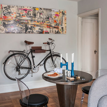
The "main room" in the apartment had to serve multiple functions - a living room, a kitchen, a dining room, as well as a place to store items like our client's bicycle. Because space was tight, we used a small bistro table so that our client could sit with one other person (or more by pulling up other chairs) and enjoy a meal. By using a wall mounted bike rack that also incorporated some storage for his helmet + lock, we were able to save some space, and love the way that it highlights our client's graffiti art purchased on the streets of NYC!
Photos by Matthew Williams

Sponsored
Delaware, OH

Buckeye Basements, Inc.
Central Ohio's Basement Finishing ExpertsBest Of Houzz '13-'21
 Alair Homes Plano
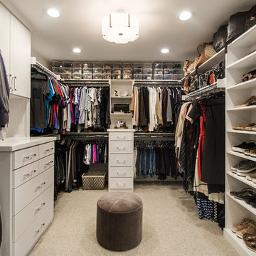
This home had a previous master bathroom remodel and addition with poor layout. Our homeowners wanted a whole new suite that was functional and beautiful. They wanted the new bathroom to feel bigger with more functional space. Their current bathroom was choppy with too many walls. The lack of storage in the bathroom and the closet was a problem and they hated the cabinets. They have a really nice large back yard and the views from the bathroom should take advantage of that.
We decided to move the main part of the bathroom to the rear of the bathroom that has the best view and combine the closets into one closet, which required moving all of the plumbing, as well as the entrance to the new bathroom. Where the old toilet, tub and shower were is now the new extra-large closet. We had to frame in the walls where the glass blocks were once behind the tub and the old doors that once went to the shower and water closet. We installed a new soft close pocket doors going into the water closet and the new closet. A new window was added behind the tub taking advantage of the beautiful backyard. In the partial frameless shower we installed a fogless mirror, shower niches and a large built in bench. . An articulating wall mount TV was placed outside of the closet, to be viewed from anywhere in the bathroom.
The homeowners chose some great floating vanity cabinets to give their new bathroom a more modern feel that went along great with the large porcelain tile flooring. A decorative tumbled marble mosaic tile was chosen for the shower walls, which really makes it a wow factor! New recessed can lights were added to brighten up the room, as well as four new pendants hanging on either side of the three mirrors placed above the seated make-up area and sinks.
Design/Remodel by Hatfield Builders & Remodelers | Photography by Versatile Imaging
 Twelve Stones Designs, LLC
The owners of this kitchen had spent the money to upgrade the finishes in their kitchen upon building the home 12 years ago, but after living in the space for several years they realized how nonfunctional the layout really was. The (then) two preschool aged children had grown into busy, hungry teenagers with many friends who also liked to hang out at the house. So the family needed a more functional kitchen with better traffic flow, space for daily activities revolving around the kitchen at different times of day, and a kitchen that could accommodate cooking for and serving large groups. Furthermore, the dark, traditional finishes no longer reflected the homeowners’ style. They requested a brighter, more relaxed, coastal style that reflected their love of the seaside cities they like to visit.
Originally, the kitchen was U-shaped with a narrow island in the middle. The island created narrow aisles that bottle-necked at the dishwasher, refrigerator, and cooktop areas. There was a pass-through from the foyer into the kitchen, but the owners never liked that the pass-through was also located so close to the powder room. The awkward proximity was unappealing and made guests feel uncomfortable.
The kitchen’s storage was made up of lots of narrow cabinets, apothecary drawers, clipped corner units, and very few drawers. It lacked useful storage for the larger items the family used on a daily basis. And the kitchen’s only pantry was small closet that had only builder-grade, narrow shelving with no illumination to be able to see the contents inside.
Overall, the kitchen’s lighting plan was poorly executed. Only six recessed cans illuminated the entire kitchen and nook areas. The under cabinet lighting was not evenly distributed either. In fact, the builder had mis-placed the under cabinet lighting around the decorative pilasters which made for choppy, dark cubbies. Further, the builder didn’t include any lighting over the sink or the bar area, which meant whoever was doing the dishes was always in their own shadow. That, coupled with the steep overhang of the game room above made the bar area feel like a dim, cavernous space that wasn’t inviting or task oriented. The kitchen looked out into the main living space, but the raised bar and a narrow wall (which held the only large cabinet in the kitchen) created more of a barrier than a relationship to the living room or breakfast nook. In fact, one couldn’t even see the breakfast nook from the cooktop or sink areas due to its orientation. The raised bar top was too narrow to comfortably sit to either dine at or chat from due to the lack of knee space. The the homeowners confided that the kitchen felt more like a dark, dirty prison than place where the family, or their guests, wanted to gather and commune.
The clients' needs and desires were:
➢ to create a kitchen that would be a space the family loved to be in; to relate to the adjacent spaces all around, and to have better flow for entertaining large groups
➢ to remove the walls between the breakfast nook and living area and to be able to utilize the natural light from the windows in both those areas
➢ to incorporate a functional chopping block for prepping fresh food for home cooked meals, an island with a large sink and drain board, 2 pull out trash cans, and seating for at least the 2 teens to eat or do homework
➢ to design a kitchen and breakfast nook with an airy, coastal, relaxed vibe that blended with the rest of the house's coastal theme
➢ to integrate a layered lighting plan which would include ample general illumination, specific task lighting, decorative lighting, and lots of illuminated storage
➢ to design a kitchen with not only more storage for all the husband’s kitchen gadgets and collection of oils and spices, but smart storage, including a coffee/breakfast bar and a place to store and conceal the toaster oven and microwave
➢ to find a way to utilize the large open space between the kitchen, pantry area, and breakfast nook
Twelve Stones Designs achieved the owner's goals by:
➢ removing the walls between the kitchen and living room to allow the natural light to filter in from the adjacent rooms and to create a connection between the kitchen, nook, and living spaces for a sense of unity and communion
➢ removing the existing pantry and designing 3 large pantry style cabinets with LED tape lights and rollout drawers to house lots of kitchen appliances, gadgets, and tons of groceries. We also took the cabinets all the way up to the 9’ ceiling for additional storage for seasonal items and bulk storage.
➢ designing 2 islands - 1 with a gorgeous black walnut chopping block that houses a drawer for chopping and carving knives and a custom double pull out trash unit for point of use utilization - and 1 that houses the dishwasher, a large Blanco Gourmet sink with integrated drain board, woven baskets for fresh root vegetables and kitchen towels, plenty of drawer storage for kitchen items, and bar seating for up to 4 diners.
➢ closing off the space between the kitchen and the powder room to create a beautiful new private alcove for the powder room as well as adding some decorative storage. This also gave us space to include more tall storage near the new range for precision placement of the husband’s extensive oil and spice collection as well as a location for a combo-steam oven the wife wanted for baking and cooking healthy meals.
The project is enhanced functionally by:
➢ incorporated USB and standard receptacles for the kids’ laptops and phone charging in the large island
➢ designing the small island to include additional open shelving for items used on a daily basis such as a variety of bowls, plates, and colanders. This set up also works well for the husband who prefers to “plate” his dinners in restaurant-style fashion before presenting them to the table.
➢ the integration of specific storage units, such as double stacked cutlery drawers, a custom spice pull-out, a Kuerig coffee and tea pod drawer, and custom double stacked utensil drawers
➢ moving the refrigerator to the old oven location - this eliminated the bottle neck as well as created a better relationship to the eating table. It also utilizes the floor space between the pantry, nook, and kitchen
➢ creating a banquet style breakfast nook - this banquette seating not only doubles the amount of seating for large gatherings but it better utilizes the odd space between the kitchen and the previous nook area. It also helps to create a distinct pathway from the mudroom room through the pantry area, kitchen, nook, and living room.
➢ the coffee/breakfast bar area which includes the perfect location for the concealed microwave and toaster oven, convenient storage for the coffee pods and tea accoutrements. Roll-out drawers below also house the smoothie maker, hot water kettle, and a plethora of smoothie-making ingredients such as protein powders, smoothie additives, etc. Furthermore, the drawers below the Keurig house measuring utensil, cutlery, baking supplies and tupperware storage.
➢ incorporating lots of wide drawers and pullouts to accommodate large cookware.
➢ utilizing as much vertical space as possible by building storage to the ceiling which accommodates the family’s abundant amount of serving platters, baking sheets, bakeware, casserole dishes, and additional cutting boards.
The project is enhanced aesthetically by:
➢ new 5-piece Versailles pattern porcelain tile that now seamlessly joins the entire down stairs area together creating a bright, cohesiveness feeling instead of choppy separated spaces - it also adds a coastal feeling
➢ designing a cabinet to conceal the microwave and toaster oven
➢ the coastal influenced light fixtures over the nook table and island
➢ the sandy colors of the Langdon Cambria countertops. The swirling pattern and sparkling quartz pieces remind the homeowner of black-and-tan sandy beaches
➢ the striped banquet seating whose creamy white background and blue-green stripes were the inspiration for the cabinet and wall colors.
➢ All the interior doors were painted black to coordinate with the blacks and grays in the backsplash tile and countertop. This also adds a hint of tailored formality to an otherwise casual space.
➢ the use of WAC's Oculux small aperture LED units for the overhead lighting complimented with Diode LED strips for task lighting under the cabinets and inside the pantry and glass wall cabinets. All of the lighting applications are on separate dimmer switches.
Innovative uses of materials or construction methods by Realty Restoration LLC:
➢ Each 1-1/2” x 3” block of reclaimed end-grain black walnut that makes up the center island chopping block was hand milled and built in the shop. It was designed to look substantial and proportional to the surrounding elements, executed by creating the 4 inch tall top with a solid wood chamfered edge band.
➢ The metal doors on either side of the vent hood were also custom designed for this project and built in the Realty Restoration LLC shop. They are made 1x2, 11-gauge mild steel with ribbed glass. Weighing 60 lbs a piece, heavy duty cabinet hinges were added to support the weight of the door and keep them from sagging.
➢ Under-cabinet receptacles were added along the range wall in order to have a clean, uninterrupted backsplash.
Design obstacles to overcome:
➢ Because we were removing the demising walls between the kitchen and living room, we had to find a way to plumb and vent the new island. We did this by tunneling through the slab (the slab had post tension cables which prevented us from just trenching) to run a new wet vent through a nearby structural wall. We pulled the existing hot and cold lines between upper floor joists and ran them down the structural wall as well and up through a conduit in the tunnel.
➢ Since we were converting from wall overs to a gas range it allowed us to utilize the 220 feed for the wall ovens to provide a new sub panel for all the new kitchen circuits
➢ Due to framing deficiencies inherited from the original build there was a 1-1/2” differential in the floor-to-ceiling height over a 20 foot span; by utilizing the process of cutting and furring coupled with the crown moulding details on the cabinet elevations we were able to mask the problem and provide seamless transitions between the cabinet components.
Evidence of superior craftsmanship:
➢ uniquely designed, one-of-a-kind metal “X” end panels on the large island. The end panels were custom made in the Realty Restoration LLC shop and fitted to the exact dimensions of the island. The welding seams are completely indistinguishable - the posts look like they are cut from a single sheet of metal
➢ square metal posts on the small island were also custom made and designed to compliment and carry through the metal element s throughout the kitchen
➢ the beautiful, oversized end panels on the pantry cabinets which give the breakfast nook a tailored look
➢ integrating a large format 5 piece Versailles tile pattern to seamlessly flow from the existing spaces into the new kitchen space
➢ By constructing a custom cabinet that jogged around a corner we could not remodel (housing the entry way coat closet) we were able to camouflage the adjacent wall offset within the upper and lower cabinets. By designing around the existing jog in the structural walls we accomplished a few things: we were able to find the space to house, and hide, the microwave and toaster oven yet still have a clean cohesive appearance from the kitchen side. Additionally, the owners were able to keep their much needed coat closet and we didn’t have to increase the budget with unnecessary structural work.
 River Valley Landscapes
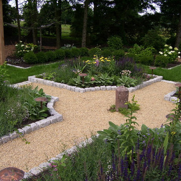
The property is one of the original farm houses located on the main street of a small town. It has been in the family for many years and our client just inherited the property. They were trying to have balance of preserving the old while realizing modern day living has its benefits too. The house had a large addition added using mostly old style materials, but designed with function and modern day luxuries. Our goal was to carry that theme to the outside.
Our first problem we had to address was how to transition between the first floor elevation changes. The lower room was the husband’s office. He stated in the future he may have clients over and it would be nice to have an area to sit outside. The wife’s main concern was to renew the four corner garden. She also felt it was very important to be able to see it from the kitchen area. Finally there was an old wishing well stuck right outside the kitchen. They both felt it would be neat to be able to incorporate this in some how. They wanted a patio area with a built in grill to accommodate there family and friends. They also wanted to keep a large play area for the kids.
We were able to pull this off successfully. We addressed the first issue by having a small lower level flagstone area. This area is large enough for 1 to 2 people to sit comfortably. It also provides a transition from his office to the larger patio area. We installed a simple small gravel sitting area opposite of the main patio. This provides our client a secluded place to relax or do business. Mrs.... told me she is amazed how much her and her husband enjoys this area. It is so peaceful looking at the small creek over a glass of wine.
We built a natural limestone retaining wall to create the patio terrace. The stone was chosen to extend the houses architectural elements into the landscape. Irregular broken flagstone was used to give it a more casual feel. We installed three Serviceberries into the patio terrace to replace some trees that were taken down during the remodeling. She was very concern that they would block the view of the four corner garden. We new they were crucial to nestle in the terrace, so we placed them for a couple days for her to decide. Fortunately she agreed they not only kept the view open, but helped frame the garden.
The four corner garden was designed to be viewed from afar and experienced up close. We wanted the space to have some formal structure while keeping with the casual farm house feel. Another natural limestone retaining wall was created. This leveled the garden terrace and helped associate it with the rest of the property. The four corner garden is nestled into the existing woods edge. This provides three distinct experiences to entering the garden; a more formal from the driveway, an open feel from the lower lawn, and a more natural / casual experience from the wooded area. The Plymouth brown gravel was used for the center of the garden. This helped highlight the stone post that was found during construction. The gravel also brings the sense of sound into the garden space. Lamb’s ear was chosen as a fun way to get kids interest in horticulture.
The balance of using the new to create the old feel is what makes this project a success. The property has already hosted a local historical society event and won an award for its preservation efforts. When Mrs.... can’t find her husband, she knows he is either reading the newspaper by the grill or resting in the hammock along the wood’s path.
 Marcye Philbrook
Siri Blanchette/Blind Dog Photo Associates
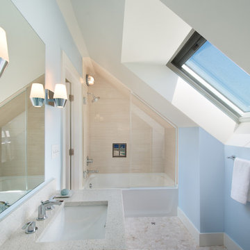
This kids bath has all the fun of a sunny day at the beach. In a contemporary way, the details in the room are nautical and beachy. The color of the walls are like a clear blue sky, the vanity lights look like vintage boat lights, the vanity top looks like sand, and the shower walls are meant to look like a sea shanty with weathered looking wood grained tile plank walls and a shower "window pane" cubby with hand painted tiles designed by Marcye that look like a view out to the beach. The floor is bleached pebbles with hand painted sea creature tiles placed randomly for the kids to find.
 J Design Group - Interior Designers Miami - Modern
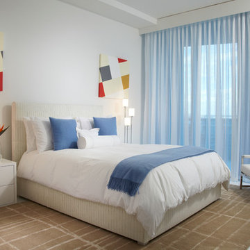
Modern Guest Bedroom, Miami Beach.
Ocean front, Luxury home in Miami Beach.
Projects by J Design Group, Your friendly Interior designers firm in Miami, FL. at your service.
AVENTURA MAGAZINE selected our client’s luxury 5000 Sf ocean front apartment in Miami Beach, to publish it in their issue and they Said:
Story by Linda Marx, Photography by Daniel Newcomb
Light & Bright
New York snowbirds redesigned their Miami Beach apartment to take advantage of the tropical lifestyle.
New York snowbirds redesigned their Miami Beach apartment to take advantage of the tropical lifestyle.
WHEN INTERIOR DESIGNER JENNIFER CORREDOR was asked to recreate a four-bedroom, six-bath condominium at The Bath Club in Miami Beach, she seized the opportunity to open the rooms and better utilize the vast ocean views.
In five months last year, the designer transformed a dark and closed 5,000-square-foot unit located on a high floor into a series of sweeping waterfront spaces and updated the well located apartment into a light and airy retreat for a sports-loving family of five.
“They come down from New York every other weekend and wanted to make their waterfront home a series of grand open spaces,” says Jennifer Corrredor, of the J. Design Group in Miami, a firm specializing in modern and contemporary interiors. “Since many of the rooms face the ocean, it made sense to open and lighten up the home, taking advantage of the awesome views of the sea and the bay.”
The designer used 40 x 40 all white tile throughout the apartment as a clean base. This way, her sophisticated use of color would stand out and bring the outdoors in.
The close-knit family members—two parents and three boys in college—like to do things together. But there were situations to overcome in the process of modernizing and opening the space. When Jennifer Corredor was briefed on their desires, nothing seemed too daunting. The confident designer was ready to delve in. For example, she fixed an area at the front door
that was curved. “The wood was concave so I straightened it out,” she explains of a request from the clients. “It was an obstacle that I overcame as part of what I do in a redesign. I don’t consider it a difficult challenge. Improving what I see is part of the process.”
She also tackled the kitchen with gusto by demolishing a wall. The kitchen had formerly been enclosed, which was a waste of space and poor use of available waterfront ambience. To create a grand space linking the kitchen to the living room and dining room area, something had to go. Once the wall was yesterday’s news, she relocated the refrigerator and freezer (two separate appliances) to the other side of the room. This change was a natural functionality in the new open space. “By tearing out the wall, the family has a better view of the kitchen from the living and dining rooms,” says Jennifer Corredor, who also made it easier to walk in and out of one area and into the other. “The views of the larger public space and the surrounding water are breathtaking.
Opening it up changed everything.”
They clients can now see the kitchen from the living and dining areas, and at the same time, dwell in an airy and open space instead of feeling stuck in a dark enclosed series of rooms. In fact, the high-top bar stools that Jennifer Corredor selected for the kitchen can be twirled around to use for watching TV in the living room.
In keeping with the theme of moving seamlessly from one room to the other, Corredor designed a subtle wall of glass in the living room along with lots of comfortable seating. This way, all family members feel at ease while relaxing, talking, or watching sporting events on the large flat screen television. “For this room, I wanted more open space, light and a supreme airy feeling,” she says. “With the glass design making a statement, it quickly became the star of the show.”…….
….. To add texture and depth, Jennifer Corredor custom created wood doors here, and in other areas of the home. They provide a nice contrast to the open Florida tropical feel. “I added character to the openness by using exotic cherry wood,” she says. “I repeated this throughout the home and it works well.”
Known for capturing the client’s vision while adding her own innovative twists, Jennifer Corredor lightened the family room, giving it a contemporary and modern edge with colorful art and matching throw pillows on the sofas. She added a large beige leather ottoman as the center coffee table in the room. This round piece was punctuated with a bold-toned flowering plant atop. It effortlessly matches the pillows and colors of the contemporary canvas.
Jennifer Corredor also gutted all of the bathrooms, resulting in a major redesign of the master. She jettisoned the whirlpool and created the dazzling illusion of a floating tub. From an area where there were two toilets, she eliminated one to make a grand rectangular shower, which became an overall showpiece. The master bath went from being just a functional water closet to a sophisticated spa-like space. “The client said I was ‘delicious’ after seeing the change,” laughed Jennifer Corredor, who emphasized that her clients love their part-time life in South Florida more each time they come down. Even when the husband has to work from their Miami Beach digs, he is surrounded by tropical beauty. For instance, there are times when the master bedroom must double as the husband’s home office.
The room had to be large enough to accommodate a working space for this purpose. So Jennifer Corredor placed an appropriate table near the window and across from the king-size bed. “No blocking of the amazing water view was necessary,” she says. “I kept an open space with a lot of white so It functions well and the work space fits right in.” She repeated the bold modern art in the room as well as in the guest bedroom, which also has a workspace for the sons when they are home from school and need to study.
The designer is still happy and glowing with the results of her toil in this apartment. She gets a “spiritual feeling” when she walks inside. “It is so peaceful and serene, with subtle hints of explosive statements,” she says. “The entire space is open, yet anchored by the warmth of the exotic woods.” The client wrote Jennifer Corredor a letter at the end of the project congratulating her on a
job well done. She revealed that owning a Miami Beach home was her husband’s dream 30 years ago. “Now we have a quality perfect yet practical home,” she wrote to the designer. “You solved the challenges, and the end
result far exceeds our expectations. We love it.”
Thanks for your interest in our Contemporary Interior Design projects and if you have any question please do not hesitate to ask us.
http://www.JDesignGroup.com
305.444.4611
Modern Interior designer Miami. Contemporary
Miami
Miami Interior Designers
Miami Interior Designer
Interior Designers Miami
Interior Designer Miami
Modern Interior Designers
Modern Interior Designer
Modern interior decorators
Modern interior decorator
Contemporary Interior Designers
Contemporary Interior Designer
Interior design decorators
Interior design decorator
Interior Decoration and Design
Black Interior Designers
Black Interior Designer
Interior designer
Interior designers
Interior design decorators
Interior design decorator
Home interior designers
Home interior designer
Interior design companies
Interior decorators
Interior decorator
Decorators
Decorator
Miami Decorators
Miami Decorator
Decorators Miami
Decorator Miami
Interior Design Firm
Interior Design Firms
Interior Designer Firm
Interior Designer Firms
Interior design
Interior designs
home decorators
Interior decorating Miami
Best Interior Designers.
225 Malaga Ave.
Coral Gable, FL 33134
http://www.JDesignGroup.com
305.444.4611
 Oscar Interiors
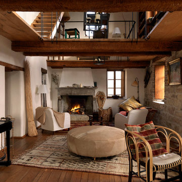
Hideaway, Le Marche - San Marino, Italy
A historical Hideaway.
Image courtesy on the realtor, Leo Trippi.
A well-hidden place where the spirit finds its peace, nested between the Romagna, the Marches and Tuscany. Entering the gate, one leaves behind the pace of chaotic lives, and abandons itself to the joy of living of this ancient land. It is meant to be understood as a site of experience, where nature, culture, history and pleasure are elevated to the centre of things in order to finally rediscover it in oneself. A sort of “back to the simplicity”, aiming to dedicate oneself to observation and drawing from it valuable experiences for one’s life. Each of the three houses presents itself as an unexpected world in its own right, closed in on itself and yet a harmonious part of the whole, waiting to be enlivened by lively laughter, animated conversation and playfulness. This territory is a paradise for lovers of nature and the great outdoors. The sheer variety of places and landscapes enables visitors to take excursions on foot, on horseback or by mountain bike. History and architecture enthusiasts can follow an itinerary of strongholds and castles dotted around the area. Lovers of gourmet food will discover a full range of traditional dishes and quality local produce all year round. The rich variety of regional museums enables exploration into the rural arts, medieval architecture, archaeological finds and contemporary art.

Sponsored
Columbus, OH

Structural Remodeling
Franklin County's Heavy Timber Specialists | Best of Houzz 2020!
 Brookfield Residential Colorado
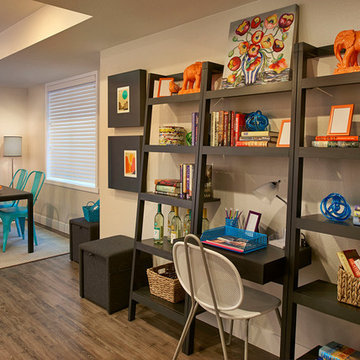
For those who want more of a good thing, we offer our Tealight 4 plan. This is the only Tealight home design that comes standard with three bedrooms (which can easily become four) plus a loft. You’ll see that the living room, kitchen and other spaces are just a bit more, well, spacious. You may also notice that the master bedroom is placed over the garage. This arrangement not only expands the upstairs, it lets you monitor when your teenager gets home at night. Which is also a good thing.
 Milgard Windows & Doors
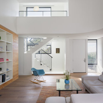
The Kiguchi family moved into their Austin, Texas home in 1994. Built in the 1980’s as part of a neighborhood development, they happily raised their family here but longed for something more contemporary. Once they became empty nesters, they decided it was time for a major remodel. After spending many years visiting Austin AIA Home Tours that highlight contemporary residential architecture, they had a lot of ideas and in 2013 were ready to interview architects and get their renovation underway.
The project turned into a major remodel due to an unstable foundation. Architects Ben Arbib and Ed Hughey, of Arbib Hughey Design were hired to solve the structural issue and look for inspiration in the bones of the house, which sat on top of a hillside and was surrounded by great views.
Unfortunately, with the old floor plan, the beautiful views were hidden by small windows that were poorly placed. In order to bring more natural light into the house the window sizes and configurations had to be addressed, all while keeping in mind the homeowners desire for a modern look and feel.
To achieve a more contemporary and sophisticated front of house, a new entry was designed that included removing a two-story bay window and porch. The entrance of the home also became more integrated with the landscape creating a template for new foliage to be planted. Older exterior materials were updated to incorporate a more muted palette of colors with a metal roof, dark grey siding in the back and white stucco in the front. Deep eaves were added over many of the new large windows for clean lines and sun protection.
“Inside it was about opening up the floor plan, expanding the views throughout the house, and updating the material palette to get a modern look that was also warm and inviting,” said Ben from Arbib Hughey Design. “Prior to the remodel, the house had the typical separation of rooms. We removed the walls between them and changed all of the windows to Milgard Thermally Improved Aluminum to connect the inside with the outside. No matter where you are you get nice views and natural light.”
The architects wanted to create some drama, which they accomplished with the window placement and opening up the interior floor plan to an open concept approach. Cabinetry was used to help delineate intimate spaces. To add warmth to an all-white living room, white-washed oak wood floors were installed and pine planks were used around the fireplace. The large windows served as artwork bringing the color of nature into the space.
An octagon shaped, elevated dining room, (named “the turret”), had a big impact on the design of the house. They architects rounded the corners and added larger window openings overlooking a new sunken garden. The great room was also softened by rounding out the corners and that circular theme continued throughout the house, being picked up in skylight wells and kitchen cabinetry. A staircase leading to a catwalk was added and the result was a two-story window wall that flooded the home with natural light.
When asked why Milgard® Thermally Improved Aluminum windows were selected, the architectural team listed many reasons:
1) Aesthetics: “We liked the slim profiles and narrow sightlines. The window frames never get in the way of the view and that was important to us. They also have a very contemporary look that went well with our design.”
2) Options: “We liked that we could get large sliding doors that matched the windows, giving us a very cohesive look and feel throughout the project.”
3) Cost Effective: “Milgard windows are affordable. You get a good product at a good price.”
4) Custom Sizes: “Milgard windows are customizable, which allowed us to get the right window for each location.”
Ready to take on your own traditional to modern home remodeling project? Arbib Hughey Design advises, “Work with a good architect. That means picking a team that is creative, communicative, listens well and is responsive. We think it’s important for an architect to listen to their clients and give them something they want, not something the architect thinks they should have. At the same time you want an architect who is willing and able to think outside the box and offer up design options that you may not have considered. Design is about a lot of back and forth, trying out ideas, getting feedback and trying again.”
The home was completely transformed into a unique, contemporary house perfectly integrated with its site. Internally the home has a natural flow for the occupants and externally it is integrated with the surroundings taking advantage of great natural light. As a side note, it was highly praised as part of the Austin AIA homes tour.
 TKS Design Group
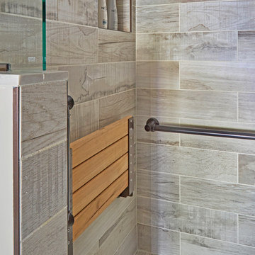
This project was completed for clients who wanted a comfortable, accessible 1ST floor bathroom for their grown daughter to use during visits to their home as well as a nicely-appointed space for any guest. Their daughter has some accessibility challenges so the bathroom was also designed with that in mind.
The original space worked fairly well in some ways, but we were able to tweak a few features to make the space even easier to maneuver through. We started by making the entry to the shower flush so that there is no curb to step over. In addition, although there was an existing oversized seat in the shower, it was way too deep and not comfortable to sit on and just wasted space. We made the shower a little smaller and then provided a fold down teak seat that is slip resistant, warm and comfortable to sit on and can flip down only when needed. Thus we were able to create some additional storage by way of open shelving to the left of the shower area. The open shelving matches the wood vanity and allows a spot for the homeowners to display heirlooms as well as practical storage for things like towels and other bath necessities.
We carefully measured all the existing heights and locations of countertops, toilet seat, and grab bars to make sure that we did not undo the things that were already working well. We added some additional hidden grab bars or “grabcessories” at the toilet paper holder and shower shelf for an extra layer of assurance. Large format, slip-resistant floor tile was added eliminating as many grout lines as possible making the surface less prone to tripping. We used a wood look tile as an accent on the walls, and open storage in the vanity allowing for easy access for clean towels. Bronze fixtures and frameless glass shower doors add an elegant yet homey feel that was important for the homeowner. A pivot mirror allows adjustability for different users.
If you are interested in designing a bathroom featuring “Living In Place” or accessibility features, give us a call to find out more. Susan Klimala, CKBD, is a Certified Aging In Place Specialist (CAPS) and particularly enjoys helping her clients with unique needs in the context of beautifully designed spaces.
Designed by: Susan Klimala, CKD, CBD
Photography by: Michael Alan Kaskel
 Leslie Meyers
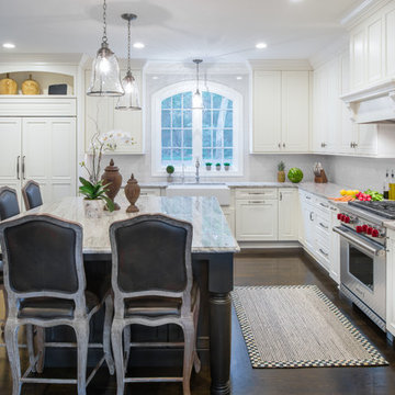
This beautiful kitchen has everything on the client's wish list, from state of the art appliances, plenty of functional and well placed storage, a large island for prep and entertaining needs, and just the right amount of today's clean updated look with a twist of traditional.
Dark floors and crisp white cabinets lean toward today's current trends, while a Knotty Alder Island in rich Peppercorn, large farm sink, and arched detailing throughout in the windows, cabinetry and lighting pull in the Traditional feel.
Sponsored
Columbus, OH

Snider & Metcalf Interior Design, LTD
Leading Interior Designers in Columbus, Ohio & Ponte Vedra, Florida
 Designs Anew Houston LLC
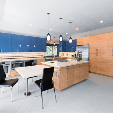
This contemporary kitchen is designed for accessibility and ease of use for everyone in the family, including the mother who uses an electric wheelchair.
It won 4 National First Place awards and an Honorable Mention for Universal Design and Aging in Place.
Photographer - Brian Vogel
 Oscar Interiors
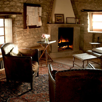
Hideaway, Le Marche - San Marino, Italy
A historical Hideaway.
Image courtesy on the realtor, Leo Trippi.
A well-hidden place where the spirit finds its peace, nested between the Romagna, the Marches and Tuscany. Entering the gate, one leaves behind the pace of chaotic lives, and abandons itself to the joy of living of this ancient land. It is meant to be understood as a site of experience, where nature, culture, history and pleasure are elevated to the centre of things in order to finally rediscover it in oneself. A sort of “back to the simplicity”, aiming to dedicate oneself to observation and drawing from it valuable experiences for one’s life. Each of the three houses presents itself as an unexpected world in its own right, closed in on itself and yet a harmonious part of the whole, waiting to be enlivened by lively laughter, animated conversation and playfulness. This territory is a paradise for lovers of nature and the great outdoors. The sheer variety of places and landscapes enables visitors to take excursions on foot, on horseback or by mountain bike. History and architecture enthusiasts can follow an itinerary of strongholds and castles dotted around the area. Lovers of gourmet food will discover a full range of traditional dishes and quality local produce all year round. The rich variety of museums enables exploration into the rural arts, medieval architecture, archaeological finds and contemporary art.
 Mitch Allen Photography
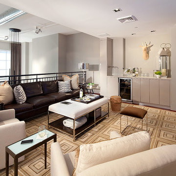
Using stratigically placed lights I was able to create my desired mood and contrast. I even placed a light downstairs aimed at the brick wall on the left corner or the image. Shot for Jenkins Baer Interior Design which was showcased in Home and Design Magazine.
8