
Search results for "Window between cabinets" in Home Design Ideas
 McC | Architecture pllc
Photos: Scott Robert Larsen
Cabinetry: Sleepy Hollow Custom Kitchens
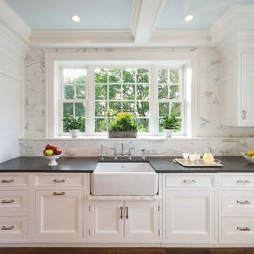
Example of a classic galley eat-in kitchen design in New York with a farmhouse sink, recessed-panel cabinets, white cabinets, quartz countertops, white backsplash, stone tile backsplash and stainless steel appliances
Example of a classic galley eat-in kitchen design in New York with a farmhouse sink, recessed-panel cabinets, white cabinets, quartz countertops, white backsplash, stone tile backsplash and stainless steel appliances
 Bella Vista Company
Shoot2Sell
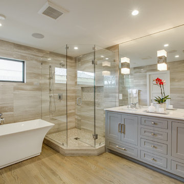
Bathroom - mid-sized transitional master gray tile and stone tile light wood floor bathroom idea in Dallas with shaker cabinets, gray cabinets, gray walls, an undermount sink, quartz countertops and a hinged shower door
Bathroom - mid-sized transitional master gray tile and stone tile light wood floor bathroom idea in Dallas with shaker cabinets, gray cabinets, gray walls, an undermount sink, quartz countertops and a hinged shower door
 Marvin
Architect: Portuondo Perotti Architects
Photography: Carlos Domenech
“This is well detailed and consistent inside and out. It is a classic Mediterranean Revival in the Floridian tradition of Mizner.”
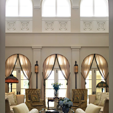
This single-family residential home in Gables Estates, Coral Gables, Florida, successfully pays respect to the architecture of the Mediterranean and Renaissance Italian styles. From the use of courtyards to the high level of detailing, this project emphasizes the most picturesque and expressive qualities of these styles. The residence reflects the visions of two of Coral Gables’ first architects, who designed beautiful and timeless architecture in this garden city to become a lasting piece in the landscape. This project not only captures the breathtaking views of Biscayne Bay, but with timeless style and lush landscaping, it creates a centerpiece for the view from the bay to Coral Gables.
The home is designed as a long gallery, with spaces connected by courtyards and public realms. Another large inspiration for this project was the idea of the garden and landscape. With Coral Gables as a garden city, landscape became an integral part of the conception and design.
The durability of Marvin products, their ability to stand up to the South Florida climate, as well as the Marvin attention to detail and proportion, made them the perfect choice to employ in a project of such high standards. The range of products allowed the freedom of design to explore all possibilities and turn visions into reality. The result was a lasting piece of architecture that would reflect a level of detail in every part of its structure.
MARVIN PRODUCTS USED:
Marvin Round Top Window
Marvin Ultimate Arch Top French Door
Marvin Ultimate Swinging French Door
Marvin Ultimate Venting Picture Window
Marvin Casemaster
Find the right local pro for your project
 Nar Design Group
This client grew up in this 1950’s family home and has now become owner in his adult life. Designing and remodeling this childhood home that the client was very bonded and familiar with was a tall order. This modern twist of original mid-century style combined with an eclectic fusion of modern day materials and concepts fills the room with a powerful presence while maintaining its clean lined austerity and elegance. The kitchen was part of a grander complete home re-design and remodel.
A modern version of a mid-century His and Hers grand master bathroom was created to include all the amenities and nothing left behind! This bathroom has so much noticeable and hidden “POW” that commands its peaceful spa feeling with a lot of attitude. Maintaining ultra-clean lines yet delivering ample design interest at every detail, This bathroom is eclectically a one of a kind luxury statement.
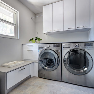
The concept in the laundry room was to create a simple, easy to use and clean space with ample storage and a place removed from the central part of the home to house the necessity of the cats and their litter box needs. There was no need for glamour in the laundry room yet we were able to create a simple highly utilitarian space.
If there is one room in the home that requires frequent visitors to thoroughly enjoy with a huge element of surprise, it’s the powder room! This is a room where you know that eventually, every guest will visit. Knowing this, we created a bold statement with layers of intrigue that would leave ample room for fun conversation with your guests upon their prolonged exit. We kept the lights dim here for that intriguing experience of crafted elegance and created ambiance. The walls of peeling metallic rust are the welcoming gesture to a powder room experience of defiance and elegant mystical complexity.
It's a lucky house guest indeed who gets to stay in this newly remodeled home. This on-suite bathroom allows them their own space and privacy. Both Bedroom and Bathroom offer plenty of storage for an extended stay. Rift White Oak cabinets and sleek Silestone counters make a lovely combination in the bathroom while the bedroom showcases textured white cabinets with a dark walnut wrap.
Photo credit: Fred Donham of PhotographerLink
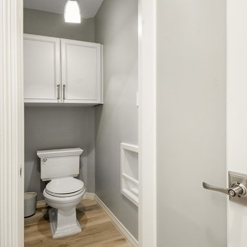
 Alair Homes Plano
Our clients called us wanting to not only update their master bathroom but to specifically make it more functional. She had just had knee surgery, so taking a shower wasn’t easy. They wanted to remove the tub and enlarge the shower, as much as possible, and add a bench. She really wanted a seated makeup vanity area, too. They wanted to replace all vanity cabinets making them one height, and possibly add tower storage. With the current layout, they felt that there were too many doors, so we discussed possibly using a barn door to the bedroom.
We removed the large oval bathtub and expanded the shower, with an added bench. She got her seated makeup vanity and it’s placed between the shower and the window, right where she wanted it by the natural light. A tilting oval mirror sits above the makeup vanity flanked with Pottery Barn “Hayden” brushed nickel vanity lights. A lit swing arm makeup mirror was installed, making for a perfect makeup vanity! New taller Shiloh “Eclipse” bathroom cabinets painted in Polar with Slate highlights were installed (all at one height), with Kohler “Caxton” square double sinks. Two large beautiful mirrors are hung above each sink, again, flanked with Pottery Barn “Hayden” brushed nickel vanity lights on either side. Beautiful Quartzmasters Polished Calacutta Borghini countertops were installed on both vanities, as well as the shower bench top and shower wall cap.
Carrara Valentino basketweave mosaic marble tiles was installed on the shower floor and the back of the niches, while Heirloom Clay 3x9 tile was installed on the shower walls. A Delta Shower System was installed with both a hand held shower and a rainshower. The linen closet that used to have a standard door opening into the middle of the bathroom is now storage cabinets, with the classic Restoration Hardware “Campaign” pulls on the drawers and doors. A beautiful Birch forest gray 6”x 36” floor tile, laid in a random offset pattern was installed for an updated look on the floor. New glass paneled doors were installed to the closet and the water closet, matching the barn door. A gorgeous Shades of Light 20” “Pyramid Crystals” chandelier was hung in the center of the bathroom to top it all off!
The bedroom was painted a soothing Magnetic Gray and a classic updated Capital Lighting “Harlow” Chandelier was hung for an updated look.
We were able to meet all of our clients needs by removing the tub, enlarging the shower, installing the seated makeup vanity, by the natural light, right were she wanted it and by installing a beautiful barn door between the bathroom from the bedroom! Not only is it beautiful, but it’s more functional for them now and they love it!
Design/Remodel by Hatfield Builders & Remodelers | Photography by Versatile Imaging
 Renaissance GSB
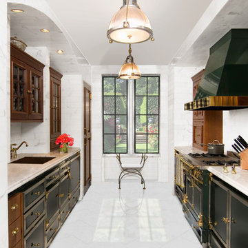
Renaissance solid bronze casement and picture window replicating old world craftsmanship, with narrow sightlines, factory glazing, and cremone bolt locking system. http://solidbronzewindows.com/
 TKS Design Group
Download our free ebook, Creating the Ideal Kitchen. DOWNLOAD NOW
Lakefront property in the northwest suburbs of Chicago is hard to come by, so when we were hired by this young family with exactly that, we were immediately inspired by not just the unusually large footprint of this 1950’s colonial revival but also the lovely views of the manmade lake it was sited on. The large 5-bedroom home was solidly stuck in the 1980’s, but we saw tons of potential. We started out by updating the existing staircase with a fresh coat of paint and adding new herringbone slate to the entry hall.
The powder room off the entryway also got a refresh - new flooring, new cabinets and fixtures. We ran the new slate right through into this space for some consistency. A fun wallpaper and shiplap trim add a welcoming feel and set the tone for the home.
Next, we tackled the kitchen. Located away from the rest of the first floor, the kitchen felt a little isolated, so we immediately began planning for how to better connect it to the rest of the first floor. We landed on removing the wall between the kitchen and dining room and designed a modified galley style space with separate cooking and clean up zones. The cooking zone consists of the refrigerator, prep sink and cooktop, along with a nice long run of prep space at the island. The cleanup side of the kitchen consists of the main sink and dishwasher. Both areas are situated so that the user can view the lake during prep work and cleanup!
One of the home’s main puzzles was how to incorporate the mudroom and area in front of the patio doors at the back of the house. We already had a breakfast table area, so the space by the patio doors was a bit of a no man’s land. We decided to separate the kitchen proper from what became the new mudroom with a large set of barn doors. That way you can quickly hide any mudroom messes but have easy access to the light coming in through the patio doors as well as the outdoor grilling station. We also love the impact the barn doors add to the overall space.
The homeowners’ first words to us were “it’s time to ditch the brown,” so we did! We chose a lovely blue pallet that reflects the home’s location on the lake which is also vibrant yet easy on the eye. Countertops are white quartz, and the natural oak floor works well with the other honey accents. The breakfast table was given a refresh with new chairs, chandelier and window treatments that frame the gorgeous views of the lake out the back.
We coordinated the slate mudroom flooring with that used in the home’s main entrance for a consistent feel. The storage area consists of open and closed storage to allow for some clutter control as needed.
Next on our “to do” list was revamping the dated brown bar area in the neighboring dining room. We eliminated the clutter by adding some closed cabinets and did some easy updates to help the space feel more current. One snag we ran into here was the discovery of a beam above the existing open shelving that had to be modified with a smaller structural beam to allow for our new design to work. This was an unexpected surprise, but in the end we think it was well worth it!
We kept the colors here a bit more muted to blend with the homeowner’s existing furnishings. Open shelving and polished nickel hardware add some simple detail to the new entertainment zone which also looks out onto the lake!
Next we tackled the upstairs starting with the homeowner’s son’s bath. The bath originally had both a tub shower and a separate shower, so we decided to swap out the shower for a new laundry area. This freed up some space downstairs in what used to be the mudroom/laundry room and is much more convenient for daily laundry needs.
We continued the blue palette here with navy cabinetry and the navy tile in the shower. Porcelain floor tile and chrome fixtures keep maintenance to a minimum while matte black mirrors and lighting add some depth the design. A low maintenance runner adds some warmth underfoot and ties the whole space together.
We added a pocket door to the bathroom to minimize interference with the door swings. The left door of the laundry closet is on a 180 degree hinge to allow for easy full access to the machines. Next we tackled the master bath which is an en suite arrangement. The original was typical of the 1980’s with the vanity outside of the bathroom, situated near the master closet. And the brown theme continued here with multiple shades of brown.
Our first move was to segment off the bath and the closet from the master bedroom. We created a short hall from the bedroom to the bathroom with his and hers walk-in closets on the left and right as well as a separate toilet closet outside of the main bathroom for privacy and flexibility.
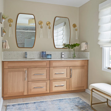
The original bathroom had a giant soaking tub with steps (dangerous!) as well as a small shower that did not work well for our homeowner who is 6’3”. With other bathtubs in the home, they decided to eliminate the tub and create an oversized shower which takes up the space where the old tub was located. The double vanity is on the opposite wall and a bench is located under the window for morning conversations and a place to set a couple of towels.
The pallet in here is light and airy with a mix of blond wood, creamy porcelain and marble tile, and brass accents. A simple roman shade adds some texture and it’s top-down mechanism allows for light and privacy.
This large whole house remodel gave our homeowners not only the ability to maximize the potential of their home but also created a lovely new frame from which to view their fabulous lake views.
Designed by: Susan Klimala, CKD, CBD
Photography by: Michael Kaskel
For more information on kitchen and bath design ideas go to: www.kitchenstudio-ge.com

Sponsored
Sunbury, OH

J.Holderby - Renovations
Franklin County's Leading General Contractors - 2X Best of Houzz!

 Dura Supreme Cabinetry
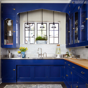
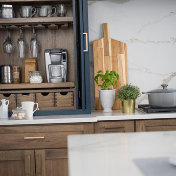
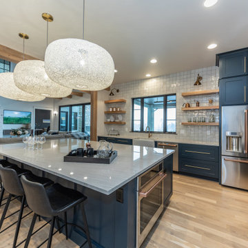
This modern farmhouse kitchen features a beautiful combination of Navy Blue painted and gray stained Hickory cabinets that’s sure to be an eye-catcher. The elegant “Morel” stain blends and harmonizes the natural Hickory wood grain while emphasizing the grain with a subtle gray tone that beautifully coordinated with the cool, deep blue paint.
The “Gale Force” SW 7605 blue paint from Sherwin-Williams is a stunning deep blue paint color that is sophisticated, fun, and creative. It’s a stunning statement-making color that’s sure to be a classic for years to come and represents the latest in color trends. It’s no surprise this beautiful navy blue has been a part of Dura Supreme’s Curated Color Collection for several years, making the top 6 colors for 2017 through 2020.
Beyond the beautiful exterior, there is so much well-thought-out storage and function behind each and every cabinet door. The two beautiful blue countertop towers that frame the modern wood hood and cooktop are two intricately designed larder cabinets built to meet the homeowner’s exact needs.
The larder cabinet on the left is designed as a beverage center with apothecary drawers designed for housing beverage stir sticks, sugar packets, creamers, and other misc. coffee and home bar supplies. A wine glass rack and shelves provides optimal storage for a full collection of glassware while a power supply in the back helps power coffee & espresso (machines, blenders, grinders and other small appliances that could be used for daily beverage creations. The roll-out shelf makes it easier to fill clean and operate each appliance while also making it easy to put away. Pocket doors tuck out of the way and into the cabinet so you can easily leave open for your household or guests to access, but easily shut the cabinet doors and conceal when you’re ready to tidy up.
Beneath the beverage center larder is a drawer designed with 2 layers of multi-tasking storage for utensils and additional beverage supplies storage with space for tea packets, and a full drawer of K-Cup storage. The cabinet below uses powered roll-out shelves to create the perfect breakfast center with power for a toaster and divided storage to organize all the daily fixings and pantry items the household needs for their morning routine.
On the right, the second larder is the ultimate hub and center for the homeowner’s baking tasks. A wide roll-out shelf helps store heavy small appliances like a KitchenAid Mixer while making them easy to use, clean, and put away. Shelves and a set of apothecary drawers help house an assortment of baking tools, ingredients, mixing bowls and cookbooks. Beneath the counter a drawer and a set of roll-out shelves in various heights provides more easy access storage for pantry items, misc. baking accessories, rolling pins, mixing bowls, and more.
The kitchen island provides a large worktop, seating for 3-4 guests, and even more storage! The back of the island includes an appliance lift cabinet used for a sewing machine for the homeowner’s beloved hobby, a deep drawer built for organizing a full collection of dishware, a waste recycling bin, and more!
All and all this kitchen is as functional as it is beautiful!
Request a FREE Dura Supreme Brochure Packet:
http://www.durasupreme.com/request-brochure
 Housing & Building Association of Colorado Springs
The Home
While looking for space where their active family could expand, these homeowners turned to Black Forest, with trees that remind them of their Indiana years. A stunning Pikes Peak view underscores how fortunate they are to live in Colorado. This home features classic nods to the owner’s French heritage while embracing a thoroughly of-the-moment Colorado lifestyle. Priorities for these homeowners included blending outdoor and indoor spaces wherever possible with generously proportioned windows and doors, porches, patios and balconies.
A gracious lime-washed brick entry punctuates a simplified white stucco and black-frame-windowed exterior with traditional
rooflines. Dramatic open spaces on the main floor comfortably accommodate the everyday activities of this busy family of four, while
providing for welcomed visits from family and friends. A functional, open kitchen is designed for serious cooking, a butler’s pantry for
staples, and serveware storage and dining spaces that effortlessly host after-school snacking to multi-course meals. A main-level,
Peak-view office comfortably supports working at home, complete with a beer cave and tasting nook for hosting fellow aficionados
after work is done. Guests will find comfort and privacy in a ma in-level guestroom suite or sleepover fun in the built-in bunks of the
expansive over-garage bonus room.
This home is a true collaboration that blends the homeowner’s long-held vision of their ideal home brought to life by the builder’s vision
and design/build process that achieves something truly…Warm and welcoming in the Forest.
The Builder
Stauffer & Sons Construction is a true Design-Build team creating some of the finest living spaces in the Pikes Peak region for over twenty years. We’ve developed an easy point-of-entry to the Design-Build process that begins with our very popular Conceptual Design and Budgeting Agreement. This affordable, low-commitment step provides answers to the early-stage questions of “what and how much?” With this critical information in place, a robust collaboration between client and builder ensues, resulting in a thoughtfully designed home that strikes a balance between size and scope and budget.
The Interior Design
Family, friends and soon-to-be friends are welcomed into this updated version of a French country farmhouse through a bricked archway and a solid arch-top entry door. Once inside, a sweeping gallery of windows adorned with flower-filled window boxes sets a nice foreground to the ponderosa pine forest. A great room with a two-story, lime-washed, brick fireplace sits juxtaposed to a cozy farm-styled kitchen with large island, plenty of storage and a Pikes Peak view. This family home features a simple, clean design with warm, wooden beams and solid, white-oak flooring. This home is designed to be lived in. Wherever you go, downstairs, upstairs or out on the porch, this home wraps around you and is a delightful place to enjoy.
 J Reilly Construction
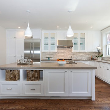
Inspiration for a contemporary l-shaped kitchen remodel in San Francisco with shaker cabinets, white cabinets, quartz countertops, white backsplash, stainless steel appliances and brown countertops
 Jordan Design Build Group
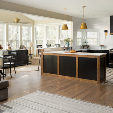
This client came to us with a very clear vision of what she wanted, but she needed help to refine and execute the design. At our first meeting she described her style as somewhere between modern rustic and ‘granny chic’ – she likes cozy spaces with nods to the past, but also wanted to blend that with the more contemporary tastes of her husband and children. Functionally, the old layout was less than ideal with an oddly placed 3-sided fireplace and angled island creating traffic jams in and around the kitchen. By creating a U-shaped layout, we clearly defined the chef’s domain and created a circulation path that limits disruptions in the heart of the kitchen. While still an open concept, the black cabinets, bar height counter and change in flooring all add definition to the space. The vintage inspired black and white tile is a nod to the past while the black stainless range and matte black faucet are unmistakably modern.
High on our client’s wish list was eliminating upper cabinets and keeping the countertops clear. In order to achieve this, we needed to ensure there was ample room in the base cabinets and reconfigured pantry for items typically stored above. The full height tile backsplash evokes exposed brick and serves as the backdrop for the custom wood-clad hood and decorative brass sconces – a perfect blend of rustic, modern and chic. Black and brass elements are repeated throughout the main floor in new hardware, lighting, and open shelves as well as the owners’ curated collection of family heirlooms and furnishings. In addition to renovating the kitchen, we updated the entire first floor with refinished hardwoods, new paint, wainscoting, wallcovering and beautiful new stained wood doors. Our client had been dreaming and planning this kitchen for 17 years and we’re thrilled we were able to bring it to life.
 Neil Kelly Company
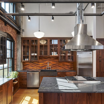
The "Dream of the '90s" was alive in this industrial loft condo before Neil Kelly Portland Design Consultant Erika Altenhofen got her hands on it. The 1910 brick and timber building was converted to condominiums in 1996. No new roof penetrations could be made, so we were tasked with creating a new kitchen in the existing footprint. Erika's design and material selections embrace and enhance the historic architecture, bringing in a warmth that is rare in industrial spaces like these. Among her favorite elements are the beautiful black soapstone counter tops, the RH medieval chandelier, concrete apron-front sink, and Pratt & Larson tile backsplash

 Rachel Savage Design Management
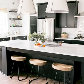
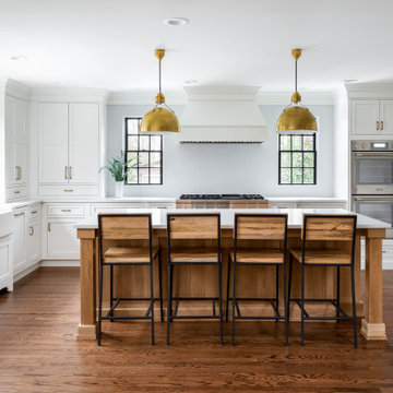
There are so many things that make this kitchen beautiful. The white inset cabinets with the aged bronze hardware and faucet, against the backdrop of the black trimmed windows makes a winning combination. The island is custom made from quarter sawn white oak.
 Mariano & Co., LLC
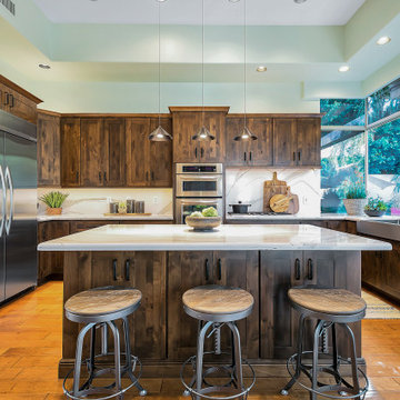
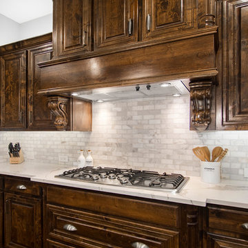
We removed the old cabinetry and backsplash and replaced with Cabinetry and countertops. The new cabinets are OakCraft Knotty Alder in a Truffle Stain. The countertops are Brittanica Cambria quartz.
 Alair Homes Plano
Our clients house was built in 2012, so it was not that outdated, it was just dark. The clients wanted to lighten the kitchen and create something that was their own, using more unique products. The master bath needed to be updated and they wanted the upstairs game room to be more functional for their family.
The original kitchen was very dark and all brown. The cabinets were stained dark brown, the countertops were a dark brown and black granite, with a beige backsplash. We kept the dark cabinets but lightened everything else. A new translucent frosted glass pantry door was installed to soften the feel of the kitchen. The main architecture in the kitchen stayed the same but the clients wanted to change the coffee bar into a wine bar, so we removed the upper cabinet door above a small cabinet and installed two X-style wine storage shelves instead. An undermount farm sink was installed with a 23” tall main faucet for more functionality. We replaced the chandelier over the island with a beautiful Arhaus Poppy large antique brass chandelier. Two new pendants were installed over the sink from West Elm with a much more modern feel than before, not to mention much brighter. The once dark backsplash was now a bright ocean honed marble mosaic 2”x4” a top the QM Calacatta Miel quartz countertops. We installed undercabinet lighting and added over-cabinet LED tape strip lighting to add even more light into the kitchen.
We basically gutted the Master bathroom and started from scratch. We demoed the shower walls, ceiling over tub/shower, demoed the countertops, plumbing fixtures, shutters over the tub and the wall tile and flooring. We reframed the vaulted ceiling over the shower and added an access panel in the water closet for a digital shower valve. A raised platform was added under the tub/shower for a shower slope to existing drain. The shower floor was Carrara Herringbone tile, accented with Bianco Venatino Honed marble and Metro White glossy ceramic 4”x16” tile on the walls. We then added a bench and a Kohler 8” rain showerhead to finish off the shower. The walk-in shower was sectioned off with a frameless clear anti-spot treated glass. The tub was not important to the clients, although they wanted to keep one for resale value. A Japanese soaker tub was installed, which the kids love! To finish off the master bath, the walls were painted with SW Agreeable Gray and the existing cabinets were painted SW Mega Greige for an updated look. Four Pottery Barn Mercer wall sconces were added between the new beautiful Distressed Silver leaf mirrors instead of the three existing over-mirror vanity bars that were originally there. QM Calacatta Miel countertops were installed which definitely brightened up the room!
Originally, the upstairs game room had nothing but a built-in bar in one corner. The clients wanted this to be more of a media room but still wanted to have a kitchenette upstairs. We had to remove the original plumbing and electrical and move it to where the new cabinets were. We installed 16’ of cabinets between the windows on one wall. Plank and Mill reclaimed barn wood plank veneers were used on the accent wall in between the cabinets as a backing for the wall mounted TV above the QM Calacatta Miel countertops. A kitchenette was installed to one end, housing a sink and a beverage fridge, so the clients can still have the best of both worlds. LED tape lighting was added above the cabinets for additional lighting. The clients love their updated rooms and feel that house really works for their family now.
Design/Remodel by Hatfield Builders & Remodelers | Photography by Versatile Imaging
 TreHus Architects+Interior Designers+Builders
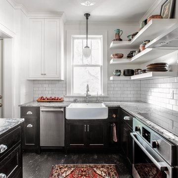
The clients were involved in the neighborhood organization dedicated to keeping the housing instead of tearing down. They wanted to utilize every inch of storage which resulted in floor-to-ceiling cabinetry. Cabinetry and counter space work together to create a balance between function and style.
Sponsored
Plain City, OH

Kuhns Contracting, Inc.
Central Ohio's Trusted Home Remodeler Specializing in Kitchens & Baths
 HEYDT DESIGNS
Photography by Golden Gate Creative
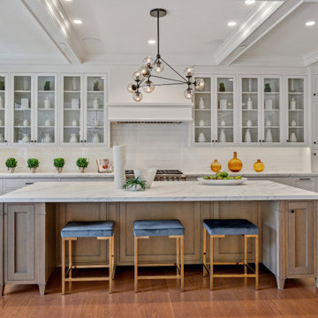
Example of a mid-sized cottage u-shaped medium tone wood floor, brown floor and coffered ceiling open concept kitchen design in San Francisco with a farmhouse sink, shaker cabinets, light wood cabinets, marble countertops, white backsplash, subway tile backsplash, stainless steel appliances, an island and white countertops
Example of a mid-sized cottage u-shaped medium tone wood floor, brown floor and coffered ceiling open concept kitchen design in San Francisco with a farmhouse sink, shaker cabinets, light wood cabinets, marble countertops, white backsplash, subway tile backsplash, stainless steel appliances, an island and white countertops
 Azy LaBelle Design
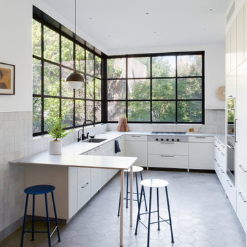
Our overall design concept for the renovation of this space was to optimize the functional space for a family of five and accentuate the existing window. In the renovation, we eliminated a huge centrally located kitchen island which acted as an obstacle to the feeling of the space and focused on creating an elegant and balanced plan promoting movement, simplicity and precisely executed details. We held strong to having the kitchen cabinets, wherever possible, float off the floor to give the subtle impression of lightness avoiding a bottom heavy look. The cabinets were painted a pale tinted green to reduce the empty effect of light flooding a white kitchen leaving a softness and complementing the gray tiles.
To integrate the existing dining room with the kitchen, we simply added some classic dining chairs and a dynamic light fixture, juxtaposing the geometry of the boxy kitchen with organic curves and triangular lights to balance the clean design with an inviting warmth.
 User
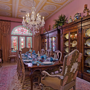
Userceiling medallions, renaissance, crystal chandelier, long dining able, ornate table, ornate dining room chairs, area rug, china cabinets, dentil crown molding, pink paint, drapes, high ceilings, arched window, stain glass, buffet, gold accents, gold framed art, blue accept, yellow ceiling
66