
Search results for "Window between cabinets" in Home Design Ideas
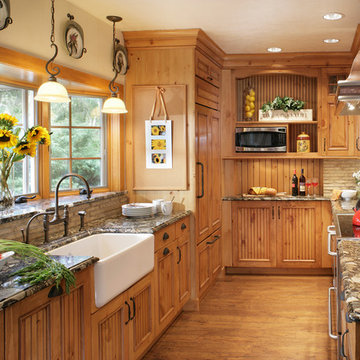
 Ulrich Inc
Ulrich designer: Bonnie Hufnagel, CKD
Photography by Peter Rymwid
To make this small kitchen work-flow really work and to add storage. The original kitchen had the refrigerator sticking out into the kitchen passage area. We installed a built-in Sub-Zero model that only projected to counter depth, and to install a custom wood panel on it matching the cabinetry. This made the refrigerator look like the cabinets and reduced its visual presence. We also moved the range to the center of the side wall space which provided 4 feet of prep area on either side of the range. The soffits were removed from overhead and the cabinets were brought to the ceiling around the kitchen perimeter to gain more storage space.
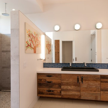
 KW Designs
Photo: Tyler Van Stright, JLC Architecture
Architect: JLC Architecture
General Contractor: Naylor Construction
Interior Design: KW Designs
Cabinetry: Peter Vivian
 Jared Nelson
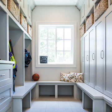
Millcreek Cabinet and Design constructed only the cabinetry. We do not have other information regarding the other finishes such as flooring, wall color, and counters; they were selected by the designer or homeowner.
Find the right local pro for your project
 Associate Interiors
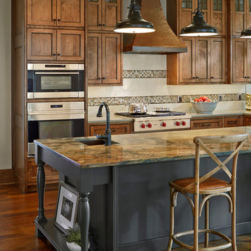
The accent of glass and copper mosaic backslash tiles echoes the copper hood and farmhouse sink. This kitchen stands out with state of the art Wolf and Subzero appliances which are paired with the ingenuity of intricately constructed custom frameless cabinetry.
 Divine Custom Homes
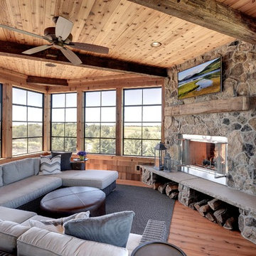
Rustic 3-Season Porch by Divine Custom Homes
Windows by SunSpace Twin Cities www.sunspacetwincities.com
Photo by SpaceCrafting
Inspiration for a mid-sized rustic enclosed medium tone wood floor and brown floor living room remodel in Minneapolis with beige walls, a standard fireplace, a stone fireplace and a wall-mounted tv
Inspiration for a mid-sized rustic enclosed medium tone wood floor and brown floor living room remodel in Minneapolis with beige walls, a standard fireplace, a stone fireplace and a wall-mounted tv
 Flavin Architects
Mid-Century Remodel on Tabor Hill
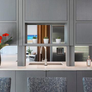
This sensitively sited house was designed by Robert Coolidge, a renowned architect and grandson of President Calvin Coolidge. The house features a symmetrical gable roof and beautiful floor to ceiling glass facing due south, smartly oriented for passive solar heating. Situated on a steep lot, the house is primarily a single story that steps down to a family room. This lower level opens to a New England exterior. Our goals for this project were to maintain the integrity of the original design while creating more modern spaces. Our design team worked to envision what Coolidge himself might have designed if he'd had access to modern materials and fixtures.
With the aim of creating a signature space that ties together the living, dining, and kitchen areas, we designed a variation on the 1950's "floating kitchen." In this inviting assembly, the kitchen is located away from exterior walls, which allows views from the floor-to-ceiling glass to remain uninterrupted by cabinetry.
We updated rooms throughout the house; installing modern features that pay homage to the fine, sleek lines of the original design. Finally, we opened the family room to a terrace featuring a fire pit. Since a hallmark of our design is the diminishment of the hard line between interior and exterior, we were especially pleased for the opportunity to update this classic work.
 Harry Braswell Inc.
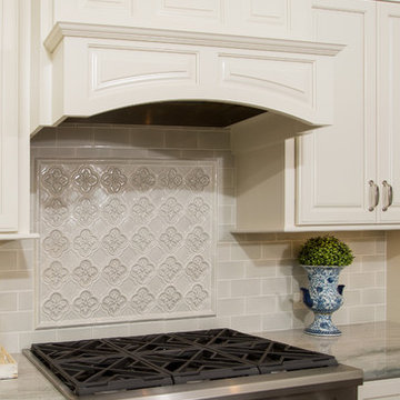
Off-white Decora maple cabinets, an Ethan Allen chandelier and Seapearl quartzite grey and green countertops transformed an outdated kitchen into a peaceful sanctuary. A high gloss ceramic handmade tile, Light Ocean from Quemere International, reflects light from the kitchen's large window. Stamped concrete island cabinets provide an enchanting color contrast to the Chantille cabinets. Amish wood stools offer understated seating. Top Knobs trunk pulls in polished nickel contribute to this kitchen’s high class.
The existing kitchen floor plan in this 20-year-old Fairfax Station did not require enlarging. The homeowners upgraded to a double oven and converted from electric to gas.
In the breakfast room, a Hinkley chandelier above a Lee Industries table accommodates eight, with an open view of an updated fireplace. After removing the wall between living and breakfast rooms, in-house lead carpenter Bruce designed and built the classic columns on either side of the arch between the rooms. The rooms are painted in Benjamin Moore Titanium, and the wet bar boasts an Arabesque Carrara marble backsplash.
Photographer Greg Hadley

 Bilotta Kitchen & Home
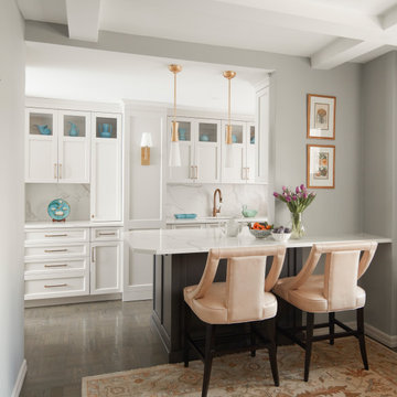
Bilotta Senior Designer, Thomas Vecchio, and Patrick J. Hamilton of Patrick James Hamilton Designs, partnered on this Manhattan upper east side kitchen renovation. This nondescript ‘60’s co-op and galley kitchen were reimagined into a pre-war era gem by adding architectural details: paneling, coffers, and moldings. Widening the opening created an open vista. Upper panes of glass on the Bilotta Collection wall cabinets echo the apartment’s transoms and unite the two sections that are interrupted by the paneled structural column. To compensate for the shorter wall, storage is optimized with plentiful pullouts, dividers, and specialized organizers. The “dead end” under the window was eliminated by continuing cabinetry and countertop materials around the room.
Countertop wall cabinets create a hutch in full view of the dining room. With dark gray paint, corner posts and furniture base molding, the peninsula reads like an island and bridges the two areas. Quartz countertops sport “lightning bolt” veins for pattern. Sophisticated on-
trend brushed brass was employed on the cabinet pulls and knobs, faucet, sconces, and pendants. A gamechanger was extending the footprint of the kitchen into the hallway with two tall cabinets. One is allocated for cleaning supplies, bulk items, recycling, and the vacuum. The other conceals a built-in wine rack; glassware and bar items; a docking drawer for charging devices; and a Penda-flex rack for files. An absolutely stunning metamorphosis.
Written by Paulette Gambacorta adapted for Houzz.
Bilotta Designer: Tom Vecchio
Interior Designer: Patrick J. Hamilton of Patrick James Hamilton Designs
Photographer: John Bessler
 TKS Design Group
Download our free ebook, Creating the Ideal Kitchen. DOWNLOAD NOW
Lakefront property in the northwest suburbs of Chicago is hard to come by, so when we were hired by this young family with exactly that, we were immediately inspired by not just the unusually large footprint of this 1950’s colonial revival but also the lovely views of the manmade lake it was sited on. The large 5-bedroom home was solidly stuck in the 1980’s, but we saw tons of potential. We started out by updating the existing staircase with a fresh coat of paint and adding new herringbone slate to the entry hall.
The powder room off the entryway also got a refresh - new flooring, new cabinets and fixtures. We ran the new slate right through into this space for some consistency. A fun wallpaper and shiplap trim add a welcoming feel and set the tone for the home.
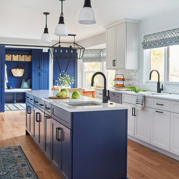
Next, we tackled the kitchen. Located away from the rest of the first floor, the kitchen felt a little isolated, so we immediately began planning for how to better connect it to the rest of the first floor. We landed on removing the wall between the kitchen and dining room and designed a modified galley style space with separate cooking and clean up zones. The cooking zone consists of the refrigerator, prep sink and cooktop, along with a nice long run of prep space at the island. The cleanup side of the kitchen consists of the main sink and dishwasher. Both areas are situated so that the user can view the lake during prep work and cleanup!
One of the home’s main puzzles was how to incorporate the mudroom and area in front of the patio doors at the back of the house. We already had a breakfast table area, so the space by the patio doors was a bit of a no man’s land. We decided to separate the kitchen proper from what became the new mudroom with a large set of barn doors. That way you can quickly hide any mudroom messes but have easy access to the light coming in through the patio doors as well as the outdoor grilling station. We also love the impact the barn doors add to the overall space.
The homeowners’ first words to us were “it’s time to ditch the brown,” so we did! We chose a lovely blue pallet that reflects the home’s location on the lake which is also vibrant yet easy on the eye. Countertops are white quartz, and the natural oak floor works well with the other honey accents. The breakfast table was given a refresh with new chairs, chandelier and window treatments that frame the gorgeous views of the lake out the back.
We coordinated the slate mudroom flooring with that used in the home’s main entrance for a consistent feel. The storage area consists of open and closed storage to allow for some clutter control as needed.
Next on our “to do” list was revamping the dated brown bar area in the neighboring dining room. We eliminated the clutter by adding some closed cabinets and did some easy updates to help the space feel more current. One snag we ran into here was the discovery of a beam above the existing open shelving that had to be modified with a smaller structural beam to allow for our new design to work. This was an unexpected surprise, but in the end we think it was well worth it!
We kept the colors here a bit more muted to blend with the homeowner’s existing furnishings. Open shelving and polished nickel hardware add some simple detail to the new entertainment zone which also looks out onto the lake!
Next we tackled the upstairs starting with the homeowner’s son’s bath. The bath originally had both a tub shower and a separate shower, so we decided to swap out the shower for a new laundry area. This freed up some space downstairs in what used to be the mudroom/laundry room and is much more convenient for daily laundry needs.
We continued the blue palette here with navy cabinetry and the navy tile in the shower. Porcelain floor tile and chrome fixtures keep maintenance to a minimum while matte black mirrors and lighting add some depth the design. A low maintenance runner adds some warmth underfoot and ties the whole space together.
We added a pocket door to the bathroom to minimize interference with the door swings. The left door of the laundry closet is on a 180 degree hinge to allow for easy full access to the machines. Next we tackled the master bath which is an en suite arrangement. The original was typical of the 1980’s with the vanity outside of the bathroom, situated near the master closet. And the brown theme continued here with multiple shades of brown.
Our first move was to segment off the bath and the closet from the master bedroom. We created a short hall from the bedroom to the bathroom with his and hers walk-in closets on the left and right as well as a separate toilet closet outside of the main bathroom for privacy and flexibility.
The original bathroom had a giant soaking tub with steps (dangerous!) as well as a small shower that did not work well for our homeowner who is 6’3”. With other bathtubs in the home, they decided to eliminate the tub and create an oversized shower which takes up the space where the old tub was located. The double vanity is on the opposite wall and a bench is located under the window for morning conversations and a place to set a couple of towels.
The pallet in here is light and airy with a mix of blond wood, creamy porcelain and marble tile, and brass accents. A simple roman shade adds some texture and it’s top-down mechanism allows for light and privacy.
This large whole house remodel gave our homeowners not only the ability to maximize the potential of their home but also created a lovely new frame from which to view their fabulous lake views.
Designed by: Susan Klimala, CKD, CBD
Photography by: Michael Kaskel
For more information on kitchen and bath design ideas go to: www.kitchenstudio-ge.com
 KraftMaster Renovations
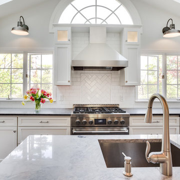
Dove white cabinets perimeter with warm gray and black accents are tied in with the traditional and rustic ambiance in the rest of the home. The new large island will hold the kitchen sink while guests can sit on the other end and enjoy the views. The range and hood are now a focal point between the exterior windows. Barn doors were be added to the newly enlarged opening to the dining room.
 Lori Dennis, ASID, LEED AP
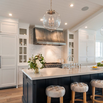
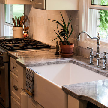
Inspiration for a large country u-shaped light wood floor open concept kitchen remodel in Los Angeles with a farmhouse sink, recessed-panel cabinets, white cabinets, solid surface countertops, white backsplash, marble backsplash, paneled appliances, an island and white countertops
 Renovations Group Inc
A spacious layout was achieved by taking down the wall between the cramped U-shaped kitchen and the under-utilized dining room. Removing this wall provide the wide open space needed for additional cabinet space as well as a large stone island with seating. The kitchen is now far more functional for the clients' modern lifestyle following the removal of soffits around the perimeter, which allowed for full height cabinetry and full size appliances. A bench seat was built around the large picture window for taking in views of their well-manicured back yard.
Zachary Seib Photography
 Design Matters Home
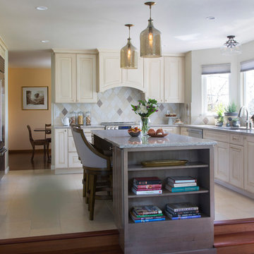
Custom decorative damask backsplash with painted and contrasting wood island, travertine stone floor, stainless appliances, brushed nickel faucet. Opened up space between this room and a family room for better flow.
Sponsored
Sunbury, OH

J.Holderby - Renovations
Franklin County's Leading General Contractors - 2X Best of Houzz!
 Eden Builders
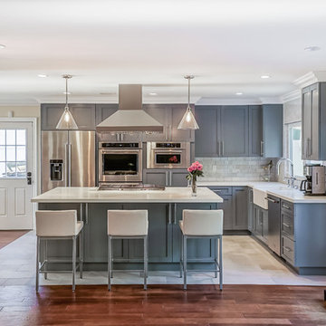
Complete custom kitchen remodeling project in Pasadena
Large transitional l-shaped porcelain tile and white floor open concept kitchen photo in Los Angeles with a farmhouse sink, shaker cabinets, gray cabinets, quartz countertops, gray backsplash, marble backsplash, stainless steel appliances and an island
Large transitional l-shaped porcelain tile and white floor open concept kitchen photo in Los Angeles with a farmhouse sink, shaker cabinets, gray cabinets, quartz countertops, gray backsplash, marble backsplash, stainless steel appliances and an island
 Kitchen Studio: Kansas City
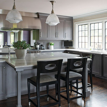
This grey stained walnut kitchen was designed with Kurt Knapstein in a historical home in Kansas City. The blend of old and new elements allow this kitchen to mesh peacefully with the home, while easily standing on it's own.
 NB Construction
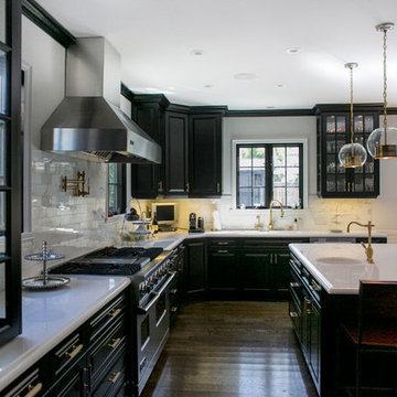
Creating a beloved dream home requires synergy between the design side and the construction side of the process.
At 24 Design Construction, we work together under one umbrella to seamlessly create perfectly designed, completely personal new construction projects.
Interior Design: Abby wolf Weiss | Taken By: Jessica Claire |
Design Construction: 24 Design Construction
 SoCal Contractor
kenhaden.com Photography
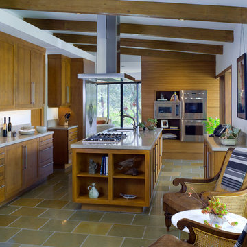
Trendy kitchen photo in Los Angeles with shaker cabinets, medium tone wood cabinets, gray backsplash and stainless steel appliances
Trendy kitchen photo in Los Angeles with shaker cabinets, medium tone wood cabinets, gray backsplash and stainless steel appliances
Sponsored
Sunbury, OH
J.Holderby - Renovations
Franklin County's Leading General Contractors - 2X Best of Houzz!
 Vision Interiors
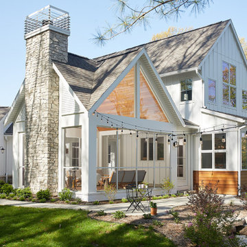
The Holloway blends the recent revival of mid-century aesthetics with the timelessness of a country farmhouse. Each façade features playfully arranged windows tucked under steeply pitched gables. Natural wood lapped siding emphasizes this homes more modern elements, while classic white board & batten covers the core of this house. A rustic stone water table wraps around the base and contours down into the rear view-out terrace.
Inside, a wide hallway connects the foyer to the den and living spaces through smooth case-less openings. Featuring a grey stone fireplace, tall windows, and vaulted wood ceiling, the living room bridges between the kitchen and den. The kitchen picks up some mid-century through the use of flat-faced upper and lower cabinets with chrome pulls. Richly toned wood chairs and table cap off the dining room, which is surrounded by windows on three sides. The grand staircase, to the left, is viewable from the outside through a set of giant casement windows on the upper landing. A spacious master suite is situated off of this upper landing. Featuring separate closets, a tiled bath with tub and shower, this suite has a perfect view out to the rear yard through the bedroom's rear windows. All the way upstairs, and to the right of the staircase, is four separate bedrooms. Downstairs, under the master suite, is a gymnasium. This gymnasium is connected to the outdoors through an overhead door and is perfect for athletic activities or storing a boat during cold months. The lower level also features a living room with a view out windows and a private guest suite.
Architect: Visbeen Architects
Photographer: Ashley Avila Photography
Builder: AVB Inc.
 Sullivan Building & Design Group
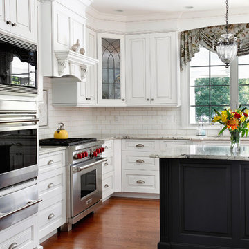
The cabinets add interesting dimension to the room by bumping in and out to highlight the various aspects of the kitchen layout.
Eat-in kitchen - traditional l-shaped eat-in kitchen idea in Philadelphia with an undermount sink, raised-panel cabinets, white cabinets, granite countertops, white backsplash, subway tile backsplash and stainless steel appliances
Eat-in kitchen - traditional l-shaped eat-in kitchen idea in Philadelphia with an undermount sink, raised-panel cabinets, white cabinets, granite countertops, white backsplash, subway tile backsplash and stainless steel appliances
 GMT Home Designs Inc.
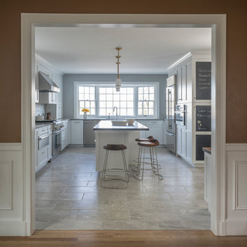
The original kitchen was dark and lacked storage space. It was cut off from the rest of the house and needed an update. We removed the wall between the dining room and kitchen and bumped the kitchen out in the rear of the house. We created lots of storage, a new island with seating and added windows bringing in much needed natural light. The kitchen is now a hub of activity for the whole family.
70