
Search results for "Workable" in Home Design Ideas


 qbic-ft
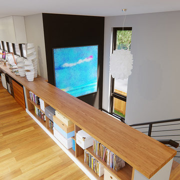
This is a proposal for a 36'x128' corner lot in South Minneapolis. The main considerations were sun exposure, privacy and as big as possible private yard.
After setbacks the workable area is 23'x95'. The house is composed of two boxes connected by a bridge. This bridge allows to keep more area on the ground level creating a covered deck for the courtyard as well as being the studio/home office area.
The features of this 3bd/3.5 br. and 2 car garage home (2400s.f above grade) are double height living room, open layout, integrated dining/kitchen and studio.
Find the right local pro for your project
 Affordable Home Handyman LLC
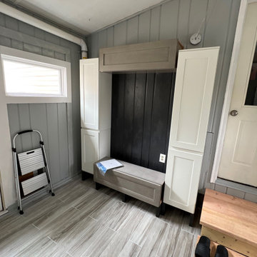
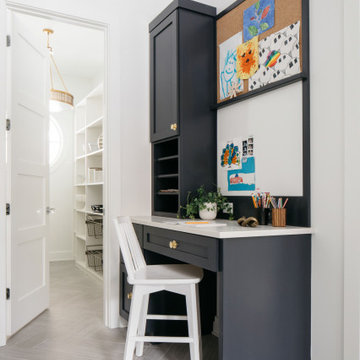
Client had a very dated bright aquamarine mudroom and a very tight budget. We mocked up a workable floor design and created a user friendly space that fit within her budget by utilizing a local builder supplies outlet and creating a design around the cabinets that fell into their budget.
 User
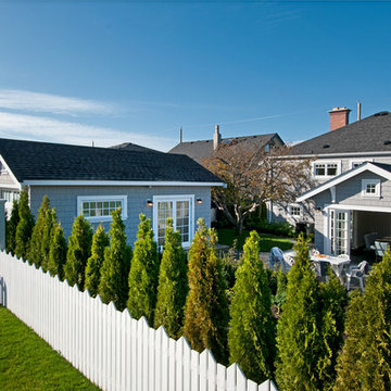
UserLeanna Rathkelly photo: A home near the ocean in Victoria, BC, gets a contemporary exterior update, including new shingle siding painted misty blue-grey and trim finished in bright white. The back features a dining room addition that opens with French doors right onto the outdoor dining area. A shed has been renovated to become a workable office and storage area.

 New England Kitchen and Bath
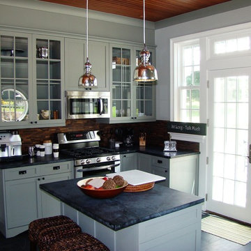
Eat-in kitchen - small transitional single-wall porcelain tile eat-in kitchen idea in New York with an undermount sink, shaker cabinets, gray cabinets, soapstone countertops, brown backsplash, matchstick tile backsplash, stainless steel appliances and an island
 Revealing Redesign
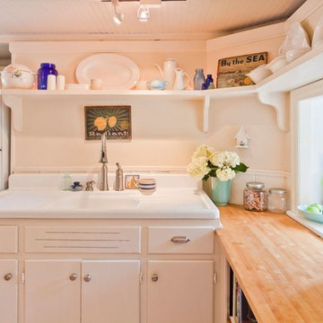
This farmhouse, with it's original foundation dating back to 1778, had a lot of charm--but with its bad carpeting, dark paint colors, and confusing layout, it was hard to see at first just how welcoming, charming, and cozy it could be.
The first focus of our renovation was creating a master bedroom suite--since there wasn't one, and one was needed for the modern family that was living here day-in and day-out.
To do this, a collection of small rooms (some of them previously without heat or electrical outlets) were combined to create a gorgeous, serene space in the eaves of the oldest part of the house, complete with master bath containing a double vanity, and spacious shower. Even though these rooms are new, it is hard to see that they weren't original to the farmhouse from day one.
In the rest of the house we removed walls that were added in the 1970's that made spaces seem smaller and more choppy, added a second upstairs bathroom for the family's two children, reconfigured the kitchen using existing cabinets to cut costs ( & making sure to keep the old sink with all of its character & charm) and create a more workable layout with dedicated eating area.
Also added was an outdoor living space with a deck sheltered by a pergola--a spot that the family spends tons of time enjoying during the warmer months.
A family room addition had been added to the house by the previous owner in the 80's, so to make this space feel less like it was tacked on, we installed historically accurate new windows to tie it in visually with the original house, and replaced carpeting with hardwood floors to make a more seamless transition from the historic to the new.
To complete the project, we refinished the original hardwoods throughout the rest of the house, and brightened the outlook of the whole home with a fresh, bright, updated color scheme.
Photos by Laura Kicey
 Transitions Designs
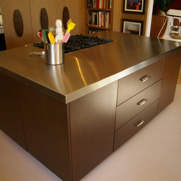
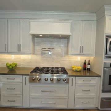
A chef's range is the focal point for this multiple cook & prep area & is flanked by pull-out storage on either side. This kitchen is designed for an active family who loves to bake, cook and entertain. It is beautifully functional, provides room for multiple cooks, storage for all the kitchen gadgets, lots of space for preparation, an eat-in area and a workable flow to the rest of the house. Relocating appliances eliminates the bottleneck. In addition, opening up the wall to the dining room allows for conversation and pass through but still provides needed storage with beautiful glass front cabinets. Photo:J. Brent Reeves
 Southcoast Kitchen Designs
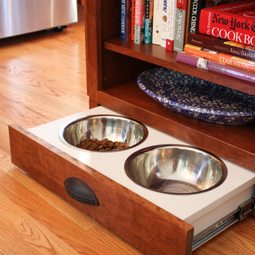
Inspiration for a mid-sized timeless l-shaped dark wood floor eat-in kitchen remodel in Boston with an undermount sink, shaker cabinets, dark wood cabinets, soapstone countertops, multicolored backsplash, mosaic tile backsplash, stainless steel appliances and an island
 Old World Stone Imports Flooring & Design
Photos taken from homes in the 2013 Parade of Homes
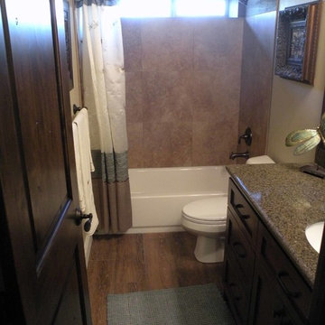
Example of a minimalist brown tile and stone tile bathroom design in Salt Lake City with an undermount sink, raised-panel cabinets, dark wood cabinets, granite countertops and a one-piece toilet
Example of a minimalist brown tile and stone tile bathroom design in Salt Lake City with an undermount sink, raised-panel cabinets, dark wood cabinets, granite countertops and a one-piece toilet
 Sawdust Therapy
Customer Testimonial
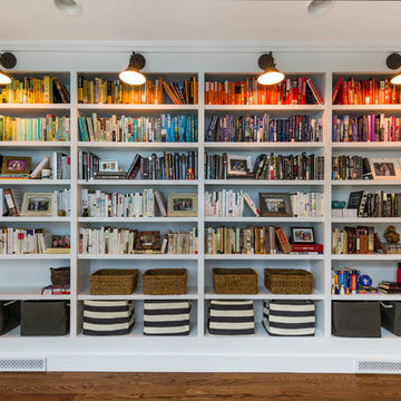
"My wife and I had a book collection that had outgrown the inexpensive bookcases that had followed us from our small downtown apartment to our new home in Over-The-Rhine. After researching different possibilities on the internet, we contacted Greg to discuss having built-in bookcases installed in our library/office, which is a fairly narrow space where we had little room to spare.
Greg was very friendly and professional in the initial meeting, and provided helpful suggestions for the project while being completely amenable to our initial vision. Once we agreed upon the design, Greg gave a very reasonable price, and provided us with a very workable timeline as to when he could complete the project in his shop and have them installed.
On the day of the installation, Greg's team was able to quickly transfer the four bookcases up a staircase with some fairly tight turns. Amazingly, there was no damage to the walls, stairs, or bookcases in the process (a complication that I was fully anticipating based on the layout of our home).
The complete installation, including electrical work and painting, was accomplished very quickly. My wife and I couldn't be happier with how everything turned out, and the library has become our favorite room in the house.
Greg's craftsmanship, professionalism, and friendliness throughout the project were extremely refreshing. His artistic vision really sets him apart. We're already considering using him for a future project!"
- Hannah and Andy
Photography by Michael Schneider
 Revealing Redesign
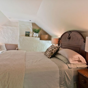
This farmhouse, with it's original foundation dating back to 1778, had a lot of charm--but with its bad carpeting, dark paint colors, and confusing layout, it was hard to see at first just how welcoming, charming, and cozy it could be.
The first focus of our renovation was creating a master bedroom suite--since there wasn't one, and one was needed for the modern family that was living here day-in and day-out.
To do this, a collection of small rooms (some of them previously without heat or electrical outlets) were combined to create a gorgeous, serene space in the eaves of the oldest part of the house, complete with master bath containing a double vanity, and spacious shower. Even though these rooms are new, it is hard to see that they weren't original to the farmhouse from day one.
In the rest of the house we removed walls that were added in the 1970's that made spaces seem smaller and more choppy, added a second upstairs bathroom for the family's two children, reconfigured the kitchen using existing cabinets to cut costs ( & making sure to keep the old sink with all of its character & charm) and create a more workable layout with dedicated eating area.
Also added was an outdoor living space with a deck sheltered by a pergola--a spot that the family spends tons of time enjoying during the warmer months.
A family room addition had been added to the house by the previous owner in the 80's, so to make this space feel less like it was tacked on, we installed historically accurate new windows to tie it in visually with the original house, and replaced carpeting with hardwood floors to make a more seamless transition from the historic to the new.
To complete the project, we refinished the original hardwoods throughout the rest of the house, and brightened the outlook of the whole home with a fresh, bright, updated color scheme.
Photos by Laura Kicey
 qbic-ft
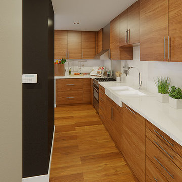
This is a proposal for a 36'x128' corner lot in South Minneapolis. The main considerations were sun exposure, privacy and as big as possible private yard.
After setbacks the workable area is 23'x95'. The house is composed of two boxes connected by a bridge. This bridge allows to keep more area on the ground level creating a covered deck for the courtyard as well as being the studio/home office area.
The features of this 3bd/3.5 br. and 2 car garage home (2400s.f above grade) are double height living room, open layout, integrated dining/kitchen and studio.
 Envision Sun & Screen Rooms an Elchin Inc. Co
Elchin Inc.
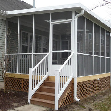
Example of a mid-sized classic backyard tile patio design in Huntington with an awning
Example of a mid-sized classic backyard tile patio design in Huntington with an awning
 Austin's Paint Guys
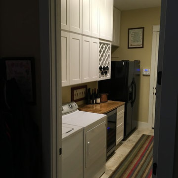
We painted this laundry room and then added cabinets for more storage. This space also serves as a wine cellar after we added granite and a wine storage space.
 Ence Homes
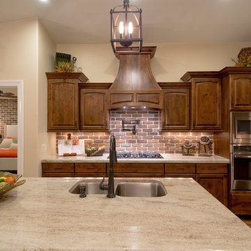
This home is our current model for our community, Tupelo Estates. A large covered porch invites you into this well appointed comfortable home. The joined great room and dining room make for perfect family time or entertaining. The workable kitchen features an island and corner pantry. Separated from the other three bedrooms, the master suite is complete with vaulted ceilings and two walk in closets. This cozy home has everything you need to enjoy the great life style offered at Tupelo Estates.
Jeremiah Barber
 User
UserA contractor installs Boral TruExterior Nickel Gap siding on the Fine Homebuilding ProHOME. TruExterior offers the workability of wood, using the same tools and fasteners.
 Trendsetter Renovations Ltd.
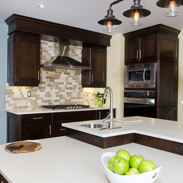
Inspiration for a large transitional l-shaped cork floor and brown floor eat-in kitchen remodel in Calgary with an island, an undermount sink, shaker cabinets, dark wood cabinets, solid surface countertops, beige backsplash, stone tile backsplash and stainless steel appliances
16