
Search results for "Adequately" in Home Design Ideas
 TVL Creative Ltd.
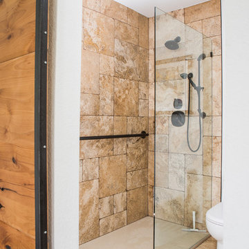
This project is an exhilarating exploration into function, simplicity, and the beauty of a white palette. Our wonderful client and friend was seeking a massive upgrade to a newly purchased home and had hopes of integrating her European inspired aesthetic throughout. At the forefront of consideration was clean-lined simplicity, and this concept is evident in every space in the home. The highlight of the project is the heart of the home: the kitchen. We integrated smooth, sleek, white slab cabinetry to create a functional kitchen with minimal door details and upgraded modernity. The cabinets are topped with concrete-look quartz from Caesarstone; a welcome soft contrast that further emphasizes the contemporary approach we took. The backsplash is a simple and elongated white subway paired against white grout for a modernist grid that virtually melts into the background. Taking the kitchen far outside of its intended footprint, we created a floating island with a waterfall countertop that can house critical cooking fixtures on one side and adequate seating on the other. The island is backed by a dramatic exotic wood countertop that extends into a full wall splash reaching the ceiling. Pops of black and high-gloss finishes in appliances add a touch of drama in an otherwise white field. The entire main level has new hickory floors in a natural finish, allowing the gorgeous variation of the wood to shine. Also included on the main level is a re-face to the living room fireplace, powder room, and upgrades to all walls and lighting. Upstairs, we created two critical retreats: a warm Mediterranean inspired bathroom for the client's mother, and the master bathroom. In the mother's bathroom, we covered the floors and a large accent wall with dramatic travertine tile in a bold Versailles pattern. We paired this highly traditional tile with sleek contemporary floating vanities and dark fixtures for contrast. The shower features a slab quartz base and thin profile glass door. In the master bath, we welcomed drama and explored space planning and material use adventurously. Keeping with the quiet monochromatic palette, we integrated all black and white into our bathroom concept. The floors are covered with large format graphic tiles in a deco pattern that reach through every part of the space. At the vanity area, high gloss white floating vanities offer separate space for his/her use. Tall linear LED fixtures provide ample lighting and illuminate another grid pattern backsplash that runs floor to ceiling. The show-stopping bathtub is a square steel soaker tub that nestles quietly between windows in the bathroom's far corner. We paired this tub with an unapologetic tub filler that is bold and large in scale. Next to the tub, an open shower is adorned with a full expanse of white grid subway tile, a slab quartz shower base, and sleek steel fixtures. This project was exciting and inspiring in its ability to push the boundaries of simplicity and quietude in color. We love the result and are so thrilled that our wonderful clients can enjoy this home for years to come!
 Leslie Klinck - Closet Factory
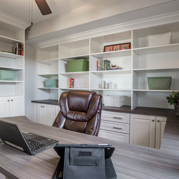
When my clients recently purchased this home, this room in the basement was a playroom for the previous owner's children. Marc works from home frequently and needed a functional, organized, and quiet space to work. In addition, he and his wife, Michele wanted to be able to store a collection of photo albums. The project had a few challenges, including the height of the window, a door that swings into the room, and a water valve access panel that needed to be moved. Marc took care of the water valve acces, and we did the rest. File storage, office supply storage, adjustable shelves, adequate counter space, crown moulding, and raised panel doors and drawers, make this room both stylish and functional.
Photographs by Libbie Martin
 Hardwall Outdoor Living
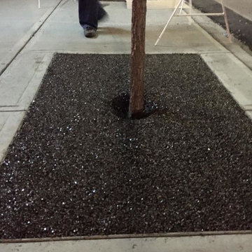
permeable base around trees (either residentially or commercially) allows for adequate water drainage and oxygen to ensure healthy root systems
This is an example of a traditional landscaping in Calgary.
This is an example of a traditional landscaping in Calgary.
Find the right local pro for your project
 Burgin Design • Remodel
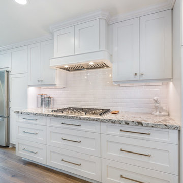
The Evanow Family longed for an open Kitchen and Dining space that provided plenty of space to move and gather around, prepare meals, and enjoy the heart of their home. There was just one major problem…a single load-bearing post.
The post was surrounded by cabinets and provided a very open pass-through to the kitchen from the small breakfast nook, but it all took up lots of room and made the space feel cramped and disconnected. It was time for a drastic change, so the family contacted Burgin Construction to see what could be done.
After taking a look with designer, Tamara Stratton, we suggested removing the load-bearing post, adding new elements to ensure that the structure was adequately supported, opening up the kitchen to accommodate a larger island, larger workstation and even a buffet area. Brand new painted finish Dewils Cabinets with contrasting stained island cabinetry turned this ho-hum kitchen into a family space filled with natural light and love for years to come.
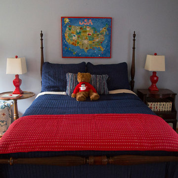
 The Prepared Nest
Refreshed, repurposed and well-organized child's bedroom designed to enhance his natural development. Reading corner, rug for play, learning and exploration, child-sized table and chairs, open shelves, adequate lighting and more.
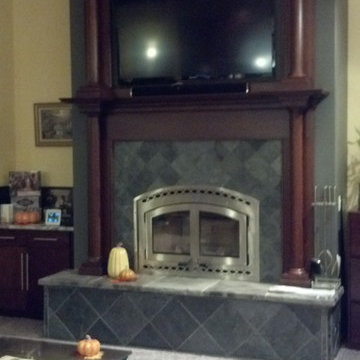
 Northwest Hearth & Home
Pictured here is a Bis Tradition wood burning fireplace installed in a new construction setting. The home is 4,000 sq.ft. and this fireplace more than adequately heats the entire home. It sits on a raised hearth (approx 24" tall) and is framed by a custom mantel and matching mantel top customized to fit the TV which is mounted within the opening. A feature wall painted a contrasting color extends above to the 30' ceiling.
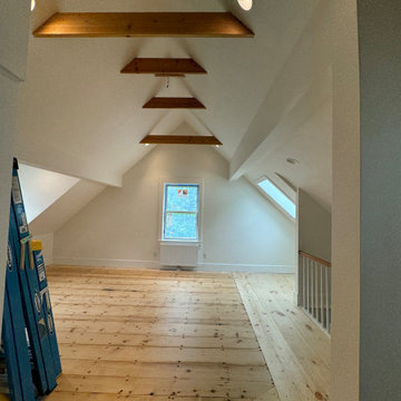
 Fixed Home Repair
When we opened up this old plaster and lathe living room we discovered a less than adequate framing. We brought in a structural engineer. We added new windows, a new sky light, created a curved ceiling to match the original home, and patched in new flooring to the old.

 FormLA Landscaping
After a winter of adequate rainfall, Hummingbird sage (Salvia spathacea) in the bioswale grew to 6 feet! Photo: Lesly Hall Photography
Photo of a huge eclectic drought-tolerant and full sun stone vegetable garden landscape in Los Angeles for spring.
Photo of a huge eclectic drought-tolerant and full sun stone vegetable garden landscape in Los Angeles for spring.
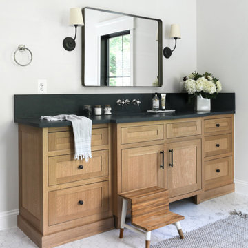
 Peltier Interiors
This farmhouse designed by our Virginia interior design studio showcases custom, traditional style with modern accents. The laundry room was given an interesting interplay of patterns and texture with a grey mosaic tile backsplash and printed tiled flooring. The dark cabinetry provides adequate storage and style. All the bathrooms are bathed in light palettes with hints of coastal color, while the mudroom features a grey and wood palette with practical built-in cabinets and cubbies. The kitchen is all about sleek elegance with a light palette and oversized pendants with metal accents.
---
Project designed by Vienna interior design studio Amy Peltier Interior Design & Home. They serve Mclean, Vienna, Bethesda, DC, Potomac, Great Falls, Chevy Chase, Rockville, Oakton, Alexandria, and the surrounding area.
---
For more about Amy Peltier Interior Design & Home, click here: https://peltierinteriors.com/
To learn more about this project, click here:
https://peltierinteriors.com/portfolio/vienna-interior-modern-farmhouse/
 THE Remodel Group
 Behind the unassuming exterior of a 1985 split-level home in Southwest Portland lies a dramatic transformation that celebrates both function and style. This kitchen renovation reimagines a dated footprint as an upscale postmodern gathering space, blending bold material selections with highly personalized storage solutions designed around the homeowners' lifestyle.
At the heart of the design is a striking composition of rich Sapele cabinetry, geometric white tile, and sleek contemporary finishes. The strong vertical grain of the wood creates warmth and movement throughout the space, while the dimensional backsplash introduces texture and visual rhythm. Together, these elements establish a distinctly postmodern aesthetic that balances nostalgia with modern sophistication.
The renovation began with a common challenge: a kitchen that lacked adequate storage and efficient workflow. Appliances were confined to tight corners, cabinetry was undersized, and valuable space was underutilized. Through strategic space planning, the layout was completely reworked to maximize functionality without sacrificing design. Every cabinet was thoughtfully customized with purpose-built storage, including integrated silverware organization, hidden tip-out trays for cleaning supplies, vertical dividers for baking sheets, and heavy-duty rollouts sized for everyday cookware.
The island serves as the functional centerpiece of the kitchen and was designed specifically to support meal preparation and entertaining. Adjustable pullout shelving accommodates oils and vinegars, specialized spice storage keeps ingredients within reach, and a double waste system simplifies composting and daily clean-up. Throughout the kitchen, panel-ready appliances and carefully concealed storage components maintain the clean lines of the design while minimizing visual distractions. A hidden microwave, integrated warming drawer, and counter-depth refrigerator all contribute to the seamless appearance of the space.
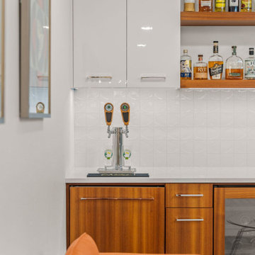
Entertaining was a primary objective for the homeowners and inspired the creation of a dedicated hospitality zone within a previously overlooked nook. Existing built-in bookcases were removed and replaced with a thoughtfully curated beverage station featuring a kegerator, wine refrigerator, and beverage refrigerator. Custom cabinetry was tailored to display the homeowners' collection of cocktail and pint glasses, while floating shelves with integrated lighting showcase an assortment of spirits, creating an inviting destination for guests before dinner gatherings.
What makes this project especially compelling is the balance between bold design expression and everyday livability. Rather than competing for attention, each material was selected to complement the others. High-gloss upper cabinetry quietly recedes into the dimensional backsplash, allowing the Sapele grain to remain the focal point. Chrome fixtures add reflectivity and polish, while waterfall countertops transform the island into a furniture-inspired centerpiece. Even details such as electrical cover plates were carefully selected to blend into the surrounding wood grain and preserve the clean visual composition.
The completed kitchen demonstrates how thoughtful design can transform an ordinary floor plan into a highly customized environment tailored to the way homeowners live, cook, and entertain. By combining meticulous storage planning, seamless appliance integration, and a confident postmodern aesthetic, this renovation delivers a sophisticated yet welcoming space where functionality and personality coexist beautifully.
 Castle Building & Remodeling
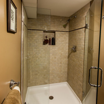
This 1949 South Minneapolis home had an underutilized, unwelcoming basement with old, dark paneling in the family room, and an unfinished laundry, storage and work shop area. Headroom was at a premium because of low hanging duct work, plumbing and gas lines.Castle Building & Remodeling transformed this basement by creating a much more welcoming, well-lit and functional family room, with an added egress window, built-in storage units and a media area with a flat screen TV. Duct work and piping in the unfinished half of the basement was raised or consolidated to give adequate headroom for a bright and spacious new laundry area.
A new 3/4 bath completes the package, along with a built-in linen cabinet in the finished hallway. Storage areas were consolidated in separate areas of the basement with their own access doors.
The family now eagerly uses the basement space as a regular part of their home, no longer dreading the trip down to the ‘cellar’.
 Kohn Shnier architects
This impressive detached building is located in the heart of the bustling Dundas West strip, and presents a unique opportunity for creative live + work space.
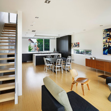
Designed by Kohn Shnier Architects, the building was completed in 2008 and has been owner-occupied ever since. Modern steel and concrete construction enable clear spans throughout, and the virtual elimination of bulkheads. The main floor features a dynamic retail space, that connects to a lower level with high ceilings – perfect as a workshop, atelier or as an extension of the retail.
Upstairs, a spacious loft-like apartment is spread over 2 floors. The mainfloor includes a decadent chef’s kitchen finished in Corian, with a large eat-at island. The combined living & dining rooms connect with a large south-facing terrace with exceptional natural light and neighbourhood views. Upstairs, the master bathroom features abundant built-in closets, together with a generous ensuite bathroom. A second open space is presently used as a studio, but is easily converted to a closed 2nd bedroom.
Parking is provided at the rear of the building, and the rooftop functions as a green roof. The finest materials have been used in this very special building, from anodized aluminium windows paired with black manganese brick, to high quality appliances and dual furnaces to provide adequate heating and fire separation between the retail and residential units. Photo by Tom Arban
 JFF Design Architects
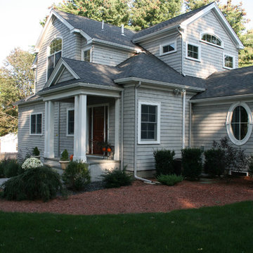
This home is nestled within the quiet Belmont Hill neighborhood originally constructed in the early 1960′s and in need of dramatic updating. We determined the house was sited correctly to the lot but not necessarily to the street. We focused on developing the living spaces allowing for large family gatherings. This family of six each appreciates their own space within this major addition. The challenge on this type of sloping lot is to provide adequate space without overbuilding the structure. The series of sloping ceilings in the upper story provides dynamic spaces suitable for bedrooms and expressing creative windows that provide animation through natural light.
-JFF Design Architects
 Showpiece Kitchen & Bath
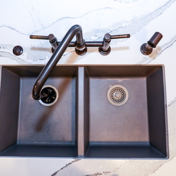
Beautiful rustic kitchen with modern touches. The floating shelves were handmade out of white oak and stained to match the floors. An open floor-plan and adequate storage were important to this family.
 Naikoon Contracting Ltd
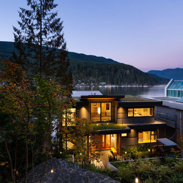
This project has three components, which is all built differently.
The main house is a waterfront property at the bottom of a steep cliff. All machine and materials are delivered by barge. Concrete is pumped from the top of the cliff down to the bottom with a 400ft line into a boom pump which was delivered by barge. Due to the challenging access to the site, most of the structural backfill is actually Styrofoam (EPS) backfill.
The garage is built from the top of the cliff, with a 27ft tall foundation wall. We needed to excavate to solid bedrock in order to adequately anchor the foundation into the hillside. This tall foundation wall are 10″ thick with a double grid of rebar to retain approximately 350 cu yards of fill. Styrofoam backfill was also used. A funicular (tramway) is also being built on this project, which required it’s own building permit.
Image by Ema Peter Photography
 User
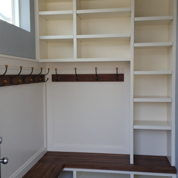
UserThis mudroom was designed with a custom walnut bench, white paneling with mounted walnut coat rack and hooks, and built-in white, open shelving. John collaborated with his client to create a modern space in their mudroom that provided adequate seating for their kids and storage for all their shoes, bags, and belongings.
 Corinthian Fine Homes
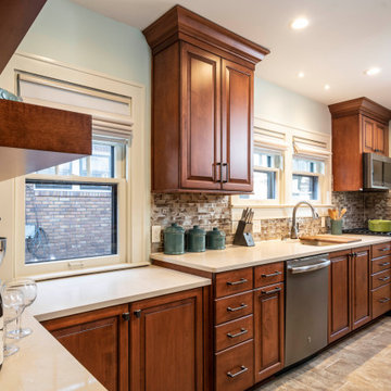
This homeowner loved her home and location, but it needed updating and a more efficient use of the condensed space she had for her kitchen.
We were creative in opening the kitchen and a small eat-in area to create a more open kitchen for multiple cooks to work together. We created a coffee station/serving area with floating shelves, and in order to preserve the existing windows, we stepped a base cabinet down to maintain adequate counter prep space. With custom cabinetry reminiscent of the era of this home and a glass tile back splash she loved, we were able to give her the kitchen of her dreams in a home she already loved. We attended a holiday cookie party at her home upon completion, and were able to experience firsthand, multiple cooks in the kitchen and hear the oohs and ahhs from family and friends about the amazing transformation of her spaces.
 Residential Interiors
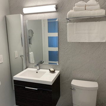
A gray and white colour scheme considerabl;e calms this space . Floating vanity and mirrored storage door visually enlarge it, and with adequate storage to contain necessities, this tiny bathroom has become a calming ensuite.
 Dreamwork Kitchens
From builder standard to designer upgrade.
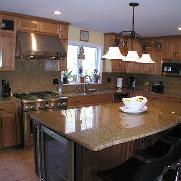
A recent project of ours in Harrison NY had us taking an adequate builder designed kitchen to something much more special. The original layout led to traffic jams while entertaining and valuable storage was lost due to the fact that the cabinets did not go to the ceiling.
The new design moves the refrigerator out of the traffic pattern that often lead to gridlock
in previous years as well as providing ample storage for trays and baking sheets in the slim pantry. Grillwork doors allow for airflow from the air-conditioning vents, while still allowing for cabinets to the ceiling.
A professional grade range replaces the old smaller model, with a heavy-duty hood to assure complete ventilation no matter what the cook creates. The microwave moves farther down the work triangle to assure that the heating of a cup of coffee or bag of popcorn need never interfere with the chef again. Equally of value is the island mini-frig not just to chill the occasional bottle of wine, but to keep the kids sodas out the main refrigerator.
And then there is the desk/ command central area. The formerly blank wall where no piece of furniture seemed to fit, because of the radiator, has become an efficient home office.
With room for two people to work, grown-ups can search Food Network for recipes while the kids do their homework – problem area solved!

 Murphy Bros. Design | Build | Remodel
These Excelsior homeowners bought this property primarily for the lakeshore view. All was well until they realized that the floor plan didn’t leave adequate room for a larger kitchen remodel and a dining room. Their first attempt to design a large enough dining addition with another remodeler failed. So, they lived in frustration without the dining room view for years.
Fortunately, for all of us, their next-door neighbors had just finished a deck/sauna remodel with Murphy Bros. and gladly made the referral to us.
Now they have a 9 x 12 foot dining room addition, with an 8 x 12 foot deck extension off the dining room, all seamlessly integrated into their existing structure. To stay within budget, we re-used the decking to extend the deck off the new addition. We also designed a slanted pergola over the existing deck for added visual interest.
51