
Search results for "Bulkhead" in Home Design Ideas
 McAdams Remodeling & Design
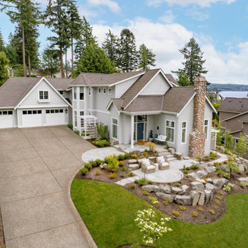
Kirkland clients, Shayna and Anthony had a lovely home with a beautiful view of Lake Washington. However, the waterfront side of their home didn’t offer an ideal set-up to fully enjoy the magnificence that their lot provides. They desired more year-round use of their home in the form of an outdoor covered living room, along with more overall functionality from their outdoor spaces.
Their formal living area had a door to the outside that the couple never used. The McAdams Remodeling & Design team replaced the sliding door with a window that still offered plenty of natural light but enclosed the space providing more options for furniture placement. The room’s exterior stairs and landing were removed. The exterior siding was matched, and the new landscaping along with an arbor installed, was created in tandem during the remodel by a local landscape architecture firm, ensuring the change looked natural.
Past the seating around the gas firepit, a new large deck was constructed, half of which was covered, to replace the smaller, dated version. The metal railing was exchanged for a new composite one, and a new Dutch back door leading from the kitchen offers an alternative option for ingress and egress along with fresh air on nice days. The covered deck area adjacent to the family room provides protection from the weather and now houses the outdoor kitchen they desired for entertaining family and friends. The outdoor kitchen includes a built-in gas grill, stone gas fireplace, refrigerator for food and beverages, and a garbage receptacle. A ceiling fan and heaters are incorporated into the outdoor living space design to provide year-round comfort. Finally, retractable shades were installed so that the couple can enclose the space if desired.
A small upstairs bedroom was used as a den for relaxation and reading but also contains one of the best views in the home. The McAdams team removed the windows and base bulkhead, adding floor to ceiling windows and a glass door for an unobstructed view. The new medium-sized deck above the covered outdoor living space gives Shayna and Anthony the opportunity to entertain or relax while highlighting their view of the lake. Finally, their Juliet balcony off the primary bedroom received a re-coated railing and new decking, while the home was repainted to offer a classy craftsman feel and pull all of the changes into one cohesive home design.
Shayna and Anthony love their new entertainment spaces and expect to use them often.
 Atelier Lawrence Cheung
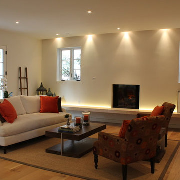
The definitive idea behind this project was to create a modest country house that was traditional in outward appearance yet minimalist from within. The harmonious scale, thick wall massing and the attention to architectural detail are reminiscent of the enduring quality and beauty of European homes built long ago.
It features a custom-built Spanish Colonial- inspired house that is characterized by an L-plan, low-pitched mission clay tile roofs, exposed wood rafter tails, broad expanses of thick white-washed stucco walls with recessed-in French patio doors and casement windows; and surrounded by native California oaks, boxwood hedges, French lavender, Mexican bush sage, and rosemary that are often found in Mediterranean landscapes.
An emphasis was placed on visually experiencing the weight of the exposed ceiling timbers and the thick wall massing between the light, airy spaces. A simple and elegant material palette, which consists of white plastered walls, timber beams, wide plank white oak floors, and pale travertine used for wash basins and bath tile flooring, was chosen to articulate the fine balance between clean, simple lines and Old World touches.
 Jordan Design Build Group
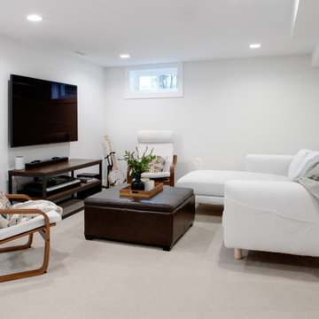
The old basement was a warren of random rooms with low bulkheads crisscrossing the space. A laundry room was awkwardly located right off the family room and blocked light from one of the windows. We reconfigured/resized the ductwork to minimize the impact on ceiling heights and relocated the laundry in order to expand the family room and allow space for a kid's art corner. The natural wood slat wall keeps the stairway feeling open and is a real statement piece; additional space was captured under the stairs for storage cubbies to keep clutter at bay.
Find the right local pro for your project
 Laqfoil Ltd.
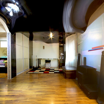
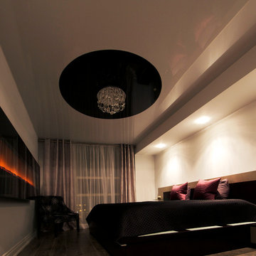
Instead of creating drywall (GWB) bulkheads, we hid this homeowner's ducts and pipes without making the new ceiling very low by curving the support profiles for the new black high gloss stretch ceiling so that it flows organically around the ceiling structures. The resulting 3D shape completes this basement renovation beautifully, saving the client both time and money.
 BCN Homes
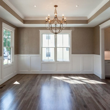
Example of a cottage medium tone wood floor and brown floor enclosed dining room design in DC Metro with beige walls
 Turnbull Interiors of Distinction Inc.
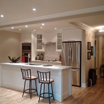
The use of small bulkheads to create ceiling coffers allows crown moulding to bring continuity to interior architectural finishing.
Example of a transitional kitchen design in Toronto
Example of a transitional kitchen design in Toronto


 GMT Home Designs Inc.
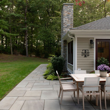
The original 10' x 12' den was demolished to create a 20' x 25' family room addition with 1200sf of outdoor living space. This addition created a beautiful connection to the rest of the home with large windows, a cathedral ceiling and plenty of space for the family to gather.
 Renaissance Interiors
Deborah Maguire
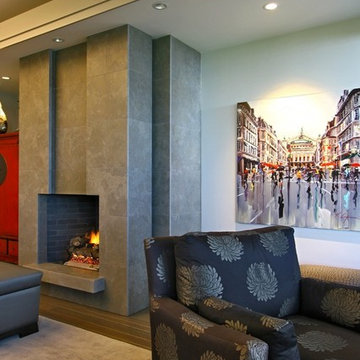
Example of a trendy formal and enclosed dark wood floor living room design in Vancouver with white walls, a standard fireplace, a concrete fireplace and no tv
Example of a trendy formal and enclosed dark wood floor living room design in Vancouver with white walls, a standard fireplace, a concrete fireplace and no tv
 Lagois Design Build Renovate
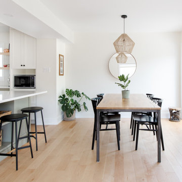
Step into a cozy and inviting atmosphere – a Hygge-inspired Scandinavian kitchen that is sure to warm the heart and bring the family closer together. Previously closed off and isolated from the rest of the home and family, we opened up walls between the kitchen and dining room and created an open-concept space that encourages togetherness and shared moments. Goodbye to isolation and hello to a kitchen that not only looks stunning but also fosters a sense of unity and connection.
The front of the home now has a full glass door as well as a full glass side panel to allow more light into the front entrance. The homeowners needed more storage, so we created a floor-to-ceiling bank of pantry cupboards in an unused part of the eat-in kitchen, and we also created more storage under the bench.
The removal of the wall was a little challenging because it was a load-bearing wall. We needed to add a full-span beam around to the back of the home and have it installed in one piece. We had to reroute the mechanical systems, a bulkhead and mechanical chase now to hide the beam and the plumbing.
The selections and colours – light cabinetry with sage-coloured lower cabinets, white countertops and natural maple hardwood – add to the beautiful open feeling the homeowners wanted. The original kitchen had dated finishes and was tired looking. The peninsula and meal-homework-and-crafts nook make the perfect setting for a young family.
 Friel Lumber Company
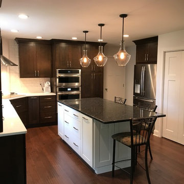
The homeowners chose to install perimeter cabinets using Dynasty by Omega. They chose the Madrid door style, Cherry wood, and a truffle stain. As for the island cabinets, they wanted the Madrid door style and Maple wood and then opted for the Pearl paint. The countertops are quartz and the island is granite.
Before the renovation started, the homeowners selected Jenn-Air appliances, including an induction cooktop and built-in microwave oven with speed cook. Once the construction was underway, we removed the bulkheads to allow new cabinets that extended to the ceiling with two PC crown molding. This provided a cleaner, more modern look along with added storage for items that are occasionally used.
We also swapped the pantry and refrigerator location to open up space as you enter the kitchen from the garage. The redesign also gave the refrigerator a built-in look. Then, we moved the cooktop to the corner and installed stainless steel Zephyr range hood and beveled subway tile in a herringbone pattern. The backsplash and new cooktop turned the most used area of the kitchen into a design feature.
The addition of an enlarged island allows extra seating for up to four people. Moreover, island cabinets include two full-sized waste baskets for recycling and standard waste. The new farmhouse sink from Kohler not only looks and functions well but the drain is positioned at the rear corner. The plumbing in the cabinet below is consolidated to the back corner providing much more storage. Last, the built-in TV not only looks great but also reduces counter clutter. Plus, the drawer below the TV contains USB outlet for small personal device charging.
 Michael Nash Design, Build & Homes
2013 NARI CAPITAL COTY, GRAND AWARD WINNER, RESIDENTIAL KTICHEN $80,001 -$120,000
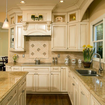
This Old Town Alexandria home was ready for a major kitchen renovation. After 20 years of putting up with the dark, short cabinets and a dysfunctional traffic pattern and layout, the owners were ready to roll up their sleeves and throw this kitchen out the window.
Design challenges include a peninsula that was too big for the space, appliance locations that were all over, a stackable washer and dryer in the middle of the kitchen and a lack of storage.
The first step toward a remodeling solution was to move the washer and dryer to a new lower level laundry area. That created space for a new built-in refrigerator, microwave/oven cabinet, pantry and angular end cabinets. This move also created more room on the walls of kitchen for added cabinetry and countertops.
The cook top was moved to one of the walls with a custom wood hood over it. Having removed the old bulkheads, there was space for taller cabinets and some glass front cabinetry (with inside lights) to display china. Large crown molding, along with big arched valances, legs and corbels made this brushed stoke custom cabinetry really stand out.
A big knee wall and a middle post made the breakfast room too closed in and separated from adjacent family room. By installing a couple of structural beams, the space was opened up and dressed up with a large arch opening to replicate the front hall columns.
Similarly, the front door separating the front hall to the kitchen was taken off, widened and then had the same panel arch treatment done. Now all the doorways in the home have a very classy, yet sophisticated detailed molding.
A previously wasted corner area is now home to a custom hutch cabinet. The middle island, not only improved the traffic flow, but also dressed up this kitchen with its furniture look. The expansion of hardwood flooring, from the front hall into the kitchen and beyond, created a seamless transition to the entire first floor.
Use of this highly custom brushed stroke glazed cabinetry in a soft vanilla tone complemented the uniqueness of a slab of granite. The light color tumbled marble backsplash made the glazing of this cabinetry stand out. The transformation of this kitchen was so incredible that no one believes the before photos.


 Garrison Homes
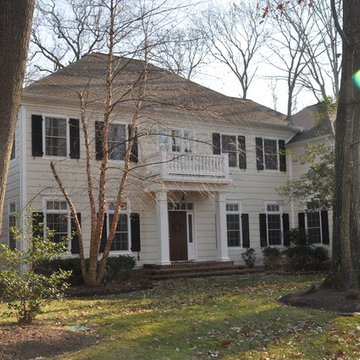
Inspiration for a timeless beige two-story concrete fiberboard exterior home remodel in Philadelphia
 Distinctive Contracting Services
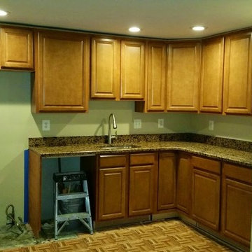
Before photo shows original kitchen. Remodel received new LED lighting, new full height cabinets, new electrical upgrade, dishwasher, microwave, remove bulkheads, removed vent fan, undermount stainless sink, granite tops, over sink LED lamps.
 Jordan Design Build Group
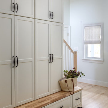
Relocating the hallway for the kitchen redesign, required us to reimagine the rear entryway, mudroom, laundry room and pantries. We replaced dated travertine tile with the blonde maple floors to maintain consistency and connection. In the previous mudroom a bulkhead intersected the vaulted ceiling so we opted to remove it and open up the stair wall to create a brighter more welcoming entry. The mudroom cabinetry was designed with concealed storage in mind which helps keep this drop zone neat and tidy. A wood block benchtop complements the refinished maple floors and updated stair railings. In the adjacent laundry room, handcrafted tiles on the floor and backsplash infuse the space with charm.
 Laqfoil Ltd.
The issues that annoyed the family in this condo are common to new condo units: Low ceilings covered with a popcorn finish, small rooms, low light in the bedrooms and living room, and no ceiling light fixtures. Concrete ceilings are not only difficult to drill into to install fixtures, installing wiring behind them for such fixtures is impossible. There are often conduits for building services embedded in the concrete along with structural steel reinforcements, so drilling without x-raying first is dangerous.
Laqfoil stretch ceiling provided a solution to all of these issues for this condo unit. A high gloss finish was chosen, as the reflections visually double the height of the space. Installing a stretch ceiling also naturally conceals the popcorn ceiling behind it, but in this case, was also used to conceal the wiring necessary to add ceiling lights in every room. The wiring was simply attached to the existing popcorn ceiling. Laqfoil stretch ceiling is supported around the perimeter only, by tracks, or profiles which are only about 0.75" thick. The ceiling membrane itself is less than one millimetre thick.
We also added a small vector graphic, printed in each corner of the living room ceiling, for a unique aesthetic effect.
We constructed a suspended bulkhead above the island and covered it with red high gloss membrane, to visually separate the kitchen and living room while keeping the design's open concept. This also provided a supporting structure for 3 mini chandelier pendant lights.
A red rose depicted on a black and white textured ground was chosen for the kitchen ceiling and applied using digital wide format printing technology, to tie the red, black and white colour scheme with the kitchen cabinets' texture.
61