
Search results for "Ensures" in Home Design Ideas
 Drury Design
THE SETUP
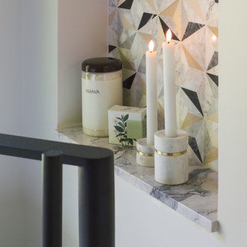
While the existing layout wasn’t inherently flawed, this primary bathroom felt outdated and lacked the desired aesthetic appeal for our client. The goal was to revitalize the space, catering to her refined taste while ensuring a bright, inviting ambiance. The client wanted a comfortable and classy gender-neutral design that would retain its updated look and have broad appeal for eventual resale.
Design Objectives:
Create a spacious, luxurious shower enclosure
Incorporate ample storage for towels, linens and an extensive hair care collection
Embrace a transitional design style that blends contemporary and classic elements
Establish a harmonious color palette that complements the home’s new black window frames
Ensure a future-proof design to maximize resale potential
Design Challenges:
Integrating a spacious shower within the existing layout
Ensuring accessible towel and robe storage near the shower and tub areas
Providing ample lighting and mirror space without cluttering the vanity area
Finding dedicated storage for hair care essentials and accessories
Maximizing linen storage while minimizing clutter
Decluttering the tub niche area
Tall angled ceiling almost too dramatic
THE RENEWED SPACE
Design Solutions:
Frameless glass shower enclosure with a recessed niche (in the half wall) for body care products
Strategically placed robe/towel hooks on shower glass facing shower and tub
Illuminated, oversized mirrors with integrated lighting
Multiple large pull-out drawers with electrical outlets in the vanity
Dedicated base cabinet with countertop for towel/linen storage and decor
Single, spacious tub niche for products and decorative accents
Subtle horizontal trim lines at standard ceiling height to visually ground the space
This primary bathroom remodel seamlessly blends style and functionality, catering to the client’s discerning taste while ensuring adaptability for future needs. The harmonious fusion of contemporary and classic design elements, coupled with innovative storage solutions and thoughtful lighting choices, creates a timeless sanctuary that exudes elegance and comfort.
 Drury Design
THE SETUP
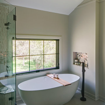
While the existing layout wasn’t inherently flawed, this primary bathroom felt outdated and lacked the desired aesthetic appeal for our client. The goal was to revitalize the space, catering to her refined taste while ensuring a bright, inviting ambiance. The client wanted a comfortable and classy gender-neutral design that would retain its updated look and have broad appeal for eventual resale.
Design Objectives:
Create a spacious, luxurious shower enclosure
Incorporate ample storage for towels, linens and an extensive hair care collection
Embrace a transitional design style that blends contemporary and classic elements
Establish a harmonious color palette that complements the home’s new black window frames
Ensure a future-proof design to maximize resale potential
Design Challenges:
Integrating a spacious shower within the existing layout
Ensuring accessible towel and robe storage near the shower and tub areas
Providing ample lighting and mirror space without cluttering the vanity area
Finding dedicated storage for hair care essentials and accessories
Maximizing linen storage while minimizing clutter
Decluttering the tub niche area
Tall angled ceiling almost too dramatic
THE RENEWED SPACE
Design Solutions:
Frameless glass shower enclosure with a recessed niche (in the half wall) for body care products
Strategically placed robe/towel hooks on shower glass facing shower and tub
Illuminated, oversized mirrors with integrated lighting
Multiple large pull-out drawers with electrical outlets in the vanity
Dedicated base cabinet with countertop for towel/linen storage and decor
Single, spacious tub niche for products and decorative accents
Subtle horizontal trim lines at standard ceiling height to visually ground the space
This primary bathroom remodel seamlessly blends style and functionality, catering to the client’s discerning taste while ensuring adaptability for future needs. The harmonious fusion of contemporary and classic design elements, coupled with innovative storage solutions and thoughtful lighting choices, creates a timeless sanctuary that exudes elegance and comfort.
 Homeowner Services of Michigan LLC
Our clients found their perfect home in the ideal location, with just one catch...they didn't love the interior. It was a little dated.
We can fix that!
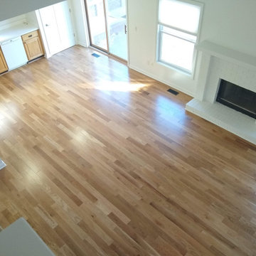
And so we did. Starting with new hardwood floors, we painted the kitchen cabinets, added new carpeting to the staircase, new tile floors in the upstairs bathrooms, new comfort-height toilets, and fresh paint throughout the home.
We chose distinct colors for the ceiling, trim, doors, and walls, ensuring a harmonious yet dynamic look. The fireplace brick and trim received a fresh coat, and the stair railings were painted to create a cohesive and modern aesthetic.
Revamping the Kitchen
We installed a new sink and faucet in the kitchen to enhance functionality and style. Removing the half-wall opened up the space, and we relocated the electrical socket to the outside wall for better accessibility and a cleaner look.
Hardwood and Vinyl Flooring
We installed beautiful hardwood flooring throughout the home, excluding the laundry room and the tub area of the master bathroom. The two upstairs bedrooms, covering approximately 350 square feet, now boast the elegance of hardwood. We laid luxury vinyl flooring in the laundry room and upstairs bath for practical and aesthetic purposes, combining durability with style.
Upgrading Doors
To add a touch of luxury, we replaced four hollow doors with solid wood doors in the master bedroom, front TV room, and two upstairs bedrooms. Additionally, we hung a slab door in the basement, all provided by the homeowner, ensuring their taste was reflected in the updates.
Addressing Miscellaneous Needs
We didn't overlook the details. The access panel to the tub in the upstairs bedroom closet was repaired to ensure functionality and aesthetic continuity. We also provided and installed a half-size utility sink in the laundry room, enhancing its practicality.
A Client-Centered Approach
Throughout the project, our priority was maintaining a clean and organized worksite, minimizing disruption to our client's daily life. We focused on clear communication, ensuring our client's needs and preferences guided every step of the process.
This interior makeover is a testament to our dedication to delivering high-quality results tailored to our clients' visions. We are proud to have transformed this home into a more beautiful, functional, and comfortable space for our clients.
Find the right local pro for your project
 EA Home Design
We are thrilled to unveil our latest bathroom remodeling project, a seamless blend of modern design and functional elegance. Here's a glimpse into the transformation:
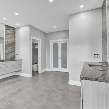
1. Contemporary Palette: The choice of a grey color tile sets a sophisticated and neutral backdrop, allowing the features of the bathroom to shine. This hue not only exudes a sense of calm but also complements the contemporary design elements we've incorporated.
2. Warmth Underfoot: One of the standout features of this remodel is the heated flooring that runs under all the tiled areas. This luxurious addition ensures that even on the coldest mornings, your feet are greeted with a warm embrace, elevating the comfort level of the bathroom.
3. Enhanced Layout: Recognizing the need for more convenience, we repositioned the shower and introduced a second toilet room. This not only maximizes the use of space but also ensures that the bathroom can cater to multiple users without any hassle.
4. Dual Shower Spaces: By eliminating two angles in the bathroom's corner, we've carved out space for two distinct shower areas. This design choice not only adds a touch of luxury but also offers a versatile bathing experience tailored to individual preferences.
5. Wet Room Wonder: The shower and tub area now reside within a waterproof wet room. This innovative design ensures that water stays where it's supposed to, eliminating the need for a curb and offering a sleek, uninterrupted flow to the space.
6. Floating Vanities: Our floating vanities are more than just a design statement. They create an illusion of space, making the bathroom appear larger and more open. Paired with a stunning stone backsplash, they offer a perfect blend of style and functionality.
7. Illuminated Elegance: The mirrors, with their integrated lights, are the pièce de résistance. They not only enhance the aesthetic appeal of the bathroom but also ensure optimal lighting, making daily grooming tasks a breeze.
This bathroom remodel is a testament to our commitment to marrying design with functionality. Every element, from the choice of tiles to the heated floors, has been thoughtfully chosen to create a space that is not just visually appealing but also supremely functional and comfortable. We invite you to step in and experience this modern oasis for yourself.
 Liberty Kitchen Design
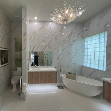
In the heart of Delray Beach, FL, lies a cabinetry store that is redefining the essence of functional spaces with its unparalleled custom cabinets and cabinetry services. Liberty Kitchen Design stands as a beacon of creativity and craftsmanship, offering homeowners the unique opportunity to bring their dream kitchens and bathrooms to life. The pursuit of perfect cabinetry design is not just about storage solutions; it's about creating spaces that reflect the homeowner’s personal style while ensuring every inch serves a purpose. With an extensive array of options, from classic to contemporary, every design is executed with precision and attention to detail, ensuring that each piece is as beautiful as it is functional.
The foundation of Liberty Kitchen Design's offering is deeply rooted in its expertise and a relentless commitment to quality. For over seven years, this cabinetry store has been transforming homes across South Florida, guided by a philosophy that combines aesthetic elegance with practicality. Through the use of top-tier brands and materials, the team elevates every project they undertake, ensuring durability and timeless appeal. The service goes beyond mere installation; it’s a comprehensive design solution that takes into account the homeowner's lifestyle, the architecture of the space, and the seamless integration of form and function.
Embarking on a cabinetry project with Liberty Kitchen Design is a journey of collaboration. From the initial consultation to the final reveal, the team works closely with each client to understand their vision and requirements. This personalized approach allows for a fully customized space that meets every need and desire. Whether it’s a kitchen that becomes the heart of the home or a bathroom that offers a sanctuary of relaxation, the focus is always on tailoring the space to suit the individual. The meticulous planning and design process, combined with the skilled craftsmanship, results in cabinetry that not only serves its purpose but also adds value and character to the home.
Selecting the right partner for your cabinetry needs is crucial in achieving the home of your dreams. Liberty Kitchen Design in Delray Beach, FL, with its proven track record and commitment to excellence, offers a service that goes beyond the conventional. It’s not just about fitting cabinets; it’s about creating a space that you love, a space that reflects who you are, and a space that stands the test of time. With an unwavering dedication to customer satisfaction and a portfolio that speaks volumes of their capability, stepping into their showroom is the first step towards realizing the potential of your home. Explore the possibilities and watch as your vision is transformed into reality, with every detail meticulously catered to, ensuring your home is exactly as you imagined, if not better.
 KURV Architecture DPC (Alex Hughes Architects)
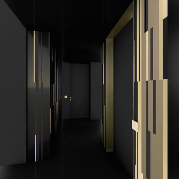
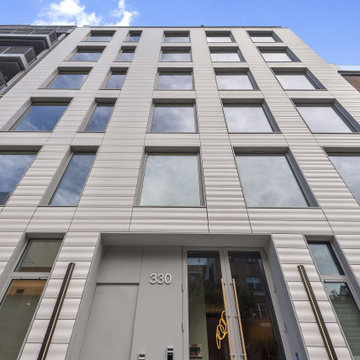
Located in the heart of Manhattan’s Lower East Side, the building was erected on a shallow commercial lot between two 120 year old masonry buildings and a new residential rental building. 330 Grand Street is a mix of 725 SF 1BRs and 1050 SF 2BR apartments. It also contains a 1100 SF two story duplex as well as private and public rooftop space, large private balconies for most units and two large private terraces for the ground floor units.
330 Grand Street was originally designed and approved at the NYC DOB as a prefabricated modular building. During the pandemic, as shipping costs skyrocketed putting the project at risk, we suggested redesigning the building as a reinforced cast-in-place concrete structure. Concrete was readily available and prices had not been affected by the demand increase that many other materials suffered in the pandemic. We took this opportunity to raise floor to ceiling heights, enlarge high performance windows and redistribute the buildings MEPFS and Structural Systems to create very open floor plans.
The challenge was to create a luxurious sensorial living experience with very limited means. In a city with very high construction costs, low cost residential buildings in the area are usually devoid of good quality, design and character. Our approach was to aim high for the end user, prioritizing natural light, open space with long visual perspectives, high ceilings and as always, rejecting the use of predefined building templates.
Our biggest challenge was to ensure that the small spaces feel as clean cut, large and bright as possible. Several unique design decisions were made to ensure low cost and high quality;
Floor plans were laid out so that spaces were wide open and free of clutter from mechanical or structural interruptions. Therefore all infrastructure was placed in lateral demising walls, which in turn act as the unit’s storage and kitchen. The apartments feel wide open, are super quiet and have more storage space than any other comparable apartment in the city.
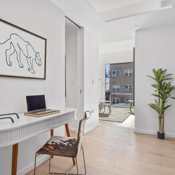
To solve the problem of the site’s shallow commercial lot which is typically prone to dark interior spaces we focused our attention on the building’s envelope. Instead of the usual small punched window openings, oversized high performance windows were designed to ensure that light penetrated as far as possible into the units. In the smaller 1BR units, the full 50’ depth of the lot is perceived by partitioning spaces with sliding pocket doors that can be retracted to allow deep visual perspectives, making the sight lines in the space feel longer, larger, more ample than normal. In addition to the full height glazing, each unit above the 2nd floor receives a 7 foot covered balcony, adding 120 to 240 sf to each apartment, something unusual in New York City buildings. The space is large enough for a full size dining table, when the weather permits being outside.
We also worked hard to ensure modularity. For example, all kitchen units are all identical throughout the building. The idea of modularity and the economy of the repetitive unit is exercised to the maximum through the building.
Hardware, appliances, flooring, wall coverings and material finishes are all carefully selected to feel bespoke, high quality and unique.
It was important to KURV that the result of this work manifest into something that would deeply connect with the end user and sustain relationships with the consumers of this space.
All images by KURV Architecture ©
 EA Home Design
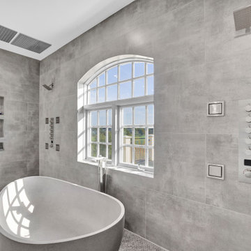
We are thrilled to unveil our latest bathroom remodeling project, a seamless blend of modern design and functional elegance. Here's a glimpse into the transformation:
1. Contemporary Palette: The choice of a grey color tile sets a sophisticated and neutral backdrop, allowing the features of the bathroom to shine. This hue not only exudes a sense of calm but also complements the contemporary design elements we've incorporated.
2. Warmth Underfoot: One of the standout features of this remodel is the heated flooring that runs under all the tiled areas. This luxurious addition ensures that even on the coldest mornings, your feet are greeted with a warm embrace, elevating the comfort level of the bathroom.
3. Enhanced Layout: Recognizing the need for more convenience, we repositioned the shower and introduced a second toilet room. This not only maximizes the use of space but also ensures that the bathroom can cater to multiple users without any hassle.
4. Dual Shower Spaces: By eliminating two angles in the bathroom's corner, we've carved out space for two distinct shower areas. This design choice not only adds a touch of luxury but also offers a versatile bathing experience tailored to individual preferences.
5. Wet Room Wonder: The shower and tub area now reside within a waterproof wet room. This innovative design ensures that water stays where it's supposed to, eliminating the need for a curb and offering a sleek, uninterrupted flow to the space.
6. Floating Vanities: Our floating vanities are more than just a design statement. They create an illusion of space, making the bathroom appear larger and more open. Paired with a stunning stone backsplash, they offer a perfect blend of style and functionality.
7. Illuminated Elegance: The mirrors, with their integrated lights, are the pièce de résistance. They not only enhance the aesthetic appeal of the bathroom but also ensure optimal lighting, making daily grooming tasks a breeze.
This bathroom remodel is a testament to our commitment to marrying design with functionality. Every element, from the choice of tiles to the heated floors, has been thoughtfully chosen to create a space that is not just visually appealing but also supremely functional and comfortable. We invite you to step in and experience this modern oasis for yourself.
 EA Home Design
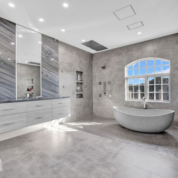
We are thrilled to unveil our latest bathroom remodeling project, a seamless blend of modern design and functional elegance. Here's a glimpse into the transformation:
1. Contemporary Palette: The choice of a grey color tile sets a sophisticated and neutral backdrop, allowing the features of the bathroom to shine. This hue not only exudes a sense of calm but also complements the contemporary design elements we've incorporated.
2. Warmth Underfoot: One of the standout features of this remodel is the heated flooring that runs under all the tiled areas. This luxurious addition ensures that even on the coldest mornings, your feet are greeted with a warm embrace, elevating the comfort level of the bathroom.
3. Enhanced Layout: Recognizing the need for more convenience, we repositioned the shower and introduced a second toilet room. This not only maximizes the use of space but also ensures that the bathroom can cater to multiple users without any hassle.
4. Dual Shower Spaces: By eliminating two angles in the bathroom's corner, we've carved out space for two distinct shower areas. This design choice not only adds a touch of luxury but also offers a versatile bathing experience tailored to individual preferences.
5. Wet Room Wonder: The shower and tub area now reside within a waterproof wet room. This innovative design ensures that water stays where it's supposed to, eliminating the need for a curb and offering a sleek, uninterrupted flow to the space.
6. Floating Vanities: Our floating vanities are more than just a design statement. They create an illusion of space, making the bathroom appear larger and more open. Paired with a stunning stone backsplash, they offer a perfect blend of style and functionality.
7. Illuminated Elegance: The mirrors, with their integrated lights, are the pièce de résistance. They not only enhance the aesthetic appeal of the bathroom but also ensure optimal lighting, making daily grooming tasks a breeze.
This bathroom remodel is a testament to our commitment to marrying design with functionality. Every element, from the choice of tiles to the heated floors, has been thoughtfully chosen to create a space that is not just visually appealing but also supremely functional and comfortable. We invite you to step in and experience this modern oasis for yourself.
 KURV Architecture DPC (Alex Hughes Architects)
Located in the heart of Manhattan’s Lower East Side, the building was erected on a shallow commercial lot between two 120 year old masonry buildings and a new residential rental building. 330 Grand Street is a mix of 725 SF 1BRs and 1050 SF 2BR apartments. It also contains a 1100 SF two story duplex as well as private and public rooftop space, large private balconies for most units and two large private terraces for the ground floor units.
330 Grand Street was originally designed and approved at the NYC DOB as a prefabricated modular building. During the pandemic, as shipping costs skyrocketed putting the project at risk, we suggested redesigning the building as a reinforced cast-in-place concrete structure. Concrete was readily available and prices had not been affected by the demand increase that many other materials suffered in the pandemic. We took this opportunity to raise floor to ceiling heights, enlarge high performance windows and redistribute the buildings MEPFS and Structural Systems to create very open floor plans.
The challenge was to create a luxurious sensorial living experience with very limited means. In a city with very high construction costs, low cost residential buildings in the area are usually devoid of good quality, design and character. Our approach was to aim high for the end user, prioritizing natural light, open space with long visual perspectives, high ceilings and as always, rejecting the use of predefined building templates.
Our biggest challenge was to ensure that the small spaces feel as clean cut, large and bright as possible. Several unique design decisions were made to ensure low cost and high quality;
Floor plans were laid out so that spaces were wide open and free of clutter from mechanical or structural interruptions. Therefore all infrastructure was placed in lateral demising walls, which in turn act as the unit’s storage and kitchen. The apartments feel wide open, are super quiet and have more storage space than any other comparable apartment in the city.
To solve the problem of the site’s shallow commercial lot which is typically prone to dark interior spaces we focused our attention on the building’s envelope. Instead of the usual small punched window openings, oversized high performance windows were designed to ensure that light penetrated as far as possible into the units. In the smaller 1BR units, the full 50’ depth of the lot is perceived by partitioning spaces with sliding pocket doors that can be retracted to allow deep visual perspectives, making the sight lines in the space feel longer, larger, more ample than normal. In addition to the full height glazing, each unit above the 2nd floor receives a 7 foot covered balcony, adding 120 to 240 sf to each apartment, something unusual in New York City buildings. The space is large enough for a full size dining table, when the weather permits being outside.
We also worked hard to ensure modularity. For example, all kitchen units are all identical throughout the building. The idea of modularity and the economy of the repetitive unit is exercised to the maximum through the building.
Hardware, appliances, flooring, wall coverings and material finishes are all carefully selected to feel bespoke, high quality and unique.
It was important to KURV that the result of this work manifest into something that would deeply connect with the end user and sustain relationships with the consumers of this space.
All images by KURV Architecture ©
 KURV Architecture DPC (Alex Hughes Architects)
Located in the heart of Manhattan’s Lower East Side, the building was erected on a shallow commercial lot between two 120 year old masonry buildings and a new residential rental building. 330 Grand Street is a mix of 725 SF 1BRs and 1050 SF 2BR apartments. It also contains a 1100 SF two story duplex as well as private and public rooftop space, large private balconies for most units and two large private terraces for the ground floor units.
330 Grand Street was originally designed and approved at the NYC DOB as a prefabricated modular building. During the pandemic, as shipping costs skyrocketed putting the project at risk, we suggested redesigning the building as a reinforced cast-in-place concrete structure. Concrete was readily available and prices had not been affected by the demand increase that many other materials suffered in the pandemic. We took this opportunity to raise floor to ceiling heights, enlarge high performance windows and redistribute the buildings MEPFS and Structural Systems to create very open floor plans.
The challenge was to create a luxurious sensorial living experience with very limited means. In a city with very high construction costs, low cost residential buildings in the area are usually devoid of good quality, design and character. Our approach was to aim high for the end user, prioritizing natural light, open space with long visual perspectives, high ceilings and as always, rejecting the use of predefined building templates.
Our biggest challenge was to ensure that the small spaces feel as clean cut, large and bright as possible. Several unique design decisions were made to ensure low cost and high quality;
Floor plans were laid out so that spaces were wide open and free of clutter from mechanical or structural interruptions. Therefore all infrastructure was placed in lateral demising walls, which in turn act as the unit’s storage and kitchen. The apartments feel wide open, are super quiet and have more storage space than any other comparable apartment in the city.
To solve the problem of the site’s shallow commercial lot which is typically prone to dark interior spaces we focused our attention on the building’s envelope. Instead of the usual small punched window openings, oversized high performance windows were designed to ensure that light penetrated as far as possible into the units. In the smaller 1BR units, the full 50’ depth of the lot is perceived by partitioning spaces with sliding pocket doors that can be retracted to allow deep visual perspectives, making the sight lines in the space feel longer, larger, more ample than normal. In addition to the full height glazing, each unit above the 2nd floor receives a 7 foot covered balcony, adding 120 to 240 sf to each apartment, something unusual in New York City buildings. The space is large enough for a full size dining table, when the weather permits being outside.
We also worked hard to ensure modularity. For example, all kitchen units are all identical throughout the building. The idea of modularity and the economy of the repetitive unit is exercised to the maximum through the building.
Hardware, appliances, flooring, wall coverings and material finishes are all carefully selected to feel bespoke, high quality and unique.
It was important to KURV that the result of this work manifest into something that would deeply connect with the end user and sustain relationships with the consumers of this space.
All images by KURV Architecture ©
 Prime Design and Build
Designing with Intent: Creating Homes That Tell a Story
Have you ever stepped into a home and felt an instant connection, as if the space itself welcomed you? That’s the power of designing with intent—a thoughtful approach that blends beauty with purpose, ensuring every detail has meaning.
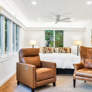
We recently worked on a remarkable 1937 home in Palomar Park, California. The project involved reimagining the second floor to create a master bedroom with a walk in closet and master bathroom while preserving the home’s traditional charm. For the homeowners, this house held decades of memories, and our goal was to honor its legacy while creating a space ready for the next chapter.
The Challenge: Balancing Tradition and Modernity
The homeowners wanted their remodeled space to feel fresh and functional without losing its historic character. This meant every decision, from the layout to the materials, had to strike the perfect balance.
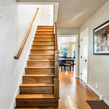
We rebuilt the upstairs including reconstruction of the existing bathroom to make an impressive master bathroom and dressing room, and refinished the hardwood floors to preserve the details that tied back to the home’s 1937 roots. By incorporating traditional elements like marble floors and walls in the bathroom , aged wood vanities and new crown molding for the whole upstairs, we ensured the updated design felt authentic and timeless.
3 Tips for Designing with Intent
Whether you’re working with a historic home or starting a new build, designing with intent can elevate your project. Here are three practical tips to help you create a space that’s as meaningful as it is beautiful:
1. Embrace the Home’s Character
Every home has unique features that tell a story. Whether it’s an original fireplace, old wood floors, or a quirky architectural detail, look for ways to celebrate and integrate these elements into your design.
2. Let Function Drive the Design
No matter how stunning a space looks, it needs to work for your lifestyle. Think about how you use each area and design accordingly. A thoughtful layout, smart storage solutions, and durable materials can transform a home from simply beautiful to truly livable.
In this project, reconfiguring the upstairs wasn’t just about aesthetics—it was about creating a layout that served the family’s everyday needs.
3. Personalize Your Space
The best designs reflect the people who live in them. Incorporate personal touches, such as family heirlooms, meaningful colors, or custom features, to make the space truly yours.
For this home, the homeowners were involved in selecting fixtures and materials that resonated with their style, ensuring the final design felt deeply personal.
Why Intentional Design Matters
Designing with intent transforms a house into a home. It’s about more than just aesthetics—it’s about creating a space that feels deeply connected to your story and needs.
At Prime Design and Build, we believe every project should start with understanding your vision. We work closely with our clients to ensure the design reflects their personality, values, and lifestyle.
Let’s Bring Your Vision to Life
If you’ve been dreaming of a home that feels like a true reflection of you, let’s make it happen. Whether it’s updating a historic property or starting fresh, we’re here to guide you through the process with expertise and care.
As I said in our Palomar Park video, “When we come over to your house, we will get to know you so that we can make your home feel like home too.”
Ready to start your journey? Reach out today for a consultation, and let’s design with intent.
 Prime Design and Build
Designing with Intent: Creating Homes That Tell a Story
Have you ever stepped into a home and felt an instant connection, as if the space itself welcomed you? That’s the power of designing with intent—a thoughtful approach that blends beauty with purpose, ensuring every detail has meaning.
We recently worked on a remarkable 1937 home in Palomar Park, California. The project involved reimagining the second floor to create a master bedroom with a walk in closet and master bathroom while preserving the home’s traditional charm. For the homeowners, this house held decades of memories, and our goal was to honor its legacy while creating a space ready for the next chapter.
The Challenge: Balancing Tradition and Modernity
The homeowners wanted their remodeled space to feel fresh and functional without losing its historic character. This meant every decision, from the layout to the materials, had to strike the perfect balance.
We rebuilt the upstairs including reconstruction of the existing bathroom to make an impressive master bathroom and dressing room, and refinished the hardwood floors to preserve the details that tied back to the home’s 1937 roots. By incorporating traditional elements like marble floors and walls in the bathroom , aged wood vanities and new crown molding for the whole upstairs, we ensured the updated design felt authentic and timeless.
3 Tips for Designing with Intent
Whether you’re working with a historic home or starting a new build, designing with intent can elevate your project. Here are three practical tips to help you create a space that’s as meaningful as it is beautiful:
1. Embrace the Home’s Character
Every home has unique features that tell a story. Whether it’s an original fireplace, old wood floors, or a quirky architectural detail, look for ways to celebrate and integrate these elements into your design.
2. Let Function Drive the Design
No matter how stunning a space looks, it needs to work for your lifestyle. Think about how you use each area and design accordingly. A thoughtful layout, smart storage solutions, and durable materials can transform a home from simply beautiful to truly livable.
In this project, reconfiguring the upstairs wasn’t just about aesthetics—it was about creating a layout that served the family’s everyday needs.
3. Personalize Your Space
The best designs reflect the people who live in them. Incorporate personal touches, such as family heirlooms, meaningful colors, or custom features, to make the space truly yours.
For this home, the homeowners were involved in selecting fixtures and materials that resonated with their style, ensuring the final design felt deeply personal.
Why Intentional Design Matters
Designing with intent transforms a house into a home. It’s about more than just aesthetics—it’s about creating a space that feels deeply connected to your story and needs.
At Prime Design and Build, we believe every project should start with understanding your vision. We work closely with our clients to ensure the design reflects their personality, values, and lifestyle.
Let’s Bring Your Vision to Life
If you’ve been dreaming of a home that feels like a true reflection of you, let’s make it happen. Whether it’s updating a historic property or starting fresh, we’re here to guide you through the process with expertise and care.
As I said in our Palomar Park video, “When we come over to your house, we will get to know you so that we can make your home feel like home too.”
Ready to start your journey? Reach out today for a consultation, and let’s design with intent.
 KURV Architecture DPC (Alex Hughes Architects)
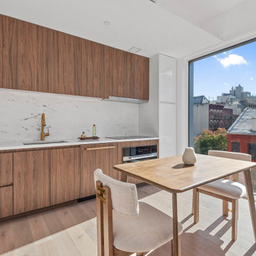
Located in the heart of Manhattan’s Lower East Side, the building was erected on a shallow commercial lot between two 120 year old masonry buildings and a new residential rental building. 330 Grand Street is a mix of 725 SF 1BRs and 1050 SF 2BR apartments. It also contains a 1100 SF two story duplex as well as private and public rooftop space, large private balconies for most units and two large private terraces for the ground floor units.
330 Grand Street was originally designed and approved at the NYC DOB as a prefabricated modular building. During the pandemic, as shipping costs skyrocketed putting the project at risk, we suggested redesigning the building as a reinforced cast-in-place concrete structure. Concrete was readily available and prices had not been affected by the demand increase that many other materials suffered in the pandemic. We took this opportunity to raise floor to ceiling heights, enlarge high performance windows and redistribute the buildings MEPFS and Structural Systems to create very open floor plans.
The challenge was to create a luxurious sensorial living experience with very limited means. In a city with very high construction costs, low cost residential buildings in the area are usually devoid of good quality, design and character. Our approach was to aim high for the end user, prioritizing natural light, open space with long visual perspectives, high ceilings and as always, rejecting the use of predefined building templates.
Our biggest challenge was to ensure that the small spaces feel as clean cut, large and bright as possible. Several unique design decisions were made to ensure low cost and high quality;
Floor plans were laid out so that spaces were wide open and free of clutter from mechanical or structural interruptions. Therefore all infrastructure was placed in lateral demising walls, which in turn act as the unit’s storage and kitchen. The apartments feel wide open, are super quiet and have more storage space than any other comparable apartment in the city.
To solve the problem of the site’s shallow commercial lot which is typically prone to dark interior spaces we focused our attention on the building’s envelope. Instead of the usual small punched window openings, oversized high performance windows were designed to ensure that light penetrated as far as possible into the units. In the smaller 1BR units, the full 50’ depth of the lot is perceived by partitioning spaces with sliding pocket doors that can be retracted to allow deep visual perspectives, making the sight lines in the space feel longer, larger, more ample than normal. In addition to the full height glazing, each unit above the 2nd floor receives a 7 foot covered balcony, adding 120 to 240 sf to each apartment, something unusual in New York City buildings. The space is large enough for a full size dining table, when the weather permits being outside.
We also worked hard to ensure modularity. For example, all kitchen units are all identical throughout the building. The idea of modularity and the economy of the repetitive unit is exercised to the maximum through the building.
Hardware, appliances, flooring, wall coverings and material finishes are all carefully selected to feel bespoke, high quality and unique.
It was important to KURV that the result of this work manifest into something that would deeply connect with the end user and sustain relationships with the consumers of this space.
All images by KURV Architecture ©
 Liberty Kitchen Design
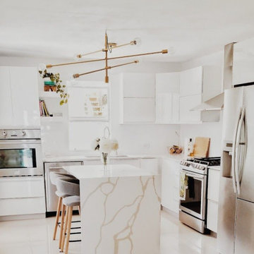
Discover the transformative power of meticulously installed countertops with Liberty Kitchen Design, a name synonymous with quality and finesse in the realm of kitchen and bathroom remodeling. Our countertop installation service isn't just about adding a piece to your space; it's about redefining your interiors with surfaces that resonate with your lifestyle and aesthetic preferences. At Liberty Kitchen Design, we bring to the fore decades of expertise in sculpting and installing countertops that are not only visually compelling but are also built to stand the test of time. Our passion for perfection and dedication to craftsmanship ensures that each installation is a seamless fusion of beauty and functionality, tailored to elevate your kitchen or bathroom's overall ambiance.
Our expansive showroom stands as a testament to our commitment to diversity and quality, featuring an array of countertop options that cater to every taste and design preference. From the timeless elegance of marble to the robust charm of granite and the modern allure of quartz, Liberty Kitchen Design offers a palette of choices, ensuring you find the perfect countertop to match your vision. Our experienced team is on hand to guide you through each selection process, offering insights into the unique characteristics, benefits, and care requirements of different materials. This personalized approach ensures that every countertop installation reflects the homeowner's personality and lifestyle, creating spaces that inspire and delight.
Embarking on a countertop installation project with Liberty Kitchen Design means entrusting your home to seasoned professionals who regard every project with the utmost significance. Our meticulous attention to detail, from precise measurements to the final touches, guarantees flawless execution and results that surpass expectations. We understand that a countertop is not just a work surface but a centerpiece that brings together the aesthetics and functionality of your kitchen and bathroom. That's why we devote ourselves to crafting installations that blend seamlessly with your existing décor, enhancing both the visual appeal and the practicality of your space. Our dedication to excellence at every step of the installation process has cemented our reputation as industry leaders in kitchen and bathroom remodeling.
Liberty Kitchen Design's countertop installation service is where your quest for elegance, durability, and precision finds its answer. Our unyielding commitment to quality, coupled with our diverse showroom selection, ensures that every project we undertake is a hallmark of innovation and craftsmanship. Whether renovating your kitchen, upgrading your bathroom, or simply seeking to inject a new lease of life into your home, partnering with Liberty Kitchen Design guarantees a service that transcends the ordinary. Experience the difference with us, where every countertop installation is a step towards realizing the home of your dreams. Let us help you transform your vision into reality, setting new benchmarks in beauty and functionality.
 Thinkterior LLC
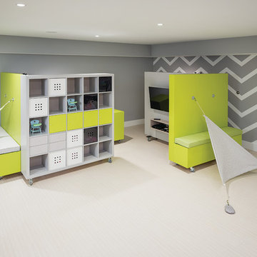
THEME The theme in this space is
defined by the design and flow of the
rest of this beautiful contemporary
home. They needed the space to blend
with the home while still providing the
youngest family members with all the
enjoyment of a dedicated play room.
FOCUS The focus of this space
changes with the configuration of
the modular pieces around the room.
One configuration could put focus
on the television for movie night,
another could create a stage for a
musical performance, while another
could close off the kids play area all
together keeping the focus on adult
conversation. Every configuration
provides focus on the activity or plans
for that moment.
STORAGE Each of the modular pieces
includes multiple storage options.
The multimedia section ensures that
all electronic equipment and remote
devices have a dedicated home no
matter where the section is placed. The
large dedicated storage unit provides
open blocks that can be filled with
baskets of toys or books while creating
the perfect wall in any configuration.
The magnetic section allows for display
of artwork or calendars while the lower
box provides closed storage and a
cushioned seating area.
GROWTH These modular pieces will
always be a useful and functional
addition to this space providing the
family with endless configuration
options ensuring that the space will
mature with the family.
SAFETY Safety is always a concern
and modular pieces require added
attention to stability and security
to ensure that they will provide the
desired flexible functionality along
with the safety of built in elements.
Custom made brackets lock the
sections together at multiple points to
keep them linked once placed and the
rolling castors under each section also
lock into place to ensure that they will
not continue to move across the floor.
 KURV Architecture DPC (Alex Hughes Architects)
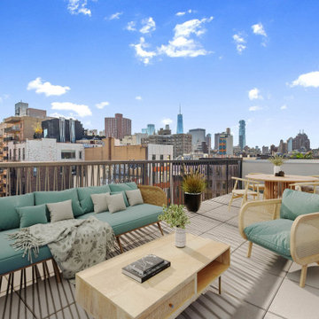
Located in the heart of Manhattan’s Lower East Side, the building was erected on a shallow commercial lot between two 120 year old masonry buildings and a new residential rental building. 330 Grand Street is a mix of 725 SF 1BRs and 1050 SF 2BR apartments. It also contains a 1100 SF two story duplex as well as private and public rooftop space, large private balconies for most units and two large private terraces for the ground floor units.
330 Grand Street was originally designed and approved at the NYC DOB as a prefabricated modular building. During the pandemic, as shipping costs skyrocketed putting the project at risk, we suggested redesigning the building as a reinforced cast-in-place concrete structure. Concrete was readily available and prices had not been affected by the demand increase that many other materials suffered in the pandemic. We took this opportunity to raise floor to ceiling heights, enlarge high performance windows and redistribute the buildings MEPFS and Structural Systems to create very open floor plans.
The challenge was to create a luxurious sensorial living experience with very limited means. In a city with very high construction costs, low cost residential buildings in the area are usually devoid of good quality, design and character. Our approach was to aim high for the end user, prioritizing natural light, open space with long visual perspectives, high ceilings and as always, rejecting the use of predefined building templates.
Our biggest challenge was to ensure that the small spaces feel as clean cut, large and bright as possible. Several unique design decisions were made to ensure low cost and high quality;
Floor plans were laid out so that spaces were wide open and free of clutter from mechanical or structural interruptions. Therefore all infrastructure was placed in lateral demising walls, which in turn act as the unit’s storage and kitchen. The apartments feel wide open, are super quiet and have more storage space than any other comparable apartment in the city.
To solve the problem of the site’s shallow commercial lot which is typically prone to dark interior spaces we focused our attention on the building’s envelope. Instead of the usual small punched window openings, oversized high performance windows were designed to ensure that light penetrated as far as possible into the units. In the smaller 1BR units, the full 50’ depth of the lot is perceived by partitioning spaces with sliding pocket doors that can be retracted to allow deep visual perspectives, making the sight lines in the space feel longer, larger, more ample than normal. In addition to the full height glazing, each unit above the 2nd floor receives a 7 foot covered balcony, adding 120 to 240 sf to each apartment, something unusual in New York City buildings. The space is large enough for a full size dining table, when the weather permits being outside.
We also worked hard to ensure modularity. For example, all kitchen units are all identical throughout the building. The idea of modularity and the economy of the repetitive unit is exercised to the maximum through the building.
Hardware, appliances, flooring, wall coverings and material finishes are all carefully selected to feel bespoke, high quality and unique.
It was important to KURV that the result of this work manifest into something that would deeply connect with the end user and sustain relationships with the consumers of this space.
All images by KURV Architecture ©
 KURV Architecture DPC (Alex Hughes Architects)
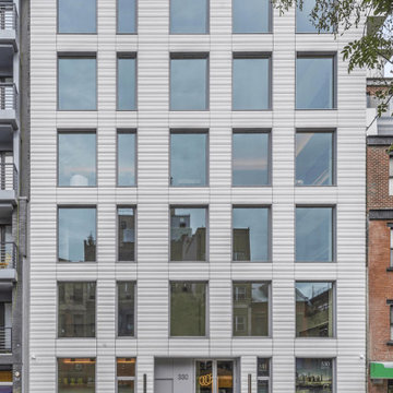
Located in the heart of Manhattan’s Lower East Side, the building was erected on a shallow commercial lot between two 120 year old masonry buildings and a new residential rental building. 330 Grand Street is a mix of 725 SF 1BRs and 1050 SF 2BR apartments. It also contains a 1100 SF two story duplex as well as private and public rooftop space, large private balconies for most units and two large private terraces for the ground floor units.
330 Grand Street was originally designed and approved at the NYC DOB as a prefabricated modular building. During the pandemic, as shipping costs skyrocketed putting the project at risk, we suggested redesigning the building as a reinforced cast-in-place concrete structure. Concrete was readily available and prices had not been affected by the demand increase that many other materials suffered in the pandemic. We took this opportunity to raise floor to ceiling heights, enlarge high performance windows and redistribute the buildings MEPFS and Structural Systems to create very open floor plans.
The challenge was to create a luxurious sensorial living experience with very limited means. In a city with very high construction costs, low cost residential buildings in the area are usually devoid of good quality, design and character. Our approach was to aim high for the end user, prioritizing natural light, open space with long visual perspectives, high ceilings and as always, rejecting the use of predefined building templates.
Our biggest challenge was to ensure that the small spaces feel as clean cut, large and bright as possible. Several unique design decisions were made to ensure low cost and high quality;
Floor plans were laid out so that spaces were wide open and free of clutter from mechanical or structural interruptions. Therefore all infrastructure was placed in lateral demising walls, which in turn act as the unit’s storage and kitchen. The apartments feel wide open, are super quiet and have more storage space than any other comparable apartment in the city.
To solve the problem of the site’s shallow commercial lot which is typically prone to dark interior spaces we focused our attention on the building’s envelope. Instead of the usual small punched window openings, oversized high performance windows were designed to ensure that light penetrated as far as possible into the units. In the smaller 1BR units, the full 50’ depth of the lot is perceived by partitioning spaces with sliding pocket doors that can be retracted to allow deep visual perspectives, making the sight lines in the space feel longer, larger, more ample than normal. In addition to the full height glazing, each unit above the 2nd floor receives a 7 foot covered balcony, adding 120 to 240 sf to each apartment, something unusual in New York City buildings. The space is large enough for a full size dining table, when the weather permits being outside.
We also worked hard to ensure modularity. For example, all kitchen units are all identical throughout the building. The idea of modularity and the economy of the repetitive unit is exercised to the maximum through the building.
Hardware, appliances, flooring, wall coverings and material finishes are all carefully selected to feel bespoke, high quality and unique.
It was important to KURV that the result of this work manifest into something that would deeply connect with the end user and sustain relationships with the consumers of this space.
All images by KURV Architecture ©
 KURV Architecture DPC (Alex Hughes Architects)
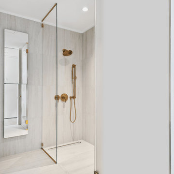
Located in the heart of Manhattan’s Lower East Side, the building was erected on a shallow commercial lot between two 120 year old masonry buildings and a new residential rental building. 330 Grand Street is a mix of 725 SF 1BRs and 1050 SF 2BR apartments. It also contains a 1100 SF two story duplex as well as private and public rooftop space, large private balconies for most units and two large private terraces for the ground floor units.
330 Grand Street was originally designed and approved at the NYC DOB as a prefabricated modular building. During the pandemic, as shipping costs skyrocketed putting the project at risk, we suggested redesigning the building as a reinforced cast-in-place concrete structure. Concrete was readily available and prices had not been affected by the demand increase that many other materials suffered in the pandemic. We took this opportunity to raise floor to ceiling heights, enlarge high performance windows and redistribute the buildings MEPFS and Structural Systems to create very open floor plans.
The challenge was to create a luxurious sensorial living experience with very limited means. In a city with very high construction costs, low cost residential buildings in the area are usually devoid of good quality, design and character. Our approach was to aim high for the end user, prioritizing natural light, open space with long visual perspectives, high ceilings and as always, rejecting the use of predefined building templates.
Our biggest challenge was to ensure that the small spaces feel as clean cut, large and bright as possible. Several unique design decisions were made to ensure low cost and high quality;
Floor plans were laid out so that spaces were wide open and free of clutter from mechanical or structural interruptions. Therefore all infrastructure was placed in lateral demising walls, which in turn act as the unit’s storage and kitchen. The apartments feel wide open, are super quiet and have more storage space than any other comparable apartment in the city.
To solve the problem of the site’s shallow commercial lot which is typically prone to dark interior spaces we focused our attention on the building’s envelope. Instead of the usual small punched window openings, oversized high performance windows were designed to ensure that light penetrated as far as possible into the units. In the smaller 1BR units, the full 50’ depth of the lot is perceived by partitioning spaces with sliding pocket doors that can be retracted to allow deep visual perspectives, making the sight lines in the space feel longer, larger, more ample than normal. In addition to the full height glazing, each unit above the 2nd floor receives a 7 foot covered balcony, adding 120 to 240 sf to each apartment, something unusual in New York City buildings. The space is large enough for a full size dining table, when the weather permits being outside.
We also worked hard to ensure modularity. For example, all kitchen units are all identical throughout the building. The idea of modularity and the economy of the repetitive unit is exercised to the maximum through the building.
Hardware, appliances, flooring, wall coverings and material finishes are all carefully selected to feel bespoke, high quality and unique.
It was important to KURV that the result of this work manifest into something that would deeply connect with the end user and sustain relationships with the consumers of this space.
All images by KURV Architecture ©
 Momentous Impressions Ltd.
CLIENT ISSUES/PROBLEMS
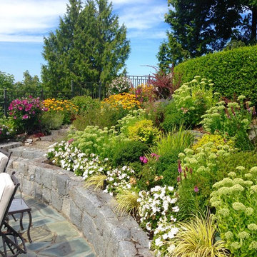
o Large property with variety of native and foreign species
o requires expertise and thorough understanding of gardening to ensure property maintenance
o regular functions held on weekends, require coordination to ensure all aspects of required gardening are addressed
MOMENTOUS APPROACH
o 6 year maintenance client
o weekly maintenance scheduled for end of week to ensure property looks it’s best for weekend functions
o recommendation of plants and soil for areas needing replacement or additions
o consistent crew leader to ensure development of relationship with client
o treatment of plants for pests/mites/insects (IPM Certified Staff)
RESULTS
o Well maintained property that shows amazing colour and interest year-round
o Strong relationship between Momentous Impressions and Client, allowing for ease of communication and quick follow-up for client requests
 KURV Architecture DPC (Alex Hughes Architects)
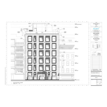
Located in the heart of Manhattan’s Lower East Side, the building was erected on a shallow commercial lot between two 120 year old masonry buildings and a new residential rental building. 330 Grand Street is a mix of 725 SF 1BRs and 1050 SF 2BR apartments. It also contains a 1100 SF two story duplex as well as private and public rooftop space, large private balconies for most units and two large private terraces for the ground floor units.
330 Grand Street was originally designed and approved at the NYC DOB as a prefabricated modular building. During the pandemic, as shipping costs skyrocketed putting the project at risk, we suggested redesigning the building as a reinforced cast-in-place concrete structure. Concrete was readily available and prices had not been affected by the demand increase that many other materials suffered in the pandemic. We took this opportunity to raise floor to ceiling heights, enlarge high performance windows and redistribute the buildings MEPFS and Structural Systems to create very open floor plans.
The challenge was to create a luxurious sensorial living experience with very limited means. In a city with very high construction costs, low cost residential buildings in the area are usually devoid of good quality, design and character. Our approach was to aim high for the end user, prioritizing natural light, open space with long visual perspectives, high ceilings and as always, rejecting the use of predefined building templates.
Our biggest challenge was to ensure that the small spaces feel as clean cut, large and bright as possible. Several unique design decisions were made to ensure low cost and high quality;
Floor plans were laid out so that spaces were wide open and free of clutter from mechanical or structural interruptions. Therefore all infrastructure was placed in lateral demising walls, which in turn act as the unit’s storage and kitchen. The apartments feel wide open, are super quiet and have more storage space than any other comparable apartment in the city.
To solve the problem of the site’s shallow commercial lot which is typically prone to dark interior spaces we focused our attention on the building’s envelope. Instead of the usual small punched window openings, oversized high performance windows were designed to ensure that light penetrated as far as possible into the units. In the smaller 1BR units, the full 50’ depth of the lot is perceived by partitioning spaces with sliding pocket doors that can be retracted to allow deep visual perspectives, making the sight lines in the space feel longer, larger, more ample than normal. In addition to the full height glazing, each unit above the 2nd floor receives a 7 foot covered balcony, adding 120 to 240 sf to each apartment, something unusual in New York City buildings. The space is large enough for a full size dining table, when the weather permits being outside.
We also worked hard to ensure modularity. For example, all kitchen units are all identical throughout the building. The idea of modularity and the economy of the repetitive unit is exercised to the maximum through the building.
Hardware, appliances, flooring, wall coverings and material finishes are all carefully selected to feel bespoke, high quality and unique.
It was important to KURV that the result of this work manifest into something that would deeply connect with the end user and sustain relationships with the consumers of this space.
All images by KURV Architecture ©
24