
Search results for "Explore choices" in Home Design Ideas


 Jetton Construction, Inc.
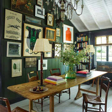
This property was transformed from an 1870s YMCA summer camp into an eclectic family home, built to last for generations. Space was made for a growing family by excavating the slope beneath and raising the ceilings above. Every new detail was made to look vintage, retaining the core essence of the site, while state of the art whole house systems ensure that it functions like 21st century home.
This home was featured on the cover of ELLE Décor Magazine in April 2016.
G.P. Schafer, Architect
Rita Konig, Interior Designer
Chambers & Chambers, Local Architect
Frederika Moller, Landscape Architect
Eric Piasecki, Photographer
 Kimberlee Marie Interiors
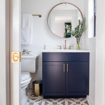
This one is near and dear to my heart. Not only is it in my own backyard, it is also the first remodel project I've gotten to do for myself! This space was previously a detached two car garage in our backyard. Seeing it transform from such a utilitarian, dingy garage to a bright and cheery little retreat was so much fun and so rewarding! This space was slated to be an AirBNB from the start and I knew I wanted to design it for the adventure seeker, the savvy traveler, and those who appreciate all the little design details . My goal was to make a warm and inviting space that our guests would look forward to coming back to after a full day of exploring the city or gorgeous mountains and trails that define the Pacific Northwest. I also wanted to make a few bold choices, like the hunter green kitchen cabinets or patterned tile, because while a lot of people might be too timid to make those choice for their own home, who doesn't love trying it on for a few days?At the end of the day I am so happy with how it all turned out!
---
Project designed by interior design studio Kimberlee Marie Interiors. They serve the Seattle metro area including Seattle, Bellevue, Kirkland, Medina, Clyde Hill, and Hunts Point.
For more about Kimberlee Marie Interiors, see here: https://www.kimberleemarie.com/
Find the right local pro for your project

 Thyme & Place Design LLC
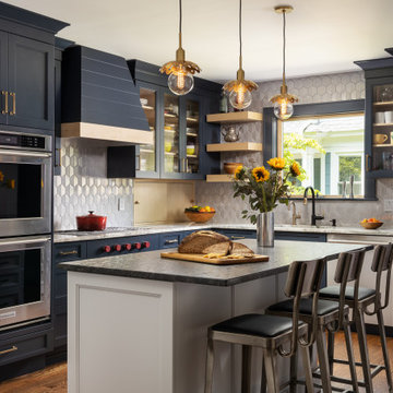
The client requested a kitchen that would not only provide a great space to cook and enjoy family meals but one that would fit in with her unique design sense. An avid collector of contemporary art, she wanted something unexpected in her 100-year-old home in both color and finishes but still providing a great layout with improved lighting, storage, and superior cooking abilities. The existing kitchen was in a closed off space trapped between the family room and the living. If you were in the kitchen, you were isolated from the rest of the house. Making the kitchen an integrated part of the home was a paramount request.
Step one, remove the wall separating the kitchen from the other rooms in the home which allowed the new kitchen to become an integrated space instead of an isolation room for the cook. Next, we relocated the pantry access which was in the family room to the kitchen integrating a poorly used recess which had become a catch all area which did not provide any usable space for storage or working area. To add valuable function in the kitchen we began by capturing unused "cubbies", adding a walk-in pantry from the kitchen, increasing the storage lost to un-needed drop ceilings and bring light and design to the space with a new large awning window, improved lighting, and combining interesting finishes and colors to reflect the artistic attitude of the client.
A bathroom located above the kitchen had been leaking into the plaster ceiling for several years. That along with knob and tube wiring, rotted beams and a brick wall from the back of the fireplace in the adjacent living room all needed to be brought to code. The walls, ceiling and floors in this 100+ year old home were completely out of level and the room’s foot print could not be increased.
The choice of a Sub-Zero wolf product is a standard in my kitchen designs. The quality of the product, its manufacturing and commitment to food preservation is the reason I specify Sub Zero Wolf. For the cook top, the integrated line of the contemporary cooktop and the signature red knobs against the navy blue of the cabinets added to the design vibe of the kitchen. The cooking performance and the large continuous grate on the cooktop makes it an obvious choice for a cook looking for a great cook top with professional results in a more streamlined profile. We selected a Sharp microwave drawer for the island, an XO wine refrigerator, Bosch dishwasher and Kitchen Aid double convection wall ovens to round out the appliance package.
A recess created by the fireplace was outfitted with a cabinet which now holds small appliances within easy reach of my very petite client. Natural maple accents were used inside all the wall cabinets and repeated on the front of the hood and for the sliding door appliance cabinet and the floating shelves. This allows a brighter interior for the painted cabinets instead of the traditional same interior as exterior finish choice. The was an amazing transformation from the old to the new.
The final touches are the honey bronze hardware from Top Knobs, Mitzi pendants from Hudson Valley Lighting group,
a fabulous faucet from Brizo. To eliminate the old freestanding bottled water cooler, we specified a matching water filter faucet.
 WINN Design+Build
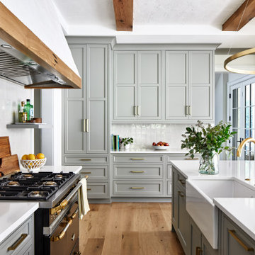
Inspiration for a large transitional l-shaped medium tone wood floor and brown floor kitchen remodel in DC Metro with a farmhouse sink, shaker cabinets, gray cabinets, quartz countertops, white backsplash, stone tile backsplash, black appliances, an island and white countertops
 TKS Design Group
Free ebook, Creating the Ideal Kitchen. DOWNLOAD NOW
Our clients and their three teenage kids had outgrown the footprint of their existing home and felt they needed some space to spread out. They came in with a couple of sets of drawings from different architects that were not quite what they were looking for, so we set out to really listen and try to provide a design that would meet their objectives given what the space could offer.
We started by agreeing that a bump out was the best way to go and then decided on the size and the floor plan locations of the mudroom, powder room and butler pantry which were all part of the project. We also planned for an eat-in banquette that is neatly tucked into the corner and surrounded by windows providing a lovely spot for daily meals.
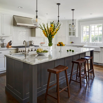
The kitchen itself is L-shaped with the refrigerator and range along one wall, and the new sink along the exterior wall with a large window overlooking the backyard. A large island, with seating for five, houses a prep sink and microwave. A new opening space between the kitchen and dining room includes a butler pantry/bar in one section and a large kitchen pantry in the other. Through the door to the left of the main sink is access to the new mudroom and powder room and existing attached garage.
White inset cabinets, quartzite countertops, subway tile and nickel accents provide a traditional feel. The gray island is a needed contrast to the dark wood flooring. Last but not least, professional appliances provide the tools of the trade needed to make this one hardworking kitchen.
Designed by: Susan Klimala, CKD, CBD
Photography by: Mike Kaskel
For more information on kitchen and bath design ideas go to: www.kitchenstudio-ge.com

Sponsored
Delaware, OH

Buckeye Basements, Inc.
Central Ohio's Basement Finishing ExpertsBest Of Houzz '13-'21
 AG&M Austin (Architectural Granite & Marble)
Counters: Metro Quartz
Color: Calacatta Metro/ Vagli
Design by: A-Line Design, LLC.
Edmond, OK
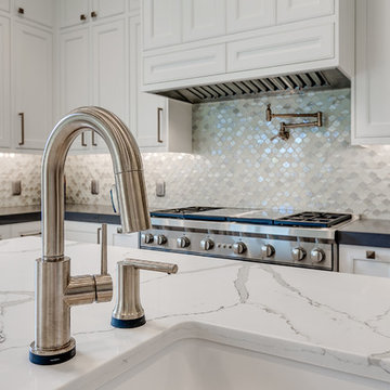
Eat-in kitchen - mid-sized transitional galley light wood floor eat-in kitchen idea in Austin with a farmhouse sink, flat-panel cabinets, white cabinets, quartz countertops, white backsplash, mosaic tile backsplash, stainless steel appliances and an island
Eat-in kitchen - mid-sized transitional galley light wood floor eat-in kitchen idea in Austin with a farmhouse sink, flat-panel cabinets, white cabinets, quartz countertops, white backsplash, mosaic tile backsplash, stainless steel appliances and an island
 Normandy Remodeling
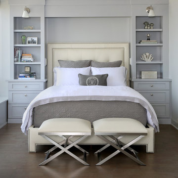
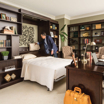
These floor to ceiling book shelves double as a storage and an eye- capturing focal point that surrounds the head board, making the bed in this master bedroom, the center of attention.
Learn more about Chris Ebert, the Normandy Remodeling Designer who created this space, and other projects that Chris has created: https://www.normandyremodeling.com/team/christopher-ebert
Photo Credit: Normandy Remodeling
 Pineapple House Interior Design
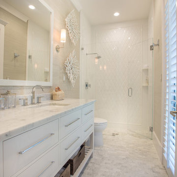
The shower is universally designed and has no curb or step at its entry. The drawer pulls are also designed for easy use.
A Bonisolli Photography
Mid-sized transitional white tile walk-in shower photo in Miami with an undermount sink, flat-panel cabinets, white cabinets and marble countertops
Mid-sized transitional white tile walk-in shower photo in Miami with an undermount sink, flat-panel cabinets, white cabinets and marble countertops
 Custer Homes Inc
Alan Wycheck Photography
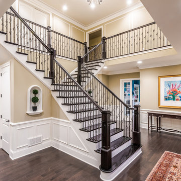
This extensive remodel in Mechanicsburg, PA features a complete redesign of the kitchen, pantry, butler's pantry and master bathroom as well as repainting and refinishing many areas throughout the house.
 Decorator's Choice Closets
Org Dealer
Bedroom - small industrial guest carpeted bedroom idea in New York with green walls and no fireplace
Bedroom - small industrial guest carpeted bedroom idea in New York with green walls and no fireplace
 Woodcraft Design Build Inc.
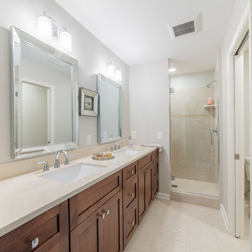
Inspiration for a mid-sized transitional 3/4 beige tile and travertine tile travertine floor and beige floor alcove shower remodel in Minneapolis with shaker cabinets, medium tone wood cabinets, a two-piece toilet, white walls, an undermount sink, quartz countertops and a hinged shower door
 ODS Architecture
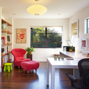
Originally a nearly three-story tall 1920’s European-styled home was turned into a modern villa for work and home. A series of low concrete retaining wall planters and steps gradually takes you up to the second level entry, grounding or anchoring the house into the site, as does a new wrap around veranda and trellis. Large eave overhangs on the upper roof were designed to give the home presence and were accented with a Mid-century orange color. The new master bedroom addition white box creates a better sense of entry and opens to the wrap around veranda at the opposite side. Inside the owners live on the lower floor and work on the upper floor with the garage basement for storage, archives and a ceramics studio. New windows and open spaces were created for the graphic designer owners; displaying their mid-century modern furnishings collection.
A lot of effort went into attempting to lower the house visually by bringing the ground plane higher with the concrete retaining wall planters, steps, wrap around veranda and trellis, and the prominent roof with exaggerated overhangs. That the eaves were painted orange is a cool reflection of the owner’s Dutch heritage. Budget was a driver for the project and it was determined that the footprint of the home should have minimal extensions and that the new windows remain in the same relative locations as the old ones. Wall removal was utilized versus moving and building new walls where possible.
Photo Credit: John Sutton Photography.
 Kimberley Harrison Interiors
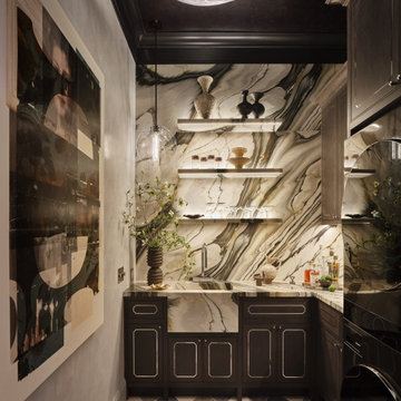
The Slow Spin reflects our belief that every space — no matter how utilitarian — deserves intention and a sense of intrigue. Our concept was rooted in contrast: concealment and reveal, historic architecture layered with modern restraint, and function elevated through materiality. The Calacatta Oyster marble was our jumping-off point—we sourced the stone first and let its movement, warmth, and quiet drama set the tone for everything that followed. Staying true to our intuitive approach and refined aesthetic, we were inspired to reframe daily rituals as moments of pause, designing a room that feels thoughtfully explored, curated, and discovered rather than purely installed. Meticulous detailing, disciplined material choices, and close collaboration with our partners allowed us to create a space that is highly functional and emotionally resonant—proving that even the most practical rooms can carry beauty, depth, and personality.
 Marvin
Architect: Portuondo Perotti Architects
Photography: Carlos Domenech
“This is well detailed and consistent inside and out. It is a classic Mediterranean Revival in the Floridian tradition of Mizner.”
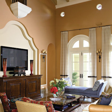
This single-family residential home in Gables Estates, Coral Gables, Florida, successfully pays respect to the architecture of the Mediterranean and Renaissance Italian styles. From the use of courtyards to the high level of detailing, this project emphasizes the most picturesque and expressive qualities of these styles. The residence reflects the visions of two of Coral Gables’ first architects, who designed beautiful and timeless architecture in this garden city to become a lasting piece in the landscape. This project not only captures the breathtaking views of Biscayne Bay, but with timeless style and lush landscaping, it creates a centerpiece for the view from the bay to Coral Gables.
The home is designed as a long gallery, with spaces connected by courtyards and public realms. Another large inspiration for this project was the idea of the garden and landscape. With Coral Gables as a garden city, landscape became an integral part of the conception and design.
The durability of Marvin products, their ability to stand up to the South Florida climate, as well as the Marvin attention to detail and proportion, made them the perfect choice to employ in a project of such high standards. The range of products allowed the freedom of design to explore all possibilities and turn visions into reality. The result was a lasting piece of architecture that would reflect a level of detail in every part of its structure.
MARVIN PRODUCTS USED:
Marvin Round Top Window
Marvin Ultimate Arch Top French Door
Marvin Ultimate Swinging French Door
Marvin Ultimate Venting Picture Window
Marvin Casemaster
 Thyme & Place Design LLC
The client requested a kitchen that would not only provide a great space to cook and enjoy family meals but one that would fit in with her unique design sense. An avid collector of contemporary art, she wanted something unexpected in her 100-year-old home in both color and finishes but still providing a great layout with improved lighting, storage, and superior cooking abilities. The existing kitchen was in a closed off space trapped between the family room and the living. If you were in the kitchen, you were isolated from the rest of the house. Making the kitchen an integrated part of the home was a paramount request.
Step one, remove the wall separating the kitchen from the other rooms in the home which allowed the new kitchen to become an integrated space instead of an isolation room for the cook. Next, we relocated the pantry access which was in the family room to the kitchen integrating a poorly used recess which had become a catch all area which did not provide any usable space for storage or working area. To add valuable function in the kitchen we began by capturing unused "cubbies", adding a walk-in pantry from the kitchen, increasing the storage lost to un-needed drop ceilings and bring light and design to the space with a new large awning window, improved lighting, and combining interesting finishes and colors to reflect the artistic attitude of the client.
A bathroom located above the kitchen had been leaking into the plaster ceiling for several years. That along with knob and tube wiring, rotted beams and a brick wall from the back of the fireplace in the adjacent living room all needed to be brought to code. The walls, ceiling and floors in this 100+ year old home were completely out of level and the room’s foot print could not be increased.
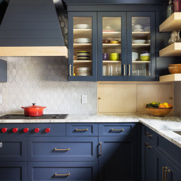
The choice of a Sub-Zero wolf product is a standard in my kitchen designs. The quality of the product, its manufacturing and commitment to food preservation is the reason I specify Sub Zero Wolf. For the cook top, the integrated line of the contemporary cooktop and the signature red knobs against the navy blue of the cabinets added to the design vibe of the kitchen. The cooking performance and the large continuous grate on the cooktop makes it an obvious choice for a cook looking for a great cook top with professional results in a more streamlined profile. We selected a Sharp microwave drawer for the island, an XO wine refrigerator, Bosch dishwasher and Kitchen Aid double convection wall ovens to round out the appliance package.
A recess created by the fireplace was outfitted with a cabinet which now holds small appliances within easy reach of my very petite client. Natural maple accents were used inside all the wall cabinets and repeated on the front of the hood and for the sliding door appliance cabinet and the floating shelves. This allows a brighter interior for the painted cabinets instead of the traditional same interior as exterior finish choice. The was an amazing transformation from the old to the new.
The final touches are the honey bronze hardware from Top Knobs, Mitzi pendants from Hudson Valley Lighting group,
a fabulous faucet from Brizo. To eliminate the old freestanding bottled water cooler, we specified a matching water filter faucet.
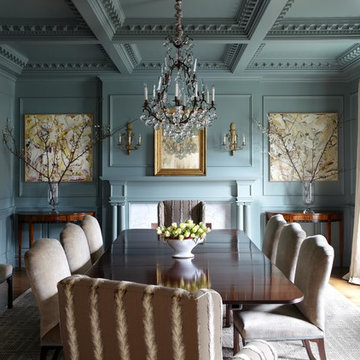
 Lisa Hilderbrand - Hilderbrand Interiors
Inspiration for a mid-sized timeless medium tone wood floor enclosed dining room remodel in New York with blue walls and a standard fireplace
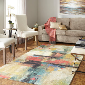
 Mohawk Home
Watercolor inspired washes of sunny yellow, crisp white, dark charcoal and silver gray contemporary color illuminate the abstract patchwork motif of Mohawk Homes modern Painted Geo Area Rug. When it comes to color, the sky is no longer the limit with the infinite possibilities of Mohawk Homes revolutionary Prismatic Collection. Thoughtfully crafted in the U.S.A. in small batches utilizing Mohawk Homes exclusive Precision Dye Injected Printer, the Prismatic Collection is redefining printed rugs, literally one original design at a time. Each style in this collection features superior strength, stain resistance, and a cozy soft touch. Consciously created with Everstrand yarn, Mohawk Homes exclusive premium recycled polyester produced from post-consumer plastic water bottles, this collection offers environmentally friendly options that are as easy on the eyes as they are the world around us.

2