
Search results for "Feels softer" in Home Design Ideas
 Vitt Customs Design
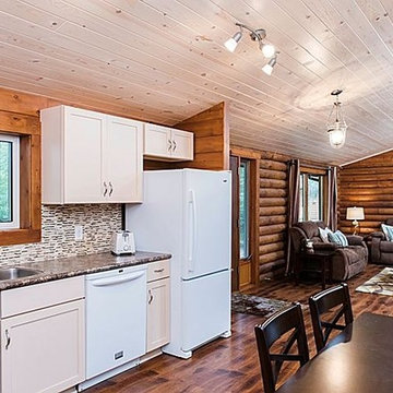
Interior logs were brought back to life, ceiling was replaced with a lighter softer wood . Kitchen was freshened up with white cabinetry, A stone back splash with light tones was installed. I didn't want to compromise the feeling of the log cabin and so it was important to incorporate the outside as much as possible.
 Costa Bella Builders
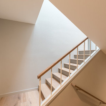
This 30-year-old Aptos beachfront townhome was completely renovated. Our goal on this project was to take what had been a dark and closed in full-time residence and transform it into a lovely, open, and airy weekend beach retreat. This goal was fueled by our Silicon Valley clients’ desire for a nearby weekend escape from their busy schedules. Using their input and design ideas, we opened up the family room space structurally and lightened it aesthetically using a new electrical plan, softer interior colors, contemporary tile surfaces, new cabinetry, flooring and fixtures. The change from the old darker space to the lighter feel shown here was quite dramatic. The owners now have a beautiful and functional space in which to relax or host friends on the weekends and Holidays.
 Regan Baker Design Inc.
Well-traveled. Relaxed. Timeless.
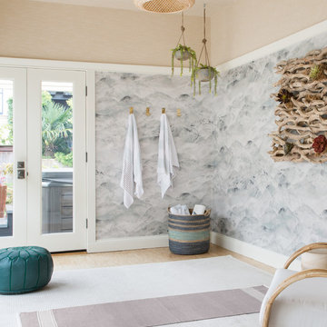
Our well-traveled clients were soon-to-be empty nesters when they approached us for help reimagining their Presidio Heights home. The expansive Spanish-Revival residence originally constructed in 1908 had been substantially renovated 8 year prior, but needed some adaptations to better suit the needs of a family with three college-bound teens. We evolved the space to be a bright, relaxed reflection of the family’s time together, revising the function and layout of the ground-floor rooms and filling them with casual, comfortable furnishings and artifacts collected abroad.
One of the key changes we made to the space plan was to eliminate the formal dining room and transform an area off the kitchen into a casual gathering spot for our clients and their children. The expandable table and coffee/wine bar means the room can handle large dinner parties and small study sessions with similar ease. The family room was relocated from a lower level to be more central part of the main floor, encouraging more quality family time, and freeing up space for a spacious home gym.
In the living room, lounge-worthy upholstery grounds the space, encouraging a relaxed and effortless West Coast vibe. Exposed wood beams recall the original Spanish-influence, but feel updated and fresh in a light wood stain. Throughout the entry and main floor, found artifacts punctate the softer textures — ceramics from New Mexico, religious sculpture from Asia and a quirky wall-mounted phone that belonged to our client’s grandmother.
Find the right local pro for your project
 Treasure in the Detail
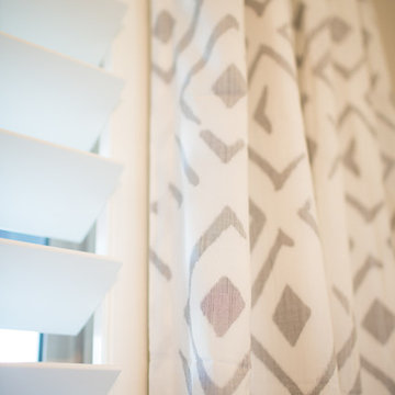
The vision here was to brighten the space while making it feel inviting and comfortable. The addition of the mirrors helped lighten the space and the updated chandelier brought style to the room. The stripes brought character to the entry way and we framed the windows with softer window treatments.
 AppWood Custom Woodwork
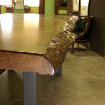
Many times we are asked, especially by former clients, to create “other” special projects for them. Here is one such project. A former AppWood Door client contacted us 3 years after receiving her custom door asking us to design and build a Dining Table for her that meshed some elements of her sleek and modern Front Entry Door while contrasting others.
After considerable thought, sketches and multiple drawings, we developed this “Live Edge”
Sycamore and Walnut table with a shop-made metal base. It incorporates the modern elements of her wood and metal door but with a softer, more organic and warm overall feel. The oblong shape of the Sycamore slab required a way to “widen” it on one end so it would be more uniform in size. We created a solid Walnut panel with soft curving lines and piston-fit it in the middle of the table to widen it and make it uniform in size.
Metal still meets wood… organically! Needless to say, she loves it
 Bennett Contracting, Inc.
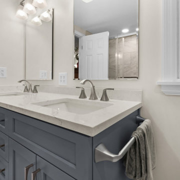
We recently completed a fabulous bathroom renovation, drawing inspiration from our client’s serene beachside vacation. They fell in love with the calming blue hues of the ocean, the sky and even seashells they collected. They found a real version that perfectly encapsulated the dreamy blue in the vacation bathroom and brought it home. The Ballard Blue vanity pairs perfectly with the subtle blue hints in the Cambria Quartz top. You will find accents of the same blue in the penny round tiles in the shower niche. The unique starburst floor tiles perfectly complement the natural blue hues found throughout the space. We replaced the outdated 5’ mirror with two elegant mirrors which create a beautiful symmetry above the double sinks. The previously installed snazzy LED lights didn’t quite capture the calm our clients were seeking, so we added softer downward lights instead. This dream bathroom wouldn’t have been possible without the incredible work of Project Manager, Steve Shanholtz, our talented Sarah design duo (Sarah Domery and Sarah McDonald) and our master craftsman, Dave Buran. Our team made walking into this bathroom feel like vacation every day!
 lavish
This stunning primary bedroom remodel delivers a refined, masculine aesthetic that feels equal parts luxury hotel and personal sanctuary. The transformation centers around a rich, moody palette anchored by a custom periwinkle-blue wall color that shifts beautifully from cool gray to soft lavender depending on the light — creating an atmosphere that is both energizing and deeply restful.
The room's focal point is a king-sized upholstered platform bed featuring a wide, channel-tufted headboard in warm taupe velvet, dressed with layered indigo linen bedding, oversized quilted shams in dusty mauve, and a classic windowpane throw blanket. Flanking the bed are sleek black oval nightstands — each topped with a marble-column lamp, silver starburst sculptures, and carefully curated personal accessories that nod to the homeowner's passions for horology and classic automobiles.
A full wall of fluted black wood dressers provides generous storage while doubling as a dramatic display surface beneath a large-scale framed photograph of a luxury watch movement — a conversation piece that elevates the space into gallery territory. The sitting area features a channel-tufted slate leather armchair paired with a minimalist pedestal side table, positioned beside a grand bay window with an arched transom and custom woven valance.
Personal touches throughout — a vintage car model, A Man & His Car coffee table book, watch displays, and framed automotive photography — give this retreat a deeply personal character without sacrificing sophistication. A cognac leather oval bench at the foot of the bed introduces warmth and a subtle vintage nod that ties the entire palette together beautifully.
The second bedroom refreshes a guest suite with a softer, transitional sensibility: warm greige walls, a linen platform bed, crisp white bedding with charcoal velvet accent pillows, and a triptych of terracotta-framed abstract art above the headboard.

Sponsored
Columbus, OH

Wannemacher Interiors
Customized Award-Winning Interior Design Solutions in Franklin Cnty OH
 Bilotta Kitchen & Home
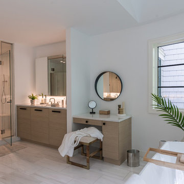
Award winning contemporary bathroom for the 2018 Design Awards by Westchester Home Magazine, this master bath project was a collaboration between Scott Hirshson, AIA of Hirshson ARCHITECTURE + DESIGN and Rita Garces, Senior Designer of Bilotta Kitchens of NY. The client had two primary objectives. First and foremost, they wanted a calm, serene environment, balancing clean lines with quiet stone and soft colored cabinets. The design team opted for a washed oak, wood-like laminate in a flat panel with a horizontal grain, a softer palette than plain white yet still just as bright. Secondly, since they have always used the bathtub every day, the most important selection was the soaking tub and positioning it to maximize space and view to the surrounding trees. With the windows surrounding the tub, the peacefulness of the outside really envelops you in to further the spa-like environment. For the sinks and faucetry the team opted for the Sigma Collection from Klaffs. They decided on a brushed finish to not overpower the soft, matte finish of the cabinetry. For the hardware from Du Verre, they selected a dark finish to complement the black iron window frames (which is repeated throughout the house) and then continued that color in the decorative lighting fixtures. For the countertops and flooring Rita and Scott met with Artistic Tile to control the variability of the Dolomite lot for both the cut stone and slab materials. Photography by Stefan Radtke. Bilotta Designer: Rita Garces with Scott Hirshson, AIA of Hirshson ARCHITECTURE + DESIGN
 Phoenix Home Remodeling
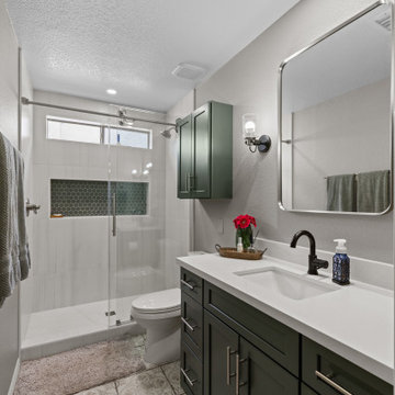
Along with her primary bathroom, Jill decided to give the guest bathroom a complete update. The original space had a dated tub-and-shower combo, basic cabinetry, and flooring that no longer fit the style of the home.
She wanted this room to feel welcoming and fresh for anyone who used it. The tub and shower surround were removed down to the studs to make way for a new custom shower. Large porcelain wall tile, also used in the primary bathroom for a cohesive look, was installed in a stacked layout with clean white trim.
A long recessed niche was added, finished in Bedrosians Makoto Midori Green mosaic. The shower floor was finished with the same white glass mosaic tile used in the primary bathroom, tying the two spaces together.
Stainless fixtures matched those in the primary bathroom, keeping continuity across the home. A frameless barn-style sliding glass door with brushed nickel hardware completed the enclosure.
Cabinetry was updated with sage green for a softer tone than the navy in the primary bath, with a wall cabinet added above the toilet for extra storage.
Quartz counters matched the primary bath, paired with an undermount sink and matte black faucet for contrast. A framed mirror with two black-and-nickel sconces finished the vanity wall, tying in with details from the primary bath while giving this space its own style.
 Regan Baker Design Inc.
Well-traveled. Relaxed. Timeless.
Our well-traveled clients were soon-to-be empty nesters when they approached us for help reimagining their Presidio Heights home. The expansive Spanish-Revival residence originally constructed in 1908 had been substantially renovated 8 year prior, but needed some adaptations to better suit the needs of a family with three college-bound teens. We evolved the space to be a bright, relaxed reflection of the family’s time together, revising the function and layout of the ground-floor rooms and filling them with casual, comfortable furnishings and artifacts collected abroad.
One of the key changes we made to the space plan was to eliminate the formal dining room and transform an area off the kitchen into a casual gathering spot for our clients and their children. The expandable table and coffee/wine bar means the room can handle large dinner parties and small study sessions with similar ease. The family room was relocated from a lower level to be more central part of the main floor, encouraging more quality family time, and freeing up space for a spacious home gym.
In the living room, lounge-worthy upholstery grounds the space, encouraging a relaxed and effortless West Coast vibe. Exposed wood beams recall the original Spanish-influence, but feel updated and fresh in a light wood stain. Throughout the entry and main floor, found artifacts punctate the softer textures — ceramics from New Mexico, religious sculpture from Asia and a quirky wall-mounted phone that belonged to our client’s grandmother.
 Nicola Interiors
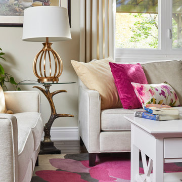
A formal living room now exhibits a feminine and glamorous feel presented through rich pink hues, floral prints, and nature-inspired decor. To balance out the vivid colors, we integrated softer gray tones along with the feature wall. The fireplace showcases a wooden brick-style accent wall, while the surrounding built-in shelves show off a natural wooden design.
Home located in Mississauga, Ontario. Designed by Nicola Interiors who serves the whole Greater Toronto Area.
For more about Nicola Interiors, click here: https://nicolainteriors.com/
To learn more about this project, click here: https://nicolainteriors.com/projects/truscott/
 O'Brien Harris LLC
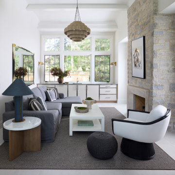
In this new construction home in Hinsdale, IL the design team at O’Brien Harris was brought in at the earliest stages of planning—allowing for seamless integration of cabinetry and architectural details. Early collaboration with the builder meant every functional need could be fully addressed, including custom framing for hidden lighting and other details that would have been difficult to retrofit.
The kitchen features a unique layout that places the cook at the center of the space, facing the yard and natural light. This intentional orientation shaped the design from the start to create a layout that felt open, balanced, and multi-functional. Because the project was built from the ground up, O’Brien Harris was able to integrate downdraft ventilation systems that maintain sightlines allowing the range to face outward—achieving both form and function without compromise.
Two kitchen islands define the space, though each serves a distinct purpose. The first island is centered around the cooktop and prep area, while the second acts more like a piece of freestanding furniture—with seating, storage, and a softer presence in the room. Four oversized pendant lanterns anchor the entire space, offering both visual weight and warm illumination.
To support entertaining, a full back kitchen was added behind the main space, offering the same level of functionality with additional appliances and prep areas. A fully retractable pass-through window opens directly to the outdoor entertaining area, making the kitchen feel as expansive as the outdoors. O’Brien Harris also designed and fabricated the cabinetry in the primary bath.
Location: Hinsdale | Custom Cabinetry: O’Brien Harris | Interior Designer: Brynn Olson Design | Builder: J. Jordan Homes | Architect: Moment Design Architecture | Photography: Werner Straube Photography | Kitchen Cabinetry: Painted Finish in Gossamar Veil | Kitchen Island and Back Kitchen Cabinetry: Stained Chatham Oak
Featured Article: Luxe Interiors + Design
 Phoenix Home Remodeling
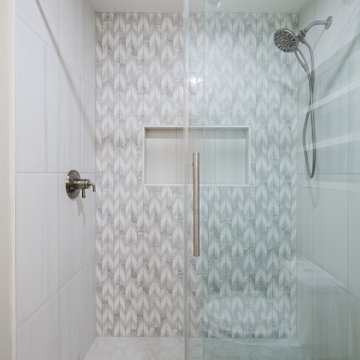
Jamie’s guest bathroom felt cramped and outdated, making it less comfortable for visitors. A remodel was needed to improve storage, update finishes, and replace the old tub with a more functional shower.
Old shower walls and tub were removed down to the studs, clearing the way for a custom shower. New plumbing was added with a carefully built drain and waterproof base to ensure lasting quality.
The new shower became the focal point of the bathroom. MSI Eden Dolomite Hex tile was chosen for the floor, while Emser Kudos Perla Chevron polished tile brought movement and style to the back wall.
Side walls and the niche were finished in Themar Bianco Lasa for a clean contrast. A recessed niche was reframed to provide more room for bath products and lined with matching tile for a cohesive look. The shower was completed with clear barn-style glass doors accented by brushed nickel hardware.
Flooring throughout the bathroom was upgraded with Arizona Tile Savannah Dust planks in an 8x40 size. The staggered layout and warm tones helped create a softer flow between the shower and vanity areas.
Above the toilet, a recessed wall niche was designed with Arizona Tile Paloma Denim glossy tiles in a herringbone layout. Floating Balluci Sydney shelves were added inside, offering functional storage with a refined touch.
Finishing touches included a new exhaust fan, recessed lighting, fresh baseboards, and updated Delta Kayra accessories. Walls were repainted in Sherwin-Williams Agreeable Grey to tie the space together.
Jamie’s guest bathroom now feels inviting and refined, offering a beautiful space for visitors. The updates balanced function with style, transforming the room into a lasting upgrade for the home.


 Bilotta Kitchen & Home
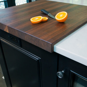
This two-toned kitchen was designed by Paula Greer, CKD of Bilotta Kitchens with Robin Zahn of Robin Prince Zahn Architecture. The u-shaped space has perimeter cabinets in Bilotta’s own line, the Bilotta Collection in a custom gray paint. The island is Wood-Mode Cabinetry in cherry with a stain. Countertops are Caesarstone’s London Grey with a built-in walnut cutting board on one corner of the island from Brooks Custom. The custom Madison Hood by Rangecraft is in a Dark Antique Steel finish and extends up accentuating the high ceiling above the cooking triangle. Two of the most interesting elements of this space are the banquette area and the coffered ceilings. By far, the most frequent installation of banquettes is tucking them into a corner of the room, regardless of how much seating is available at the island. In this kitchen, the island provides enough space for four to five stools. But because the space is separated from the rest of the house, the client wanted to ensure there was sufficient seating for their frequent entertaining. Also, the house is situated in a secluded wooded area; the new kitchen includes an abundance of unobstructed windows to fully experience the beautiful outdoor surroundings. The corner banquette (under more windows!) makes it feel like you’re dining in the trees. The bonus feature is that there’s extra storage below for table linens or seldom-used serving pieces. This really functions like a couch, complete with throw pillows and a TV, where the empty-nesters love spending time even when it isn’t mealtime. As for the ceiling, coffers don’t necessarily have to be large and intricately detailed with layers of moldings in order to be effective. This kitchen features two different ceiling heights: a small section of an addition contains a vaulted ceiling, while the larger island and eating area are tucked under a 2nd floor balcony and bedrooms. The client wanted to distinguish the lower area from the vaulted section, but in a subtle manner. The architect chose to implement shallow coffers with minimal trim for a softer result. The geometric pattern also reflects the floor tile and other lines within the room. The most interesting aspect, though, is that the vaulted area is actually concealed from view when you’re standing in the breakfast area; but as you approach the sink and window, the ceiling explodes above you for a visual surprise. And lastly, of course during this time of “work from home” the desk tucked in a nook opposite the banquette creates the perfect space for Zoom meetings, email checking and just the day-to-day activities we used to go into the office to do. The kitchen is an all-around perfect space for cooking, entertaining, relaxing or working!
Bilotta Designer: Paula Greer
Photographer: Philip Jensen-Carter
Architect: Robin Prince Zahn Architecture
 Laurie Yapp Design
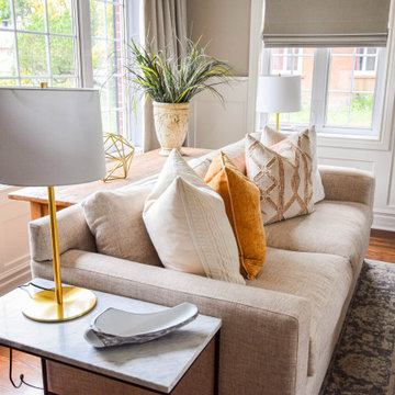
Coastal influence created this peaceful, bright living room and doubled as a family room. Used light fabric for sofa and went with a softer palette to create a peaceful feel.
 Laurie Yapp Design
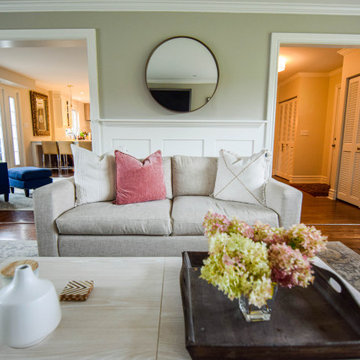
Coastal influence created this peaceful, bright living room and doubled as a family room. Used light fabric for sofa and went with a softer palette to create a peaceful feel.
 Michelle Yorke Interior Design LLC
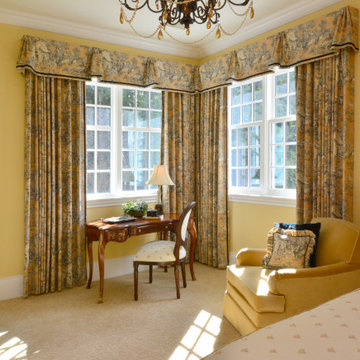
The bedrooms in this home definitely take on a more subtle style of Regency period design. We wanted the rooms to feel luxurious yet calming - but not overwhelming. We went with softer color schemes and usually one accent of pattern, either through the window treatments or bedding.

 Studio 38 Designs, Inc.
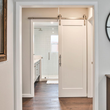
Different than the kitchen, the clients really wanted this space to feel relaxing and "spa like" so a softer cooler palate was used. With a completely new layout, the once bare bathroom now is fully equipped. The larger footprint allowed for a double vanity and ample storage inside the mirrors, vanity, linen shelving, and extra deep shower niches.
 Costa Bella Builders
This 30-year-old Aptos beachfront townhome was completely renovated. Our goal on this project was to take what had been a dark and closed in full-time residence and transform it into a lovely, open, and airy weekend beach retreat. This goal was fueled by our Silicon Valley clients’ desire for a nearby weekend escape from their busy schedules. Using their input and design ideas, we opened up the family room space structurally and lightened it aesthetically using a new electrical plan, softer interior colors, contemporary tile surfaces, new cabinetry, flooring and fixtures. The change from the old darker space to the lighter feel shown here was quite dramatic. The owners now have a beautiful and functional space in which to relax or host friends on the weekends and Holidays.
 Costa Bella Builders
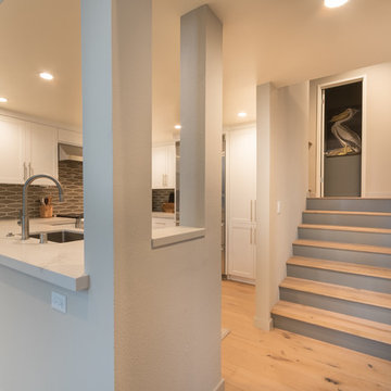
 This 30-year-old Aptos beachfront townhome was completely renovated. Our goal on this project was to take what had been a dark and closed in full-time residence and transform it into a lovely, open, and airy weekend beach retreat. This goal was fueled by our Silicon Valley clients’ desire for a nearby weekend escape from their busy schedules. Using their input and design ideas, we opened up the family room space structurally and lightened it aesthetically using a new electrical plan, softer interior colors, contemporary tile surfaces, new cabinetry, flooring and fixtures. The change from the old darker space to the lighter feel shown here was quite dramatic. The owners now have a beautiful and functional space in which to relax or host friends on the weekends and Holidays.
31