
Search results for "Flat strike" in Home Design Ideas
 San Diego Master Craftsmen
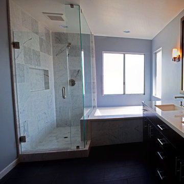
The large tiles on the shower wall made for a striking feature in this bathroom remodel. Dark flooring and light tile creates a beautiful contrast.
Mid-sized transitional master dark wood floor bathroom photo in San Diego with flat-panel cabinets, dark wood cabinets, blue walls, an undermount sink, granite countertops and a hinged shower door
Mid-sized transitional master dark wood floor bathroom photo in San Diego with flat-panel cabinets, dark wood cabinets, blue walls, an undermount sink, granite countertops and a hinged shower door
 Trail Appliances BC
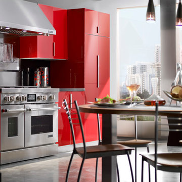
This small Jenn-Air kitchen manages to hold a 48 inch range with a double oven and a pro range hood. The red cabinets give it a striking look. Very Italian.
 Natalie Howe Design
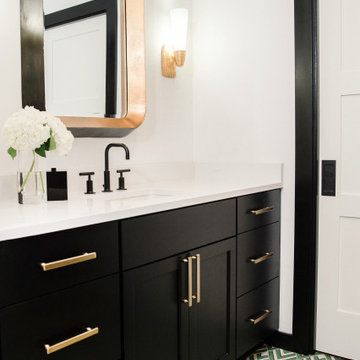
A third time client, these empty nesters wanted to modernize an outdated bathroom with bold features and a masculine look. Ann Sacks cement tile complements the floor in a vivid pattern and matte black and brass features give the look a handsome appeal. Other features in this room: Kelly Wearstler wall sconces, Erica Wakerly wallpaper in the WC, Black, iron shower doors, and Ann Sacks shower tile.
Find the right local pro for your project
 building Lab, inc.
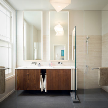
Having recently purchased the condominium in a late 19th century building, this Swedish couple saw the sharing of the master bath with their guests a shortcoming worth resolving sooner than later. They turned to building Lab to create an en-suite master bath, that would afford a sense of privacy and strike a balance between original detailing and a modern spa-like feel. With adequate storage elsewhere we co-opted an existing closet into the new master bath which resulted in an ample if not generous foot print. The couple’s decidedly Scandinavian design sensibilities prompted us to keep the
material palette simple and neutral thus allowing the space and light to speak
for themselves. Tall skinny mirrors emphasize the height of the room and saturate all corners with reflected light. Suspended walnut cabinetry contributes a tactility and warmth. Subtle custom details such as the integral LED lighting wrapping around the mirrors invite closer examination. But
perhaps the most successful quality of the project is the expansive sense of
space and lightness.
photo by scott hargis
 Ariel Muller Designs
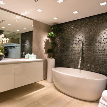
A freestanding oval tub softens the space as
it nestles close to the feature mosaic wall with unique tub filler.
The result is a modern, luxurious retreat
 Grandeur Hills Group,Inc.
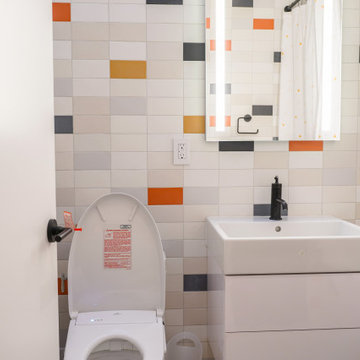
Despite its small size, this bathroom does not look cramped thanks to the small amount of furniture and sanitary ware. In addition, the dominant color in the bathroom is white, which tends to visually expand small spaces.
The high-quality lighting also enhances the sense of space and freedom in the bathroom. The multi-colored walls make the ambience in the bathroom welcoming, cozy, and warm.
Try to make your own bathroom look stylish and beautiful too. Add a bit of high style to it together with our best interior designers!
 andisonresidentialdesign
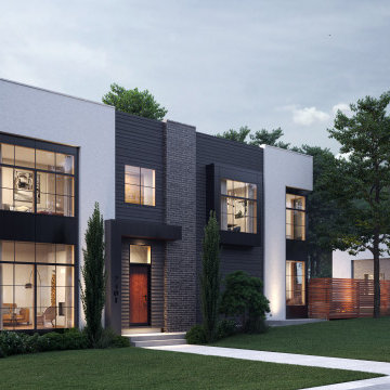
Located on an established corner in the neighbourhood of Killarney in Calgary, AB, this new single-family custom home was designed to make a lasting impression.
With a striking rectangular design and plenty of modern clean lines, this home is full of character. Materials include smooth stucco, horizontal siding, brick, metal panelling and cedar accents – and of course, the large glass windows that are a hallmark of modern architecture.
The expansive windows wrap around the corners to let the light pour into the interior from multiple sides. Rather than incorporating the garage front and center like many contemporary homes, the home has a simple walkway to its stylish asymmetrical front entrance (the garage is located to the side of the home).


 Grassroots Design & Build Inc.
JVL Photography
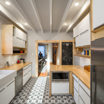
Example of a small trendy galley ceramic tile enclosed kitchen design in Ottawa with a farmhouse sink, flat-panel cabinets, white cabinets, wood countertops, white backsplash, subway tile backsplash, stainless steel appliances and a peninsula
Example of a small trendy galley ceramic tile enclosed kitchen design in Ottawa with a farmhouse sink, flat-panel cabinets, white cabinets, wood countertops, white backsplash, subway tile backsplash, stainless steel appliances and a peninsula
 HDR Remodeling Inc.
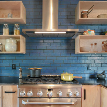
Blue Fireclay glazed brick tiles create a striking focal point, with the roughness and shine providing contrast to the honed granite and maple cabinets.
Photo Credit: Michael Hospelt
 Smith & Ragsdale Interior Design
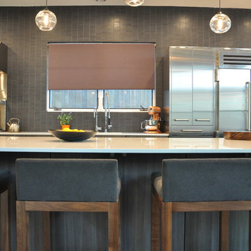
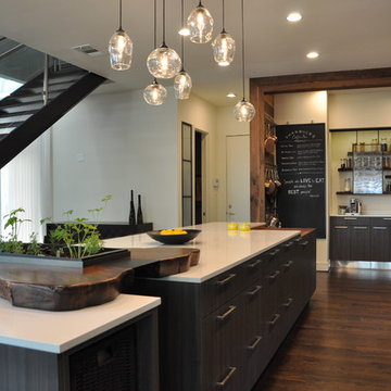
While this new home had an architecturally striking exterior, the home’s interior fell short in terms of true functionality and overall style. The most critical element in this renovation was the kitchen and dining area, which needed careful attention to bring it to the level that suited the home and the homeowners.
As a graduate of Culinary Institute of America, our client wanted a kitchen that “feels like a restaurant, with the warmth of a home kitchen,” where guests can gather over great food, great wine, and truly feel comfortable in the open concept home. Although it follows a typical chef’s galley layout, the unique design solutions and unusual materials set it apart from the typical kitchen design.
Polished countertops, laminated and stainless cabinets fronts, and professional appliances are complemented by the introduction of wood, glass, and blackened metal – materials introduced in the overall design of the house. Unique features include a wall clad in walnut for dangling heavy pots and utensils; a floating, sculptural walnut countertop piece housing an herb garden; an open pantry that serves as a coffee bar and wine station; and a hanging chalkboard that hides a water heater closet and features different coffee offerings available to guests.
The dining area addition, enclosed by windows, continues to vivify the organic elements and brings in ample natural light, enhancing the darker finishes and creating additional warmth.
Photography by Ira Montgomery
 Paula Ables Interiors
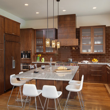
This kitchen is made for cooking and entertaining! The walnut cabinets paired with the striking quartzite counters create a magnetizing space for the homeowners and guests to gather.
Photographed by: Coles Hairston
Architect: James LaRue
 McDonald Remodeling
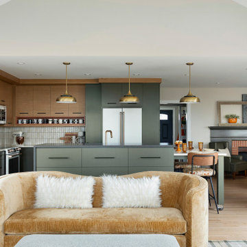
Main floor, kitchen, and dining remodel plus addition replacement by Minneapolis / St. Paul-based McDonald Remodeling. See more examples of our work and learn more at www.mcdonaldremodeling.com
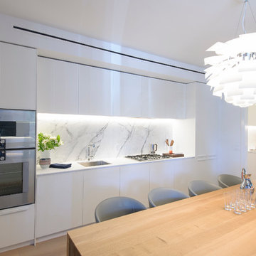
 F. M. Construction Ltd
F. M. Construction provided construction management services for the completion of the Sales Centre and display suite of this exciting new project.
Sharing a passion for innovation and perfection, two leaders of their respective industries in Vancouver – Intracorp and Inform Interiors – have partnered to reimagine how homes are designed and built.
Aesthetically striking and considered from every possible angle, The Jervis is uncompromising design put into practice. It is 58 perfectly formed and carefully crafted homes, built by design and made for living.


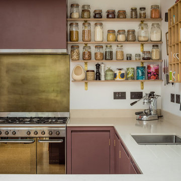
 Honest Kitchens
 A kitchen to show the clients love of colour in three show-stopping shades; Paint and Papers 'Plumb brandy' and 'temple', plus Farrow And Ball's 'Charlotte's Locks'.
Painted flat panel with handle-less design and open shelving.
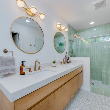
 Stearns Design Build
The clients did not care for a tub in this bathroom, so we constructed a spacious full shower instead, with a niche and bench that is tiled in a beautiful sage green tile arranged in a vertical stack pattern. These colors and patterns fit in seamlessly with the Mid-Century Modern style!
When designing the vanity, the clients opted for a more modern look by choosing a floating vanity, meaning the cabinets hang off the wall and do not touch the ground. The cabinet doors are a slab style, which means there is no paneling or decoration of any kind; which is another very modern touch. The vanity was made of maple wood and was finished in a warm golden stain. The vanity was topped with a stunning sparkling white flecked quartz with a 3-inch edge cap, which gives the illusion of a much thicker countertop.
This bathroom also included a Japanese-style toilet, with features such as a seat warmer and bidet. To illuminate the space further, we installed two recessed can lights in addition to spectacular globe-shaped vanity lights- which is a key element in Mid-Century Modern design.
Now, to finish out the space! We installed stunning marble-look hexagon tiles for the bathroom and shower floors and opted for striking champagne bronze fixtures to complete this Mid-Century Modern aesthetic.
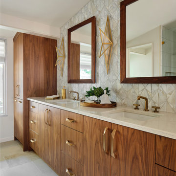
 Haven Design and Construction
In the primary bath, all of the original features had been removed, except for the low sloped MCM ceiling that was prominently interrupted by a rectangular AC soffit that was added on later. We relocated the AC ducting to vent through the floor instead, and once again revealed the bath’s iconic low sloped triangular ceiling. Then, we began re-creating the new MCM space from the floor up. We widened the original primary bath by 2’ to accommodate an enclosed toilet room, at the request of the homeowners. This was quite a feat, as it required structural engineering to relocate one vertical steel column that interfered with the new toilet room layout. The new 14’ tall steel column, which supported part of the steel roof trusses, had to be extended through the home’s bathroom floor and into a cave underground secured by a concrete pier. Oh, did I mention that this home has a cave under part of it? Haha—when I say that this home was a challenge to remodel, I do mean it was a CHALLENGE.
 Ogawa Fisher Architects
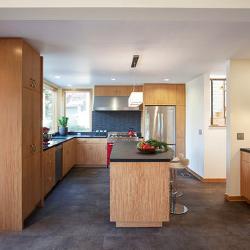
The open kitchen invites conversation and provides ample prep space.
www.marikoreed.com
Mid-sized minimalist l-shaped ceramic tile open concept kitchen photo in San Francisco with an undermount sink, flat-panel cabinets, ceramic backsplash, stainless steel appliances, an island, medium tone wood cabinets, quartz countertops and black backsplash
Mid-sized minimalist l-shaped ceramic tile open concept kitchen photo in San Francisco with an undermount sink, flat-panel cabinets, ceramic backsplash, stainless steel appliances, an island, medium tone wood cabinets, quartz countertops and black backsplash
 SGDI - Sarah Gallop Design Inc.
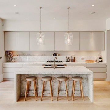
The objective was to create a warm neutral space to later customize to a specific colour palate/preference of the end user for this new construction home being built to sell. A high-end contemporary feel was requested to attract buyers in the area. An impressive kitchen that exuded high class and made an impact on guests as they entered the home, without being overbearing. The space offers an appealing open floorplan conducive to entertaining with indoor-outdoor flow.
Due to the spec nature of this house, the home had to remain appealing to the builder, while keeping a broad audience of potential buyers in mind. The challenge lay in creating a unique look, with visually interesting materials and finishes, while not being so unique that potential owners couldn’t envision making it their own. The focus on key elements elevates the look, while other features blend and offer support to these striking components. As the home was built for sale, profitability was important; materials were sourced at best value, while retaining high-end appeal. Adaptations to the home’s original design plan improve flow and usability within the kitchen-greatroom. The client desired a rich dark finish. The chosen colours tie the kitchen to the rest of the home (creating unity as combination, colours and materials, is repeated throughout).
Photos- Paul Grdina
 The Kitchen Source
While this new home had an architecturally striking exterior, the home’s interior fell short in terms of true functionality and overall style. The most critical element in the home’s renovation was the kitchen and dining area, which needed careful attention to bring it to the level that suited the home and the homeowners. The concept and vision of Abby Smith, Abby Smith Design, was brought to life by collaboration with The Kitchen Source to elicit thoughtful space-planning and great attention to the necessary details.
Having trained in the culinary arts, the homeowner wanted a kitchen that “feels like a restaurant,” where guests can gather over great food, great wine, and truly feel comfortable in the open concept home. The use of natural materials, textures, and finishes beautifully contrasts the professional appliances and industrial elements sought after by the homeowners. The dining area addition, enclosed by windows, continues to vivify the organic elements and brings in ample natural light, enhancing the darker finishes.
This collaborative effort proved to be successful in producing a truly custom and elegant space that finally gave life to this modern home.
Photography - Lemuel Walsh
 Lundin Architects LLC
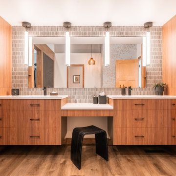
An under used whirlpool tub and inefficient layout were rectified by removing the tub and outdated glass block shower to create a generous walk-in shower area and dual vanity with built ins for storage. Woods and textured materials add warmth and sophistication to the space.
19