
Search results for "Flat strike" in Home Design Ideas
 TVL Creative Ltd.
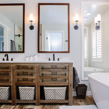
This master bathroom renovation transforms a builder-grade standard into a personalized retreat for our lovely Stapleton clients. Recognizing a need for change, our clients called on us to help develop a space that would capture their aesthetic loves and foster relaxation. Our design focused on establishing an airy and grounded feel by pairing various shades of white, natural wood, and dynamic textures. We replaced the existing ceramic floor tile with wood-look porcelain tile for a warm and inviting look throughout the space. We then paired this with a reclaimed apothecary vanity from Restoration Hardware. This vanity is coupled with a bright Caesarstone countertop and warm bronze faucets from Delta to create a strikingly handsome balance. The vanity mirrors are custom-sized and trimmed with a coordinating bronze frame. Elegant wall sconces dance between the dark vanity mirrors and bright white full height mirrors flanking the bathtub. The tub itself is an oversized freestanding bathtub paired with a tall bronze tub filler. We've created a feature wall with Tile Bar's Billowy Clouds ceramic tile floor to ceiling behind the tub. The wave-like movement of the tiles offers a dramatic texture in a pure white field. We removed the existing shower and extended its depth to create a large new shower. The walls are tiled with a large format high gloss white tile. The shower floor is tiled with marble circles in varying sizes that offer a playful aesthetic in an otherwise minimalist space. We love this pure, airy retreat and are thrilled that our clients get to enjoy it for many years to come!
 J. Alexander Fine Woodworking
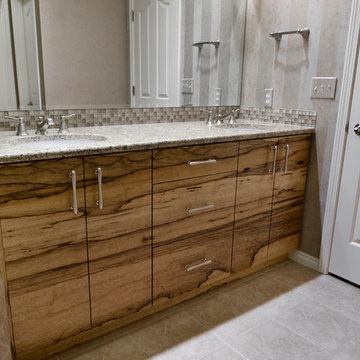
A custom master vanity constructed from solid Black Limba hardwood. The vanity front was cut from one large glue-up, ensuring the striking grain would be continuous from left to right, and top to bottom.
 Sustainable Sedona
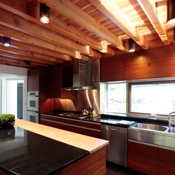
This kitchen mixes several types of wood. There are rough sawn fir beams, fir tongue and groove ceilings, maple butcher block and most striking, ribbon mahogany cabinets. The mahogany is intended as the "star of the show". All of the wood in finished with clear material so the true character of the wood can shine through. All other surfaces are kept neutral so as not to compete with the warms of the natural wood.
Sustainable Sedona Kitchen Design. Photos by Sustainable Sedona.
Find the right local pro for your project
 Amy Pearson Design
The primary bedroom and bathroom are the showstoppers of this phase! Unused and awkwardly located closets in both the bedroom and bathroom were removed to make way for additional square-footage in the bath and replaced with a sizable and functional reach-in closet in the bedroom. A dated and cramped shower stall was removed in favor for an expansive step in shower spanning the width of the bathroom and a new transom window washes the room in natural light. While the previous bathroom was only able to accommodate a single vanity, the new layout allowed us to create double matching vanities mirrored across from each other - a much appreciated addition for a primary bath. Floating walnut vanities boast impressive storage and are capped with tower cabinets with hidden outlets for charging and storing electronic bathroom tools. While the color palette is restrained - black, white, gray, and brown - the result is a timelessly modern and masculine space that is at once striking and warm. Modern geometric patterns play with each other throughout the material selections.

 Sixth Sense Studio
This bathroom exudes a sense of serene luxury and thoughtful design, inviting one to relax and rejuvenate. The light wood double vanity with its elegant marble countertop forms a calming centerpiece, its natural warmth softening the crisp modernity of the space. Twin mirrors, framed in sleek black, reflect light and create an illusion of expanded space, while the brass globe sconces cast a gentle, flattering glow that would be perfect for a relaxing evening routine.
There's a palpable balance between sophistication and comfort here. The brushed gold faucets add a touch of opulence without ostentation, their warm tones echoing the inviting wood tones below. One can almost imagine the cool, smooth feel of the marble countertop and the satisfying weight of the black cabinet pulls.
The small framed artwork and potted plant bring life and personality to the space, hinting at the tastes of those who use this bathroom. These touches, along with the natural light streaming through the window, make the room feel lived-in and loved, rather than sterile or overly pristine.
Overall, this bathroom strikes a harmonious chord between functional and indulgent. It's a space that encourages lingering, whether for a refreshing morning start or a soothing wind-down at day's end. The thoughtful blend of textures, colors, and materials creates an atmosphere of understated elegance that would make daily rituals feel like a luxurious retreat.
 Charlie & Co. Design, Ltd
Corey Gaffer Photography
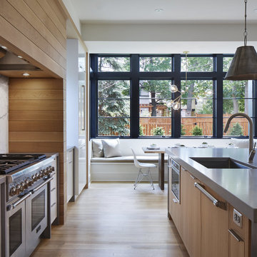
Example of a transitional galley light wood floor eat-in kitchen design in Minneapolis with an undermount sink, flat-panel cabinets, white cabinets, solid surface countertops, white backsplash, stone slab backsplash, an island and stainless steel appliances
Example of a transitional galley light wood floor eat-in kitchen design in Minneapolis with an undermount sink, flat-panel cabinets, white cabinets, solid surface countertops, white backsplash, stone slab backsplash, an island and stainless steel appliances
 interior design etc
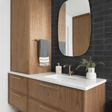
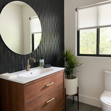
Hip powder room to show off for guests. A striking black accent tile wall highlight the beautiful walnut vanity from Rejuvenation and brushed champagne brass plumbing fixtures. The gray Terrazzo flooring is the perfect nod to the mid century architecture of the home.

 studio | TRACE, pllc
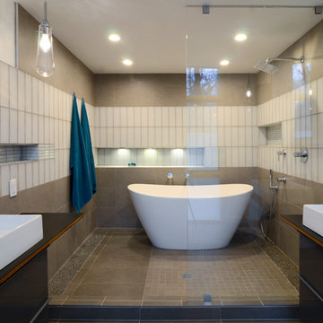
Example of a large minimalist master gray tile and ceramic tile ceramic tile and gray floor bathroom design in Raleigh with flat-panel cabinets, gray cabinets, a wall-mount toilet, white walls, a vessel sink and wood countertops
 Advance Design Studio, Ltd.
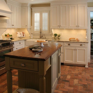
Located on a partially wooded lot in Elburn, Illinois, this home needed an eye-catching interior redo to match the unique period exterior. The residence was originally designed by Bow House, a company that reproduces the look of 300-year old bow roof Cape-Cod style homes. Since typical kitchens in old Cape Cod-style homes tend to run a bit small- or as some would like to say, cozy – this kitchen was in need of plenty of efficient storage to house a modern day family of three.
Advance Design Studio, Ltd. was able to evaluate the kitchen’s adjacent spaces and determine that there were several walls that could be relocated to allow for more usable space in the kitchen. The refrigerator was moved to the newly excavated space and incorporated into a handsome dinette, an intimate banquette, and a new coffee bar area. This allowed for more countertop and prep space in the primary area of the kitchen. It now became possible to incorporate a ball and claw foot tub and a larger vanity in the elegant new full bath that was once just an adjacent guest powder room.
Reclaimed vintage Chicago brick paver flooring was carefully installed in a herringbone pattern to give the space a truly unique touch and feel. And to top off this revamped redo, a handsome custom green-toned island with a distressed black walnut counter top graces the center of the room, the perfect final touch in this charming little kitchen.
 Smith & Ragsdale Interior Design
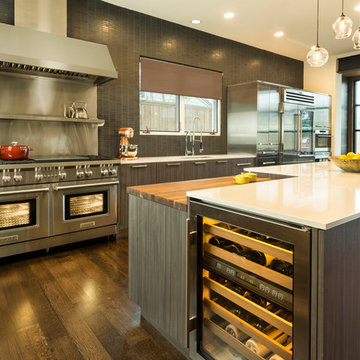
While this new home had an architecturally striking exterior, the home’s interior fell short in terms of true functionality and overall style. The most critical element in this renovation was the kitchen and dining area, which needed careful attention to bring it to the level that suited the home and the homeowners.
As a graduate of Culinary Institute of America, our client wanted a kitchen that “feels like a restaurant, with the warmth of a home kitchen,” where guests can gather over great food, great wine, and truly feel comfortable in the open concept home. Although it follows a typical chef’s galley layout, the unique design solutions and unusual materials set it apart from the typical kitchen design.
Polished countertops, laminated and stainless cabinets fronts, and professional appliances are complemented by the introduction of wood, glass, and blackened metal – materials introduced in the overall design of the house. Unique features include a wall clad in walnut for dangling heavy pots and utensils; a floating, sculptural walnut countertop piece housing an herb garden; an open pantry that serves as a coffee bar and wine station; and a hanging chalkboard that hides a water heater closet and features different coffee offerings available to guests.
The dining area addition, enclosed by windows, continues to vivify the organic elements and brings in ample natural light, enhancing the darker finishes and creating additional warmth.
Photography by Ira Montgomery
 Stéphanie Fortier Design
Bodoum Photographie
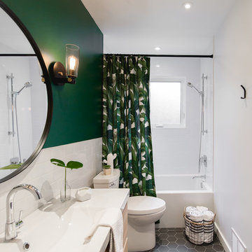
Small minimalist 3/4 white tile and subway tile ceramic tile and gray floor bathroom photo in Montreal with flat-panel cabinets, a one-piece toilet, green walls, quartzite countertops, white countertops, light wood cabinets and a console sink
Small minimalist 3/4 white tile and subway tile ceramic tile and gray floor bathroom photo in Montreal with flat-panel cabinets, a one-piece toilet, green walls, quartzite countertops, white countertops, light wood cabinets and a console sink
 Let's Remodel
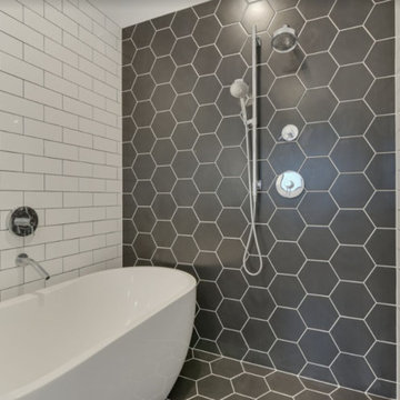
In this bathroom, the client wanted the contrast of the white subway tile and the black hexagon tile. We tiled up the walls and ceiling to create a wet room feeling.
 Alair Homes Plano
 Our clients came to us because they were tired of looking at the side of their neighbor’s house from their master bedroom window! Their 1959 Dallas home had worked great for them for years, but it was time for an update and reconfiguration to make it more functional for their family.
They were looking to open up their dark and choppy space to bring in as much natural light as possible in both the bedroom and bathroom. They knew they would need to reconfigure the master bathroom and bedroom to make this happen. They were thinking the current bedroom would become the bathroom, but they weren’t sure where everything else would go.
This is where we came in! Our designers were able to create their new floorplan and show them a 3D rendering of exactly what the new spaces would look like.
The space that used to be the master bedroom now consists of the hallway into their new master suite, which includes a new large walk-in closet where the washer and dryer are now located.
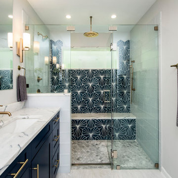
From there, the space flows into their new beautiful, contemporary bathroom. They decided that a bathtub wasn’t important to them but a large double shower was! So, the new shower became the focal point of the bathroom. The new shower has contemporary Marine Bone Electra cement hexagon tiles and brushed bronze hardware. A large bench, hidden storage, and a rain shower head were must-have features. Pure Snow glass tile was installed on the two side walls while Carrara Marble Bianco hexagon mosaic tile was installed for the shower floor.
For the main bathroom floor, we installed a simple Yosemite tile in matte silver. The new Bellmont cabinets, painted naval, are complemented by the Greylac marble countertop and the Brainerd champagne bronze arched cabinet pulls. The rest of the hardware, including the faucet, towel rods, towel rings, and robe hooks, are Delta Faucet Trinsic, in a classic champagne bronze finish. To finish it off, three 14” Classic Possini Euro Ludlow wall sconces in burnished brass were installed between each sheet mirror above the vanity.
In the space that used to be the master bathroom, all of the furr downs were removed. We replaced the existing window with three large windows, opening up the view to the backyard. We also added a new door opening up into the main living room, which was totally closed off before.
Our clients absolutely love their cool, bright, contemporary bathroom, as well as the new wall of windows in their master bedroom, where they are now able to enjoy their beautiful backyard!


 Smith & Ragsdale Interior Design
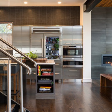
While this new home had an architecturally striking exterior, the home’s interior fell short in terms of true functionality and overall style. The most critical element in this renovation was the kitchen and dining area, which needed careful attention to bring it to the level that suited the home and the homeowners.
As a graduate of Culinary Institute of America, our client wanted a kitchen that “feels like a restaurant, with the warmth of a home kitchen,” where guests can gather over great food, great wine, and truly feel comfortable in the open concept home. Although it follows a typical chef’s galley layout, the unique design solutions and unusual materials set it apart from the typical kitchen design.
Polished countertops, laminated and stainless cabinets fronts, and professional appliances are complemented by the introduction of wood, glass, and blackened metal – materials introduced in the overall design of the house. Unique features include a wall clad in walnut for dangling heavy pots and utensils; a floating, sculptural walnut countertop piece housing an herb garden; an open pantry that serves as a coffee bar and wine station; and a hanging chalkboard that hides a water heater closet and features different coffee offerings available to guests.
The dining area addition, enclosed by windows, continues to vivify the organic elements and brings in ample natural light, enhancing the darker finishes and creating additional warmth.
Photography by Ira Montgomery
 Striking Kitchen & Bath by Bell
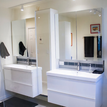
Mr. Bates had a 1970’s bath room that did not work well for his family, it had a ton of wasted space and looked dated. He had a garden tub under the window that was not being utilized, so we pulled out the tub and made the shower larger. Now, we had some room to work with! With all the open space we now had, we added a sitting area. The vanity area also need some TLC, so we added wall hung vanity’s and a tower in the middle for more storage. We also redid the lighting so that it accented the new vanity's and the beautiful shower!
We hope you love it as much as we do!
 Striking Kitchen & Bath by Bell
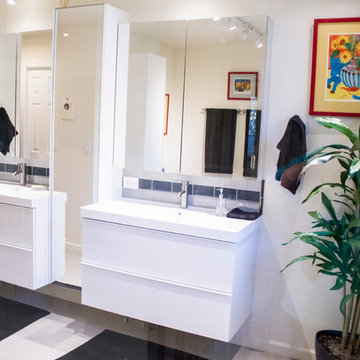
Mr. Bates had a 1970’s bath room that did not work well for his family, it had a ton of wasted space and looked dated. He had a garden tub under the window that was not being utilized, so we pulled out the tub and made the shower larger. Now, we had some room to work with! With all the open space we now had, we added a sitting area. The vanity area also need some TLC, so we added wall hung vanity’s and a tower in the middle for more storage. We also redid the lighting so that it accented the new vanity's and the beautiful shower!
We hope you love it as much as we do!
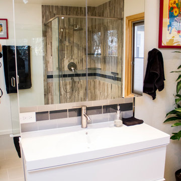 Striking Kitchen & Bath by Bell
Mr. Bates had a 1970’s bath room that did not work well for his family, it had a ton of wasted space and looked dated. He had a garden tub under the window that was not being utilized, so we pulled out the tub and made the shower larger. Now, we had some room to work with! With all the open space we now had, we added a sitting area. The vanity area also need some TLC, so we added wall hung vanity’s and a tower in the middle for more storage. We also redid the lighting so that it accented the new vanity's and the beautiful shower!
We hope you love it as much as we do!

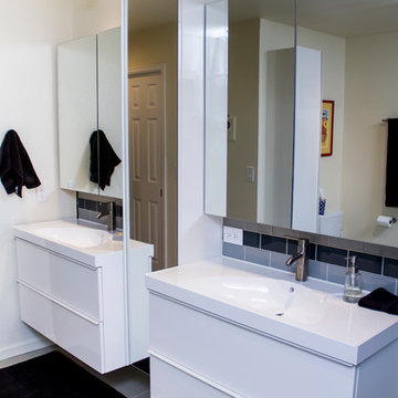 Striking Kitchen & Bath by Bell
Mr. Bates had a 1970’s bath room that did not work well for his family, it had a ton of wasted space and looked dated. He had a garden tub under the window that was not being utilized, so we pulled out the tub and made the shower larger. Now, we had some room to work with! With all the open space we now had, we added a sitting area. The vanity area also need some TLC, so we added wall hung vanity’s and a tower in the middle for more storage. We also redid the lighting so that it accented the new vanity's and the beautiful shower!
We hope you love it as much as we do!
 Cresmark Custom Homes
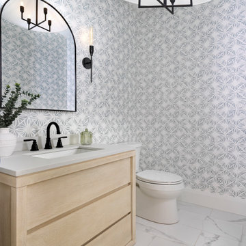
This powder room renovation is fresh, bright, and full of character. A soft wood vanity with clean lines grounds the space, while bold patterned wallpaper adds personality and visual interest. The black arched mirror, wall sconces, and matte black faucet introduce a modern edge, creating striking contrast against the lighter tones.
Large-format marble-look floor tiles enhance the airy feel while maintaining a touch of elegance. The design balances playful pattern with sleek finishes, turning this small space into a stylish statement.
 Marvin
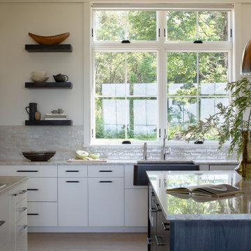
The homeowners of this transitional contemporary home near Albany, Vermont, are avid bird watchers. When building their new home near the Green Mountains, they wanted windows and doors that provided natural views while also helping to protect the local bird population. The homeowners used bird-friendly, bird-strike-deterring glass to meet both of these goals.
The homeowners used the services of the Marvin at 7 Tide Brand Experience Center in Boston, Massachusetts, to help curate the window and door choices for their project, including confirming their desire to use bird-friendly glass in Marvin Ultimate collection windows and exterior doors. To complete their home, they selected interior doors from TruStile.
15